Font Maestro
- Fonts
- By Theme
- All fonts
- Wedding and invitations 1225
- Christmas and winter 752
- Kids, cartoon and bubble 621
- Halloween and horror 337
- Retro, groovy and western 282
- Logo and branding 238
- Tech, gaming and futuristic 187
- Sports and varsity 163
- Gothic, blackletter and tattoo 86
- Boho, botanical and doodle 68
- Book covers, posters and editorial 22
- Crafts, shirts and signs 11
- Works With
- Font Pairings
- Blog
Skip to content
Script and Calligraphy Fonts
Script, cursive and signature faces — the ones that do the heavy lifting on invitations, logos and quote prints. Look at the lowercase l and the capital S: that is where a bad script gives itself away.
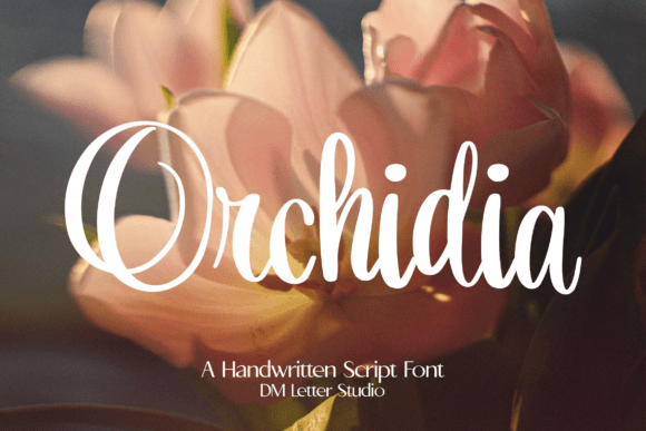
Orchidia
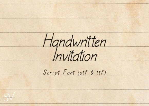
See itHandwritten Invitation Script
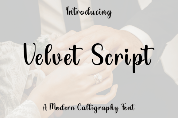
See itVelvet Script
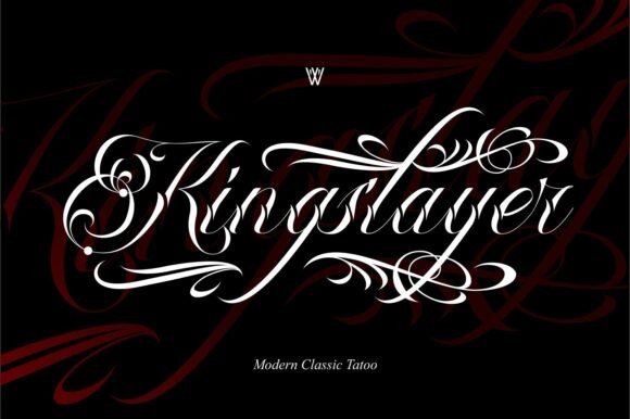
See itKing Slayer
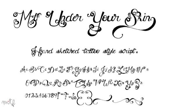
See itUnder Your Skin
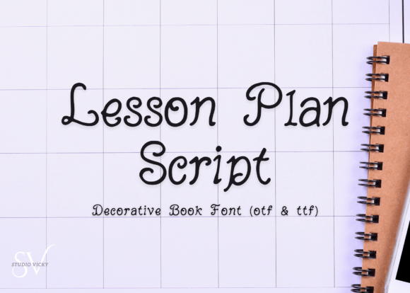
See itLesson Plan Script
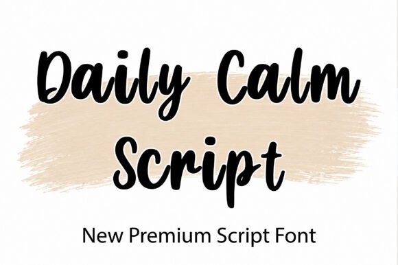
See itDaily Calm Script
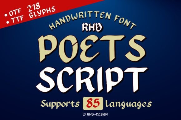
See itPoets Script
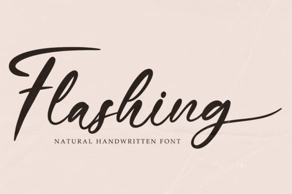
See itFlashing
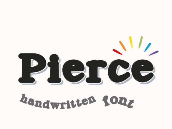
See itPierce
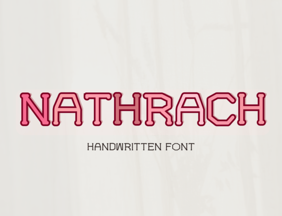
See itNathrach
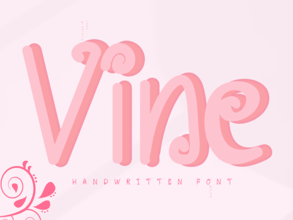
See itVine
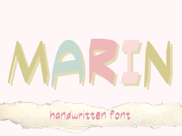
See itMarin
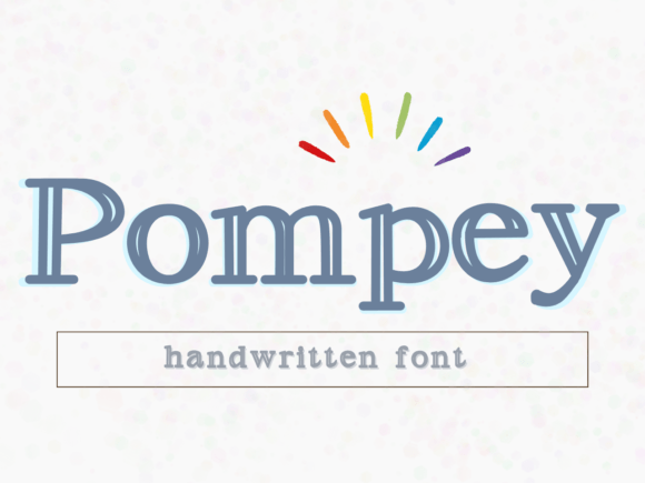
See itPompey
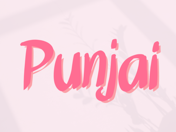
See itPunjai
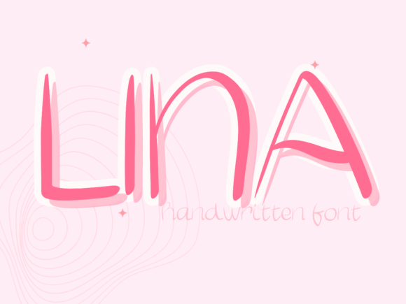
See itLina
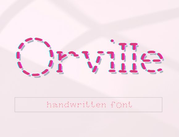
See itOrville
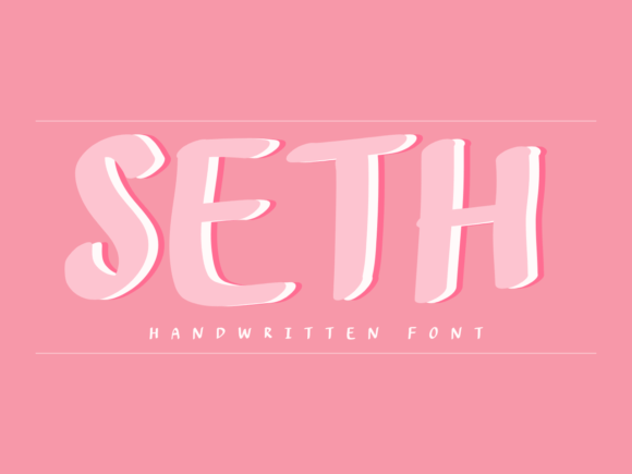
See itSeth
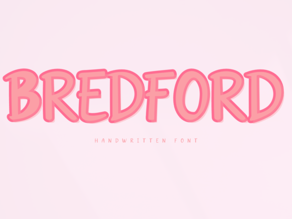
See itBredford
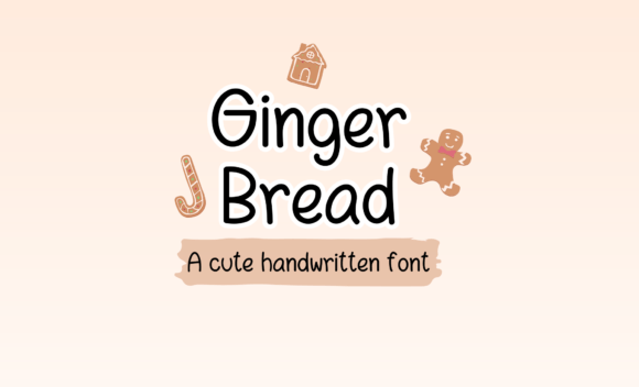
See itGingerbread
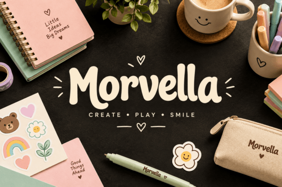
See itMorvella
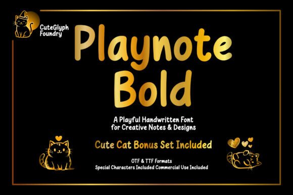
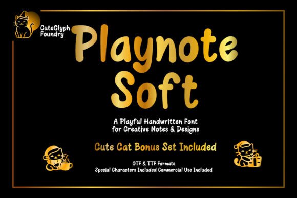
See itPlaynote
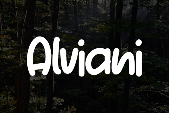
See itAlviani
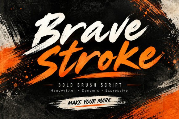
See itBrave Stroke
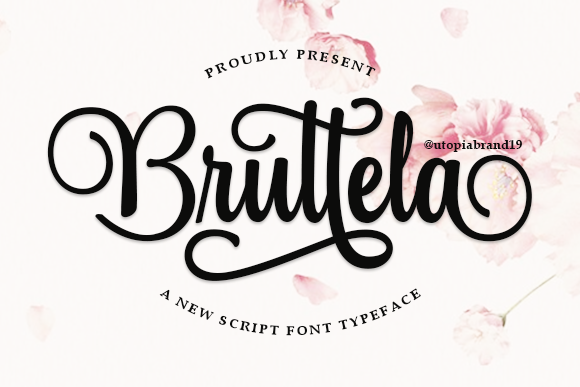
See itBruttela
Bold script for brand marks: heavy stems, tight spacing, alternates for the awkward letter pairs. OTF/TTF only, so no cut files — this one is for…
See itPlaynote Soft
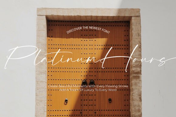
See itPlatinum Hours
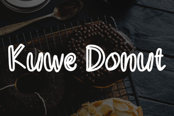
See itKuwe Donut
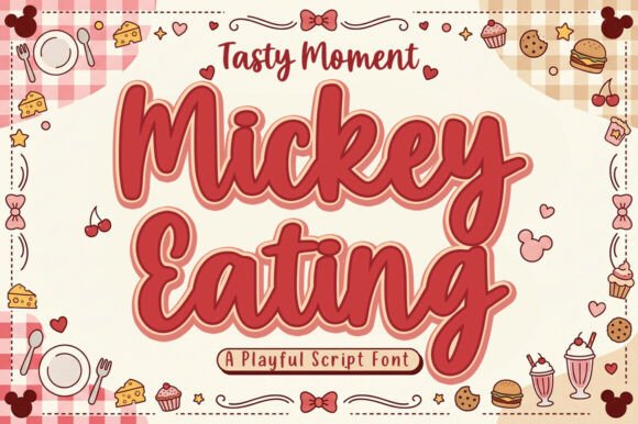
See itMickey Eating
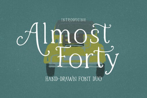
See itAlmost Forty
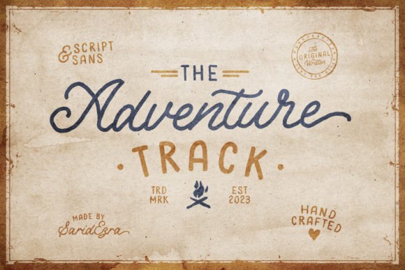
See itAdventure Track
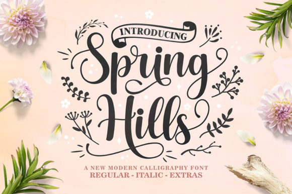
See itSpring Hills
The alternates are the point here — swapping one or two letters is what stops a repeated name from looking stamped. Thirty-five reviews is unusually deep…
See itTeiring
See itTedwo
See it