Quick answer: elegance in type comes from three things: high contrast between thick and thin strokes, generous spacing, and restraint everywhere else. A high-contrast serif carries luxury branding. An all-caps serif with wide letter-spacing carries packaging and headers. A monogram face carries initials. A modern calligraphy script carries invitations. Below is a licensed pick for each job, plus the parts most people forget until the design is already built: numerals, capitals, and non-Latin alphabets.
Start here
Unlimited creative assets. Access to AI tools.
Commercial licence included.
Get downloads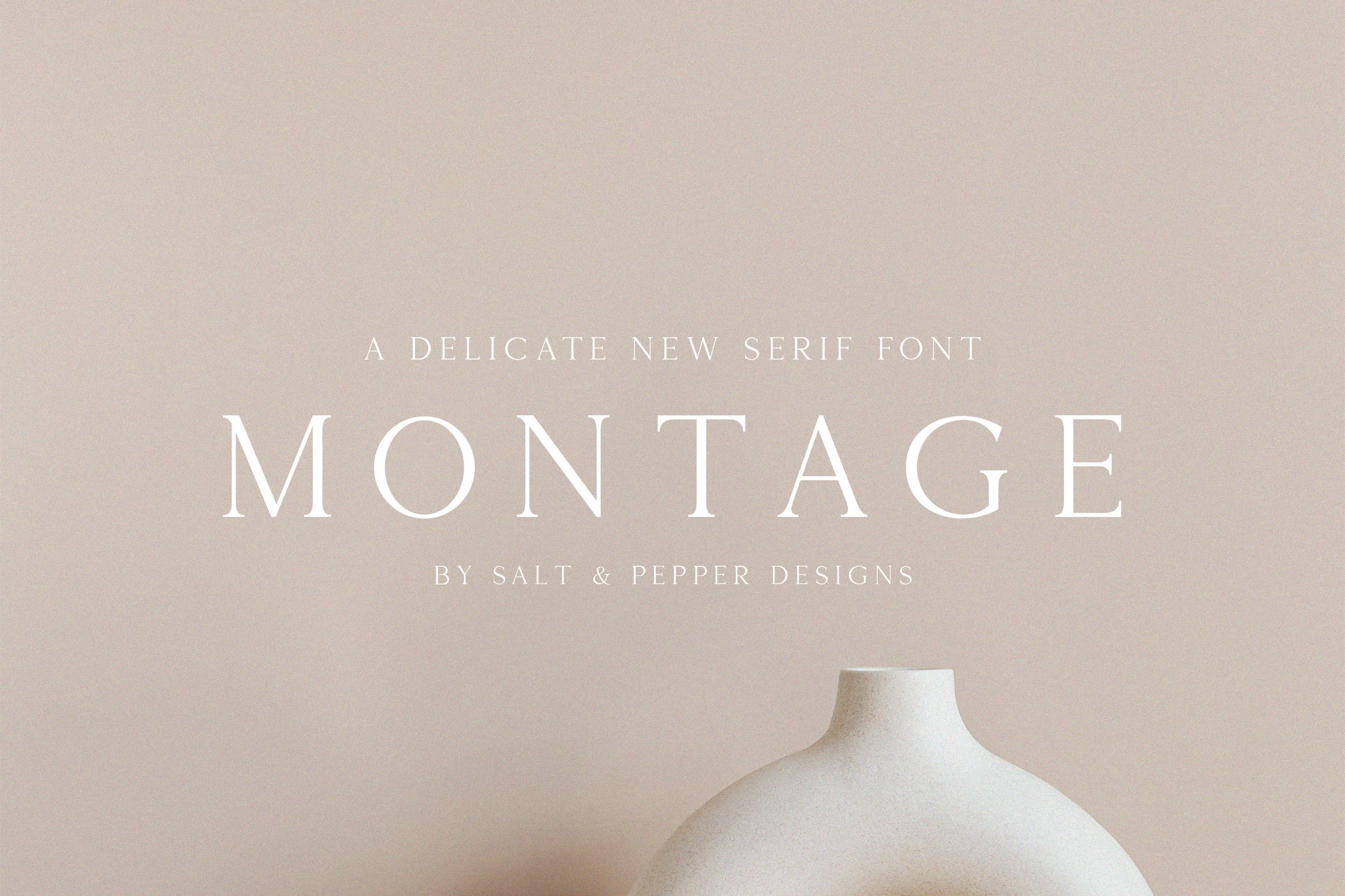
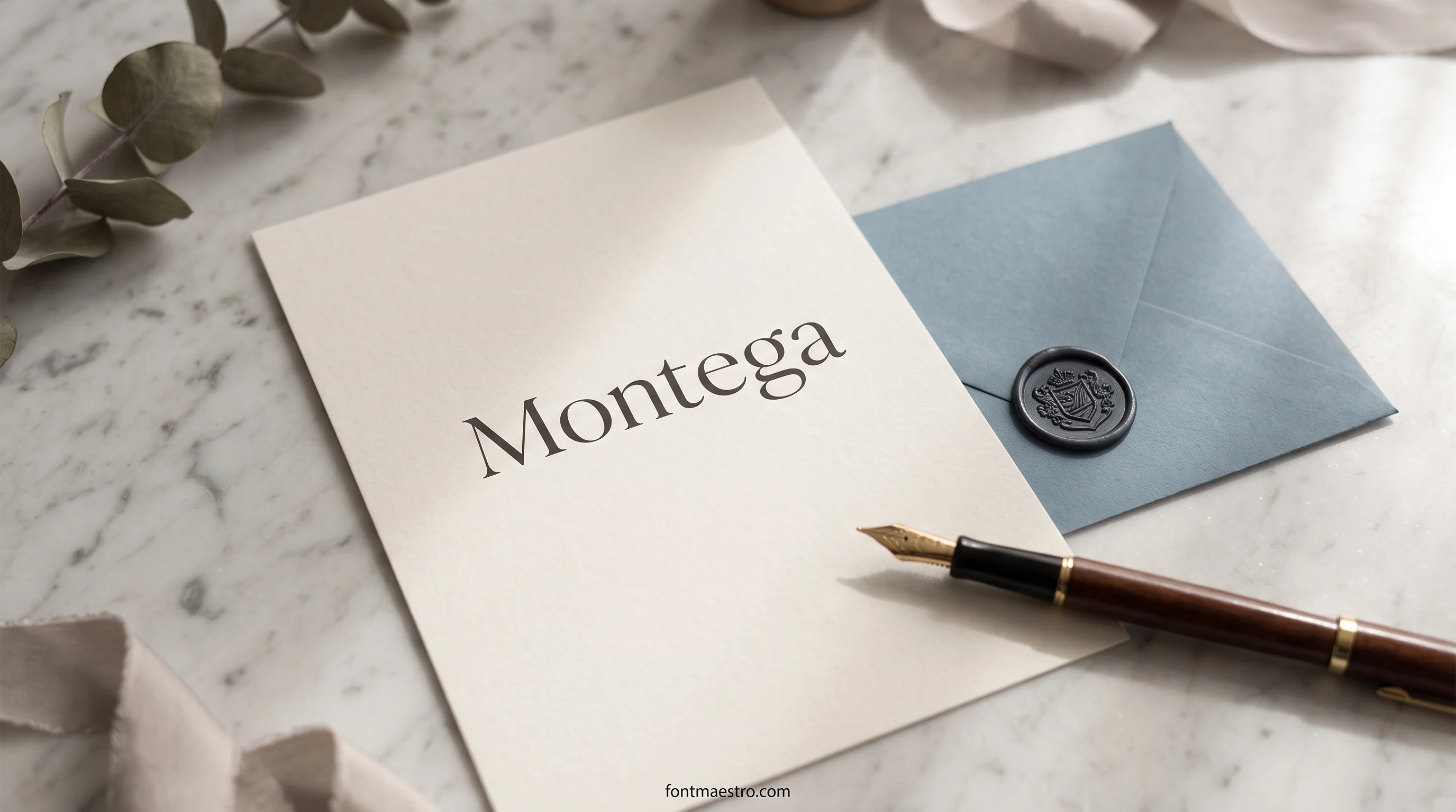
Start here: Montage
The high-contrast serif that carries the luxury wordmark job below.
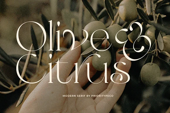
Olive & Citrus on a packaging section header
A classic serif with modest contrast, steady enough for a packaging header, with ligatures in the glyph set.
Get Olive & Citrus on a packaging section header on All Access →
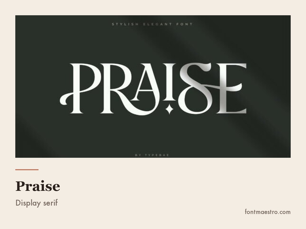
Praise on a fashion cover line
Luxury brief, not the elegant one: made to sit large on a cover.
144 samples, 11 lists, 20 fonts in common. In August 2026 I scanned 321 “elegant fonts” pins on Pinterest, took the 11 most-saved roundups posted in the last three months and counted every typeface they show: 144 named samples, of which only 20 turn up on more than one list. Roughly seven out of eight recommendations are a name nobody else recommends. Ranking is not the useful axis here. What the font has to survive is. Every pick below is tied to a job and to the small size it still has to read at.
Six Elegant Fonts by Job
Six different jobs, six different answers. Every one of these is licensed for commercial and client work.
Unlimited creative assets. Access to AI tools.
Commercial licence included.
Get downloads
Luxury wordmarks and editorial headers → Montage
The high-contrast serif every serif style pick starts from. Set a brand name in it large and spaced out — it does the whole job alone. Do not shrink it below headline size.
Olive & Citrus on a packaging section header
A classic serif with modest contrast, steady enough for a packaging header, with ligatures in the glyph set.
Get Olive & Citrus on a packaging section header on All Access →
Praise on a fashion cover line
Luxury brief, not the elegant one: made to sit large on a cover.
Unlimited creative assets. Access to AI tools.
Commercial licence included.
Get downloads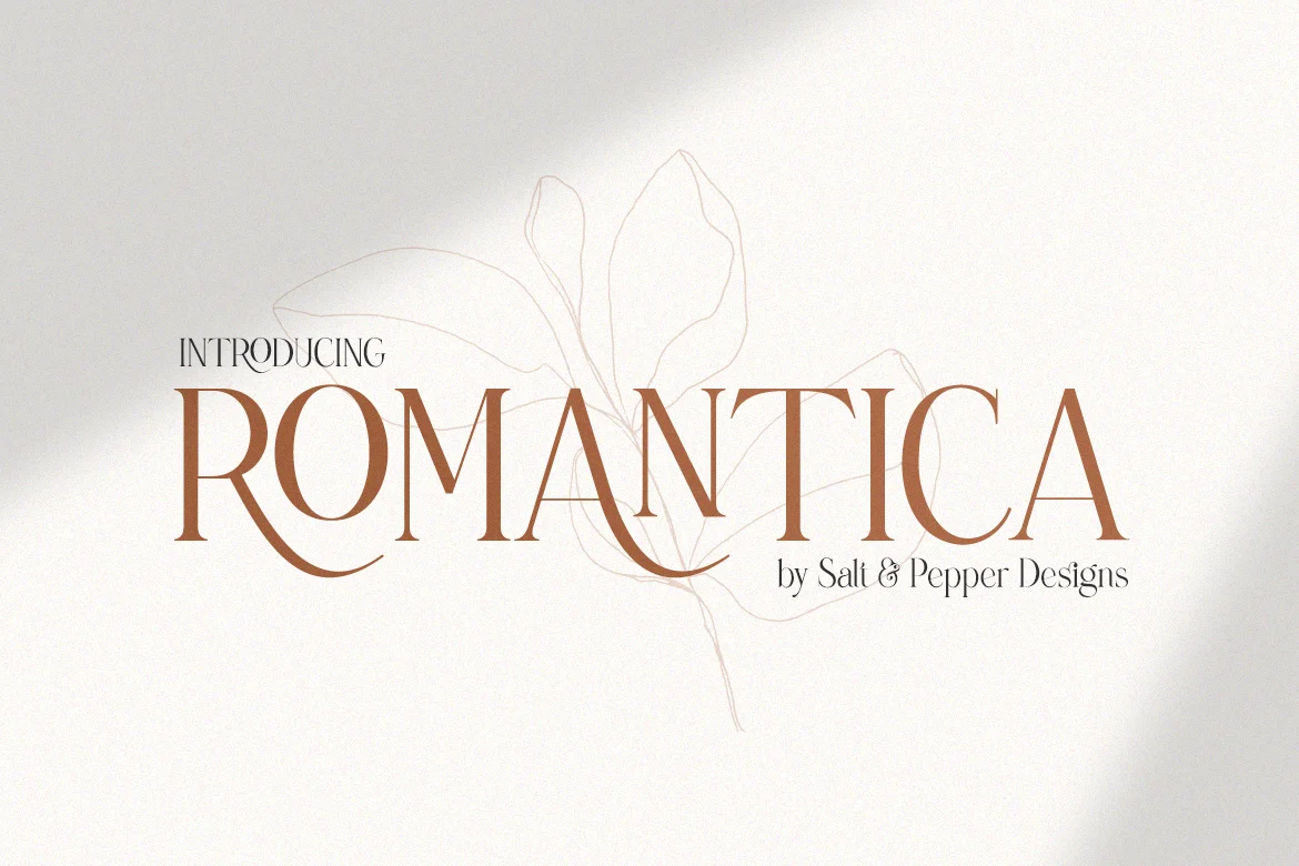
Invitations and ceremony pieces → Romantica
The details of an invitation, the date and the venue, want a refined serif rather than a second script. Romantica is drawn for that: invitations, thank-you cards, small logos.
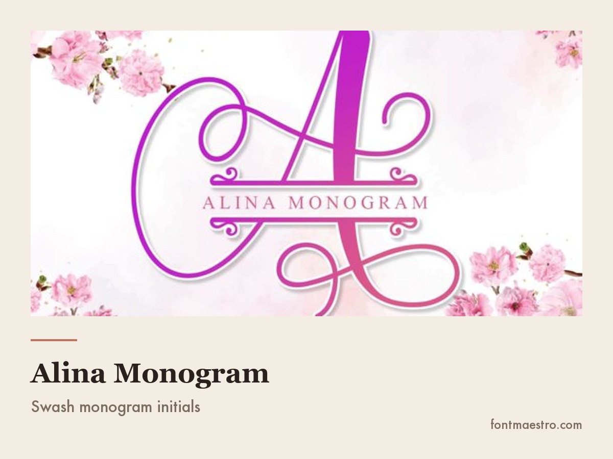
Alina Monogram initials locked in a circle
Full numeral set and locked initials, the two things that break monograms.
Get Alina Monogram initials locked in a circle on All Access →
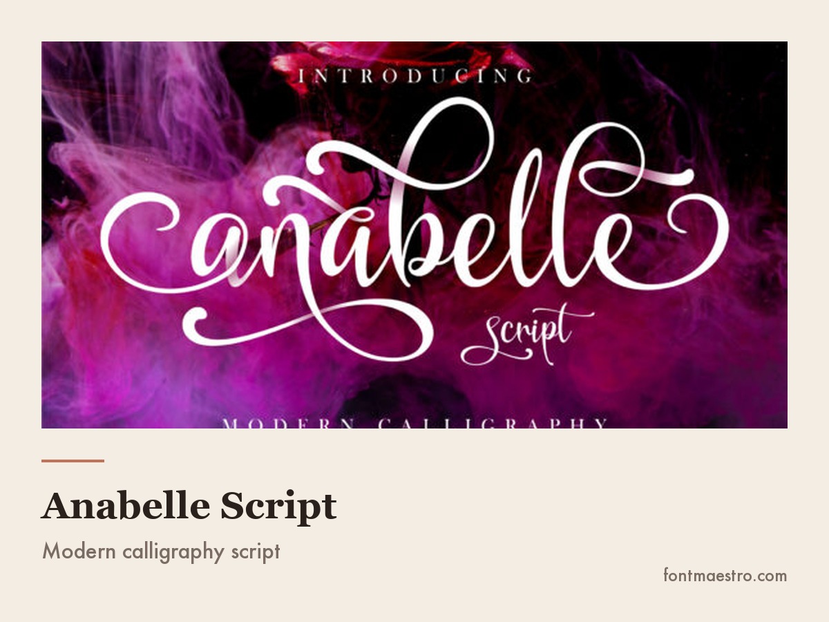
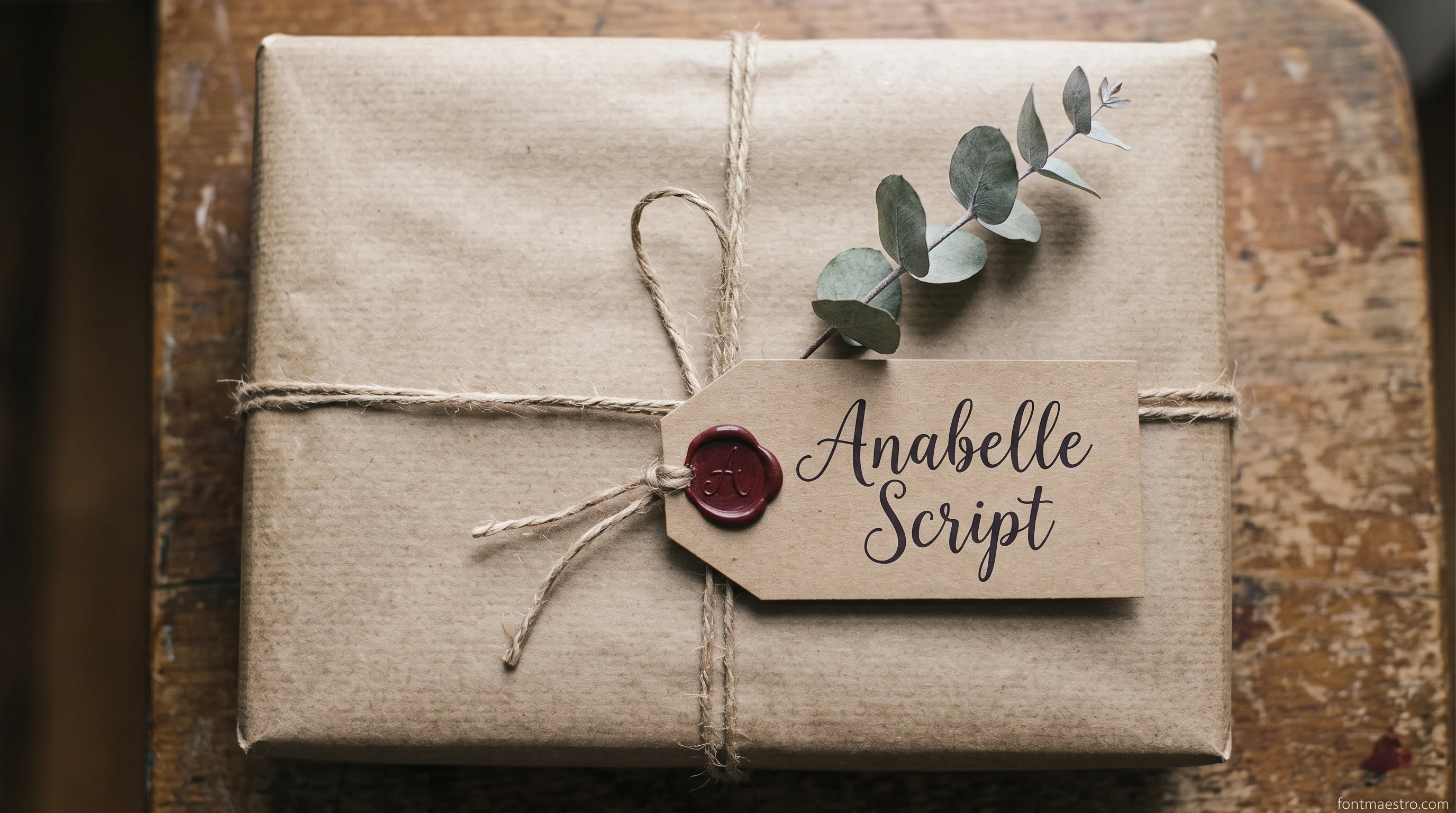
Anabelle Script alternates on an invitation line
What none of the fifteen give you: alternates deep enough for names.
Get Anabelle Script alternates on an invitation line on All Access →
Of the 15 free elegant faces listed below, seven still hold at caption size and four, every high-contrast serif in the set, are flagged as breaking before they get there. Elegance survives the shrink far less often than a preview at 200 px suggests.
What Actually Makes a Font Read as Elegant
Elegance is not a category of typeface. It is a set of properties that show up across several categories, and knowing which ones they are is the difference between choosing a font and guessing.
Unlimited creative assets. Access to AI tools.
Commercial licence included.
Get downloads
Romantica
A refined serif for invitations and small logos, with nothing decorative added.
Start here: Montage
The high-contrast serif that carries the luxury wordmark job below.
Olive & Citrus on a packaging section header
A classic serif with modest contrast, steady enough for a packaging header, with ligatures in the glyph set.
Get Olive & Citrus on a packaging section header on All Access →
Stroke contrast. The visible difference between the thick and thin parts of a letter. High contrast, the hallmark of the Didone serifs used by fashion magazines, reads as refined because it takes a steady hand to draw and good printing to reproduce. Low contrast reads as sturdy and practical instead.
Space. More than any letterform choice, spacing signals luxury. Wide letter-spacing on a capitalised word, generous line height, and a lot of empty background do more for a design’s perceived value than any decorative font can.
Restraint. An elegant layout usually contains one expressive typeface and one plain one. The moment a third voice joins, the effect collapses into a wedding-fair flyer — the same one-voice rule covered from the branding side in font branding.
Where it breaks. High contrast is fragile. Those hairline strokes are the first thing to vanish in small print, on a screen at body-text size, in embroidery, and in single-colour vinyl. That single fact decides most of the choices above, and every one that follows.
Elegant or Luxury: Two Words, Two Different Briefs
People use the two words as if they mean the same thing, and the type does not agree. Elegant is about restraint: the design gets quieter, the spacing gets wider, nothing shouts. Luxury is about deliberate expense: very high stroke contrast, a lot of empty space around very little text, and materials or effects the reader knows are not cheap. A font can do one and fail the other. The same split shows up in display fonts built for industrial branding, where the expensive look comes from spacing rather than ornament too.
Unlimited creative assets. Access to AI tools.
Commercial licence included.
Get downloads
Start here: Montage
The high-contrast serif that carries the luxury wordmark job below.
Olive & Citrus on a packaging section header
A classic serif with modest contrast, steady enough for a packaging header, with ligatures in the glyph set.
Get Olive & Citrus on a packaging section header on All Access →
The table sorts the phrasings people actually type into what each one is asking the letterforms to do.
| What people search | What it is really asking for | What to check in the preview |
|---|---|---|
| Fonts elegant enough for a wordmark | Restraint plus contrast, readable cold | Set your real name in it, not the sample text |
| Beautiful elegant fonts | Pleasing curves, no structural demand attached | Whether it still works at your smallest size |
| Best luxury fonts | Very high stroke contrast, tight but generous fit | Hairlines that survive one-colour print |
| Premium luxury fonts | A full family: weights, italics, real numerals | Glyph count and weight count on the product page |
| Modern luxury fonts | Geometric or Didone shapes, no historical ornament | Flat terminals, circular bowls, no swashes |
| Luxury modern fonts for packaging | The same, but able to hold all-caps tracking | Capitals spaced wide without falling apart |
| Luxury wedding fonts | A script for names plus a quiet serif for details | Alternates for repeated letters in the names |
The distinction has one practical consequence. If a brief says luxury and you deliver restraint, the work reads as plain rather than refined, and the feedback comes back as “it needs something”. If a brief says elegant and you deliver contrast and gold, it reads as loud. Ask which of the two words the client means before choosing anything, and the number of revision rounds drops.
Free Elegant Fonts: Google Fonts, DaFont and What to Watch For
Every font, one commercial licence
The bundles I test at logo size live in one subscription — commercial use included, no per-font checkout.
There is no shortage of elegant fonts free to download, and some of them are genuinely excellent. Three separate premium roundups of elegant cursive picks for weddings didn’t share a single name across 78 combined entries, while free-tier lists elsewhere — the same crowded field covered in script fonts — kept converging on the same narrow set of Google Fonts — a sign the market is crowded and inconsistent at the top, thin and repetitive at the free tier. What differs between sources is not beauty. It is licensing clarity and how complete the family is, the same gap that shows up when a free pick is stretched into an elegant font logo rather than a one-off invitation.
Unlimited creative assets. Access to AI tools.
Commercial licence included.
Get downloads
Montage
Licensing clarity without reading a licence: covered for client work while the subscription is active.
Olive & Citrus on a packaging section header
A classic serif with modest contrast, steady enough for a packaging header, with ligatures in the glyph set.
Get Olive & Citrus on a packaging section header on All Access →
Praise on a fashion cover line
Luxury brief, not the elegant one: made to sit large on a cover.
Elegant Google Fonts are the safest free option by a wide margin: every family is open-licensed for commercial use, they are hosted for the web, and the licence never changes under you. The reliably elegant ones are Playfair Display and Cormorant for high-contrast serifs, Libre Baskerville and EB Garamond for classic book serifs, Cinzel for engraved capitals, and Italiana for a very light display serif. Those are real families, available today, and between them they cover most of what a luxury layout needs.
Elegant fonts DaFont results are a different situation. DaFont is a catalogue of uploads, not a curated library, so the licence is set per font by whoever uploaded it, and a large share are marked personal-use only, with a commercial licence sold separately. The font file downloads identically either way; nothing stops you from using it, which is exactly why people find out too late. Open the licence text before the font goes anywhere near paid work.
Two more things to check on any free family before committing, whichever source it came from:
- Weights. A single-weight download cannot build a hierarchy. If you need a header, a subhead and a caption to feel related, you need a family with several weights. That is the most common reason free layouts look flat.
- Character coverage. Accented characters, proper quotation marks and a full set of numerals are frequently missing from free display faces. Type the actual client name, with its actual accents, before deciding.
Where elegant free fonts work best in practice: as the plain half of the pairing. Use a licensed display face for the name, and a well-made open-licence family for the body text and captions. That combination is both cheaper and better than trying to make one free display font do everything.
Unlimited creative assets. Access to AI tools.
Commercial licence included.
Get downloads
Olive & Citrus
A classic serif with modest contrast, steady enough for a packaging header, with ligatures in the glyph set.
Start here: Montage
The high-contrast serif that carries the luxury wordmark job below.
Praise on a fashion cover line
Luxury brief, not the elegant one: made to sit large on a cover.
Where the free route stops is the licence line on client work and the alternates that make a name look set rather than typed. That is the gap Montage and Anabelle Script were bought to close on this desk.
Unlimited creative assets. Access to AI tools.
Commercial licence included.
Get downloads
Montage
Licence line that free fonts cannot give you: commercial use covered while the subscription is active.
Olive & Citrus on a packaging section header
A classic serif with modest contrast, steady enough for a packaging header, with ligatures in the glyph set.
Get Olive & Citrus on a packaging section header on All Access →
Praise on a fashion cover line
Luxury brief, not the elegant one: made to sit large on a cover.
15 Free Elegant Fonts and How Small Each One Survives
Every family below is on Google Fonts under an open licence, so commercial use, client logos and products you sell are all covered, with no email and no separate purchase. What they do not share is behaviour at small size, and that is the axis this page cares about. High contrast between thick and thin strokes is what makes a face read as expensive; it is also the first thing to collapse when the design shrinks to a caption, a favicon or a business card.
Unlimited creative assets. Access to AI tools.
Commercial licence included.
Get downloads
Anabelle Script
What none of the fifteen give you: alternates deep enough for names.
Start here: Montage
The high-contrast serif that carries the luxury wordmark job below.
Olive & Citrus on a packaging section header
A classic serif with modest contrast, steady enough for a packaging header, with ligatures in the glyph set.
Get Olive & Citrus on a packaging section header on All Access →
Exact names, grouped by what the face is for. Set your own words in three or four of them and shrink the artboard until something breaks. The order in which they fail is the whole answer.
| Font | Type | Best job | How it behaves small |
|---|---|---|---|
| Playfair Display | High-contrast serif | Editorial headers, fashion wordmarks | Hairlines thin out; keep it to headline size |
| Cormorant Garamond | High-contrast serif | Luxury names, invitation headers | The most fragile here, so set it large |
| Bodoni Moda | High-contrast serif | Beauty and fashion covers | Thin strokes disappear in print below body size |
| Prata | High-contrast serif | Single-word logos, section headers | One weight only; no hierarchy from the family |
| EB Garamond | Classic book serif | Long text that still has to feel refined | Holds down to caption size comfortably |
| Libre Baskerville | Classic book serif | Body copy on a luxury site | Built for screens; the safest small |
| Lora | Classic book serif | Blog body, quotes, captions | Sturdy; brushed curves survive compression |
| Crimson Pro | Classic book serif | Editorial text, long reads | Holds small; light weights do not |
| Cinzel | Engraved capitals | Monograms, crests, stamped-look marks | Capitals only, never for text |
| Marcellus | Engraved capitals | Menus, museum-style headers | Even weight; unusually readable small |
| Forum | Engraved capitals | Boutique signage, labels | Wide letters need tracking, not size |
| Italiana | Light display serif | Fashion and interiors headers | Very light; loses ground on photographs |
| Tenor Sans | Quiet sans | The plain half of an elegant pairing | Stays legible at every size |
| Jost | Geometric sans | Modern minimal branding, captions | Reliable small; wide-open counters |
| Josefin Sans | Geometric sans | Art-deco flavoured headers | Small x-height; goes muddy in captions |
Read the last column as a ranking and the pattern is plain: the four faces that survive smallest are the four with the least contrast. Elegance you can shrink is a different purchase from elegance you can only enlarge, and most layouts need one of each.
If the free pick fails the small-size column and the work is a client wordmark, that is the point where a licensed face with a full weight range pays for itself. Get Montage on All Access →
Six Elegant Font Pairings, and Why Each One Holds
A single elegant typeface almost never finishes a layout — the same rule that drives every font pairing built for one job each. What reads as expensive is the distance between two faces: one that carries the name, one that carries everything else, and enough difference between them that nobody has to squint to see which is which. Two serifs of similar weight sitting next to each other is the most common way an otherwise good design goes flat, because the eye reads it as one typeface set badly.
Unlimited creative assets. Access to AI tools.
Commercial licence included.
Get downloads
Praise
The expressive half of a pair, obvious contrast against any plain serif under it.
Start here: Montage
The high-contrast serif that carries the luxury wordmark job below.
Olive & Citrus on a packaging section header
A classic serif with modest contrast, steady enough for a packaging header, with ligatures in the glyph set.
Get Olive & Citrus on a packaging section header on All Access →
All twelve families below are on Google Fonts under an open licence, so every pairing here can go straight into client work. Each one names the job, the face that leads, the face that stays quiet, and the point at which it stops working.
| Pairing | Job it is for | What creates the contrast | Where it breaks |
|---|---|---|---|
| Playfair Display + Tenor Sans | Editorial headers, boutique wordmarks | Sharp Didone hairlines against an even, unmodulated sans | Tenor Sans has one weight, so hierarchy below the headline must come from size and spacing |
| Bodoni Moda + Jost | Beauty and fashion covers, lookbooks | Extreme stroke contrast against flat geometric shapes | Bodoni’s thins vanish in one-colour print, so keep it above headline size |
| Cinzel + EB Garamond | Menus, crests, ceremony stationery | Engraved capitals over lowercase book text, a difference in register rather than in weight | Cinzel is capitals only, so it can never take the second line of a paragraph |
| Italiana + Lora | Interiors, galleries, long-form editorial | A very light display serif against a sturdy brushed text serif | Italiana disappears over a photograph; it needs a plain field behind it |
| Prata + Josefin Sans | Packaging panels, art-deco flavoured labels | Heavy serif slabs against a small-x-height geometric sans | Josefin Sans goes muddy in captions, so keep it to short lines and tracking |
| Marcellus + Crimson Pro | Museum-style signage, wine lists, hotel collateral | Even-weight Roman capitals against an old-style text face with real italics | The pair is quiet by design; it will not carry a brand that needs to shout |
The test that settles a pairing takes a minute. Set the brand name in the display face and one full line of detail text in the plain one, print the pair in a single colour at business-card size, and look at it on paper. If the two faces read as one, the contrast is not there yet. If the detail line is the first thing to go grey, the plain face is too light, not too small.
One warning about the direction of the swap. When a pairing feels wrong, the instinct is to change the display face, because that is the one being looked at. It is almost always the plain face that is at fault: too much personality, too close in weight, or a serif where a sans was needed. Change the quiet half first and keep the name where it is.
If you would rather not build the pair yourself, the two that carry the most layouts here are Anabelle Script for the name and Olive & Citrus for the line under it.
Unlimited creative assets. Access to AI tools.
Commercial licence included.
Get downloads
Olive & Citrus
The quiet half of the pair: set the name in Anabelle Script, everything else in this.
Start here: Montage
The high-contrast serif that carries the luxury wordmark job below.
Praise on a fashion cover line
Luxury brief, not the elegant one: made to sit large on a cover.
Modern Elegance vs Classic Elegance
Searches split almost evenly between two opposite looks, and picking the wrong one for the brand is the most common mistake in this whole category.
Modern elegant fonts strip ornament away. Thin geometric sans serifs, lots of tracking, tiny type on a large empty field — the same restraint covered from the pairing side in beautiful modern fonts. This is the language of contemporary skincare, architecture studios, and minimal e-commerce. The risk is coldness: with nothing decorative to hold onto, the layout has to earn its warmth from photography and paper stock instead.
Classic elegance uses serifs and ornament to borrow authority from the past — the broader family of classic font styles this look draws from. Hotels, jewellers, wineries and law firms live here. The risk is looking dated rather than established, usually caused by too many flourishes rather than by the typeface itself.
Between them sit the elegant minimal fonts that most brands actually end up using: a serif with modest contrast, set with wide spacing and nothing else on the page. And when a brief calls for elegant luxury fonts specifically, the reliable move is a high-contrast serif for the name plus a very plain sans for everything else. The contrast between the two is what reads as expensive, not the ornament in either one.
Practical test: describe the brand in one adjective. If the adjective is quiet, clinical or architectural, go modern. If it is established, crafted or ceremonial, go classic. Fonts that sit in the middle end up signalling neither.
Middle of that split, a serif with modest contrast: Olive & Citrus. Classic side: Romantica for invitations and ceremony pieces, and Praise for fashion covers.
Unlimited creative assets. Access to AI tools.
Commercial licence included.
Get downloads
Start here: Montage
The high-contrast serif that carries the luxury wordmark job below.
Olive & Citrus on a packaging section header
A classic serif with modest contrast, steady enough for a packaging header, with ligatures in the glyph set.
Get Olive & Citrus on a packaging section header on All Access →
Numbers, Capitals and Other Alphabets
Every font, one commercial licence
The bundles I test at logo size live in one subscription — commercial use included, no per-font checkout.
Three parts of a typeface get chosen last and cause most of the late-stage problems.
Numerals. People search for elegant number fonts because they hit this wall on invitations, price lists and anniversary graphics: the letters look right and the dates look wrong. The reason is usually the numeral style. Lining figures all sit at capital height and suit tables and all-caps settings; old-style figures have ascenders and descenders like lowercase letters and sit far more comfortably inside running text and formal stationery. Quality serif families ship both; free display faces often ship neither properly. Before you commit to a font for a date-heavy design, set the actual date and look at it.
Capitals. The demand for elegant all caps fonts comes from packaging, logos and headers, where capitals plus wide tracking is the most reliable elegance formula there is — the same tracking rules covered in capital letters font styles. Two rules make it work: never letter-space lowercase the way you letter-space capitals, and never set more than a few words this way, because capitals slow reading down, which is fine for a label and fatal for a paragraph.
Other alphabets. Searches for elegant Arabic fonts deserve a straight answer: a Latin typeface cannot render Arabic, no matter how many characters it claims. Arabic is a connected script with contextual letterforms, written right to left, and it needs a typeface actually drawn for it: a Naskh style for text, a Kufi style for geometric display work, Thuluth-influenced designs for ceremonial lettering. If a bilingual design is in scope, pick the Arabic face first and match the Latin one to it, not the other way round; the Arabic script has less tolerance for a bad match.
Devanagari. The same goes for elegant Hindi fonts, with one extra structural fact that catches Latin-trained designers out: Devanagari hangs from a horizontal headline (the shirorekha) rather than sitting on a baseline. That line is where elegance lives in the script. A font whose headline is uneven in thickness, or which breaks it between conjuncts, looks careless in Hindi even when every individual letterform is well drawn. Judge candidates by printing a full sentence and looking along the top line, not at single characters, and set the Latin partner afterwards to match its weight.
Both problems are why the monogram and stationery jobs on this page go to Alina Monogram and Anabelle Script, full numeral sets and alternates, not just a pretty lowercase.
Unlimited creative assets. Access to AI tools.
Commercial licence included.
Get downloads
Alina Monogram
Full numeral set and locked initials, the two things that break monograms.
Start here: Montage
The high-contrast serif that carries the luxury wordmark job below.
Olive & Citrus on a packaging section header
A classic serif with modest contrast, steady enough for a packaging header, with ligatures in the glyph set.
Get Olive & Citrus on a packaging section header on All Access →
Which One Should You Actually Use
For elegant wedding fonts, the deciding factor is almost never the letterforms. It is whether the font has the alternate characters to make every guest’s name look intentional, and whether the numerals look right in the date. Pick a script with a full alternate set, pair it with a quiet serif for the details, and stop there.
For branding, the pairing rule does more work than any single choice: one expressive face for the name, one plain face for everything else, obvious contrast between them — the same shortlist logic as best fonts for business logos. For packaging and labels, weight beats refinement, because hairlines that look exquisite on screen disappear on a printed foil label.
And when people ask which are the best elegant fonts outright, the honest answer is the ones that survive your smallest use. Set the brand name at the size of a business card, print it in one colour, and look at it on paper. Whatever still reads as elegant there is the shortlist.
- Wedding and stationery → Anabelle Script
- Luxury wordmark or editorial header → Montage
- Packaging and section headers → Olive & Citrus
- Fashion, beauty, lifestyle covers → Praise
- Invitations and ceremony pieces → Romantica
- Monograms and initials → Alina Monogram
Unlimited creative assets. Access to AI tools.
Commercial licence included.
Get downloads
Anabelle Script
Alternates deep enough that no two guest names look typed.
Start here: Montage
The high-contrast serif that carries the luxury wordmark job below.
Olive & Citrus on a packaging section header
A classic serif with modest contrast, steady enough for a packaging header, with ligatures in the glyph set.
Get Olive & Citrus on a packaging section header on All Access →
Key Takeaways
- Elegance comes from stroke contrast, generous spacing and restraint, not from adding decoration.
- High-contrast serifs are fragile: hairlines disappear in small print, embroidery and vinyl, so test at final size before committing.
- Google Fonts is the safest free source because the licence is open and permanent; DaFont licences are set per upload and are frequently personal-use only.
- Check numerals and accented characters before choosing, because dates and names break more elegant layouts than letterforms do.
- Arabic and other non-Latin scripts need typefaces drawn for them; a Latin font cannot substitute.
FAQ
What is the most elegant font for a logo?
A high-contrast serif set large with slightly widened letter-spacing. It reads as refined at wordmark size and stays legible, which is the combination most decorative scripts cannot manage — see font logo ideas for the full shortlist by industry.
Can I use an elegant serif for body text?
Only if it is a text serif rather than a display one. Display serifs are drawn for headline sizes and become tiring to read in paragraphs. Use a book serif such as a Garamond or Baskerville style for the running text and keep the display face for headings.
Are free elegant fonts safe for client work?
Open-licence families such as those on Google Fonts are. Anything downloaded from an upload catalogue needs its licence file read first: free to download and free to use commercially are different permissions. Where that risk is not acceptable, a licensed pick such as Montage removes the question entirely.
How do I make a plain font look more elegant?
Increase the letter-spacing, reduce the size, and give it more empty space around it. Restraint changes the perceived quality of a layout more than swapping the typeface does.
What counts as an elegant minimalist font?
One with a single job: a plain sans or a low-contrast serif set with generous tracking and nothing decorative added. The minimalist version of elegant drops ornament entirely and relies on spacing and restraint to carry the whole look, which is why it survives small sizes better than a high-contrast serif does. Olive & Citrus is the minimalist end of this list.
What are the names of the elegant fonts used most in branding?
Playfair Display, Cormorant Garamond, Bodoni Moda, Cinzel and Marcellus cover most of the briefs this list is built for, and each one is named against a specific job above rather than just listed by taste.
Is there such a thing as a tall elegant font?
Yes: a condensed, high x-height serif or sans set with extra letter-spacing reads as tall and elegant at once. Cinzel and Italiana both carry vertical proportion well; the trap is over-condensing, which starts to look cramped rather than tall past a certain point. Romantica runs tall without thinning out.
What is the easiest elegant font to start with?
Libre Baskerville. It is free, holds up from headline to caption size, and pairs cleanly with almost anything on this list, so it removes the two decisions, licence and pairing, that trip people up first. On this page that is Olive & Citrus, one weight, no decisions to make.
Are there elegant Hebrew fonts?
Yes, but the same rule applies as with Arabic: a Latin typeface cannot render Hebrew letterforms, so the search needs a face actually drawn for the script. Hebrew reads right to left with no case distinction, and elegance in it comes from consistent stroke weight and even spacing between the squared letterforms, not from serifs borrowed from Latin design. For the Latin half of a bilingual set, Montage keeps an even weight.
What are some of the best elegant fonts for logo, website, Word, Google, CapCut, Adobe, and Canva designs, including free options?
The same handful of families cover every one of those tools, because the tool only changes how the font gets installed, not which face reads as elegant. Playfair Display, Cormorant Garamond and Libre Baskerville sit in the Google Fonts library, so they load straight into Canva’s font picker — see Canva font combinations for pairing the serif with a plain partner — a Google Docs add-on, or a website’s font-face tag with no purchase involved. Word and Adobe apps read fonts from the system font folder rather than a built-in library, so a Google Fonts family gets installed there once and then shows up in both; a licensed pick such as Montage or Olive & Citrus installs the same way and adds a commercial licence Google Fonts doesn’t carry. CapCut only accepts fonts already installed on the device for the same reason. For a logo specifically, stick to the high-contrast serif picks above rather than a script — scripts are the category that breaks first at small sizes.
Is there a specific elegant font on Instagram, TikTok, Discord, or Facebook, and how do I get, use, or apply fancy or stylish fonts there?
The fancy fonts and stylish fonts people ask how to get, use, or apply on Instagram, an Instagram story, TikTok, Discord, WhatsApp, or a Facebook profile name are not a single elegant font — they come from a text-generator app that swaps letters for Unicode look-alikes for one caption or bio at a time. You can get the same fancy-font effect on Cricut with an actual elegant font file installed on the device, which is a different, licensable font rather than the app-based trick those platforms use.
Get Anabelle Script on All Access →
Unlimited creative assets. Access to AI tools.
Commercial licence included.
Get downloads
Start here: Montage
The high-contrast serif that carries the luxury wordmark job below.
Olive & Citrus on a packaging section header
A classic serif with modest contrast, steady enough for a packaging header, with ligatures in the glyph set.
Get Olive & Citrus on a packaging section header on All Access →


