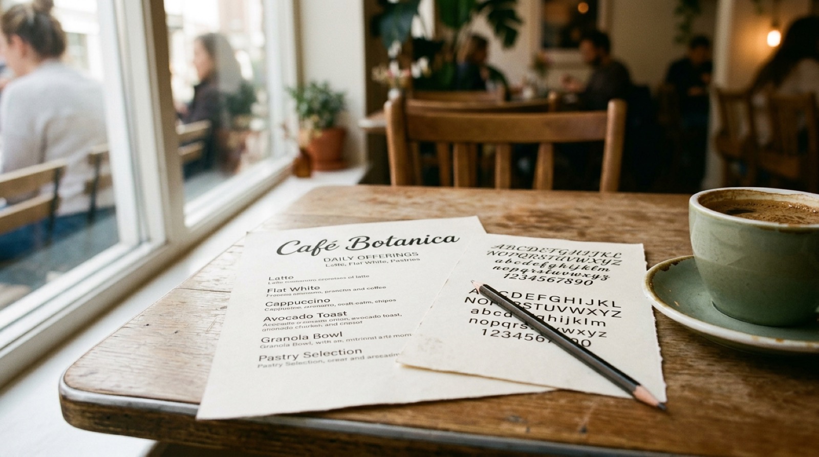
A poster comes back from the client with one comment: it looks busy. Nothing on it is wrong. The headline is a good serif, the subhead is a good sans, the date is set in something friendly, and the small print picked up whatever was left in the file. Four fonts, four opinions, and the eye has no idea which one to believe first. Removing two of them fixes it in about a minute, and that is usually the whole job.
Quick answer: a pair works when each font has exactly one job and the two are far enough apart that nobody mistakes one for a version of the other. Two fonts, one doing the shouting and one doing the explaining. Near-misses cause the mess, not clashes. A serif headline next to a slightly different serif body reads as a mistake, while the same headline next to a plain sans reads as a decision. Among pairing products worth a look, four are designed as pairs and eight are collections of thirty-seven to four hundred and sixty unrelated fonts — which is where the four-font poster comes from in the first place.
Three Pairs Worth Starting From
Unlimited creative assets. Access to AI tools.
Commercial licence included.
Get downloads
Start here if every layout turns into four fonts → Perfect Pairing Font Bundle
Thirty-seven script and display sans pairs, already matched, so dropping one in takes one decision, not forty.
Newyork Bronx Duo
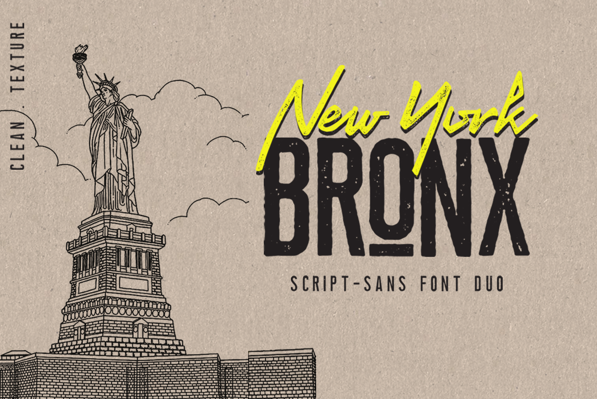
A clean serif with an outline and trace variant, paired with an expressive script, both drawn upright with the same open counters. The outline version gives you a third look for a subhead without a third typeface.
Dream Wish
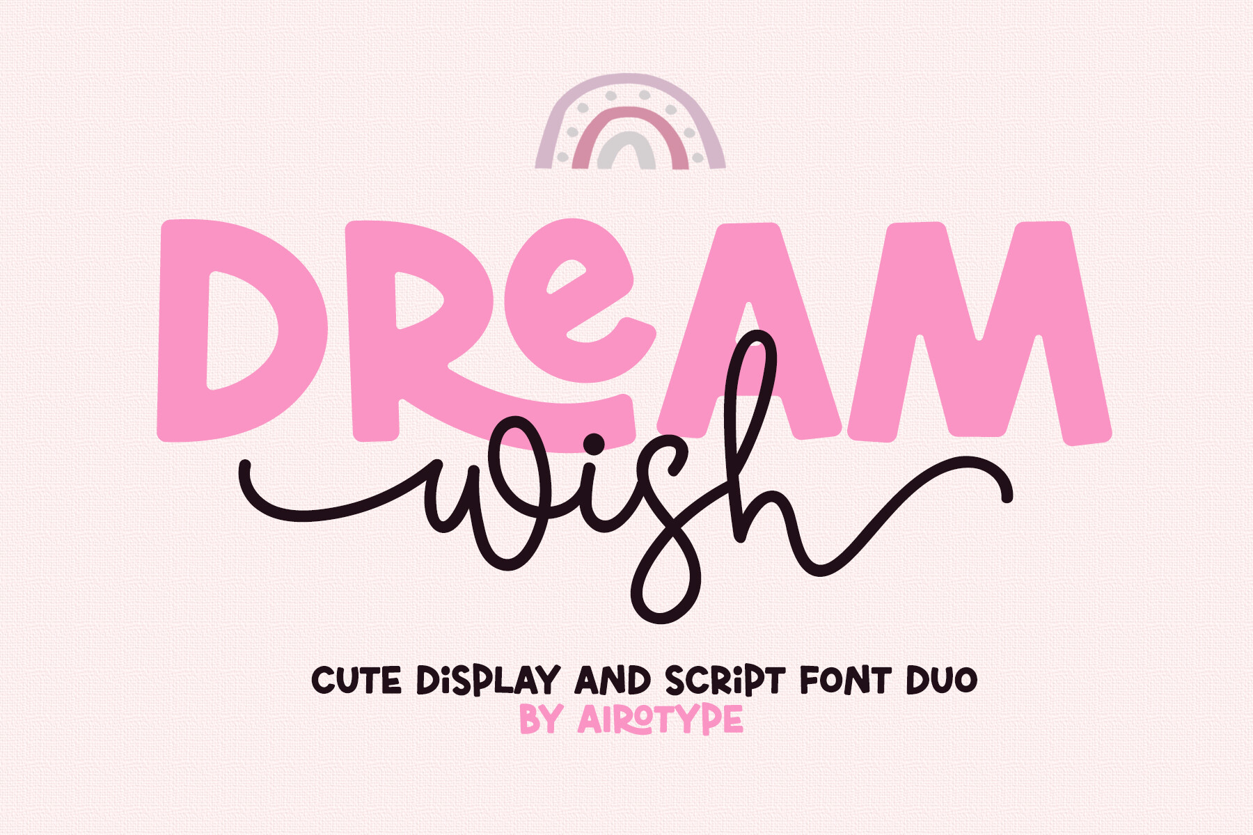
A bouncy script with swashes next to an all-caps bold, about as much contrast as a pair can carry without falling apart. The caps hold the line, the script decorates one word, and over two thousand people have saved it.
Twelve pairing products passed the demand gate in August 2026, and only four of them are actually pairs. The other eight are collections of thirty-eight, fifty-three, even four hundred and sixty fonts, and they hand the matching work straight back to you.
Give Each Font One Job
Every layout has two jobs, and only two. One font gets attention: the headline, the name on the sign, the word somebody reads from across the room. The other carries information, the body, the caption, the address, the small print nobody notices until they need it. Assign one font to each and the layout is finished before you have looked at a single specimen.
The third font is where things go wrong, and it almost never gets chosen on purpose. It arrives because a date needed to look special, or because a pull quote wanted its own voice, or because a template came with something already set. Ask what job it is doing. If the honest answer is that it is doing the same job as one of the other two, it is not a third font, it is a duplicate wearing a different coat.
Weight and size do the work people hand to extra fonts. A caption does not need its own typeface to feel like a caption. It needs to be smaller and lighter than the thing above it. A pull quote does not need a script. It needs to be bigger. One family with a few weights covers more of a layout than most people expect, and everything it covers is automatically consistent.
See a duo drawn to sit together →
The Three Tests a Pair Has to Pass
Run a candidate pair past these in order. The first failure ends it, so there is no need to go further.
One: are they obviously different? Set both at the same size and look at them from a few feet away. If you have to lean in to tell which is which, the pair is a near-miss, and near-misses read as errors. Two serifs almost always fail this. A serif and a sans almost always pass it. This test alone catches most bad pairs.
Two: do they share a skeleton? Underneath the decoration, letters have proportions: round or narrow, upright or slanted, open or closed apertures. A pair that differs in style but agrees on proportion looks deliberate. A geometric sans with perfect circles next to a condensed slab does not, because the two disagree about what an O is. The quick version: type a lowercase o in both and see whether they are the same kind of shape.
Three: do they sit at the same height? Set them at the same point size and compare where the lowercase tops land. If one is visibly smaller, you will be adjusting sizes every time the two appear together, forever. This is the test that separates a pair somebody designed from two fonts somebody put next to each other, and it is the reason a matched duo saves more time than it looks like it should.
 Pin it
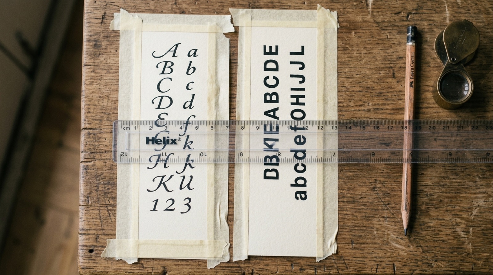
Contrast, then agreement, then size. Most pairing advice starts with mood boards and ends with a list of names. These three questions get you to the same place in under a minute, and they work on fonts nobody has written a listicle about.
Get a pair that already passes all three →
What Twelve Pairing Products Actually Contain
Every font, one commercial licence
The bundles I test at logo size live in one subscription — commercial use included, no per-font checkout.
I searched Creative Fabrica for font duos and for serif-and-script bundles, ran everything through the demand gate (rating of 4.5 or better, at least three reviews, a review from this year) and kept the twelve that passed. Then I read what was in each one.
Four are pairs. Newyork Bronx, Dream Wish and Beachwood are two fonts each, drawn together, and the Perfect Pairing bundle is thirty-seven pre-matched combinations. The other eight are collections: thirty-eight fonts, fifty-three fonts, four hundred and sixty fonts. Every one of them is a fine purchase. None of them does the matching for you.
That ratio is the four-font poster explained. Buy a collection, open it, and you are looking at fifty specimens with no relationship to each other, at the exact moment you have a deadline and a blank layout. The pairing work has not been removed. It has been handed back to you along with more options than you had before.
Start with a matched pair instead of a library →
Pairs That Arrive Already Matched
These three are two fonts each, drawn by the same designer to sit together. The matching is the product.
Unlimited creative assets. Access to AI tools.
Commercial licence included.
Get downloads
Newyork Bronx Duo
A clean serif with an outline and trace variant, paired with an expressive script, both drawn upright with the same open counters. The outline version gives you a third look for a subhead without a third typeface.
Dream Wish
A bouncy script with swashes next to an all-caps bold, about as much contrast as a pair can carry without falling apart. The caps hold the line, the script decorates one word, and over two thousand people have saved it.
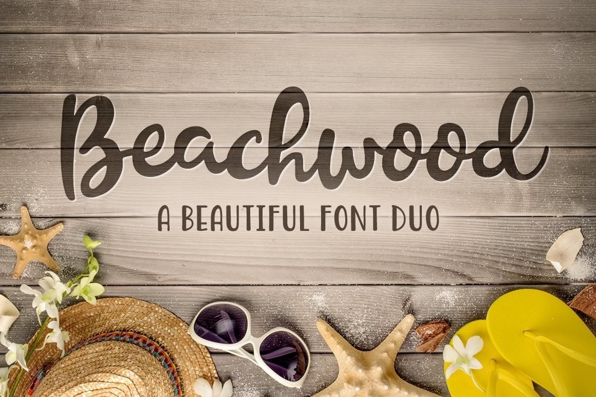
Beachwood
Script and sans, both hand-drawn by the same designer, so they agree on skeleton completely. Casual without tipping into novelty, and the sans is plain enough to carry a whole invitation, not just its first line.
What Fonts Pair Well With the Ones You Already Have
Most pairing questions are not open-ended. One font is already fixed by a brand sheet, a template, or a builder, and the only real question is what goes beside it. The three tests answer that faster than a gallery does, and here is how they land on the faces people ask about most.
What fonts pair well with Montserrat, Poppins and Inter
All three are geometric sans faces with tall x-heights, so the partner has to bring contrast the sans cannot: a serif with visible stroke modulation for headings, or a warm humanist face for long text. Pairing any of them with another geometric sans is the classic near-miss. Which fonts pair well with Montserrat in practice comes down to one rule: let Montserrat carry the body and put the character above it, not beside it.
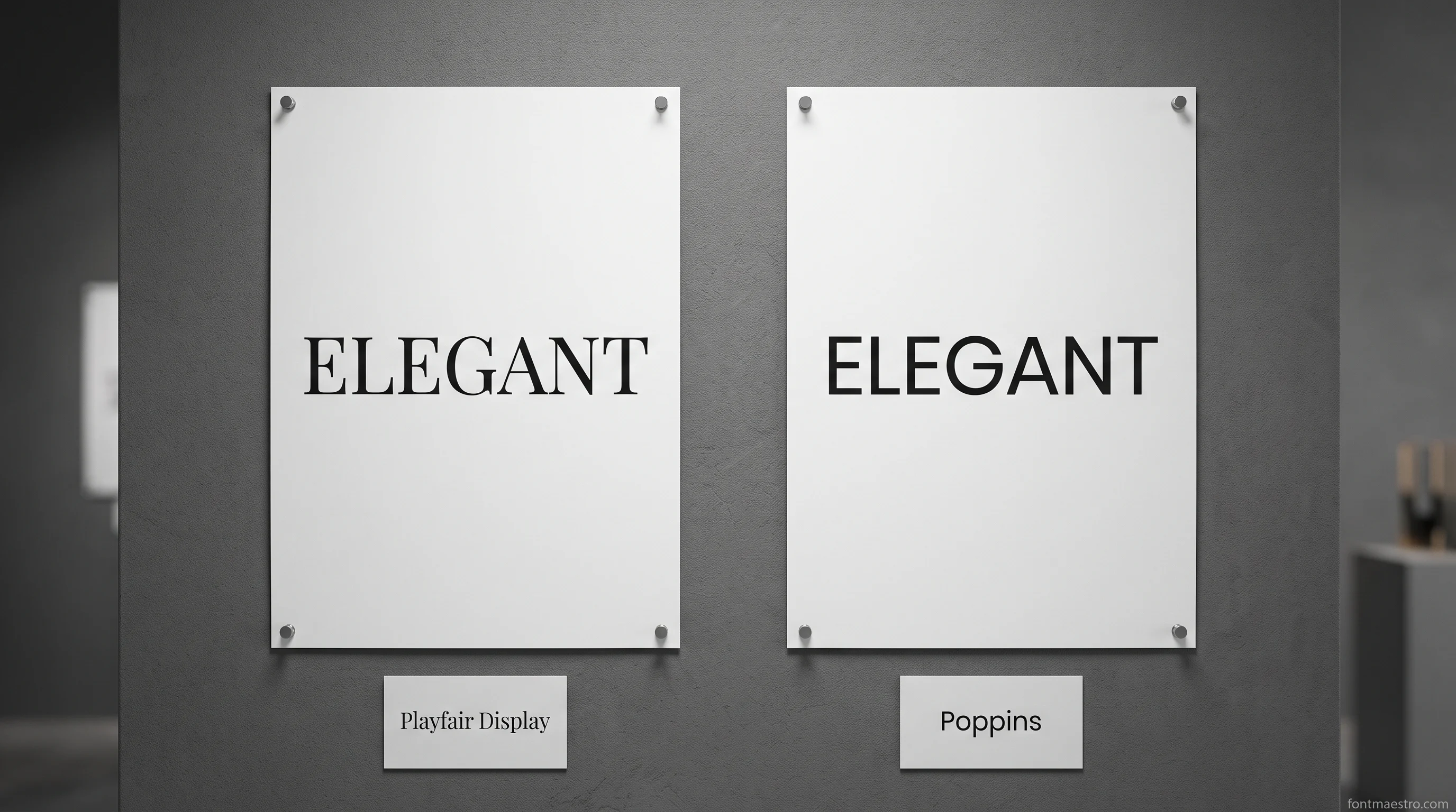
What fonts pair well with Playfair Display and Times New Roman
Both are text-first serifs, so the partner is a plain sans with a matching x-height. Playfair runs high contrast and looks best set large with a quiet grotesque underneath. Times sits at the other end, unremarkable by design, which makes it a body face waiting for a display partner rather than a headline face looking for support.
What fonts pair well with Bebas Neue, Anton, Futura and Helvetica
Bebas Neue and Anton are condensed display faces with no text weight in them at all, so they need a partner that reads at eleven points. Futura and Helvetica already work at text size, which means the pairing question flips: they want a display face above them, not another workhorse next to them. In every one of these four cases the pair is one loud face and one quiet one, never two of either.
Best font pairings for websites, decks and a resume
A website pair gets set once in the builder and then lives on every page, so both halves need real weight ranges and web licences. A deck can carry a louder display face because nobody reads it for ten minutes. A resume is the strictest of the three: one serif or one sans, two weights, and the second font only if a section label genuinely needs to look different from the body. Recruiters skim, and a busy page reads as noise before anyone reaches the words.
Whichever of these already-fixed faces you started from, the fastest way past it is a duo drawn to answer it directly rather than one more solo font pulled from a library.
See a duo built to answer a fixed font →
When a Pile of Fonts Beats a Pair
A collection earns its place when you are not designing one thing. Someone cutting a different sign every week, or running a shop with forty listings, needs range more than they need a decision made for them. The trick is to treat the collection as a shelf, not as a layout. Pick your two, close the folder, and stop looking.
Unlimited creative assets. Access to AI tools.
Commercial licence included.
Get downloads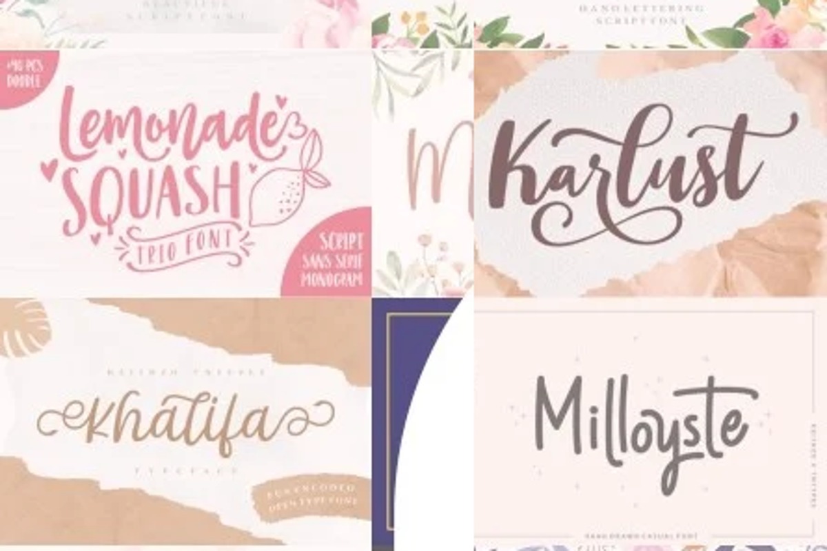
Wonderful Script Font Bundle
Modern, monoline and brush calligraphy plus serif and vintage scripts, all leaning one direction, so two pulled at random agree more often than two from a general library.
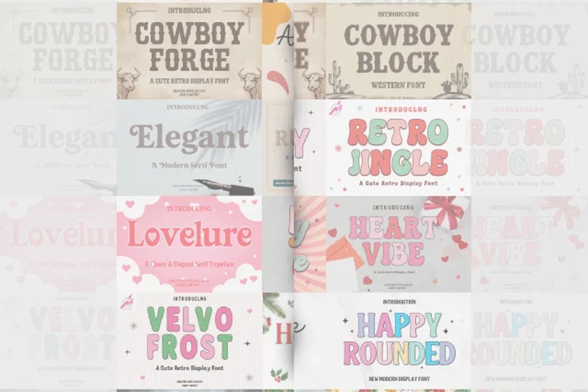
The Perfect Mix Font Bundle
Western, vintage, distressed, serif, display and handwritten in one download, the shelf version for work that changes shape weekly. Apply the three tests before combining any two.
Perfect Pairing Font Bundle
Thirty-seven script and display sans combinations, already matched: each pair shares a weight range and compatible sizes, so dropping it into a layout takes one decision, not forty.
Canva Pairings and What Survives Export
Every font, one commercial licence
The bundles I test at logo size live in one subscription — commercial use included, no per-font checkout.
Most pairing advice online is really Canva pairing advice, and the reason is simple: the fonts are right there and the layout is already built. That works well inside the platform. It stops working the moment the design has to leave.
What travels is the exported file, a PDF or an image, with the letters baked in. What does not travel is the font, because a licence to use a face inside a design tool is not a licence to install it, hand it over, or set new text with it somewhere else. If a client will ever need to edit the file, the pairing has to be built from fonts you actually hold. We went through which combinations survive that in Canva font combinations that work.
One practical note on the platform’s own defaults: its pairings lean heavily on a small set of faces, so a design built entirely from them reads as made in Canva to anyone who spends time there. Swapping the display half for a font you own is a one-field change and removes the tell entirely.
Keep the pair when the file leaves Canva →
Adobe and Google, in One Line Each
Adobe’s library is licensed through the subscription, which means the pairing lives as long as the plan does, which is fine for work you deliver as a flat file and awkward for anything a client will maintain themselves.
Google’s fonts are open licensed, so they install anywhere and can be handed on freely, and that is exactly why their best-known pairs turn up on so many sites. The three tests still apply. They are the same three that decide whether a logo font holds next to its wordmark. A Google pair passes or fails them for the same reasons as any other.
Where the Free Pairing Stops
Free pairings are easy to find, and the limit is not usually the fonts themselves. It is what you are holding when somebody asks for the source file.
| What you need | Free pairing | Matched duo or bundle |
|---|---|---|
| Two fonts that contrast | Yes, with effort | Yes, chosen for you |
| Matching x-height and weights | Coincidence | Drawn that way |
| Full character set in both | Often only one | Yes |
| One licence covering the pair | Two separate terms to check | One |
| Handing the file to a client | Depends on both licences | Covered |
| Selling what you design | Personal use, usually | Commercial licence included |
The row that catches people is the fourth one. A pairing assembled from two free downloads has two sets of terms, and they are rarely the same set. Creative Fabrica’s All Access covers everything listed here under one commercial licence, matched duos included, and there is a free plan available for setting one layout before deciding.
Get matched pairs under one licence →
Hold the source file, not just the export →
Key Takeaways
- Two jobs, two fonts. One gets attention, one carries information. A third font needs a job nobody else is doing.
- Near-misses look like mistakes; clear contrast looks like a decision. Two serifs almost always fail that test.
- Check contrast, then shared proportion, then x-height. First failure ends it.
- Of twelve demand-checked pairing products, four are actual pairs and eight are collections that hand the matching back to you.
- Weight and size replace most extra fonts. One family with several weights covers more of a layout than people expect.
- A Canva pairing lives inside Canva. If the file has to be editable elsewhere, build it from fonts you hold.
- Two free fonts mean two licences. A matched duo means one.
Skip the matching and start from a duo →
FAQ
What does font pairing mean in typography?
It means choosing two typefaces that do different jobs in the same layout: one to be noticed, one to be read. Pairing is not about the faces looking alike. It is about them being distinguishable at a glance while agreeing on proportion, so the page reads as one design instead of two.
What is font pairing in Canva, and how do I create font combinations there?
Canva ships preset combinations inside its text styles, and you can build your own by setting a heading style and a body style and reusing them across pages. How to use font combinations in Canva without a surprise later: check whether both faces are ones you uploaded or ones Canva supplies, because that decides what happens when the file leaves the tool.
How do I find and test font pairings before committing?
Set a real headline and a real paragraph, not placeholder text, then run the three tests in order: enough contrast to look deliberate, shared proportion, matching x-height. If you want to match a face you have only seen as an image, the match font feature in Photoshop identifies the closest installed candidate, which gives you something concrete to test against.
What two fonts go well together if I only remember one rule?
One serif and one sans, with clearly different sizes. It is the pairing that survives the most situations, and best font pairings in 2026 still mostly resolve to that shape with a more interesting display half.
How many fonts should one design use?
Two, in almost every case. A third is defensible when it has a job the other two cannot do, such as a monospace for code, or a face carrying a language the others do not support. If the third font is there for variety, weight and size will do that job without adding a voice.
Or skip the search and start from a matched pair →
Can two serif fonts be paired together?
It is possible and it is difficult. The pair has to differ enough that nobody reads it as one font rendering badly, which usually means pairing a high-contrast display serif with a plain text serif at very different sizes. A serif and a sans gets to the same result with far less risk.
What makes a font pairing look expensive?
Restraint and consistent spacing more than the choice of faces. Two fonts, generous line spacing, one accent size rather than four, and alignment that repeats down the page. A cheap look usually comes from too many sizes, not too few good fonts.
Do I need to buy a font duo, or can I pair fonts myself?
You can absolutely pair them yourself, and the three tests are the whole method. A duo buys time and removes the x-height problem, which matters most when you set the same pair repeatedly. For a one-off, pairing your own is fine.
Are Google font pairings good enough for client work?
Yes, and their licence is the reason to prefer them for anything a client will maintain. The risk is not quality but familiarity: the best-known pairs appear everywhere. Keeping one half from Google and buying the display half solves that without licence trouble.
Why does my layout look busy when every font in it is good?
Because good fonts still compete. Busy is a symptom of too many things asking to be read first, not of bad typefaces. Count the distinct fonts and the distinct sizes on the page; reducing either number usually fixes it faster than swapping anything.
Can I sell designs made with a purchased font pair?
With a commercial licence, yes. The design you produce is yours to sell, while the font files themselves stay non-transferable. A subscription that includes commercial rights covers the whole catalogue at once, which is easier than checking terms font by font on a mixed pairing.
Related reading: cursive fonts for cricut that weld without, bold font style name, y2k canva fonts you can actually keep.


