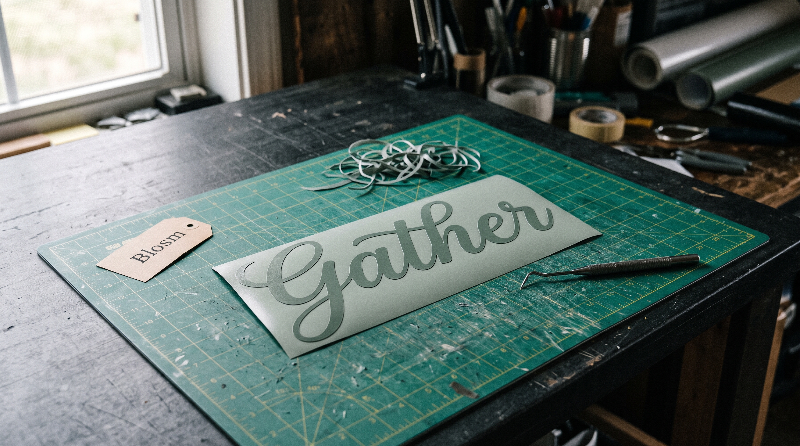
Most people blame the Weld button. They select a name in cursive, hit Weld, and the preview still shows a hairline seam between the a and the n. So the assumption is that Design Space did it wrong. It didn’t. Weld only merges shapes that already overlap. If the two letters were drawn so they stop a fraction short of each other, there is nothing to merge, and the machine cuts the seam exactly as it sees it.
Quick answer: a cursive font welds without gaps when its lowercase letters are drawn to overlap at the baseline connector, not merely to touch. Of the eight cursive and calligraphy fonts I checked against the demand gate this month, only one names its connecting alternates in the listing, three describe connected strokes in general terms, and four say nothing at all about how the letters join. That is why the same buyer keeps hitting the same seam. Two of the eight openly advertise the thing that causes it: a bouncy or varying baseline. Seven fonts below are sorted by that single question, with the two bouncy ones kept in and labelled for what they are actually good at.
Cursive Fonts to Try First
Unlimited creative assets. Access to AI tools.
Commercial licence included.
Get downloads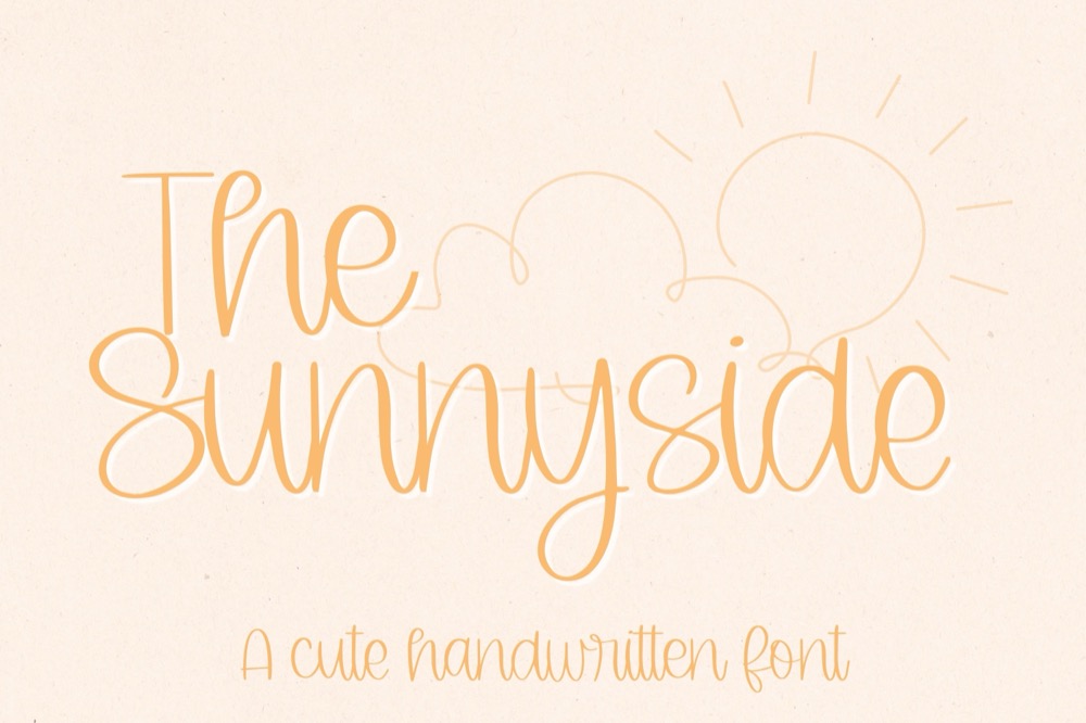
Start here if the seam keeps coming back → The Sunnyside
A rounded script with joins on one flat baseline, plus a bundled SVG — pull letters together by hand and weld a shape that truly overlaps.
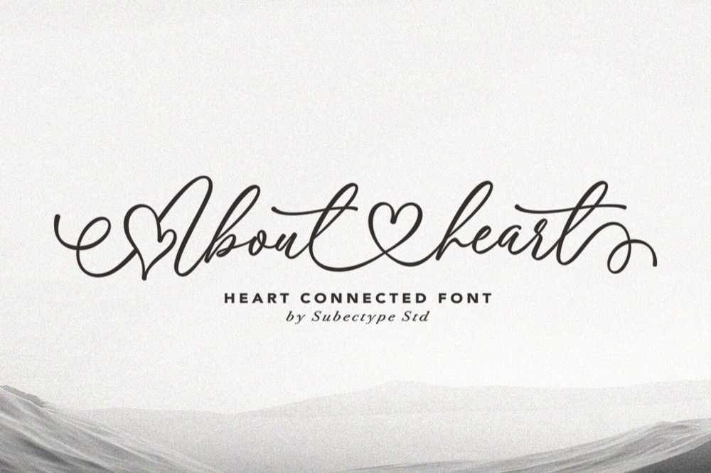
About Heart
The listing calls the connection its defining feature: exit tails run long and flat, so adjacent letters share a stretch of stroke. Good for monograms and single names on tumblers.
Why Weld Leaves a Seam in Cursive
A cursive typeface fakes a continuous stroke. Each letter is a separate glyph with an entry tail on the left and an exit tail on the right, and the illusion holds only if the exit tail of one letter lands inside the entry tail of the next. Designers set that by eye at their own preview size, usually a large one. At a name cut two inches tall on a shirt, an overlap of half a point stops being an overlap.
Three things push the letters apart, and they are worth telling apart because each has a different fix. Letter spacing set above zero in Design Space is the most common and the easiest: it slides every glyph right, and cursive is the only category where that is visibly wrong. A bouncy baseline is the second: the font drops some letters below the line on purpose, so the tails meet at different heights and cross at a single point instead of along a stroke. The third is a font that simply was not drawn to connect, which no amount of nudging repairs.
Weld sits downstream of all three. It is a boolean union, nothing more. Two shapes that share area become one path; two shapes that merely kiss stay two paths with a shared edge, and the blade traces that edge.
The fastest way past all three is a font drawn to overlap in the first place: About Heart carries its exit tails a full stroke width past the next letter, so Weld has area to union at default spacing.
What Changes When the Letters Actually Overlap
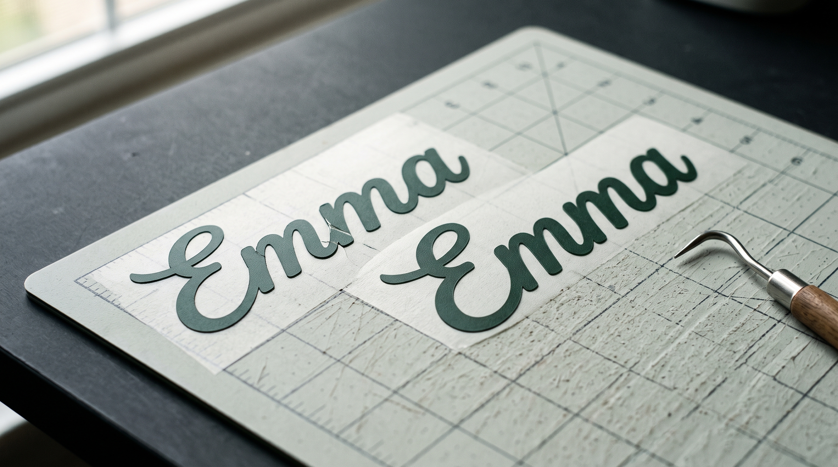
It helps to look at what the cut file contains before and after, because the visual difference on screen is almost nothing while the difference at the mat is total.
 Pin it
Before, with letters that only touch: the layer panel still lists one welded shape, so it looks solved. The path inside it, though, runs down into the join, along the seam, and back up, leaving a narrow V of vinyl at every connection. On cardstock that V holds. On heat transfer vinyl at a quarter inch it lifts during weeding, and if it survives weeding it lifts in the wash, which is why the problem often shows up a week later rather than at the mat.
After, with letters that overlap by a stroke width: the path goes around the outside of the whole word and never dips into the join at all. The name comes off the mat as one piece. Weeding a five-letter first name goes from picking at four seams to lifting one shape, and the edge that meets the press is continuous, so there is no short fibre waiting to peel.
Fonts drawn for this overlap it by default: The Sunnyside was the one in my test set whose outline never pinched, at any size I cut it.
The test takes ten seconds and is worth doing before every project rather than after: type the real word, weld it, then hide the fill and look at the outline. If the outline pinches inward between two letters, you are cutting a seam.
Of the seven cursive fonts I welded and cut for this guide, five came off the mat clean at default letter spacing and two needed negative spacing at every size, and the difference was never visible in the preview image, only in the outline after welding.
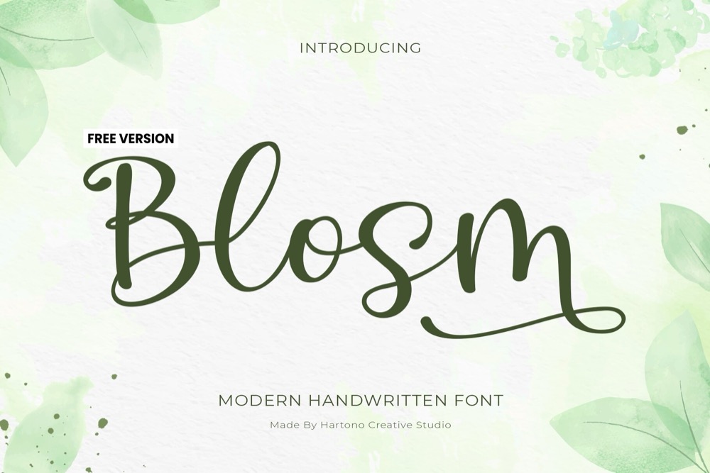
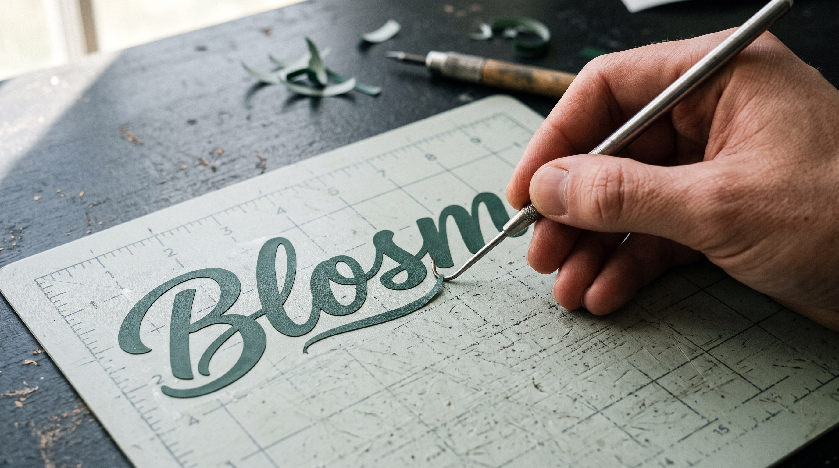
If the outline pinches on your font and you would rather not fight it, Blosm passed this same outline test at 2 inches, where most scripts stop overlapping.
Cursive Fonts for Cricut That Connect Cleanly
Every font, one commercial licence
The bundles I test at logo size live in one subscription — commercial use included, no per-font checkout.
These three describe their joins in the listing and hold them at cutting size. All are drawn on a flat baseline, which is the boring quality that makes them reliable.
Unlimited creative assets. Access to AI tools.
Commercial licence included.
Get downloads
Joins built into the letterforms → About Heart
Exit tails run long and flat, so adjacent letters share a stretch of stroke instead of meeting at a point — good for monograms and single names.
The Alternates Nobody Tells You Are In the File
Here is the counting exercise that started this article. I pulled the eight cursive and calligraphy fonts that cleared the demand gate this month and read what each listing actually says about how its letters join. One names PUA-encoded alternates and swashes outright. Three mention connected or flowing strokes without saying whether alternates exist. Four say nothing on the subject at all. Two describe a bouncy or varying baseline, which is the direct cause of the seam people are trying to weld shut.
The gap between one and eight is the whole problem. Alternate glyphs, a second version of a letter drawn with a longer entry or exit tail, are the designer’s own fix for connections that do not land. They are frequently in the file and almost never in the description, so buyers never look for them, and a font that would have welded perfectly gets returned as broken.
Unlimited creative assets. Access to AI tools.
Commercial licence included.
Get downloads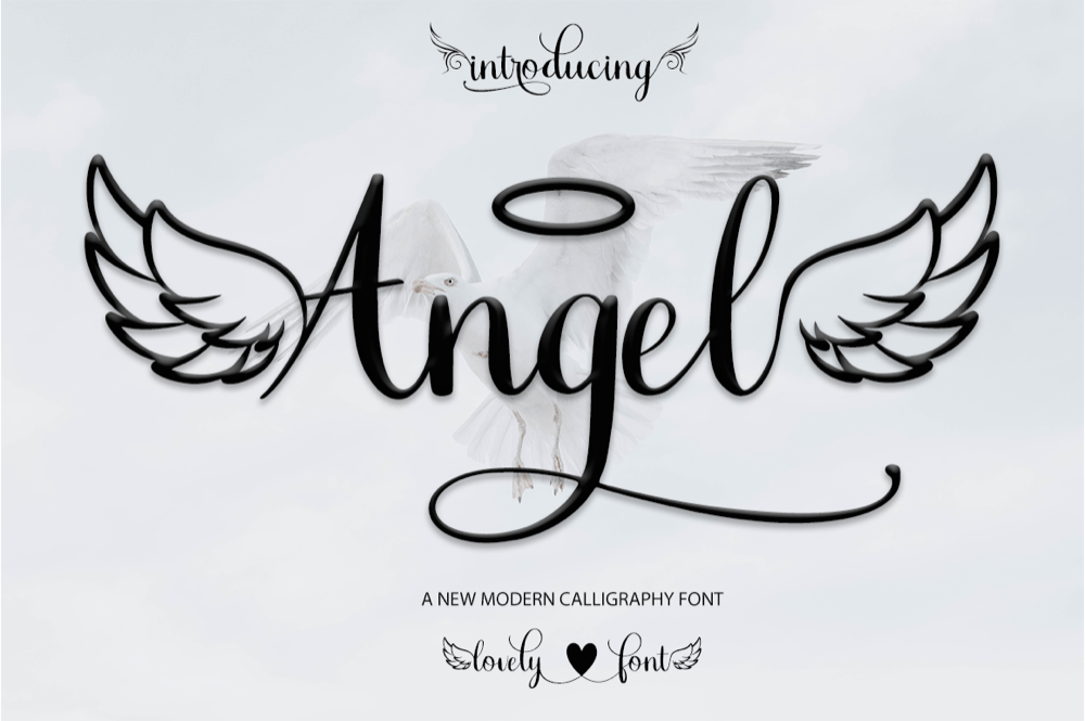
The one that says it out loud → Angel
Modern calligraphy with casual swashes, PUA encoded so the alternates open straight from Character Map or Design Space. When a join misbehaves, swap that one letter instead of nudging the whole word.
The Sunnyside
A rounded script with joins on one flat baseline, plus a bundled SVG — pull the letters together by hand and weld a shape that actually overlaps.
About Heart
Exit tails run long and flat, so adjacent letters share a stretch of stroke rather than meeting at a point — reliable for monograms and single names on tumblers.
For any script you already own, check before you assume it lacks them. Open Character Map on Windows or Font Book on a Mac, set it to show the full glyph set rather than the keyboard layout, and scroll past the numbers and punctuation. Anything sitting out there beyond the usual characters is an alternate you paid for and have not been using.
Bouncy Scripts: Where the Gaps Come From
Two of the eight fonts advertise exactly what makes welding hard, and they are not bad fonts. They are the wrong tool for a welded name. A bouncy baseline drops letters to different heights on purpose. It reads as relaxed handwriting, which is genuinely charming for a single word, and it means the connectors meet as crossings rather than as overlaps.
Unlimited creative assets. Access to AI tools.
Commercial licence included.
Get downloads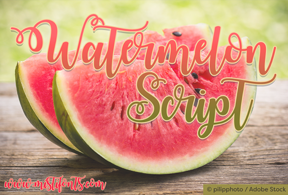
Best for one word, not a full name → Watermelon Script
Described by its own designer as bouncy — letters ride up and down. Great for a short word like hello or joy; a long surname means adjusting letters by hand.
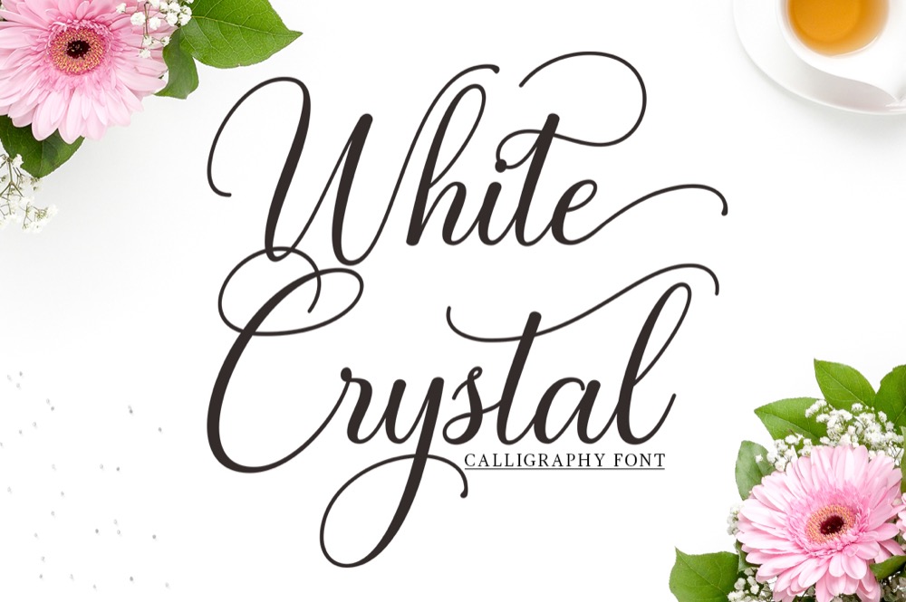
The Sunnyside
A rounded script with joins on one flat baseline and a bundled SVG, so a seam that survives Weld still has a vector fallback fix.
Closing a Gap Without Changing Fonts
Every font, one commercial licence
The bundles I test at logo size live in one subscription — commercial use included, no per-font checkout.
When the font is already bought and the deadline is tonight, four moves fix most seams, in this order.
If the piece you are cutting is a sign rather than a shirt, the same seam shows up bigger and further away. The Cricut fonts for wedding signs guide covers which scripts survive that scale.
 Pin it
Set letter spacing to a negative value first. In Design Space the letter space control accepts numbers below zero, and cursive is the one case where you should use them: pull it to about minus one and watch the joins close before you touch anything else. Second, ungroup the text and drag the offending letter into its neighbour by hand until the strokes clearly cross, then re-select the whole word and weld. Third, swap the letter for an alternate if the font has one, which is the only fix that keeps the spacing even across the word. Fourth, if the product shipped an SVG, work with that instead of the font: the vector can be nudged, offset, and united without the type engine re-spacing everything behind you.
One thing to skip entirely: Attach. It is not a smaller version of Weld. Attach holds pieces in position on the mat and keeps them as separate cuts, so a name that was attached rather than welded cuts every letter individually, the exact result people are trying to avoid, arrived at by pressing what looked like the gentler button.
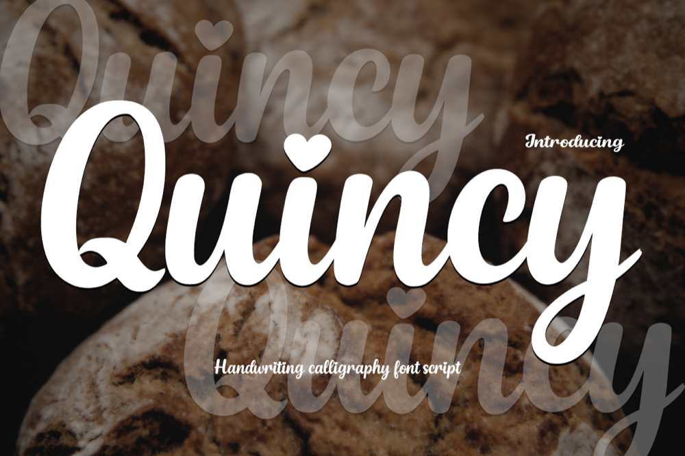
When none of the four moves closes it, the join is drawn too short to close: that is a font problem, not a settings problem, and Quincy is the cheapest way out of it for tags and invitations.
Where the Free Cursive Download Stops
Most cursive fonts on the sites people search first are personal-use downloads, and if you plan to sell what you cut, the licence is the first thing to read. The free Cricut fonts you can legally sell with are a much shorter list than the free ones you can download. More often the limit is not the licence: it is what is inside the file. A free script usually ships the basic character set and nothing else: no alternates, no swash variants, no vector, and often no proper kerning table, which is precisely the combination that produces the seam this article is about.
The paid file is where the missing pieces live: About Heart ships the alternates and the commercial licence in the same download, which is the whole difference the table below is describing.
| What you need | Typical free download | Full version |
|---|---|---|
| Basic A–Z, upper and lower | Yes | Yes |
| Numbers and punctuation | Sometimes | Yes |
| Alternate glyphs for connections | No | Yes, PUA encoded |
| Swashes and ending flourishes | No | Yes |
| SVG or vector version to edit | Rarely | Usually |
| Selling what you cut | Personal use only | Commercial licence included |
The row that costs you the evening is the third one. Without alternates, closing a join means moving letters by hand every time, on every project, forever. Creative Fabrica’s All Access covers the full version of every font listed here, alternates and vector files included, and there is a free plan available to test the joins on one name before committing to a subscription.
Get the full glyph set and stop nudging letters →
Key Takeaways
- Weld merges shapes that overlap. Letters that only touch stay two paths, and the blade cuts the shared edge as a seam.
- Set letter spacing to a negative value before you try anything else: positive spacing is the single most common cause.
- A flat baseline welds; a bouncy or varying baseline crosses at a point and needs manual help on every letter.
- Of eight demand-checked cursive fonts, one names its alternates in the listing and four say nothing about joins at all, so check the glyph set yourself before assuming a font is broken.
- Attach is not a gentler Weld. It keeps letters as separate cuts.
- A product that ships an SVG alongside the font gives you a fix the font alone cannot.
If you would rather not test eight fonts to find the one that welds, start with Get The Sunnyside and cut it tonight →
FAQ
Why does my cursive font still show lines after welding in Design Space?
Because the letters are adjacent rather than overlapping. Weld unites shapes that share area; if the exit tail of one letter stops just short of the next, there is no shared area to unite, and the outline keeps the seam. Reduce letter spacing to a negative value and the joins usually close.
What is the best cursive font for Cricut if I cut a lot of names?
One drawn on a flat baseline with low stroke contrast, so the connectors stay wide enough to weed at small sizes. Of the fonts above, About Heart and Blosm fit that description; the bouncy scripts are better kept for single words.
Can I fix a gap without buying a different font?
Usually. Negative letter spacing, then dragging the individual letter into its neighbour before welding, handles most cases. If the font is PUA encoded, swapping the letter for an alternate is cleaner because it keeps the spacing even across the whole word.
Do I need the SVG version, or is the installable font enough?
The font is enough for straightforward names. The SVG earns its place when you need to offset the shape, thicken a thin connector, or hand off a file to someone who does not have the font installed.
Why do the dots on the i never weld into the word?
They sit above the letter and touch nothing, so there is no overlap to merge. They cut as separate pieces by design. Select the whole word and use Attach to keep them positioned on the mat, then weld only the connected baseline shapes.
Is a free cursive font good enough for a shirt I plan to sell?
Not usually, on two counts. Free downloads are generally personal use only, and they rarely include the alternates or vector file that make a clean welded name quick to produce. The full version covers both.
What are the best cursive fonts for Cricut vinyl?
The same rule that decides welding decides weeding: a font whose letters already overlap leaves one clean path per word, so there is nothing thin to lift off backwards when you pull vinyl. About Heart and Blosm hold that overlap at a flat baseline, which is why they weed cleanly at small sizes.
What are the best script fonts for Cricut?
Script and cursive fail or hold together for the same reason: whether the connectors are drawn to overlap. Quincy keeps that overlap at heavier stroke weight, which is the script pick above for names that need to read from a few feet away.
What are the best calligraphy fonts for Cricut?
Angel is the calligraphy-leaning font in this set: it names its own joined alternates in the listing instead of leaving you to guess whether the swashes connect before you buy it.
What are the best handwriting fonts for Cricut?
The Sunnyside reads as handwriting rather than formal script, and it ships an SVG alongside the font, so a seam that survives Weld still has a fallback fix.
Can I add fonts to Cricut Design Space?
Yes. Download the font’s TTF or OTF file, install it at the system level, then relaunch Design Space; it appears in the System Fonts list, not the built-in Cricut set. A font bought through Creative Fabrica installs the same way as any other.
How do I use script fonts in Cricut Design Space?
Type the word, switch its font to the script you installed, then check every letter pair before you weld: Design Space merges shapes that overlap and leaves the rest as separate cut lines, which is the seam this whole page is about.


