You typed a word in heavy capitals and it looked great on the laptop. Then you sized it for a banner, a shirt or a door sign, and something went soft. A corner rounded off, the E filled in, two letters touched.
Bold letters fonts fail in the same few places when they get big. Once you know where to look, you can test any font in two minutes, before you commit to it.
Quick answer: For capitals that hold their shape at large size, pick a heavy block or condensed face with square corners and open counters, such as Scrabble Game for playful signs or Christmas Lights for all-caps seasonal lettering.
Whatever you pick, type your real word in capitals, enlarge it to the size of the final print, and look at four spots: corners, counters, joins and the gaps between letters.
What “Holds Its Shape” Means for Capital Letters
A capital holds its shape when you can scale it up ten times and it still reads as the same letter. Heavy weight alone will not do that for you. Four things do:
- Corners. Sharp corners stay sharp. Rounded ones look cute small and sloppy large.
- Counters. The holes in A, B, D, O, P, Q and R stay open instead of shrinking to dots.
- Stroke weight. Vertical and horizontal strokes stay in proportion, so the E does not look like a comb.
- Fit. Letters sit next to each other without touching or leaving holes.
I never pick a heavy font from a thumbnail. You should type the exact word you need, in capitals, and enlarge it to the size of the final job.
Bold Letters Font Generators Make Text, Not Fonts
Search for “bold letters font copy and paste” and most of the page is generators. You type a line, click, and get heavy-looking text to paste into a post.
That text is not a font. You are pasting special Unicode characters that look heavy. They work in a caption or a bio, and that is where the trick ends for you.
- You cannot choose a weight, a width or a spacing.
- Your printer, cutter or design tool will not treat it as lettering you control.
- Some devices show empty boxes instead of the characters.
For anything you print, cut or put on a product, you need a real font file. I keep a short list of those, and Christmas Lights is the first I test for all-caps seasonal work.
Four Places a Bold Capital Breaks When It Gets Big
Enlarging a font does not change its drawing. It just makes every flaw big enough for you to see. Bold letters font corners are the first thing to check, and the other three follow in this order:
- Corners. Look at the outer corners of E, F, L, T and Z. Fonts drawn for small text often soften them. Fonts drawn for display keep them crisp.
- Joins. Look where strokes meet in M, N, K and R. A heavy font can clot at the join and turn a clean notch into a dark blob.
- Terminals. Look at the ends of C, G, S and J. They should end the way the rest of the set ends, flat or cut, not half of each.
- Stroke contrast. Look at the thin parts. In a heavy high-contrast face, hairlines look fine on a screen and too thin on a sign.
If two of the four look off at full size, try another font. You cannot fix a drawing problem with spacing. A blocky face like Scrabble Game is a fair second try, because its corners are squared off.
Open Counters: Why E, A and R Fill In First
Every font, one commercial licence
The bundles I test at logo size live in one subscription — commercial use included, no per-font checkout.
The counter is the enclosed or half-enclosed space you see inside a letter. In capitals it lives in A, B, D, O, P, Q and R, and as the open gaps of E and S. Bold letters counters are the first part of the drawing to close when the weight goes up.
Push a font heavier without opening these spaces and they shrink. At poster size they are still visible. On a small sticker, a cut-out or a dark shirt print, they fill in.
Type the word “ROOM” and squint at it from across the room. If you lose the holes in the R and O, the font is too tight for your job. I do this test with every heavy face before I show it to a client.
Cut vinyl adds another reason to care. Every tiny counter becomes a small island you have to weed by hand. The guide to Cricut fonts that cut clean in vinyl goes through that step. Super 3 is one of the few heavy block faces I’ve checked that keeps its counters open at full weight.
All Caps Need Spacing You Add Yourself
Lowercase letters have built-in rhythm from ascenders and descenders. Capitals are all the same height, so you notice every gap between them. All caps bold letters spacing is something you set yourself; the font will not do it for you.
Even a good heavy font can look clumped when you set it as a line of capitals. Two fixes cost you nothing:
- Add a little tracking, which is the same small space between every letter.
- Check the tricky pairs by hand: AV, LT, RT, TA and YA. A pair like this can look like a hole in the word.
Go back to the poster, the sign or the shirt you are making. If the word still looks uneven after tracking, try a different font. The guide to capital letters font styles shows which styles hold their spacing best.
Bold Name Fonts and Long Words: Condensed or Wide
Bold name fonts have one extra problem: a fixed space. A long name on a short sign or a narrow mug has to shrink, and shrinking a wide font makes it small.
A condensed capital face solves that by making the letters narrow. You get more letters at the same height, and the weight stays strong. A condensed bold letters font is the safe default for long names.
- Long name, short space: pick a condensed heavy capital and keep the size large.
- Short word, big space: a wide block face fills the width and looks intentional.
- Stacked lines: put two short words on two rows in the same width instead of shrinking them into one.
Count the letters before you pick. If you have ten or more in one line, I go condensed every time. Super is a chunky option to test if your name is short and your sign is wide.
Capitals by Job: Signs, Banners, Merch, Cut Vinyl
The job decides what “holds its shape” means. Bold letters for signs, bold letters for banners and bold letters for vinyl each fail in a different way, so use this table before you choose a font, and test Scrabble Game against your own word if the job is a classroom or kids’ sign.
| Job | What to look for | What to avoid |
|---|---|---|
| Wall or door sign | Even stroke weight and generous spacing, readable from several steps away | Thin hairlines and tiny inner details |
| Banner or poster | Crisp corners and a strong silhouette at a distance | Decorative effects that blur when seen far away |
| T-shirt or jersey print | Open counters and simple outlines that print clean | Fine shading and tiny gaps |
| Cut vinyl | Large counters, few islands and joined shapes | Thin connecting strokes that tear when weeded |
| Name tag or label | A condensed face with enough weight to read small | A wide face that forces you to shrink the name |
For a sign, the best fonts for signs page explains why an even stroke wins. For banners and posters, see poster fonts.
Bold Letter Fonts Worth Downloading
Every font, one commercial licence
The bundles I test at logo size live in one subscription — commercial use included, no per-font checkout.
Among eight well-reviewed bold and block fonts in the Creative Fabrica catalog, only one is listed as an all-caps face. Two of the four tagged Bold Fonts are scripts, not capitals.
So “bold” on a product page tells you little. These three fit a capital-letter job, and each card says what it is for so you can test the right one.
Unlimited creative assets. Access to AI tools.
Commercial licence included.
Get downloads
Free plan available
Christmas Lights
A bold, all-caps font with holiday words decorated with stringed lights. Works for seasonal signs, cards and banners where short capitals carry the message.
Free plan available
Scrabble Game
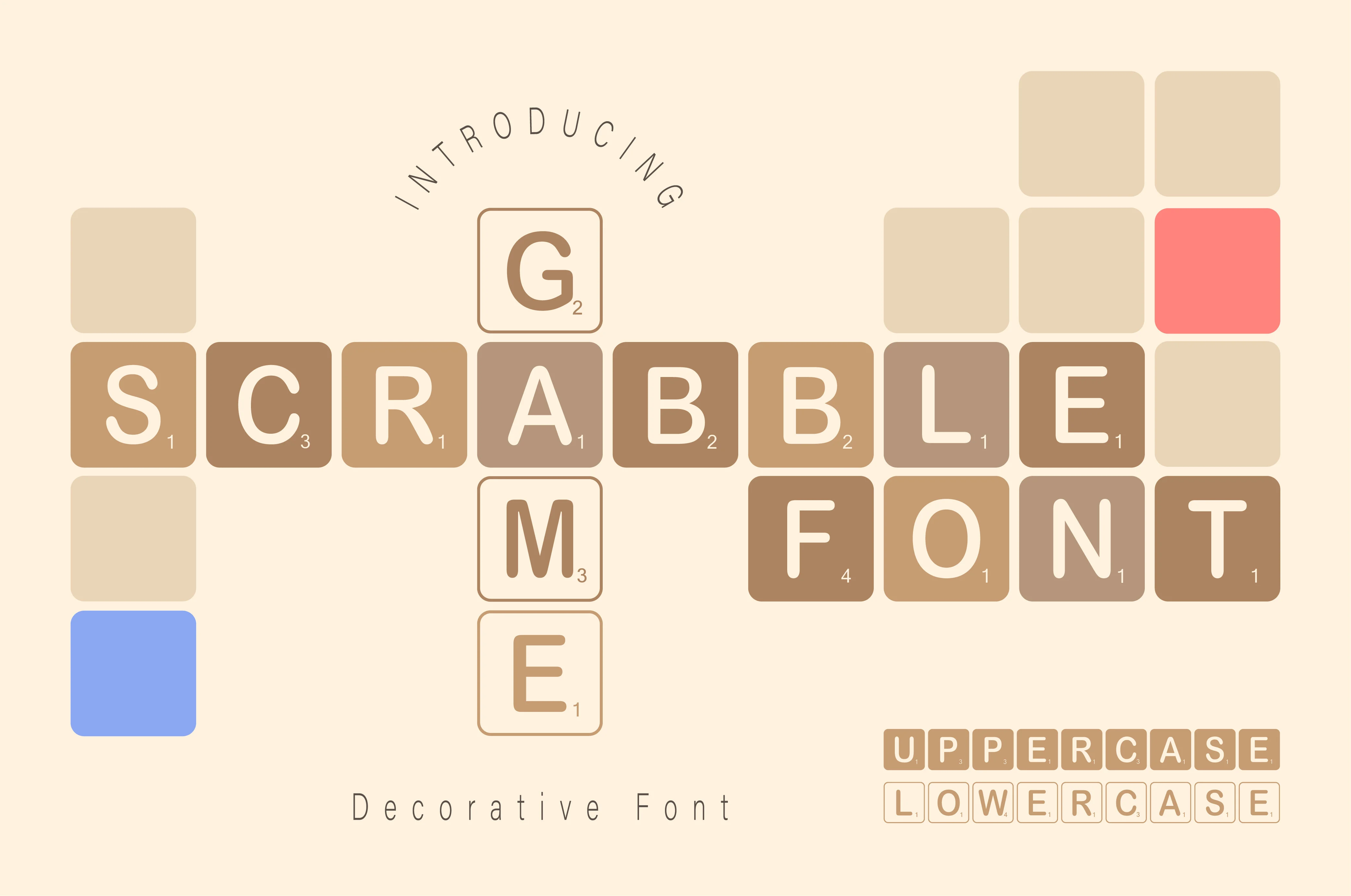
A block-letter font with silhouette uppercase and outlined lowercase, plus numbers and symbols. A good fit for classroom signs, worksheets and playful posters.

Free plan available
Super
A thick-lettered color font for kids’ products, covers and branding. It uses alternate glyphs, so plan to open a glyph panel to reach them.
One more block face worth a look is Darling Girlies. It is a swooped block font with heart details, so it suits Valentine’s cards, wedding tags and gift labels where a heavy letter should still look sweet.
Want more options in the same range? Browse bold display fonts on Creative Fabrica.
Bold Fonts That Are Not Capitals
Two popular picks under the “bold font” tag will disappoint you if you need capitals. They carry the Bold Fonts tag, but they are scripts.
- Chocolate Sprinkle is a bold, trendy script. It suits cards, labels and branding, but it has no block capitals to enlarge.
- Handmade is a sweet cursive handwriting font. Good for a romantic note, wrong for a sign.
Script capitals are built to connect to the letters after them. Used alone, in a row, they look uneven. Keep scripts for one big initial or a short accent, not for a whole capital line.
A bold capital holds its shape when its corners stay sharp, its counters stay open and its gaps stay even at the size of the final job. Type your real word, enlarge it, and check those three before you license anything.
What to Check Before You Enlarge Any Font File
A free bold font can be a perfectly good choice. Before you blow it up for print or product, check these four things in the download:
- The license. Bold text fonts license terms differ from file to file. Many free bold fonts are for personal use only. A shirt, a sign you sell, or a logo for a client needs a commercial license.
- The weights. A single-weight font gives you nothing lighter for a subtitle and nothing narrower for a long name.
- The character set. Check numbers, punctuation and accents. A sign with a date or a price needs digits that match the letters.
- Where the alternates live. Some fonts store extra capitals in the Private Use Area. Word and Canva type only the standard letters, so you need a glyph panel like the one in Illustrator to reach the rest.
If any of the four fails for you, the cheap font just got expensive. The guide to Cricut fonts you can legally sell with explains what to read in a license.
A font sold under a commercial license with its numbers and symbols included removes all four problems at once. Christmas Lights and the other cards above are built for that. If you worked through the poster-size side of this, bold fonts that still read clearly at poster size covers the small end.
Key Takeaways
- A bold capital holds its shape when its corners, counters, joins and spacing still work at the size of the final job.
- Copy-and-paste bold letters are Unicode text, not a font. They do not belong on anything you print or cut.
- Among eight well-reviewed bold and block fonts in the Creative Fabrica catalog, only one is listed as an all-caps face.
- Capitals need tracking and pair checks that lowercase does not.
- Before you enlarge a font, check its license, weights, numbers and where its alternates live.
FAQ
What font is bold?
Bold is a weight, not one font. Almost every typeface family has a bold cut with thicker strokes than its regular style.
Some fonts are heavy by design and ship with no lighter companion. Those are called display or black weights.
How do you type in bold letters?
In a design tool, pick a bold weight of your font or press the bold button. In a social post, a Unicode generator gives you bold-looking text to paste.
That second method makes characters, not a font, so use it for captions only.
What are the best bold letter fonts?
The best one depends on the job. For a sign, pick even strokes and open counters. For a long name, pick a condensed capital. For a banner, pick crisp corners.
The cards above show three that fit capital-letter jobs, such as Super, and each is sold with a commercial license.
What are the best bold text fonts for a long name?
A condensed heavy capital. It keeps the weight and fits more letters in the same width. A wide face forces you to shrink the name until the weight no longer matters.
Where do I find a bold letters font A to Z?
Look for a font that lists the full alphabet, numbers and symbols in its description. A font with only capitals will not have lowercase.
I open the preview and type the whole alphabet, then the digits, before I trust any font page’s claim. You will see any gap at once. Scrabble Game lists numbers and symbols in its description.
Can I use a bold letters font for a tattoo design?
You can use a font to sketch the shape, but check the license first. Many free fonts forbid commercial use, and a tattoo artist working for pay counts as commercial work in some licenses.
I’ve watched a thin serif turn to mush on skin within a year. Enlarge your word to full size before you show it to the artist, because thin parts and tiny counters blur as skin ages.
Can I use a free bold font on merch or a sign I sell?
Only if its license says so. Open the license file inside the download and look for the words “commercial use”. If you find no license file at all, treat the font as personal use only. For all-caps seasonal merch, Christmas Lights is sold with a commercial license.



