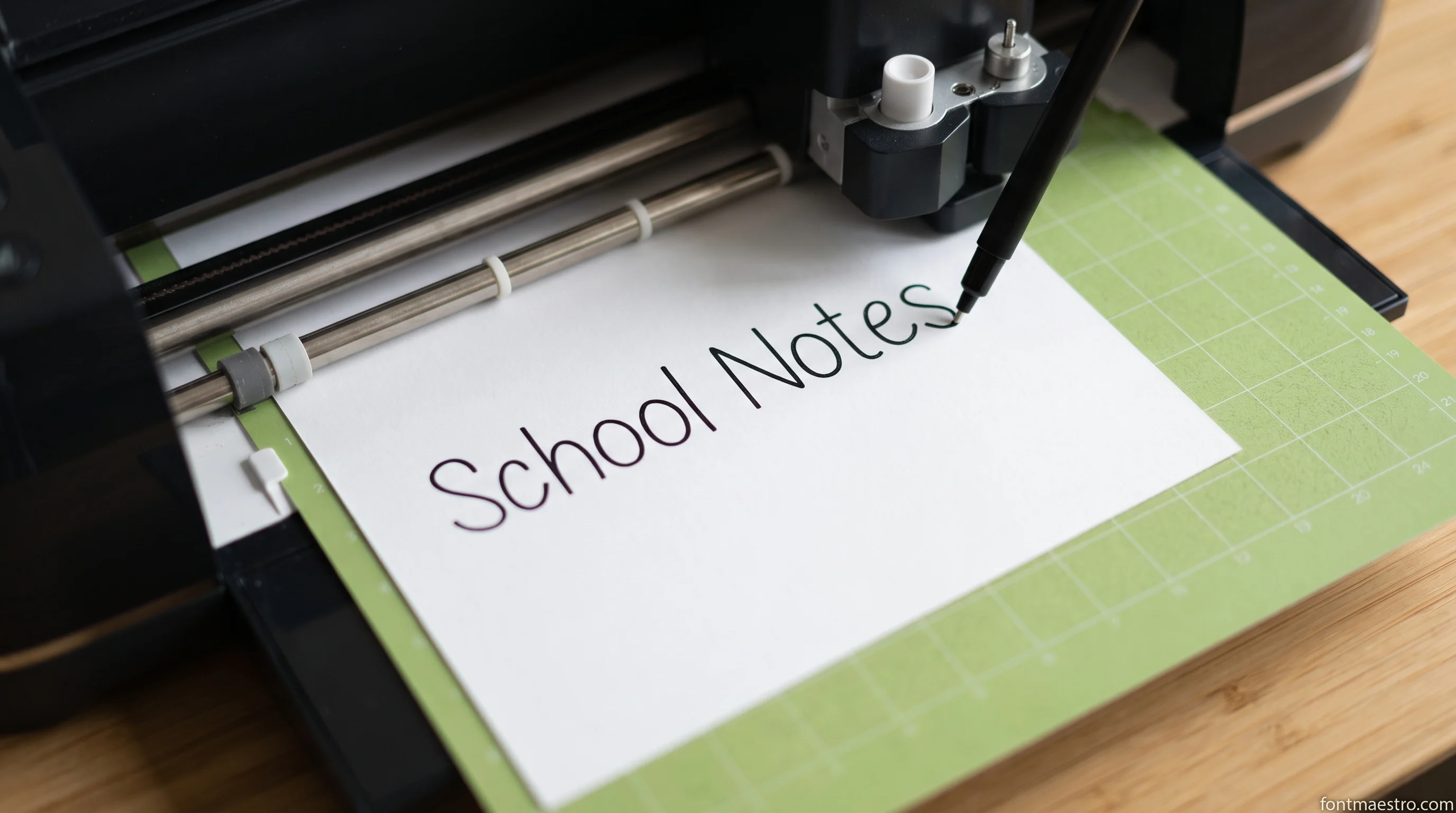
Here is the question almost nobody asks before downloading: is this a font, or is it a drawing? Both get sold under the same words. Both say Cricut in the listing. One installs, shows up in your font list, and lets you type a name. The other arrives as a file you upload as an image, and you cannot type with it at all. Buy the first when you needed the second and the pen goes around every letter instead of through it.
Quick answer: a pen draws hollow, double-lined letters when the font you installed is an ordinary outline font, because the machine follows the edge of each glyph, and that edge is all the file contains. Letters that come out as one clean stroke come from a single-line file, and those are almost never installable fonts. Of the seven writing fonts I ran through the demand check this month, three carry a single-line tag and all three come from one studio, two of those include a SKETCH file, and exactly one of the seven ships an installable OTF or TTF. The rest are AI files: you upload them, you do not type them.
Three Single-Line Writing Fonts to Start With
Unlimited creative assets. Access to AI tools.
Commercial licence included.
Get downloads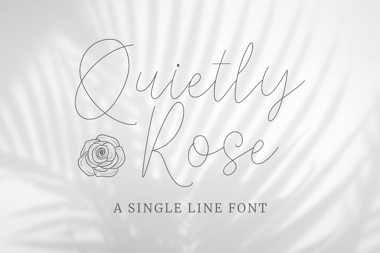
Start here if your pen keeps outlining → Quietly Rose
One continuous path plus a SKETCH file, so the pen writes each letter once and the card reads handwritten, not filled in.
Why the Pen Traces Every Letter Twice
An installed font holds no strokes. Every glyph in an OTF or TTF is a closed outline: the boundary of a shape that gets filled with black on screen. Nothing inside that boundary is described at all, because for printing it never needed to be.
Cutting works fine with that. The blade wants a boundary, so it runs the outline and drops out a filled letter. Switch the same layer to a pen and the machine does exactly what it did before: it follows the boundary. On a thin script that boundary is two nearly parallel lines a fraction apart, and the result reads as a hollow letter with a hairline down the middle. On a heavy display face the two lines are far enough apart to look like an outline drawing, which is sometimes what people want and almost never what they expected.
A single-line file is built the other way round. It has no inside and no outside. It is the path itself, the same route a hand would take across the page. Give that to a pen and one pass finishes the letter. Give it to a blade and you get nothing usable, which is the honest trade, and the reason these files are sold separately from ordinary fonts. If the pen is what you bought the machine for, start from a single-line file like Quietly Rose and the doubled line never appears.
The Two Things Sold as a Writing Font
Both types are listed under the same words, described in the same language. The difference is visible in one place, the file list.
| Installable writing font | Single-line file | |
|---|---|---|
| What arrives | OTF, TTF, sometimes an AI copy | AI, SVG, sometimes SKETCH |
| Type a name with it | Yes, in any program | No, letters are placed one by one |
| Pen result | Traces the outline, letters read hollow | One stroke, letters read written |
| Good for cutting vinyl | Yes | No, there is no shape to cut |
| Foil quill and engraving tip | Doubles the line | Made for it |
| Changing the wording later | Retype it | Rebuild it letter by letter |
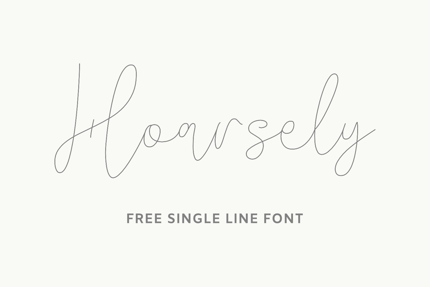
Neither one is better. A place card for eighty guests wants the single-line file and the patience to assemble names. A shirt wants the installable font. The mistake is only ever buying one while planning the other. For the first case, Hoarsely is a single-line cursive that draws a name in one pass; for the second, Boyfriends Handwriting installs like any font.
What Seven Writing Fonts Actually Ship
Take seven well-rated writing fonts sold for Cricut, the kind with a steady stream of recent buyer reviews, and read the file list instead of the description. The pattern is hard to miss.
Three of the seven carry a single-line tag, and all three come from the same designer. Two of those three include a SKETCH file. One product out of seven ships an installable OTF and TTF. The other six give you AI only, a vector you upload as an image, not a font you type with.
That ratio explains the complaint better than any setting does. Six times out of seven, the thing being sold as a writing font is a drawing, and the buyer who wanted to type a name has to place letters by hand. Once out of seven it is a real font, and then the pen outlines it, because that is what pens do with outlines. Neither group is doing anything wrong. The listings just do not lead with the one fact that decides which one you needed.
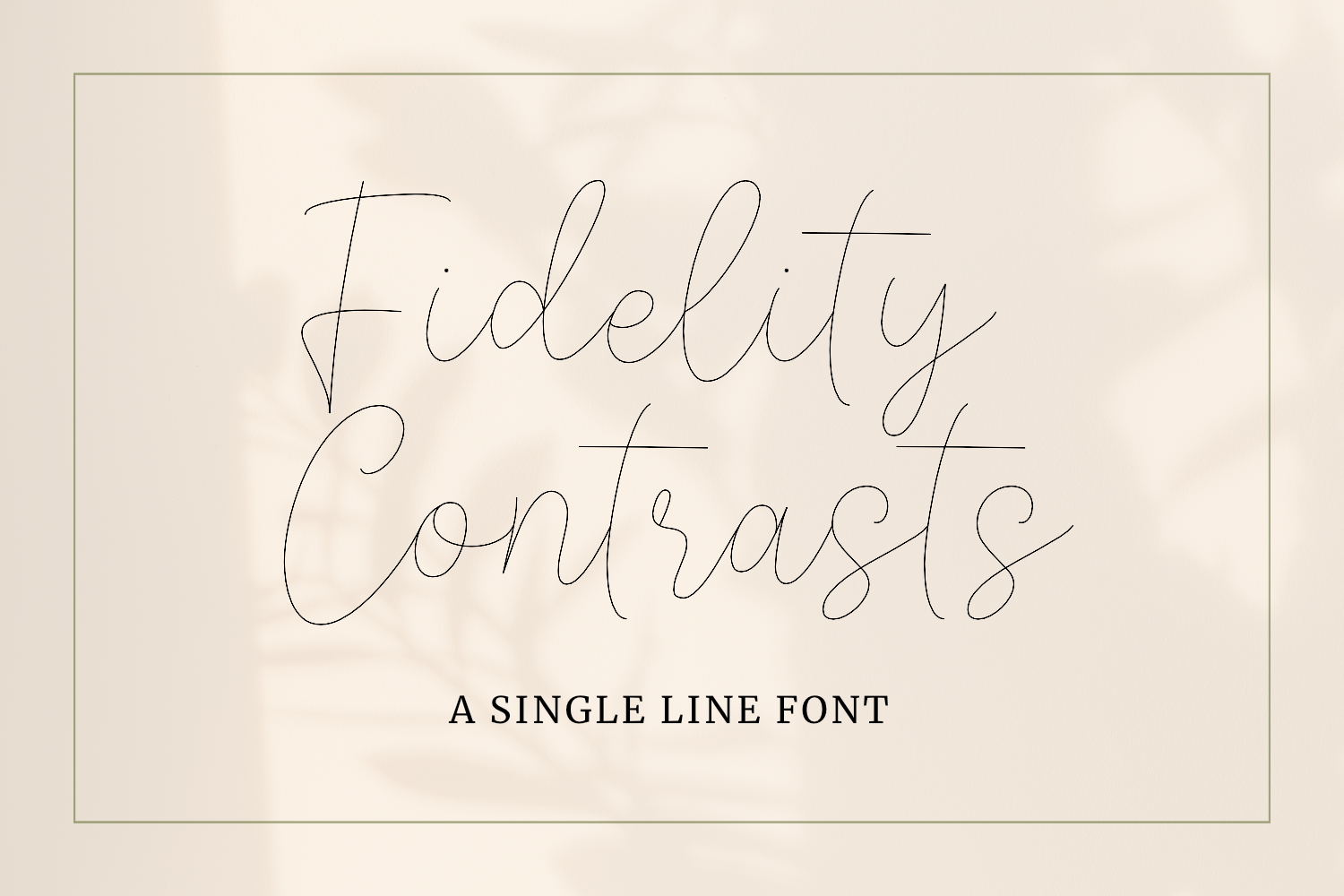
Worth noticing too: the three single-line products all list the same tool set: pen, foil quill, engraving, laser, CNC. That is not marketing spread. A single path is the shape every one of those tools follows, so a file built for one works on all of them. The same goes for the licence: a font bought with commercial rights covers the finished cards whichever tool drew them, and Fidelity Contrasts ships its sketch file on those terms.
Fonts That Draw as a Single Stroke
Every font, one commercial licence
The bundles I test at logo size live in one subscription — commercial use included, no per-font checkout.
These three came from Single Line Studio and are the reason the ratio above looks the way it does. Each is a path, not a glyph outline. None of them installs.
Unlimited creative assets. Access to AI tools.
Commercial licence included.
Get downloads
Quietly Rose
Even stroke from start to finish, which is what a pen draws anyway. Best of the three for place cards, tags and the inside of a card.
Writing Fonts You Can Type With
These four you install, or upload and type around. They will outline under a pen unless you handle them the way the next section describes, and they earn their place because typing eighty names beats placing eight hundred letters.
Unlimited creative assets. Access to AI tools.
Commercial licence included.
Get downloads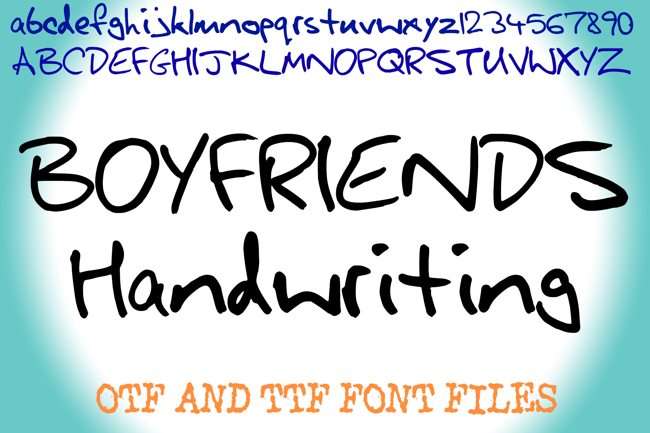
Boyfriends Handwriting
A real OTF and TTF with an uneven baseline, so typed names read like handwriting. At note size the outlined stroke passes for ink.
Small Text: Why Writing Fonts Blur When the Letters Shrink
A name on a tag is often set at a height under a centimetre, and that is where outline fonts give up first. The pen tip leaves a line with real width. When the two edges of a letter sit closer together than that width, both passes land on top of each other and the stroke fattens into a solid smear. Loops in an e or an a close up, and a fine script reads like a row of ink blots.
Two things keep small text open. A single-line file puts one pass where the outline font puts two, so the line stays the width of the tip. A constant-weight design helps as well, because it has no hairline parts that vanish or thick parts that swell. Poster-size lettering has the opposite problem; at tag size the rule is fewer passes and even weight. These three hold up when the letters get small.
Unlimited creative assets. Access to AI tools.
Commercial licence included.
Get downloads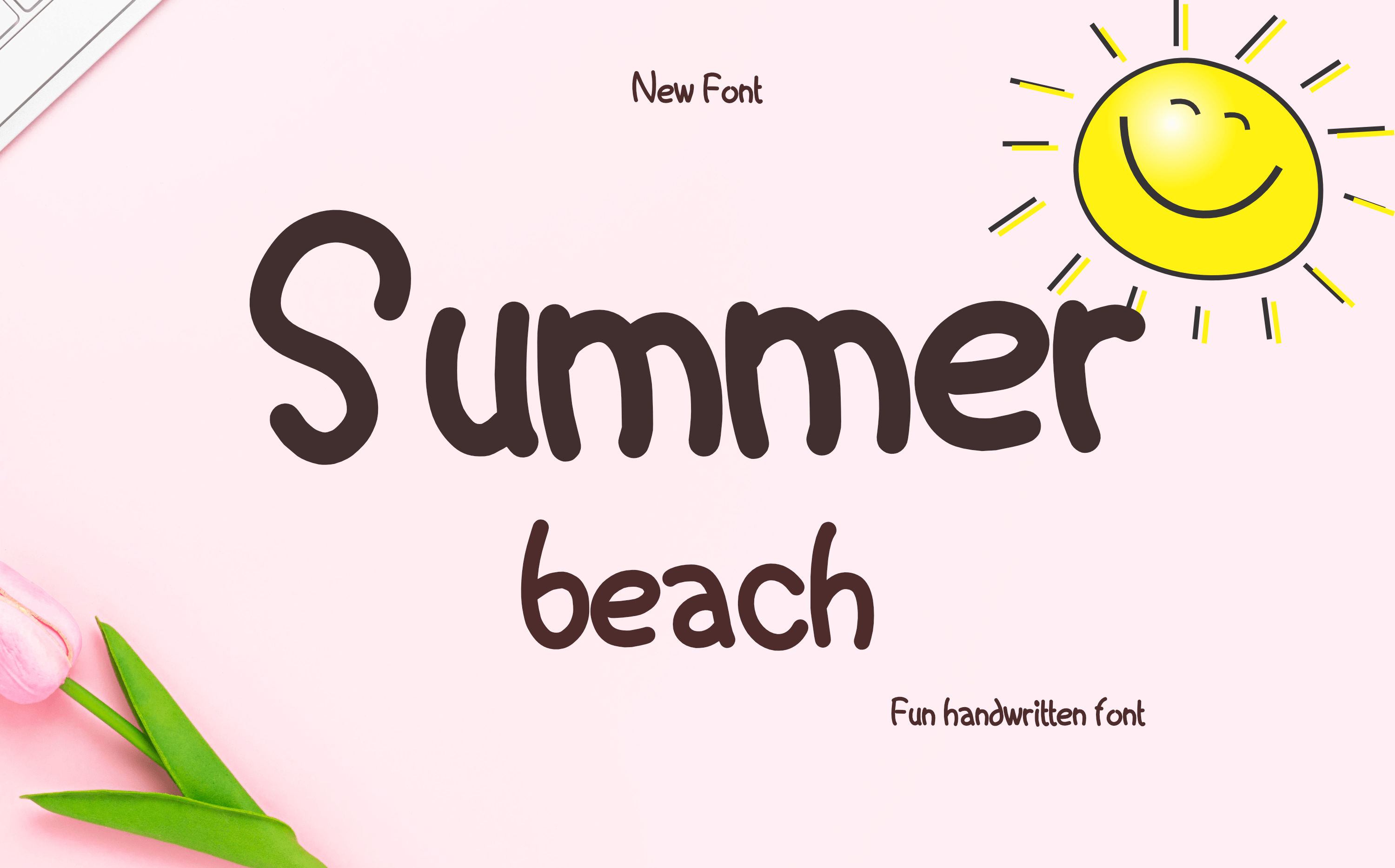
Summer Beach
One constant weight in every letter, so small lines stay open instead of closing into a blot. Readable from across a room.
Quietly Rose
Even stroke, one path per letter. Pairs with Summer Beach when a name sits above a small date line.
Setting It Up in Design Space
The pen setting itself is two clicks. Select the text layer, open the Operation menu at the top left, and choose Pen. The layer turns from a cut to a draw, and the mat preview switches from a filled letter to its outline, which is your first honest look at what the machine is about to do.
Then comes the part people skip. A drawn layer sitting on top of a cut layer is two independent jobs, and the machine will happily draw the name in one place and cut the tag somewhere else. Select both, hit Attach, and their positions lock together. Attach is the whole difference between a card with a name on it and a card with a name beside it.
Two settings are worth changing before the first pass. Drop the pen speed, because slow draws are cleaner and the difference on a fine tip is large. And leave the material setting alone even if the pen seems to be dragging. Pressure belongs to the blade, and raising it for a pen only presses the tip flat.
Once the layers are attached and the speed is down, the first real card tells you more than the preview does. If it comes out hollow, the file is the problem, not the settings, and a single-line file is the fix.
Pulling a Single Line From a Font You Already Own
If you are stuck with an outline font and want something closer to one stroke, there is a workaround worth ten minutes. Apply a negative offset to the text, roughly half the stroke width, then delete the original and keep the offset shape. What remains is a thinner version of the letter, and on an even-width font it draws close enough to a centreline that most people never ask. On a script with heavy thick-thin contrast it collapses, which is exactly why the even-width picks above were chosen.
Use the offset for a one-off, a single label or a test card. For anything repeated, a font you already paid for can stay in your cut projects while the pen gets a real single-stroke file: Summer Beach is even enough to offset cleanly, and Hoarsely skips the offset altogether.
Wedding Invitations: Which Type Wins
Every font, one commercial licence
The bundles I test at logo size live in one subscription — commercial use included, no per-font checkout.
Invitations are where the two file types separate hardest, because the job is really two jobs, the same way a good font pairing gives each font one job.
Place cards, escort cards and envelope addressing want the single-line file. Each piece carries one short name, guests read it from a foot away, and a doubled outline at that distance looks like a printing fault rather than a style. You will be placing letters by hand; that is the cost, but a name is four to nine letters and the result passes for hand lettering, which is the entire point of drawing rather than printing.
The invitation body wants the installable font. There is too much text to assemble by hand, the type is set small, and at small sizes the outline of a fine script collapses into what reads as a single ink line anyway. Set it, draw it, and nobody at the table will be measuring stroke widths.
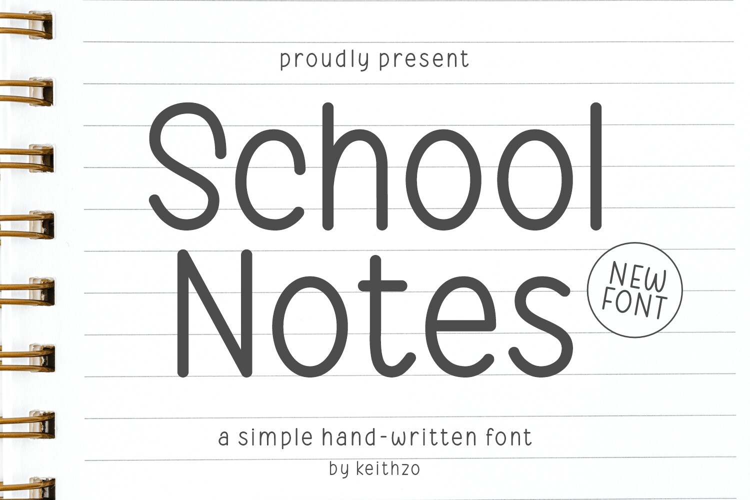
One thing to test before committing to a hundred cards: run one card at the real size with the real pen on the real stock. Cardstock with texture drinks ink and fattens every line, and a script that looked delicate on screen can close up its loops entirely. Ten minutes of testing against an evening of reprinting is not a close call. For the names, Quietly Rose draws at place-card size; for the body, School Notes types it.
Where the Free Writing Font Stops
Free writing fonts are easy to find, and the limit is almost never the licence wording. It is what the download contains. A free listing gives you the outline font and stops there. The single-line version, the SKETCH file, the numbers and punctuation you need for a date or a table number, and the right to sell what you draw all sit on the other side of the line.
| What you need | Typical free download | Full version |
|---|---|---|
| Basic A–Z, upper and lower | Yes | Yes |
| Numbers and punctuation | Sometimes | Yes |
| Single-line or SKETCH file for pens | No | Yes, where the font offers one |
| Vector file you can edit | Rarely | Usually |
| Foil quill and engraving support | No | Yes, same path file |
| Selling the cards you draw | Personal use only | Commercial licence included |
The third row is the one that costs the evening. Without a single-line file there is no version of this that ends in clean strokes. No setting, no pen, no offset repairs a font that only ever contained an outline. Creative Fabrica’s All Access covers the full version of everything listed here, single-line files and commercial rights included, and there is a free plan available for drawing one name before deciding.
Get the single-line file and stop outlining →
Numbers and Punctuation: Where a Writing Font Runs Out
An invitation needs a date. A seating chart needs table numbers. An address needs a comma, a period and sometimes an ampersand. Plenty of writing fonts, free ones above all, stop at A to Z, and you find out on the evening you set the first date line.
Single-line files have the same gap in a different form. The alphabet sheet is drawn, and the numerals may or may not be. Before buying, look at the preview images for a full numeral row and at least the period, comma and ampersand. If the preview only ever shows words, assume the digits are missing.
The workaround people reach for, borrowing digits from a second font, rarely matches: the stroke width and slant change mid-line and the date looks pasted in. A set that ships its own numerals, like School Notes for typed text or Quietly Rose for drawn names, avoids the mismatch.
Key Takeaways
- Installed fonts hold outlines, not strokes. A pen follows the outline, which is why letters come out hollow.
- One clean stroke needs a single-line file (AI, SVG or SKETCH), and those files do not install as fonts.
- Of seven well-rated writing fonts, one ships an installable OTF or TTF and three carry a single-line tag. Read the file list, not the description.
- Attach locks a drawn layer to the shape it belongs on. Without it the machine draws and cuts in two different places.
- A negative offset roughly half the stroke width fakes a centreline on even-width fonts and fails on high-contrast scripts.
- Place cards want single-line; invitation body text wants a typed font. Most weddings need both.
- Test one card on the real stock with the real pen before running the batch.
FAQ
Why does my Cricut pen draw the outline of the letters instead of filling them in?
Because the font is an outline font, and the outline is the only thing in the file. Design Space sends the pen along the same path the blade would have cut. Filling is not a setting that exists; you either use a single-line file such as Hoarsely or accept the outline look at a small size where it reads as ink.
Are there free writing fonts for Cricut that work with a pen?
Cricut Design Space includes a handful of fonts labelled Writing in its own library, and those are drawn as strokes rather than outlines. Beyond those, most free downloads elsewhere are ordinary outline fonts, whatever the listing calls them. Check whether the download contains an SVG, AI or SKETCH file: if it is only OTF or TTF, the pen will outline it.
Can I use Dafont fonts as writing fonts on a Cricut?
You can install them and draw with them, but they are outline fonts, so they behave like every other installed font under a pen. They also come with personal-use terms far more often than the download page makes obvious, which matters the moment you sell a card you drew with one. The free fonts with selling rights are a much shorter list.
Which fonts in Canva work for Cricut writing?
Canva is a design tool, not a font source. You cannot export a Canva font as a font file, and its licence does not follow a file out of the platform. What does work is designing the layout in Canva (the pairings that survive export help here), exporting it as an SVG, and uploading that to Design Space. The letters arrive as shapes at that point, so a pen will still trace their outlines unless the original was single-line.
What is the difference between Write and Draw in Design Space?
They are the same operation under different names across versions of the software. Both send the tool along the path instead of cutting it. What changes the result is not which word is on the menu but whether the path is an outline or a single stroke.
Which fonts look most like real handwriting when drawn?
The ones with an uneven baseline and a constant stroke width. Even width is what a pen physically produces, and an uneven baseline is what a hand produces. Fonts that get both right, Boyfriends Handwriting and School Notes among the picks above, pass at a glance in a way that a tidy formal script never does.
Can I sell cards and invitations I drew with a purchased writing font?
With a commercial licence, yes. The finished physical card is a product you made; the font file itself is the thing you may not pass on. A subscription that includes commercial rights, such as Creative Fabrica All Access, covers the whole catalogue at once, which is simpler than tracking terms font by font.
Can I add any font to Cricut, and does it change to a Write tool automatically?
You can add almost any font to Cricut Design Space, but adding a font does not make it write. That depends on whether the file is built as a single stroke, not on where you found it or how good it looks in the library thumbnail. To find a true writing font, look for one labeled Writing, Pen, or Single Line rather than a regular script or handwriting font, then change the tool from Cut to Write once you select it.
What are the best Cricut writing fonts for a wedding invitation, and where do I find free ones?
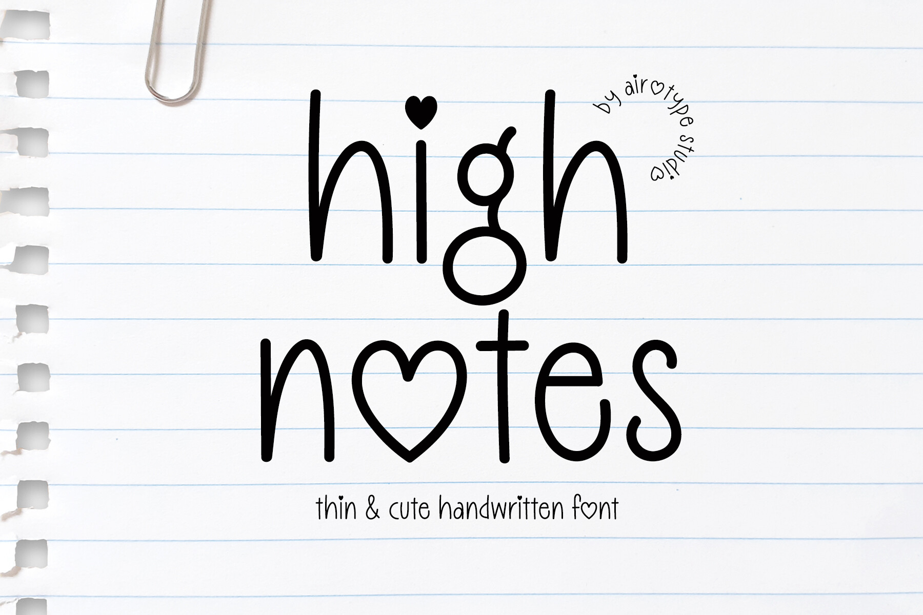
For names on place cards and envelopes, a single-line script such as Quietly Rose; for the invitation text, an installable handwriting font such as School Notes. Free options exist in Design Space under the Writing filter and on free font sites, but those are almost always outline files with personal-use terms, so check both before the print run.


