Last updated: August 21, 2026
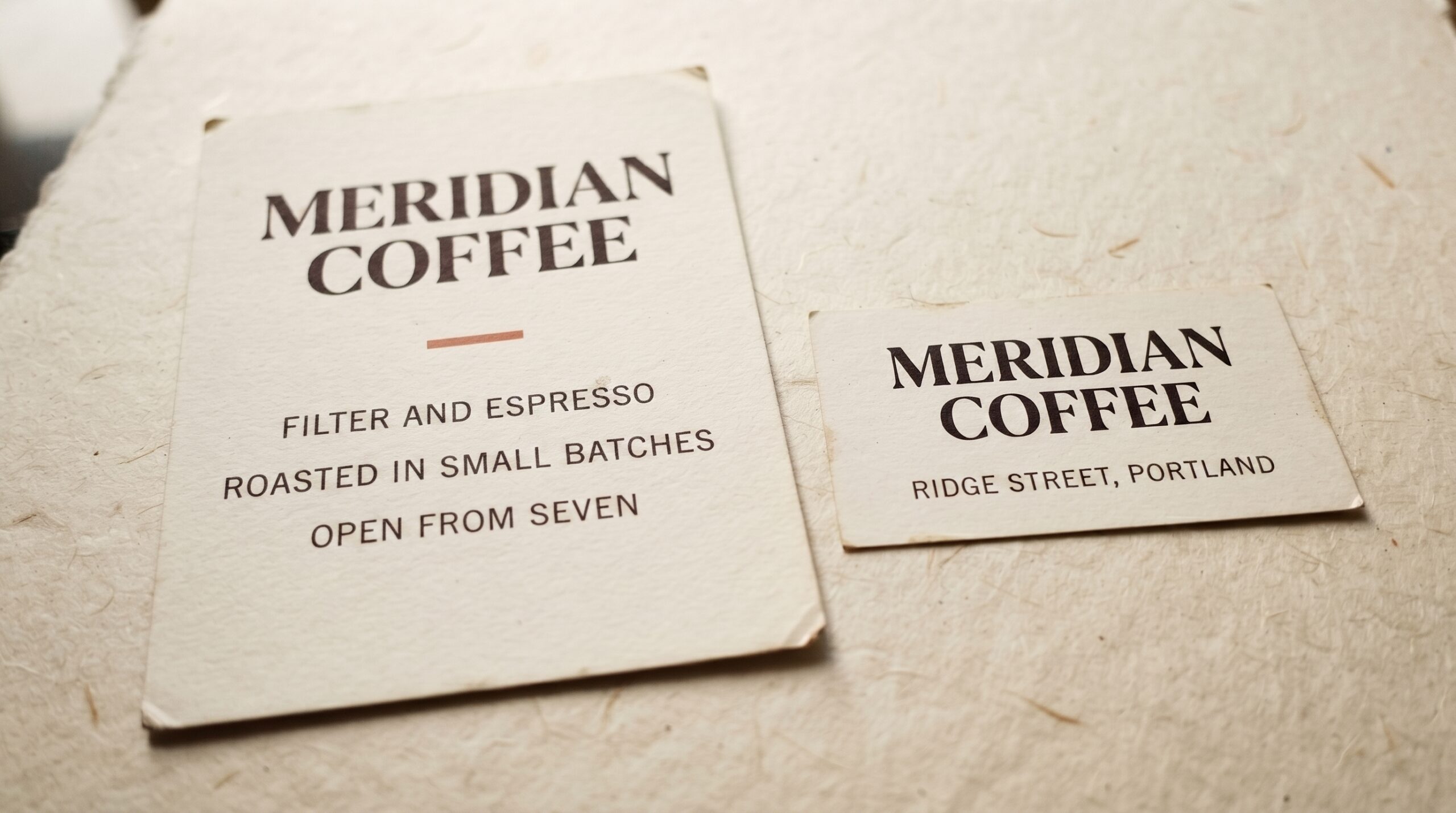
Quick answer: a font pairing works when the two faces are obviously different and clearly related: one expressive display face for the name or headline, one plain workhorse for everything else. Two similar sans serifs read as a mistake; a high-contrast serif over a geometric sans reads as deliberate. Below are five pairings built that way, the free Canva-native combinations that hold up, and the one thing most pairing guides skip: how the colours you set them in change whether the pairing reads at all.
76 pairings, one repeat. In August 2026 I scanned 292 Canva font-pairing pins on Pinterest, took the seven most-saved pairing charts posted in the last three months and counted the pairs: 76 of them. Exactly one combination shows up on two different charts, Playfair Display with Lato. Seventy-five pairings are the opinion of a single designer. So the useful thing to learn is not somebody’s 30 pairs, it is the one rule underneath them, which is the next section.
Want to skip straight to a pairing that already ships matched and licensed? Chicago Downton gets a distinctive headline live today without any of the trial and error below.
The One Rule Behind Every Pairing That Works
Most advice about font combinations is a list of pairs with no explanation, which is why people memorise five combinations and then get stuck the moment a brief needs a sixth. There is one principle underneath all of them: contrast the roles, match the mood.
Contrast the roles. One font is the voice: the brand name, the headline, the thing meant to be looked at. The other is the workhorse: body text, captions, buttons, labels. These are different jobs, and a font good at one is usually bad at the other. Give each job its own face and the hierarchy builds itself.
Match the mood. The two faces should feel like they come from the same world. A geometric sans from the 1920s tradition next to a Didone serif works because both are precise and modern. That same geometric sans next to a rough brush script does not, because one is engineered and the other is spontaneous.
The failure mode is similarity, not clash. Two sans serifs with slightly different letterforms look like nobody noticed the file was inconsistent. If you cannot tell the two fonts apart from across the room, they are not a pairing, they are an accident. Real contrast comes from a serif against a sans, a script against a sans, or a very heavy weight against a very light one.
Two is the limit. Three typefaces need a genuine reason. Build hierarchy out of size, weight and spacing within your two faces before reaching for a third.
The same voice-and-workhorse split is the whole answer when the layout is a business logo rather than a page — our business logo fonts guide applies it to a single wordmark instead of a page of text.
| Role | Job | Good pick |
|---|---|---|
| Voice | Name, headline, the thing you look at | A display face with a clear personality |
| Workhorse | Body text, captions, buttons, labels | A plain sans or serif that gets out of the way |
Of 76 Canva font pairings collected from the seven most-saved pairing charts on Pinterest, only one combination repeated across two different charts.
Once the rule is clear, the fastest way to put it into practice is a pairing that already ships matched, like Little Bee Duo below.
Five Pairings That Work
Each of these puts a licensed display face in the voice role and a free, widely available sans in the workhorse role, and that combination that gives a design a distinctive top line without paying for a whole type system.
Unlimited creative assets. Access to AI tools.
Commercial licence included.
Get downloads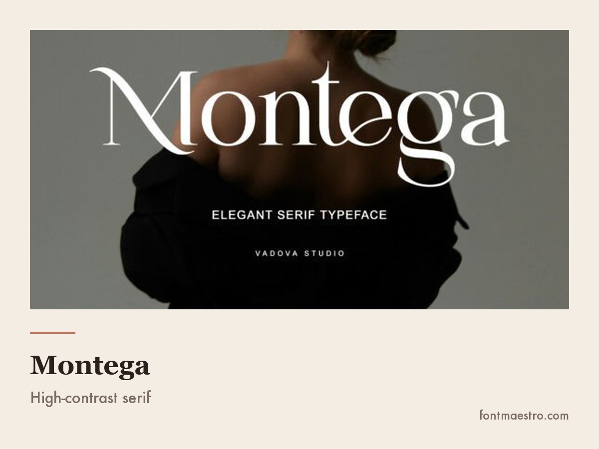
Chicago Downton + Lato → vintage and heritage branding
Chicago Downton is a bold vintage script built to carry a name on its own; pair it with Lato for labels and body copy.
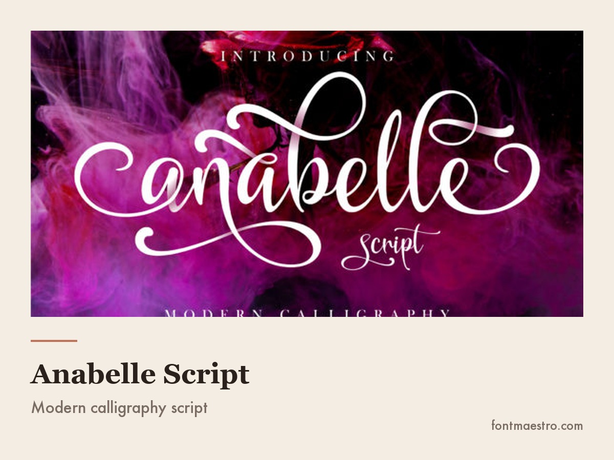
Anabelle Script + Lato → invitations and personal brands
Anabelle Script is a flowing, elegant handwritten face for names and headlines. Set it large on an invitation or logo, and let a plain sans carry the rest.
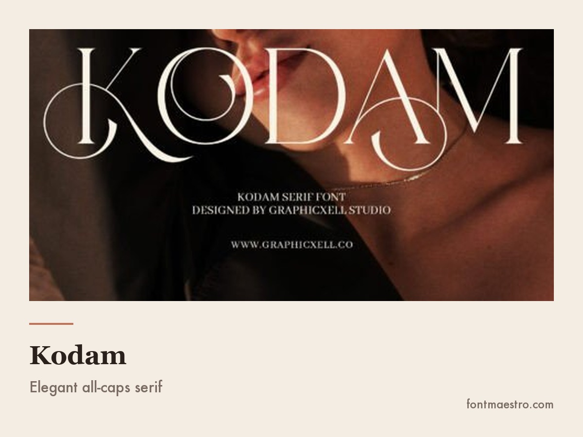
Little Bee Duo → packaging and minimal layouts
Little Bee Duo ships as a matched pair, so the display-and-workhorse decision is already made. Drop both fonts into a label or a minimal layout and the pairing holds without any extra hunting.
Unlimited creative assets. Access to AI tools.
Commercial licence included.
Get downloads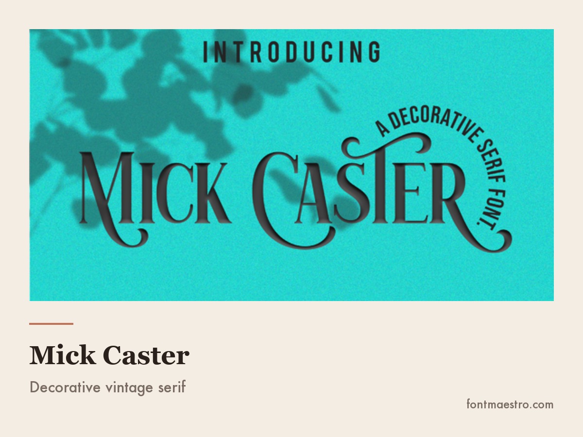
Catlovers + Lato → playful and youthful brands
Catlovers is a decorative, playful face built for names and headings. Keep captions and body copy in Lato so the playful half stays readable.
Bright Harmony → cute and fun social layouts
Bright Harmony is a cute, rounded display face built for social posts, not long copy. Keep it to a headline and let Montserrat handle everything a reader actually has to read.
Free Canva Font Pairings, Using Only Built-In Fonts
Uploading a custom font into Canva requires a paid plan, so most people looking for Canva font pairings need combinations that work with what is already in the editor. Fortunately, Canva’s free library includes most of the Google Fonts catalogue, which is more than enough to build a professional system. These Canva font combinations free to use hold up in real work:
- Playfair Display + Montserrat: the default luxury pairing. High-contrast serif over geometric sans, works for almost any premium-feeling brand.
- Cormorant Garamond + Lato: softer and more literary than the above; good for wellness, hospitality and long-form editorial.
- Bebas Neue + Open Sans: a condensed all-caps display over a plain workhorse. Built for posters, events and anything that needs one loud line.
- Josefin Sans + Libre Baskerville: a geometric sans heading over a book serif body, which reverses the usual order and reads as considered rather than corporate.
- League Spartan + Quicksand: both geometric, but the weight difference is extreme enough to make the contrast obvious; good for friendly consumer brands.
| Plan | Font source | Uploads own font? |
|---|---|---|
| Free | Built-in library, most of Google Fonts | No, paid feature |
| Pro | Built-in library plus Canva Pro exclusives | Yes, under Brand Kit |
Two Canva-specific traps are worth naming. First, the built-in templates were designed around whatever fonts the template author chose, so swapping in your own font pairings Canva selection almost always breaks the spacing, so expect to re-space the headline by hand after any font swap, especially with all-caps or script faces. Second, Canva’s licence covers using its fonts inside designs made in Canva; it does not give you the font file to install elsewhere. If the same brand needs to exist in a different tool later, pick a family you have licensed independently rather than relying on what the editor supplies.
One habit that saves hours: once a pairing is chosen, save it in a brand kit or a template page rather than re-picking per design. The most common reason a set of Canva free fonts combinations looks inconsistent across a feed is not a bad pairing. It is a good pairing applied slightly differently fifteen times.
Prefer something already licensed and paired instead of assembling one from the built-in library? Catlovers ships as a ready display face for exactly this job. The full breakdown of what makes a pair actually a pair, not just two fonts sold together, is in our font pairing guide.
14 Pairings You Can Set Up Today, With the Job Each One Does
Every font, one commercial licence
The bundles I test at logo size live in one subscription — commercial use included, no per-font checkout.
Every font named here is on Google Fonts under an open licence, which means two useful things at once: they are free for commercial work, and they exist in Canva, in Figma, in Word and on the web without anybody uploading anything. Where a pairing chart usually leaves you guessing which half is the headline, this one says it, and says what the pair is actually for, because that is the part that decides whether it works on your layout rather than on the chart.
Each row follows the rule from the section above: one font carries the character, the other stays out of the way, and the two never compete for the same job. Skipping straight to a licensed pair that already applies it? Beloved Hearts does the elegant-script row’s job without picking from Google Fonts at all.
| Headline | Body | What it is for |
|---|---|---|
| Playfair Display | Lato | The safe default: editorial, blogs, about pages |
| Cormorant Garamond | Montserrat | Luxury service brands, invitations, menu cards |
| Bodoni Moda | Work Sans | Beauty and fashion, look-book covers |
| Cinzel | Lora | Crests, monograms, heritage and hospitality |
| Marcellus | Karla | Menus, boutique signage, museum-flavoured layouts |
| Italiana | Jost | Interiors, minimal fashion, gallery pages |
| Prata | Inter | One-word wordmarks with a modern site behind them |
| Fraunces | Nunito Sans | Warm, characterful brands: food, craft, family business |
| Bebas Neue | Source Sans 3 | Posters, events, anything read at a distance |
| Oswald | Lato | Sport, gym, bold announcement layouts |
| Syne | DM Sans | Studios, tech, deliberately contemporary decks |
| Archivo | Spectral | Reports and long reads that need a serious voice |
| Great Vibes | Poppins | Personal brands, stationery, save-the-dates |
| Kaushan Script | Manrope | Cafés, markets, friendly small-business signage |
Note what is not in the table: two decorative faces in the same row. Thirteen of the fourteen pair one voice with one silence, and the fourteenth, Archivo with Spectral, works only because one is a sans and the other a serif doing completely separate jobs. That is the whole rule, applied fourteen times. For more on picking the serif half specifically, see our serif font guide; for the sans workhorse half, our Univers breakdown covers the same job Lato and Montserrat do above.
If you want a headline face already matched to a body font and licensed for commercial use, Bright Harmony covers the same “one loud line” job as Bebas Neue above.
Pairings by Mood: Elegant, Luxury, Cute, Fun and Professional
Almost nobody searches for a pairing by structure. They search by feeling, and the feeling word is doing the work of a brief nobody wrote down. The table below is the translation: what the search phrase asks for, what it means in letterforms, and which of the pairs above delivers it. Every pair named here is on Google Fonts, so it exists inside Canva without uploading anything. Want the cute-and-fun row already licensed instead of assembled from Google Fonts? Bright Harmony covers that register on its own.
| What people search | What it asks for structurally | Pair that delivers it |
|---|---|---|
| Elegant Canva fonts combinations | High stroke contrast, tall ascenders, generous letter spacing | Cormorant Garamond + Montserrat |
| Elegant font combinations Canva for print | Same contrast, but a body face that survives small print | Marcellus + Karla |
| Luxury Canva font combinations | Very high contrast display, lots of white space, nothing rounded | Bodoni Moda + Work Sans |
| Old money Canva font pairings | Conventional proportions, no trend markers, small caps if available | Cinzel + Lora |
| Cute Canva font combinations | Rounded terminals, wide counters, slightly irregular baseline | Fraunces + Nunito Sans |
| Fun Canva font combinations | Casual script or heavy display, friendly sans underneath | Kaushan Script + Manrope |
| Canva font pairings professional use | Low personality in both faces, clear weight hierarchy | Archivo + Spectral |
| The Seasons font pairing Canva users ask about | A thin high-contrast display that needs a plain, slightly heavier partner | The Seasons (Canva-native) + Jost |
Two notes on the last row, because it is the pairing question that arrives most often. The Seasons is a Canva-native family, not a Google font, which means it lives inside the editor and does not travel to Figma or Word with your file. It is also very light, so anything you set under it has to be plainer and a shade heavier, otherwise the two faces sit at the same visual weight and the hierarchy disappears.
The reason the same three or four pairs keep reappearing across different moods is that the mood is carried by the display face and the spacing, not by the pair as a unit. Swap Cormorant for Bodoni and the same layout goes from refined to expensive without touching the body font. That is also why best Canva font pairings lists disagree so completely: they are ranking taste, and taste is set by the one face at the top. If the mood you are actually after is vintage rather than elegant, that is a different letterform question entirely — see our vintage fonts guide for the difference between an aged typeface and a filtered modern one.
Practical order of operations when you are choosing Canva pairing fonts for a real project: pick the display face for the mood, pick the plainest body face that reads at your smallest size, then set your actual words in both and look at them at final size before you commit to either.
For the elegant, luxury and old-money rows above, a licensed script does the job faster than assembling one from Google Fonts. Beloved Hearts is a flowing script built for exactly that register.
Google Fonts, Adobe Fonts and DaFont
The library you draw from changes what pairing means in practice.
Google Fonts combinations are the most portable option there is. Everything is open-licensed for commercial use, hosted for the web, and available in Canva and every design tool, so a pairing chosen here follows the brand everywhere without a licensing conversation. The limitation is ubiquity: the popular families are genuinely everywhere, so a Google-only pairing rarely feels distinctive on its own. Solve that with spacing, colour and layout rather than by hunting for an obscure family.
Adobe Fonts combinations come from a curated library included with a Creative Cloud subscription, which means access to type foundries whose work is not free anywhere else. The pairing advice is identical; the practical difference is that access ends when the subscription does, and web use is served through Adobe’s own hosting. Excellent for client work while the subscription runs, though worth thinking about before it becomes a brand’s permanent identity.
DaFont fonts best combinations is a search worth approaching carefully. DaFont is an upload catalogue rather than a curated library, so quality and licensing both vary per font. Many display faces there are drawn for a single word and have no matching text weights, no italics and incomplete character sets, which makes them fine as the voice half of a pairing and unusable as the workhorse half. Pair a DaFont display face with a Google Fonts workhorse, read the licence before any paid use, and never let it carry body text.
Pairing fonts for Procreate lettering instead of Canva raises the same commercial-licence question in a different app — our Procreate fonts guide covers it.
| Library | Cost | Travels outside Canva |
|---|---|---|
| Google Fonts | Free, open licence | Yes, any tool |
| Adobe Fonts | Included with Creative Cloud | While the subscription is active |
| DaFont | Varies, check per font | Only if the licence allows it |
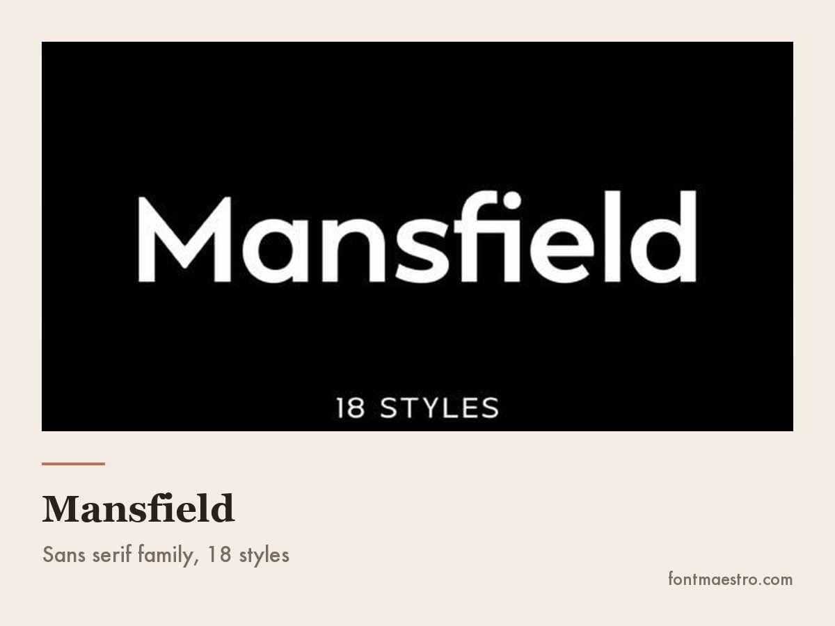
Want the portability question solved without checking a licence every time? Mansfield comes with a commercial licence attached, so it travels with the brand the same way a Google font does.
Font Colour Combinations
A pairing that works in black on white can stop working the moment it is coloured, and font colour combinations are where most otherwise-good layouts fall apart.
The mechanism is contrast. Type is read by shape recognition, and shape recognition needs a clear edge between the letters and the background. Two colours that look distinct side by side, a mid-blue and a mid-green for instance, can have almost the same lightness, and when one is set on the other the letters lose their edges. Convert the design to greyscale and look at it: if the type disappears, the problem is lightness, not hue, and changing the colours to a lighter and a darker version of the same pair will fix it.
Three practical rules:
- Give the two fonts different colour weights, not different colours. Headline in the darkest tone, body text in a slightly softer version of the same tone, accent colour reserved for one element. Colouring each font a different hue makes the design look assembled from parts.
- Thin fonts need more contrast than heavy ones. A hairline serif in a mid-grey vanishes at body sizes; the same grey is perfectly readable in a bold weight. When you lighten a colour, thicken the font to compensate.
- Check the accessible minimum. Web text needs a contrast ratio of at least 4.5:1 against its background (3:1 for large headings) to meet the WCAG AA standard. A free contrast checker settles it in seconds, and it is the same test that keeps type readable on a phone in daylight.
The same contrast test matters when the layout is a logo rather than a page of body text — our logo fonts guide walks through picking a face that still reads at business-card size.
| Combination | Contrast ratio | Passes WCAG AA? |
|---|---|---|
| Dark grey on white | ~12:1 | Yes, body and headings |
| Mid-blue on mid-green | ~1.3:1 | No, at any size |
| White on hunter green | ~7:1 | Yes, body and headings |
| Light grey on white | ~2:1 | Large headings only |
Picking colours to go with a licensed pairing rather than guessing at hex codes saves this whole check. Chicago Downton ships with a colour-safe heavy stroke that holds up even before you run the ratio.
Wedding Font Combinations
Every font, one commercial licence
The bundles I test at logo size live in one subscription — commercial use included, no per-font checkout.
Wedding fonts combinations deserve their own section because the constraints are unusual: the same pairing has to work on a large printed invitation, a tiny place card, a sign viewed from several metres away, and often on fabric or acrylic where thin strokes simply do not survive.
The structure that handles all of that is three levels, two fonts. The names go in the script, set large, using its alternate characters so each name looks lettered rather than typed. The date, venue and details go in a quiet serif or sans at a modest size with generous line spacing. And anything that must be read at a distance or cut from a physical material (signage, place cards, acrylic) goes in the plain font too, never the script, because that is where hairline connections tear or blur.
Two things to check before printing anything: set the actual date and look at the numerals, which are frequently the weakest part of a decorative font; and print one place card at true size in one colour to confirm the script still separates into legible letters. Both failures are cheap to find now and expensive to find after the order ships.
| Level | Font role | Used for |
|---|---|---|
| 1 | Script, large, alternates on | Names |
| 2 | Quiet serif or sans, modest size | Date, venue, details |
| 3 | Plain font only, never the script | Signage, place cards, cut or engraved material |
For the script role, Anabelle Script already ships with the alternate characters this structure needs. For more wedding-specific pairing and cutting advice, see our Cricut wedding signage guide. If the script itself keeps leaving gaps when cut, that is a weld problem, not a font problem — see our guide to welding cursive fonts cleanly.
Which One Should You Actually Use
If you want the shortest reliable answer to fonts combinations Canva gives you for free: Playfair Display for headlines, Montserrat for everything else. It is used often because it works, and no one has ever looked at a design and thought worse of it for that pairing.
If you want the brand to look like nobody else’s, buy one distinctive display face for the name and keep a free workhorse underneath it. That is what every pairing in the grid above does, and it is the cheapest way to sound distinctive without licensing an entire type system.
And if pairing keeps going wrong, stop pairing. A single family with many weights, like Mansfield, removes the matching problem entirely and gives a more coherent result than a mismatched pair ever will. When people search for free Canva font pairings and still cannot make one look right, the issue is almost always that the two fonts are too similar, so increase the contrast between them before you swap either one out. If the actual goal is a single logo font rather than a text pairing, browse our font logo ideas instead of forcing this list to do that job too.
Key Takeaways
- Pair by role: one expressive display face for the name or headline, one plain workhorse for everything else.
- Too similar is the failure mode, not too different. If you cannot tell the two apart at a glance, it is not a pairing.
- Two typefaces is the working limit; build the rest of the hierarchy with size, weight and spacing.
- Canva’s licence covers fonts used inside Canva only, and custom font upload needs a paid plan, so license independently if the brand must exist in other tools.
- Check colour contrast in greyscale, and thicken the font whenever you lighten its colour.
Want a pairing that already follows every rule above without the trial and error? Bright Harmony ships matched, licensed and ready to drop in.
FAQ
| Question about | Answered in |
|---|---|
| Which pairing to pick | The One Rule, Five Pairings |
| Free-plan options | Free Canva Font Pairings |
| Colour and contrast | Font Colour Combinations |
| Weddings and invitations | Wedding Font Combinations |
How many fonts should one design use?
Two. One for headlines and one for everything else. A third needs a specific reason, and in most layouts the same effect is achievable with a different weight of a font already in use.
Can two serif fonts be paired together?
Yes, but only when they are clearly different: a high-contrast display serif over a sturdy book serif, for example. Two serifs from the same tradition will read as an inconsistency rather than a choice.
Can I upload my own font to Canva?
Custom font upload is a paid-plan feature. On the free plan you are working with the built-in library, which includes most of Google Fonts and is enough to build a complete brand system.
What is the safest font pairing for a beginner?
A high-contrast serif for headlines with a geometric sans for body text. Playfair Display with Montserrat is the canonical version. It is hard to make it look wrong, which is exactly what you want while you are learning.
How many fonts does Canva have, and can you add more?
Canva ships with several thousand built-in fonts, and yes, you can add fonts in Canva or add more fonts to Canva by uploading your own — though custom font upload needs a paid plan. On the free plan the built-in library alone has more than enough choice to build a full pairing.
What are the best Canva font combinations and font pairings?
The best Canva font combinations and best Canva font pairings pair a display face for the headline with a plain workhorse for the body — that single rule matters more than any specific list, in 2026 or any other year. The best Canva font combinations free to use come straight from the built-in library, and the best Canva script font combinations pair a licensed script with a plain sans. For teachers, the best Canva font pairings for teachers favour clarity over decoration since classroom materials get read at a glance, and the best Canva pro font combinations simply add Canva Pro’s expanded library on top of the same rule. For a pairing that skips the search entirely, Catlovers already ships matched and licensed.
What are the best Canva font combinations for a wedding, and for wedding invitations?
Wedding pairings need a script for the names and a plain, legible face for everything printed small or cut from vinyl — see the wedding section above for the full structure. The best Canva font pairings for wedding invitations follow the same three-level rule: script for names, quiet plain font for details, and plain font again for anything read at a distance. Anabelle Script is built for exactly the names role in that structure.
Can I use multiple fonts in Canva, and can I use a Canva font for commercial work?
Yes — how to use multiple fonts in Canva is simply a matter of selecting a different font per text box, though two is the practical limit for one design. As for commercial use, fonts inside Canva’s free library and Canva Pro are cleared for commercial use inside designs made in Canva itself; a font used outside Canva needs its own separate commercial licence.
How do I put a font in Canva and use font combinations once it’s there?
To put a font in Canva, upload the file under Brand Kit on a paid plan, or pick straight from the built-in library on any plan. How to use font combinations in Canva after that is the same rule as everywhere else in this guide: one face for the headline, one for the body, and nothing more unless the layout genuinely needs it.
Which font pairing should I buy if I only want one answer?
If you want a single licensed pairing rather than assembling your own, Little Bee Duo ships as a matched display-and-workhorse set, so the decision this whole guide walks through is already made for you.


