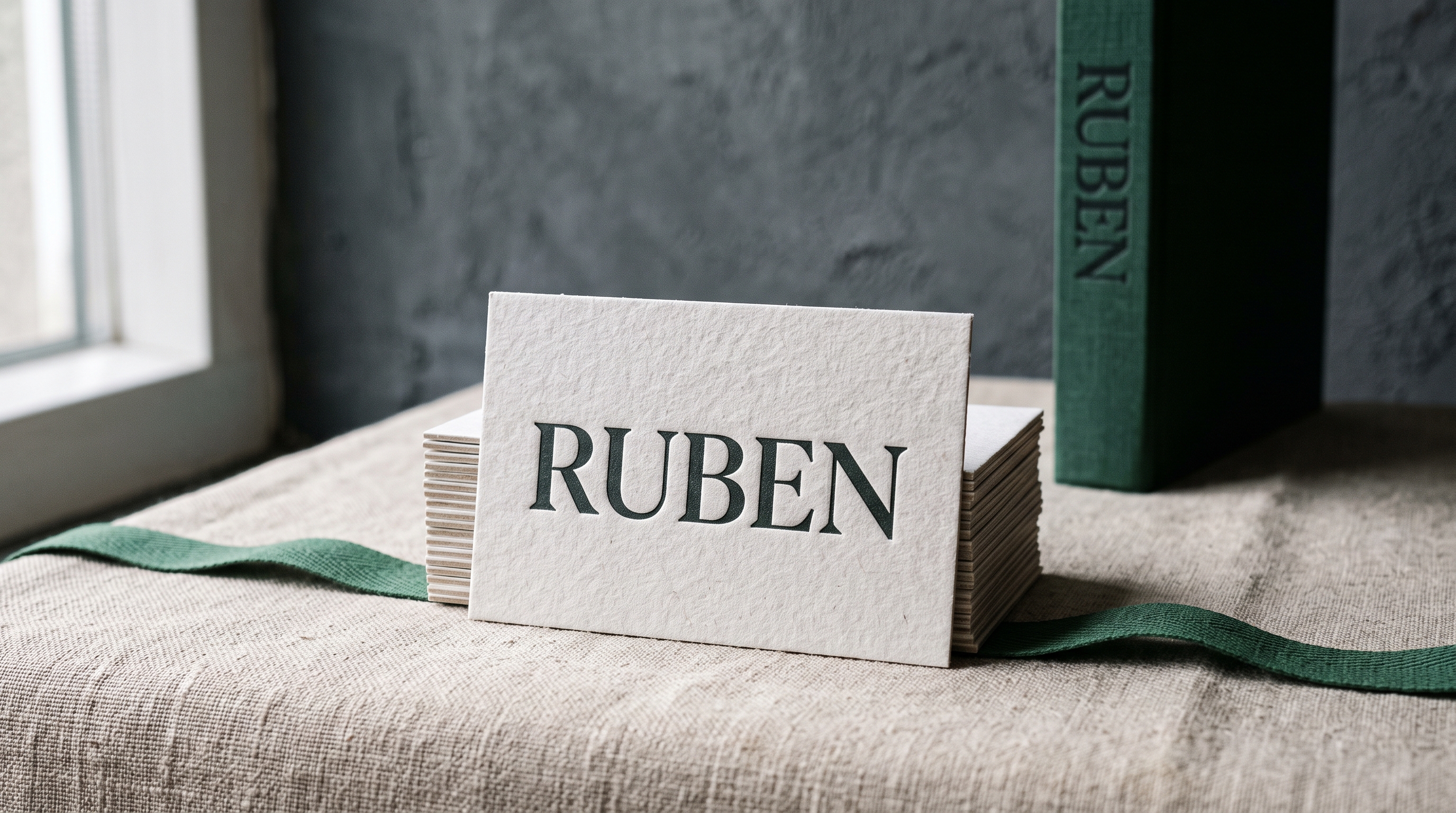
Search “best serif fonts” and you get lists that can’t agree with each other. One roundup names 17 fonts. Another names 40. Neither says why that number, and neither asks what you’re designing. A serif that reads well across three columns of body text is the wrong pick for a logo mark, and a serif built for a poster headline will fight you in a paragraph. The count in those lists means almost nothing. What matters is matching a serif’s structure to the job in front of you, and translating the word you searched (“modern”, “elegant”, “clean”) into the structural thing you actually want.
Quick answer: Serif fonts split into four structural families. Old-style and transitional serifs have low stroke contrast and open counters; use them for body text. Modern (Didone) serifs have thin hairlines and a vertical stress axis; use them for headlines, fashion and luxury branding. Slab serifs have heavy, unbracketed serifs; use them for posters, packaging and anything that has to carry weight. Ornamental and display serifs have a distinctive silhouette; use them for one-word logotypes. Pick the family first, then the font.
If you already know which of the four you need, the shortcut is here: Black Mogan for the high-contrast modern look, Sport Slab for weight on a poster, Ruben for warm display work and Bulgary for a wordmark. Everything below is how to tell which one the job is asking for.
What Actually Changes Between Serif Fonts
“Serif font” is not one design decision. It’s a family of very different structures grouped under one word. Four variables decide whether a serif fits your project, and none of them is popularity.
Stroke contrast. The difference between a letter’s thickest and thinnest strokes. Old-style serifs, modeled on early printed books, keep contrast low, so letterforms stay even at small sizes. Modern serifs push contrast high, thin hairlines against thick stems, which reads as elegant in a headline and can flicker or vanish in body copy.
Stress axis. Draw a line through the thinnest points of a rounded letter like “O” and you get the stress axis. Old-style serifs lean diagonally, echoing a broad-nib pen. Modern serifs sit dead vertical, which is part of why they read as constructed rather than handwritten.
Serif shape and bracketing. Bracketed serifs, a curved transition from stem to serif, feel warmer and hold up better in small print. Unbracketed slab serifs are heavy rectangles the same weight as the stem, built for strength at large sizes, not for a paragraph.
Historical category. Old-style, transitional, modern (Didone) and slab are the four buckets type designers actually use. A list that mixes all four with no note of which is which was built around preview images, not around a use case.
| Variable | What to look at | What it decides |
|---|---|---|
| Stroke contrast | Thickest stem against thinnest hairline | Whether it survives body-text sizes or only headlines |
| Stress axis | Line through the thin points of an “O” | Handwritten warmth (diagonal) or constructed precision (vertical) |
| Serif shape | Bracketed curve or squared slab | Small-print comfort or large-size strength |
| Category | Old-style, transitional, modern, slab | The shortlist you should even be shopping in |
Run those four on a candidate before anything else. A face like Black Mogan answers them instantly — high contrast, vertical stress, fine bracketing — which is exactly why it belongs on a headline and nowhere near a paragraph.
A roundup naming 40 “best serif fonts” and one naming 17 aren’t disagreeing about quality; they’re using no shared criterion at all. Sort by stroke contrast, stress axis and category, and most of that list collapses into four or five structural choices that actually matter for your project.
What “Modern”, “Elegant” and “Clean” Actually Ask For
Most people don’t search for a stress axis. They search for a feeling: modern serif fonts, elegant serif fonts, clean serif fonts. Those words are real signals, they just describe the result instead of the mechanism. Here’s what each one is asking for structurally, so you can shop by the property rather than by the adjective.
The clearest way to feel the difference is to open one of each next to the table: Black Mogan for the modern column and Ruben for the warm one, then read the rows against what you see on screen.
| What you searched | What it asks for structurally | Where it belongs |
|---|---|---|
| Modern serif fonts | High stroke contrast, vertical stress, tight sharp serifs (the Didone shape) | Headlines, fashion and beauty branding, magazine covers |
| Elegant serif fonts | High contrast plus generous spacing and a tall, narrow build; often an italic with real cursive forms | Wedding stationery, luxury packaging, invitations |
| Clean serif fonts | Low to moderate contrast, no ornament, even rhythm, large open counters | Body text, documents, interfaces, anything read for more than a sentence |
| Cool serif fonts | One unusual detail carried consistently, a flat terminal, a wedge serif, an odd leg on the R | Logotypes, merch, editorial display lines |
| Aesthetic serif fonts | A period cue: 70s swelled strokes, 90s tight tracking, or Didone hairlines with wide letter-spacing | Social graphics, mood-driven branding, Pinterest-facing layouts |
| Fun serif fonts | Bounced baseline, rounded terminals, exaggerated weight shifts between letters | Kids’ products, food packaging, playful headlines |
| Beautiful serif fonts | Usually a calligraphic italic or a swash set; the beauty lives in the alternates, not the roman | Short display lines where you can afford one flourish per word |
| Editorial serif fonts | Moderate contrast, sturdy at 16px, with a display cut of the same family for headlines | Blogs, long-form articles, digital magazines |
Two of those pull in opposite directions, which is why people get stuck. Elegant serif fonts and clean serif fonts are almost never the same file: elegance comes from contrast and delicacy; cleanliness comes from evenness and durability. If a project needs both, that’s two fonts: a high-contrast serif for the headline, a low-contrast one underneath.
Read the adjective, then buy the structure. Someone searching for elegance is describing Bulgary’s swash capitals; someone searching for clean is describing the even strokes of Sport Slab set small. Same word from two different people, two different files.
Which Serif Fits the Job You’re Doing
Every font, one commercial licence
The bundles I test at logo size live in one subscription — commercial use included, no per-font checkout.
Pick the path that matches what you’re actually building. Each one points to a different structure, not a different “best” list.
Body Text and Long-Form Reading
If readers are going to sit with your text for more than a sentence, an old-style or transitional serif with low contrast and open counters is the safe choice. This is the clean serif fonts case: high-contrast modern serifs put too much load on thin hairlines, which can disappear at body sizes on screen.
Logo and Wordmark
Bulgary is the shape of this path: one detail you remember, legible at favicon size. A logo serif does the opposite job of a body serif. It needs a silhouette that’s still recognizable shrunk to a favicon. Look for one memorable detail (an unusual terminal, a swash, a specific weight contrast) that reads as a mark rather than a paragraph. Test any candidate at 32px before committing a brand to it. For a longer walkthrough, see our guide to choosing logo fonts.
Headlines, Posters and Packaging
Sport Slab is the reference point for this path. Slab serifs and heavy modern serifs are built for this: strong at large sizes, confident with little supporting text around them. A slab that looks blunt in a paragraph is exactly what a headline needs.
Editorial and Digital Interfaces
Editorial serif fonts sit between body and display: enough personality to feel designed, enough restraint to stay readable across a scroll. A moderate-contrast transitional serif, or a modern serif dialed down in size, fits here better than either extreme. The practical test: set your longest real headline and your first paragraph in the same family and read both on a phone.
| What you’re building | Family to shop in | What to rule out first |
|---|---|---|
| Paragraphs people read | Old-style or transitional | Anything with hairline thins |
| Logo or wordmark | Ornamental or display | Neutral book faces — nothing to remember |
| Poster, packaging, badge | Slab | Delicate high-contrast moderns |
| Editorial and interface mix | Transitional | Display faces with tight counters |
When a Sans Serif Is the Better Answer
Half the searches that land on serif typography are really asking whether a serif belongs there at all. Serif and sans serif fonts are not a quality ranking, they answer different questions.
A serif gives a paragraph rhythm and a brand an implied history. A sans serif gives you clarity at small sizes, in low contrast, and on screens with unpredictable rendering: interfaces, app labels, form fields, signage read in motion, anything set below about 12px. Modern sans serif fonts, the neutral geometric and grotesque families, are the default for these because they hold their shape when everything else about the display is working against them.
The most common professional layout uses both: a serif for the headline, a sans serif for the interface furniture around it, or the reverse for a magazine feel. If you’re choosing between the best sans serif fonts and the best serif fonts for one project, ask where the type will be smallest and dimmest. That’s the size that decides, not the hero shot.
When the serif is only carrying the headline, it can afford to be the loud one: Ruben over a plain sans for the body copy is the whole layout, and it is a two-file decision rather than a font hunt.
Numbers Are a Separate Decision Inside a Serif
The figures in a serif font are their own design, and they’re the thing people notice missing after they’ve already licensed the family. Two properties matter.
Lining vs old-style figures. Lining figures all sit at cap height, like a row of capitals: right for tables, prices, headlines and anything set in caps. Old-style figures have ascenders and descenders, so 3, 4, 7 and 9 drop below the baseline and they mix into running text without shouting. A serif with old-style figures reads beautifully in a paragraph and looks wrong in a price table.
Tabular vs proportional. Tabular figures all occupy the same width, so columns of numbers line up vertically. Proportional figures are spaced like letters. Invoices, timetables, pricing tables and dashboards need tabular; body text reads better proportional.
Before you buy, open the product page’s character map and look for the digits, not just the alphabet. A display serif built for one-word logos often ships with figures that were clearly an afterthought, and a wedding invitation with a date in it will expose that immediately.
Check the digits on the product page before you license anything. A bundle like Sport Slab shows its numerals in the character map, which is what you want to see before a pricing table or a jersey ever gets set.
Serif Categories Compared
| Category | Stroke Contrast | Best For | Where It Struggles |
|---|---|---|---|
| Old-Style | Low | Body text, long-form reading, book-style layouts | Large display headlines, where it can read as plain |
| Transitional | Moderate | Editorial, interfaces, mixed body and heading use | Very small print, where moderate contrast still thins out |
| Modern (Didone) | High | Fashion, luxury branding, large headlines | Body copy and small sizes, where hairlines vanish |
| Slab | Low to none | Bold headlines, posters, packaging, logos needing weight | Long paragraphs, where the heavy strokes tire the eye |
Two rows of that table cover most projects that land here. If the job is a headline, Black Mogan is the modern row; if it is a poster or a label, Sport Slab is the slab row.
Serif Fonts Worth Trying by Category
Every font, one commercial licence
The bundles I test at logo size live in one subscription — commercial use included, no per-font checkout.
One example per category below, chosen for the structural job it’s built to do rather than a spot on a “top” list. Each has a commercial license available for client and product work, confirm the terms on the product page before it ships in paid work, and check the figures while you’re there.
Unlimited creative assets. Access to AI tools.
Commercial licence included.
Get downloads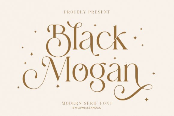
Modern Serif: for branding and headlines
High contrast, thin hairlines and a vertical stress: the structure behind almost every search for modern serif fonts. Best for logotypes, headlines and packaging; the hairlines are too fine to survive body-text sizes.
Slab Serif: for bold headlines and posters
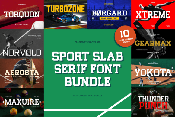
Heavy, even strokes with squared-off, unbracketed serifs built to hold weight at large sizes. Strong for headlines, badges and packaging that has to compete for attention; not built for long reading.
Display Serif: for warm, vintage-leaning branding
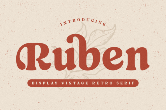
Rounded terminals and a bounce to the letterforms give this a hand-set feel rather than a strict book face: the structure people are after when they search for fun serif fonts. Keep it out of small body copy, where the flourishes crowd together.
Unlimited creative assets. Access to AI tools.
Commercial licence included.
Get downloads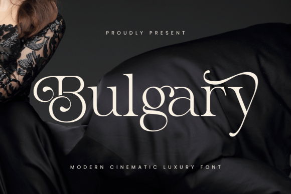
Ornamental Serif: for wordmarks and logotypes
Swash capitals and a distinctive silhouette, built to be recognized small, on a favicon or a business card, not read paragraph after paragraph. This is where beautiful serif fonts earn the word: the alternates carry it, so use one flourish per word.
modern serif fonts example with high stroke contrast for branding
High contrast, thin hairlines and a vertical stress: the structure behind almost every search for modern serif fonts. Best for logotypes, headlines and packaging; the hairlines are too fine to survive body-text sizes.
Get modern serif fonts example with high stroke contrast for branding on All Access →
slab serif font bundle example for posters
Heavy, even strokes with squared-off, unbracketed serifs built to hold weight at large sizes. Strong for headlines, badges and packaging that has to compete for attention; not built for long reading.
Get slab serif font bundle example for posters on All Access →
Want more options in any of these directions? Get the full serif catalog on All Access
Mistakes That Waste a License
Picking a serif off a “best of” list without checking its category is how a font ends up unused after purchase. Three patterns show up often enough to name.
Buying a display serif for body text. A font that looks striking as a 60px headline in a preview can be nearly unreadable at 16px across a paragraph. Preview any candidate at the size you’ll actually use, not the size it’s shown at.
Ignoring the license before client work. Free-for-personal-use and full commercial licenses are different tiers, and mixing them up is the most common licensing mistake in this niche. Confirm the license on the product page before it ships in paid work, our guide to selling with licensed fonts walks through what to check.
Choosing by adjective instead of by structure. Buying the first result for elegant serif fonts and dropping it into a paragraph produces exactly the mismatch the vocabulary table above is built to prevent. The adjective tells you the mood; the structure tells you whether it survives your layout.
The cheapest way past all three mistakes is to buy by category rather than by adjective: Black Mogan for headlines, Ruben for warm display, and a slab only where the layout needs weight.
Working the other side of the same layout? Our guide to script fonts that stay readable covers the partner face most serif projects end up needing, and our guide to elegant fonts goes deeper on what makes type read expensive rather than cheap.
Key Takeaways
- Serif fonts split into four structural families (old-style, transitional, modern and slab), and the family matters more than any ranking.
- Adjectives translate: modern means high contrast and vertical stress; elegant adds delicacy and spacing; clean means low contrast and even rhythm. Elegant and clean are rarely the same file.
- Ask where the type will be smallest and dimmest; that size decides between a serif and a sans serif, not the hero shot.
- Check the figures before licensing: lining vs old-style and tabular vs proportional decide whether the font works in a price table or a paragraph.
Skipping the audit and starting from a face that already fits its category? Get Black Mogan on All Access →
FAQ
What is the difference between an old-style serif and a modern serif?
Old-style serifs have low contrast between thick and thin strokes and a diagonal stress axis, modeled on early printed books, which is what makes them comfortable for long reading. Modern (Didone) serifs push contrast much higher with a strict vertical stress axis, which reads as elegant at large sizes and gets hard to read in a paragraph.
What makes a serif font look elegant rather than just clean?
Elegance comes from contrast and delicacy, thin hairlines, tall narrow proportions, generous letter-spacing, often a true cursive italic. Cleanliness comes from the opposite: even stroke weight, open counters, no ornament. A font can be one or the other at a given size, which is why elegant and clean usually means two fonts in one layout.
Can I use a slab serif for body text?
You can, but most slab serifs are built for weight and impact at large sizes, and their heavy, even strokes tire the eye over a full paragraph. A slab works best in headlines, short display lines, or logos.
Do serif fonts come with usable numbers?
Not always the ones you need. Check whether the figures are lining (all at cap height, right for tables and prices) or old-style (with ascenders and descenders, right for running text), and whether they are tabular or proportional. Open the character map on the product page and look at the digits before you license the family.
How do I know if a serif font is safe for a client logo?
Check the license tier on the product page for commercial and client-work rights specifically, not just “free for personal use.” Then test the font at the size it will appear (a favicon, a business card, a storefront sign), since a serif’s fine details can disappear well before the point size a preview image shows.


