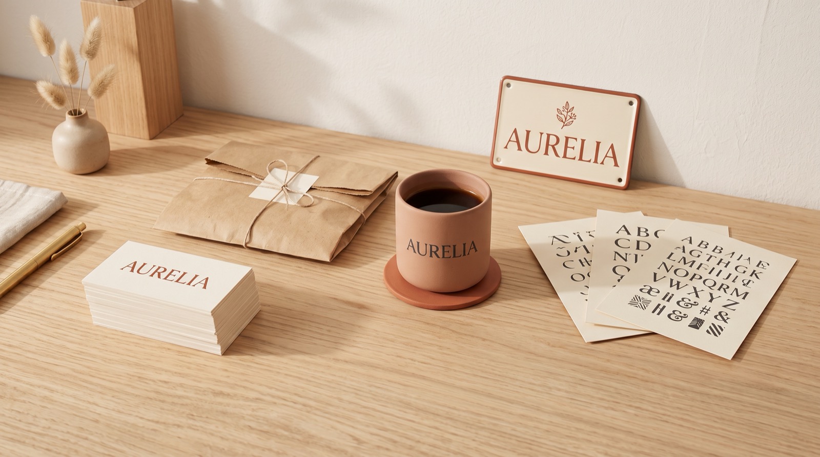
Quick answer: if your brand needs to look established and trustworthy (law firm, consultancy, real estate), pick a serif logo font. If the brand is built around a personal name or a signature-style product, pick a script font. If you’re a startup, app, or tech brand, pick a clean geometric sans serif. If you need one bold word to work as the whole logo, pick a heavy display font. The rest of this guide walks through why, with a licensed pick for each path.
Decision Paths by Use Case
Match your brand type to one of these four paths. Each one links to a font that’s licensed for commercial and client work.
Unlimited creative assets. Access to AI tools.
Commercial licence included.
Get downloads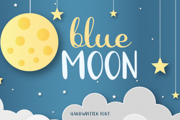
Unlimited creative assets. Access to AI tools.
Commercial licence included.
Get downloads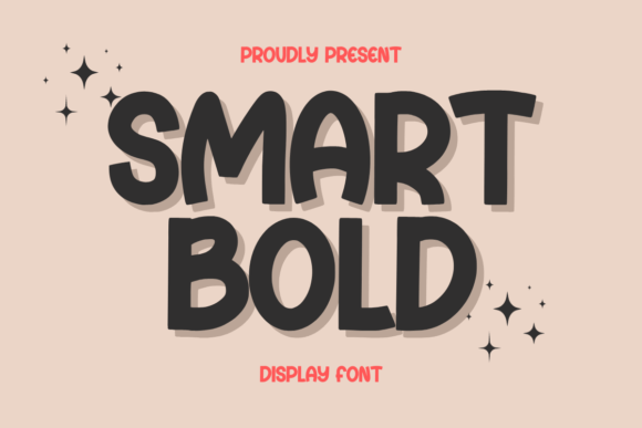
A logo font is chosen at 200 px and lives at 32. Of the four paths on this page, only the geometric sans and the heavy display survive the favicon test unchanged; the serif and the script hold their shape only when a simpler mark sits beside them.
What Actually Changes When You Pick a Logo Font
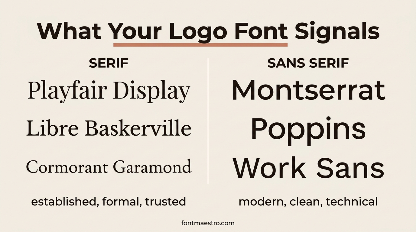
A logo font isn’t chosen for looks alone; three things about it directly affect whether the logo still works once it leaves your screen.
 Pin it
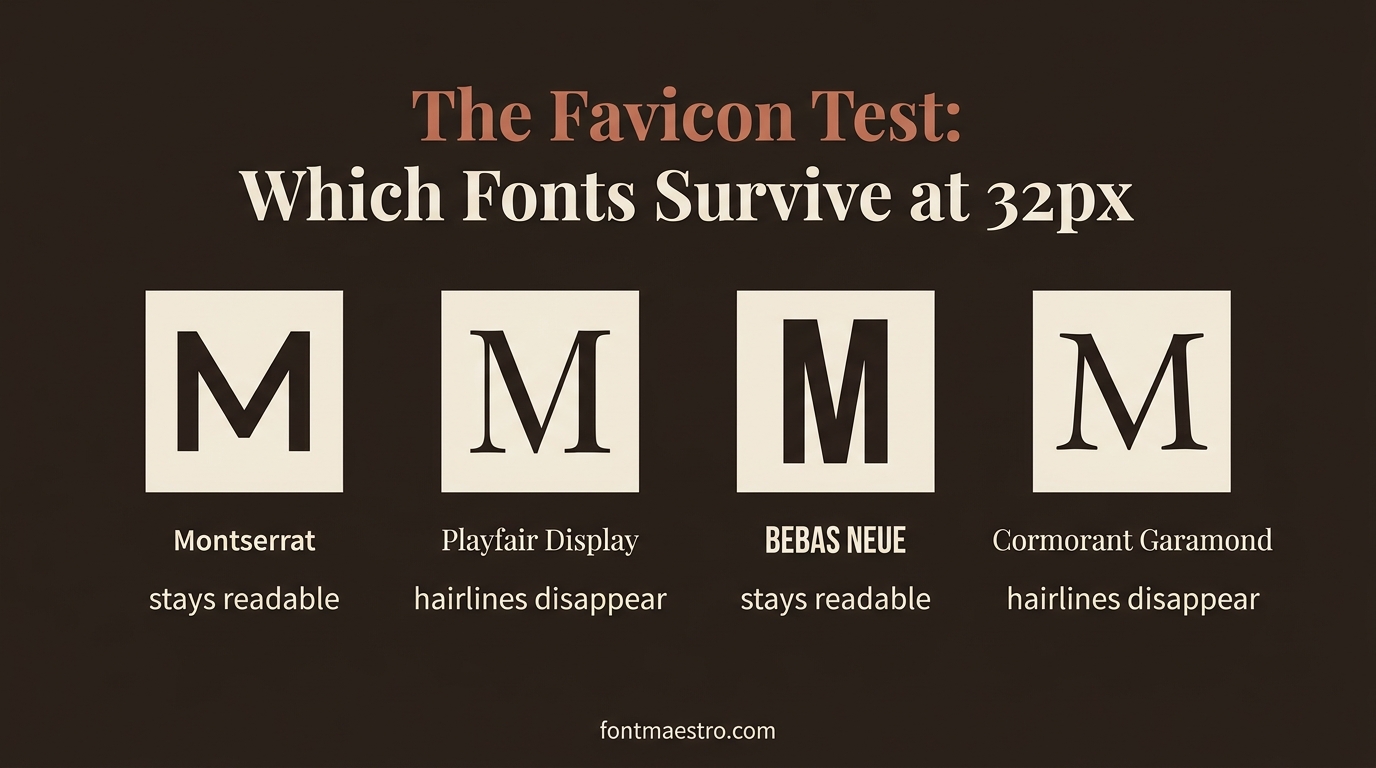
Legibility at small sizes. A logo has to read on a favicon, a business card, and a delivery van at the same time. Thin, high-contrast letterforms that look elegant at 200px can collapse into a blur at 32px. Test any candidate font at the smallest size it will realistically appear.
Weight and contrast. Heavier weights hold up better in single-color print and on busy backgrounds. Script and serif fonts with sharp stroke contrast need more breathing room and usually work better as a secondary mark next to a simpler icon, not as the entire logo at tiny sizes.
Commercial licensing. This is the one people skip and regret. A font you download for a mockup isn’t automatically cleared for a client’s logo, a product you sell, or a shirt you cut on a Cricut. Every pick above is checked for commercial use before it’s recommended, but confirm the license terms on the product page before you finalize a client logo.
 Pin it
Of the four picks above, Montreal and Smart Bold are the two that survive the 32 px favicon test without thinning out.
Unlimited creative assets. Access to AI tools.
Commercial licence included.
Get downloads
What People Mean by “Cool”, “Fun” and “Unique” Logo Fonts
Most logo font searches are adjectives, and adjectives are not a brief. Before you can pick anything you have to translate the word into a property of the letterforms, because that property is the thing you can actually look for in a preview. Here is the translation table we use on every brief that arrives with a taste word instead of a spec.
| What the brief says | What it means structurally | What to look for in a preview |
|---|---|---|
| Cool logo fonts | Low ornament, high geometry, often condensed | Flat terminals, tight spacing, no swashes |
| Bold logo fonts | Heavy stem weight, counters still open | The inside of the “o” and “a” does not fill in at small size |
| Fun logo fonts | Irregular baseline or rounded terminals | Letters sit slightly off the line on purpose |
| Fun fonts for logo work in kids and food brands | Wide letterforms, generous curves | Nothing narrow, nothing sharp-cornered |
| Creative logo fonts | One deliberate anomaly in an otherwise normal alphabet | A single character breaks the pattern, not five |
| Unique fonts for logo use | Rare shapes that are still readable cold | You can read the business name without knowing it |
| Elegant | High stroke contrast, tall ascenders | Thin strokes survive at your smallest size |
| Timeless | Conventional proportions, no dated tricks | Nothing that anchors it to one season |
The practical use of this table is negative. When a client asks for something “cool and unique”, you now have two structural targets that partly contradict each other: cool pushes toward geometry, unique pushes toward anomaly. Naming that out loud early is faster than presenting three rounds of options nobody can explain rejecting.
Run the table against the four paths: cool lands on Montreal, fun on Smart Bold, unique on Gastonia Script, classic on Blue Moon.
Unlimited creative assets. Access to AI tools.
Commercial licence included.
Get downloads
Fonts for Branding vs Fonts for One Logo
Every font, one commercial licence
The bundles I test at logo size live in one subscription — commercial use included, no per-font checkout.
A logo needs one word to work once. A brand needs the same voice on a website, an invoice, a shipping label, and a shop sign. That difference is why the best fonts for logos are frequently not the best fonts for the brand around them, and why choosing on the logo alone is the mistake that shows up six months later.
The test that separates the two: count the characters you need. A wordmark needs the letters in the business name, correctly spaced, at one or two sizes. Fonts for branding need numerals for prices and dates, punctuation for addresses, at least three weights so a document can have a hierarchy, and often a second language. A display face with 26 gorgeous capitals and nothing else can be a logo and cannot be a brand system.
So when a project brief says fonts branding rather than logo, read it as a request for a family, not a face. Look at the glyph count on the product page, look at how many weights ship in the file, and check whether the numerals are lining or old-style, because old-style figures inside a price table look like a bug to everyone who is not a typographer.
The workable arrangement for most small brands is two files: one distinctive face licensed for the mark, one broad workhorse family for everything else. That covers fonts for logos branding without paying for a distinctive family in six weights you will use once.
What we checked: across three sources that all answer the same question of licensing a font for a logo, the licence model is different in each one: a one-time marketplace purchase, an annual foundry subscription, and a separate logo-usage licence sold apart from the font itself. Three models for one act. That is why “is it licensed for commercial use” is not a yes or no question, and why the answer has to come from the product page in front of you rather than from a general rule you learned once.
Character-count test in practice: Blue Moon and Montreal ship the numerals and punctuation a brand needs, which is why they hold past the wordmark.
Unlimited creative assets. Access to AI tools.
Commercial licence included.
Get downloads
Free Logo Fonts vs Paid Ones
Searching for free logo fonts gets you thousands of results, and most of them are usable. The problem is never the quality of the letterforms, it’s what the license file says. A free download usually means free for personal projects: a poster for your own wall, a mockup in a portfolio, a birthday invitation. The moment the logo goes on a client’s storefront, a product you sell, or a shirt you cut and ship, you need a commercial license, and that is a separate permission the designer either granted or didn’t.
Unlimited creative assets. Access to AI tools.
Commercial licence included.
Get downloads
Three things to check before you use a free font in a logo:
- Does the license name commercial use explicitly, or only stay silent about it? Silence is not permission.
- Does it allow embedding and modification? Logos get outlined, stretched, and re-spaced, so a license that forbids modification quietly forbids most logo work.
- Is there a separate desktop and web license? Some free families cover one and not the other.
The reason the picks above are all paid is not that free is worse. It’s that a licensed font gives you one document to show a client if they ever ask, and that document is what turns “I think it’s fine” into an answer. If you do use a free family, download the license text at the same time as the font file and keep both in the project folder: the download page will change, your folder won’t.
If the licence questions above have no clear answer on the free file and the logo is going to a client, that is the point to switch to a licensed face. Get Blue Moon on All Access →
Canva Logo Fonts That Actually Hold Up
Most people making a logo in 2026 are making it in Canva, so it’s worth being specific about canva logo fonts rather than talking about type in the abstract. Canva ships hundreds of families, and the ones that survive being scaled down to an avatar are a much shorter list than the ones that look good in the editor at full canvas size.
The canva fonts for logo work that hold up reliably fall into the same four categories as the paths above: Playfair Display and Libre Baskerville for the established-brand look, Montserrat and Poppins for modern and technical, Bebas Neue for a single bold word, and the handwriting families for signature marks. Those are real families available inside the editor, not lookalikes.
Two Canva-specific traps worth naming. First, the built-in logo templates set the brand name in whatever font the template author chose, and swapping in your own canva fonts logo choice usually breaks the spacing the template was built around, so expect to re-space the letters by hand after any font swap. Second, Canva’s own license covers using its fonts inside designs you make in Canva; it does not hand you the font file to install elsewhere. If your logo needs to exist as a vector in Illustrator too, pick a family you have licensed independently rather than relying on logo fonts canva gives you inside the editor.
If the Canva shortlist feels generic — that is the usual complaint — the paid equivalents on this page are Blue Moon for the established look and Montreal for the modern one.
Unlimited creative assets. Access to AI tools.
Commercial licence included.
Get downloads
Typography Logo Fonts: Pairing and Single-Letter Marks
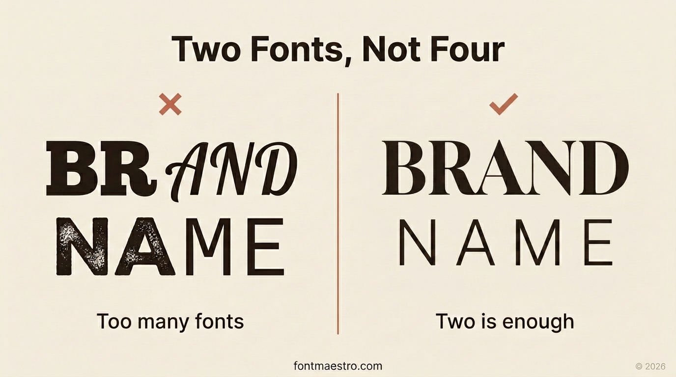
The most common failure in logo design fonts is not picking a bad font. It’s picking four decent ones and setting them next to each other. A wordmark plus a tagline plus a location line is three pieces of text, and three pieces of text tempt you into three typefaces.
 Pin it
Two is the working limit: one voice font that carries the brand name, one neutral font for everything around it. The contrast between them has to be obvious at a glance. A high-contrast serif over a spaced geometric sans reads as deliberate, while two similar sans serifs read as a mistake nobody caught. That’s the whole rule for fonts for logo design, and it survives every brief.
Single-letter marks follow a different rule. When you set just an initial (letter s logo fonts are the most searched case, because the S has the most usable curve of any capital), the letterform is doing all the work, so pick the font for the shape of that one character rather than for how the alphabet looks overall. Set the initial large, print it, and look at it upside down: a monogram that still reads as a considered shape when rotated is one that will survive being embroidered, embossed, or cut in vinyl.
People also search for fonts that look like logo marks, meaning display faces designed with the geometry of a symbol rather than a reading face. They work, but only for one or two words; run a full company name through one and the quirks that made it distinctive turn into noise. Keep display faces for the name and a plain grotesque for the rest, and the fonts logo design problem mostly solves itself.
Best logo fonts, short answer, across all of this: the ones you have tested at final size, in one color, next to your actual business name. That test disqualifies more candidates than any style preference will.
Two-font systems that work off the shelf here: Smart Bold with a plain grotesque, or Gastonia Script carrying the name over Montreal in the tagline.
Unlimited creative assets. Access to AI tools.
Commercial licence included.
Get downloads
Arabic Logo Fonts and Other Non-Latin Marks
Every font, one commercial licence
The bundles I test at logo size live in one subscription — commercial use included, no per-font checkout.
If the brand operates in more than one script, the font choice stops being a style question and becomes a matching problem. Arabic logo fonts are the most common case in our inbox, and the failure is almost always the same one: the Latin wordmark is picked first, then an Arabic face is bolted on that has a completely different stroke weight and a different sense of vertical rhythm.
Three checks before you pair scripts:
- Stroke weight has to match optically, not numerically. An Arabic face at the same nominal weight as a Latin bold usually reads heavier, because the connected strokes cover more area. Compare printed samples side by side, not weight names.
- Height relationships have to be decided, not inherited. Arabic has no x-height in the Latin sense. Someone has to choose whether the Arabic aligns to the Latin cap height or sits smaller, and that choice should be written into the brand guide so the next designer does not redo it differently.
- The file has to actually contain the script. A font advertised as multilingual may cover Latin Extended and no Arabic at all. Type the actual brand name into the preview box on the product page before buying, and if the preview refuses the characters, the file does not have them.
The same three checks apply to Cyrillic and to CJK marks. Most families sold on general marketplaces cover Latin only, which is not a defect, only a limit you need to find before rather than after the logo is approved.
For a matched Latin half of a bilingual mark, start from an even-weight sans such as Montreal rather than a high-contrast serif.
Unlimited creative assets. Access to AI tools.
Commercial licence included.
Get downloads
Which One Should You Actually Use
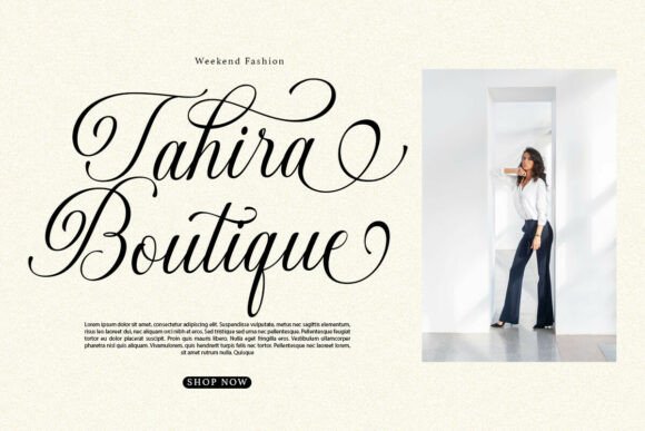
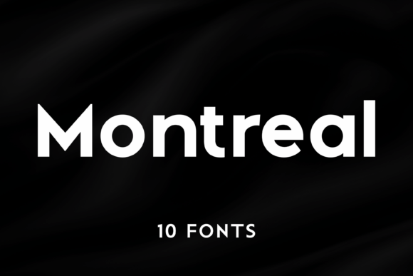
If you only take one thing from this guide: match the font to how formal or informal the brand needs to feel, then check the license before you touch a client project. Serif (Blue Moon) skews formal and trustworthy. Script (Gastonia Script) skews personal and handmade. Sans (Montreal) skews modern and technical. Bold display (Smart Bold) skews confident and friendly. If you’re still unsure after testing at small size, the sans serif path is the safest default: it’s the one that breaks the least across different applications.
One more thing worth checking before you lock in a choice: how the font behaves next to your actual business name, not a placeholder word. Some serif and script faces look great as single letters in a preview image but get cramped once a full multi-word name is set in them. Type your real business name in the font. Most Creative Fabrica product pages let you preview custom text right on the listing, and look at it at the size it will actually appear, not zoomed in. A font that looks perfect enlarged on a screen can still fail at the size of a shopfront sign or a social media avatar, so the preview-at-real-size step is not optional, it’s the step that catches the mismatch before you’ve paid for a license.
- Established or professional brand → Blue Moon
- Personal-name or signature brand → Gastonia Script
- Startup, app or tech brand → Montreal
- One bold word as the whole logo → Smart Bold
Unlimited creative assets. Access to AI tools.
Commercial licence included.
Get downloads
Key Takeaways
- Test any logo font candidate at the smallest size it will actually appear (business card, favicon, or embroidery) before you commit.
- Serif fonts read as established, script fonts read as personal, sans serif reads as modern, bold display works best as a standalone wordmark.
- Confirm commercial licensing before using any font in a client logo or a product you sell, because a download license and a commercial-use license aren’t always the same thing.
- When in doubt, a clean geometric sans serif is the safest starting point for a new brand.
FAQ
Can I use a free font for a client’s logo?
Only if the license explicitly allows commercial use. Many “free” fonts are free for personal projects only. Check the license terms on the font’s product page before delivering a logo built with it to a paying client.
What’s the safest logo font for a brand that hasn’t decided its personality yet?
A clean sans serif. It holds up at more sizes and across more materials (web, print, embroidery, signage) than script or high-contrast serif fonts, so it’s the lowest-risk choice while a brand is still finding its voice.
Should a logo font match the website’s body font?
No, they can be different. A logo font is chosen for identity and legibility at small sizes; a body font is chosen for reading comfort in long text. Most strong brands pair a distinctive logo font with a plainer, more neutral font for everything else.
Unlimited creative assets. Access to AI tools.
Commercial licence included.
Get downloads


