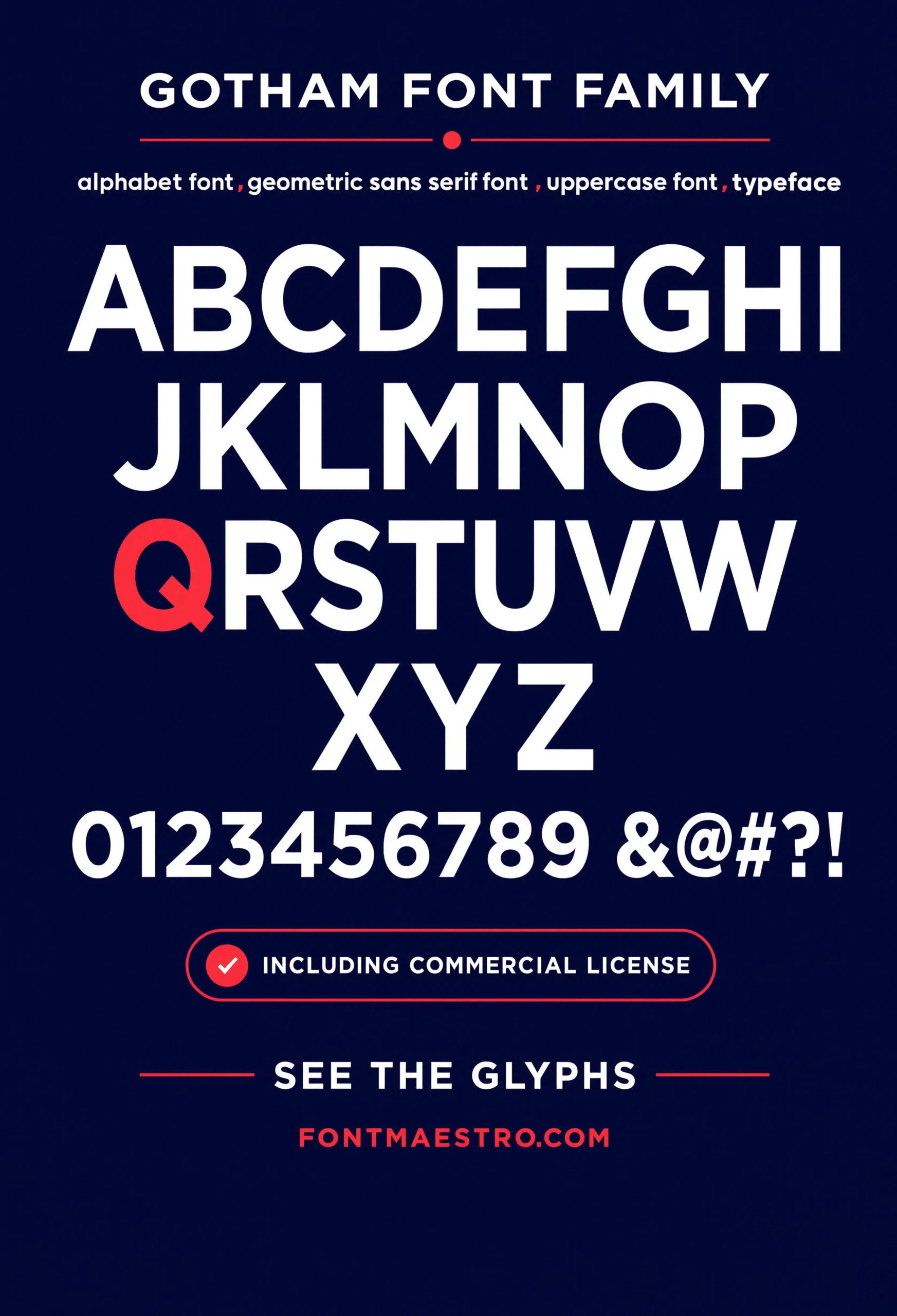
What actually separates the best fonts for business logos from the rest? Not personality — most business owners assume a “unique” font makes a stronger logo, but the opposite tends to be true. DIN Next was designed for road signage, where a driver has half a second to read it at speed. That same clarity is exactly what a logo needs at favicon size, on an invoice, or across a store awning.
A logo font isn’t judged in isolation. It’s judged next to a competitor’s sign, in a Google search result, on a delivery van seen from thirty feet away.
Quick answer: The best fonts for business logos are grotesque or geometric sans-serifs built for legibility at extreme scale — both tiny (favicon) and huge (billboard). DIN Next is a strong default because it was engineered for road signage, meaning it holds up in low-visibility and low-attention conditions, which is the exact test a logo faces every day.
Why Does Legibility Beat Personality in the Best Fonts for Business Logos?
A font with a distinctive personality can be memorable — but memorable and legible aren’t the same thing. Signage-grade fonts like DIN Next were tested against real-world conditions: motion blur, distance, low light. A logo built on that foundation survives the same conditions a shop sign or delivery truck faces daily.
The alphabet specimen below shows why: even spacing, no ambiguous letterforms (no lowercase “l” that reads as capital “I”), consistent stroke width across the whole set.
Which DIN Next Style Fits Your Business Type?
Not every business needs the same weight or setting. Here’s how the choice usually breaks down by category.
| Business type | Best fit | Why |
|---|---|---|
| Retail storefront / signage-heavy brand | Bold or Black weight | Needs to read from across a street, not just up close |
| Professional services (law, finance, consulting) | Regular or Medium weight | Needs to feel steady and legible on documents, not loud |
| Automotive / industrial / logistics | Condensed weights | Fits narrow spaces — vehicle doors, equipment labels |
| Multilingual or international brand | Any weight with full glyph set | Needs Greek/Cyrillic coverage before expansion, not after |
The billboard poster and blueprint specimen previews below show the same family holding up at two very different scales — a useful side-by-side before you settle on one weight.
Each file below is a desktop and web-font license you download directly from MyFonts — install it locally to test your logo mockups, or license the web-font cut for your site header. It’s part of the DIN Next collection, so commercial usage rights for a business logo are included in the license, not a separate add-on.
What Do Most Business Owners Get Wrong About Logo Font Choice?
Two mistakes show up constantly. First: picking a font based on how it looks in a 400px logo mockup, then discovering it breaks at app-icon size. Second: skipping glyph coverage — a beautiful Latin wordmark that has no Cyrillic or Greek support becomes a redesign the moment the business expands into a new market.
DIN Next’s Greek and Cyrillic support, shown below, is exactly the kind of detail that’s invisible until you need it and expensive to fix after launch.
Explore the DIN Next Collection →
How Do You Test a Business Logo Font Before Finalizing It?
Set your business name in the font at three sizes: favicon (16-32px), business card, and storefront signage width. If any of those three breaks — letters blur together, spacing collapses, weight looks too thin or too heavy — that’s the size to fix before you finalize anything, not after printing signage.
The hero specimen and pure form settings below are useful reference points for large-scale legibility testing.
Unlimited creative assets. Access to AI tools.
Commercial licence included.
Get downloads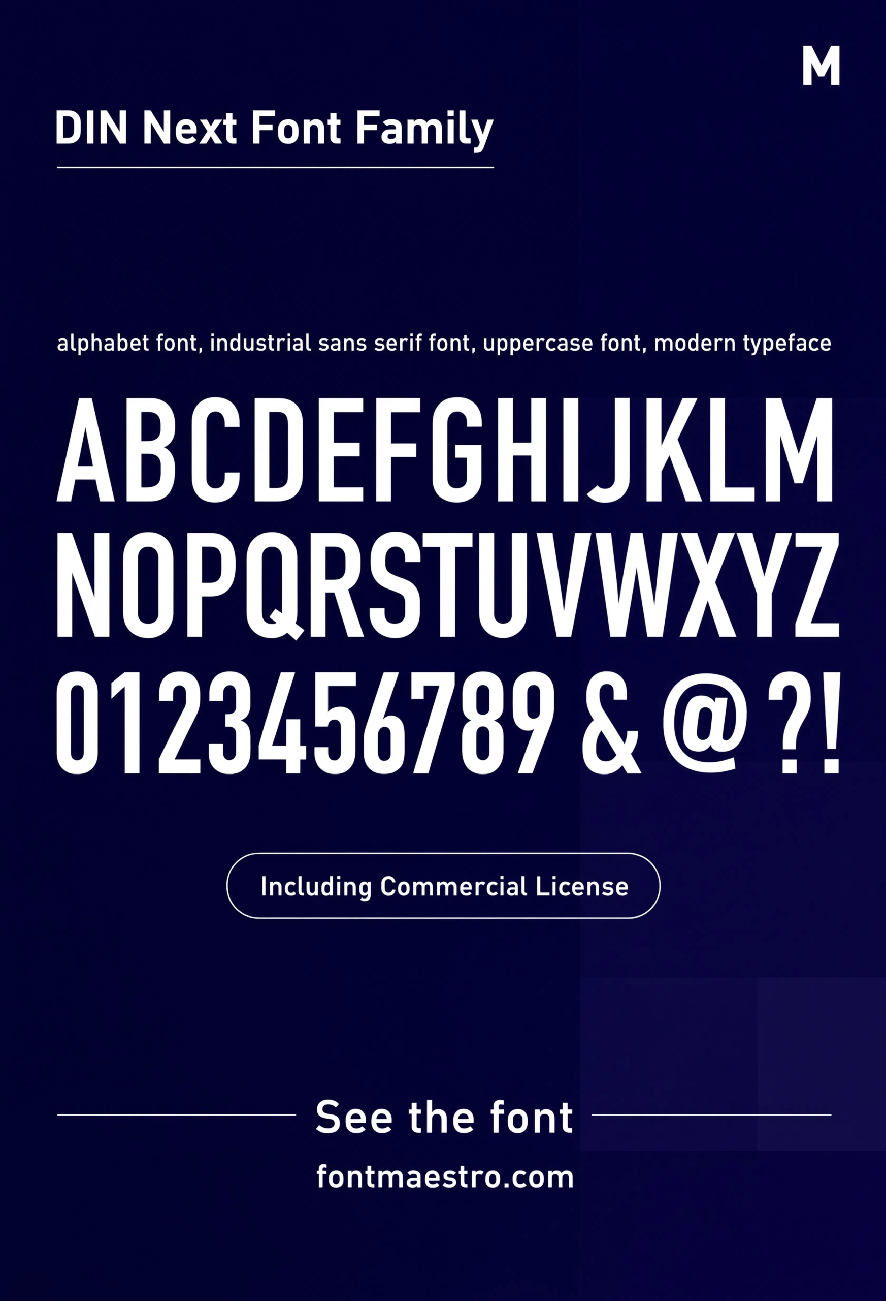
Commercial License
Alphabet Specimen — Full Character Set
Even spacing, no ambiguous letterforms, consistent stroke width across the whole set — the traits a signage-grade font needs before it can work as a logo font.
Unlimited creative assets. Access to AI tools.
Commercial licence included.
Get downloads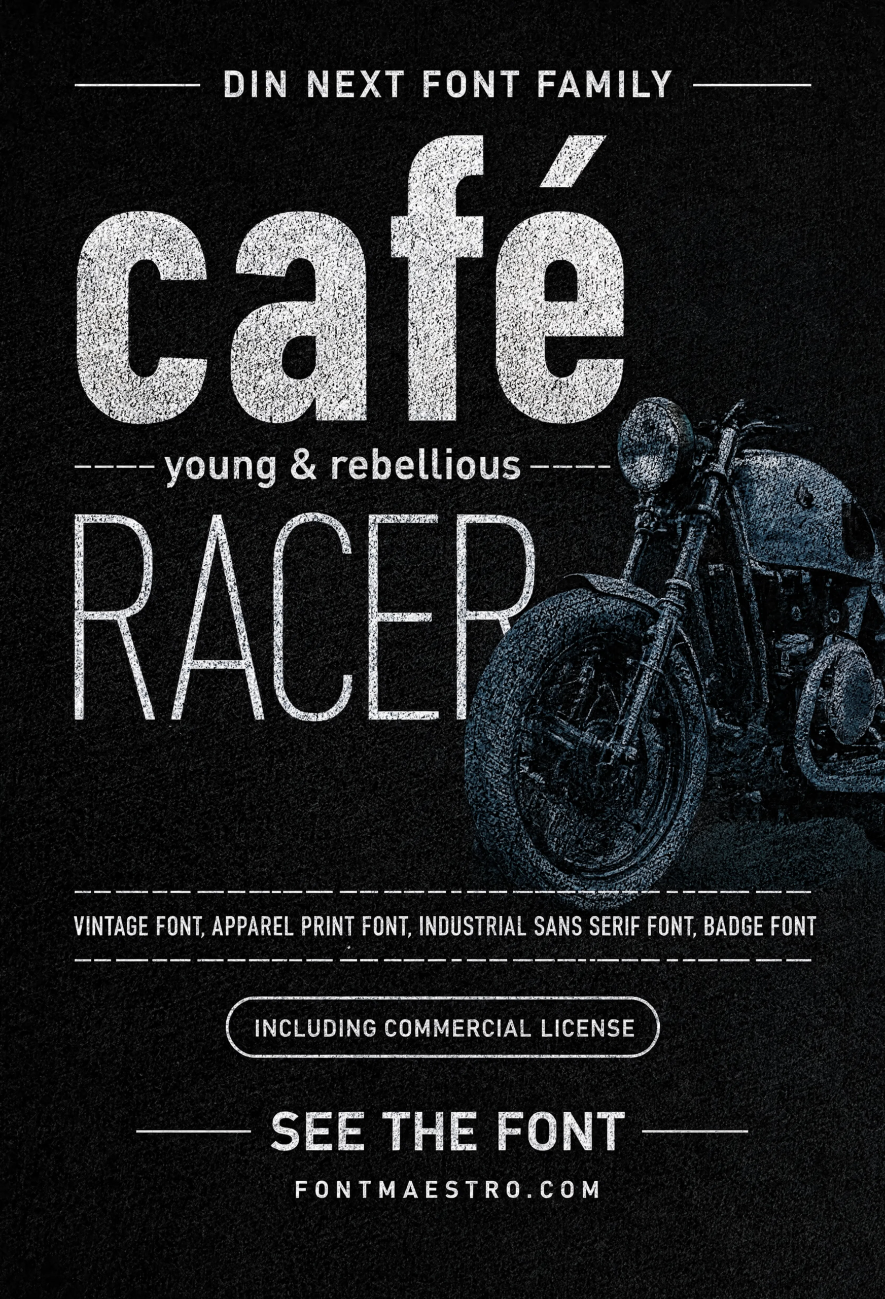
Commercial License
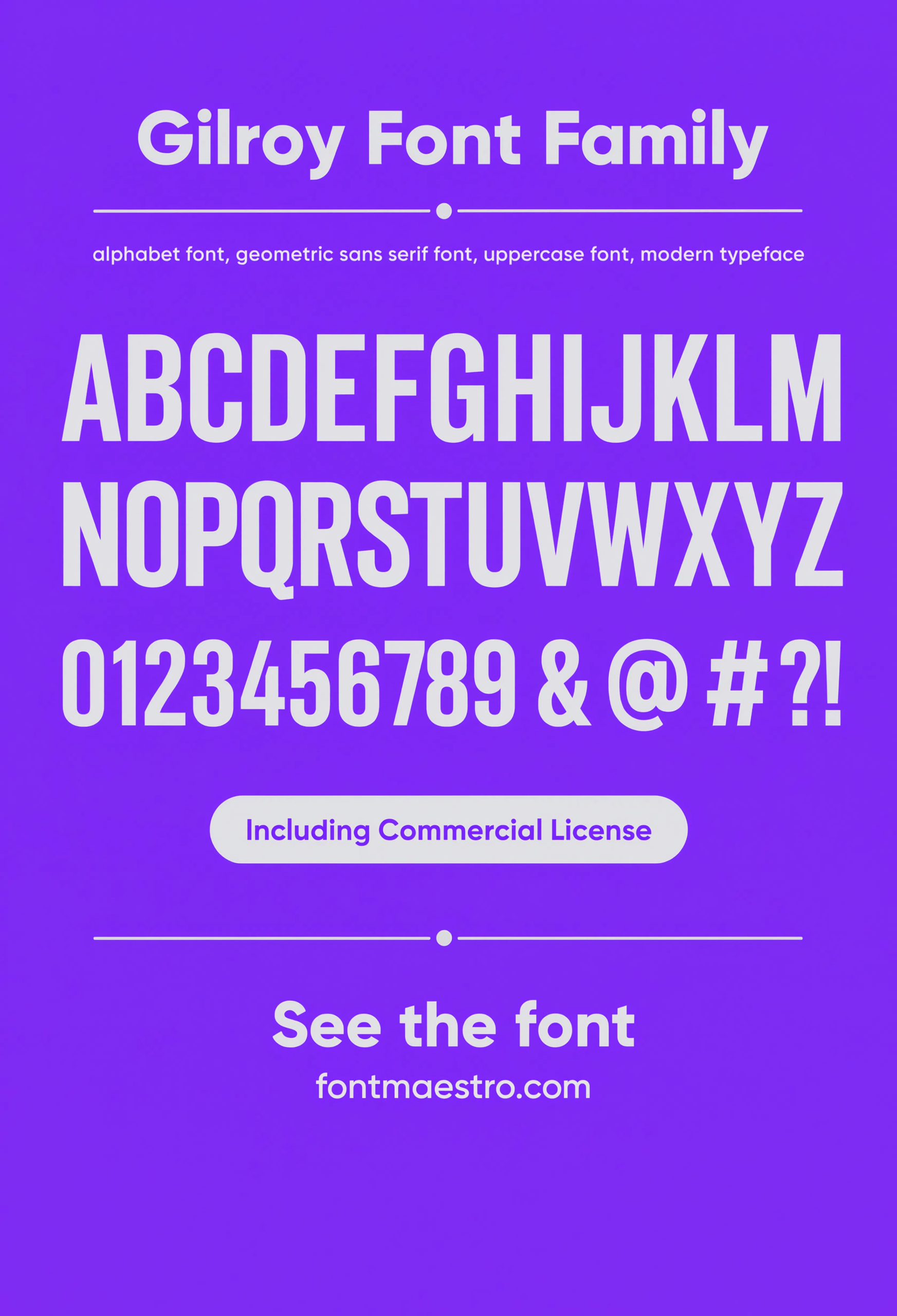
Cafe Racer Print
A retail/apparel print application — a fast way to judge how the condensed weight holds up on a small printed surface.
If you want to explore more options in this direction, our guide to Font Logo Ideas That is worth a look, and you may also enjoy Creative Font Logo Ideas or Elegant Font Logo Ideas for a different take on the same style.
Unlimited creative assets. Access to AI tools.
Commercial licence included.
Get downloads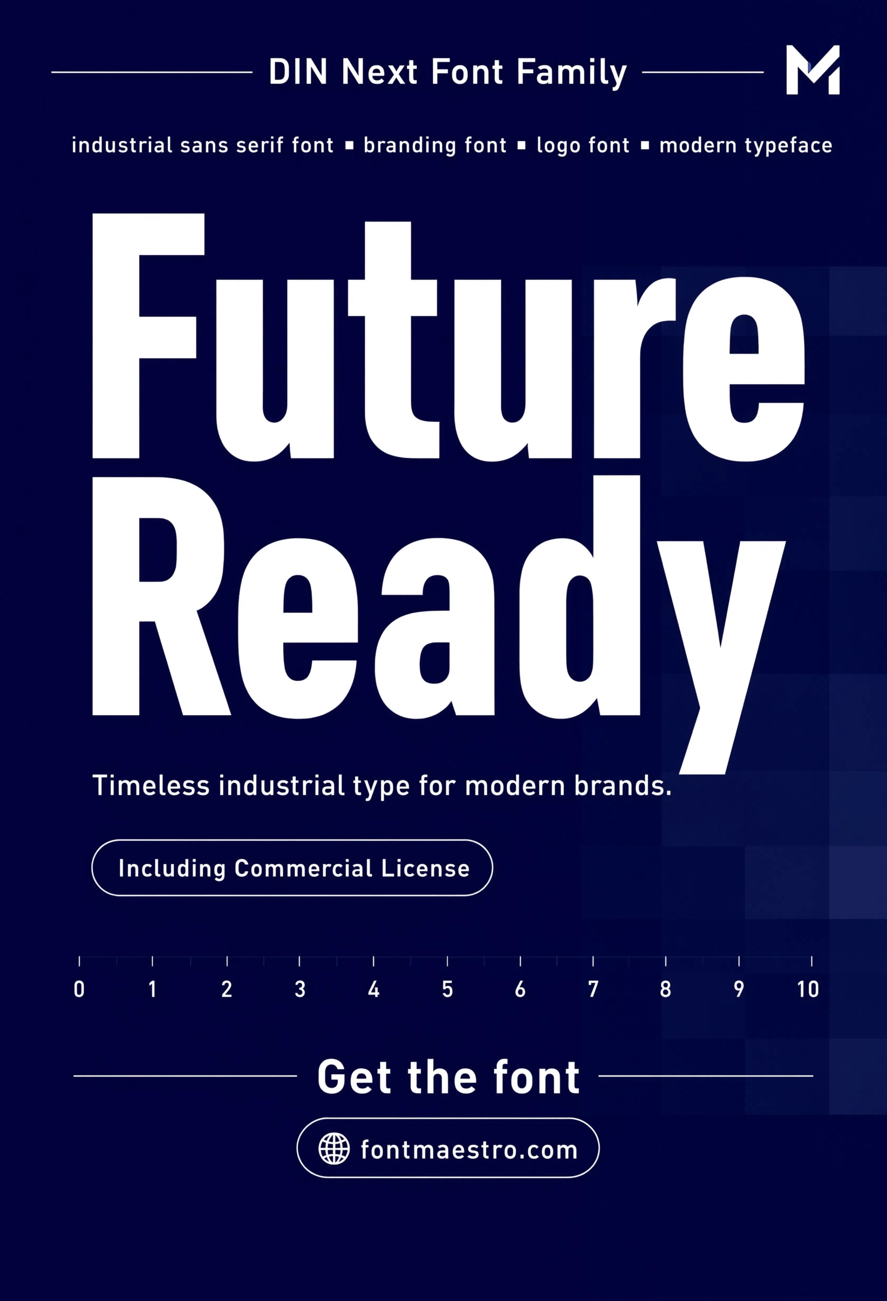
Commercial License
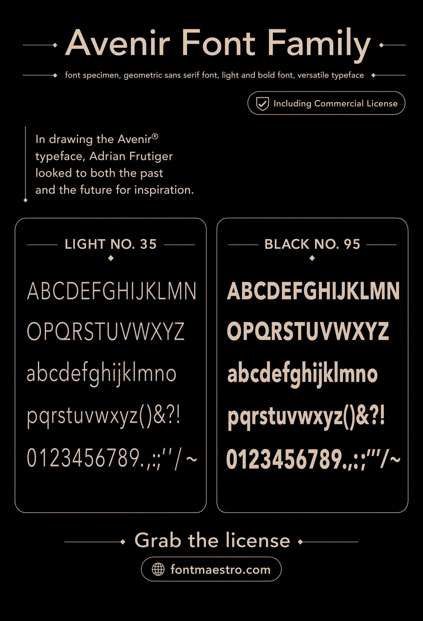
Future Ready Concept
A tech/startup styled composition — shows the font working in a context that leans modern rather than industrial.
Unlimited creative assets. Access to AI tools.
Commercial licence included.
Get downloads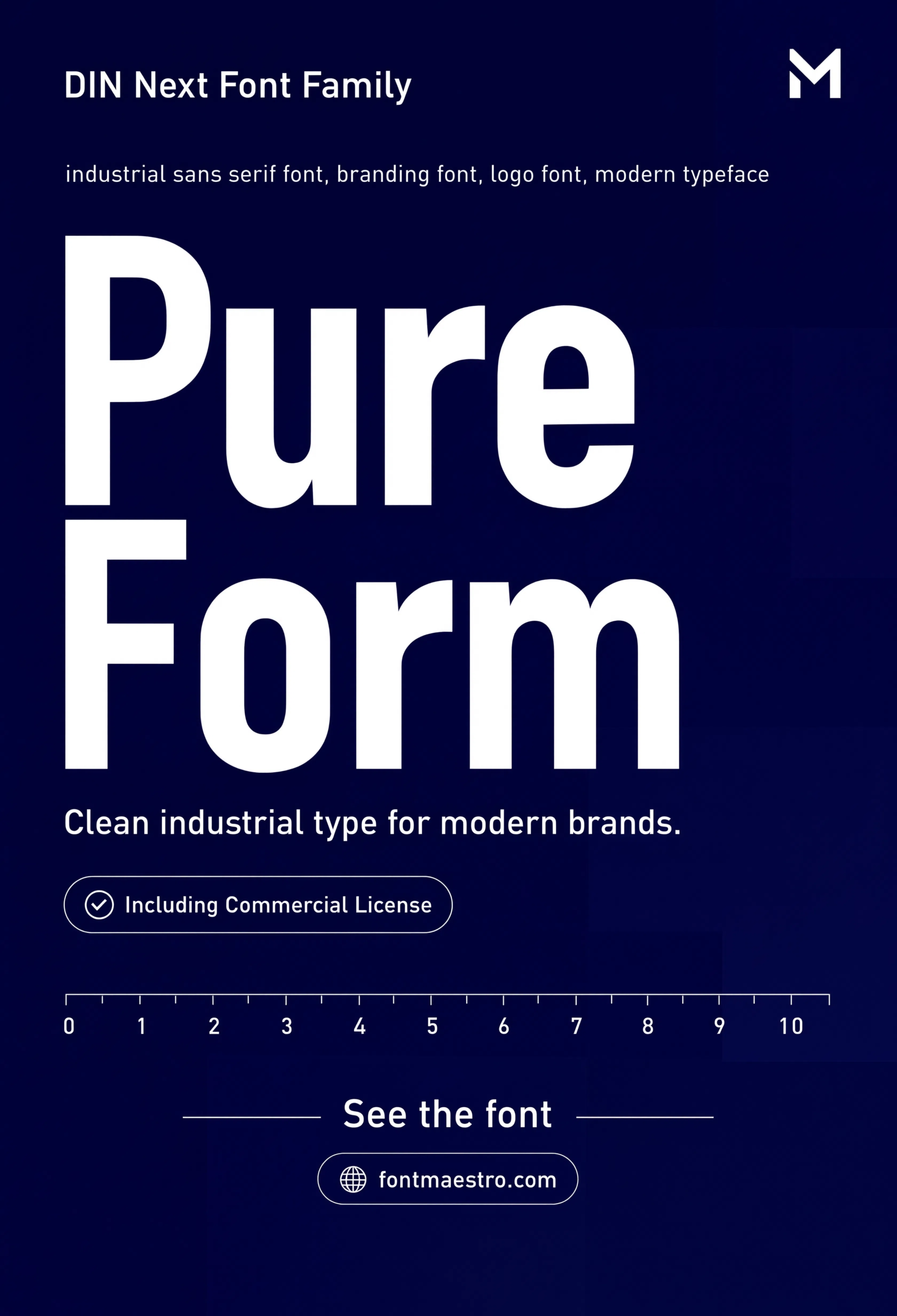
Commercial License
Pure Form
Stripped-down geometric setting with no background noise — the clearest way to judge the raw letterform quality on its own.
Wayfinding and signage systems push a font harder than almost any other application — multiple sizes, distances, and lighting conditions in one system. The wayfinding preview below is a good stress test if your business relies on physical signage.
Looking for more direction on business branding fonts? Our font branding guide covers building a full type system beyond the logo mark, and our fonts for signs picks dig deeper into signage-specific legibility.
Frequently Asked Questions
What are the best fonts for business logos?
Grotesque and geometric sans-serifs engineered for legibility at extreme scale, like DIN Next, tend to outperform decorative or script fonts for business logos because they hold up from favicon size to storefront signage.
Should a business logo font be bold or regular weight?
It depends on the business type. Retail and signage-heavy brands usually need Bold or Black for visibility at distance, while professional services do better with Regular or Medium to feel steady rather than loud.
Why does DIN Next work well for business logos?
It was originally engineered for road signage, meaning it was tested for legibility under motion, distance, and low-light conditions — the same practical demands a business logo faces daily.
Does a business logo font need multilingual glyph support?
Yes, if there’s any chance the business expands into a market using a different alphabet. Checking Greek or Cyrillic coverage before launch avoids a costly rebrand later.
How do I test if a font works for my business logo?
Set your business name at favicon size, business-card size, and signage width. If legibility breaks at any of the three, that’s the size to fix before finalizing the logo.
Key Takeaways
- Want a signage-tested option? Explore the DIN Next collection on MyFonts for a full weight range built for legibility at extreme scale.
- The best fonts for business logos prioritize legibility under real-world conditions over decorative personality.
- Test any logo font candidate at favicon size, business-card size, and signage width before finalizing.
- Check multilingual glyph coverage (Greek, Cyrillic) before launch if international expansion is even a possibility.
Related Reads
Unlimited creative assets. Access to AI tools.
Commercial licence included.
Get downloads