An elegant font logo doesn’t need a single swirl. Gilroy proves the opposite case: a strict geometric sans, zero calligraphic flourish, and it still reads as refined the moment you tighten the tracking and drop the weight to Light or Thin.
Most founders assume “elegant” means script. It doesn’t. It means restraint — even spacing, a consistent x-height, and a font that doesn’t fight the negative space around your mark.
Quick answer: If your logo needs to feel premium on a screen first (app icon, SaaS dashboard, pitch deck), pick a geometric sans like Gilroy in a Light or Regular weight with tight letter-spacing. If it needs to feel premium in print first (packaging, business cards, stationery), a geometric sans still works, but pair it with generous whitespace rather than a decorative script — scripts lose legibility fast at small sizes.
What Makes an Elegant Font Logo Read as Refined, Not Just Decorative?
Three things, in this order: consistent stroke weight, even spacing between letters, and restraint in how many styles you mix. A logo that pairs Bold and Thin in the same wordmark usually reads as busy, not elegant.
Gilroy’s alphabet was built around a single geometric skeleton — every letter shares the same circular logic, which is why the specimen below holds up at both 12px and 120px without redrawing.
Business cards are where a lot of “elegant” logo fonts fall apart — kerning that looked fine on a screen suddenly feels cramped on a 3.5-inch card. Gilroy’s business card mockup below shows the same wordmark holding its spacing at print scale, which is the real test.
Each file below is a desktop and web font license bundle you download straight from MyFonts — install it locally for your logo mockups, or license the web-font version for your site header. It comes from the Gilroy collection on MyFonts, so the license terms are commercial-ready out of the box, no separate add-on needed.
Which Elegant Font Fits Your Logo Type?
Not every “elegant” font suits every logo format. Match the use case first, then the weight.
- Wordmark-only logo, no icon → use a Light or Regular weight with slightly increased tracking. The letterforms carry the whole brand, so they need room to breathe.
- Icon + wordmark lockup → use Medium or SemiBold. A thin weight next to a solid icon shape looks unbalanced.
- Print-first brand (stationery, packaging) → lean on whitespace, not weight. Elegant in print usually means more margin, not a lighter font.
- Multilingual brand → check Cyrillic or extended glyph coverage before you finalize anything. A gorgeous Latin wordmark that breaks in a second alphabet is a rebrand waiting to happen.
Gilroy’s Cyrillic support and editorial headline setting below cover two of these cases directly.
Where Do Most Elegant Logo Fonts Go Wrong?
Three repeat mistakes, in order of how often I see them:
- Too much tracking on a small mark. Elegant spacing on a 200px poster becomes unreadable at favicon size. The fix: test your wordmark at 32px before you finalize it.
- Mixing weights without a reason. Thin headline, Bold tagline, Regular body — three cuts in one lockup rarely reads as intentional. The fix: pick two weights maximum for the whole brand system.
- Ignoring tabular figures. If your brand ever prints a price list, invoice, or pricing table, check the font has proper tabular numerals — Gilroy does, and it’s the kind of detail nobody notices until it’s missing.
Explore the Gilroy Collection →
How Do You Test an Elegant Font Before Committing to a Logo?
Set your wordmark in three contexts before you sign off: a favicon-size square, a black-and-white business card, and a dark background. A font that only looks elegant in color, at large size, on white, isn’t tested yet — it’s just untested.
The thin/italic pairing and web hero setting below are useful for exactly this — they show the same letterforms under different pressure.
Unlimited creative assets. Access to AI tools.
Commercial licence included.
Get downloads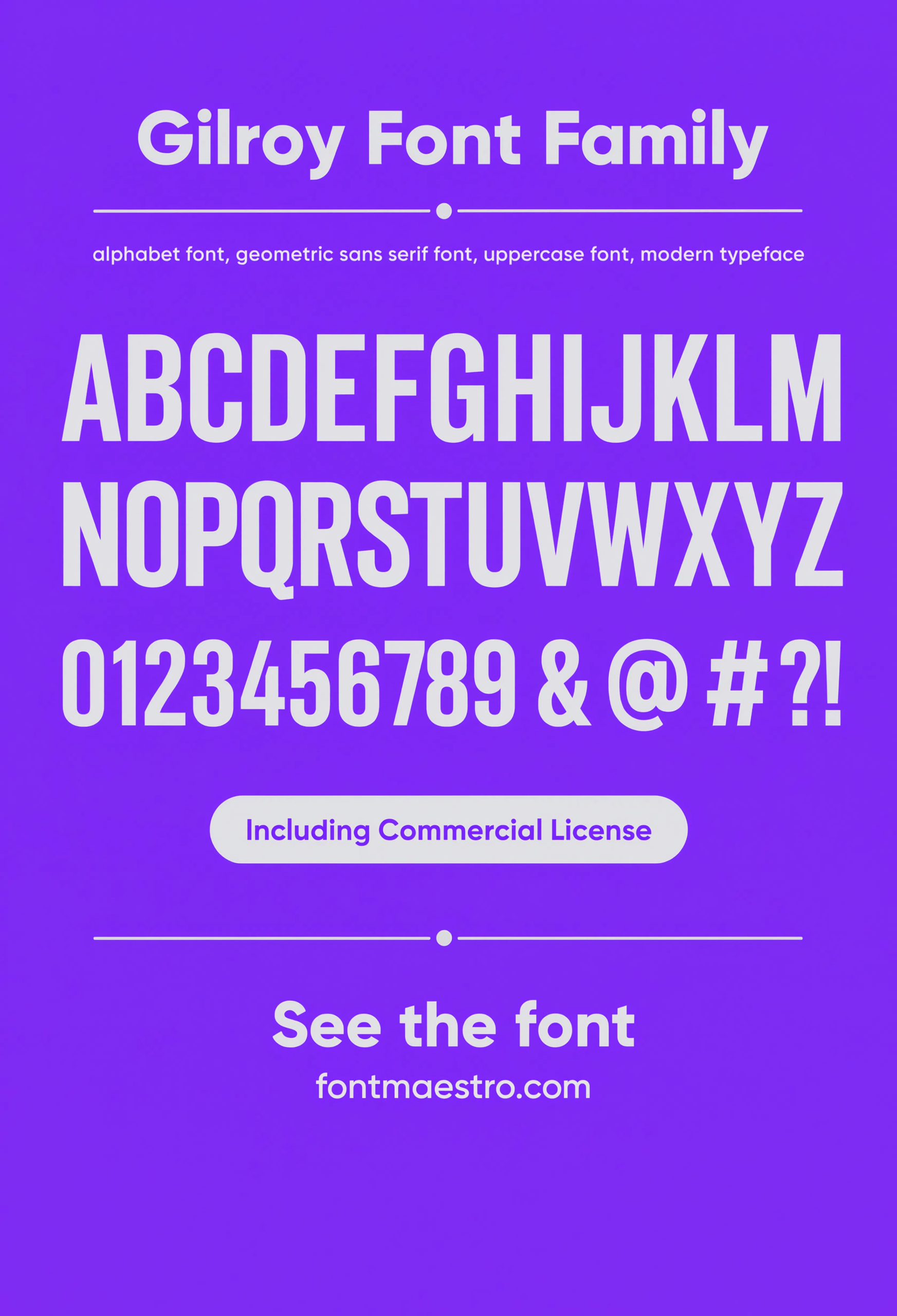
Commercial License
Alphabet Specimen — Full Character Set
Every uppercase and lowercase glyph laid out in one sheet, so you can check how the “G” and “R” hold their circular geometry before you commit a wordmark.
Unlimited creative assets. Access to AI tools.
Commercial licence included.
Get downloads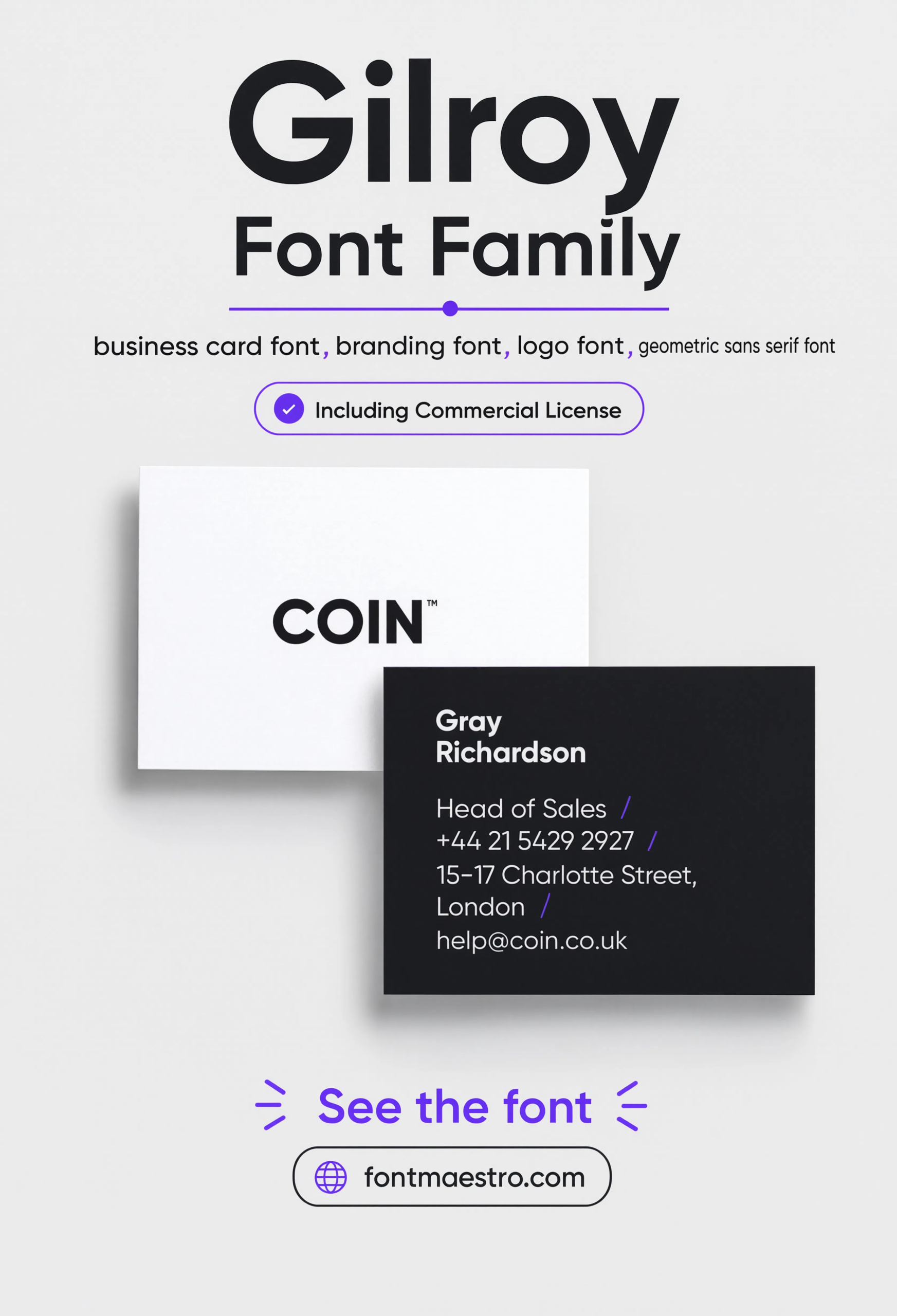
Commercial License
Business Card Layout
The wordmark set on a real business card layout — the smallest, closest-reading test most brand fonts ever face.
Unlimited creative assets. Access to AI tools.
Commercial licence included.
Get downloads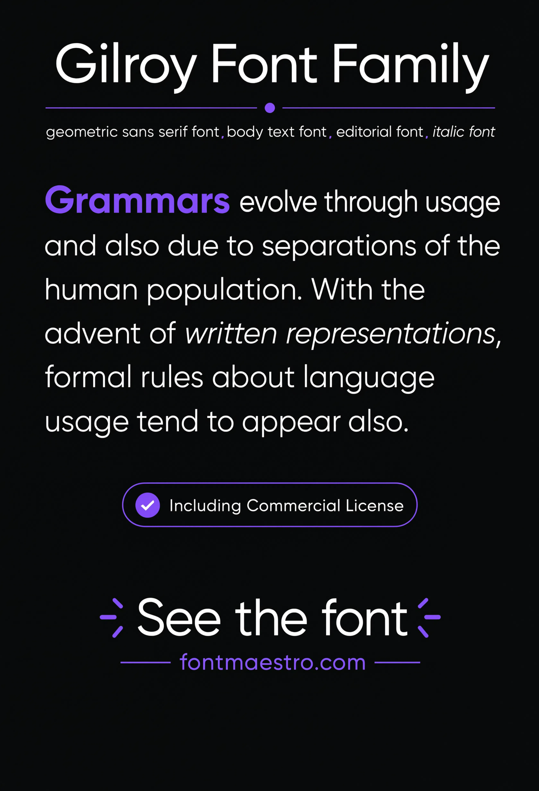
Commercial License
Paragraph Specimen
Body-copy setting at reading size — check this before you use the same family for your website’s paragraph text, not just the logo.
Unlimited creative assets. Access to AI tools.
Commercial licence included.
Get downloads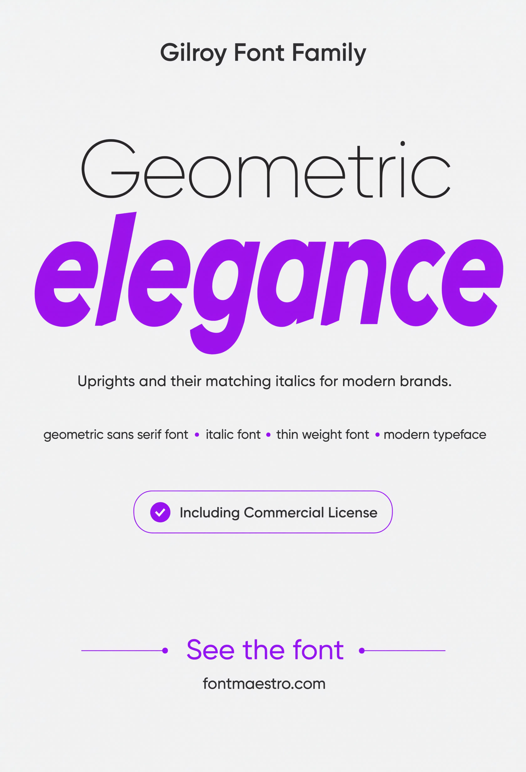
Commercial License
Thin / Italic Pairing
The Thin weight next to its italic cut — useful for checking how the lightest end of the family holds up under different pressure.
Looking for more logo direction? Our font branding guide covers how to pick a full brand type system beyond the wordmark, and our font for poster picks show how the same display-weight logic applies to large-format print.
Frequently Asked Questions
What is the best font style for an elegant logo?
A geometric sans in a Light or Regular weight, with slightly increased letter-spacing, tends to read as elegant without relying on decorative script. Restraint in weight and spacing matters more than the typeface style itself.
Should I use a script font for an elegant logo?
Only if your brand is print-first and rarely shrinks below business-card size. Script fonts lose legibility fast at favicon or app-icon scale, which is where most modern logos actually live day to day.
Does Gilroy work for both digital and print logos?
Yes — it was designed with a consistent geometric skeleton that holds up at both screen sizes and print scale, including tabular figures for pricing tables and invoices.
How many font weights should an elegant logo use?
Two at most — one for the primary wordmark, one for a supporting tagline or UI text. Mixing three or more weights in a single lockup usually reads as inconsistent rather than intentional.
Is Gilroy suitable for multilingual brands?
Yes — it includes Cyrillic glyph support, which matters if your brand expands into markets that use a non-Latin alphabet.
Key Takeaways
- Want a ready-made elegant option? Explore the Gilroy collection on MyFonts for a full weight range built around one consistent geometric skeleton.
- Elegant font logos succeed on restraint — even spacing and consistent stroke weight — not decorative flourish.
- Test any candidate font at favicon size and on a business card before finalizing a logo, not just at poster scale.
- Limit a logo system to two font weights maximum to avoid an inconsistent, busy lockup.
Related Reads
Unlimited creative assets. Access to AI tools.
Commercial licence included.
Get downloads