Most “timeless” branding claims fall apart the moment a logo sits next to real content — body copy, UI labels, a price tag. Avenir Next doesn’t. It was built in 2004 as Adrian Frutiger’s own revision of his 1988 original, specifically to hold up across every weight a brand actually uses, not just a headline mark.
That’s the real test for a sans serif font meant to anchor a brand system: does it still look considered at ten different sizes, not just the one on the pitch deck.
Quick answer: Avenir Next is a geometric sans serif font built for long-term branding — even stroke weight, a wide range from Ultra Light to Heavy, true italics, and full numeral sets that hold up in headlines, body copy, and UI alike. It’s a revision of the original Avenir, refined for sharper screen rendering and a more complete family.
Why Does Avenir Next Read as “Timeless” Instead of Trendy?
Geometric construction with almost no personality quirks. Circles stay circles, stroke width barely varies stroke-to-stroke, and there’s no stylistic flourish that dates the letterforms to a particular decade. That restraint is exactly what keeps a sans serif font from looking dated five years after launch — nothing in the letterforms was chosen to be fashionable in the first place.
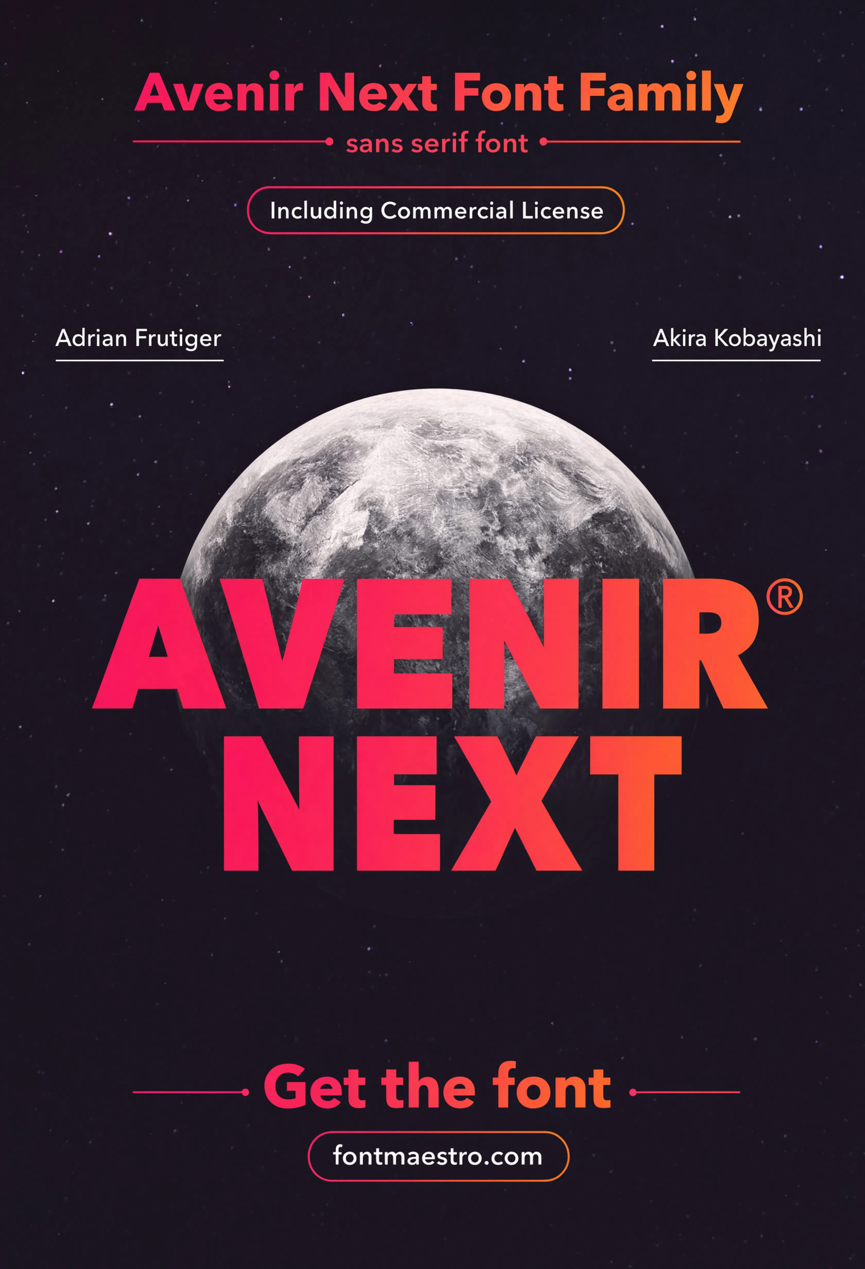
The hero specimen below shows that geometric discipline at a glance — every letter built from the same handful of shapes, repeated with almost mechanical consistency.
What Does “Built for Branding” Actually Mean in a Type Family?
- A full weight range — Avenir Next runs from Ultra Light through Heavy, so one family covers a logo mark, a headline, and body copy without switching typefaces.
- True italics, not slanted romans — the italic cut was drawn separately, keeping letterforms legible instead of just tilted.
- Condensed styles included — useful for tight headline spaces or signage where a regular-width sans won’t fit.
- Consistent numerals — pricing, dates, and data all typeset in the same voice as the logo, which matters more than most brand guides admit.
Each file below is a desktop and web-font license bundle available directly through MyFonts — install it locally for logo and brand development, or license the web-font cut for on-site typography. It’s part of the Avenir Next collection, so commercial branding rights are included in the standard license.
Unlimited creative assets. Access to AI tools.
Commercial licence included.
Get downloadsHero Specimen
The full family shown at display scale — the fastest way to judge whether the geometric structure holds the personality a brand needs without adding decoration.
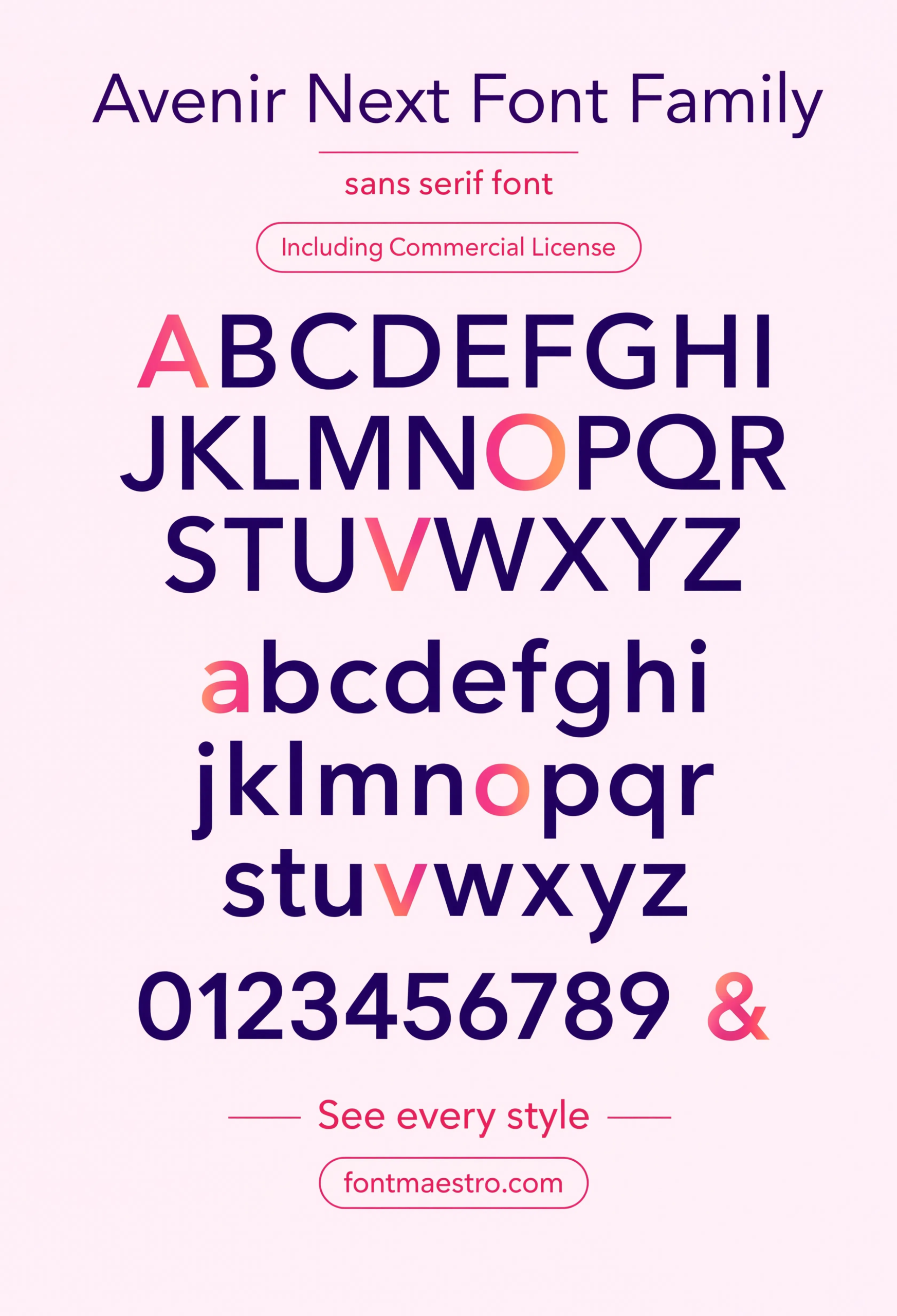
Alphabet Specimen
Every letterform laid out in sequence — check here for the repeated circular and straight construction that keeps the family reading as one consistent voice at any size.
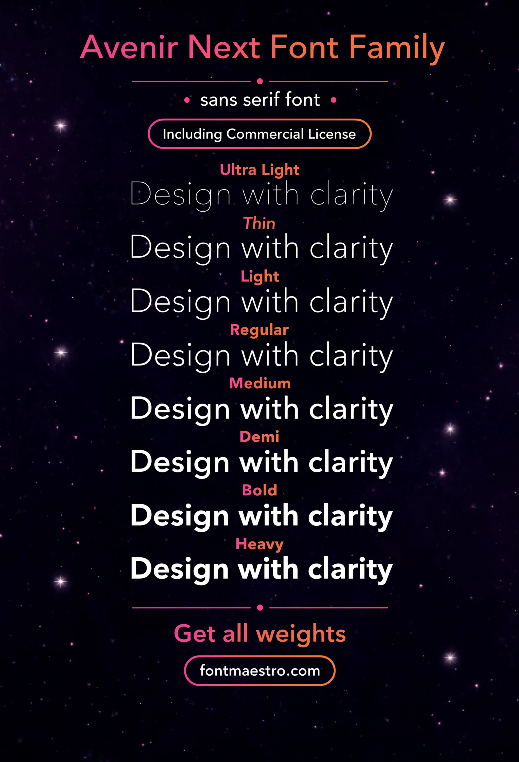
Weight Ladder
Ultra Light through Heavy in one view — the reference sheet for planning which weight carries the logo mark and which one carries supporting text.
Browse Sans Serif Font Templates →
How Does Avenir Next Actually Hold Up in a Real Brand System?
Branding mockups are where most “timeless” claims collapse. A wordmark that looks confident in isolation often falls apart once it’s sitting next to packaging text or a business card address line. Avenir Next doesn’t drop character — the same even stroke weight that makes the logo mark work also carries the fine print.
If you want to explore more options in this direction, our guide to Display Fonts for Industrial is worth a look, and you may also enjoy Trade Gothic or Aptos Font for a different take on the same style.
The condensed cut solves a separate problem: tight headline space. Signage, app icons, and narrow packaging panels rarely fit a regular-width sans comfortably. Having a matched condensed style inside the same family means the brand doesn’t have to reach for an unrelated typeface every time space runs short.
Unlimited creative assets. Access to AI tools.
Commercial licence included.
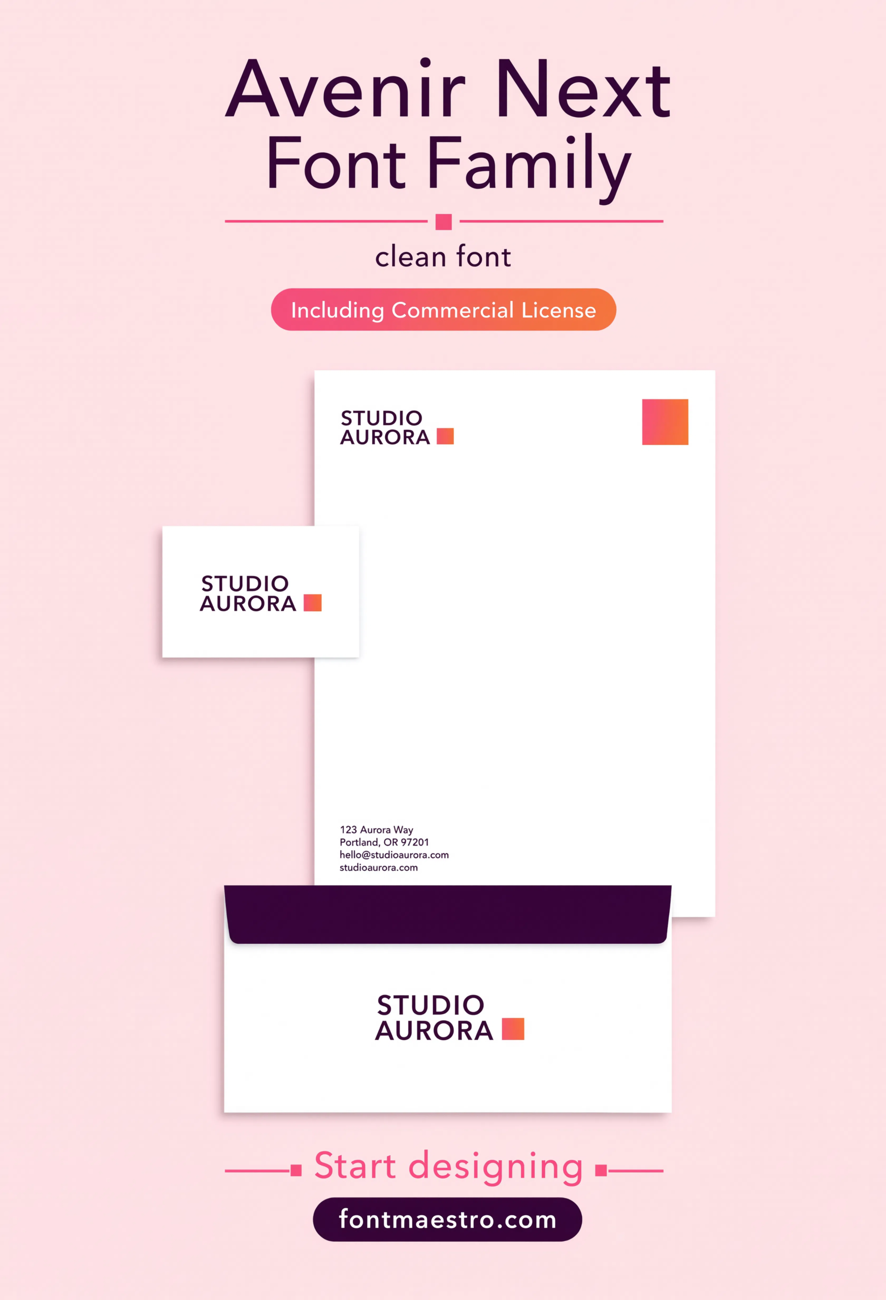
Get downloadsBranding Mockup
The family applied to a real brand context — a useful check for how the geometric structure reads once it’s surrounded by packaging or stationery details, not just isolated letterforms.
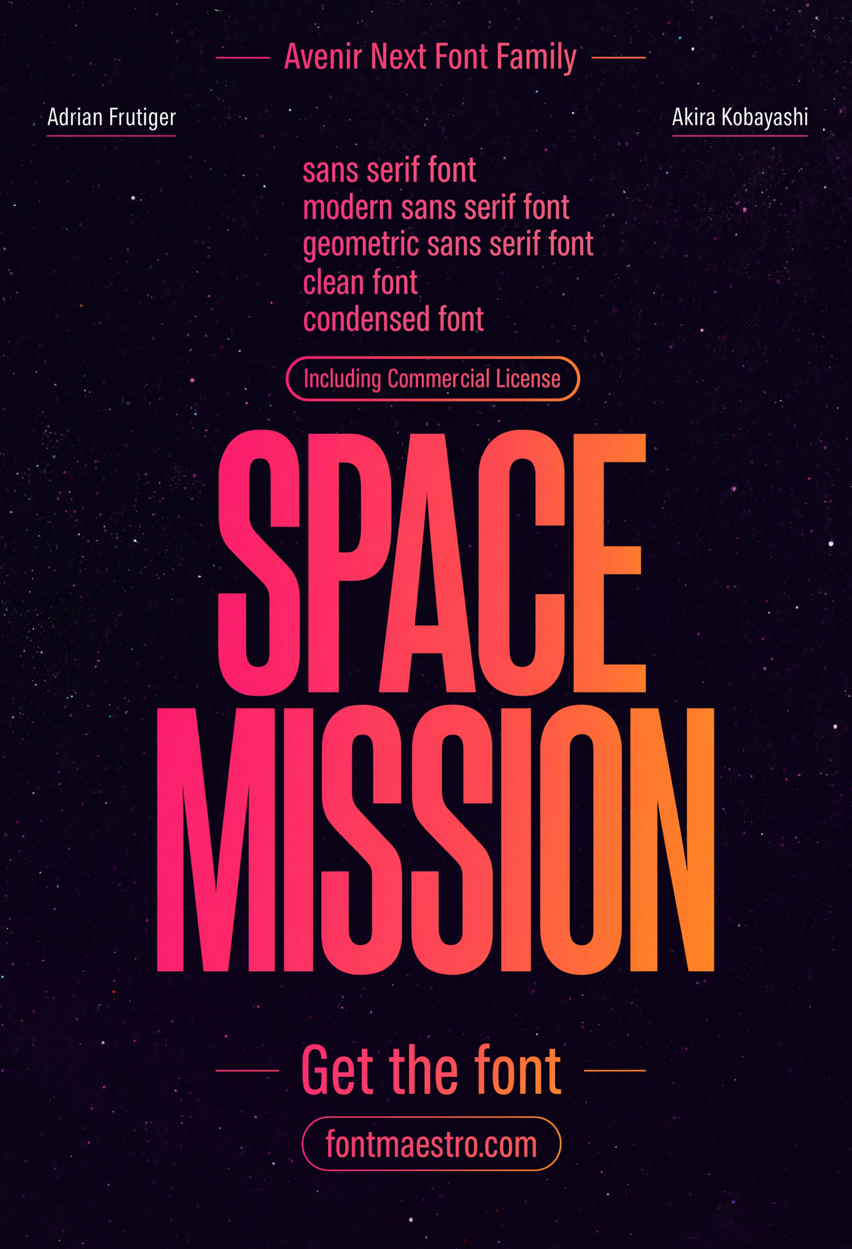
Condensed Headline
The condensed cut at large scale — matched proportionally to the regular width, so a tight headline never has to borrow from a different typeface family.
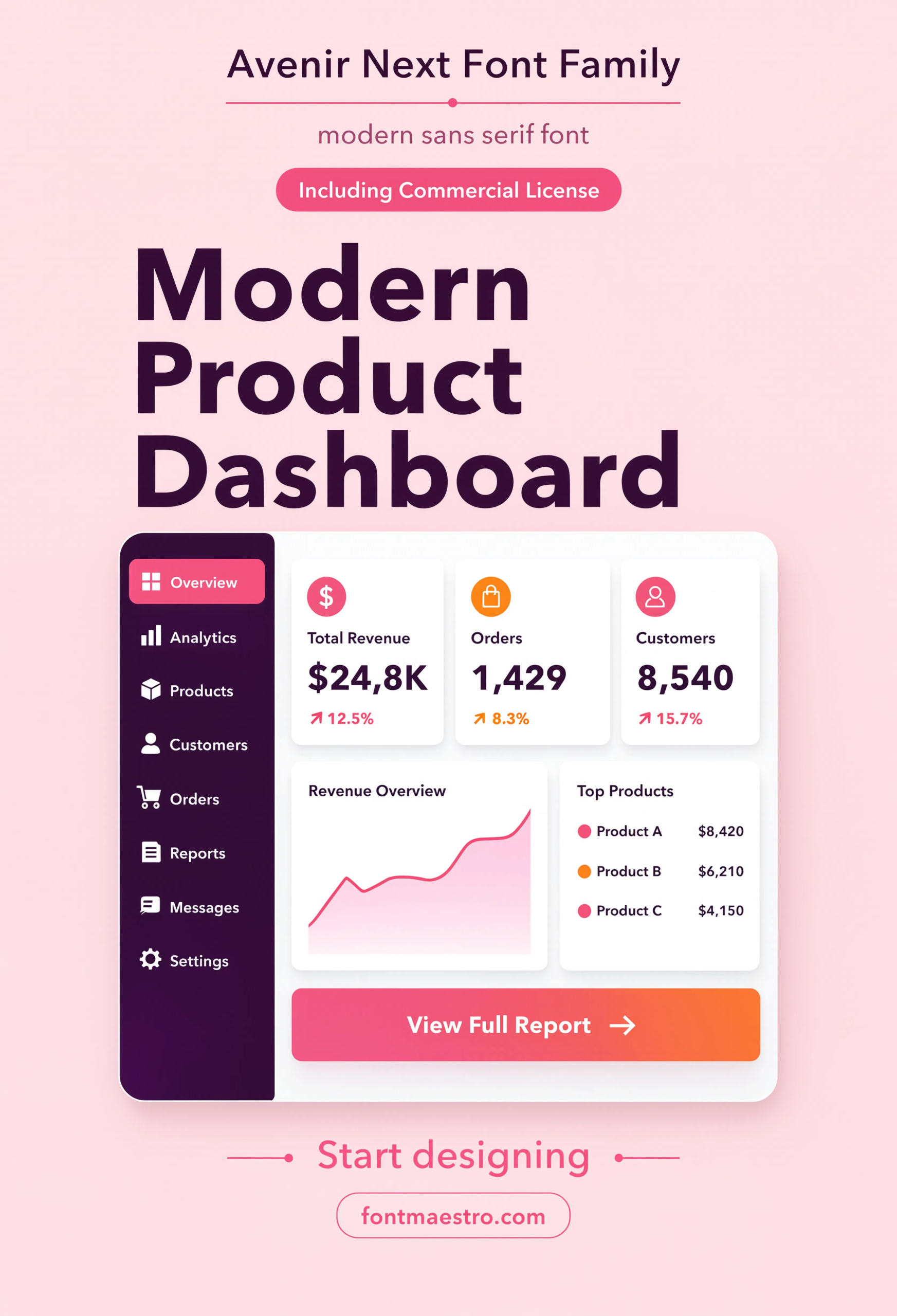
UI Screen
Set inside an app interface at small sizes — the real test for a sans serif font, since UI labels get far less forgiving scrutiny than a hero headline ever does.
Looking for more direction? Our creative font logo guide covers building a brand system around weight and range instead of decoration, and our classic font styles picks break down other type families built to age well.
Frequently Asked Questions
What’s the difference between Avenir and Avenir Next?
Avenir Next is Adrian Frutiger’s own 2004 revision of the original 1988 Avenir — sharper screen rendering, a wider weight range, and a more complete set of italics and condensed styles.
Is Avenir Next a good sans serif font for a logo?
Yes, if the brand needs range rather than a single unusual mark — its weight ladder and true italics give a designer more system-building room than a display-only face.
Does Avenir Next include condensed styles?
Yes, the family includes matched condensed cuts, useful for tight headline space, signage, and narrow packaging panels without borrowing a different typeface.
Is Avenir Next licensed for commercial branding?
The MyFonts collection includes desktop and web-font license options with commercial branding rights under the standard license.
What makes Avenir Next different from other geometric sans serif fonts?
Consistency across the full weight range — many geometric sans faces look strong at one weight and thin out at the extremes. Avenir Next holds its proportions from Ultra Light through Heavy.
Key Takeaways
- Want a proven starting point? Explore the Avenir Next collection on MyFonts for a full weight range with true italics, condensed styles, and matching numerals.
- Avenir Next holds up across headline, body, and UI sizes — not just the isolated logo mark.
- The condensed cut and full weight ladder mean one family can carry an entire brand system.
- Check a sans serif font at both small UI scale and large signage scale before committing it to a brand.




