Jazz posters from the 1960s, subway maps, sports jerseys — Trade Gothic shows up in more mid-century American design work than almost any other grotesque, and it wasn’t even trying to be elegant. Jackson Burke designed it in 1948 as a working typeface for newspaper ads and trade printing, and that utilitarian brief is exactly why it still reads as confident rather than decorative.
No refinement for refinement’s sake. Trade Gothic looks slightly rough at close range, and that roughness is what makes it hold up at poster scale.
Quick answer: Trade Gothic is a bold grotesque font built for posters and branding because it was designed for newspaper trade work first — no decorative refinement, just even weight and honest letterforms that read clearly at large sizes and hold their character under heavy ink coverage.
Why Does a 1948 Newspaper Typeface Still Work for Posters?
Because it was never designed to be precious. Trade Gothic’s letterforms have a slight irregularity that more geometric grotesques deliberately corrected out — and that irregularity is what keeps it from looking sterile at billboard scale. It’s one of the font styles bold enough to survive heavy ink coverage on cheap paper stock, which was the entire brief in 1948.
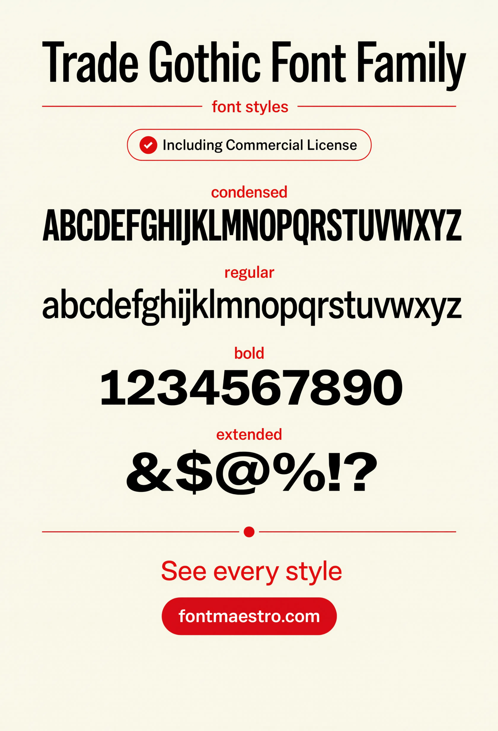
The alphabet specimen below shows that character directly — letterforms that are structurally consistent but not mechanically identical, which is a meaningfully different feeling from a font drawn purely on a grid.
What Makes Trade Gothic Different From Other Bold Grotesques?
- Slight structural irregularity — unlike Helvetica or Univers, letterforms aren’t perfectly systematized, which reads as more human at large scale.
- A genuinely bold weight, not just thickened — the bold cut was drawn as its own design, not algorithmically expanded from the regular weight.
- Condensed styles for tight headline space — a common need in poster and packaging work where copy has to fit a fixed panel.
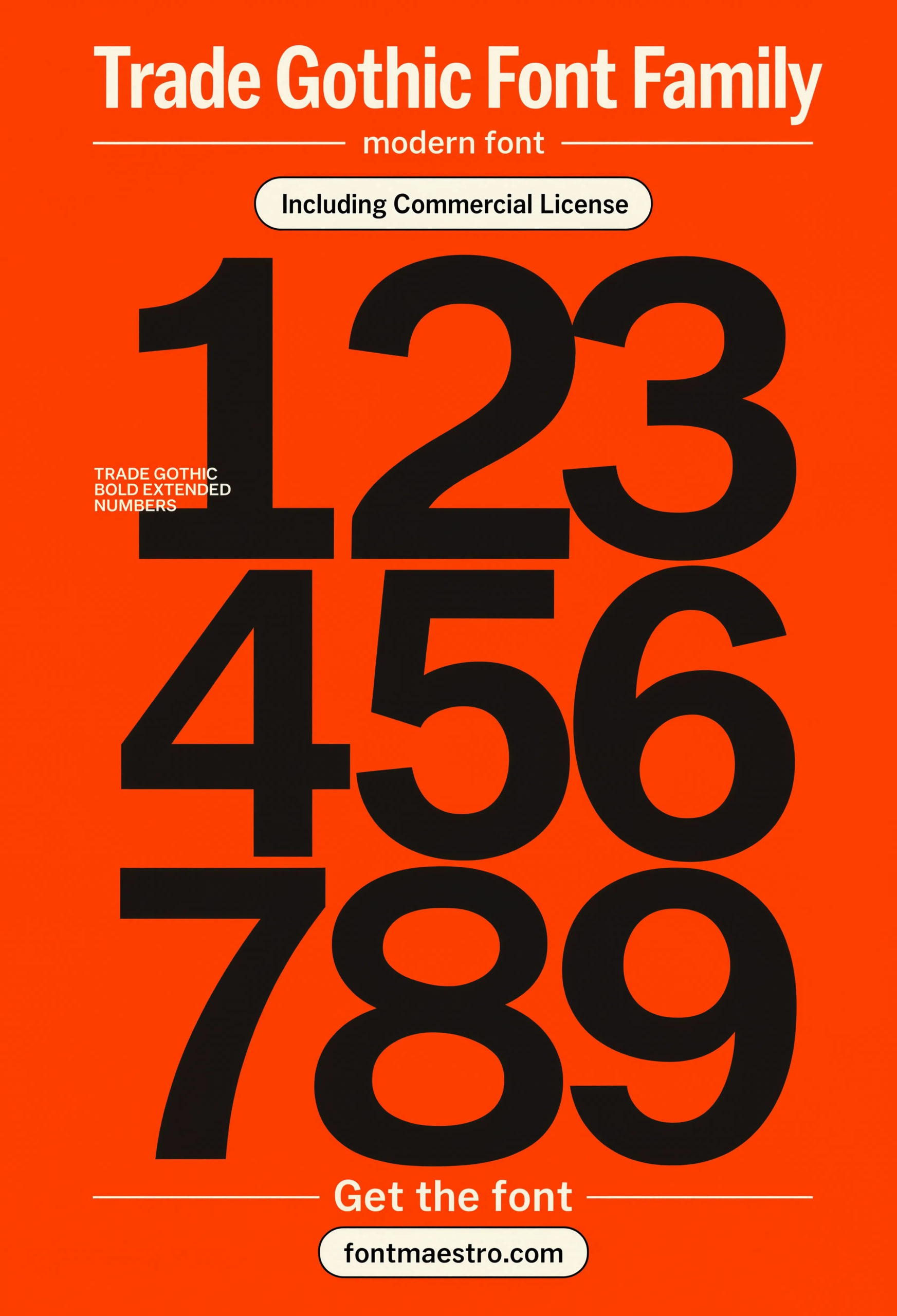
- Numerals built for print work — pricing tags, dates, and event numbers read clean even under heavy ink.
Each file below is a desktop and web-font license bundle available directly through MyFonts — install it locally for poster and merch design, or license the web-font cut for on-site headlines. It’s part of the Trade Gothic collection, so commercial branding rights are included in the standard license.
Unlimited creative assets. Access to AI tools.
Commercial licence included.
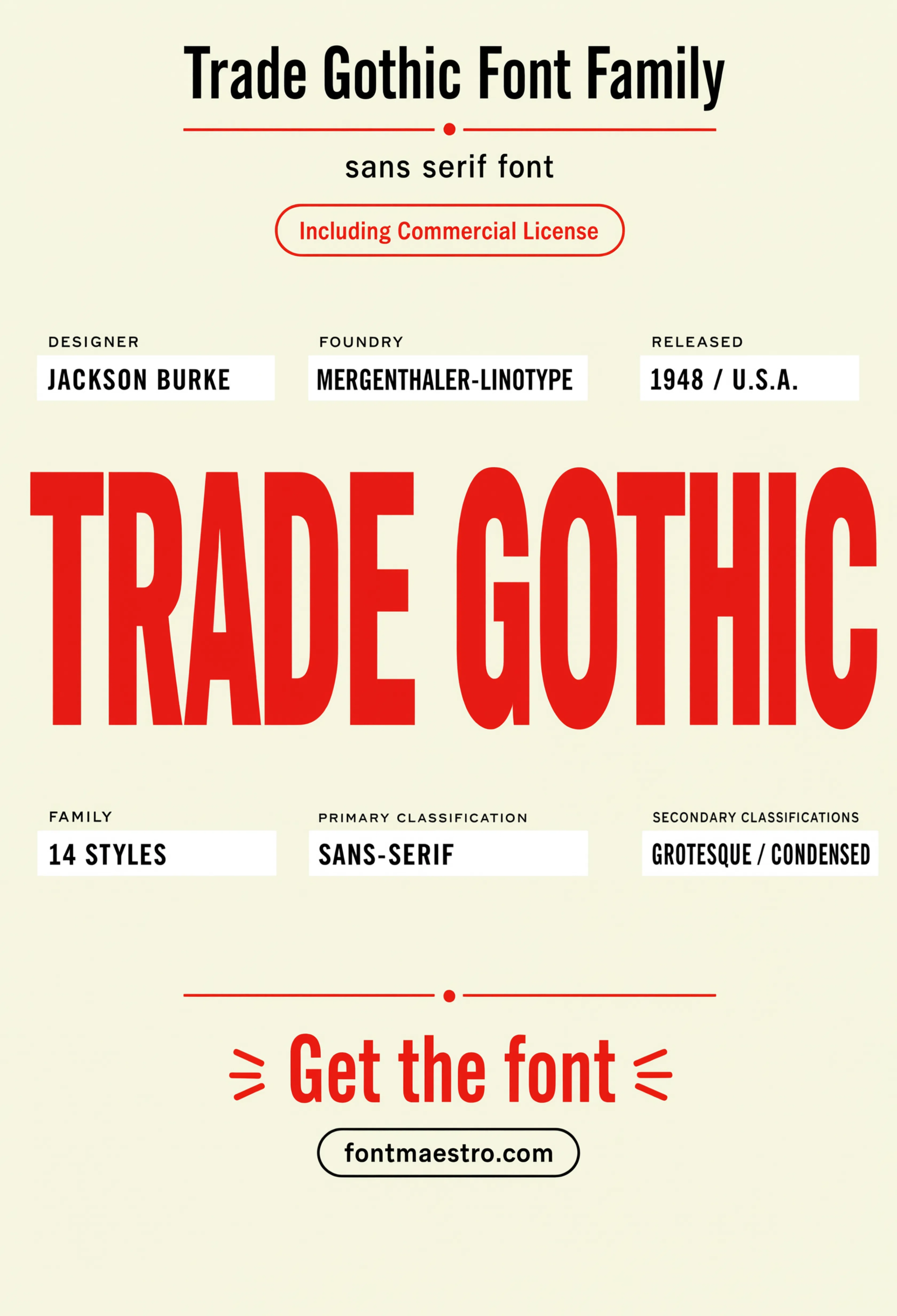
Get downloadsHero Specimen
The family at display scale — the fastest way to see the slight structural irregularity that keeps this bold grotesque from reading as sterile.
Alphabet Specimen
Every letterform laid out clean — check here for the small irregularities that separate Trade Gothic from a purely geometric grotesque.
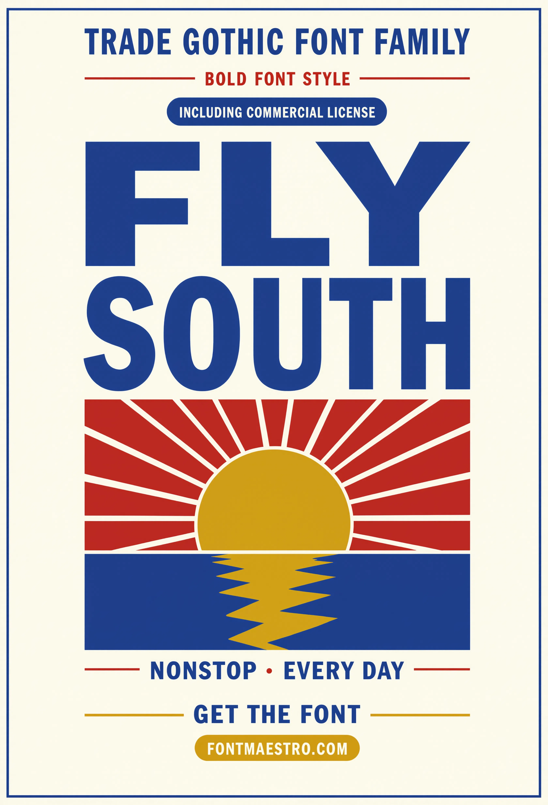
Poster Application
Set at true poster scale — the exact context Trade Gothic was built to survive, heavy ink coverage and cheap stock included.
How Far Does Trade Gothic Stretch Into Branding and Merch?
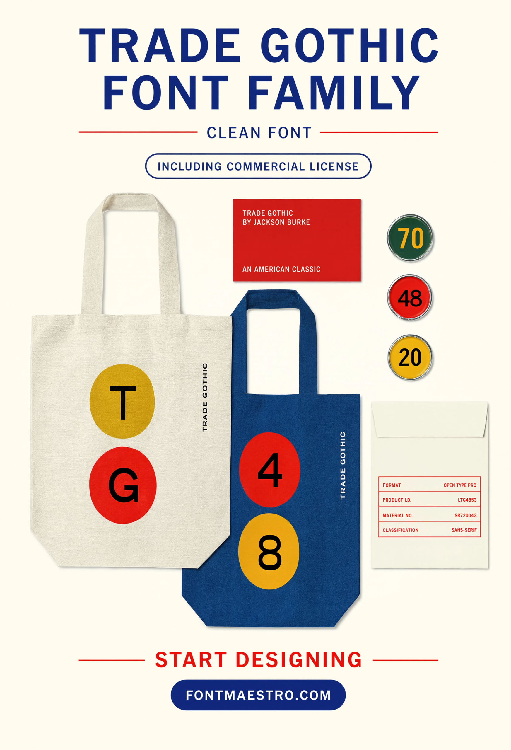
Further than a typeface built purely for newspaper trade work should. Badge and lockup design leans on the bold weight’s honest, slightly rough character — it doesn’t try to look refined, so it reads as authentic on a patch, a stamp, or a logo mark that wants to feel established rather than trendy.
If you want to explore more options in this direction, our guide to Aptos Font is worth a look, and you may also enjoy Avenir Next or Univers for a different take on the same style.
Merch is where the condensed styles earn their keep. A tight headline panel on a hang tag or a flatlay graphic rarely fits a regular-width grotesque comfortably, and Trade Gothic’s condensed cut was drawn to match proportionally, not squeezed after the fact.
Unlimited creative assets. Access to AI tools.
Commercial licence included.
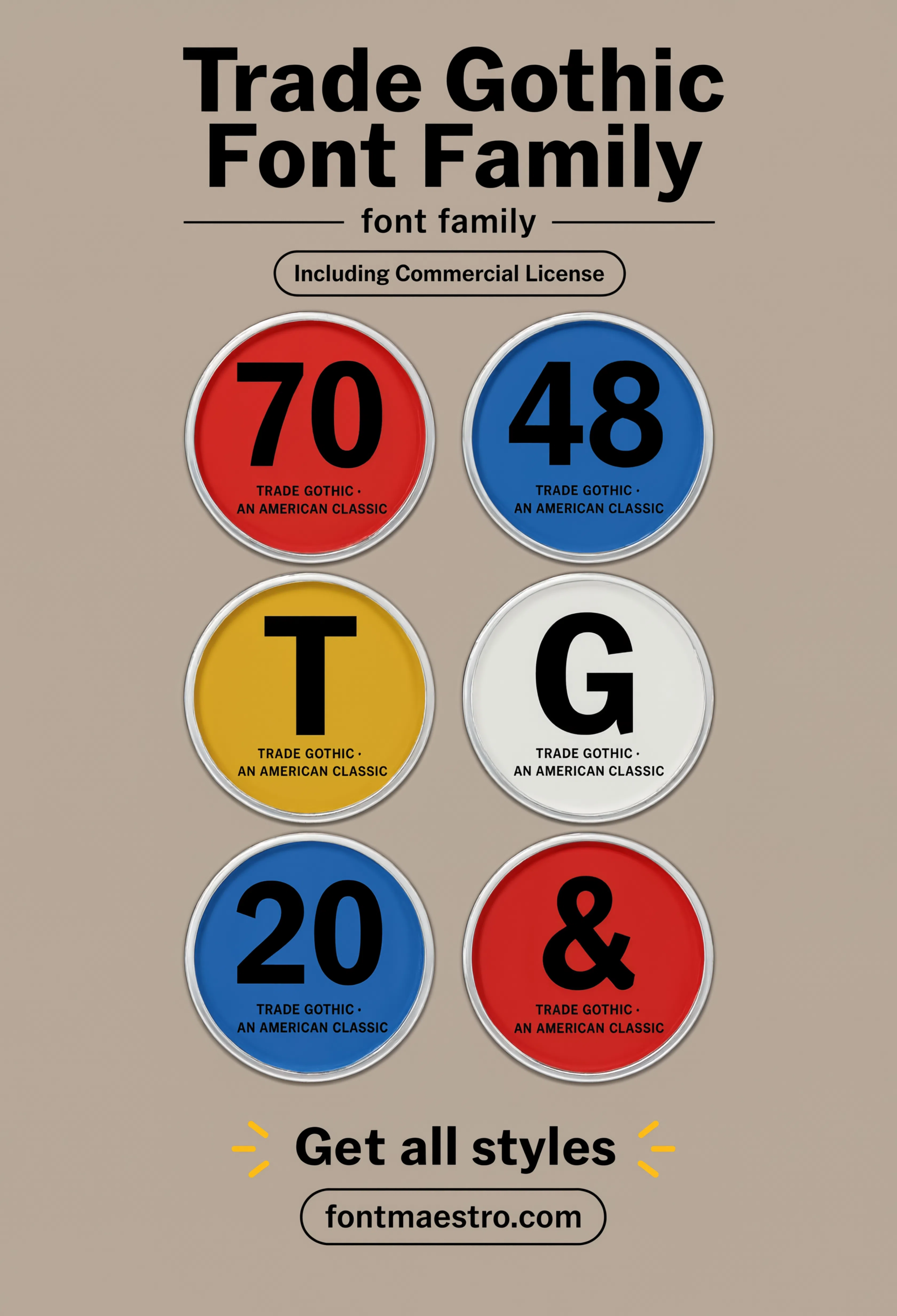
Get downloadsBadge Design
Applied to a badge and lockup context — proof the bold weight’s honest character reads as established rather than decorative.
Merch Flatlay
Set into a merch and packaging flatlay — a real check for how the bold weight holds up next to fabric texture and product photography.
Numerals Set
A dedicated numerals sheet — worth checking before committing if the project touches pricing, event dates, or scoreboard-style data.
Looking for more direction? Our Univers sans serif font guide covers a more neutral grotesque built for signage systems, and our classic font styles picks break down other type families built to age well.
Frequently Asked Questions
Is Trade Gothic considered a bold grotesque font?
Yes — its bold weight was drawn as its own design rather than algorithmically thickened, which gives it a distinct, honest character at poster and merch scale.
What was Trade Gothic originally designed for?
Jackson Burke designed it in 1948 for newspaper trade advertising, where legibility under heavy ink coverage and cheap paper stock mattered more than refinement.
How is Trade Gothic different from Helvetica?
Trade Gothic keeps slight structural irregularity in its letterforms, while Helvetica was drawn to be more systematized and geometrically consistent.
Is Trade Gothic licensed for commercial branding and merch?
The MyFonts collection includes desktop and web-font license options with commercial branding rights under the standard license.
Does Trade Gothic include condensed styles for tight layouts?
Yes — the condensed cut is drawn to match the regular width proportionally, useful for hang tags, packaging panels, and narrow headline space.
Key Takeaways
- Want a proven starting point? Explore the Trade Gothic collection on MyFonts for the bold weight, condensed styles, and print-ready numerals.
- Trade Gothic’s slight structural irregularity is what keeps it from reading as sterile at poster scale.
- It was built for newspaper trade work in 1948 — heavy ink coverage and cheap stock were the actual design brief.
- Check a bold grotesque font at both poster scale and small badge scale before committing it to a brand.




