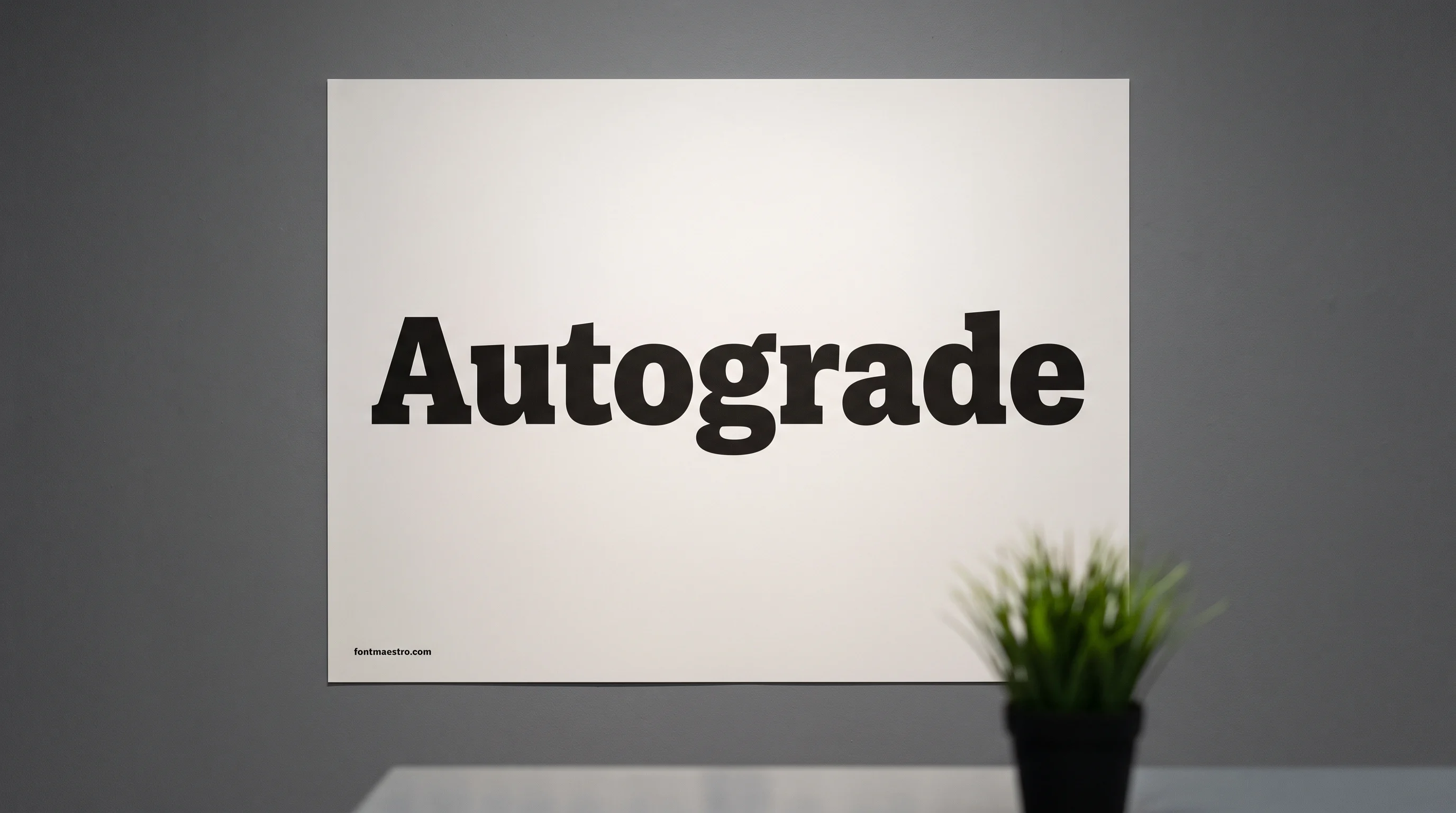
You’re building a poster, a merch drop, or a hero banner, and the brief says one thing: grab attention from across the room. So you reach for a bold font. But “bold” isn’t one thing. Some bold fonts hold their shape at three feet and fall apart at three inches. Others look powerful in a mockup, then turn into a gray smear when you print them small or add an accented name. The weight in the name won’t tell you which one you get.
Quick answer: For headlines and posters, pick a bold sans or slab with even stroke weight and open counters, such as College Block 2.0. Its 2.0 cut also covers Cyrillic and European accents.
For branding and logos, pick a bold font with a distinctive silhouette, not just thickness. A plain heavy weight looks like every other plain heavy weight at a glance.
Whatever style word you searched, test the font at the size you’ll really use. Don’t trust the oversized preview the marketplace shows you.
What “Bold” Actually Means in a Typeface
A font labeled “bold” is a weight cut of a typeface, built with thicker strokes than the regular style. Thickness alone won’t tell you whether it works at your size. Three things do:
- Stroke evenness. You want a bold that keeps the same stroke weight across every letter. Uneven strokes look fine when you blow them up on a poster. Shrink them into a subhead or a product label and they turn muddy.
- Counter space. The counter is the enclosed space inside letters like “a”, “e” and “o”. Push the weight up without opening the counters and they start to close. You can no longer tell the letters apart; they become dark blobs.
- Character coverage. A bold display font drawn for one language often ships without accents, extended Latin or non-Latin scripts. You find that out late, after you pick the font and the layout is half done.
Coverage is a gap you can close once. Gobold ships 28 matched variations instead of a single cut, so you check the character set one time, not on every project.
Cool, Cute, Elegant: What Each Style Word Asks For
Almost nobody searches for stroke evenness. You search for a mood: cool bold fonts, cute bold fonts, elegant bold fonts.
Those words are real information, but they describe the effect you want, not the mechanism. Here is what each one asks a typeface to do, so you can shop by the property and skip files that look right in the thumbnail and wrong in the layout.
| What you searched | What it asks for structurally | Where it holds up |
|---|---|---|
| Cool bold fonts | One unusual detail carried through the whole set: a cut corner, a flat terminal, an odd leg on the R | Merch, music and sports branding, logotypes |
| Cute bold fonts | Rounded terminals, a slight bounce off the baseline, wide round counters | Kids’ products, food packaging, playful headlines |
| Aesthetic bold fonts | A period cue: 70s swelled strokes, 90s tight tracking, or extended letterforms with wide spacing | Social graphics, mood boards, Pinterest-facing layouts |
| Elegant bold fonts | Weight plus contrast: heavy stems with visibly thinner joins, tighter apertures, often a serif | Editorial headlines, beauty and fashion branding |
| Bold elegant fonts | The same request from the other direction: start from a refined face and use its heaviest cut, not from a display face and thin it | Invitations, luxury packaging, event titles |
| Bold strong fonts | Maximum stem width with counters still open, low contrast, squared terminals | Posters, signage, gym and outdoor branding |
| Bold creative fonts | Alternates and ligatures you can swap in, so one word can be arranged rather than just typed | One-word logotypes, album and book covers |
| Bold feminine fonts | Heavy weight with soft curves and high stroke contrast, usually a rounded sans or a contrasted serif | Beauty, wellness and lifestyle branding |
| Bold retro fonts | Swelled strokes, tight letter fitting, and forms borrowed from a specific decade rather than a generic heavy sans | Merch, signage, vintage-styled packaging |
| Bold fancy fonts | Ornament layered on a heavy base: inline strokes, shadows, decorated capitals | Short display lines where one word carries the whole design |
| Tall bold fonts | Condensed width with a high x-height, so weight goes up without the line getting longer | Narrow columns, vertical banners, stacked poster headlines |
Two of these rows fight each other, and that’s where most wasted downloads come from.
- Bold strong wants low contrast and maximum stem width. A block face like College Block 2.0 is built for exactly that.
- Elegant bold wants visible contrast between thick and thin. It’s the same test that separates elegant fonts that hold up at small sizes from the rest.
One file rarely does both well for you. If your brief says “powerful but refined,” you need two fonts. Or use a contrasted serif large, and put nothing heavy under it.
Bold Fonts vs Display Fonts
Every font, one commercial licence
The bundles I test at logo size live in one subscription — commercial use included, no per-font checkout.
Searches for display fonts and bold fonts land in the same marketplaces, and a roundup of the Best Display Fonts will hand you half the same files as a bold list. They aren’t the same question, and you should ask both.
- Bold is a weight. It tells you how thick the strokes are next to the regular cut of the same typeface.
- Display is a job. You read the face at a glance, at size, with little text around it.
Industrial sans display faces like FF DIN show both sides at once: a big family of weights, each drawn for a specific job.
You’ll feel the practical difference outside the headline. A bold weight belongs to a family, so a regular and a light cut usually match it. You need that when you build a brand system or a multi-page layout.
A display face often ships as one cut with no companions. That’s fine for your poster. It’s a problem the moment you need a caption in the same project.
So if you’re picking type for a whole system, check what else the family includes before you fall for the hero cut. Or plan a separate quiet face for the small text. A thin minimal sans like Brooklyn covers captions under a heavy headline. See also how a bold headline pairs with a body font.
Numbers Break First in a Bold Font at Small Sizes
Bold number fonts are their own search for a reason. Figures are the first thing to fail when weight goes up, and marketplace previews almost never show them. Your preview will spell out a word instead.
Three things can go wrong when you add weight:
- The 8, 6, 9 and 0 have the tightest counters in any character set. They close up before the letters do, and you read solid blocks at small sizes.
- Some display faces ship figures lighter than the letters, because the designer drew them last. You see it at once in a price line or a date.
- Without tabular figures, your columns won’t line up, so a schedule or scoreboard drifts out of alignment.
If your layout has a date, a score, a countdown or a price, type the real numbers into the preview box before you license. Ten seconds there saves a re-typeset later.
College Block 2.0 makes a good test case. You get figures drawn as heavy as the letters. Type your own date into its preview and watch whether the 8 and 0 stay open.
Figures have the tightest counters in the character set, so in a bold weight they close up before the letters do. A font can look sharp in a headline and still fail on a price, a date, or a scoreboard.
Why “Best Bold Fonts” Lists Don’t Agree With Each Other
We pulled three published roundups on this topic and counted what each one tells you to use. One names 14 fonts, another 33, a third 95.
That’s a sevenfold spread for the one question you asked. The number comes from how long each writer felt like making the list, so you can’t read it as a quality bar.
Across those three roundups, only one discusses legibility at small size at all. None checks whether a font covers Cyrillic or extended Latin. The two failure modes that kill a bold font in a real project are the two things the lists don’t test.
This list closes that gap for you. Every pick below comes with the test you should run at three sizes, hero, subhead and caption, so you know whether its counters stay open at weight.
If a font only worked at poster size, you won’t find it here. And if your copy isn’t English-only, start with College Block 2.0. It’s the one pick here that carries Cyrillic and European diacritics.
Bold Fonts Worth Downloading
Unlimited creative assets. Access to AI tools.
Commercial licence included.
Get downloads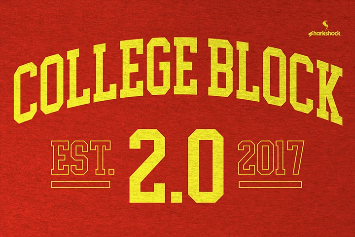
Free plan available
College Block 2.0
A heavy collegiate block face, redrawn about 30% taller in 2.0, with European accents, diacritics and Cyrillic. For jerseys, merch and sports posters.
Free plan available
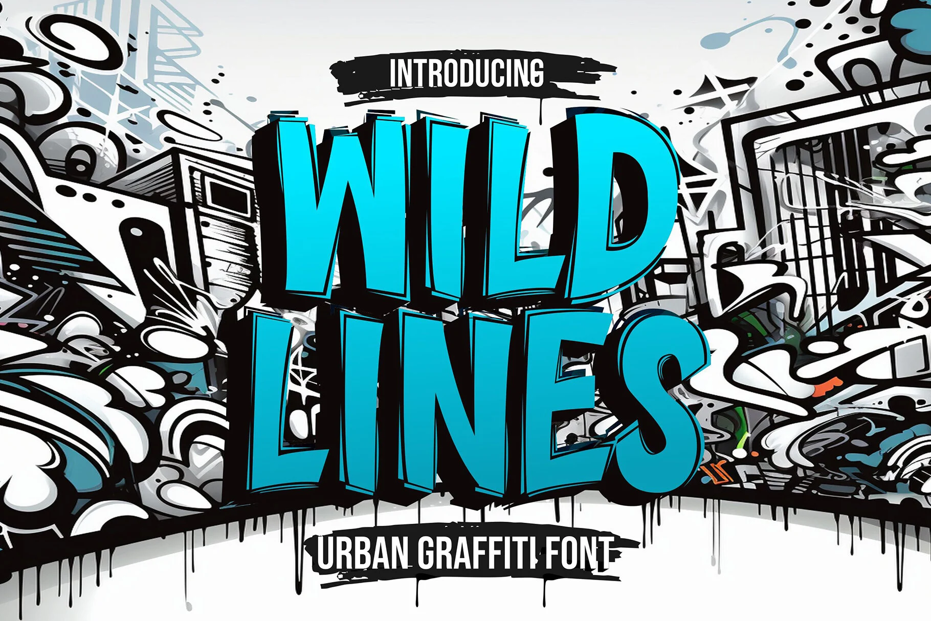
Wild Lines
An urban graffiti display face with thick outlined letters, made for album covers, streetwear and posters where one or two words carry the design.
Free plan available
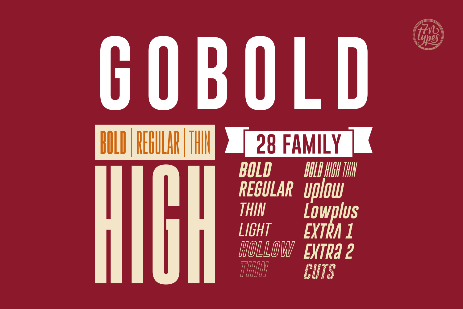
Gobold
A full sans family with 28 matched variations, so a brand system or multi-page document gets every weight from one typeface instead of pairing unrelated fonts.
Compatible with Canva, Cricut, and Silhouette. AI format, free tier available.
Unlimited creative assets. Access to AI tools.
Commercial licence included.
Get downloads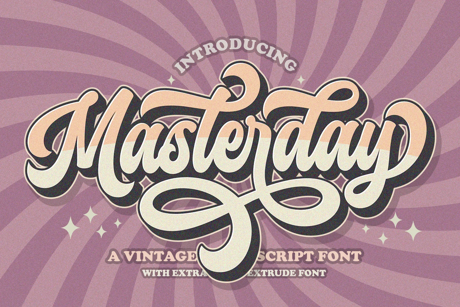
Free plan available
Masterday
A 70s retro script with a separate extrude layer for the stacked, dimensional look. Glyphs and swashes are PUA-encoded. Set it short: merch, labels, titles.
Free plan available
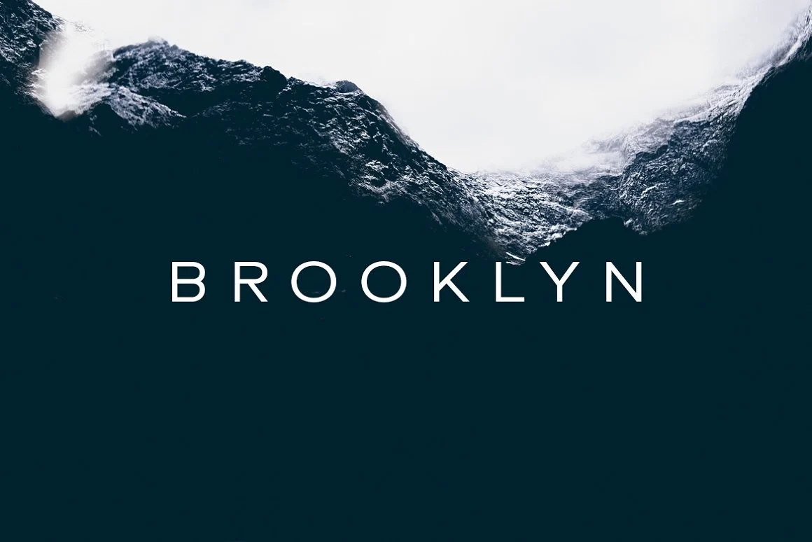
Brooklyn
Not a bold face: a thin, widely spaced minimal sans for the caption or tagline under a heavy headline, the second font most bold layouts end up needing.
Free plan available
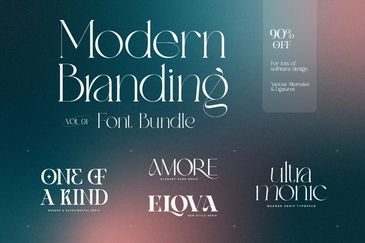
Modern Branding Bundle
A bundle of sans and script faces built for logotypes and brand kits, useful when a bold headline needs matching secondary fonts from one purchase.
Want more options in the same range? Browse bold fonts on Creative Fabrica.
One We Skipped
Every font, one commercial licence
The bundles I test at logo size live in one subscription — commercial use included, no per-font checkout.
Gibon Family Font turns up in bold-font searches often enough to name here. It’s a comic, dingbat and hand-lettered toolkit built for speech balloons and sound-effect lettering. You can’t use it as a headline or branding typeface.
It’s a deep set: fifteen styles with layered shadow and outline effects. But it solves a different brief than the bold headline font you came for.
- If you’re making a comic strip or cartoon-style graphic, it’s worth a look.
- If you’re doing a poster, logo or branding copy, it’s the wrong tool, despite the name overlap. A heavy block like College Block 2.0 fits that brief better.
Mistakes That Waste a Bold Font License
When a bold font fails you, it’s almost always one of these three, not a bad font.
Setting it at body-text size. Every bold font here is built for headline size. If you drop one into a paragraph, the closed counters that make a headline feel strong make a sentence unreadable.
Skipping the glyph check. If your project uses an accented name, a non-English word or Cyrillic, check the character set before you build the layout. A bold display font drawn for one language silently drops or swaps the characters it doesn’t include.
Judging it at preview size only. A marketplace thumbnail shows a size you’ll never use. Set the font at the size of your headline, label or logo before you decide.
If the word is going into a logo, run one more pass: shrink it to the size of a profile picture and look away, then back. Thin inline strokes, shadow layers and tight counters vanish first at that size, which is why a wordmark can look expensive in the mockup and read as a smudge in an avatar or a favicon.
For a heavy display face like Wild Lines, that means typing your real word at the real size. Outlines and inner detail are the first things to fill in.
Key Takeaways
- Bold is a weight, not a guarantee of legibility. Stroke evenness and open counters decide whether it holds up small.
- Style words map to structure: cool means one distinctive detail, cute means rounded and bouncing, tall means condensed with a high x-height, elegant means visible contrast. Strong and elegant pull in opposite directions and rarely live in one file.
- Published “best bold fonts” lists disagree sevenfold on how many fonts qualify, and none of them tests small-size legibility or glyph coverage.
- Type your real numbers into the preview before you license. Figures close up, mismatch in weight or fail to align in columns more often than letters do.
FAQ
What’s the difference between a bold font and a display font?
Bold describes a weight: how thick the strokes are next to the regular style of the same typeface. Display describes a use: a font built for large, attention-grabbing settings like headlines and posters.
A font can be bold without being a display face. A display face isn’t always available in a true bold weight. So you can’t swap the two labels.
What makes a bold font look elegant instead of just heavy?
Contrast. If you use a heavy face with even stroke weight everywhere, it reads as strong and blunt. A heavy face with thinner joins, tighter apertures and often a serif reads as refined.
That’s why you’ll usually find bold elegant fonts in the heaviest cut of a text or editorial family, not in a display face.
Can I use a bold display font for a whole paragraph of text?
Not comfortably. Bold display fonts have tight counters and heavy strokes meant for a glance. If you set one at body size, you get a dense block instead of a paragraph.
Can I use a free bold font on merch or in a logo?
Only if its license says so. Many free bold fonts are personal-use only. That rules out anything you sell: a shirt, a sticker, a print, or a logo you hand to a client.
Open the license text inside the download and look for “commercial use”. Check logos and print-on-demand separately, since some licenses allow one and not the other. No license text at all? Treat it as personal use.
The fonts above are sold with a commercial license. Read its terms on the product page before a logo job, because a logo is the one use most licenses spell out on its own.
Do bold fonts come with usable numbers?
Not always. Figures have the tightest counters in the character set, so you’ll see them close up before the letters. Some display faces ship figures lighter than the letters.
Check for tabular figures if your numbers need to line up in columns. Type your real digits into the preview before you license. With College Block 2.0, test the 8, 6 and 0 at the size of your smallest number.
Why do some bold fonts look fine in the preview but bad once I download them?
Marketplace previews are shown oversized, well above the size most projects use. A font that looks confident there can lose legibility at your real size. You only see it when you test it in your own layout.
Where do people actually use a good, best bold font, and where can I download one?
The best bold fonts for websites, logos, posters, quotes, titles and thumbnails share one job: show confidence at a glance.
You can load a good bold font straight into Canva, CapCut, Premiere Pro, Photoshop or Cricut Design Space. You can find free bold fonts by name on marketplaces like Dafont. A free file rarely comes with the same foundry support or full character set as a paid one.
Can I bold text on Instagram, Facebook, WhatsApp, LinkedIn, Discord, Messenger, or iPhone without installing a font?
Yes, but you’ll use a different tool than the fonts on this page. Each of those apps gives you its own way to make text bold: a formatting button, an accessibility setting, or a copy-paste Unicode generator for a single post.
None of them installs a real bold font file the way Canva or Cricut does. A bold caption on a Facebook or LinkedIn post won’t carry over into a design tool.
For that, license one of the fonts above and drop it into your design tool directly. Gobold covers the widest weight range of the set.


