FF DIN started life on German road signs, not in a type foundry mood board — and that origin is exactly why it still shows up on gauge clusters, warning labels, and shipping crate stencils decades later. Albert-Jan Pool drew it from the DIN 1451 standard, a font engineered purely for legibility at speed, not style.
Nothing about it tries to be charming. That’s the entire appeal.
Quick answer: FF DIN is a geometric sans-serif font family built from Germany’s DIN 1451 road-sign standard, used for industrial branding, wayfinding, and technical design because it reads clearly at small sizes and holds up under harsh printing conditions.
Why Does a Road-Sign Font Work So Well for Branding?
Because legibility at a glance was the entire design brief. DIN 1451 was engineered so a driver could read a sign at speed, in bad weather, from a distance — which means every letterform had to survive stripped of any decorative flourish. That constraint is exactly what makes FF DIN read as confident and industrial rather than generic when it’s dropped into a logotype.
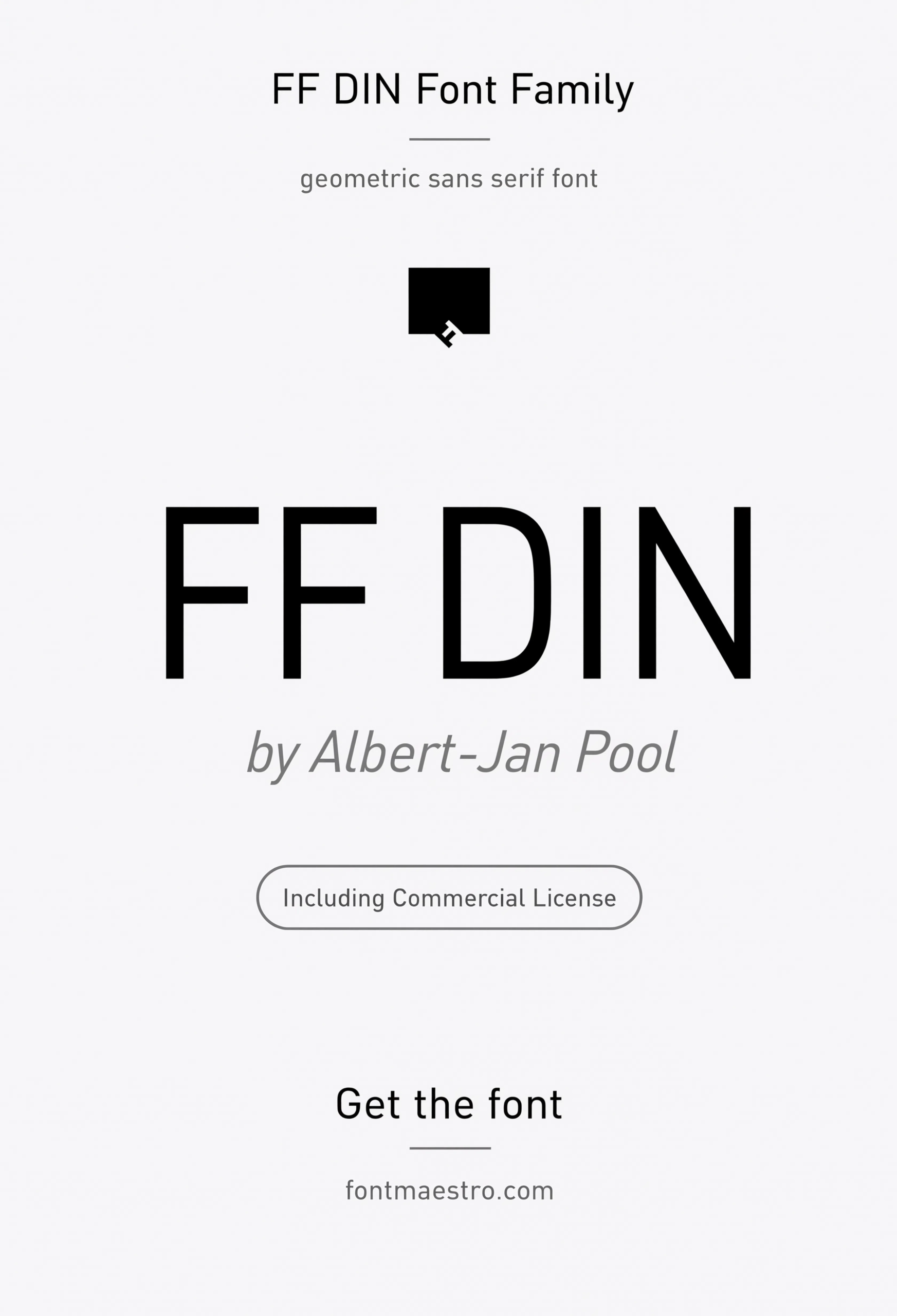
The geometric hero specimen below shows the family’s actual character: even stroke weight, minimal contrast, letterforms drawn for function first. It’s not trying to be neutral in the way Helvetica is — it’s trying to be unmistakable at a distance.
Where Does FF DIN Actually Get Used in Real Design Work?
- Automotive and industrial branding — dashboard displays, gauge clusters, and equipment labels lean on FF DIN because it was born from the same engineering-signage tradition.
- Wayfinding and metro systems — station signage and line maps need instant legibility, which is the one thing this font was built to guarantee.
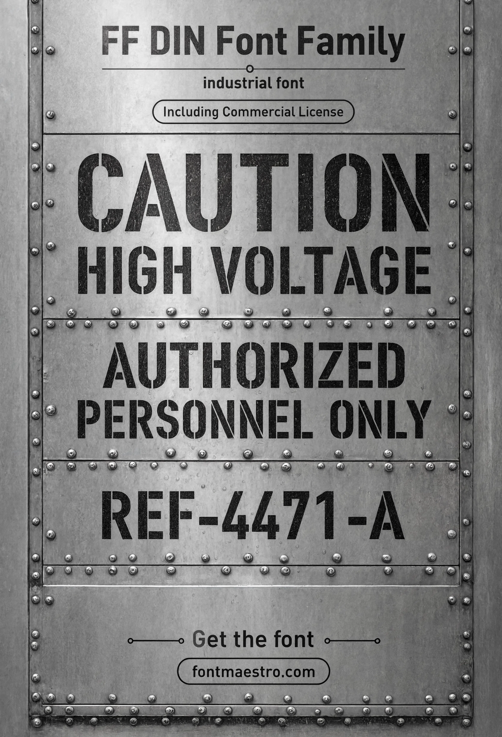
- Warning labels and crate stencils — industrial packaging needs text that survives low-quality print runs on rough stock, and the even stroke weight holds up there.
- Apothecary and technical product labels — a clinical, no-nonsense read that suits ingredient lists and dosage information.
Each file below is a desktop and web-font license bundle available through MyFonts — install it locally for signage and industrial branding work, or license the web-font cut for technical product sites. Commercial branding rights are included under the standard license.
Unlimited creative assets. Access to AI tools.
Commercial licence included.
Get downloadsGeometric Hero Specimen
The family at display scale — even stroke weight and minimal contrast, the two traits that make it read as industrial rather than generic.
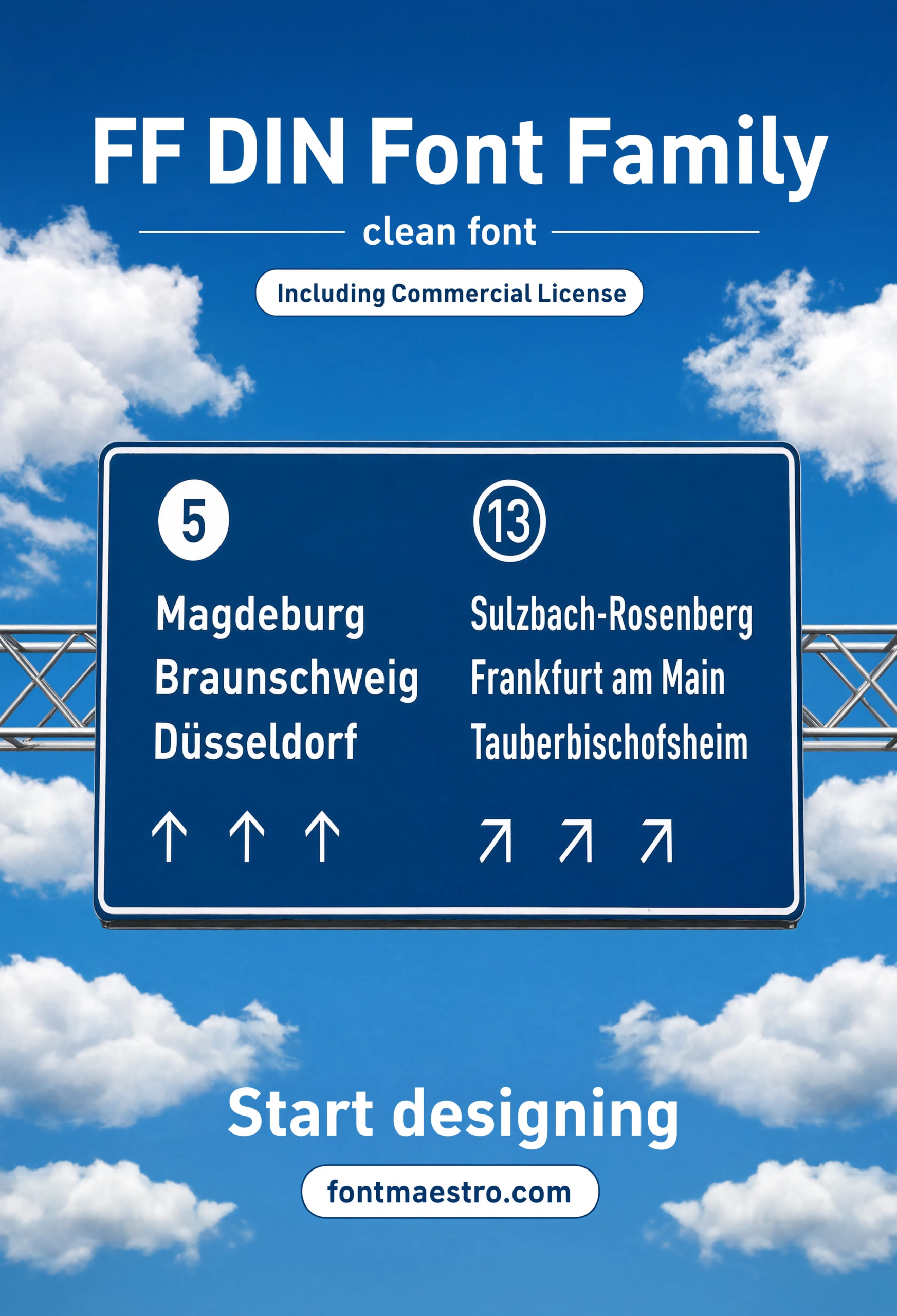
Autobahn Sign Application
Set into the exact signage context FF DIN descends from — proof of the legibility-at-speed brief that shaped every letterform.
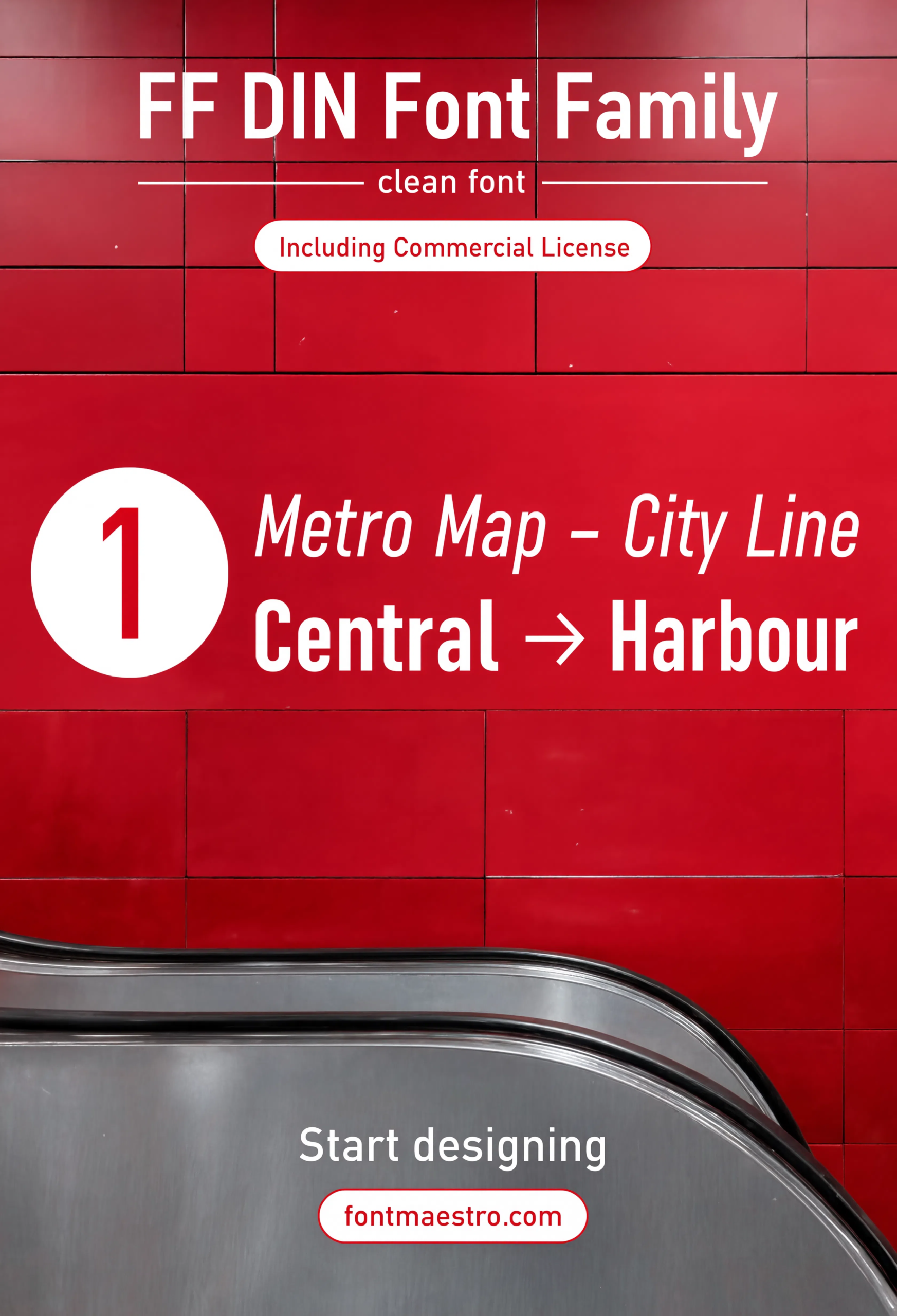
Metro Wayfinding
Applied to a metro line and wayfinding layout — a real check for legibility at a glance, moving past a sign rather than reading it up close.
Browse Geometric Font Templates →
Does FF DIN Hold Up in Condensed and Numeral-Heavy Layouts?
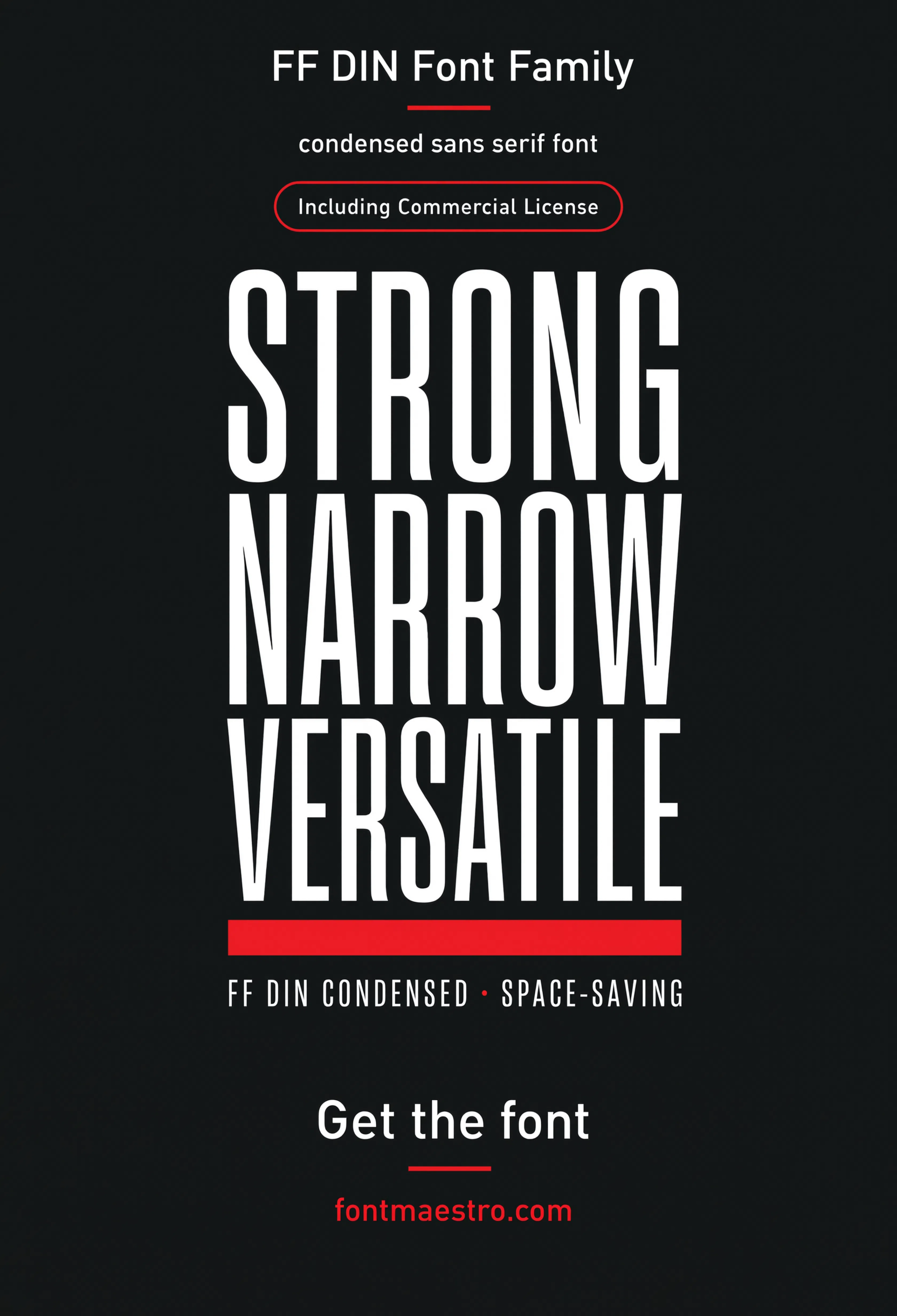
Yes, and this is where the family earns its keep beyond logotypes. A condensed cut was drawn to match the regular width proportionally, which matters when a dashboard label or crate stencil has a fixed panel width and no room to shrink a wider grotesque down to fit. The numerals are drawn with the same engineering discipline — evenly spaced, no ambiguity between similar digits at a glance.
If you want to explore more options in this direction, our guide to Avenir Next is worth a look, and you may also enjoy Trade Gothic or Aptos Font for a different take on the same style.
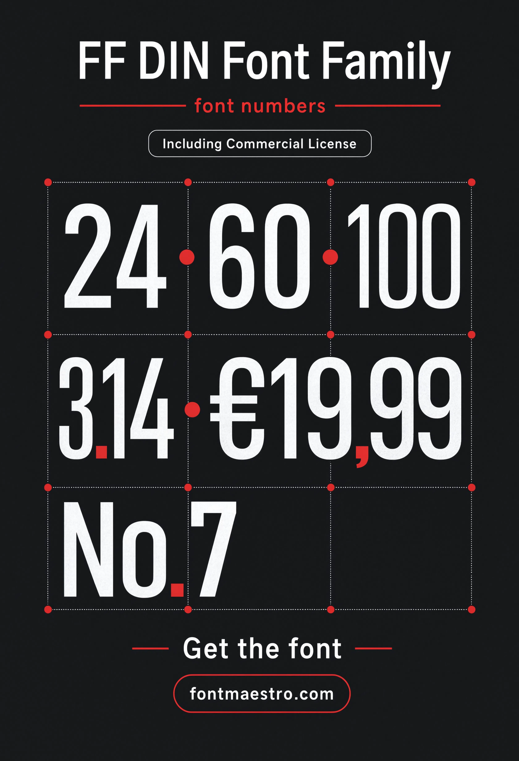
The gauge cluster specimen below is the clearest example: numerals that stay legible under low light and at an angle, which is a much harder test than a numeral looking good sitting flat on a page.
Unlimited creative assets. Access to AI tools.
Commercial licence included.
Get downloadsNumerals in Dashboard Context
Numerals set into a dashboard layout — the exact low-light, at-an-angle test this family was engineered to survive.
Condensed Lockup
The condensed cut set into a tight lockup — worth checking before committing to a narrow logotype panel.
Warning Panel Application
Applied to an industrial warning panel — a real stress test for how the family holds up on rough print stock.
Looking for more direction? Our Univers sans serif font guide covers another neutral grotesque built for signage systems, and our Trade Gothic guide breaks down a bolder grotesque built for posters and merch.
Frequently Asked Questions
What is FF DIN based on?
It’s derived from DIN 1451, the German road-sign standard engineered purely for legibility at speed rather than decorative style.
Is FF DIN good for industrial branding?
Yes — its even stroke weight and no-nonsense letterforms come directly from a signage brief, which makes it read as confident on equipment labels, dashboards, and packaging.
Does FF DIN include a condensed style?
Yes — the condensed cut is drawn to match the regular width proportionally, useful for dashboard labels and crate stencils with fixed panel widths.
Is FF DIN licensed for commercial use?
The MyFonts collection includes desktop and web-font license options with commercial branding rights under the standard license.
How is FF DIN different from Helvetica?
FF DIN was engineered from a road-sign legibility standard, while Helvetica was designed as a neutral grotesque for general typesetting — FF DIN reads more mechanical and function-first by comparison.
Key Takeaways
- Want a proven starting point? Explore the FF DIN collection on MyFonts for the geometric family, condensed cuts, and engineered numerals.
- FF DIN descends from Germany’s DIN 1451 road-sign standard — legibility at speed was the original design brief, not style.
- The condensed cut is drawn to match the regular width proportionally, which matters for dashboard labels and crate stencils with fixed panels.
- Numerals hold up under low light and off-angle viewing, a harder test than looking good flat on a page.




