Axiforma gets called a “geometric sans” so often that the description stops meaning anything. What actually matters for capital letters specifically is how the family handles all-caps spacing — most geometric sans fonts are drawn with lowercase reading in mind, and their capitals feel cramped or uneven the moment you set a headline in all-caps. Axiforma was built with a wide range of weights specifically so caps-heavy layouts, from a wordmark to a poster headline, hold consistent rhythm letter to letter.
That’s the real test for a “capital letters font style” pick: not whether the uppercase looks fine in a single word, but whether it stays even across a full line of tracked-out caps.
Quick answer: A strong capital letters font style needs even width and spacing across the whole uppercase set, not just a bold weight. Axiforma is a solid pick because its geometric construction holds that evenness across ten weights, from hairline to black, so all-caps headlines, logos, and packaging type all read cleanly at any size.
What Makes a Font’s Capital Letters Actually Work at Scale?
Even stroke width and consistent counter spacing — that’s it. A capital letter set that looks sharp in a 12pt logotype but turns uneven at poster size usually has inconsistent spacing baked into the font itself, not a kerning problem you can fix later. The alphabet specimen below shows the full uppercase set in one view, which is the fastest way to judge this before committing.
How Do You Pick a Weight for All-Caps Headlines vs. Body Text?
- Start with the pangram test — a full sentence in one weight reveals spacing problems that a single word never will.
- Match weight to context — a heavier weight reads well on packaging and posters, while a lighter weight keeps a wordmark from feeling shouty.
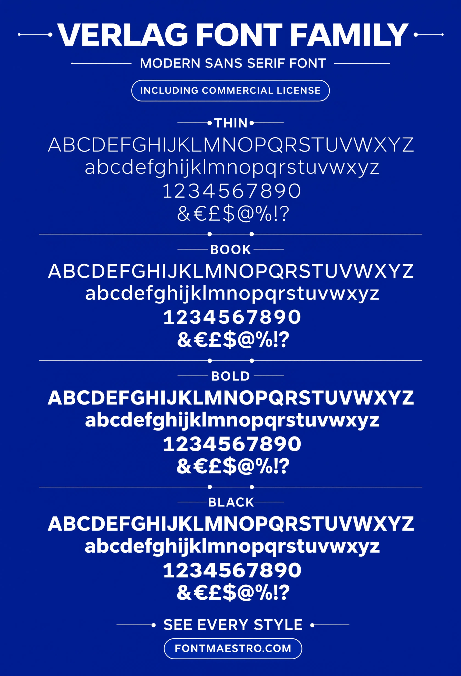
- Check the weight ladder — a family with light through bold in the same geometric skeleton lets one typeface cover a whole brand system.
- Test caps against lowercase — some geometric sans fonts favor one case over the other; confirm both hold up before locking in a brand typeface.
Each file below is a desktop and web-font license bundle available directly through MyFonts — install it locally for logo and layout work, or license the web-font cut for a website. It’s part of the Axiforma collection, so commercial branding rights are included in the standard license.
Unlimited creative assets. Access to AI tools.
Commercial licence included.
Get downloads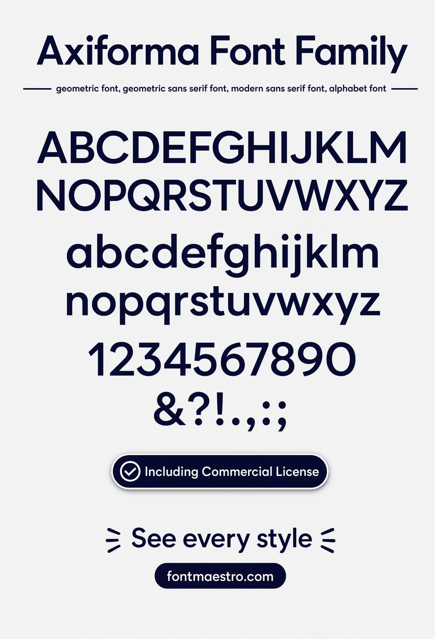
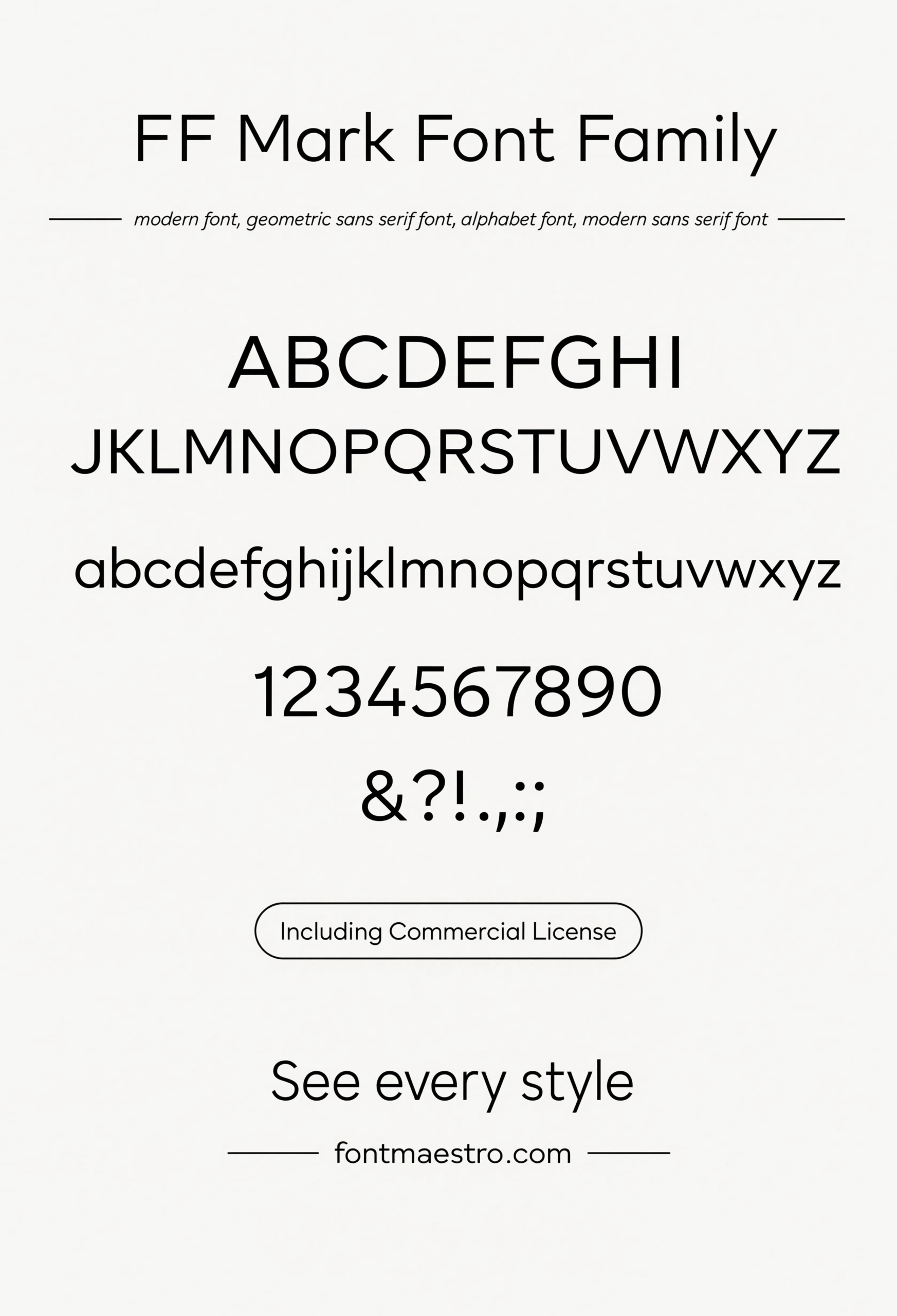
Alphabet Specimen
The full uppercase and lowercase set laid out together — the fastest way to check whether the capital letters hold even width and spacing across the whole alphabet.
Unlimited creative assets. Access to AI tools.
Commercial licence included.
Get downloads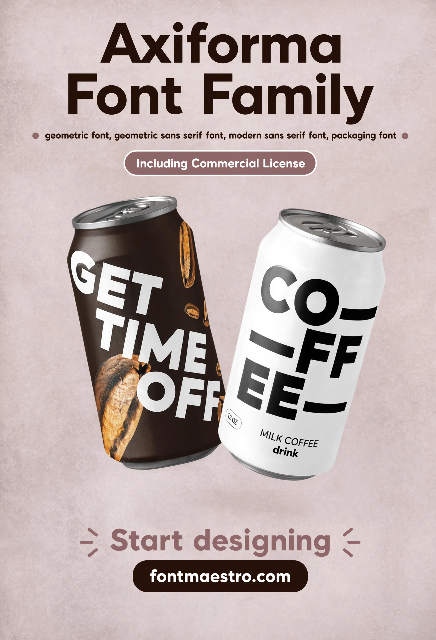
Packaging Application
Product packaging mockup — a heavier weight here shows how bold caps hold their shape at the small print sizes packaging design usually demands.
Unlimited creative assets. Access to AI tools.
Commercial licence included.
Get downloads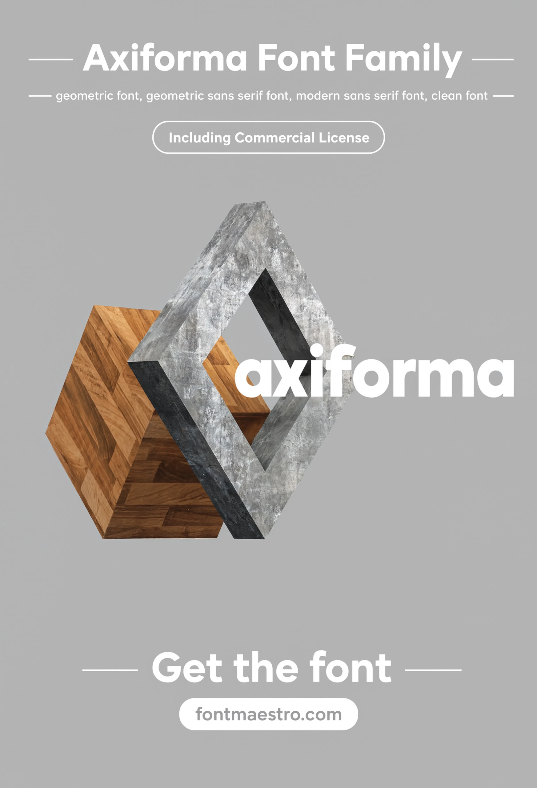
Commercial License
Logo Lockup
A full logo lockup with wordmark and supporting tagline shows how a heavier caps weight pairs with a lighter weight in the same brand system.
Unlimited creative assets. Access to AI tools.
Commercial licence included.
Get downloads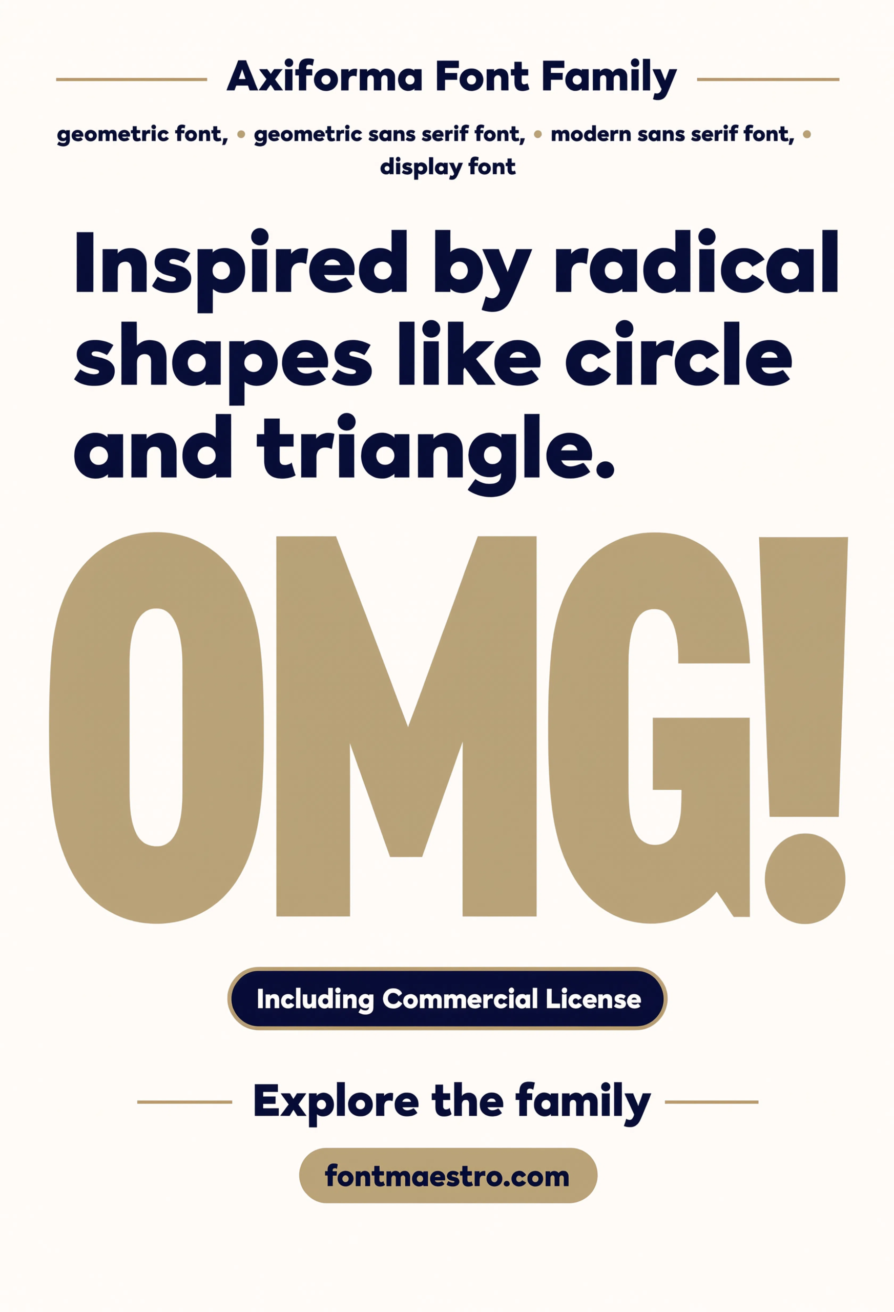
Radical Shapes Poster
A bold, shape-driven poster composition shows the heaviest weight in the family pushed into a display-scale design moment.
If you want to explore more options in this direction, our guide to Best Vintage Font Style is worth a look, and you may also enjoy Elegant Font Design or Classic Font Styles for for a different take on the same style.
Unlimited creative assets. Access to AI tools.
Commercial licence included.
Get downloads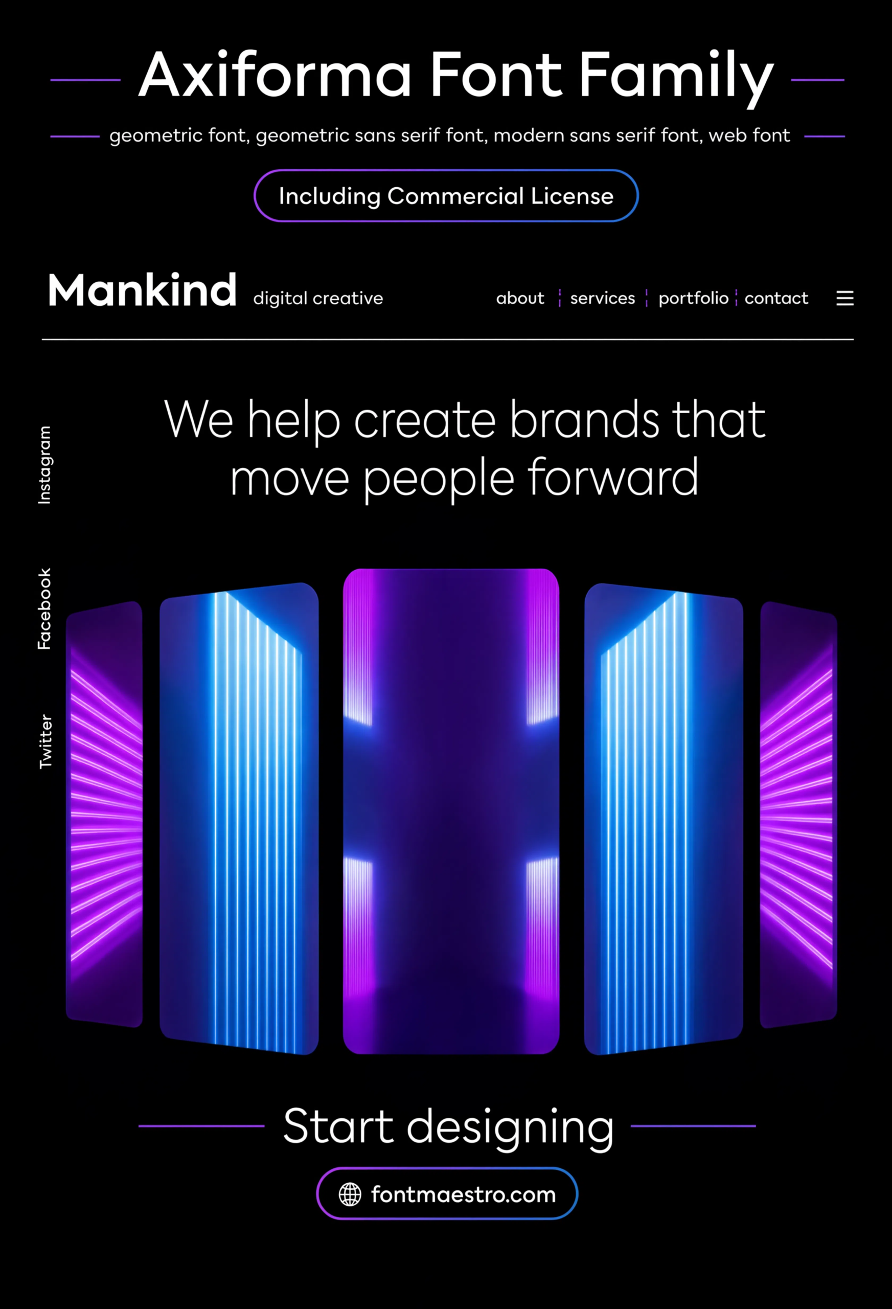
Commercial License
Web Hero Mockup
A website hero section mockup — useful for confirming a caps-heavy headline still reads cleanly at typical screen sizes and line lengths.
Where Do Capital Letters Get Tested Beyond a Logo?
A magazine cover and a web hero mockup are two of the harder real-world tests for an all-caps typeface — one competes against a busy background, the other has to hold up at typical screen reading distance. Both are shown above.
Explore the Axiforma Collection →
Does Weight Choice Change How Capital Letters Read?
Yes, more than most people expect. A light weight in all-caps can feel refined but weak at small sizes, while a black weight can feel powerful but cramped if the tracking isn’t opened up. The weight ladder and comparison sheets above make it easy to see the full range before picking one for a specific project.
Looking for more type direction? Our beautiful modern font guide covers geometric sans construction in more depth, and our font style for architecture guide looks at how the same evenness principle applies to signage and technical type.
Frequently Asked Questions
What makes capital letters in a font style look consistent?
Even stroke width and consistent spacing across every uppercase letter — a font drawn with lowercase reading in mind often has cramped or uneven capitals unless the family was built to handle all-caps layouts specifically.
How do I test a font’s capital letters before using it in a logo?
Set a full pangram or sentence in all-caps at the weight you plan to use — a single word or short lockup won’t reveal spacing problems the way a full line will.
Does a heavier weight always work better for all-caps headlines?
Not always. A heavier weight adds visual impact but can feel cramped without opened-up tracking, while a lighter weight reads as more refined but weaker at small sizes.
Can the same font family cover both a logo and body text in caps?
Yes, if the family has a full weight range — light and regular weights suit longer caps-set text, while medium and bold weights suit logos and headlines.
Are these fonts cleared for commercial branding use?
Yes, with the commercial license included on MyFonts downloads — confirm the specific license terms on the product page before client delivery.
Key Takeaways
- Want a proven starting point? Explore the Axiforma collection on MyFonts for a full weight range built to hold even spacing in all-caps layouts.
- Strong capital letters come from even width and spacing across the whole uppercase set, not just a bold weight.
- Test any candidate with a full pangram in all-caps, not just a single word or short lockup.
- A wide weight ladder in one family covers logos, headlines, and body copy without switching typefaces.
Related Reads
Unlimited creative assets. Access to AI tools.
Commercial licence included.
Get downloads



