Most “font vintage” searches aren’t nostalgia browsing, they’re someone staring at a menu layout or a farmers market sign, trying to find a typeface that reads as authentically old without looking like a Halloween poster. That’s a narrower target than it sounds. A lot of fonts marketed as vintage font style are really just a bold slab with some texture dumped on top, and it shows the moment you set real words instead of one big display letter.
The searches that land here split roughly two ways: “font vintage retro” people want something loud enough for a beer fest banner or a badge logo, while “font style vintage” and “fonts vintage” searchers are usually laying out something quieter, a farmhouse sign, a catalog page, a menu, where the type has to carry the whole mood without shouting.
Quick answer: Hanley Pro covers both ends of that range in one family, condensed slab weights built for beer fest posters and badge logos, plus a softer script and serif set for farmhouse signs, menus, and catalog spreads. Check letterspacing at small sizes and weight contrast between headline and body before committing a vintage font style to a full layout, that’s where most of them fall apart.
Why does a font vintage search turn up so many typefaces that don’t actually work?
Vintage is a mood, not a construction spec. That’s the problem. A designer can slap distressed texture on any bold serif and market it as “vintage font style”, the texture does the aesthetic work, and the underlying letterforms are often generic. The texture disappears the moment you print at small size or set it in a signage vinyl cutter, and what’s left is a font with no real period character.
What actually reads as vintage, independent of any applied texture:
- Condensed proportions, most early-to-mid-century display type was cut narrow because sign space and print columns were expensive. A font that’s wide and airy rarely reads as period-accurate no matter what texture sits on it.
- Uneven stroke contrast, hand-cut vintage letterforms have small irregularities, thick-thin transitions that aren’t strictly mechanical. Too-clean geometry reads modern even in a distressed treatment.
- A script or script-adjacent companion, genuine vintage type systems almost always pair a bold display face with a looser script for secondary text. One-weight vintage fonts are the fastest way to end up with a flat-looking layout.
Hanley Pro’s slab weights hit the condensed-proportion mark, and the pairing includes a script cut, which is the detail most single-style “vintage font” downloads skip entirely.
What does a vintage font style actually look like across a full product line?
A specimen image with one word set large tells you almost nothing about how a vintage font style holds up in production. Menus, market signs, and packaging all demand different things from the same letterforms, tight columns, small print runs, distance legibility. This is where a lot of “font vintage retro” downloads quietly fail.
Unlimited creative assets. Access to AI tools.
Commercial licence included.
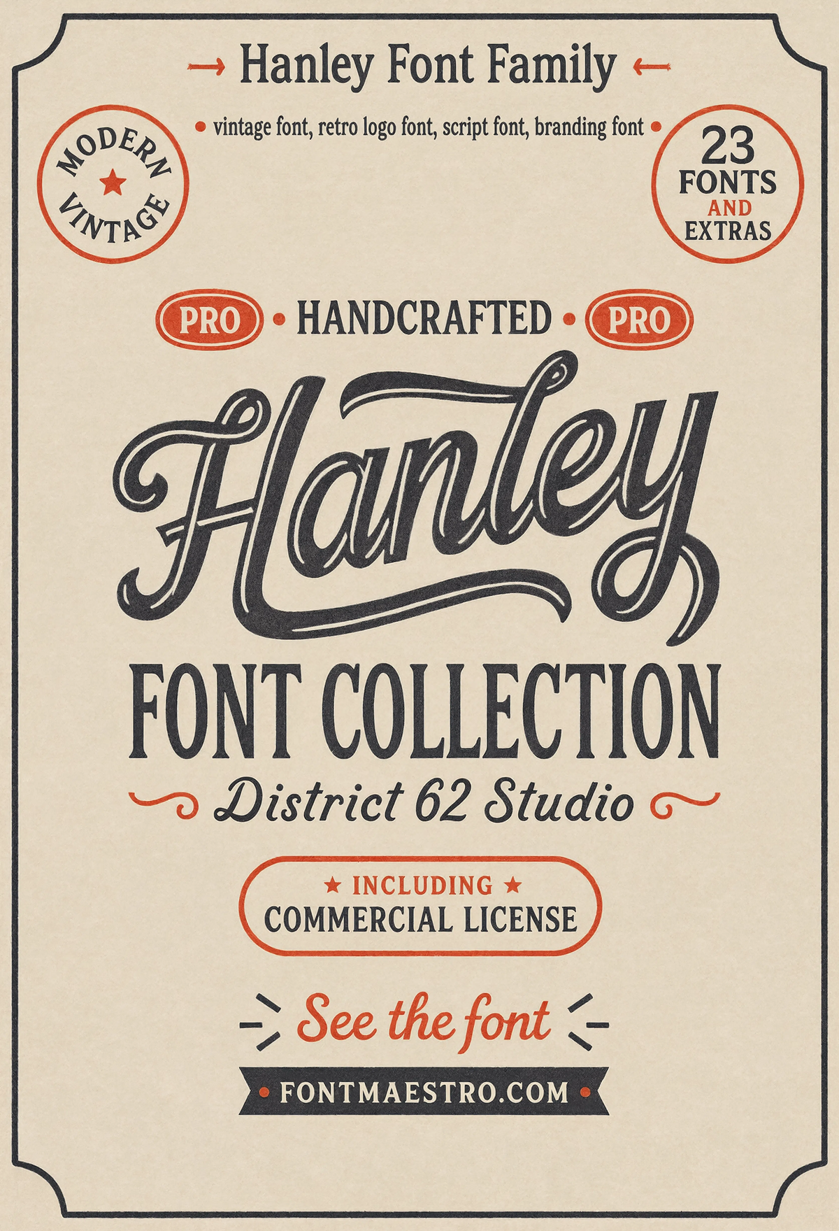
Get downloadsHanley Pro, Hero Specimen
The full family laid out together, condensed slab display next to the script companion, so you can see the weight range before committing it to a brand system. This is the specimen most font vintage searches are actually trying to find.
Commercial License
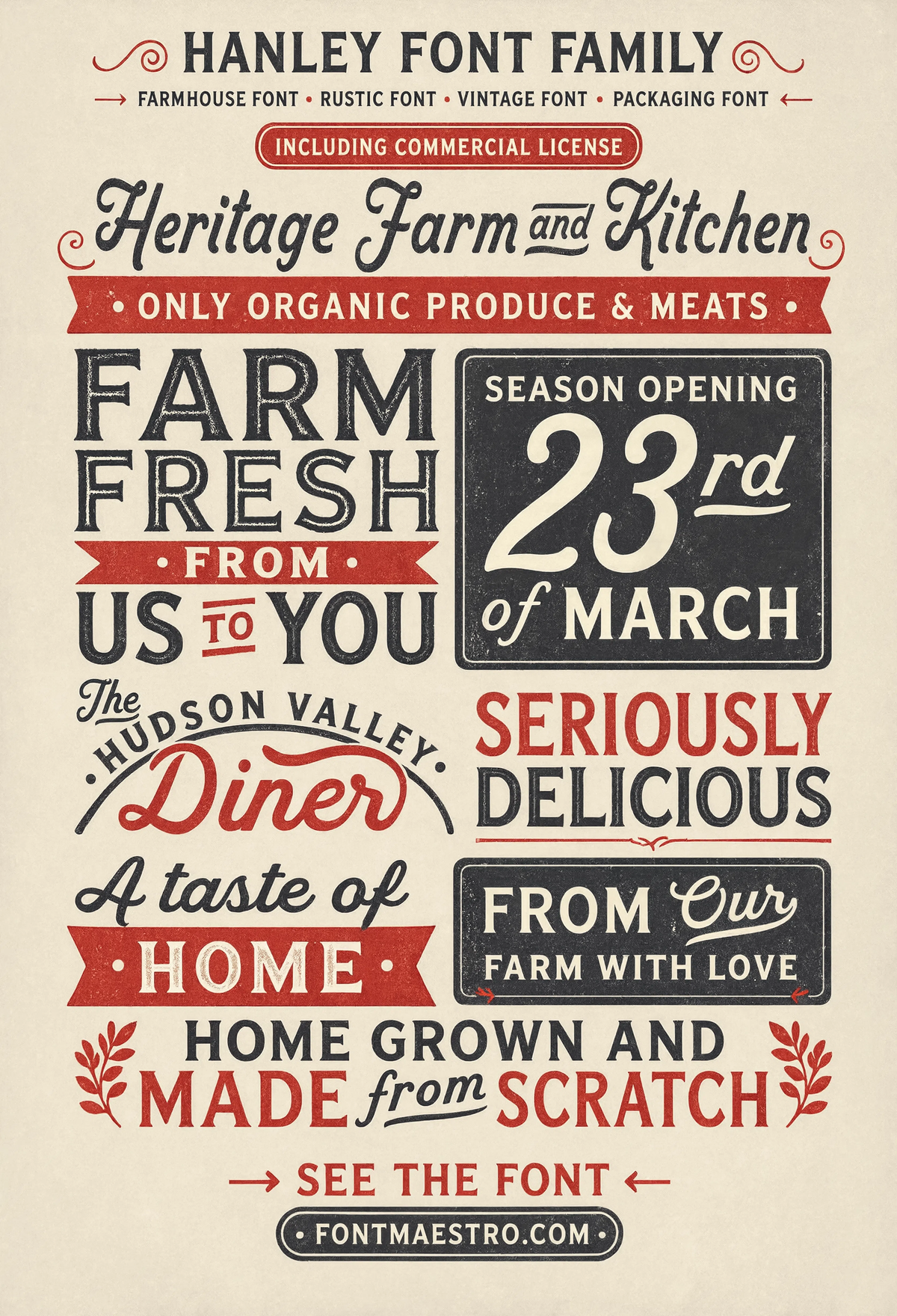
Hanley Pro, Farmhouse Sign
Condensed slab set on a rustic wood-panel layout, this is vintage font style doing exactly what farmhouse and homestead branding needs: legible at a distance, warm instead of cold.
Commercial License
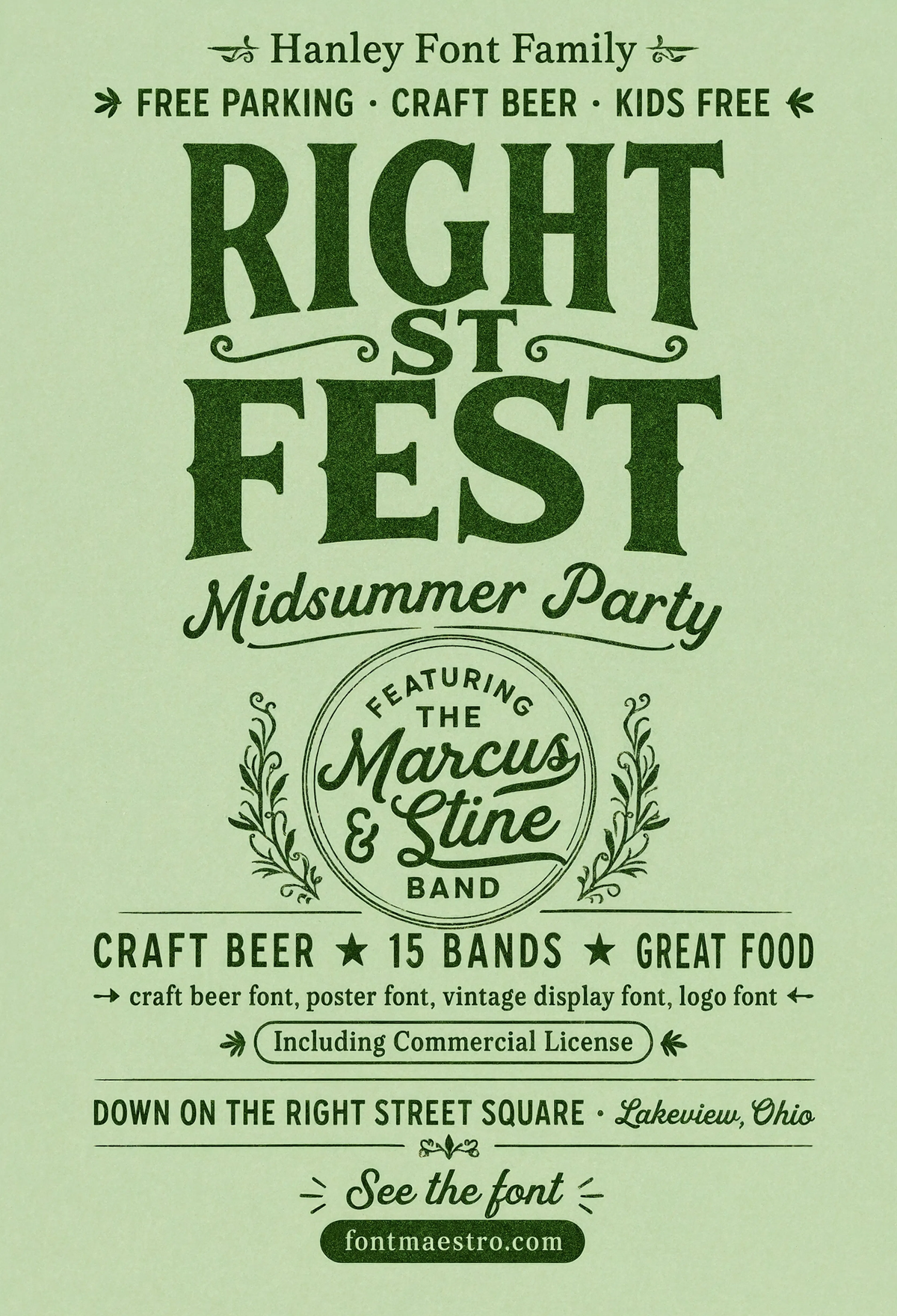
Hanley Pro, Beer Fest Poster
This is the “font vintage retro” end of the family, bold condensed caps built for a full event poster, with enough weight contrast to hold up printed large or shrunk to a flyer.
Commercial License
Every file in the Hanley Pro collection comes ready for both print and digital work, under one commercial license, drop it straight into Illustrator, Procreate, or Canva without rebuilding kerning tables by hand.
Browse the Hanley Pro Collection →
How do you pair a vintage font style with the right secondary weights?
A single vintage display font, used alone for everything, is the single fastest way to make a layout feel flat. The strongest food, market, and retail branding built around a font vintage aesthetic pairs three roles, not one.
Unlimited creative assets. Access to AI tools.
Commercial licence included.
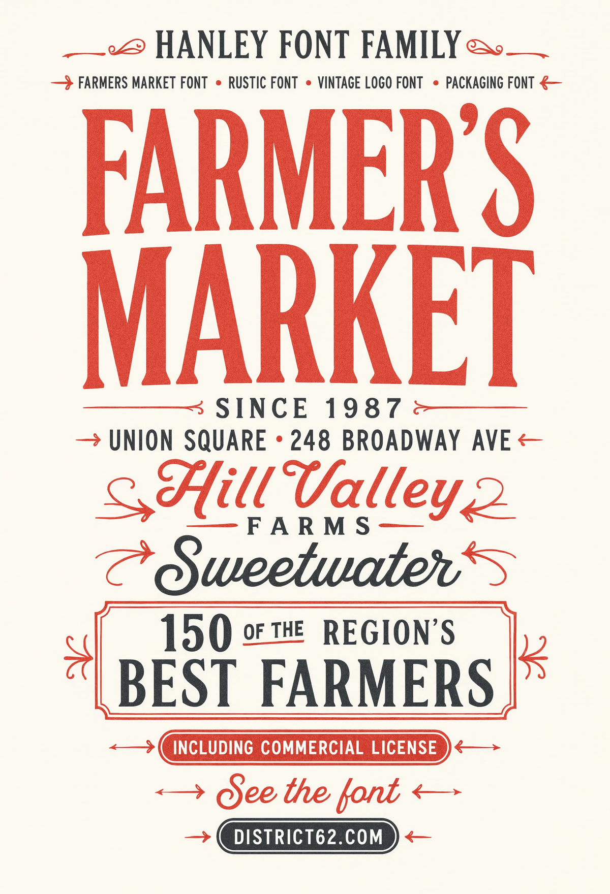
Get downloadsHanley Pro, Farmers Market Sign
Hand-lettered feel without an actual hand-lettered font’s inconsistency problem, this cut reads clean at sign distance while still carrying period character in the letterforms.
Commercial License
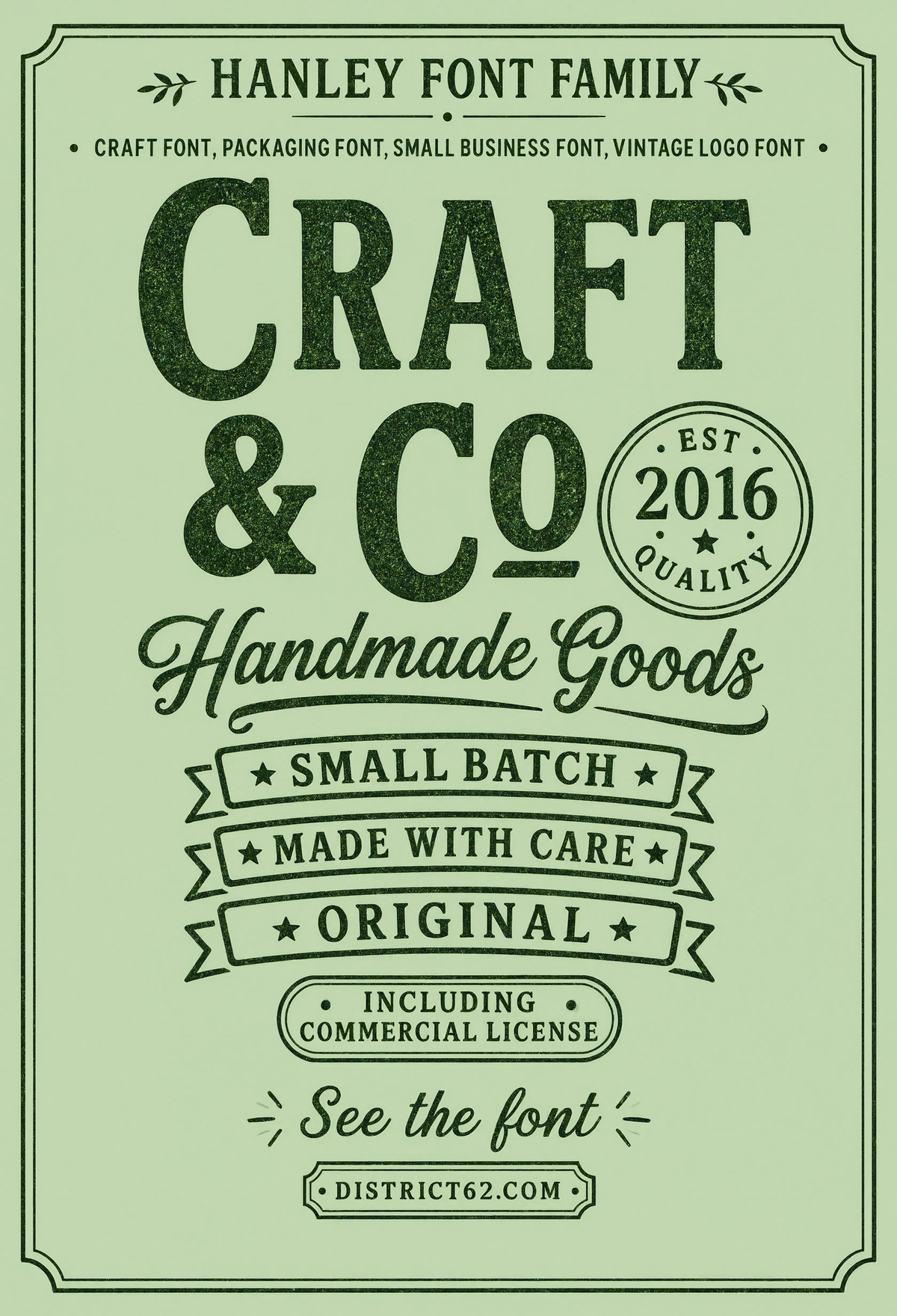
Hanley Pro, Craft Goods Label
Packaging label work at small scale, this is where letterspacing problems show up first. Tight tracking here without letters colliding is the real test of a vintage font style, not the hero poster version.
If you want to explore more options in this direction, our guide to Beautiful Modern Font is worth a look, and you may also enjoy Elegant Font Design or Best Font Design Choices for a different take on the same style.
Commercial License
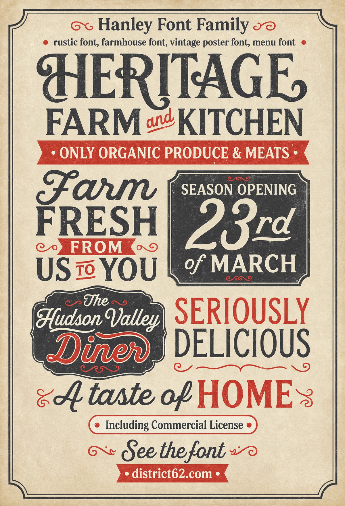
Hanley Pro, Farm Kitchen Menu
A menu board layout mixing the display slab for section headers with a lighter weight for item listings, this is the three-role pairing (display, body, accent) that separates working type systems from one-note downloads.
Commercial License
Where does the script companion actually help, and where does it hurt?
Script weights are the part of a vintage font system people misuse most. Set an entire sign in script and it reads as a wedding invite, not a market stall. Script works best as an accent, a word or two, never a full sentence at small size.
Unlimited creative assets. Access to AI tools.
Commercial licence included.
Get downloadsHanley Pro, Catalog Page
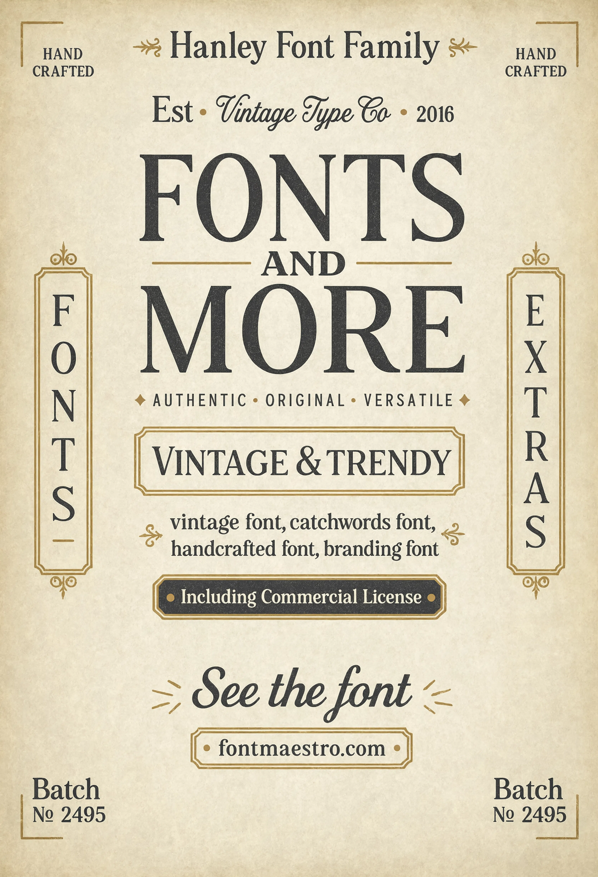
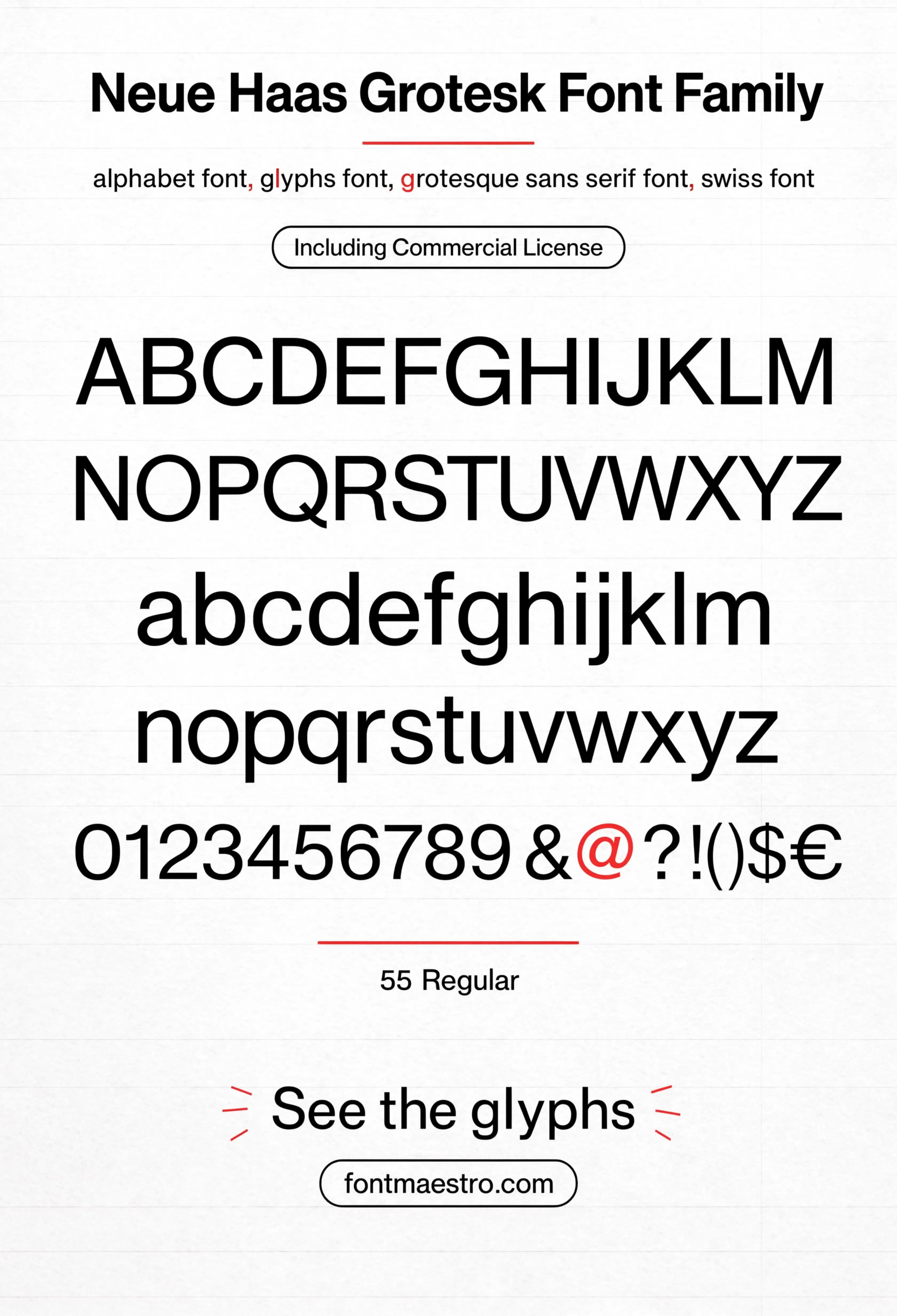
A full typeset spread, not a single headline, this is font style vintage applied to actual reading copy, where x-height consistency and line spacing matter more than any single dramatic letterform.
Commercial License
Hanley Pro, Craft Goods Label
Packaging label work at small scale, this is where letterspacing problems show up first. Tight tracking here without letters colliding is the real test of a vintage font style, not the hero poster version.
If you want to explore more options in this direction, our guide to Beautiful Modern Font is worth a look, and you may also enjoy Elegant Font Design or Best Font Design Choices for a different take on the same style.
Commercial License
Unlimited creative assets. Access to AI tools.
Commercial licence included.
Get downloadsHanley Pro, Victorian Display
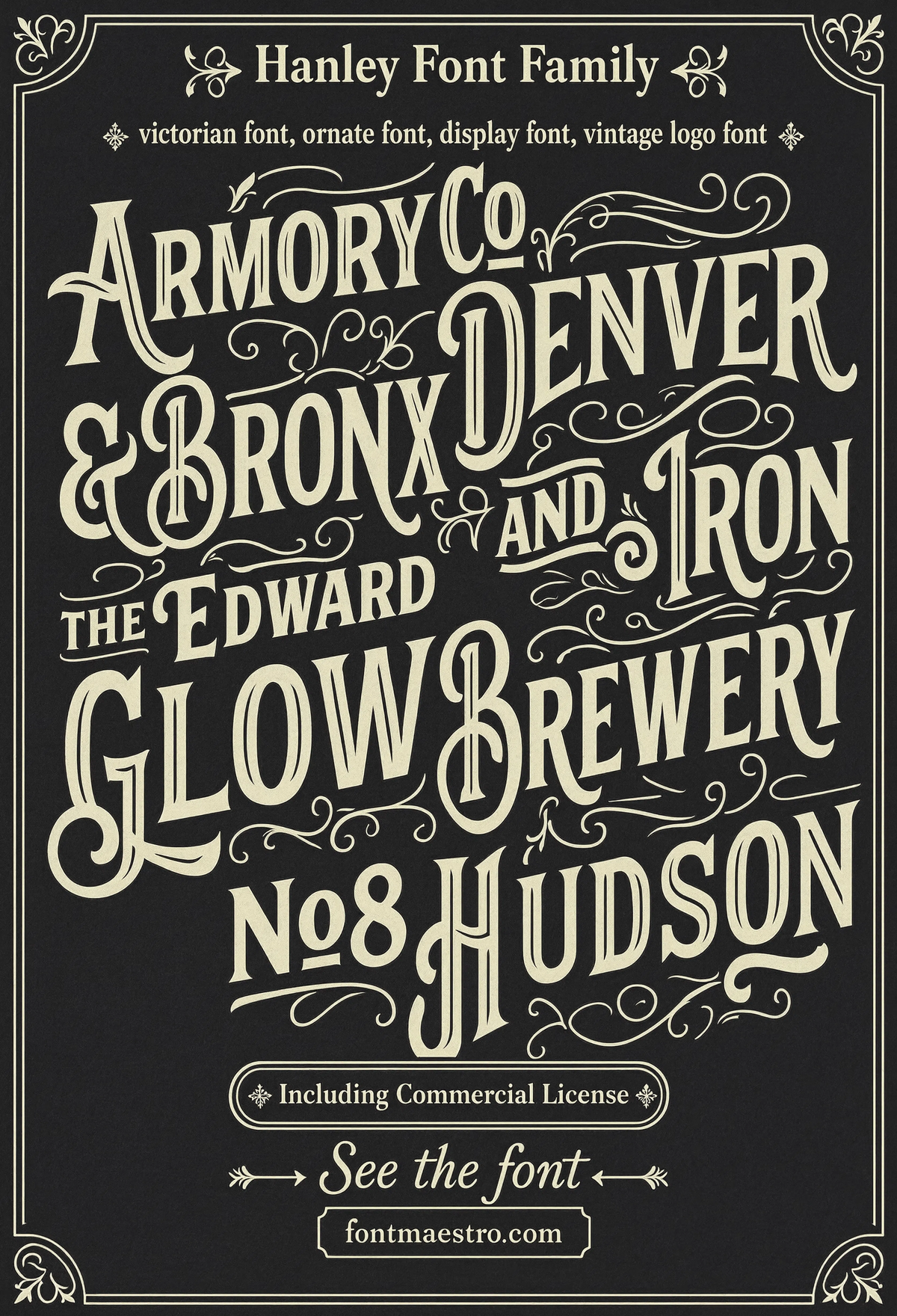
The most ornate cut in the family, ornamental detail on the display caps, closer to sign-painter revival than plain condensed slab. Use it sparingly; it’s the loudest voice in the family.
Commercial License
Hanley Pro, Craft Goods Label
Packaging label work at small scale, this is where letterspacing problems show up first. Tight tracking here without letters colliding is the real test of a vintage font style, not the hero poster version.
If you want to explore more options in this direction, our guide to Beautiful Modern Font is worth a look, and you may also enjoy Elegant Font Design or Best Font Design Choices for a different take on the same style.
Commercial License
Looking for more on how vintage type performs in different formats? Our guide to font design fundamentals covers optical sizing and weight consistency in more depth, and our guide to fonts for letters breaks down individual letterform construction.
Frequently Asked Questions
What makes a font read as “vintage” instead of just old-fashioned?
Condensed proportions, uneven stroke contrast, and a script or serif companion for secondary text. Texture and distressing help sell the effect visually but don’t create it on their own, the underlying letterform structure does most of the work.
Is Hanley Pro good for both print and digital signage?
Yes, the condensed slab weights hold up at sign distance and the full family works equally well set small for packaging or menu print. Test the script cut at your target size before committing it to body copy.
Should I use the script weight for a full sentence?
No, script cuts in vintage font families are built for short accent text, usually one or two words. Set a full sentence in script and legibility drops fast, especially at signage distance.
What file formats come with a vintage font style download?
Most commercial vintage font collections, Hanley Pro included, ship as OTF and TTF with the full weight range under one commercial license, ready for Illustrator, Procreate, Canva, and most print software.
How many weights does a working vintage font system need?
At minimum a display/headline weight and a body-friendly weight. A script or accent cut is a strong third addition, three roles covers most menu, signage, and packaging layouts without needing a second typeface family.
Key Takeaways
- Want the exact family from this breakdown? Get Hanley Pro with the full commercial license.
- Condensed proportions and uneven stroke contrast do more for a vintage look than any applied texture.
- Reserve script weights for accent words, a full sentence in script reads as invitation type, not signage.
- Check letterspacing at your actual print or sign size before trusting a vintage font style to a full layout.
Related Reads
Unlimited creative assets. Access to AI tools.
Commercial licence included.
Get downloads