A “modern” font gets called beautiful for one reason more than any other: restraint. FF Mark is a case study in it — a geometric sans-serif built with true pan-European and Greek/Cyrillic support baked into the family from the start, not bolted on as an afterthought. That kind of range is what actually separates a font that looks considered from one that just looks trendy for a season.
The alphabet specimen below shows why it holds up across so many contexts: consistent stroke width, open counters, and alternate numeral styles that give a designer real flexibility without switching typefaces.
What Separates a Genuinely Modern Font From a Trendy One?
Trend-driven fonts date fast because they lean on one gimmick — an unusual ligature, an exaggerated weight contrast — that reads as fresh for a year and dated the next. A font built on solid geometric proportion doesn’t have that expiration date. FF Mark’s pangram specimen makes the underlying logic visible: every letter shares the same construction principles, so nothing about it reads as a passing trend.
Where Does a Modern Font Actually Get Tested?
Range matters more than any single application. A font that only looks good in a hero headline hasn’t proven much — the real test is whether it holds up in a dense UI dashboard, a multilingual brochure, and a full-bleed poster without needing a different typeface for each.
Each file below is a desktop and web-font license bundle available directly through MyFonts — install it locally for design work, or license the web-font cut for your site. It’s part of the FF Mark collection, so commercial branding rights are included in the standard license.
Unlimited creative assets. Access to AI tools.
Commercial licence included.
Get downloads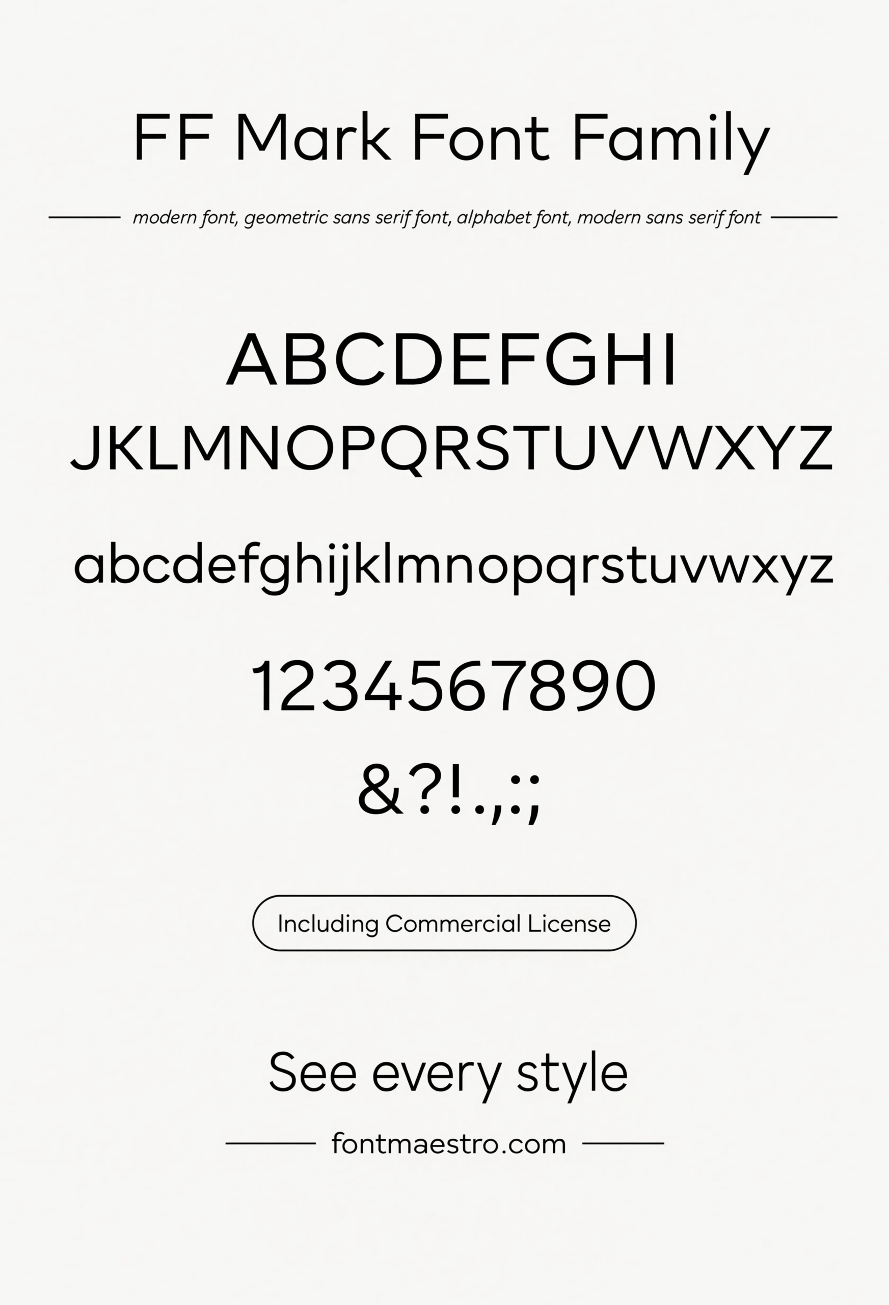
Alphabet Specimen
Full uppercase, lowercase, and numeral set. Consistent stroke width across every letter is what keeps a modern sans from looking mechanical.
Unlimited creative assets. Access to AI tools.
Commercial licence included.
Get downloads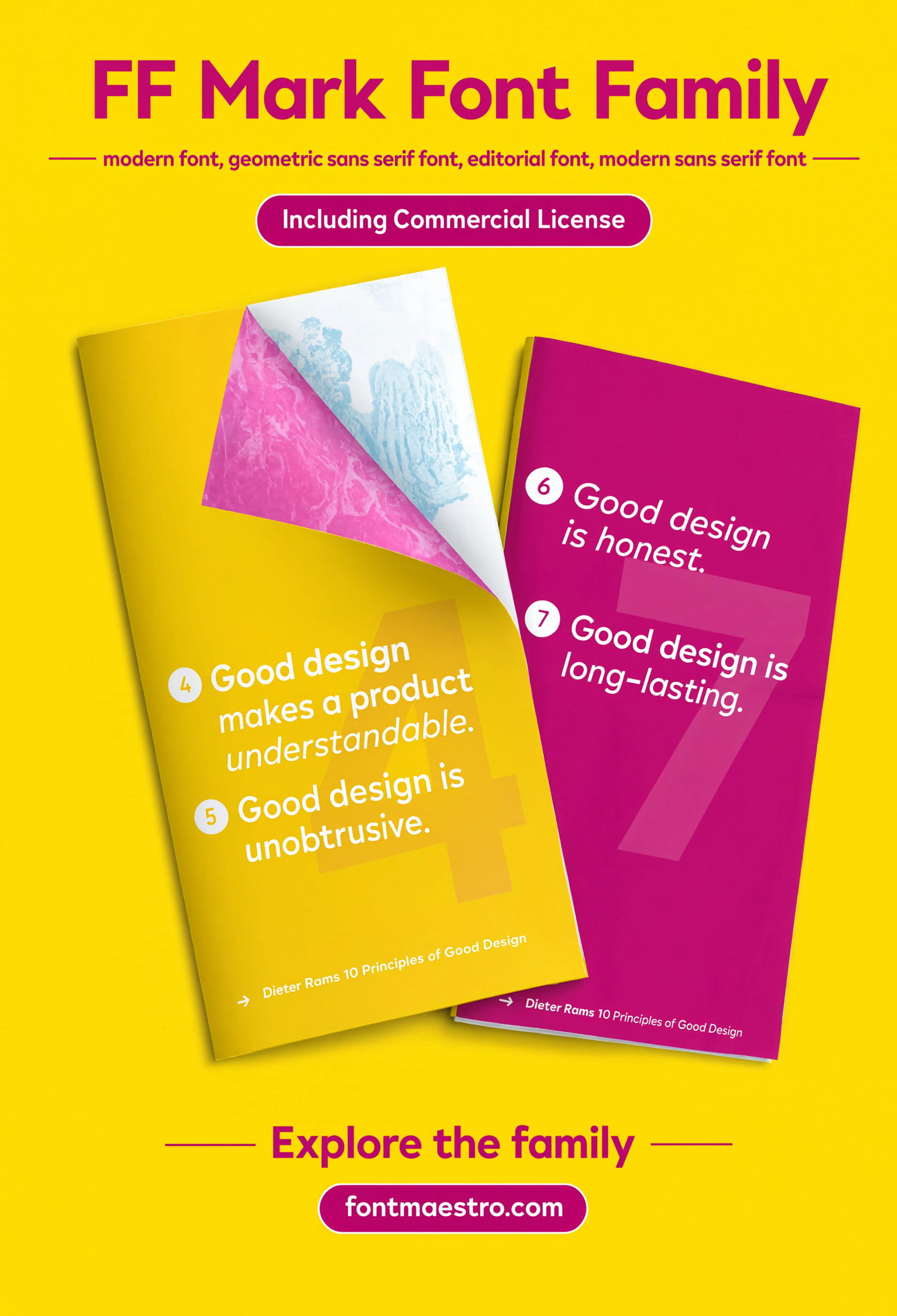
Brochure Layout
Editorial-style brochure spread — a test of how the font handles a mix of headline, subhead, and body copy on the same page.
Unlimited creative assets. Access to AI tools.
Commercial licence included.
Get downloads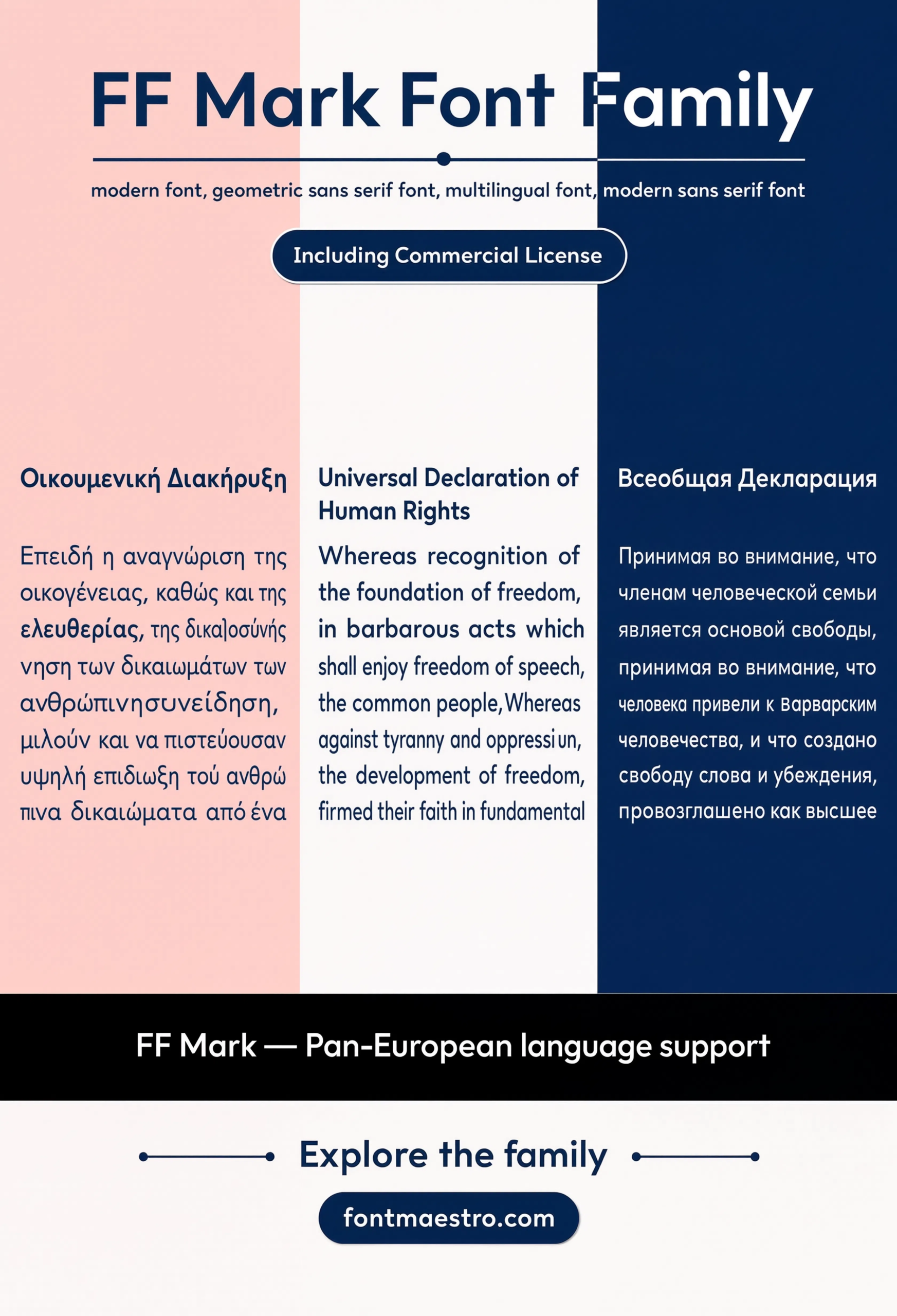
Commercial License
Pan-European Character Support
Full diacritic coverage for European languages — a detail that only shows up as a problem once a project needs it and the font doesn’t have it.
Unlimited creative assets. Access to AI tools.
Commercial licence included.
Get downloads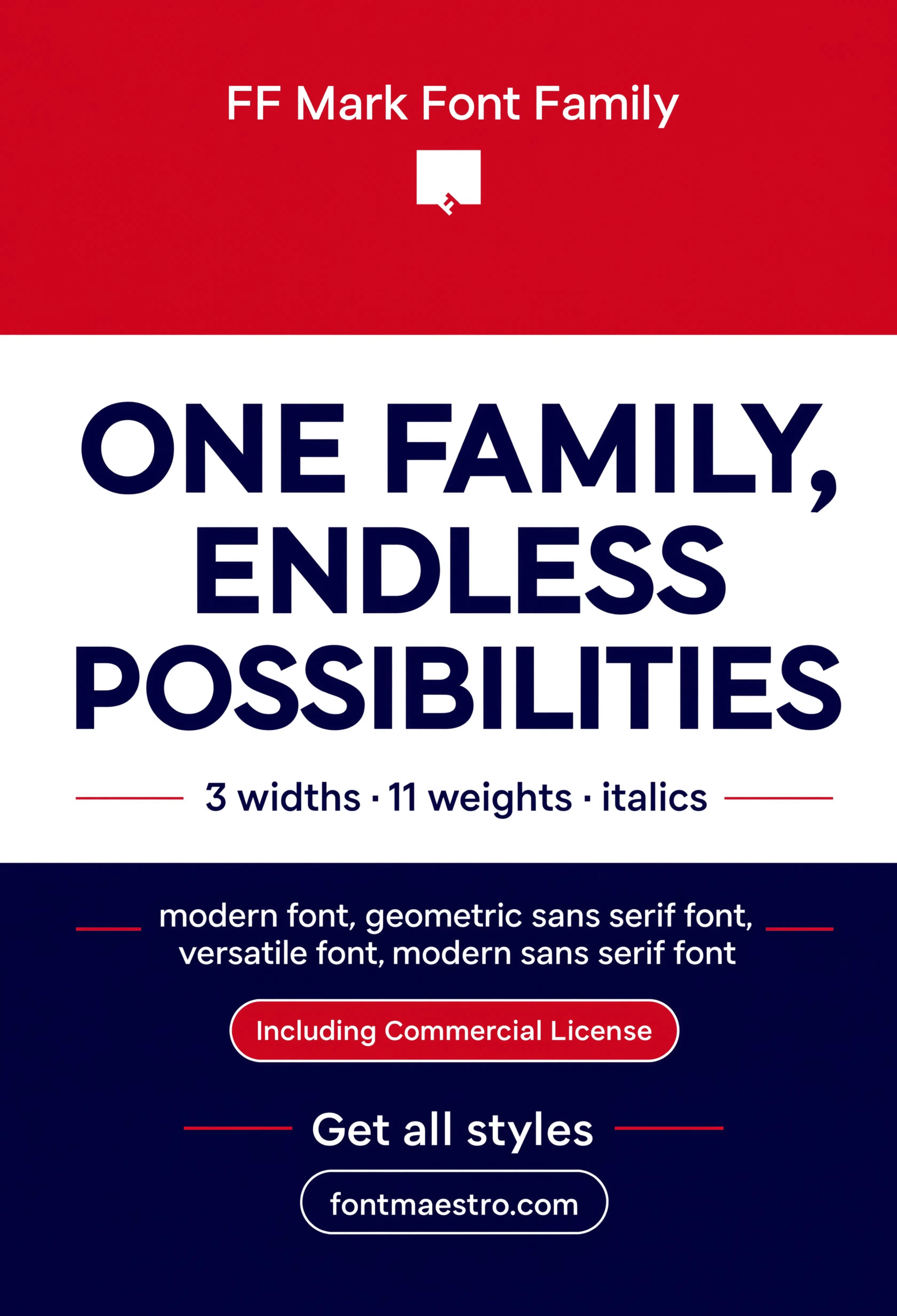
Commercial License
Statement Poster
Full-bleed poster treatment at display scale — the environment where a font’s geometric confidence either holds up or falls apart.
If you want to explore more options in this direction, our guide to Classic Font Styles for is worth a look, and you may also enjoy Bold Font Style Name or Elegant Font Design for a different take on the same style.
Unlimited creative assets. Access to AI tools.
Commercial licence included.
Get downloads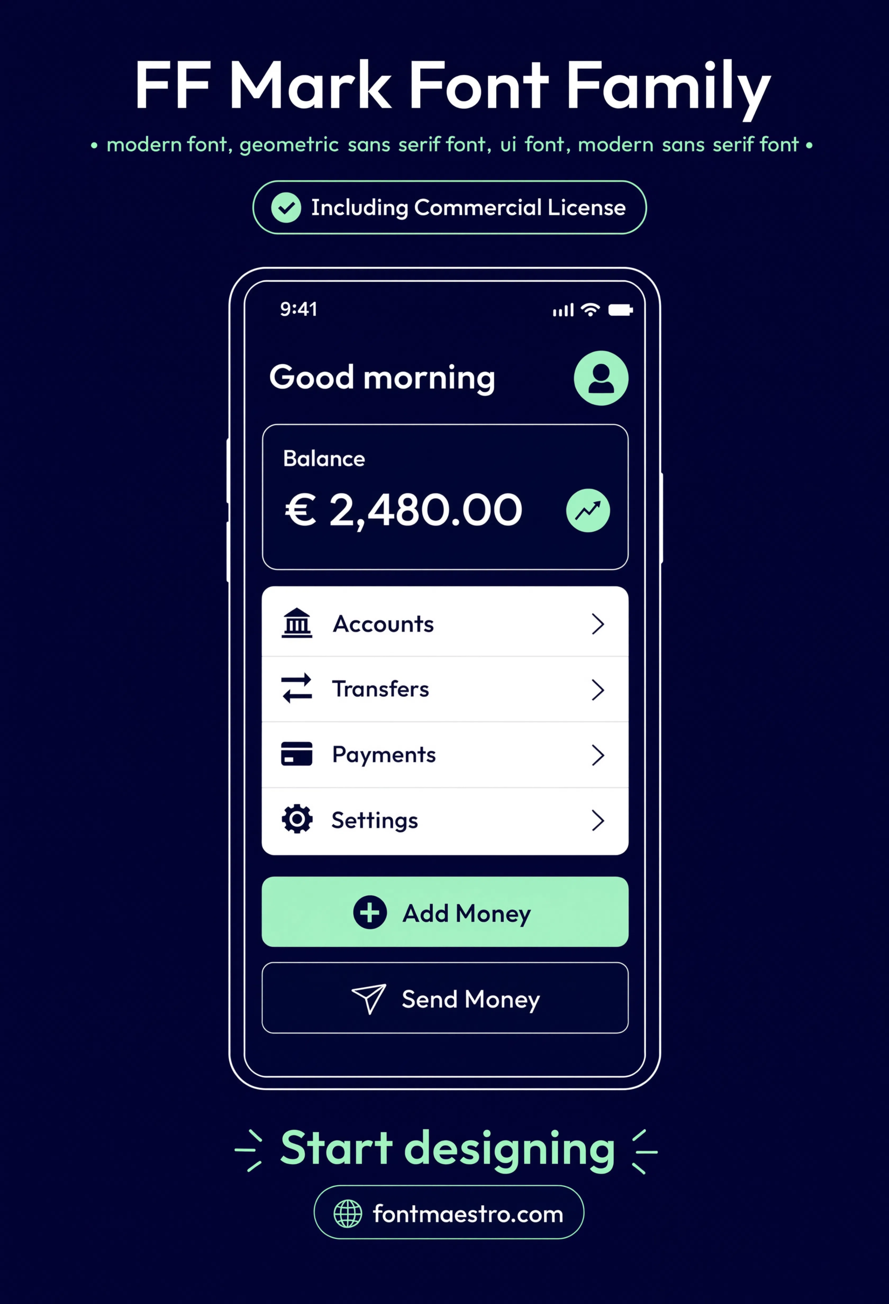
Commercial License
UI Dashboard
Interface application showing small-size legibility — labels, buttons, and data all stay clear, the real test for a font headed to a digital product.
Explore the FF Mark Collection →
How Do You Know a Font Will Still Look Modern in a Few Years?
Check the character set before the headline sample. A font with full multilingual support, alternate numerals, and stylistic alternates was built as a long-term system, not a seasonal display face — that range is usually a better predictor of longevity than how striking the hero preview image looks.
Looking for more type inspiration? Our capital letters font styles guide covers all-caps spacing rules that apply to a family like this one, and our bold font style name guide looks at the opposite end of the weight spectrum.
Frequently Asked Questions
What makes a font read as “modern” rather than just plain?
Consistent geometric proportion and a full supporting character set — multilingual glyphs, alternate numerals, stylistic alternates — rather than a single striking gimmick that dates quickly.
Does a modern font need multilingual support?
It depends on the project, but native Greek/Cyrillic or Pan-European glyph support avoids a mismatched fallback font showing up mid-layout on international work.
What’s the benefit of stylistic alternates in a modern sans?
They let a headline pick up personality without switching to a second typeface, keeping the whole system visually consistent.
Is a geometric sans font good for UI design?
Yes, if it holds its legibility at small sizes — check a dashboard or interface mockup sample before committing, not just a large display specimen.
Can I use these fonts commercially for branding?
Yes, with the commercial license included in the standard MyFonts bundle — confirm the specific license terms on the product page before client delivery.
Key Takeaways
- Want a proven starting point? Explore the FF Mark collection on MyFonts for a full weight and character range.
- A genuinely modern font comes from consistent geometric proportion, not a single trendy detail
- Check multilingual support, alternate numerals, and stylistic alternates before committing — not just the headline sample
- Commercial license is included in the standard bundle, so client branding work is covered
Related Reads
Unlimited creative assets. Access to AI tools.
Commercial licence included.
Get downloads