The assumption behind most “geometric letters font” searches is that geometric automatically means cold or corporate. It doesn’t. A geometric sans built on true circles and consistent stroke widths can read as warm, modern, or striking depending entirely on how the weight and spacing are handled — the geometry sets the skeleton, not the personality.
That distinction matters because geometric letterforms show up everywhere from tech branding to editorial headlines to packaging, and picking one without understanding what “geometric” actually controls in a typeface leads to mismatched choices later in a project.
Quick answer: Axiforma is a geometric sans built on near-perfect circular forms with a wide weight range, from Thin through Black, so the same underlying letter structure can read minimal or bold depending on which cut is used. Compare weight and letter-width options side by side before choosing — geometric families vary more in usable range than their uniform look suggests.
Geometric doesn’t mean rigid — here’s what the label actually describes
The common misconception: “geometric letters font” implies a single rigid look — perfect circles, perfect angles, no variation. In practice, geometric only describes the construction method, not the final character. Two geometric sans families can look completely different depending on their weight range, x-height, and spacing choices.
What “geometric” actually controls in a typeface:
| Trait | What it means | What it does NOT mean |
|---|---|---|
| Circular bowls | Letters like “o,” “e,” “c” are built from near-true circles | Every letter looks mechanically identical |
| Consistent stroke width | Minimal contrast between thick and thin strokes | The typeface can’t have expressive weight variation |
| Wide weight range | Many geometric families span Thin to Black | Only one “geometric” weight exists |
| Uniform letter width | Predictable spacing for grid-based layouts | The typeface feels robotic in body text |
A geometric sans with genuine range can carry a minimalist tech brand at its lightest weight and a bold, attention-grabbing headline at its heaviest — the same circular letter construction underneath both.
What does a geometric letters font look like across real applications?
A single alphabet specimen doesn’t show how geometric structure holds up once it’s carrying a poster, a coffee bag, or a magazine cover. Here’s the range in practice.
Unlimited creative assets. Access to AI tools.
Commercial licence included.
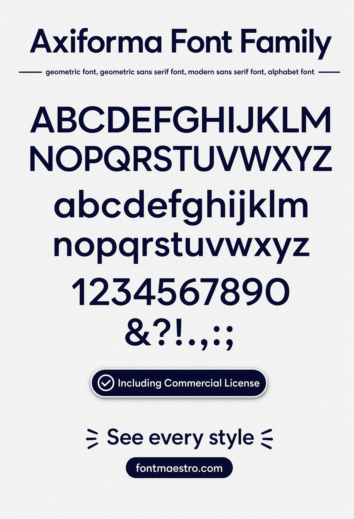
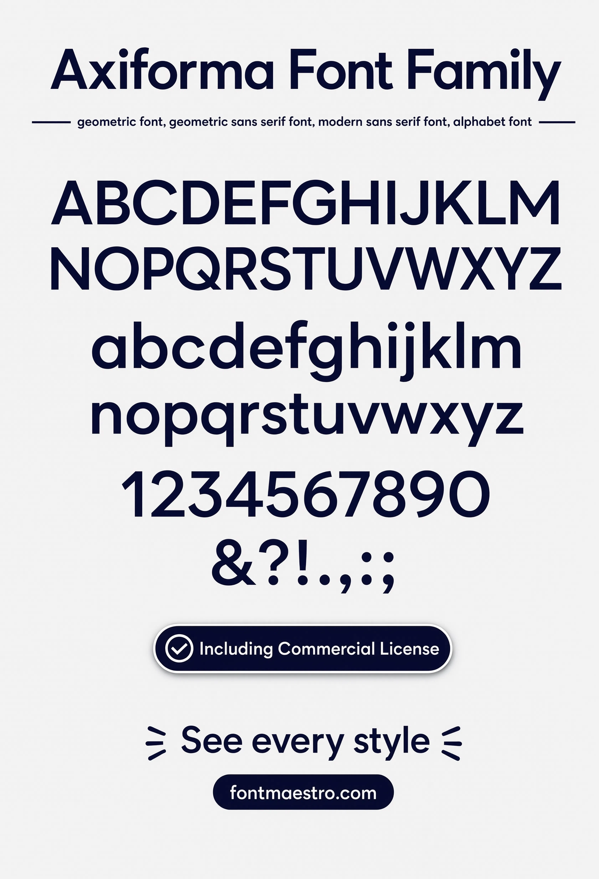
Get downloadsAxiforma — Alphabet Specimen
The full alphabet laid out together — circular bowls and consistent stroke width visible across every letterform, the foundation any geometric letters font is judged on.
Commercial License
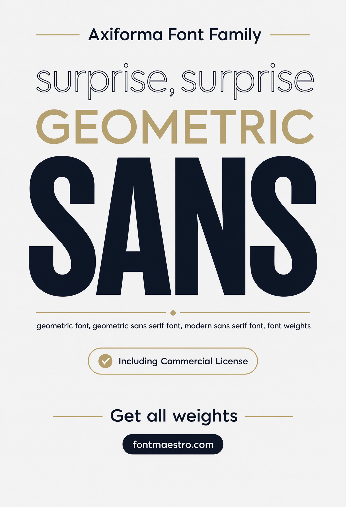
Axiforma — Geometric Sans Poster
A full poster layout built on the family’s geometric structure — proof this construction method scales cleanly from a single letterform to a complete large-format piece.
Commercial License
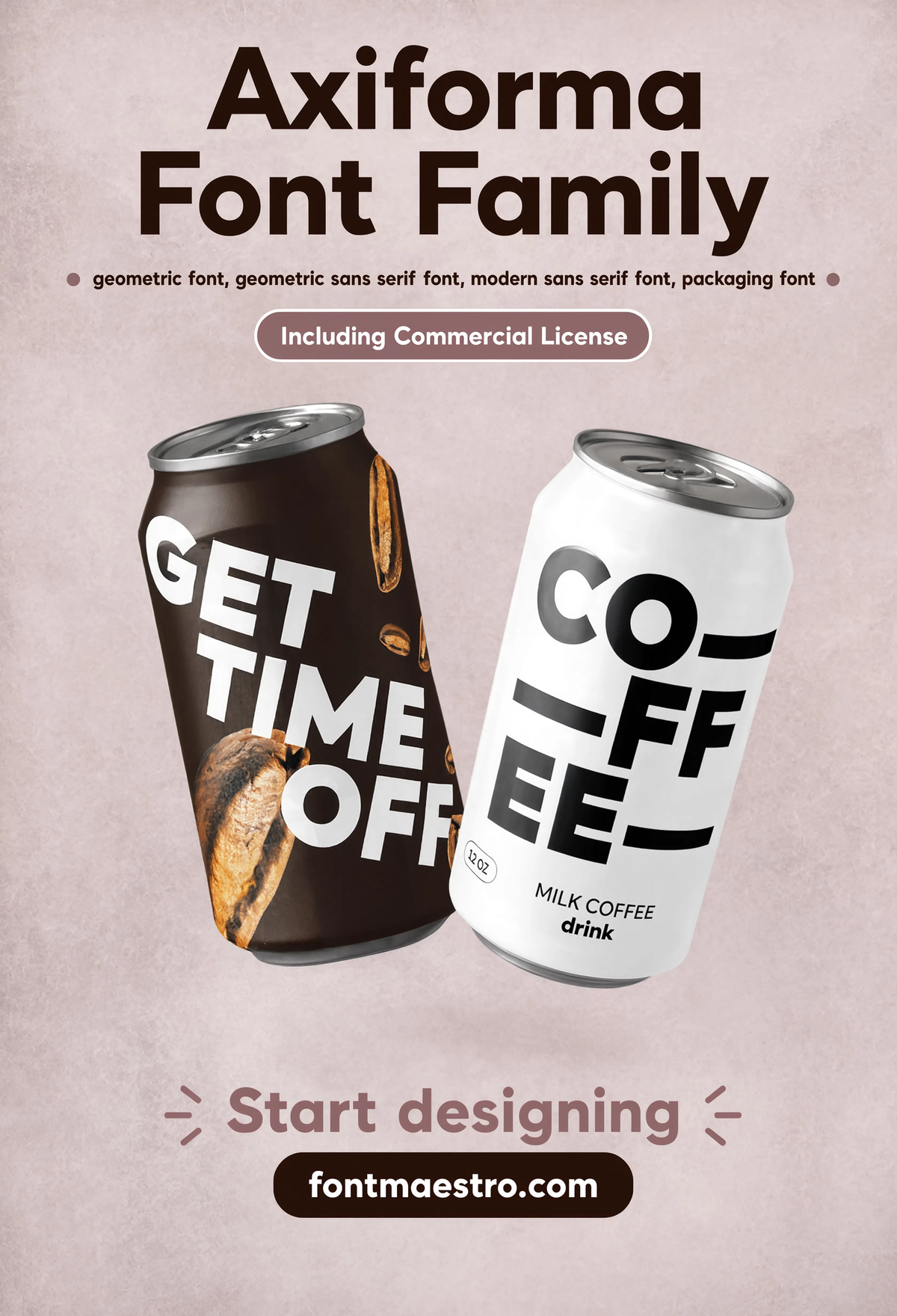
Axiforma — Coffee Packaging
Product packaging built around the geometric letterforms — a warmer, more tactile use case than the tech-branding stereotype these typefaces usually get pigeonholed into.
Commercial License
Every file ships as OTF and TTF across the full weight range under one commercial license, ready for Illustrator, Figma, or Photoshop across print and digital work alike.
Browse the Axiforma Collection →
How wide is the usable weight range in a geometric letters font?
The range from Thin to Black in the same geometric skeleton is what separates a versatile family from a one-trick display font. Here’s that range shown across different real weights.
Unlimited creative assets. Access to AI tools.
Commercial licence included.
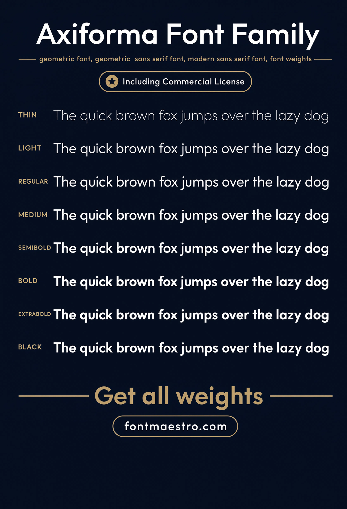
Get downloadsAxiforma — Weight Ladder
Every weight in the family stacked together — the fastest way to judge whether a geometric sans has a genuinely usable range or just two extremes.
Commercial License
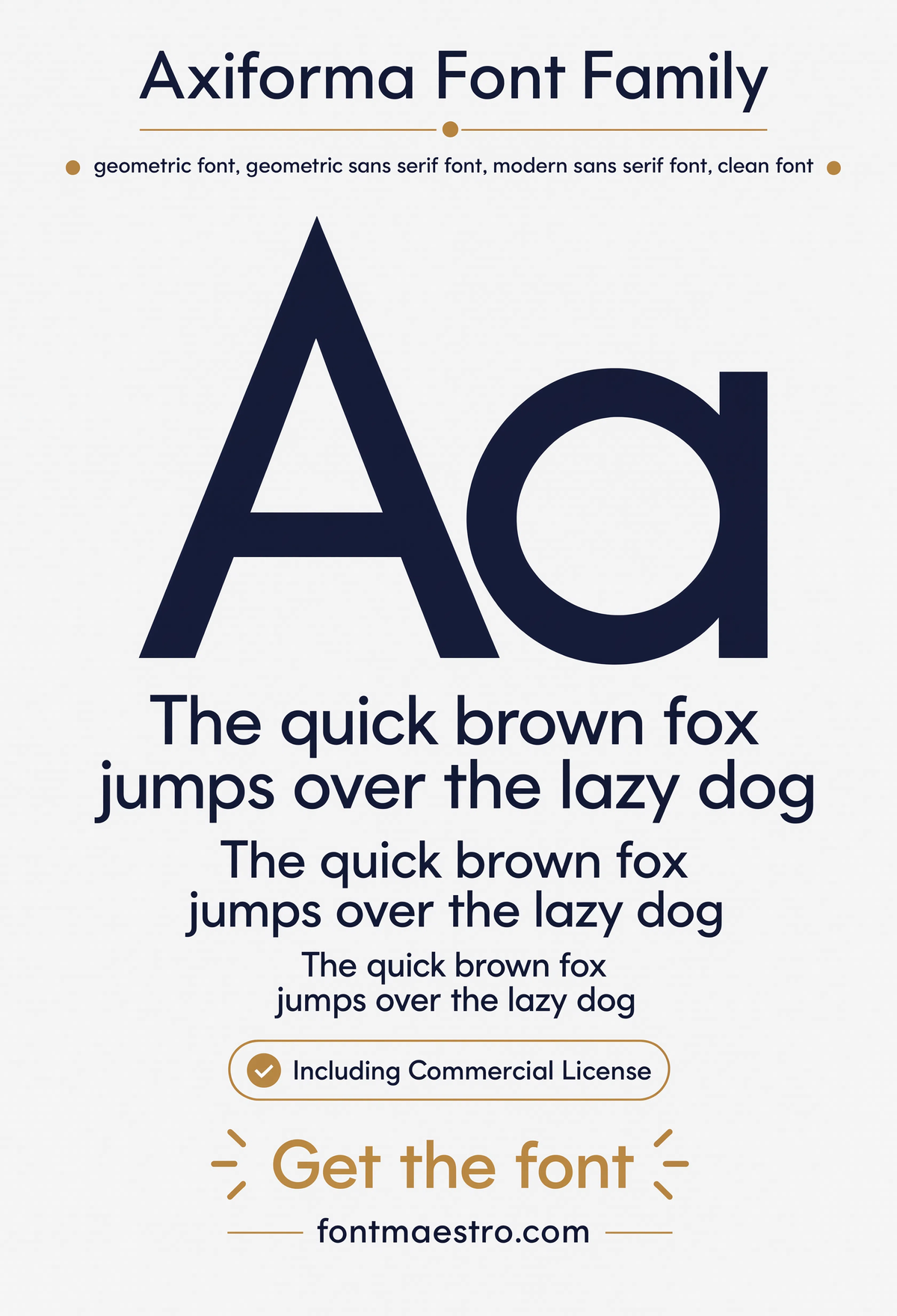
Axiforma — Pangram Specimen
A full pangram set at readable size — every letter in the alphabet shown together, useful for testing how the geometric letterforms behave as continuous text.
Commercial License
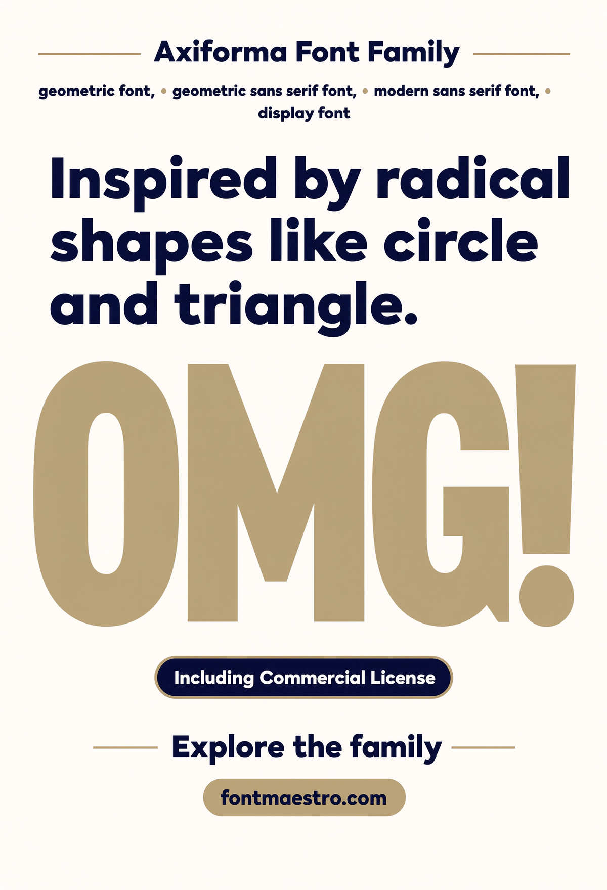
Axiforma — Radical Shapes
A bold, oversized display treatment pushing the geometric forms to their most graphic extreme — proof the same skeleton can carry a loud, attention-grabbing statement.
Commercial License
Where does a geometric letters font carry into branding work?
Circular, consistent letterforms compress well into logotypes and lockups — the same predictability that makes geometric sans typefaces easy to read also makes them easy to brand around.
If you want to explore more options in this direction, our guide to Font Style For Architecture is worth a look, and you may also enjoy Best Font for Poster or Best Font for Branding for a different take on the same style.
Unlimited creative assets. Access to AI tools.
Commercial licence included.
Get downloadsAxiforma — Logo Lockup
A compact logotype built from the geometric letterforms — the circular bowls compress cleanly into a lockup without losing their roundness at small sizes.
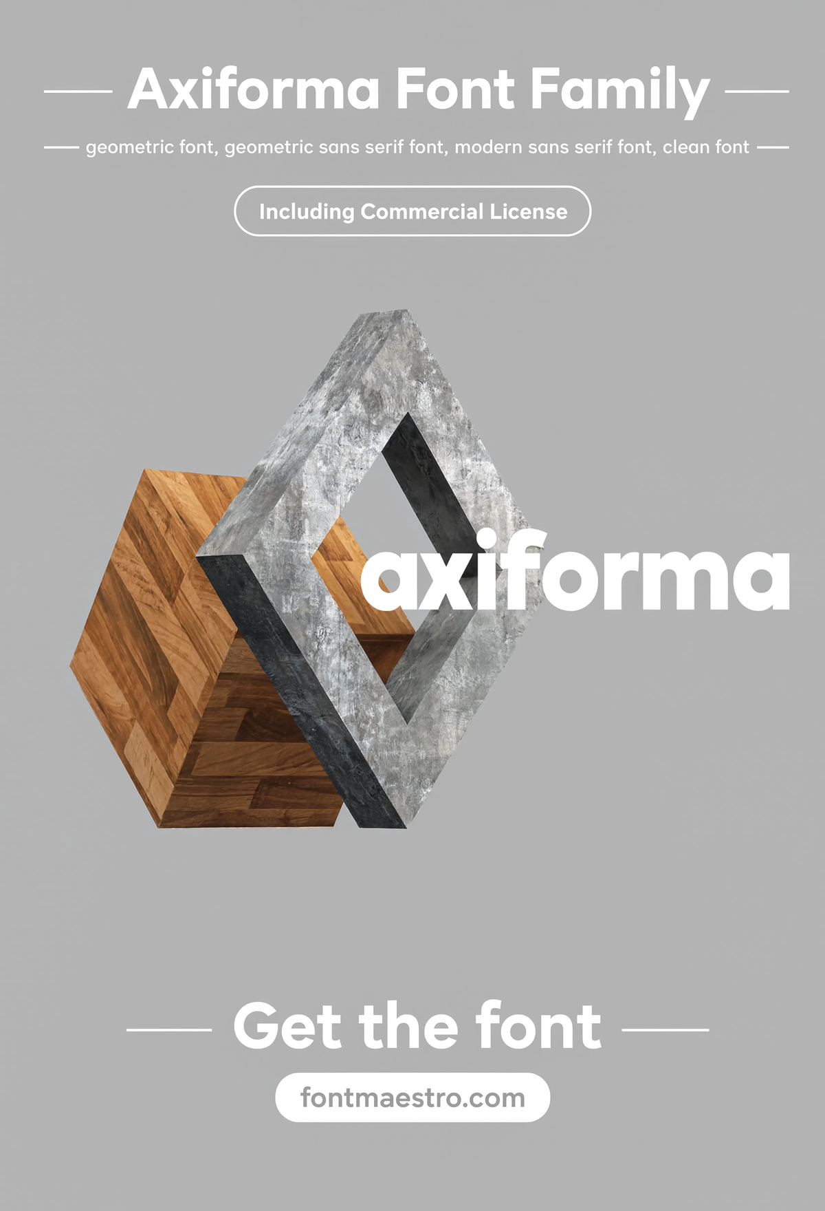
Commercial License
Axiforma — Winner Wordmark
An award or achievement-style wordmark treatment — showing the letterforms carrying a celebratory, confident tone rather than a purely clinical one.
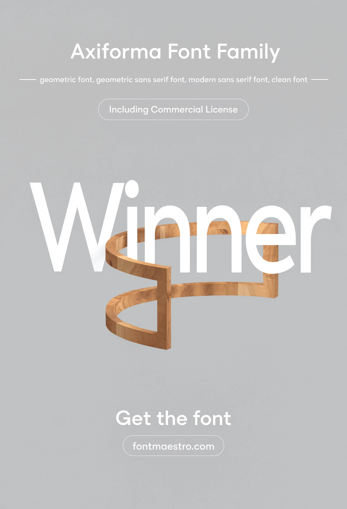
Commercial License
Axiforma — Card Logo Composition
A logo composed onto a card layout — a smaller-scale branding application showing how the geometric structure holds up in compact, detail-heavy layouts.
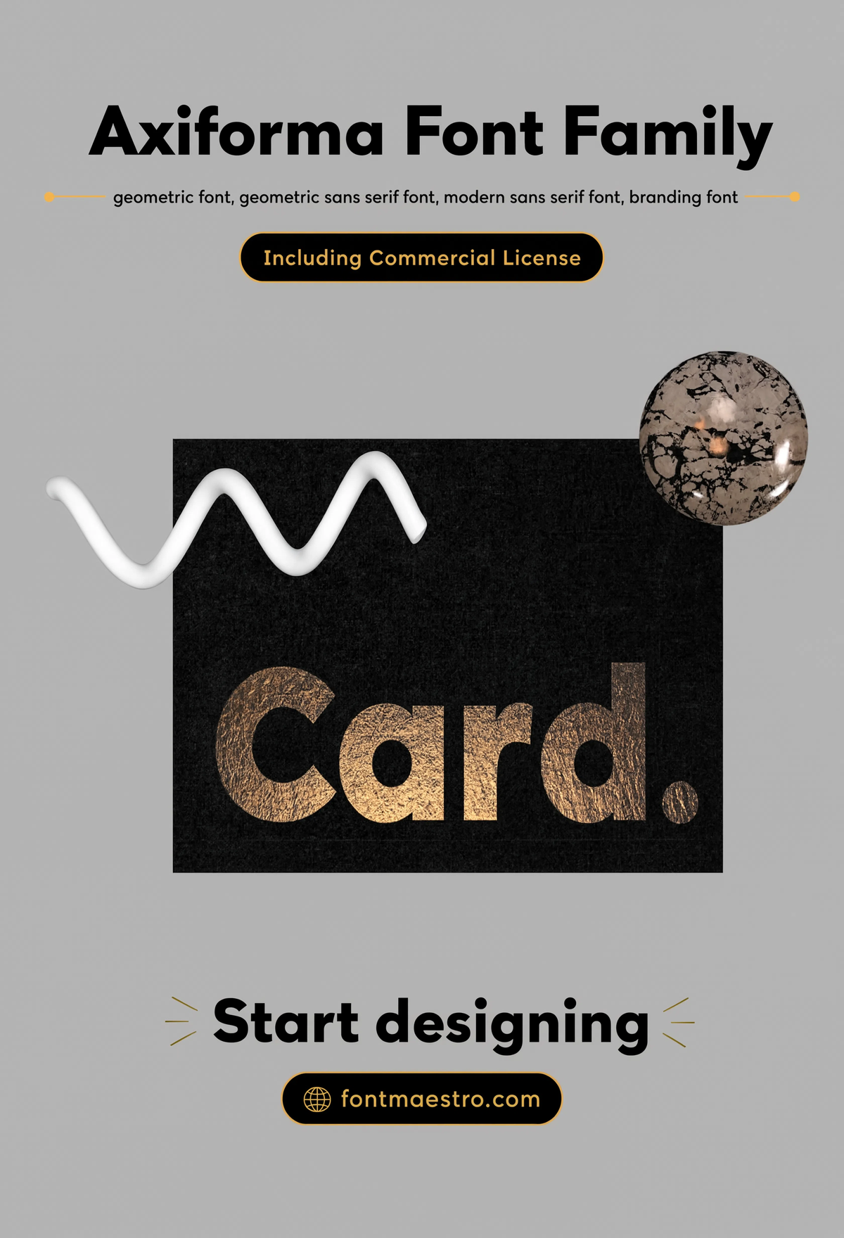
Commercial License
Does a geometric letters font hold up on screens as well as print?
Digital surfaces test a typeface differently than print — smaller rendering sizes, backlit glow, and interactive contexts all stress geometric structure in ways a printed poster doesn’t.
Unlimited creative assets. Access to AI tools.
Commercial licence included.
Get downloadsAxiforma — Web Hero Mockup
A website hero section using the family as the primary headline typeface — a direct look at how the geometric structure reads on a backlit screen at large scale.
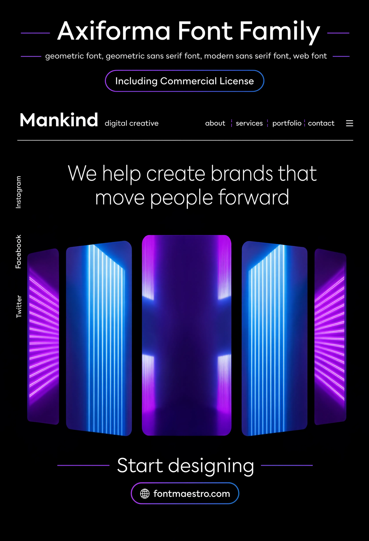
Commercial License
Unlimited creative assets. Access to AI tools.
Commercial licence included.
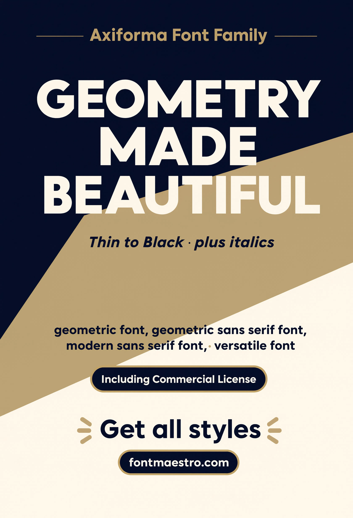
Get downloadsAxiforma — Geometry Statement
A minimal statement piece built entirely around the geometric construction itself — the clearest single example of what makes this letterform approach distinct.
Commercial License
For more on letterform selection, see our guide to fonts for letters, and our guide to fonts for branding covers how a similar structural consistency carries across a full identity system.
Frequently Asked Questions
Does “geometric” mean a font will look cold or robotic?
No — geometric describes the construction method (circular bowls, consistent stroke width), not the emotional tone. Weight, spacing, and application decide whether a geometric sans reads warm, minimal, or bold.
What’s the difference between a geometric and a humanist sans-serif?
Geometric sans typefaces are built on near-perfect circles and consistent stroke width. Humanist sans typefaces are based more on handwriting proportions, with more organic curves and stroke contrast.
How many weights should I look for in a geometric letters font?
A wide range — Thin through Black or similar — gives the most flexibility, letting the same skeleton carry both minimal and bold applications without switching typefaces.
Is a geometric sans a safe choice for both branding and body text?
Yes, provided the weight range includes a Regular or Book weight tuned for continuous reading, not just display weights. Check both a body-text sample and a large headline sample before committing.
Do geometric letterforms work well for logos and small-scale branding?
Very well — the predictable, consistent shapes compress cleanly into logotypes and lockups, which is part of why geometric sans families are common in tech and modern branding work.
Key Takeaways
- Want the exact family from this breakdown? Get Axiforma with the full commercial license.
- “Geometric” describes letter construction, not personality — weight and spacing decide the tone.
- A wide weight range is what separates a versatile geometric letters font from a one-trick display face.
- Circular, consistent letterforms compress especially well into logos and small-scale branding work.
Related Reads
Unlimited creative assets. Access to AI tools.
Commercial licence included.
Get downloads