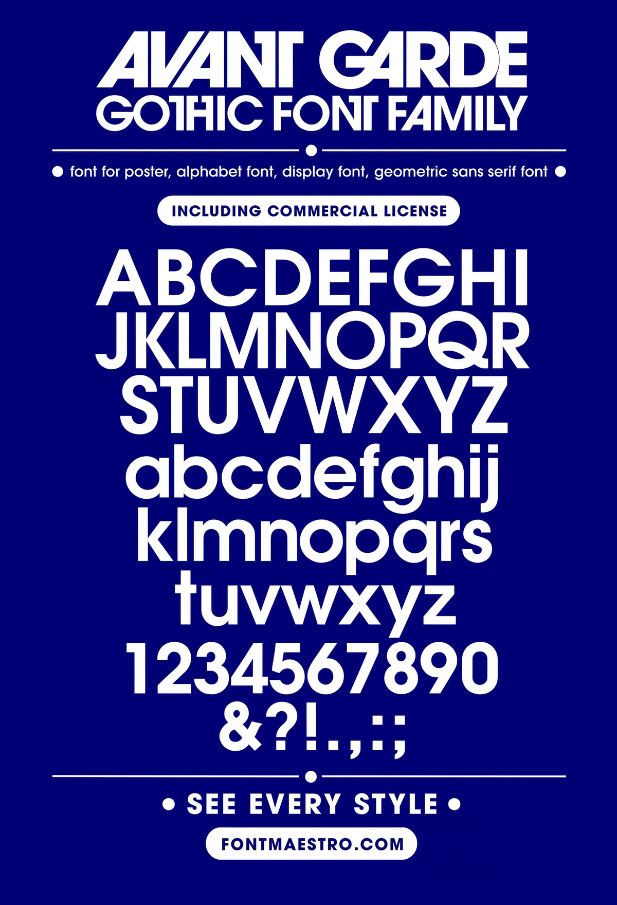
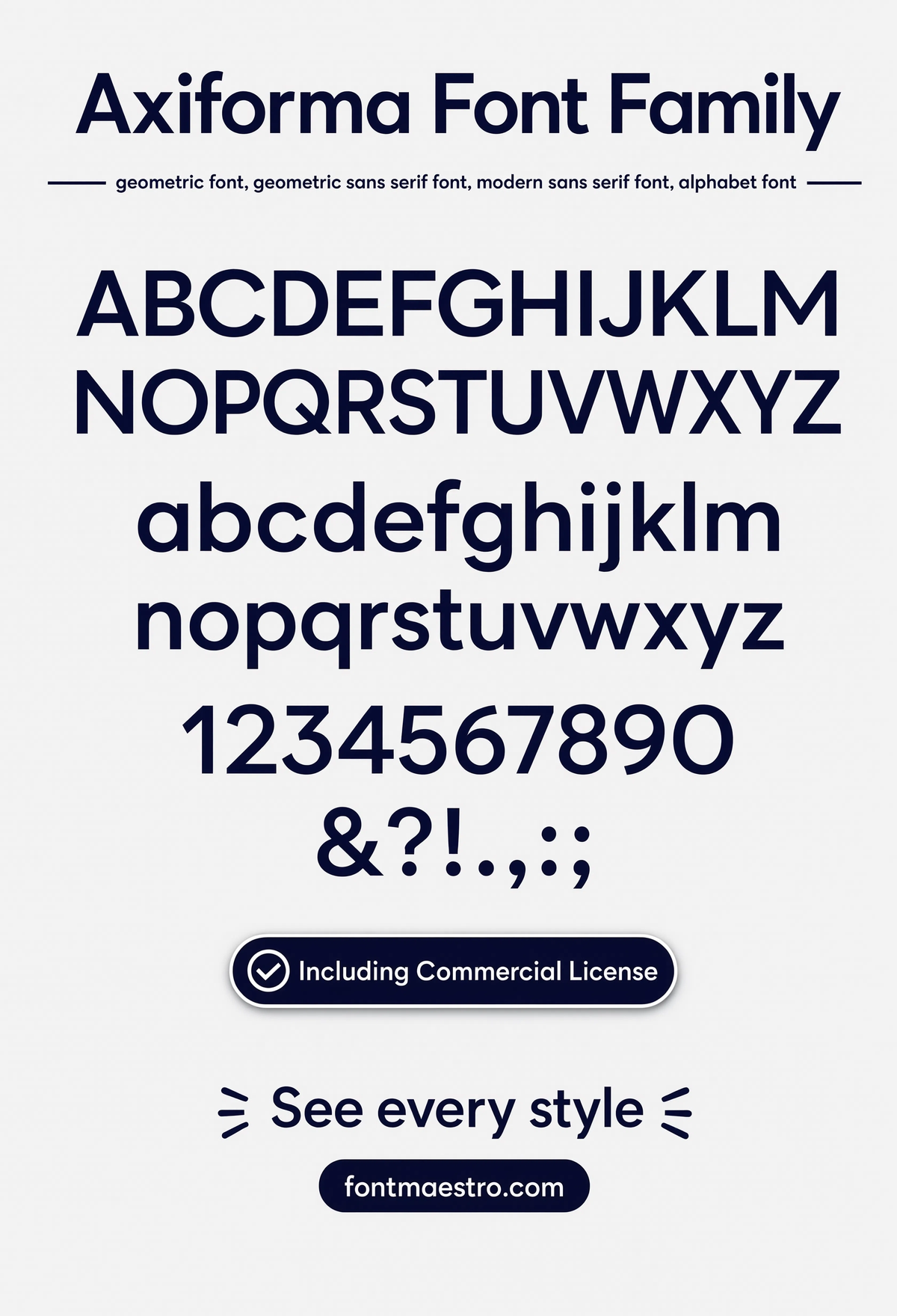
Most people searching “font design” aren’t researching typography theory — they’re mid-project, staring at a logo mockup or a poster layout, trying to find a typeface that actually looks designed instead of default. The searches that feed this exact question split into two camps: “design fonts” and “font for design” people want a typeface to drop into their own project, while “font art design” and “font style design” searchers are hunting for something with more visual character than a generic system font.
Both camps run into the same wall: a font that looks sharp in a one-word preview can fall apart the moment it’s stretched across a logo, shrunk into a business card, or set in a full sentence. That’s the actual problem “font design” searches are trying to solve — not the theory, the risk of picking wrong.
Quick answer: If you’re picking a font for a design project, check three things before committing — how it holds its shape at small sizes, how tight the letter spacing gets in real words (not just a single test word), and whether the weight range gives you enough contrast for a logo vs. body copy. Helvetica Now Display is built for headlines and logos; Text is built for paragraphs — using the wrong one is the most common mistake in font-for-design searches.
What separates good font design from a font that just looks good in a preview?
A preview image shows one word, one size, one line. Real font design has to hold up across paragraphs, headlines, all-caps labels, and whatever weird combination of characters a project throws at it. The swashes on a script capital can look gorgeous in isolation and then overlap the next letter the moment kerning gets tight past 40 characters.
Three things to actually check before trusting a font:
- X-height consistency — lowercase letters should sit at a uniform height relative to caps. Inconsistent x-height is the fastest way to make body text look amateur.
- Optical sizing — does the font have separate Display/Text/Micro cuts, or is it one master scaled up and down? Scaled-up display type from a text-optimized master looks thin and fragile at large sizes.
- Glyph coverage — ligatures, PUA-encoded icons, extended Latin, currency symbols. A font that’s missing half of these breaks the moment a project needs them.
Unlimited creative assets. Access to AI tools.
Commercial licence included.
Get downloadsHelvetica Now — Full Specimen
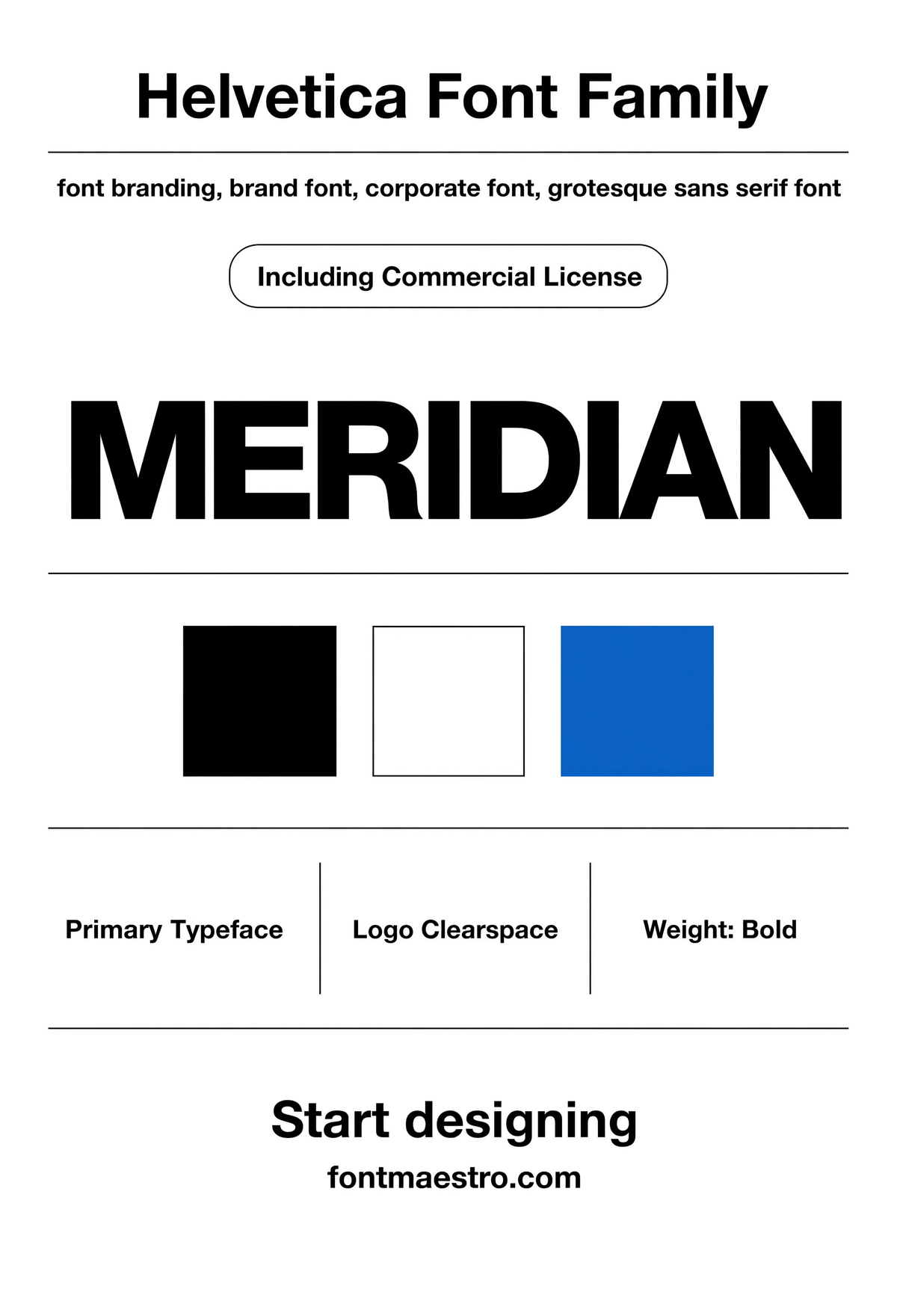
This is the version most “font for design” searches are actually looking for — a complete specimen showing every weight together, so you can see how the family holds together before committing it to a logo or brand system.
Commercial License
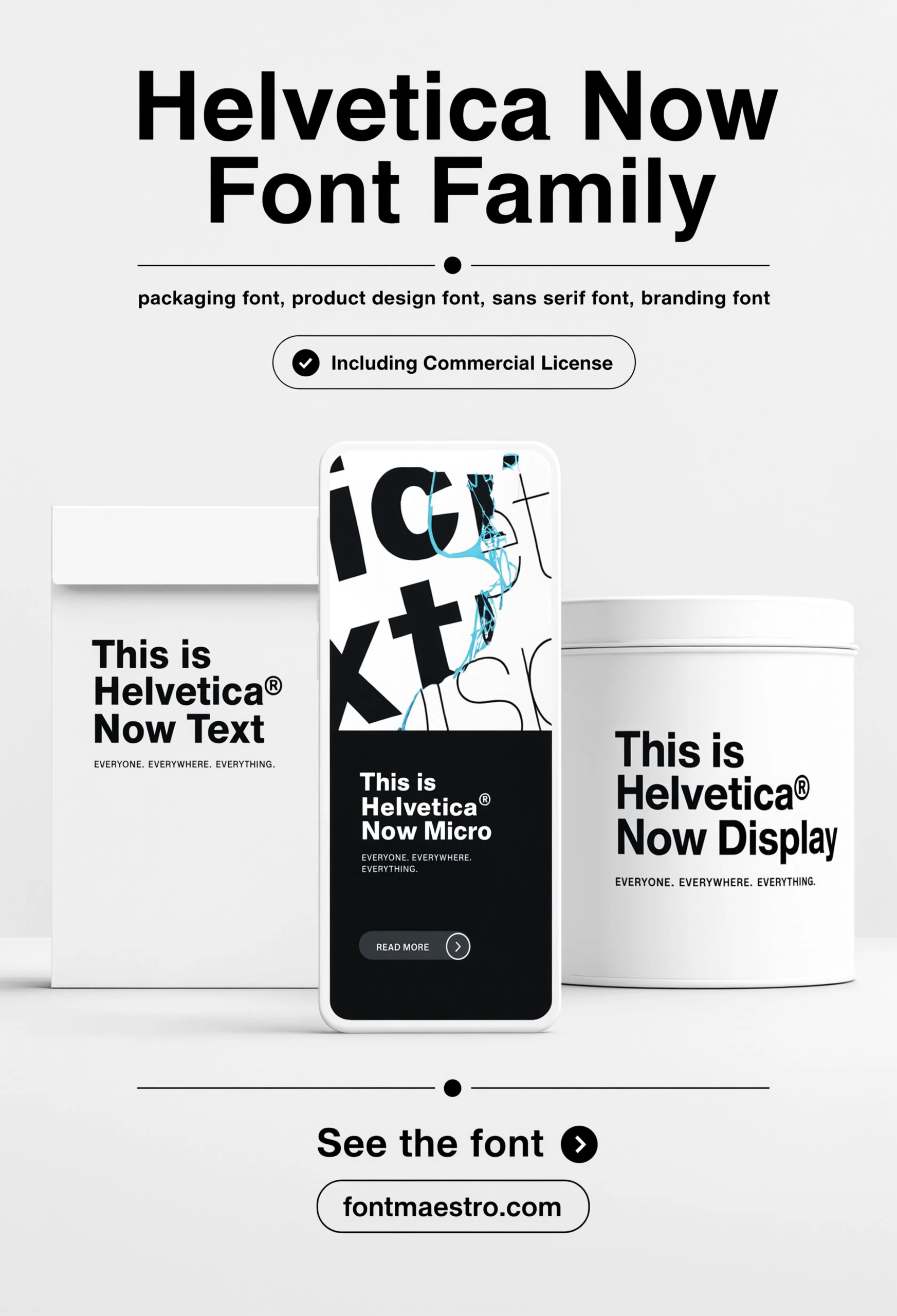
Helvetica Now — Packaging Mockup
Packaging is one of the toughest real-world tests for font design — small print runs, varied lighting, curved surfaces. A typeface that stays legible here is proven for retail and product work.
If you want to explore more options in this direction, our guide to Classic Font Styles for is worth a look, and you may also enjoy Beautiful Modern Font or Elegant Font Design for a different take on the same style.
Commercial License
Unlimited creative assets. Access to AI tools.
Commercial licence included.
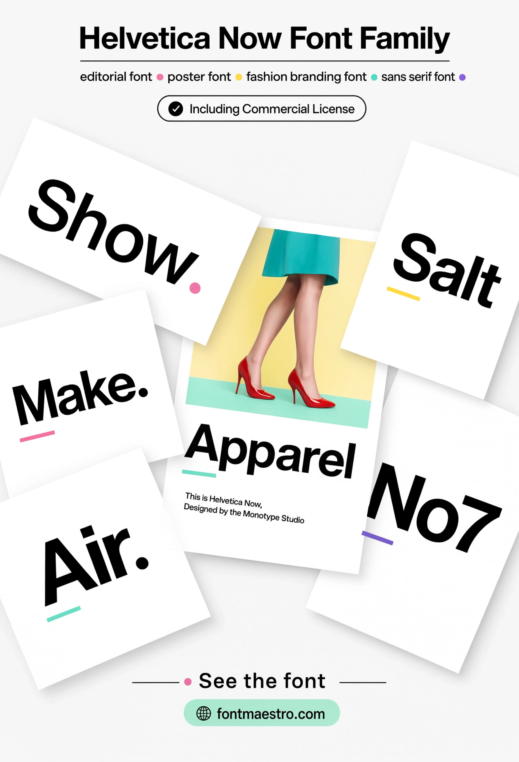
Get downloadsHelvetica Now — Poster Layout
This is font design applied, not just displayed — the same family used across a full poster layout, mixing weights for hierarchy. If you’re designing anything with a headline-to-body relationship, this is the real-world test.
Commercial License
Helvetica Now — Packaging Mockup
Packaging is one of the toughest real-world tests for font design — small print runs, varied lighting, curved surfaces. A typeface that stays legible here is proven for retail and product work.
If you want to explore more options in this direction, our guide to Classic Font Styles for is worth a look, and you may also enjoy Beautiful Modern Font or Elegant Font Design for a different take on the same style.
Commercial License
Unlimited creative assets. Access to AI tools.
Commercial licence included.
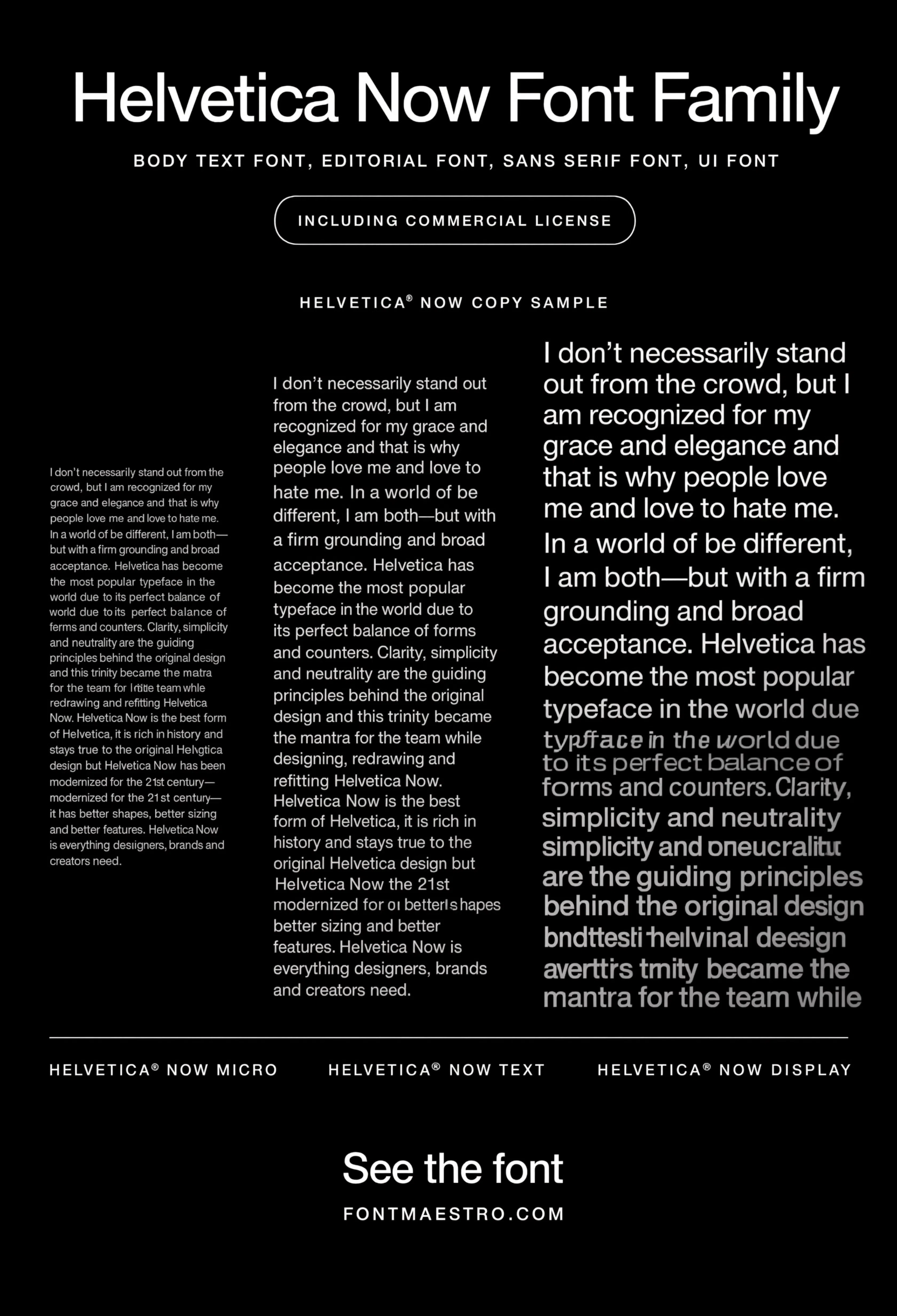
Get downloadsHelvetica Now — Running Copy
This is the test most “design fonts” searches skip entirely: a full paragraph, not a headline. Spacing problems that are invisible in a three-word logo become obvious across five lines of running text.
Commercial License
Helvetica Now — Packaging Mockup
Packaging is one of the toughest real-world tests for font design — small print runs, varied lighting, curved surfaces. A typeface that stays legible here is proven for retail and product work.
If you want to explore more options in this direction, our guide to Classic Font Styles for is worth a look, and you may also enjoy Beautiful Modern Font or Elegant Font Design for a different take on the same style.
Commercial License
Unlimited creative assets. Access to AI tools.
Commercial licence included.
Get downloadsHelvetica Now — Packaging Mockup
Packaging is one of the toughest real-world tests for font design — small print runs, varied lighting, curved surfaces. A typeface that stays legible here is proven for retail and product work.
If you want to explore more options in this direction, our guide to Classic Font Styles for is worth a look, and you may also enjoy Beautiful Modern Font or Elegant Font Design for a different take on the same style.
Commercial License
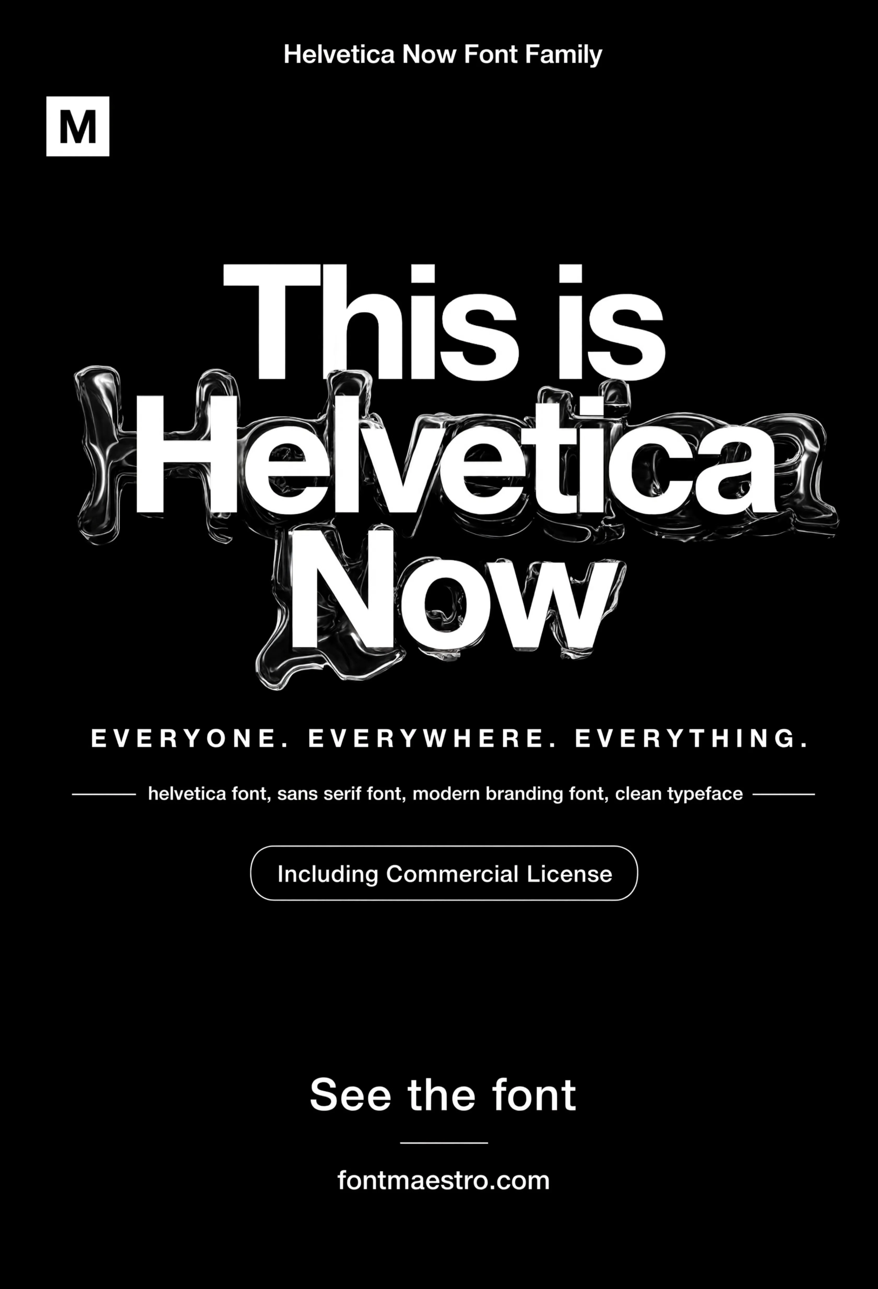
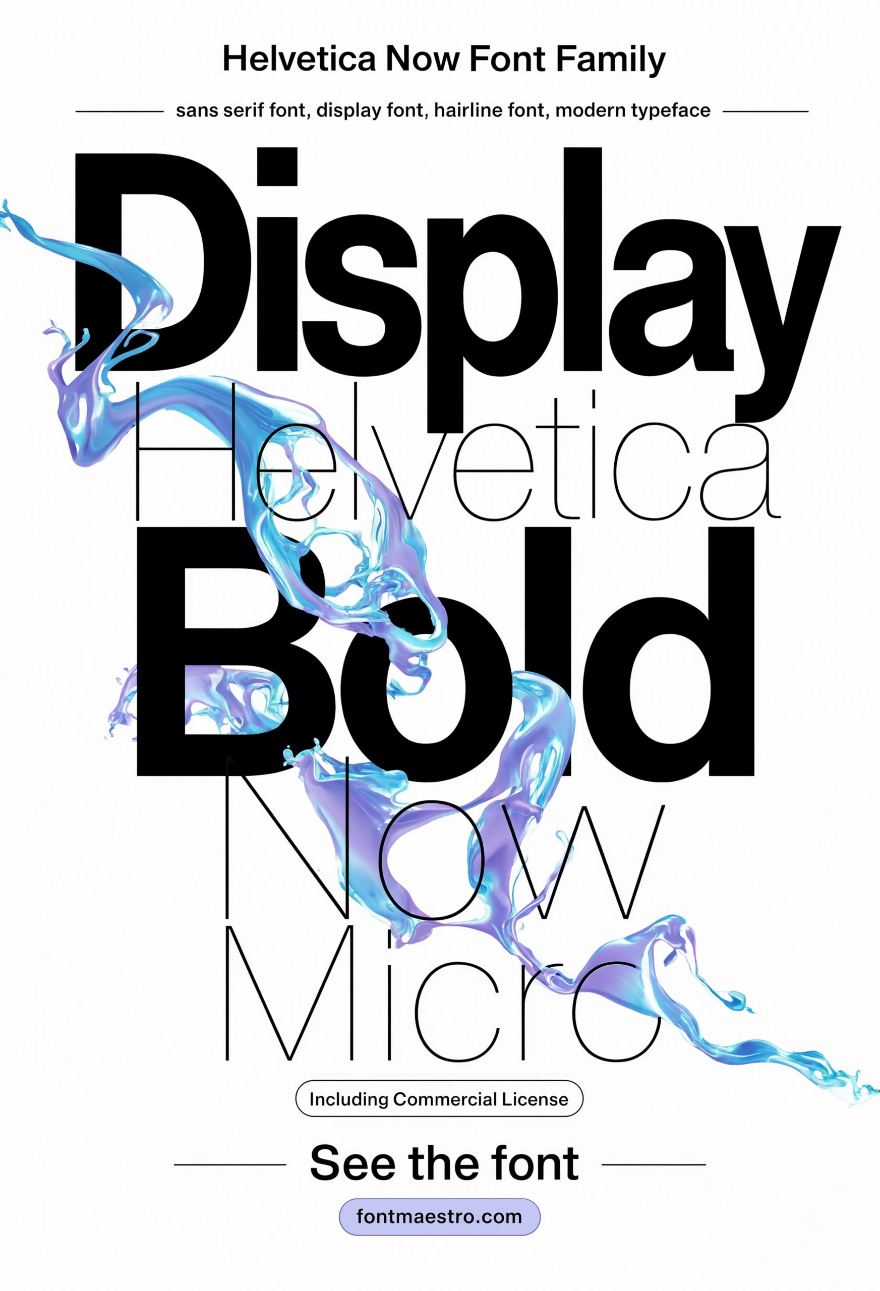
Helvetica Now — Liquid Display, Alternate Crop
A second take on the liquid display treatment, showing the effect from a different angle — useful for judging how far the family can be pushed for experimental branding work without losing legibility.
Commercial License
Each file comes as OTF and TTF, with the full weight range in one commercial license — open it directly in Illustrator, Figma, or your design tool of choice and it’s ready to use, no rebuilding needed.
Browse Helvetica Now Collection →
What does font design look like across different real-world formats?
Screenshots on a font’s product page rarely show how a typeface holds up once it’s actually applied — on a metal surface, in signage, printed on packaging. “Font style design” and “font art design” searches often lead here because a font can look flat in a spec sheet and completely different once it’s rendered in context.
How do Display, Text, and Micro cuts actually differ?
| Cut | Best for | Spacing | Stroke contrast |
|---|---|---|---|
| Micro | Captions, footnotes, UI labels under 8px | Wide, open | Low — avoids strokes disappearing |
| Text | Body copy, paragraphs | Standard, readable | Medium |
| Display | Headlines, posters, large-format | Tighter, more elegant | Higher — fine details read clearly at scale |
Using Display at body-text size looks cramped. Using Text at headline size looks loose and a little clumsy. This is the single most avoidable font design mistake — the fix is free, it’s just picking the right cut for the job instead of installing one weight and scaling it everywhere.
Why does font design matter more than picking “a nice font”?
A typeface with weak design work will fight you at every size. Kerning tightens unpredictably in headlines, italics lean wrong against upright text, and weights don’t share a consistent skeleton — so a Bold heading looks like it’s from a different family than the Regular paragraph under it. None of this shows up in a one-word preview image. It shows up three weeks into a project when the client asks why the logo looks “off” at small sizes.
Good font design is invisible when it’s working. You only notice it when it isn’t.
Looking for more on how specific letterforms hold up? Our Helvetica closeup breakdown gets into individual letter construction, and our guide to fonts for letters covers legibility across a wider range of styles.
Frequently Asked Questions
What makes font design different from font styling?
Font design is the construction of the letterforms themselves — stroke weight, spacing tables, optical corrections. Font styling is what you do with an already-built font: color, size, layout. You can style a badly designed font endlessly and it will still break at small sizes.
Does optical sizing actually matter for digital projects?
Yes — a font built with separate Micro, Text, and Display masters will read cleaner at every size than a single master scaled up or down. It matters most in UI work, where text sizes range from 10px labels to 40px headlines in the same interface.
How many weights does a well-designed font family need?
Enough to cover the hierarchy you actually use — usually 4 to 6 (Light, Regular, Medium, Bold, at minimum). More weights only help if they share the same underlying skeleton; otherwise you’re just adding inconsistency.
What is optical correction in type design?
Small adjustments that make letters look uniform to the eye even though they’re not geometrically identical — round letters like O are drawn slightly taller than square letters like H to appear the same height, for example.
Is OTF or TTF better for font design work?
OTF supports more advanced typographic features (ligatures, stylistic sets, extended glyph sets) and is the standard for professional design work. TTF is more universally compatible with older software. Most commercial licenses include both.
Key Takeaways
- Want the exact font from this breakdown? Get Helvetica Now with the full commercial license.
- Check optical sizing before anything else — Display, Text, and Micro cuts are not interchangeable.
- X-height consistency and kerning at 40+ characters reveal more about font quality than any single-word preview.
- A font family is only as good as its weight consistency — Bold should look like heavier Regular, not a different typeface.
Related Reads
Unlimited creative assets. Access to AI tools.
Commercial licence included.
Get downloads