A bold headline typeface has one job — hold its weight and shape while a reader’s eye moves fast across a poster wall, a magazine spread, or a tour flyer pinned between a dozen others competing for the same glance. Heading Now was built specifically for that job: a display family with an unusually wide width range alongside its weight range, so a bold headline can be pushed wide for a banner or condensed for a tight column without losing its character.
That width-and-weight combination is what separates a genuinely bold font style name from a typeface that’s just been set heavier in a design tool — the letterforms were drawn to carry that weight, not stretched into it.
Quick answer: A bold font style name should mean a display typeface drawn with true heavy weights and a wide range of widths, not a regular weight artificially thickened. Heading Now fits this because its width and weight axes were built together, so a headline stays legible and structurally sound whether it’s set condensed in a narrow column or expanded across a poster.
What Separates a True Bold Weight From a Fake One?
A genuine bold weight is drawn with its own letterforms — wider counters, adjusted stroke junctions, and spacing built for the heavier weight specifically. A fake bold, created by a design tool’s “bold” button on a regular weight, just thickens strokes uniformly, which often closes up counters and blurs details at small sizes. The alphabet specimen below shows Heading Now’s actual bold construction.
How Do Width and Weight Work Together in a Headline Font?
- Check the width range first — a family with condensed through expanded widths gives far more layout flexibility than weight alone.
- Match width to available space — condensed widths suit narrow columns and tight headlines, expanded widths suit banners and posters.
- Test italics separately — a true italic cut redraws the letterforms rather than just slanting them, which matters for editorial and magazine work.
- Confirm the weight ladder holds up at both extremes — the lightest and heaviest weights should share the same underlying structure.
Each file below is a desktop and web-font license bundle available directly through MyFonts — install it locally for headline and poster work, or license the web-font cut for a website. It’s part of the Heading Now collection, so commercial branding rights are included in the standard license.
Unlimited creative assets. Access to AI tools.
Commercial licence included.
Get downloads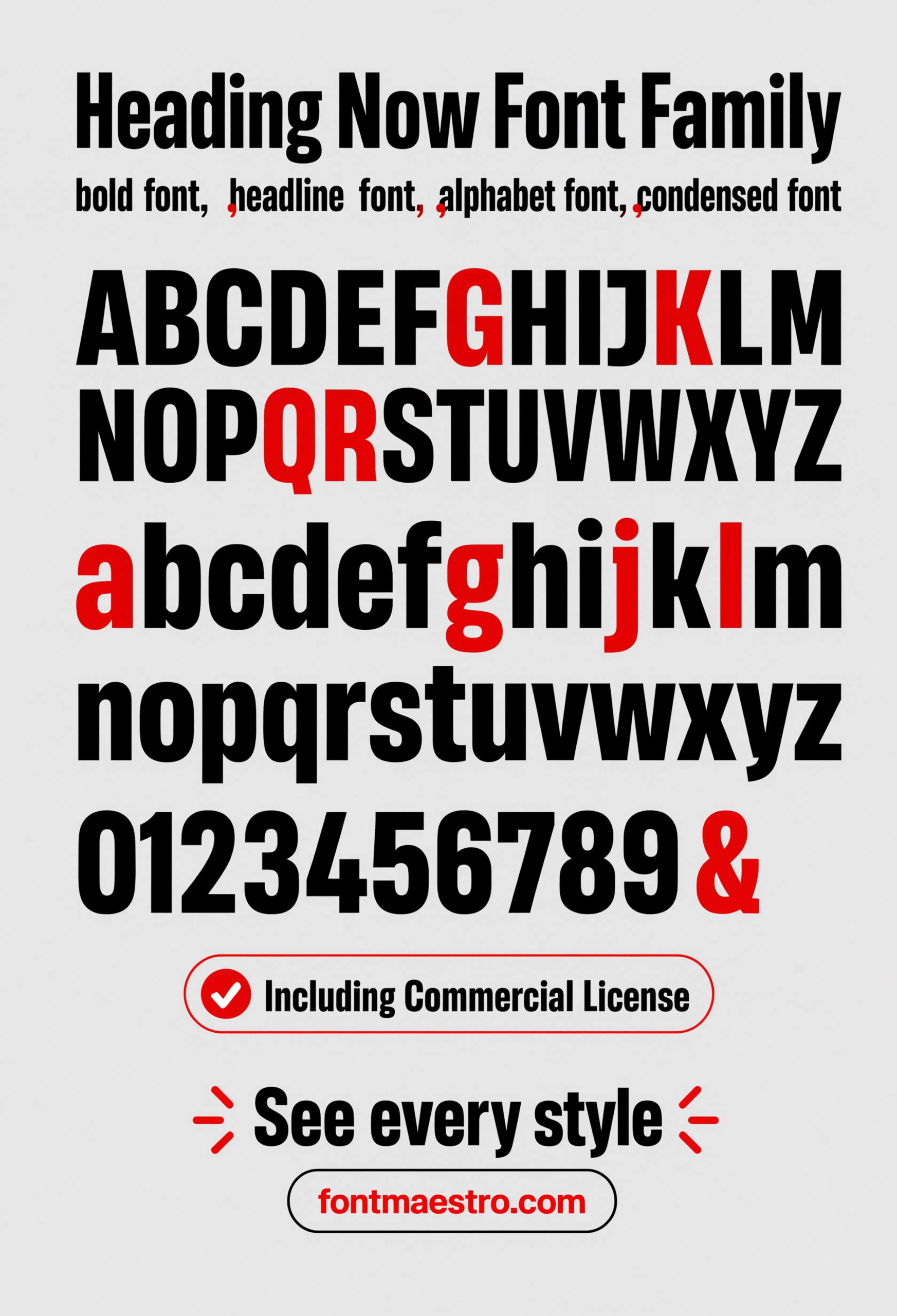
Alphabet Specimen
The full character set at a heavy weight — the fastest way to confirm the counters stay open and the letterforms hold their structure at true bold weight.
Unlimited creative assets. Access to AI tools.
Commercial licence included.
Get downloads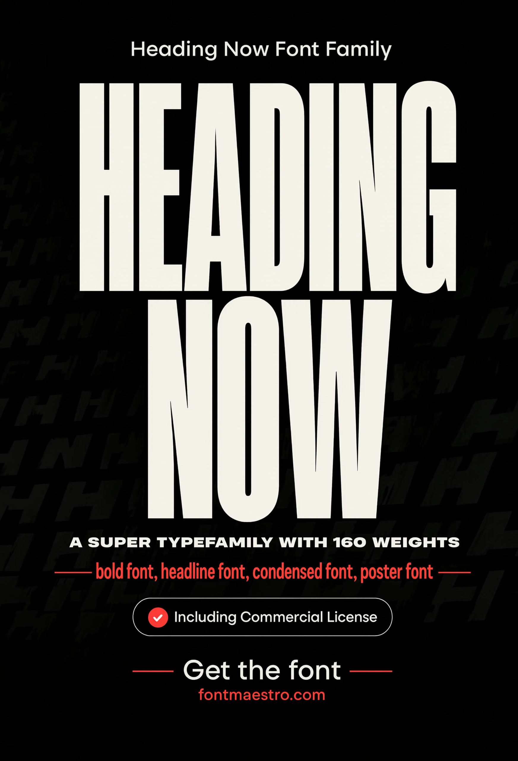
Commercial License
Hero Headline
A full-width hero headline treatment — this is the scale a bold font style name is actually built for, dominating a page rather than sharing it.
Unlimited creative assets. Access to AI tools.
Commercial licence included.
Get downloads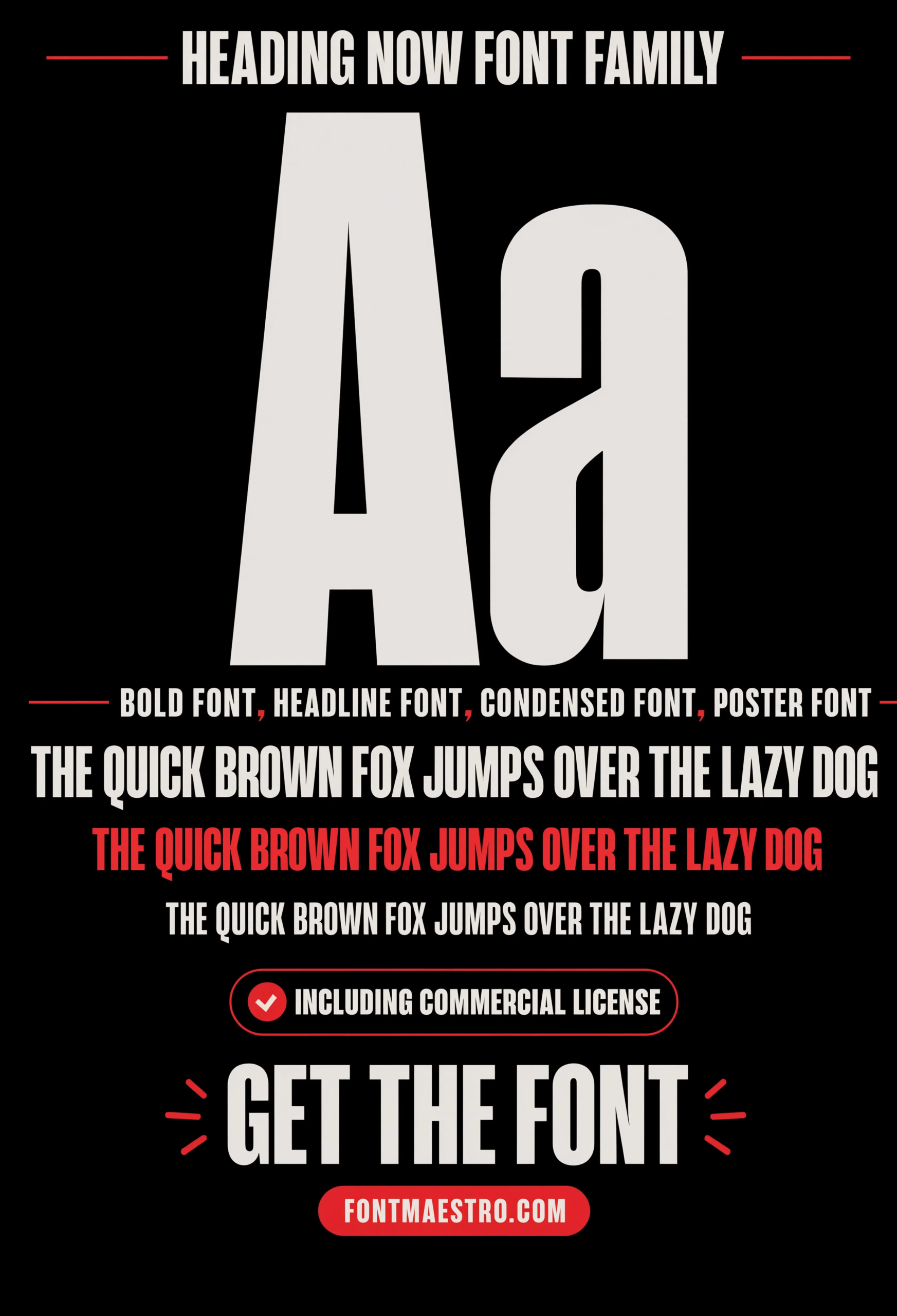
Pangram Specimen
A full pangram sentence in a single bold weight — the quickest way to spot spacing or counter problems a short word or logo test would miss.
Unlimited creative assets. Access to AI tools.
Commercial licence included.
Get downloads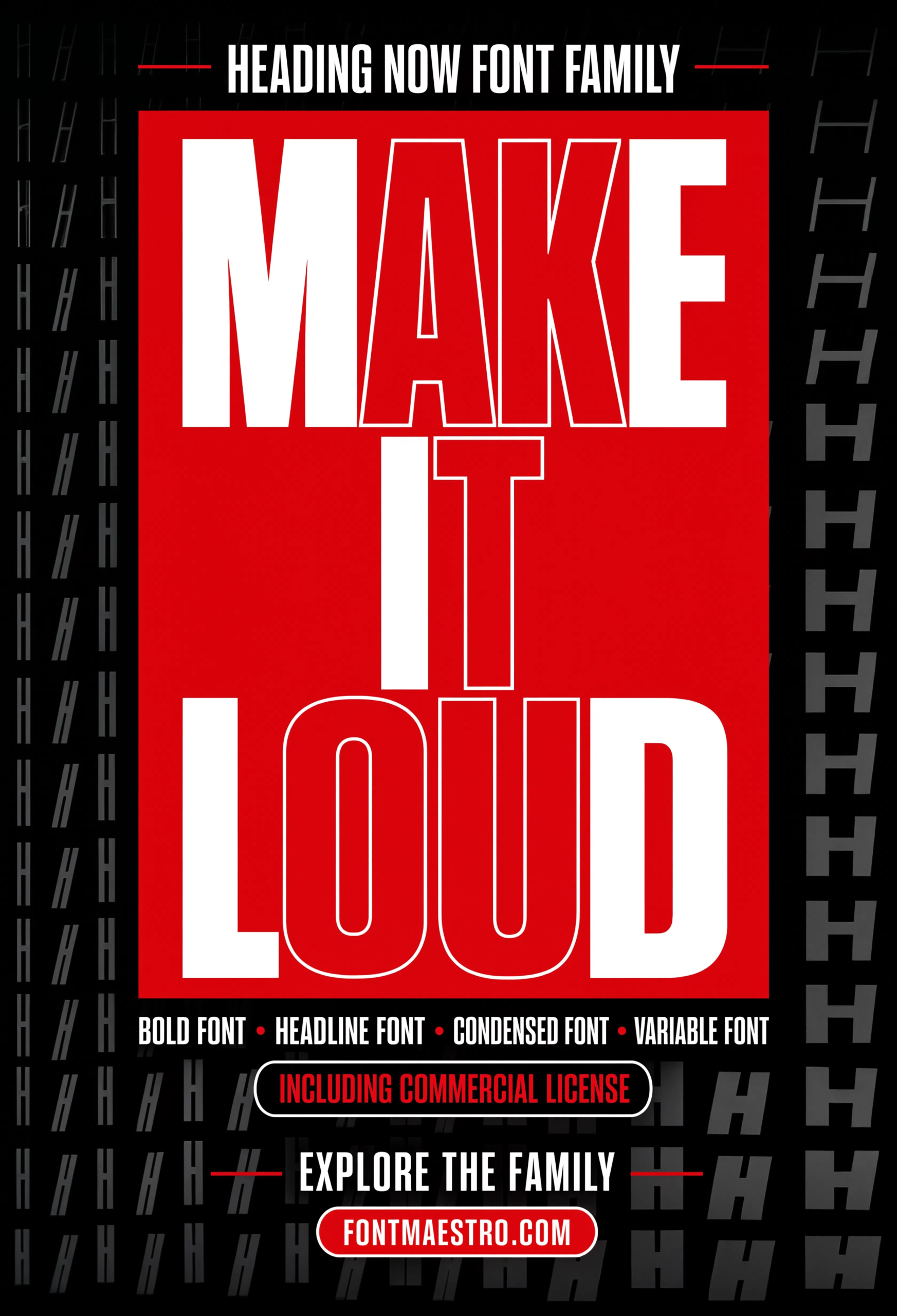
Red Block Poster
A bold color-block composition pushes the heavy weight into a high-contrast display moment, testing legibility at maximum visual intensity.
If you want to explore more options in this direction, our guide to Best Font Design Choices is worth a look, and you may also enjoy Capital Letters Font Styles or Beautiful Modern Font for a different take on the same style.
Unlimited creative assets. Access to AI tools.
Commercial licence included.
Get downloads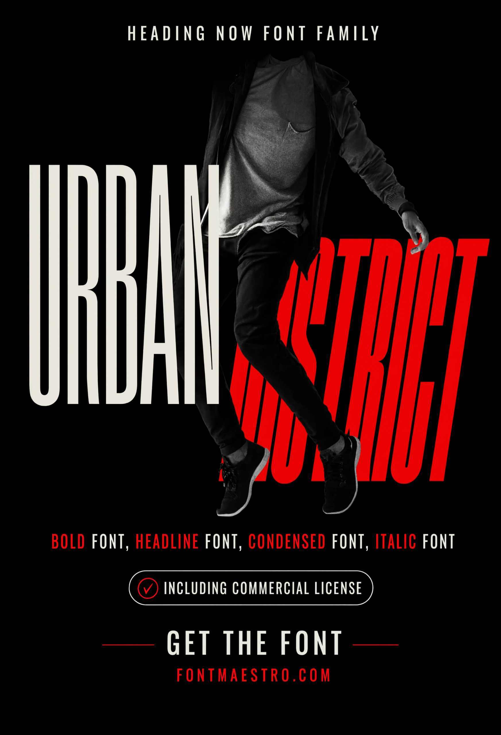
Commercial License
Urban District Signage
An urban environment mockup shows the bold headline style applied to signage-style type — a useful comparison point for outdoor legibility.
Where Does a Bold Headline Font Get Tested Beyond a Poster?
A magazine spread and an urban signage mockup are two of the more demanding real-world tests for a bold display face — one has to sit next to running body copy, the other has to hold up against outdoor viewing conditions. Both are shown above.
Explore the Heading Now Collection →
Does a Wide Width Range Matter as Much as Weight?
Often more than designers expect. A single bold weight with no width flexibility forces awkward line breaks or forced resizing whenever the available space changes. A family built with condensed, regular, and expanded widths at each weight lets one typeface adapt to a banner, a column, or a square social post without ever looking stretched.
Looking for more type direction? Our capital letters font styles guide covers how all-caps spacing interacts with weight, and our beautiful modern font guide breaks down geometric sans construction for a different display use case.
Frequently Asked Questions
What makes a font style genuinely “bold” rather than just thickened?
A true bold weight is drawn with its own letterforms, adjusted counters, and spacing built for that weight — a fake bold created by digitally thickening a regular weight often closes up counters and loses detail at small sizes.
Why does width matter for a bold headline font?
A family with condensed through expanded widths adapts to different layout spaces without distortion — a single fixed width forces awkward resizing whenever the available space changes.
Is a true italic different from a slanted regular weight?
Yes. A true italic cut redraws the letterforms with adjusted angles and proportions, while a slanted regular weight just tilts the same shapes digitally, which usually looks mechanical.
What’s the best way to test a bold display font before committing?
Set it at the actual size and context you’ll use it — a poster mockup or hero headline test reveals problems that a small specimen sheet preview won’t show.
Are these fonts cleared for commercial poster and branding use?
Yes, with the commercial license included on MyFonts downloads — confirm the specific license terms on the product page before client delivery.
Key Takeaways
- Want a proven starting point? Explore the Heading Now collection on MyFonts for true bold weights built alongside a wide width range.
- A genuine bold weight is drawn with its own letterforms, not created by digitally thickening a regular weight.
- Width range matters as much as weight for layout flexibility across banners, columns, and posters.
- Test any bold display font at real headline scale, not just on a specimen sheet, before committing to a project.
Related Reads
Unlimited creative assets. Access to AI tools.
Commercial licence included.
Get downloads