Every grotesque sans-serif on a design blog’s “clean and modern” list traces back to one 1957 release: Neue Haas Grotesk, designed by Max Miedinger in Switzerland. Helvetica is its better-known descendant — but the original still holds tighter spacing and sharper terminals than the version most people recognize today.
That distinction matters if you’re chasing classic font styles for a project that needs to look considered rather than default. Neue Haas Grotesk is the source, not the copy.
Quick answer: Classic font styles built on Neue Haas Grotesk get their character from tight letter spacing, a large x-height, and near-uniform stroke width — the traits that defined 1950s Swiss International Style typography and still read as clean and authoritative today. It works across editorial, wayfinding, and branding use because the letterforms were engineered for neutrality at any scale.
What Makes Neue Haas Grotesk a Genuine Classic Font Style?
Most “classic” labels get slapped on any sans-serif that’s been around for a few decades. Neue Haas Grotesk earns it differently — it was one of the first typefaces designed specifically to have no personality of its own, so the content could carry all the meaning. That neutrality is exactly what made Swiss International Style typography so influential.
The alphabet specimen below shows that restraint across the full character set — consistent stroke width, minimal contrast, and letterforms that stay legible without calling attention to themselves.
Which Classic Font Style Detail Should You Check First?
- Letter anatomy — Neue Haas Grotesk’s squared-off terminals and consistent bowl shapes are what separate a genuine classic grotesque from a generic system-font substitute.
- Type scale behavior — a classic font style needs to hold its proportions from caption size up to a headline without losing legibility.
- Weight ladder — Swiss-style branding typically leans on two or three weights maximum, not a sprawling ten-weight family.
- True italics — check whether the italic is a genuine cut or a mechanically slanted roman; Neue Haas Grotesk’s italic was drawn separately.
Each option below links to Neue Haas Grotesk’s MyFonts collection page, where desktop and web-font licenses are sold separately — install the desktop cut for print or brand work, or license the web-font version for a live site. Commercial branding rights are included in the standard license.
Unlimited creative assets. Access to AI tools.
Commercial licence included.
Get downloads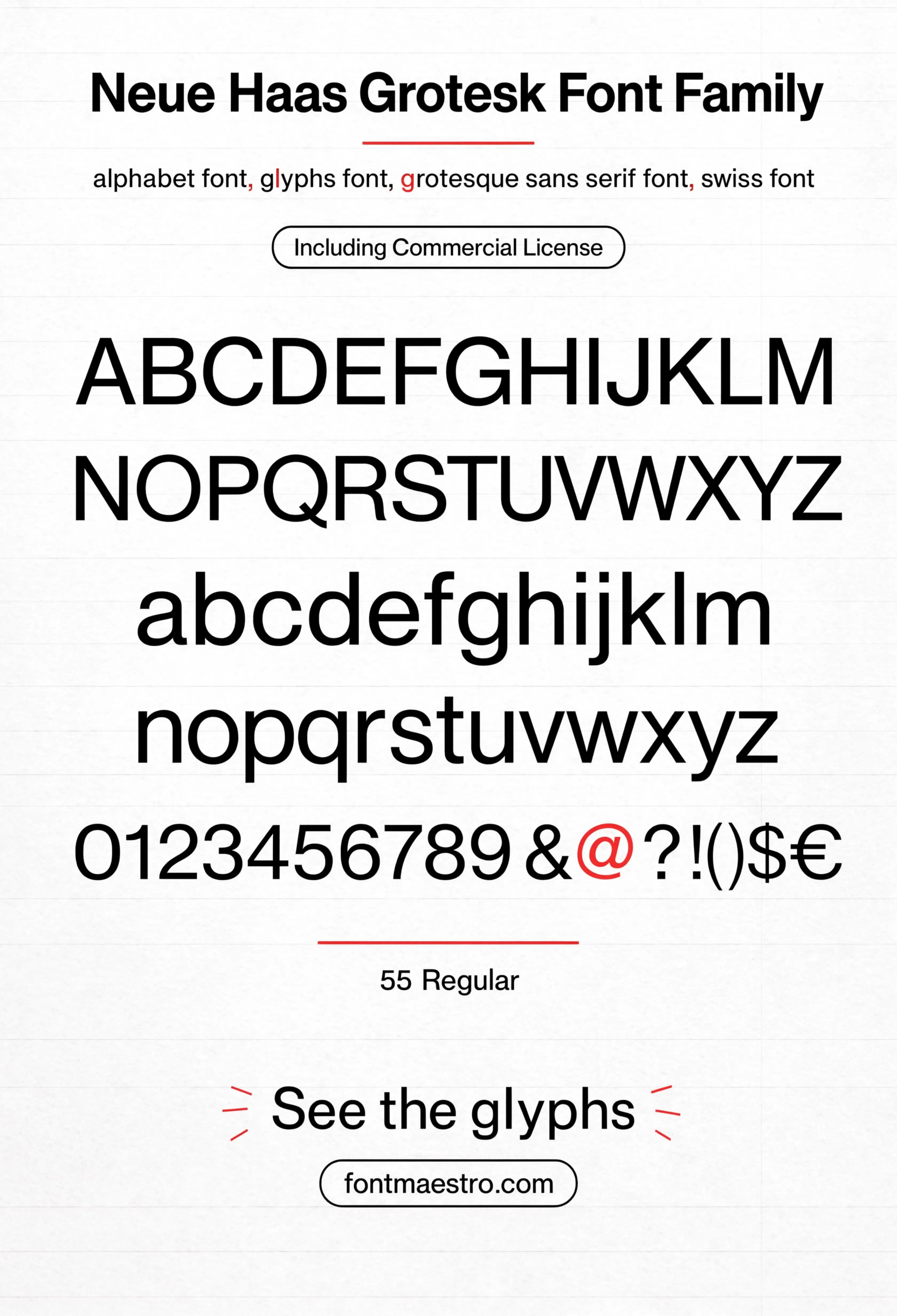
Commercial License
Alphabet Specimen — Full Character Set
Every letterform in one sheet — the restraint that separates a genuine classic grotesque from a generic system-font substitute.
Unlimited creative assets. Access to AI tools.
Commercial licence included.
Get downloads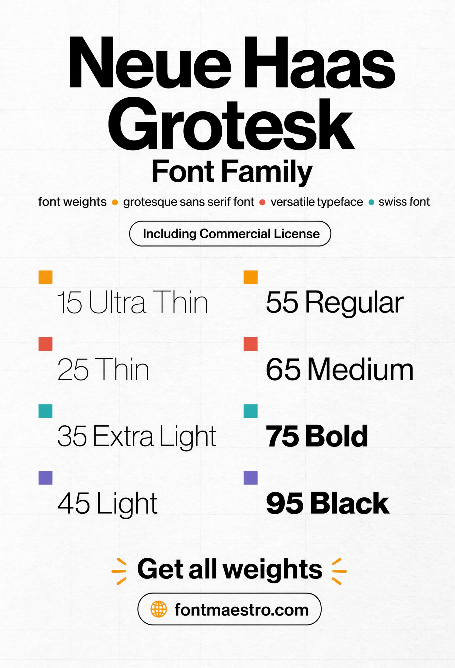
Commercial License
Weight Ladder
Swiss-style branding rarely needs more than a couple of weights — this sheet shows how far restraint can go before a system starts feeling repetitive.
Unlimited creative assets. Access to AI tools.
Commercial licence included.
Get downloads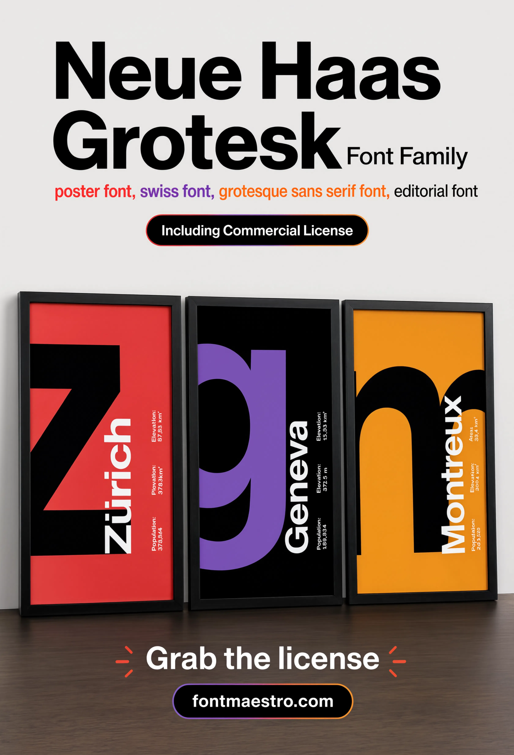
Commercial License
City Poster Series
A run of city-name posters that leans entirely on type — no imagery, just the letterforms carrying the whole composition.
Unlimited creative assets. Access to AI tools.
Commercial licence included.
Get downloads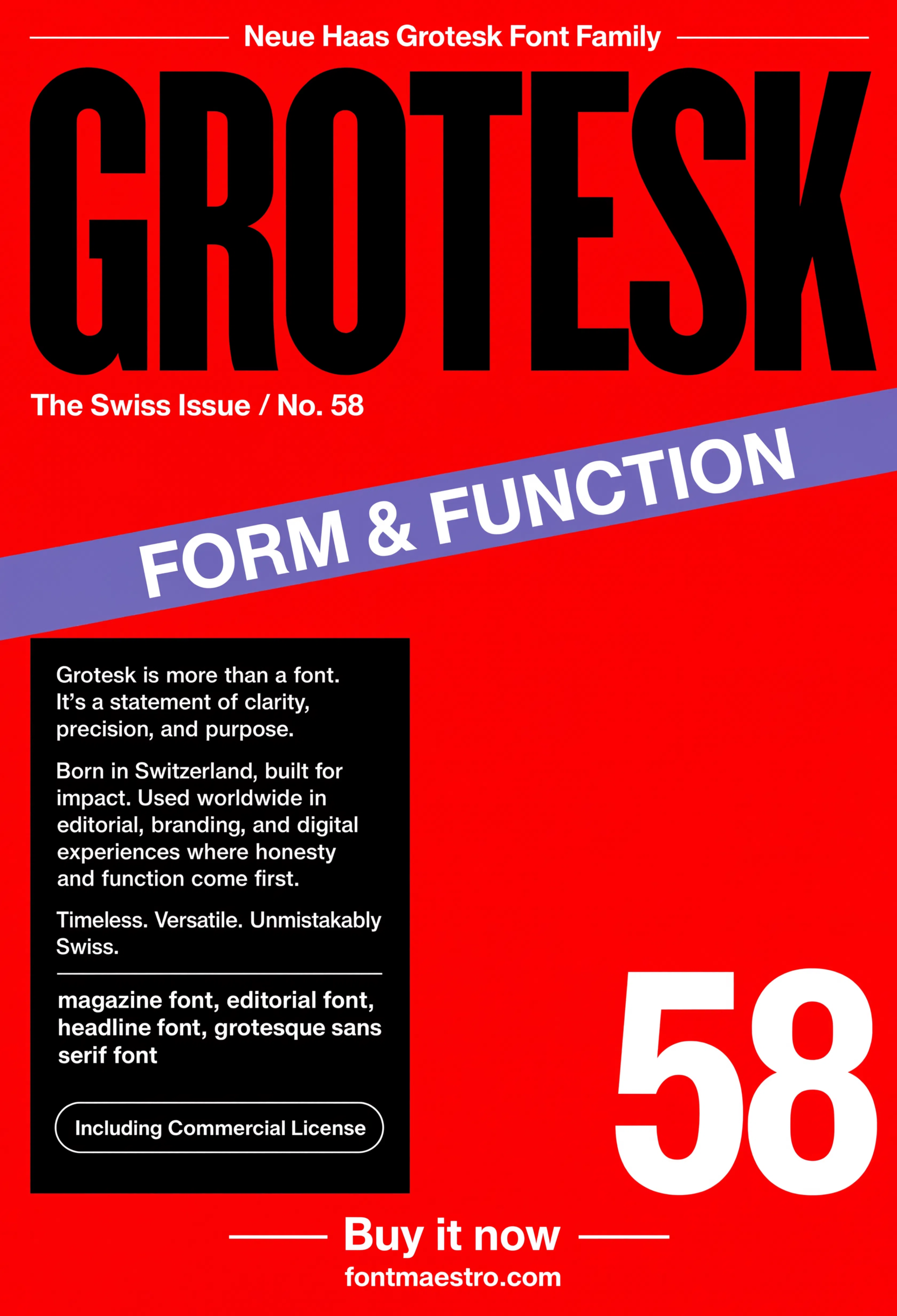
Commercial License
Magazine Cover
Editorial cover treatment — large-scale masthead type next to smaller cover-line text, testing the family across two very different sizes at once.
Unlimited creative assets. Access to AI tools.
Commercial licence included.
Get downloads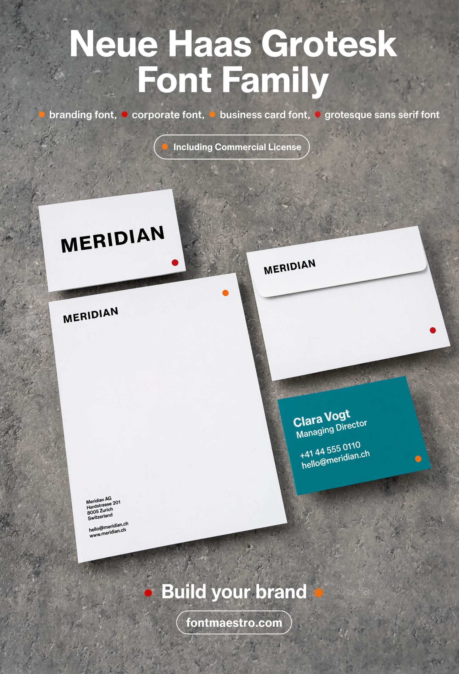
Commercial License
Stationery Layout
Letterhead and business-card scale type — the smallest, closest-reading test most classic grotesques ever face.
Is the Italic a True Cut or a Fake Slant?
A slanted roman is the fastest way to spot a font family that skipped real design work. Neue Haas Grotesk’s italic was drawn as its own style, not tilted mechanically from the upright — the proportions shift slightly, the way a genuine italic should.
The italic sheet below shows that distinction next to the upright weights.
Explore the Neue Haas Grotesk Collection →
Why Does Neue Haas Grotesk Still Define “Classic” Today?
Neutrality ages differently than trend-driven design. A typeface built to disappear behind its content doesn’t look dated the way a decorative or era-specific display font eventually does — that’s the real reason Swiss International Style typography from the 1950s still reads as current.
Helvetica popularized the look worldwide, but it also softened some of the original’s tighter spacing and sharper detailing. Going back to Neue Haas Grotesk directly is the difference between a classic font style and a slightly blurred copy of one.
Looking for more direction on font pairing and structure? Our font design guide covers the fundamentals of building a typeface system, and our best fonts for business logos picks lean into signage-tested options for brand work.
Frequently Asked Questions
What is Neue Haas Grotesk known for?
Neue Haas Grotesk is the 1957 Swiss typeface that later inspired Helvetica. It’s defined by tight letter spacing, near-uniform stroke width, and a design goal of staying neutral so content, not typography, carries the message.
Is Neue Haas Grotesk the same as Helvetica?
No. Helvetica is a later, widely distributed adaptation of Neue Haas Grotesk. The original has tighter spacing and sharper terminal details that got softened in Helvetica’s mass-market version.
What defines a classic font style?
Restraint and structural consistency — tight, controlled letterforms with uniform stroke width, built to stay legible and neutral across decades rather than chase a trend.
How many weights does a classic Swiss-style typeface need?
Often just two or three. Swiss International Style branding tends to favor a small, disciplined weight range over a sprawling family.
Does Neue Haas Grotesk include a true italic?
Yes — the italic was drawn as its own design rather than a mechanically slanted version of the upright weight, which is part of what makes it a genuine classic rather than a shortcut font.
Key Takeaways
- Want a proven starting point? Explore the Neue Haas Grotesk collection on MyFonts for the original Swiss grotesque that inspired Helvetica.
- Classic font styles come from structural restraint — tight spacing, uniform stroke width, and neutrality — not decoration or trend.
- Check letter anatomy and true italic cuts before assuming any “clean sans” font qualifies as a genuine classic.
- Neue Haas Grotesk holds its Swiss International Style character more precisely than Helvetica, its better-known descendant.
Related Reads
Unlimited creative assets. Access to AI tools.
Commercial licence included.
Get downloads