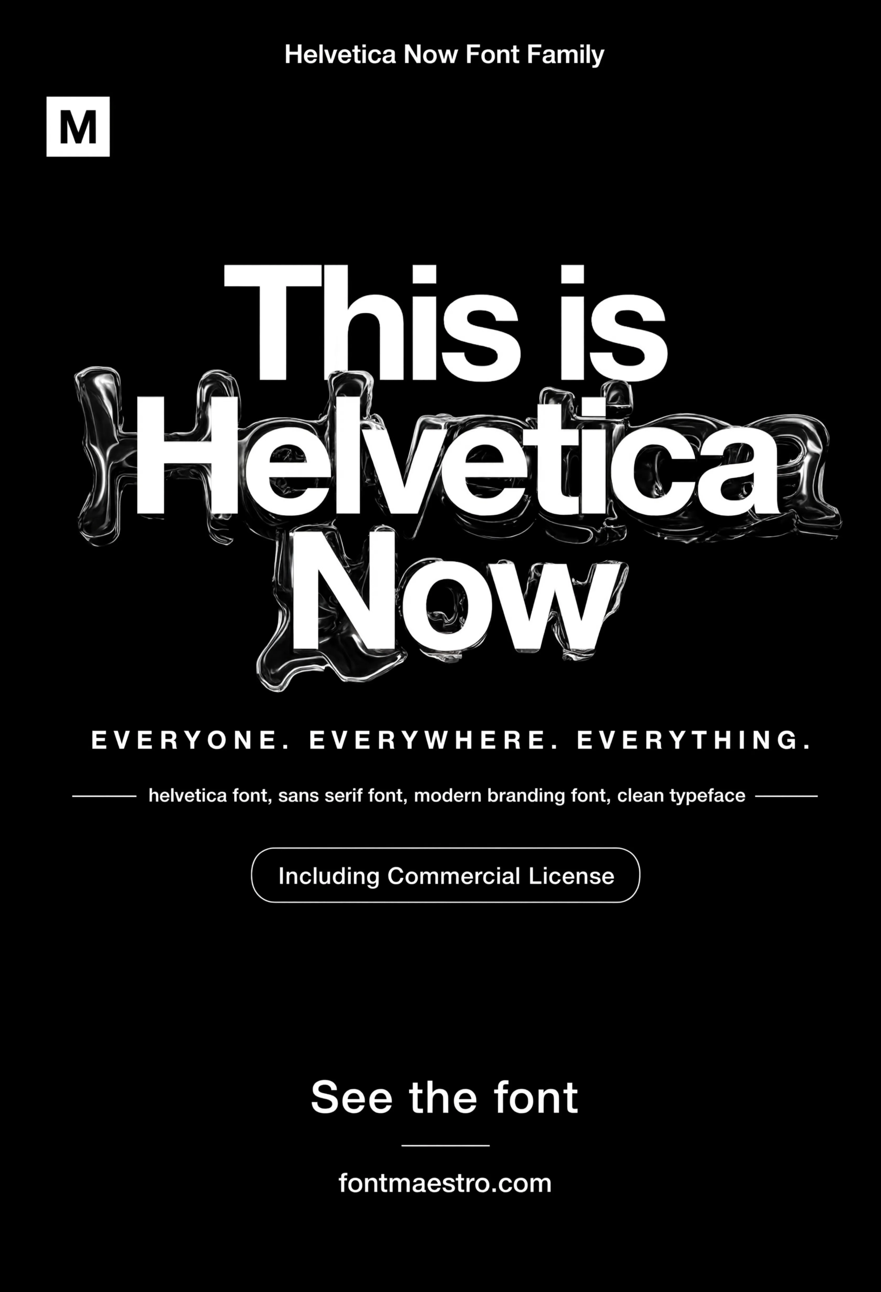
A font for poster work has to survive a completely different set of conditions than body copy, read at a glance, hold up printed three feet wide, and still look intentional shrunk down to a social share image. Most “font poster design” searches start after a first attempt already fell apart at one of those sizes.
The keyword splits into a few real needs: “font poster” and “fonts poster” people usually want a display face they can drop straight into a layout, while “font style for poster” and “font untuk poster” searchers are further back, still deciding what category of typeface fits the poster’s mood before picking a specific file.
Quick answer: Avant Garde Gothic is built specifically for poster-scale work, a geometric sans family with enough weight range to run a headline in Bold and supporting text in a lighter cut from the same family, plus a distinct ligature set for retro broadcast and event-poster layouts. Check weight contrast and letter width before picking any font for poster use; a single-weight download rarely gives you a working hierarchy.
Why does a font for poster use need more than a bold headline weight?
A poster isn’t one line of type. It’s a headline, a date, a venue, fine print, usually four or five size jumps on the same sheet. A font family with only one usable display weight forces the designer to fake the rest with size and spacing tricks alone, and that’s exactly where posters start to look amateur.
What a working poster typeface actually needs:
- A genuine weight range, Extra Light through Bold, ideally more, so a hierarchy exists without switching typefaces mid-layout.
- Geometric consistency across weights, the O should stay round, the A should keep its apex shape, at every weight. Weights that drift structurally make a poster look like it’s mixing two different fonts.
- Ligatures or stylistic alternates, a poster headline is where a designer wants one distinctive detail. Without alternates, every headline in the family looks interchangeable.
Avant Garde Gothic’s geometric structure holds its circular O and angular A consistently from Extra Light to Bold, which is the detail that separates a real poster typeface from a single-weight display font wearing a poster’s clothes.
What does a font for poster look like across real layouts?
A one-word specimen tells you nothing about how a typeface behaves once it’s carrying an actual event poster, date stacks, venue lines, sponsor logos competing for the same sheet. This is where “font poster design” searches usually run into trouble with generic downloads.
Unlimited creative assets. Access to AI tools.
Commercial licence included.
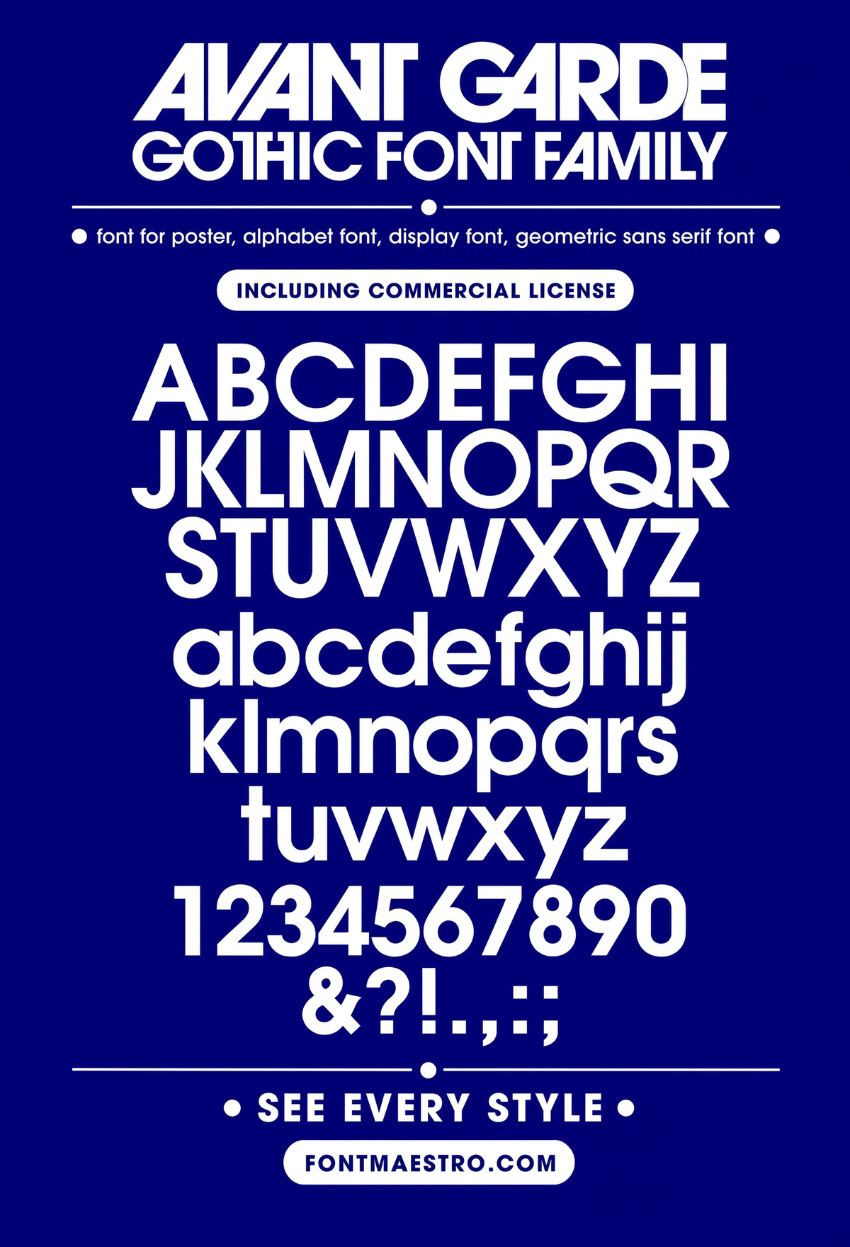
Get downloadsAvant Garde Gothic, Alphabet Specimen
The full geometric sans alphabet laid out together, this is the reference sheet worth checking before anything else, since it shows every weight’s letterforms side by side.
Commercial License
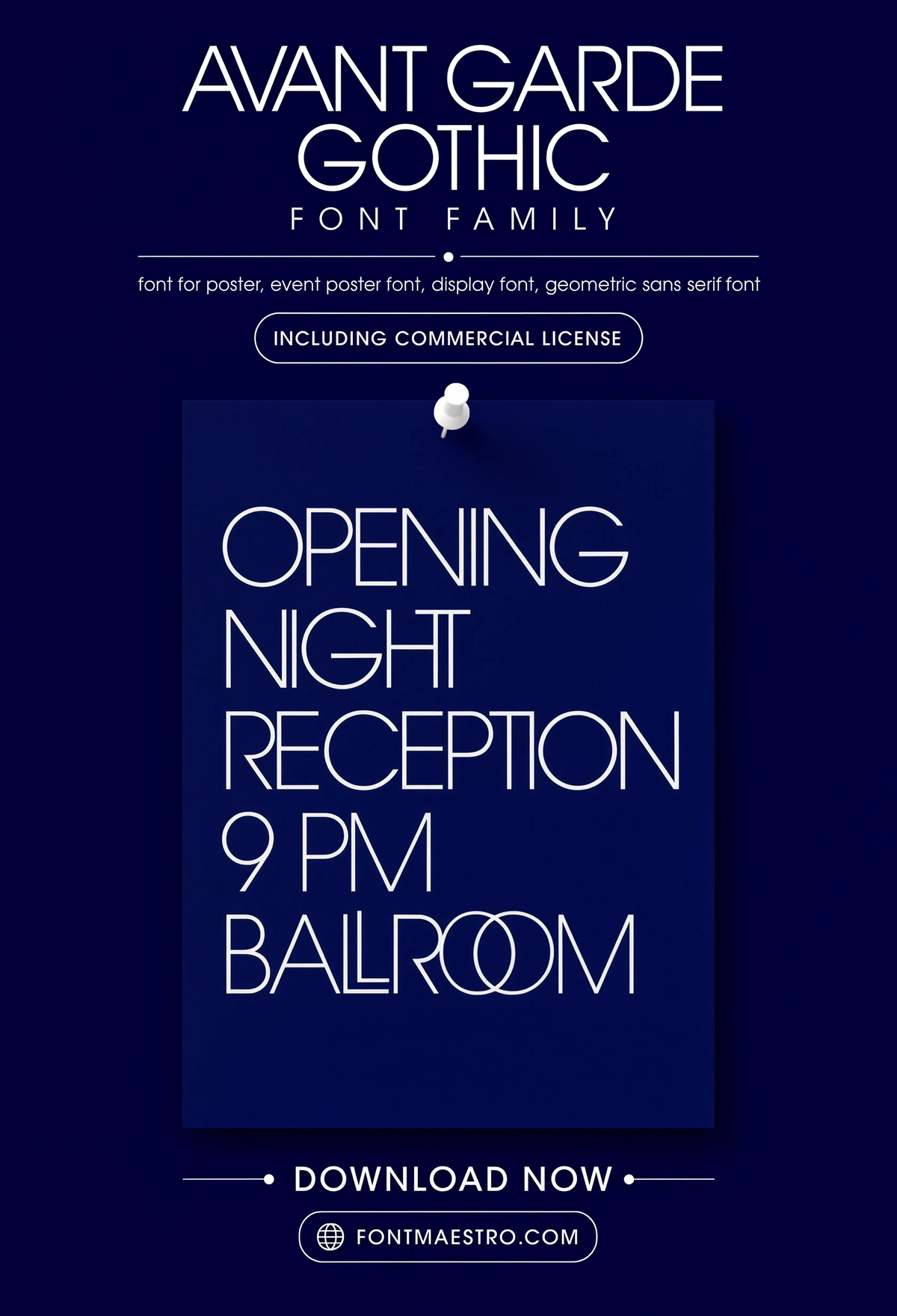
Avant Garde Gothic, Event Poster
A full event poster layout, not a single word, headline, date stack, and venue line all set in the same geometric sans family at different weights, proof the family scales down cleanly.
Commercial License
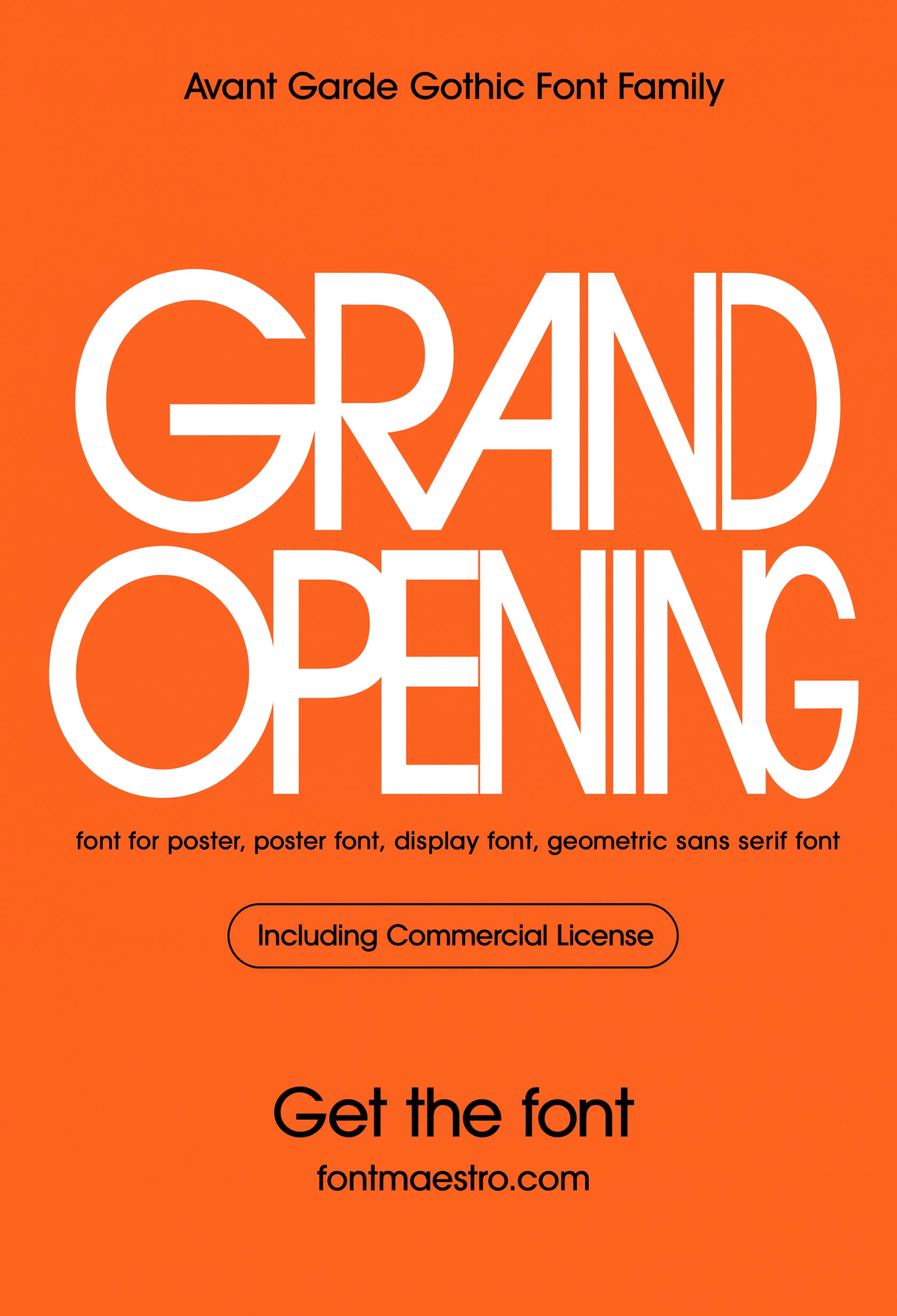
Avant Garde Gothic, Grand Opening Poster
Bold weight carrying a full retail announcement, this is font poster design under commercial pressure, where the type has to grab attention from across a store window.
Commercial License
Every file in the collection comes as OTF and TTF with the full weight range under one commercial license, ready to drop into Illustrator, InDesign, or Canva for print or digital poster work without rebuilding tracking by hand.
Browse the Avant Garde Gothic Collection →
How do weight extremes change what a poster font communicates?
Extra Light and Bold from the same geometric family send completely different signals, even with identical letterforms underneath. Extra Light reads editorial and restrained, fashion, museum, gallery work. Bold reads urgent and commercial, sales, events, announcements. Picking the wrong end of that range for the wrong context is a common font for poster mistake.
Unlimited creative assets. Access to AI tools.
Commercial licence included.
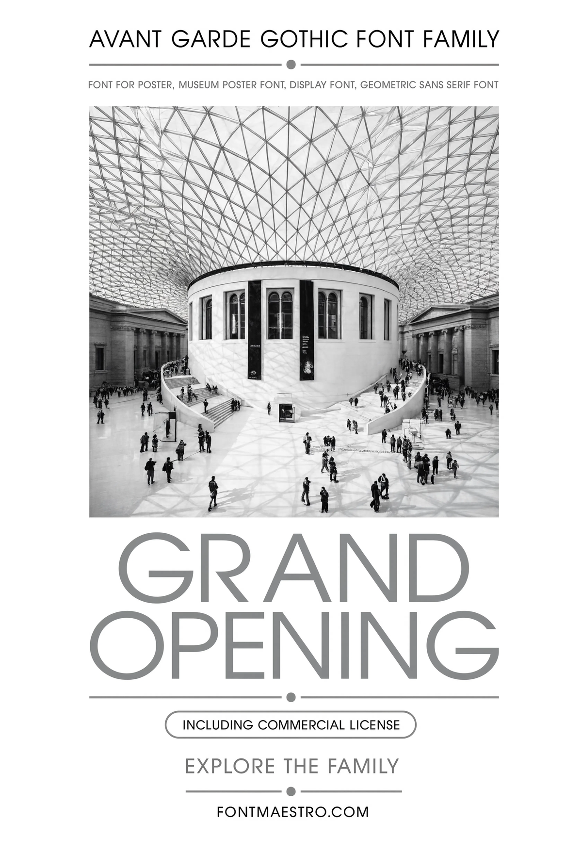
Get downloadsAvant Garde Gothic, Museum Poster
A quieter application, museum and exhibition poster work, where restraint matters as much as impact. The same geometric structure reads calm here instead of loud.
Commercial License
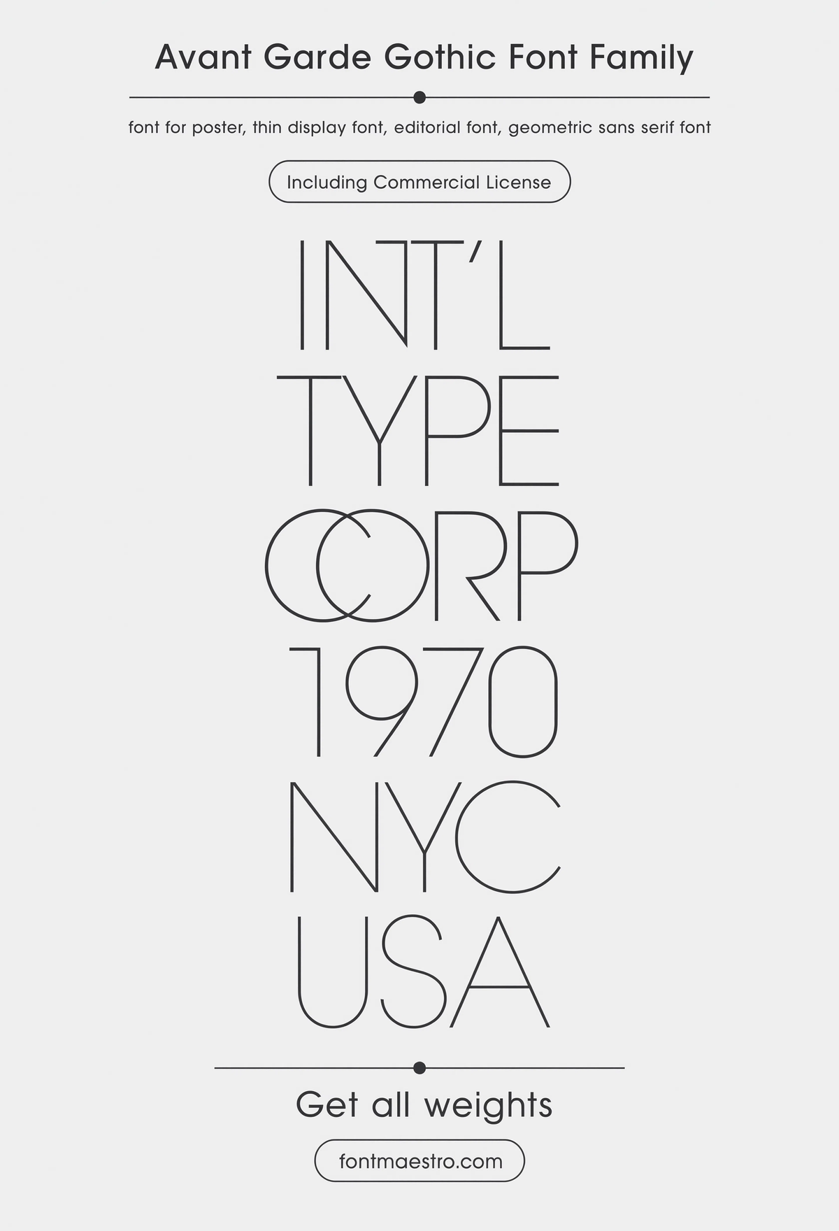
Avant Garde Gothic, Extra Light Poster
The lightest cut in the family, set large, this is font poster design leaning toward editorial restraint, better suited to fashion or gallery work than a loud announcement.
Commercial License
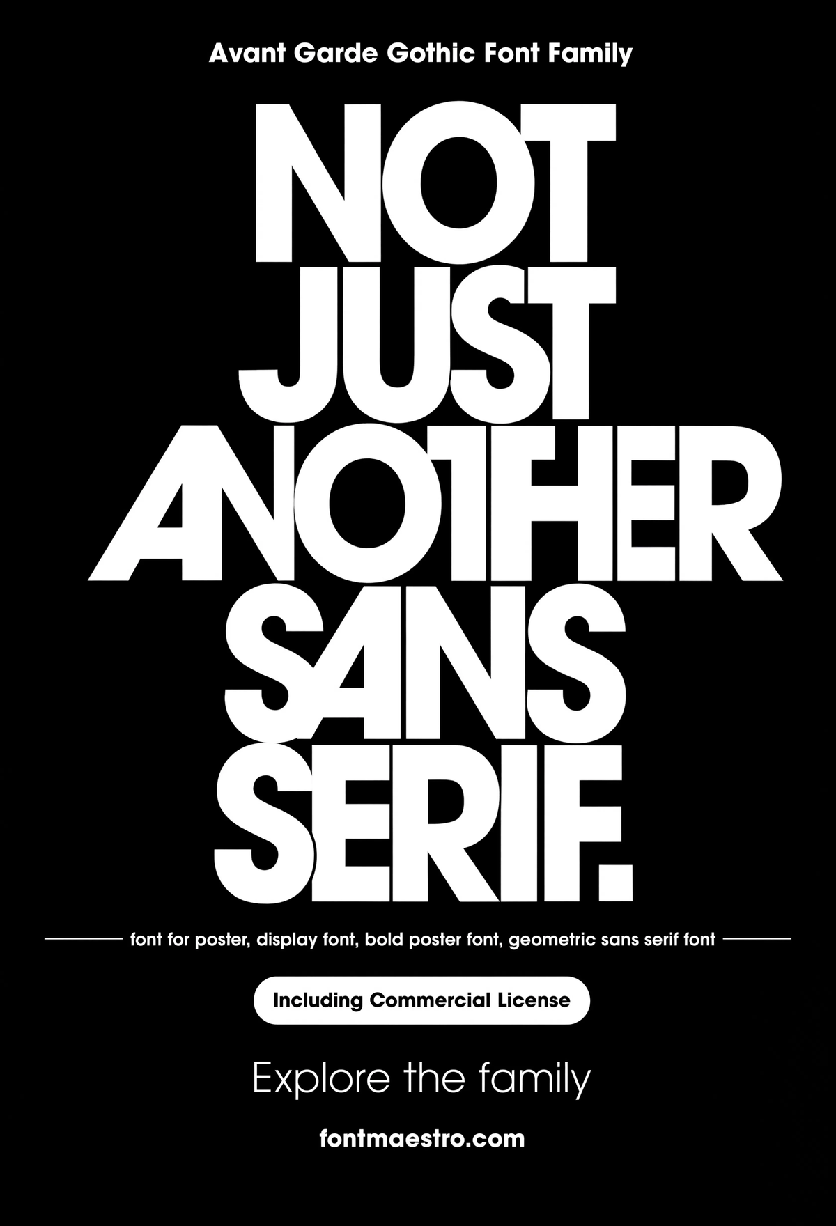
Avant Garde Gothic, Bold Statement
Full weight, minimal supporting copy, a single bold statement filling the sheet. This is where the geometric consistency across weights actually pays off; the Bold cut doesn’t feel like a different typeface than the Light.
Commercial License
What ligature and alternate details set a poster typeface apart?
Stylistic alternates are the detail most generic display fonts skip entirely, and it’s exactly the detail a designer needs when a headline word needs one distinctive treatment without switching to a whole second typeface.
If you want to explore more options in this direction, our guide to Best Fonts for Signs is worth a look, and you may also enjoy Best Geometric Letters Font or Font Style For Architecture for a different take on the same style.
Unlimited creative assets. Access to AI tools.
Commercial licence included.
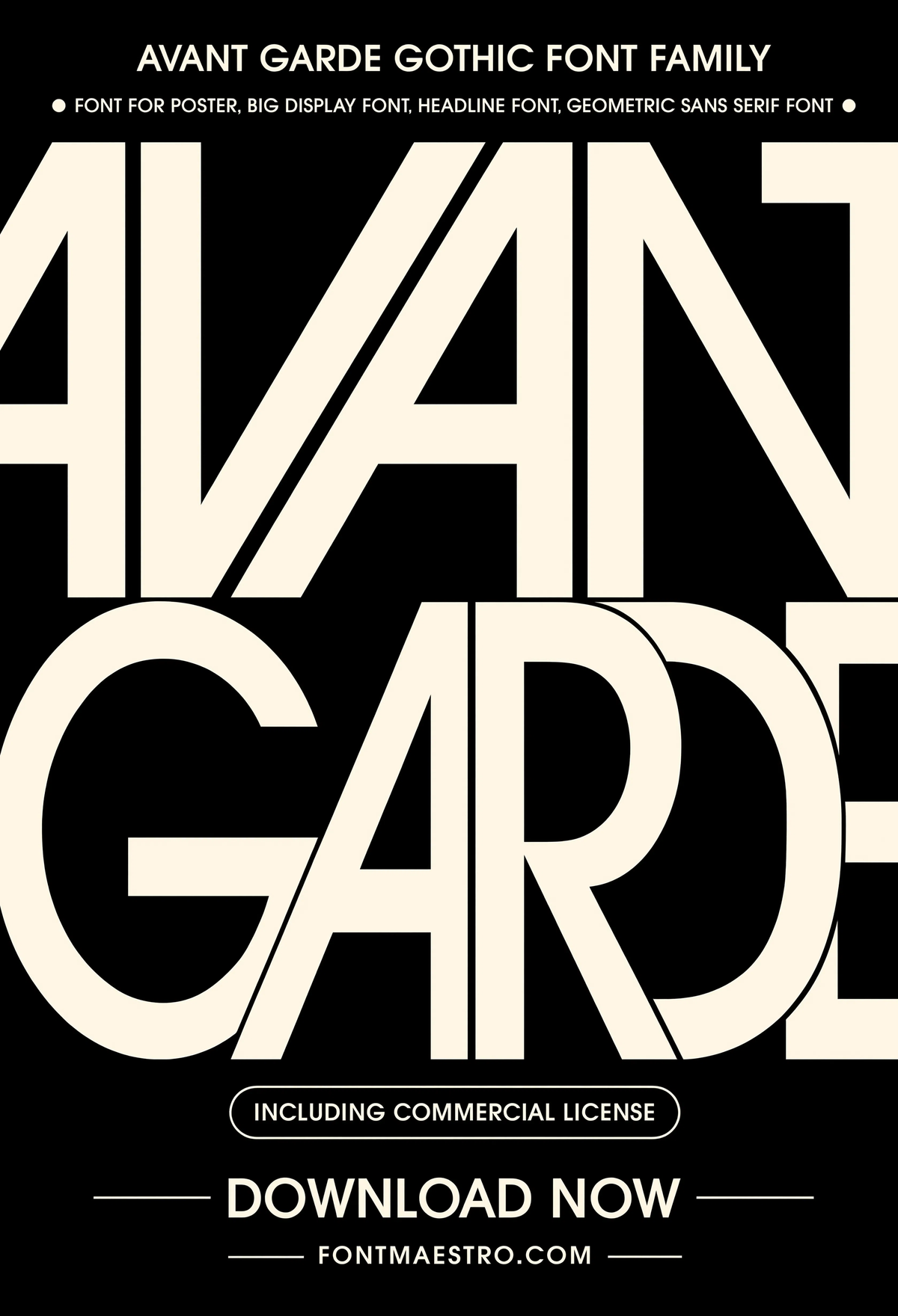
Get downloadsAvant Garde Gothic, Oversized Display
Pushed to display scale, filling the frame, this is the stress test for geometric consistency. Any wobble in the circular forms shows up instantly at this size.
Commercial License
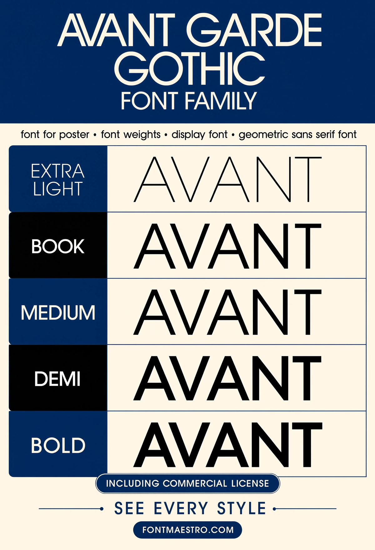
Avant Garde Gothic, Weights Show
Every weight from the family stacked together, the easiest way to see the whole range before deciding which cut fits your specific poster brief.
Commercial License
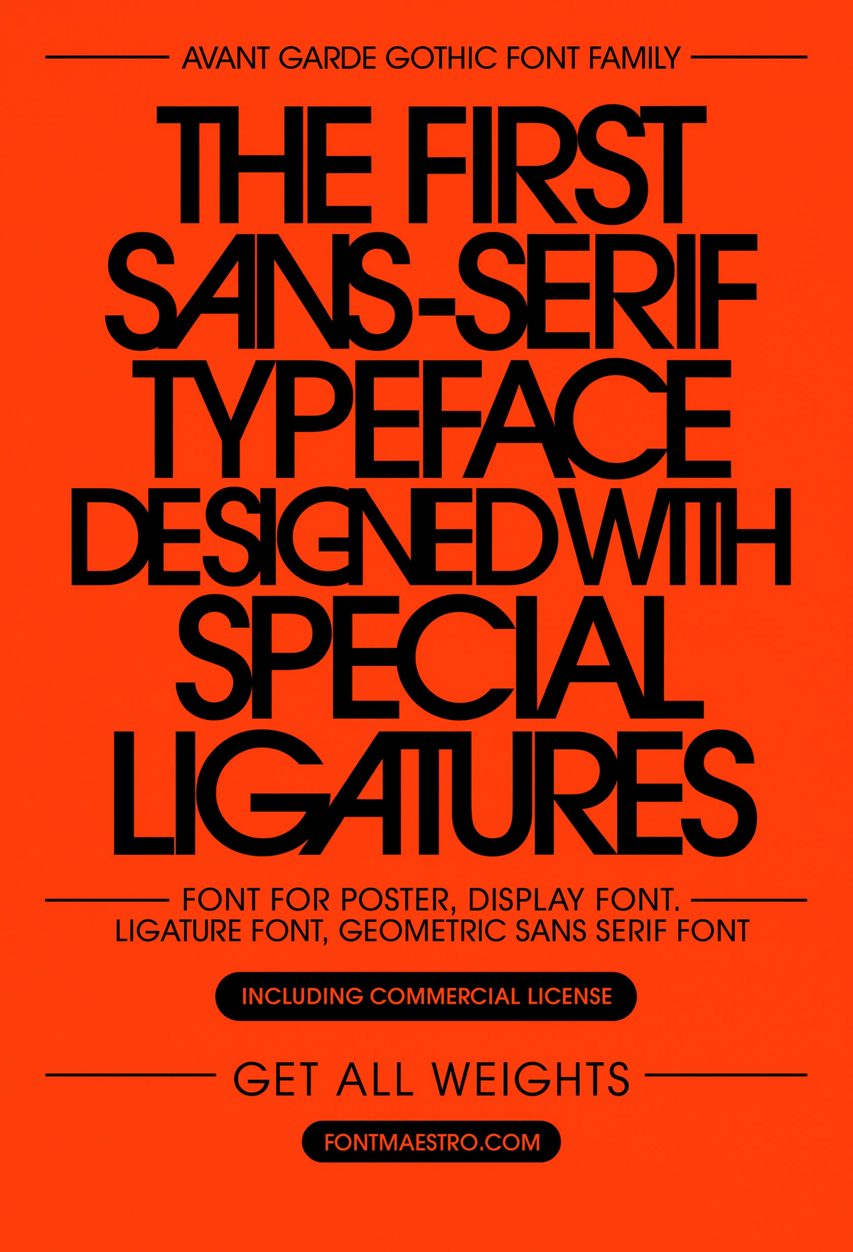
Avant Garde Gothic, Ligature Statement
A ligature-heavy headline treatment, connected letterforms doing the visual work a generic sans can’t. This is the single detail most “font poster” downloads are missing.
Commercial License
Where else does the same geometric family carry over cleanly?
A poster typeface that only works on posters is a narrow investment. Avant Garde Gothic’s consistency across weights makes it useful for stationery, logotype work, and branding systems built around the same visual language as the poster.
Unlimited creative assets. Access to AI tools.
Commercial licence included.
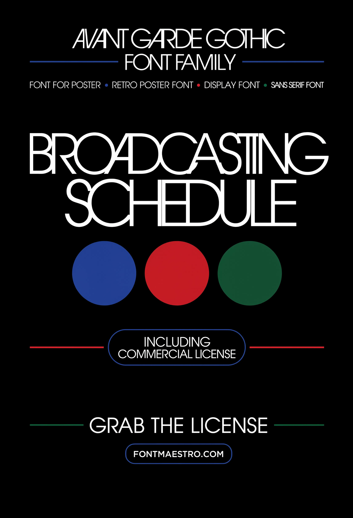
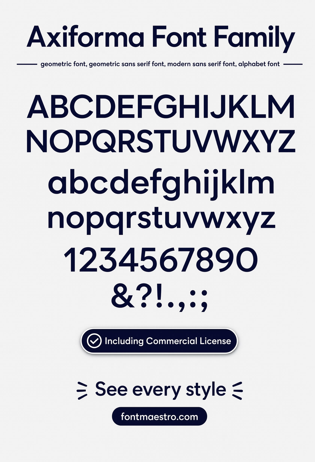
Get downloadsAvant Garde Gothic, Retro Broadcast Poster
A retro broadcast-style layout leaning on the ligature set, proof the same alternates that work for a modern minimalist poster also carry a nostalgic, TV-title-card feel.
Commercial License
Unlimited creative assets. Access to AI tools.
Commercial licence included.
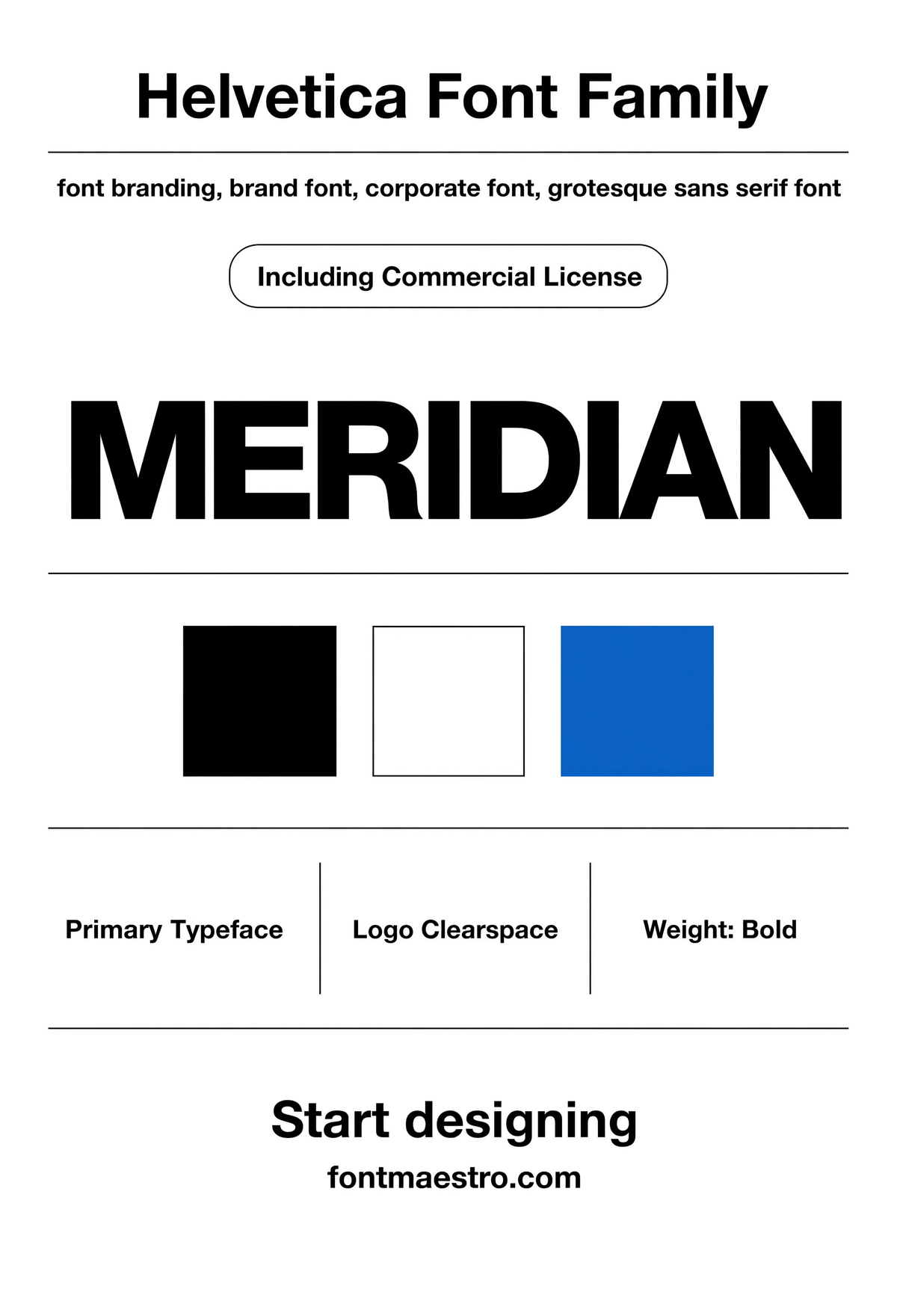
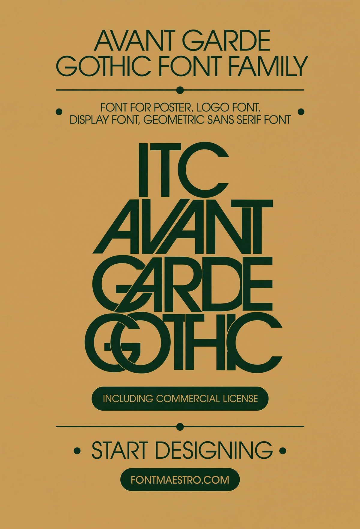
Get downloadsAvant Garde Gothic, Logotype Lockup
A compact logotype built from the same letterforms, geometric sans compresses well into a lockup without losing the roundness that defines the family.
Commercial License
Looking for more on how the same typeface family carries across different applications? Our guide to font design fundamentals covers weight consistency and optical sizing in depth, and our guide to vintage font style looks at a very different category of poster-ready display type.
Frequently Asked Questions
What makes a font work well for poster design specifically?
A wide weight range, geometric or structural consistency across those weights, and at least one distinctive detail, a ligature set or stylistic alternate, that gives headlines character without needing a second typeface.
Should I use one weight or multiple weights on a single poster?
Multiple weights from the same family. A poster with a headline, date, and fine print needs a hierarchy, using one weight and faking the rest with size alone flattens that hierarchy and reads less professional.
Is a geometric sans like Avant Garde Gothic good for both bold and minimal posters?
Yes, the Extra Light cuts suit editorial and gallery work, while Bold and the ligature variants carry commercial and event posters. The same underlying letterforms cover both moods.
What file formats come with a font for poster download?
Commercial poster typefaces typically ship as OTF and TTF with the full weight range under one license, compatible with Illustrator, InDesign, Photoshop, and most design software.
Does a poster font need to work at small sizes too?
Often, yes, the same poster gets shrunk into a social share image or a printed flyer. Check that fine details like ligatures and tight tracking still hold up before finalizing a layout at multiple sizes.
Key Takeaways
- Want the exact family from this breakdown? Get Avant Garde Gothic with the full commercial license.
- A working poster typeface needs multiple weights, not just one bold display cut.
- Ligatures and stylistic alternates are the detail that separates a memorable headline from a generic one.
- Test any font for poster use at both full scale and shrunk-down social size before finalizing the layout.
Related Reads
Unlimited creative assets. Access to AI tools.
Commercial licence included.
Get downloads