Aptos replaced Calibri as Microsoft Office’s default font in 2023, which sounds like a footnote until you realize it now sits behind more documents, slide decks, and emails than almost any other typeface in active use. It wasn’t picked for personality — it was picked because it stays readable at every size a business document actually gets used at.
That’s a much harder brief than it sounds. Most “safe” fonts feel forgettable at large sizes and mushy at small ones. Aptos does neither.
Quick answer: Aptos font is Microsoft’s default typeface since 2023, a humanist sans-serif with subtle warmth in its curves, built to stay legible in dense body text and confident in presentation headlines — with serif and mono variants for wider document use.
Why Did Microsoft Replace Calibri With Aptos?
Calibri had been the default since 2007 — 16 years is a long run for any typeface to sit unchanged in front of a billion users. Microsoft ran a public vote among five candidate fonts before landing on Aptos, and the deciding factor wasn’t novelty. It was that Aptos held its shape better across the full range of real Office use: dense spreadsheet cells, slide titles at 44pt, and body paragraphs in a report nobody proofreads twice.
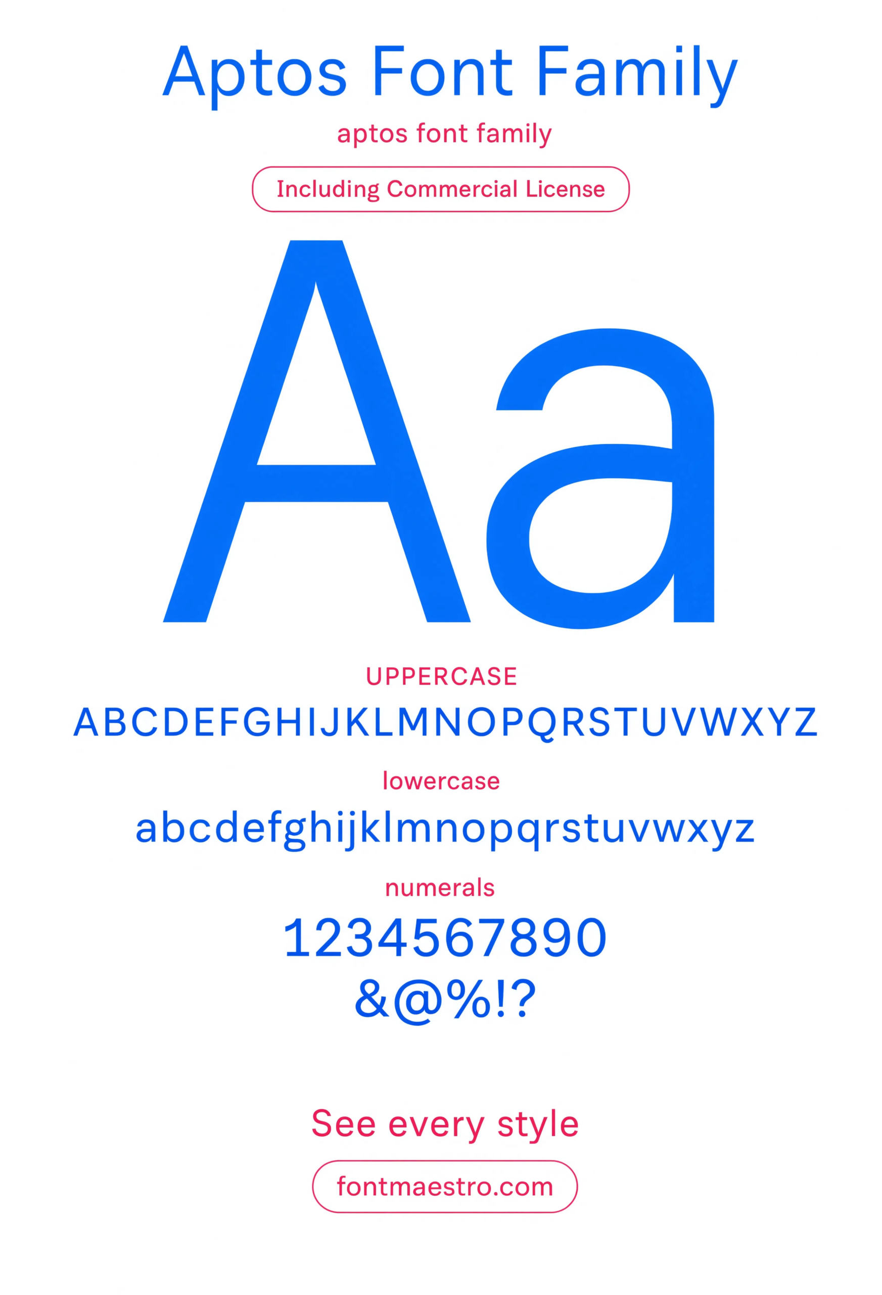
The specimen below shows why it won that test. The letterforms carry just enough warmth to avoid feeling mechanical, without tipping into anything that reads as a “personality” font.
How Does Aptos Actually Differ From Calibri?
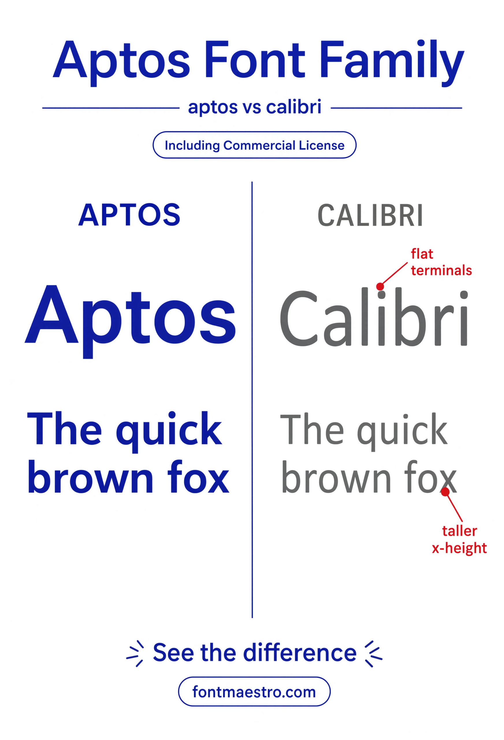
- More geometric structure — Calibri’s rounded terminals gave it a soft, slightly casual read; Aptos tightens that up without going fully grotesque.
- Better small-size performance — spacing and x-height were tuned specifically for dense body copy at 10-11pt, a size Calibri could get slightly muddy at.
- A wider weight range — Aptos ships in more weights out of the box, useful for hierarchy inside a single document instead of relying on bold alone.
- A genuinely distinct serif companion — Aptos Serif isn’t a bolted-on afterthought, it shares proportions with the sans cut.
Each file below is a desktop and web-font license bundle available through MyFonts — install it locally for document templates and branded decks, or license the web-font cut for on-site body text. Commercial branding rights are included under the standard license.
Unlimited creative assets. Access to AI tools.
Commercial licence included.
Get downloadsAa Specimen
The full alphabet laid out clean — the fastest way to see the subtle warmth that keeps Aptos from reading as mechanical.
Aptos vs Calibri Comparison
Set side by side with its predecessor — check here for the tighter geometric structure that replaced Calibri’s softer terminals.
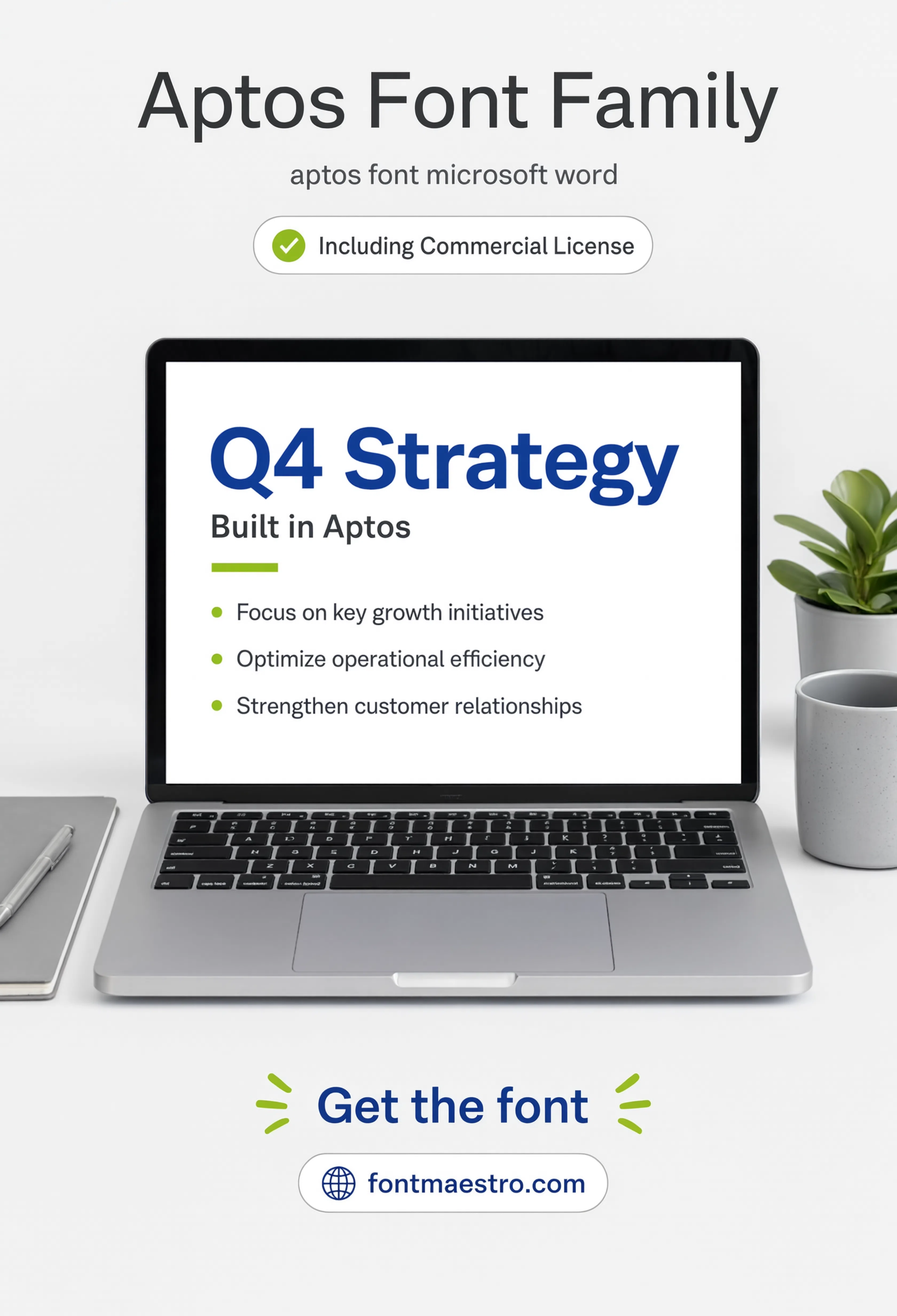
Presentation Slide Application
Set into a real slide layout — the exact context Aptos was tuned to handle at large display sizes.
Browse Modern Font Templates →
Does the Aptos Family Cover More Than Body Text?
Yes — this is where Aptos separates itself from a typical office-default font. Microsoft shipped it as a full type system from the start: a serif cut for print-leaning documents, a monospace cut for code and tabular data, and multilingual coverage for global teams, all sharing the same underlying proportions instead of feeling like three unrelated fonts stapled together.
If you want to explore more options in this direction, our guide to Avenir Next is worth a look, and you may also enjoy Univers or Display Fonts for Industrial for a different take on the same style.
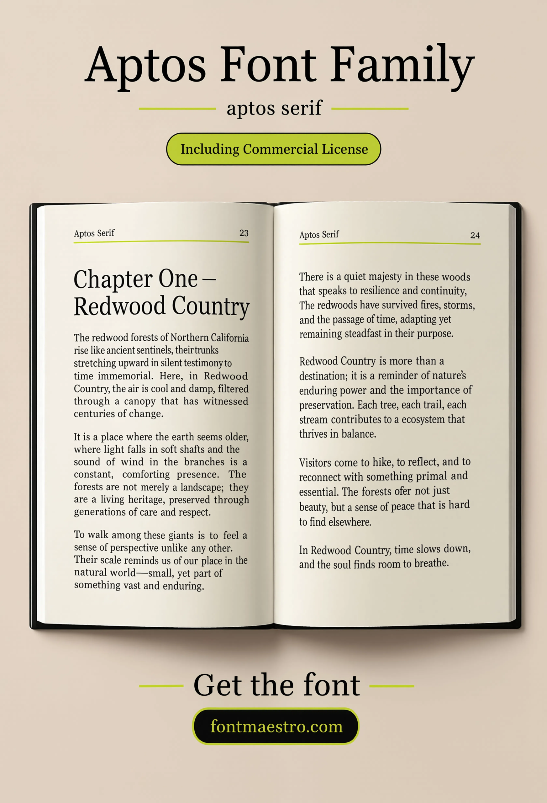
The serif book spread below shows how deliberately that pairing was handled — it reads as a genuine companion to the sans cut, not a generic serif swapped in for print contexts.
Unlimited creative assets. Access to AI tools.
Commercial licence included.
Get downloadsSerif Book Spread
Aptos Serif set into a book-style layout — proof the serif cut shares real proportions with the sans, not a bolted-on afterthought.
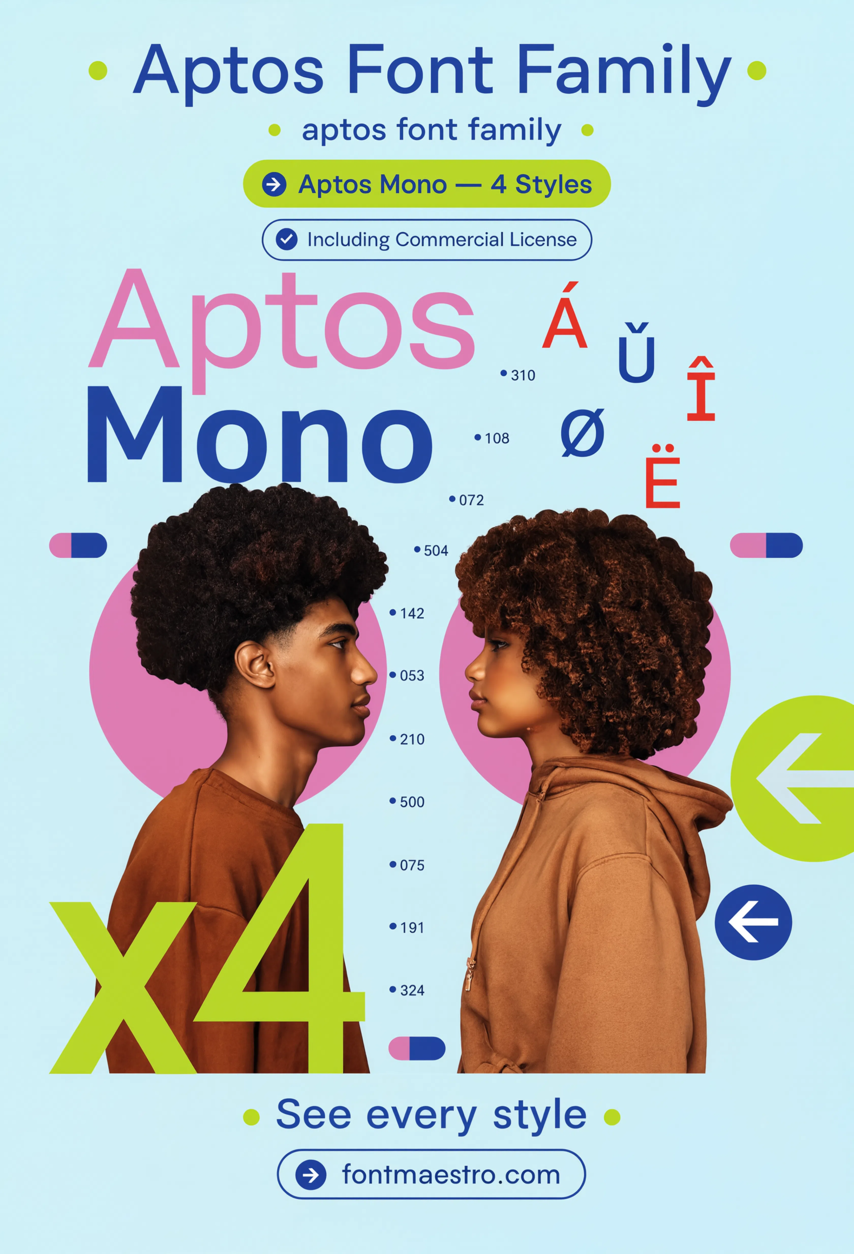
Mono Family Profile
The monospace cut profiled on its own — worth checking before pairing it with code blocks or tabular financial data.
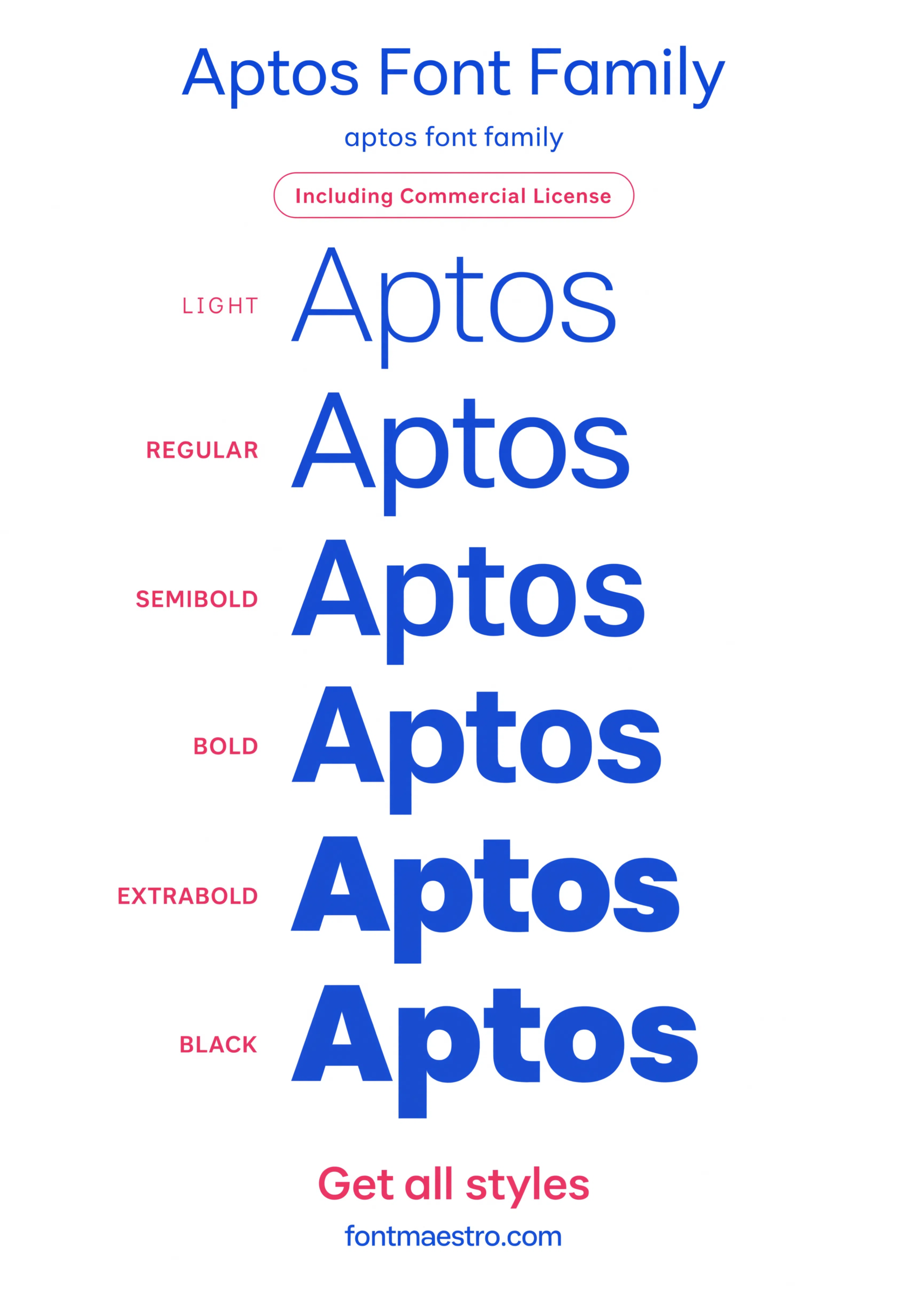
Weight Ladder
Every weight lined up together — useful for planning hierarchy inside a single document without leaning on bold alone.
Looking for more direction? Our Univers sans serif font guide covers another neutral grotesque built for high-volume use, and our classic font styles picks break down type families built to age well in professional settings.
Frequently Asked Questions
Is Aptos the new default font in Microsoft Word?
Yes — Aptos replaced Calibri as the default font across Microsoft Office in 2023, after Calibri had held that spot since 2007.
How is Aptos different from Calibri?
Aptos has a more geometric structure with tighter terminals, better-tuned spacing at small body-text sizes, and a wider default weight range than Calibri.
Does Aptos include a serif version?
Yes — Aptos Serif shares proportions with the sans cut rather than being a generic serif substitution, making it a genuine companion for print-leaning documents.
Is Aptos font free to use?
It ships with Microsoft 365 subscriptions and is also available for standalone licensing through MyFonts for use outside Office documents.
Is Aptos suitable for presentation slides and headlines?
Yes — it was tuned to stay confident at large display sizes as well as dense body text, which is part of why it won Microsoft’s internal font evaluation.
Key Takeaways
- Want a proven starting point? Explore the Aptos collection on MyFonts for the full sans, serif, and mono system.
- Aptos replaced Calibri as Microsoft’s default font in 2023 after winning a public vote among five candidates.
- It was tuned to hold its shape across the full range of Office use — dense spreadsheets, 44pt slide titles, and unproofread body text.
- The serif and mono cuts share real proportions with the sans, unlike many office-default fonts that bolt on unrelated companion styles.




