Most Latin sans-serif fonts fall apart the moment they’re paired with kanji — the stroke weights don’t match, and the whole layout looks like two different typefaces got stapled together. Tazugane Gothic was built to solve exactly that problem: a genuinely unified Japanese font system where the Latin and Japanese glyphs share the same design DNA.
That matching isn’t cosmetic. It’s the difference between a bilingual poster that reads as one coherent piece of design and one that reads as a patch job.
Quick answer: Tazugane Gothic is a Japanese font family designed with matching Latin and kana/kanji weights, built for signage, transit systems, and editorial layouts that need Japanese and Latin text to sit together without a visual seam.
Why Do Most Japanese Fonts Look Mismatched Next to Latin Text?
Because they’re usually designed separately. A studio picks a Latin grotesque for the English copy, then bolts on whatever Japanese font happens to be licensed nearby — and the stroke contrast, x-height, and weight almost never line up. Kanji has far more visual density per character than Latin letters, so a “Regular” weight in one script can look noticeably heavier or lighter than “Regular” in the other.
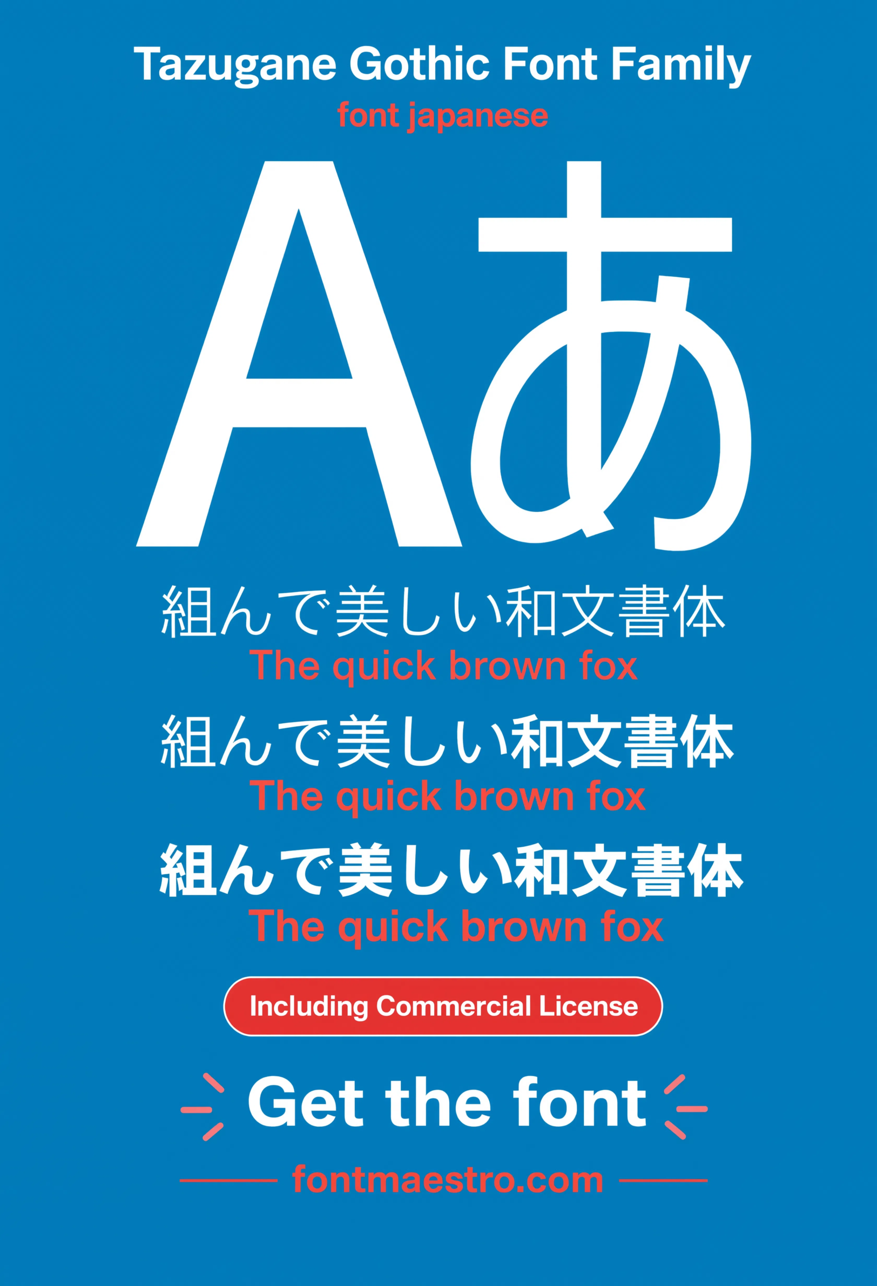
The Aa specimen below shows what happens when both scripts are drawn by the same hand instead: the kana strokes and the Latin letterforms share the same terminal treatment and weight distribution, so nothing fights for attention.
Where Does a Unified Japanese Font Actually Earn Its Keep?
- Transit and wayfinding signage — station names in kanji next to romanized text need identical legibility at a glance, not a font mismatch competing for the eye.
- Packaging with bilingual labeling — ingredient lists and brand names side by side read as one system instead of two typefaces stitched together.
- Editorial layouts — magazine spreads mixing Japanese body copy with English pull quotes hold a consistent rhythm down the page.
- Large-format kanji display — at poster scale, uneven stroke weight becomes obvious fast; a matched system avoids that.
Each file below is a desktop and web-font license bundle available through MyFonts — install it locally for print and signage work, or license the web-font cut for on-site bilingual layouts. Commercial branding rights are included under the standard license.
Unlimited creative assets. Access to AI tools.
Commercial licence included.
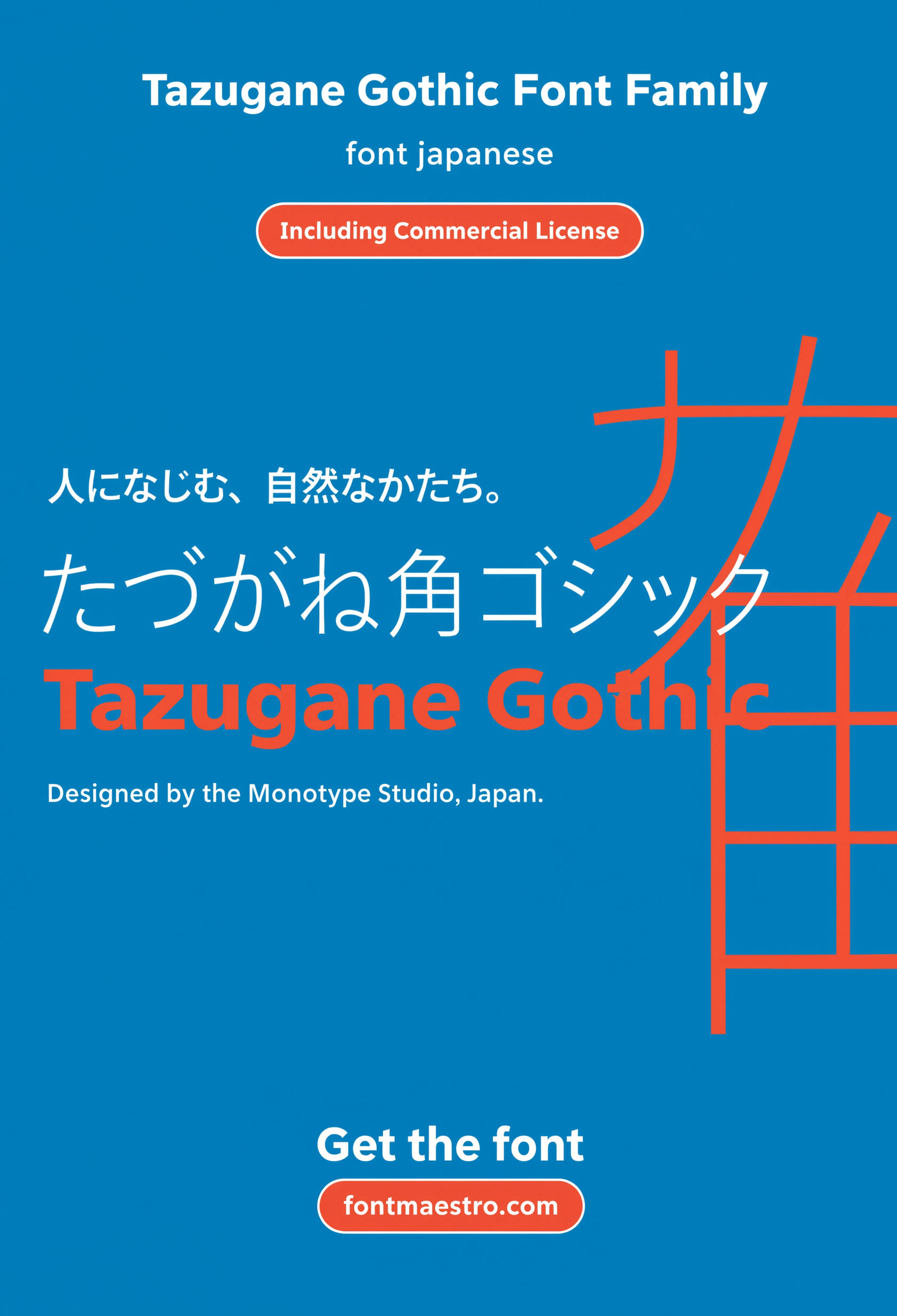
Get downloadsHero Specimen
The family at display scale — the fastest way to see how closely the Latin and kana weights actually track each other.
Aa Specimen
Latin and kana glyphs set side by side — check here for the shared terminal treatment that keeps the two scripts from clashing.
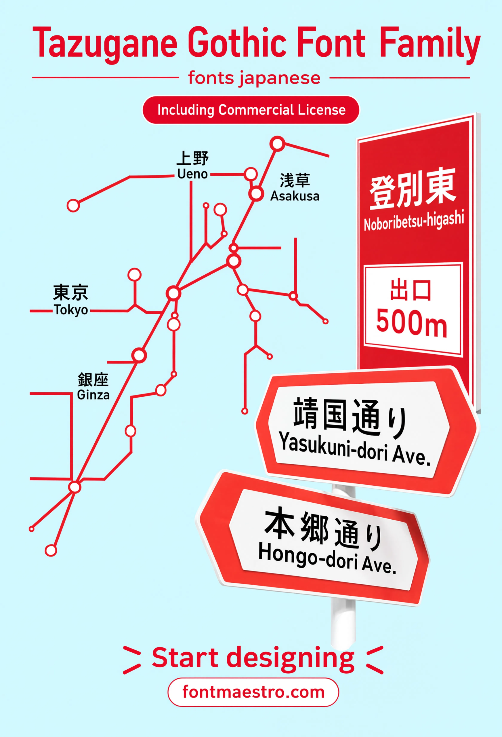
Transit Map Application
Set into a transit map layout — the exact bilingual signage context this family was built to handle.
Browse Japanese Font Templates →
How Many Weights Does Tazugane Gothic Actually Need?
More than most Latin-only families, because kanji density changes how a weight reads. A “Thin” kanji character can still look visually heavier than a “Regular” Latin letter sitting next to it, so a wide weight range gives a designer room to actually balance the two scripts rather than settle for whatever the default pairing gives them.
If you want to explore more options in this direction, our guide to Best Font for Poster is worth a look, and you may also enjoy Best Geometric Letters Font or Best Font for Branding for a different take on the same style.
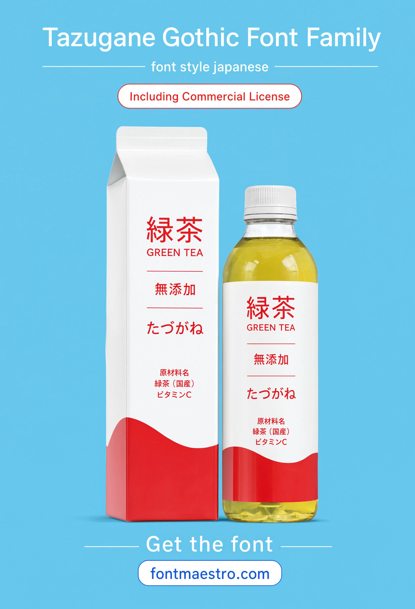
The packaging application below is a useful stress test — small-size bilingual ingredient text next to a larger brand name in kanji, both needing to stay legible without one script visually overpowering the other.
Unlimited creative assets. Access to AI tools.
Commercial licence included.
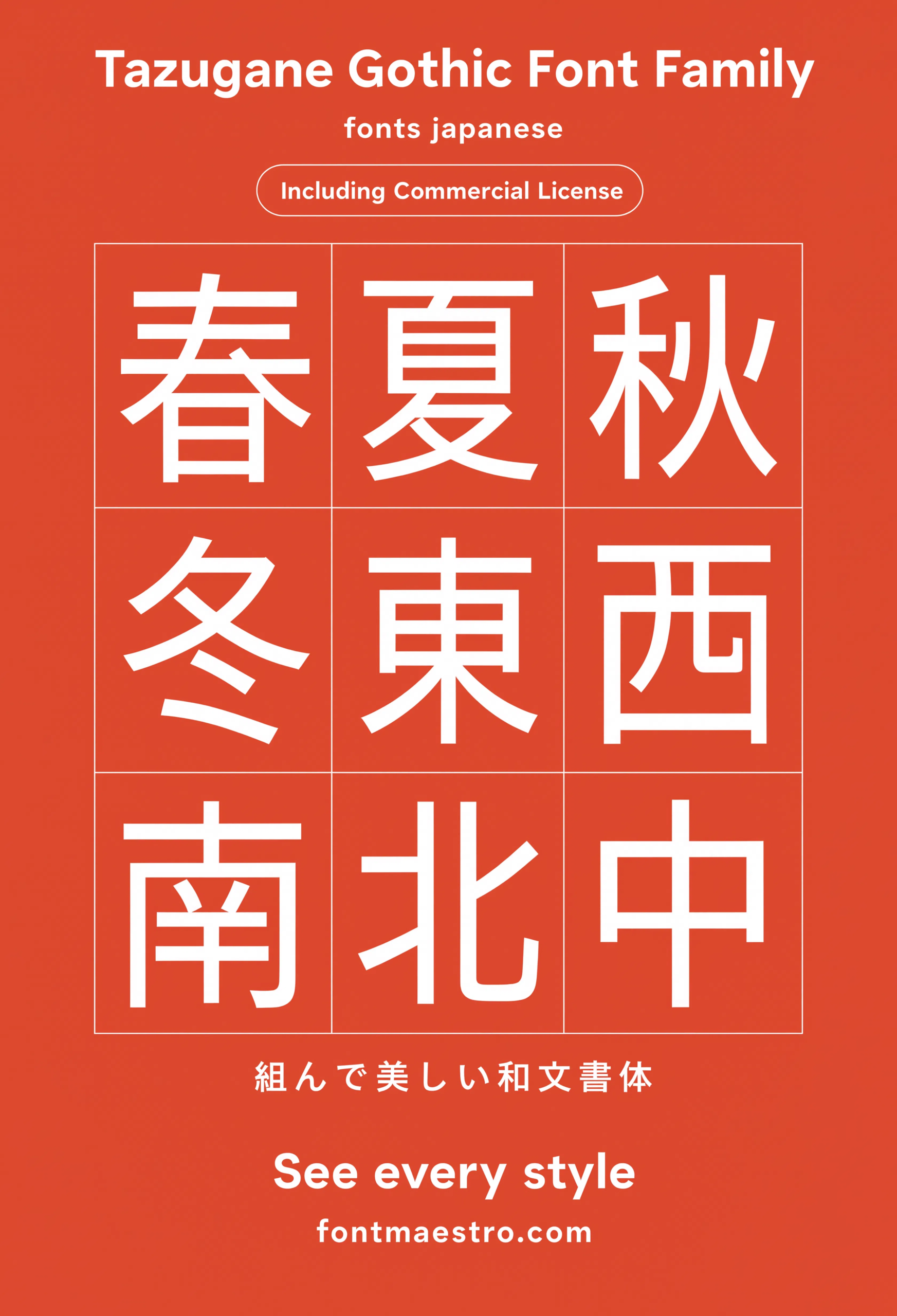
Get downloadsKanji Glyph Grid
A full glyph grid laid out clean — useful for checking stroke consistency across a large character set before committing to a project.
Packaging Application
Applied to a bilingual packaging layout — a real check for how the weights hold up next to small-size ingredient text.
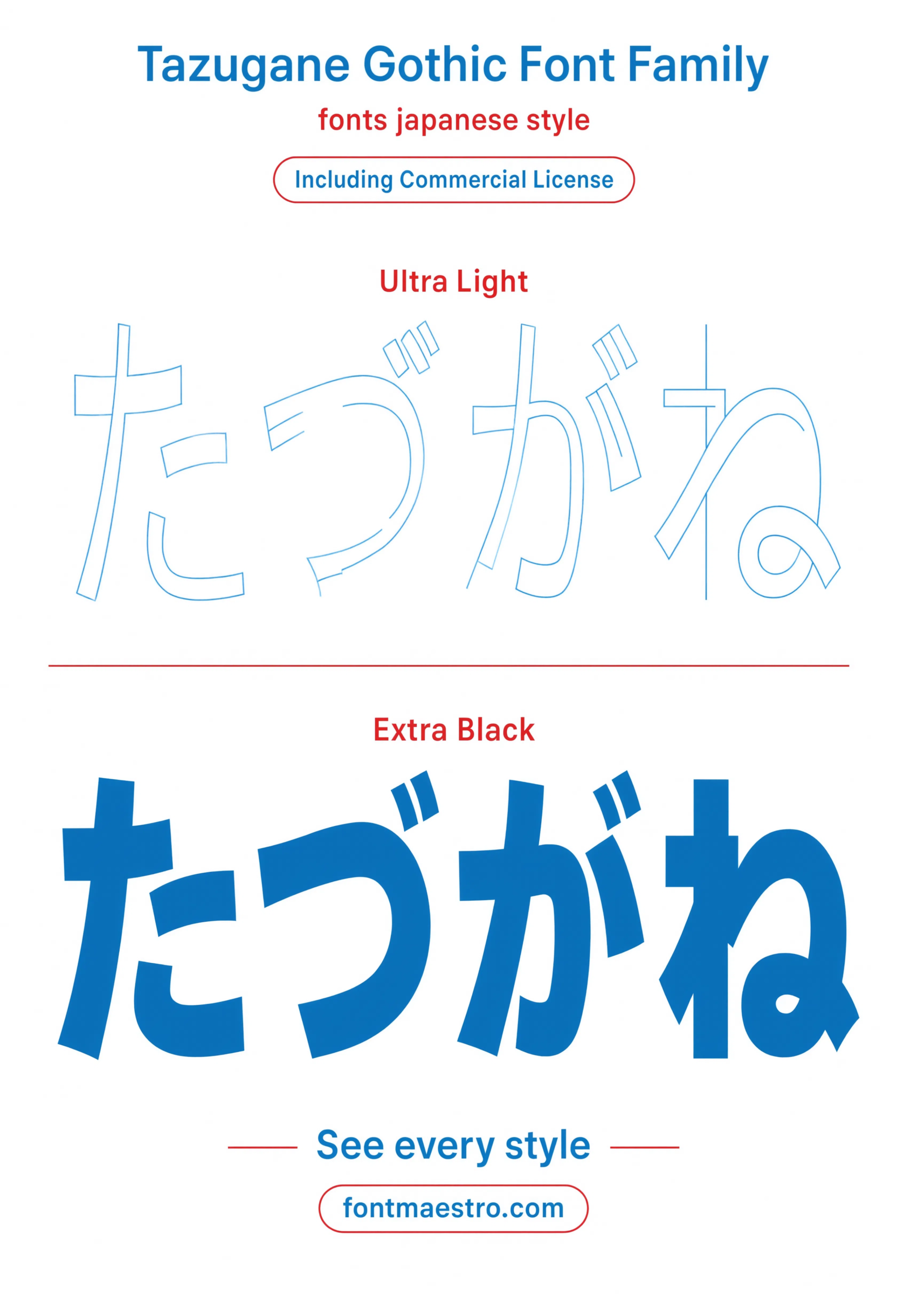
Weight Comparison
Thin versus black side by side — worth checking before picking a weight for dense bilingual text blocks.
Looking for more direction? Our Univers sans serif font guide covers a neutral grotesque built for signage systems, and our font styles for architecture picks break down other type families built for wayfinding and built-environment work.
Frequently Asked Questions
What makes Tazugane Gothic different from other Japanese fonts?
Its Latin and Japanese glyphs were drawn together as one system, so weights and stroke terminals match instead of being licensed separately and forced to coexist.
Is Tazugane Gothic suitable for signage and wayfinding?
Yes — matched bilingual weights are exactly what transit and wayfinding signage needs when station names appear in both kanji and romanized text.
Does Tazugane Gothic include multiple weights?
Yes — a wide weight range is included, which matters because kanji density can make a lighter weight still read as visually heavier than expected next to Latin text.
Is Tazugane Gothic licensed for commercial branding?
The MyFonts collection includes desktop and web-font license options with commercial branding rights under the standard license.
Can Tazugane Gothic be used for packaging with bilingual labels?
Yes — the matched weight system is built to keep small-size bilingual ingredient text and larger brand kanji legible without either script overpowering the other.
Key Takeaways
- Want a proven starting point? Explore the Tazugane Gothic collection on MyFonts for matched Latin and kana weights.
- Most Japanese font mismatches come from Latin and kanji being licensed and drawn separately, not from a single design flaw.
- Kanji density means a lighter weight can still read heavier than expected — check both scripts together, not separately.
- Transit signage and bilingual packaging are the clearest stress tests for whether a Japanese font system actually holds up.




