Univers has been on airport signage, transit systems, and corporate identity manuals since 1957 — and it’s still selling today, which says more about the typeface than any pitch could. Adrian Frutiger designed it as a single system with 21 numbered weight-and-width variants, a structure that was radical at the time and is still copied by every modern sans serif font family since.
That numbering system is the actual reason it sells. A designer doesn’t guess which weight pairs with which width — the number tells them directly.
Quick answer: Univers sells because it removes guesswork — 21 weight-and-width combinations, each numbered, mean a brand system, wayfinding sign, or magazine layout can pull an exact match instead of approximating with a single regular-and-bold pair. It’s a clean sans serif font built as one coordinated family, not a handful of loosely related cuts.
Why Does a Numbered Weight System Matter More Than It Sounds?
Most sans serif families offer four to six weights with vague names — Light, Regular, Medium, Bold. Univers assigns every weight and width a two-digit number, so “Univers 65 Bold” and “Univers 67 Bold Condensed” are unambiguous choices, not approximations. That precision is why type directors could specify an exact cut for a specific use — a magazine byline, a transit sign, a footnote — without second-guessing the pairing.
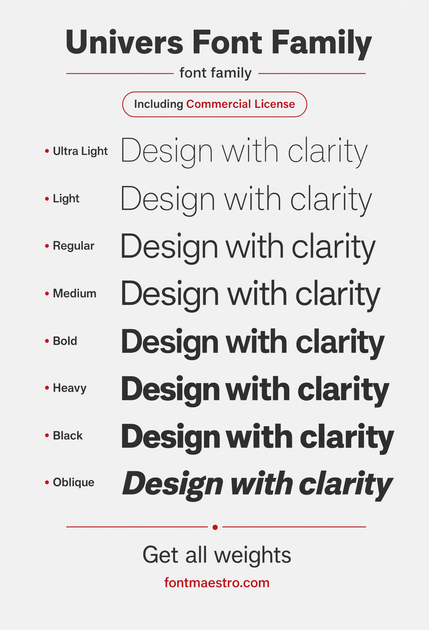
The weight ladder specimen below lays that numbering system out visually — the same structural logic that made Univers the reference point for corporate identity manuals for decades.
What Made Univers the Default Choice for Signage and Wayfinding?
- Even stroke weight at every size — legible from a magazine footnote up to a full building directory sign.
- Condensed and expanded widths built in — a system planner never has to reach for an unrelated typeface to fit a narrow sign panel.
- Numerals that hold their own weight — pricing, gate numbers, and floor directories read cleanly, no mismatched fallback font.
- A genuinely neutral voice — Univers doesn’t compete with the content it’s labeling, which is exactly the point in wayfinding.
Each file below is a desktop and web-font license bundle available directly through MyFonts — install it locally for identity and signage work, or license the web-font cut for on-site typesetting. It’s part of the Univers collection, so commercial branding rights are included in the standard license.
Unlimited creative assets. Access to AI tools.
Commercial licence included.
Get downloadsHero Specimen
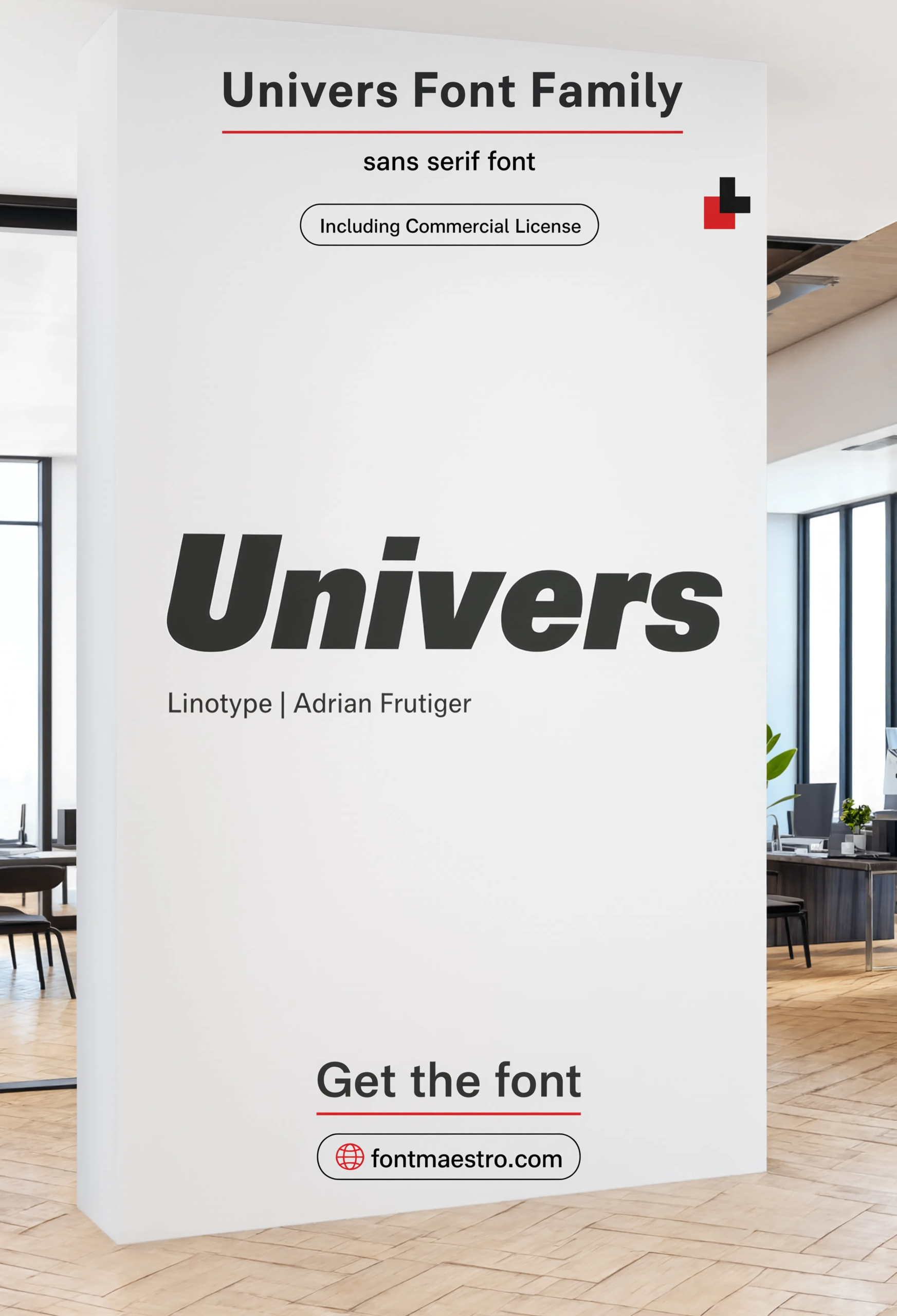
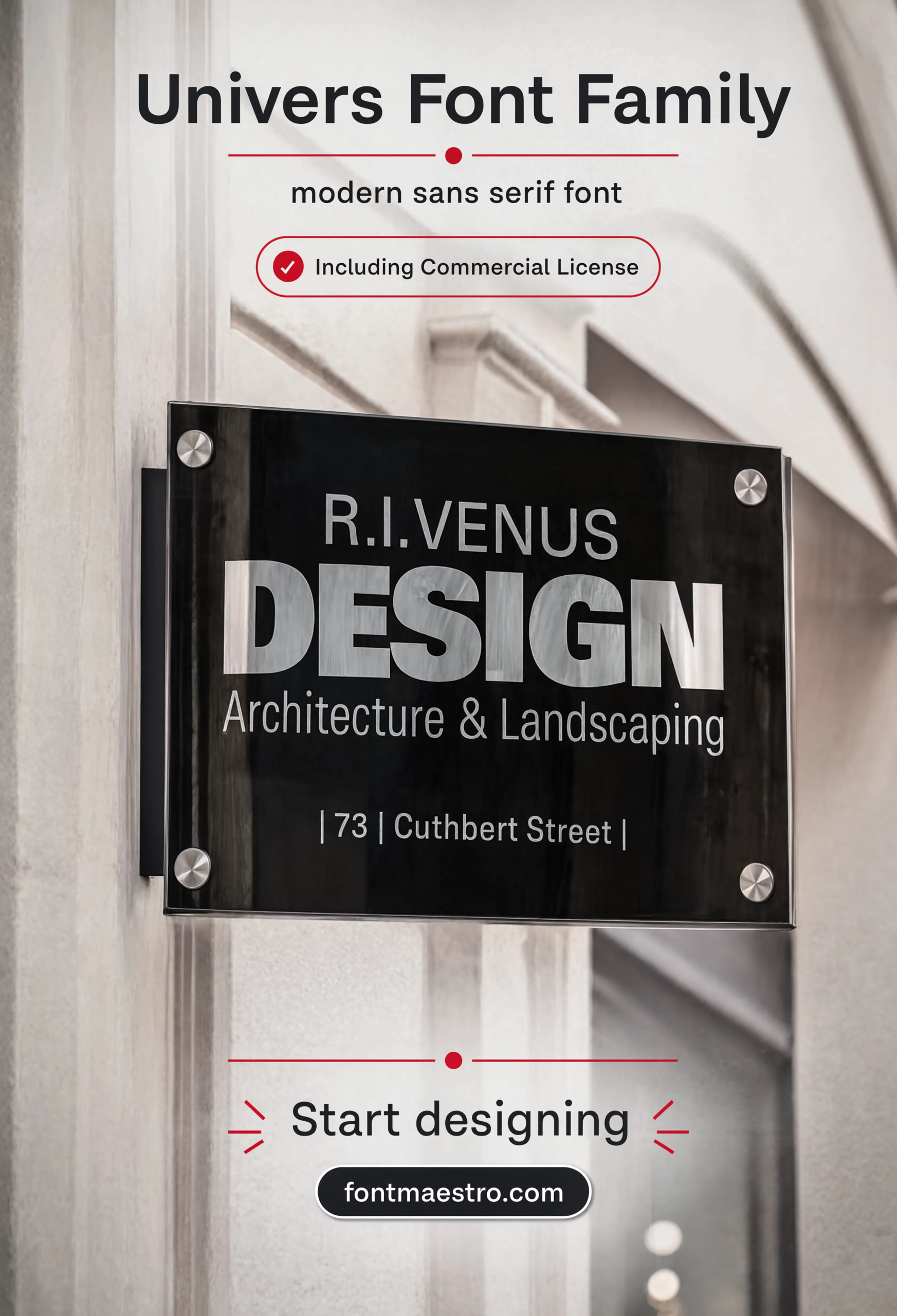
The family shown in a real office signage context — proof the neutral voice holds up once it’s surrounded by actual content, not just isolated letterforms.
Alphabet Specimen
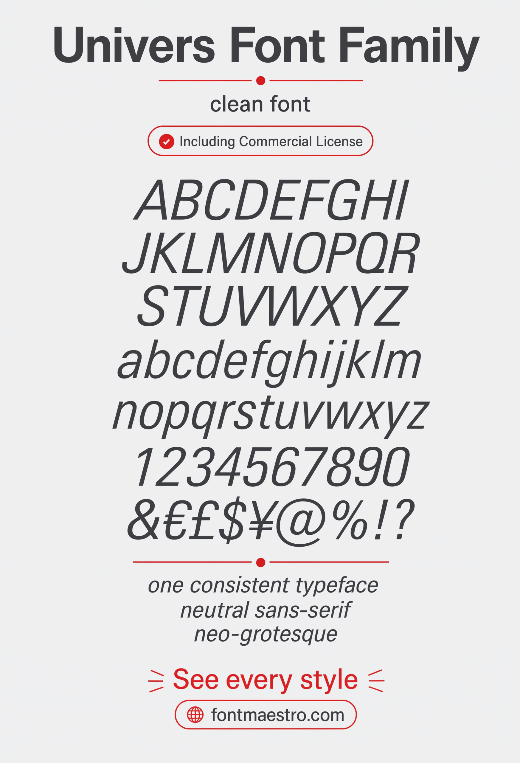
The full letterform set laid out clean — check here for the even stroke weight that made Univers the reference point for legible, neutral type.
Weight Ladder
The numbered weight-and-width system in one view — the reference sheet for pulling an exact match instead of approximating with a single bold cut.
Browse Sans Serif Font Templates →
Where Does Univers Still Outperform Newer Sans Serif Fonts?
Branding mockups reveal the gap fast. Plenty of modern geometric sans faces look sharp as a headline mark, then lose consistency once they’re set in a footer address line or a data table. Univers doesn’t — the same even stroke weight that reads clean on a building sign carries through to the smallest supporting text.
If you want to explore more options in this direction, our guide to Display Fonts for Industrial is worth a look, and you may also enjoy Aptos Font or Trade Gothic for a different take on the same style.
Signage is where the family still earns its reputation. A directory board, a gate number, a floor plan label — all need type that stays legible from a distance without demanding attention. Univers was built for exactly that job, and it hasn’t been meaningfully improved on in almost seventy years.
Unlimited creative assets. Access to AI tools.
Commercial licence included.
Get downloadsBranding Mockup
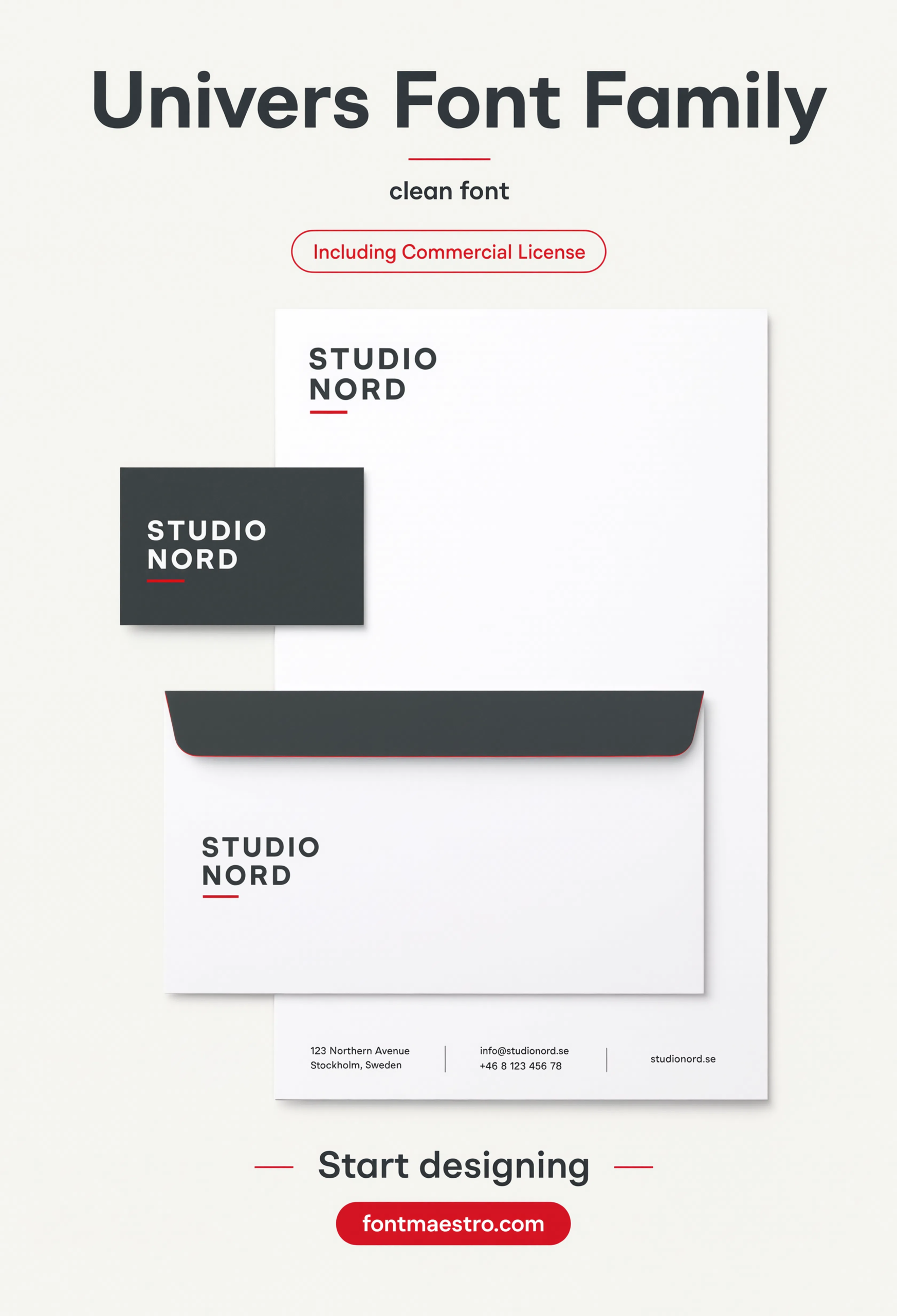
Applied to a real identity system — a check for how the neutral voice holds up once the typeface is sharing space with logos, color, and packaging detail.
Signage System
Set into a wayfinding context at distance — the exact use case the numbered weight system was originally built to solve.
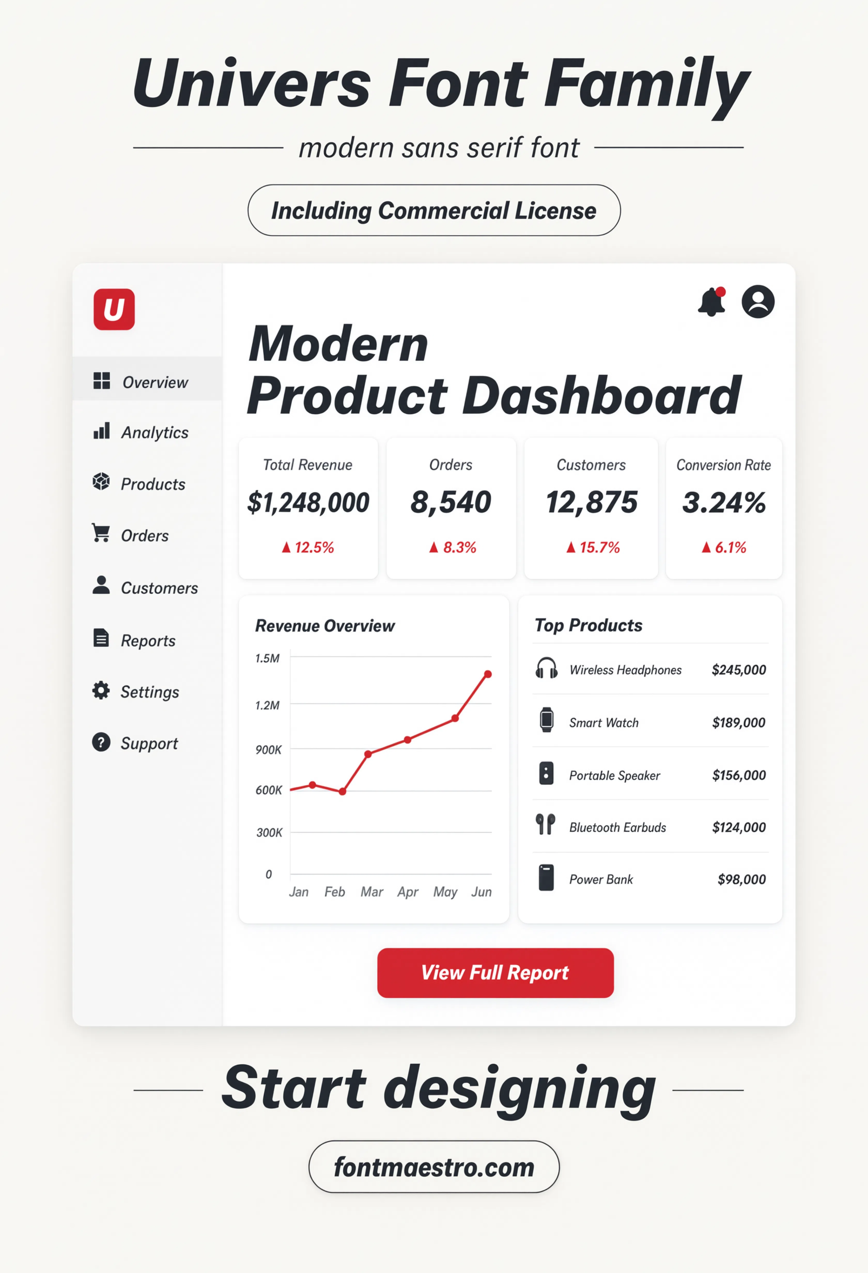
UI Screen
Set inside an app interface — the modern equivalent of the signage test, since UI labels get scrutinized at even smaller sizes than a directory board.
Looking for more direction? Our Avenir Next sans serif font guide covers a different geometric option built for branding range, and our classic font styles picks break down other type families built to age well.
Frequently Asked Questions
What does Univers 65 mean?
It’s one of the 21 numbered weight-and-width variants in the Univers family — the first digit signals weight, the second signals width, so a designer can specify an exact cut without ambiguity.
Is Univers a good sans serif font for signage?
Yes — it was designed with wayfinding and identity systems in mind, and its even stroke weight stays legible at distance, which is exactly what signage needs.
How is Univers different from Helvetica?
Both are neutral geometric sans faces from the same era, but Univers ships as a coordinated numbered system of 21 variants, while Helvetica’s family structure grew less systematically over time.
Is Univers licensed for commercial branding?
The MyFonts collection includes desktop and web-font license options with commercial branding rights under the standard license.
Does Univers include condensed and expanded widths?
Yes — condensed and expanded widths are part of the original numbered system, not a separate add-on family.
Key Takeaways
- Want a proven starting point? Explore the Univers collection on MyFonts for the full numbered weight-and-width system with commercial licensing included.
- Univers sells because its 21 numbered variants remove guesswork from weight and width choices.
- The same even stroke weight that works on a directory sign carries through to the smallest supporting text.
- Check a sans serif font at both signage distance and UI scale before committing it to an identity system.




