Fonts for signs live or die on one test: can a stranger read it from thirty feet away, at speed, in bad light? Most typefaces never have to pass that test — signage does, every single day.
“Fonts for signs” searches usually come from two different places — someone designing an actual wayfinding or storefront sign, and someone who just needs a clean, legible sans-serif for a poster or brochure that reads as “signage-style” without being an actual sign. Both need the same underlying quality: a geometric, wide-glyph-support sans built for clarity first.
Quick answer: The strongest fonts for signs share three traits — open counters (the enclosed spaces inside letters like “o” and “e”), consistent stroke width, and wide language support so numerals and accented characters read as clearly as plain letters. A geometric sans built for transit and wayfinding systems is the safest starting point for any sign project. Check pan-European glyph coverage before finalizing a typeface for public signage.
Why do most sans-serif fonts fail at actual sign scale?
A typeface can look perfectly clean on a screen at sixteen points and still blur into mush printed four feet wide and viewed from across a parking lot. Signage has its own physics — legibility problems that only show up at scale.
What breaks down first when a typeface isn’t built for signs:
- Closed counters — tight, narrow openings inside letters like “a,” “e,” and “s” fill in with shadow or glare at distance, turning into dark blobs instead of readable shapes.
- Inconsistent stroke contrast — thin-to-thick transitions that look elegant in print vanish or exaggerate unpredictably depending on lighting and viewing angle outdoors.
- Narrow character support — a sign system serving multiple languages or regions needs accented characters and non-Latin glyphs that match the primary alphabet’s weight and proportions exactly.
A geometric wayfinding-style sans keeps counters open and strokes consistent specifically because it was built to survive exactly these conditions — not just to look good in a type specimen PDF.
What does a real sign-ready typeface look like across applications?
A single word on a white background says nothing about how a typeface behaves on an actual sign, vehicle graphic, or public directory. Here’s the same geometric sans under real conditions.
Unlimited creative assets. Access to AI tools.
Commercial licence included.
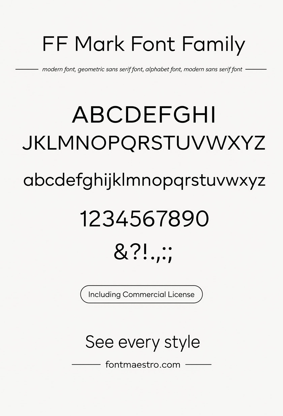
Get downloadsAlphabet Specimen — Full Character Set
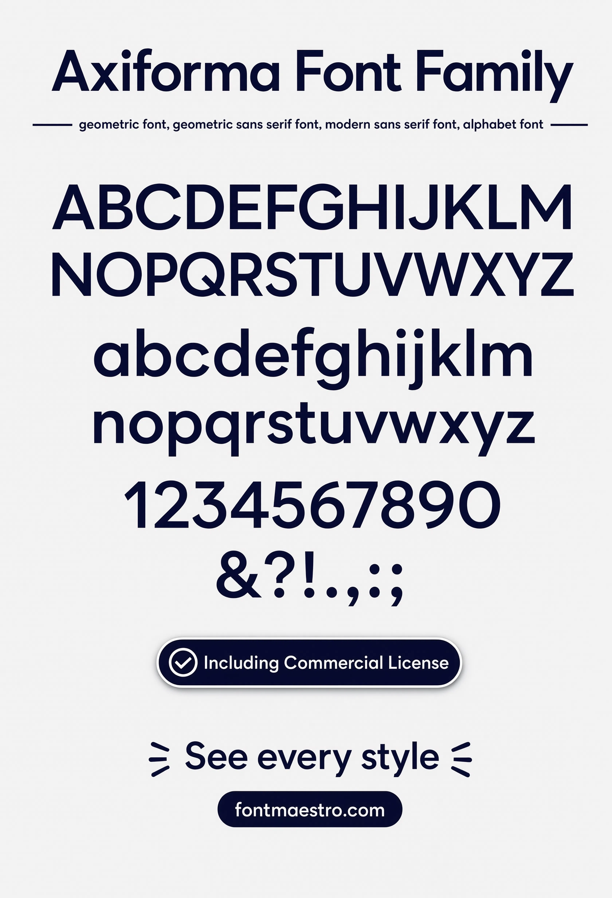
The complete alphabet laid out together — open counters and consistent stroke width visible across every letter, the two traits that matter most for fonts for signs.
Commercial License
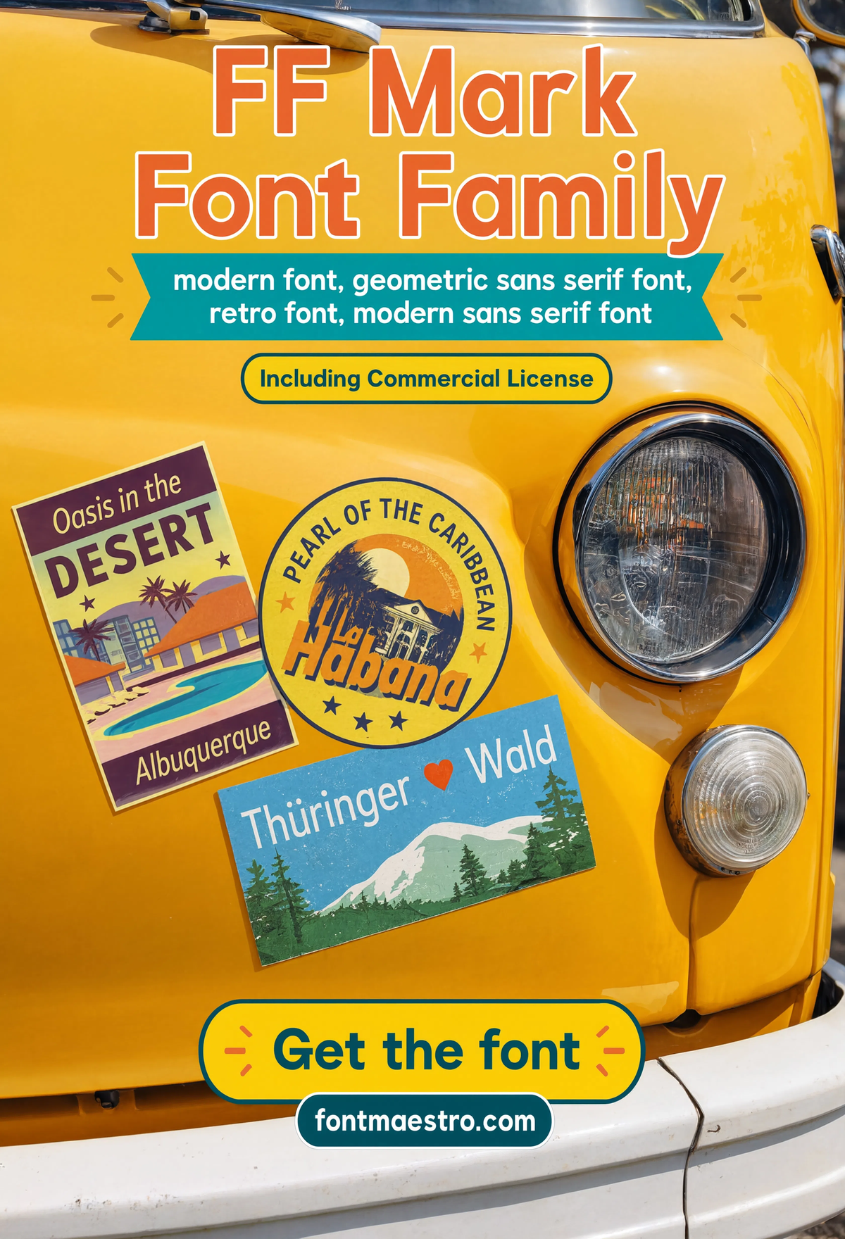
Retro Van Stickers
Applied to vehicle graphics — a genuinely different reading environment than a static sign, testing legibility while the surface itself is moving.
Commercial License
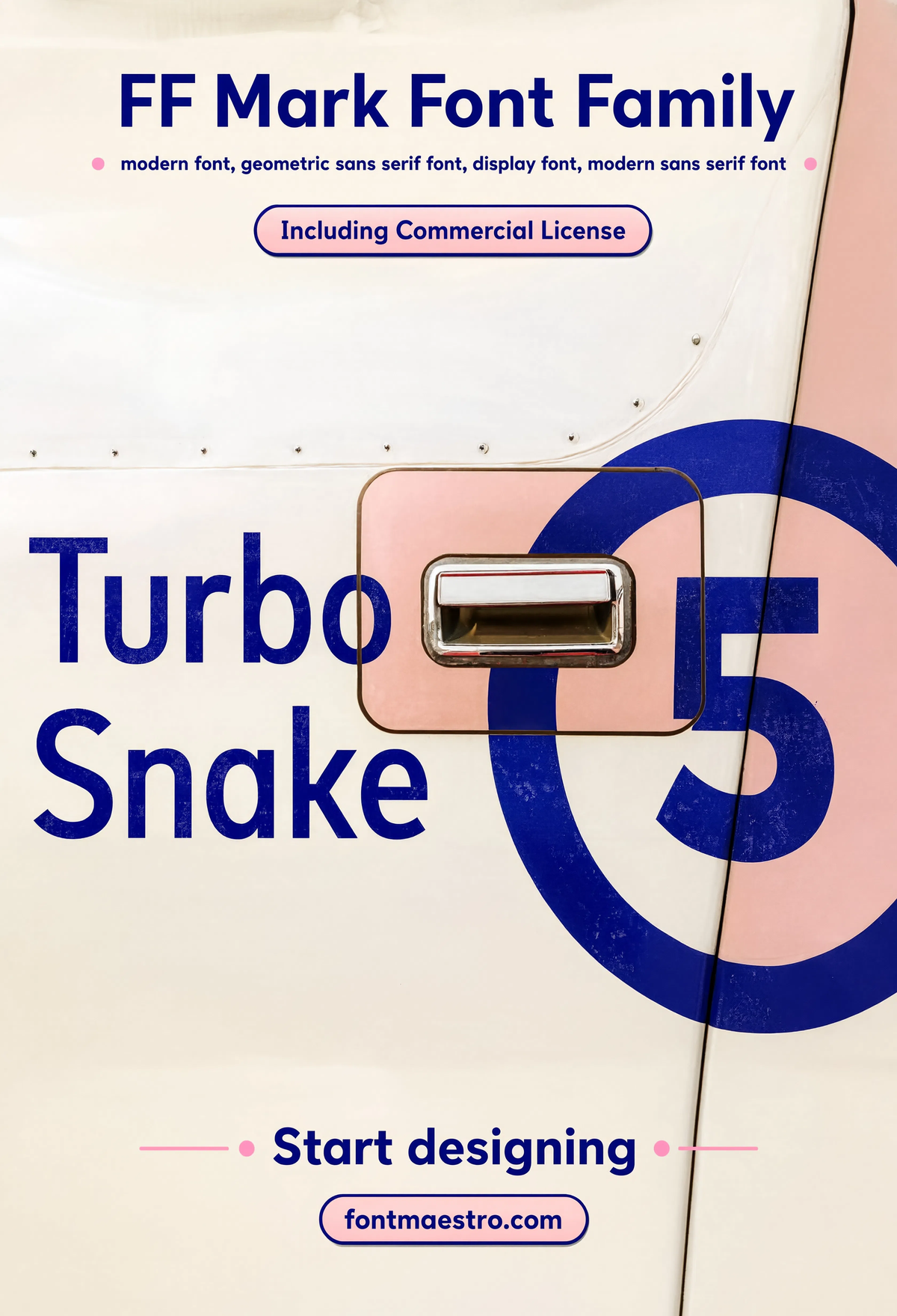
Bold Van Graphic — Turbo Snake
A bold, large-scale vehicle graphic pushing the family’s heaviest weight — proof the same geometric structure holds up even under maximum stroke width.
Commercial License
Every file ships as OTF and TTF across the full weight range under one commercial license — ready for signage layout software, vehicle graphic templates, and everyday brochure or poster work.
Browse the Geometric Sans Collection →
Why does language and character support matter for public signage?
A sign system that only accounts for basic Latin letters breaks the moment it needs to display a name with an accent, a currency symbol, or a second language. This is the detail most “fonts for signs” searches never think to check until it’s a problem mid-project.
Unlimited creative assets. Access to AI tools.
Commercial licence included.
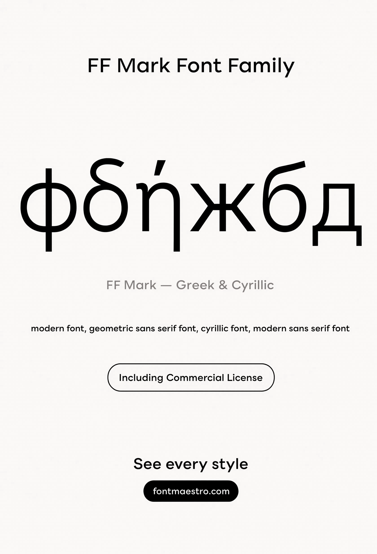
Get downloadsGreek & Cyrillic Glyph Support
Extended language support shown side by side with the primary alphabet — matching weight and proportion across scripts is what keeps a multilingual sign system looking unified.
Commercial License
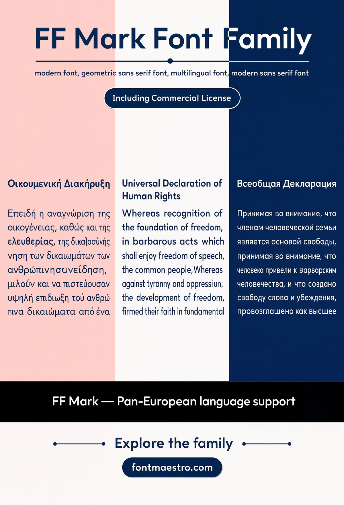
Pan-European Character Support
Accented characters across multiple European languages, all matching the base alphabet’s stroke weight — essential for any sign serving an international audience.
Commercial License
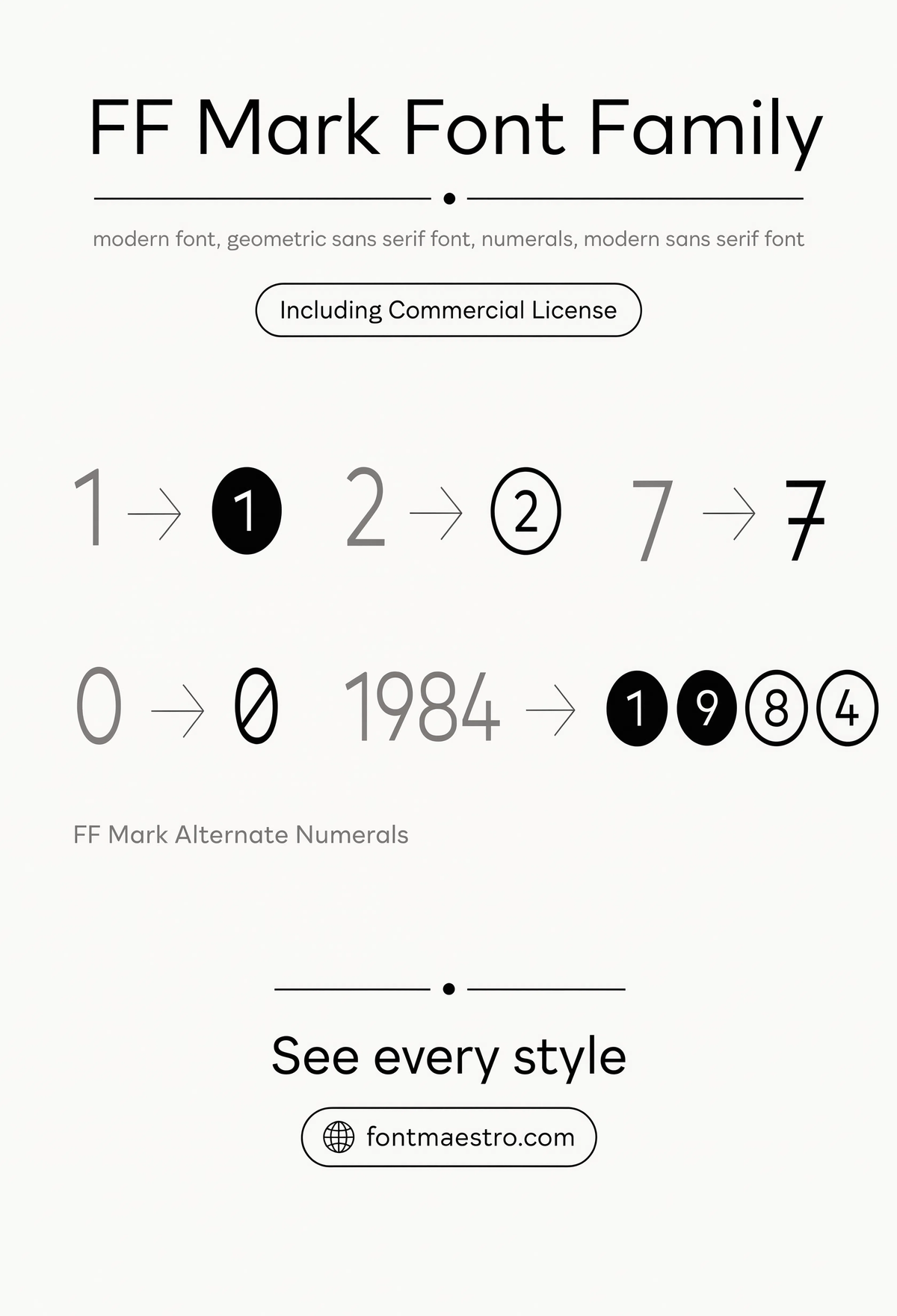
Alternate Numerals
Numeral variants shown in detail — signage often leans on numbers as heavily as letters, from room numbers to distance markers, and this is where a weak font quietly fails.
Commercial License
What weight and width range does a full sign system actually need?
A one-off sign might only need a single weight. A full wayfinding or brand signage system needs a range wide enough to separate primary directions from secondary labels, and bold enough to hold up printed at building scale.
If you want to explore more options in this direction, our guide to Font Japanese is worth a look, and you may also enjoy Best Geometric Letters Font or Font Style For Architecture for a different take on the same style.
Unlimited creative assets. Access to AI tools.
Commercial licence included.
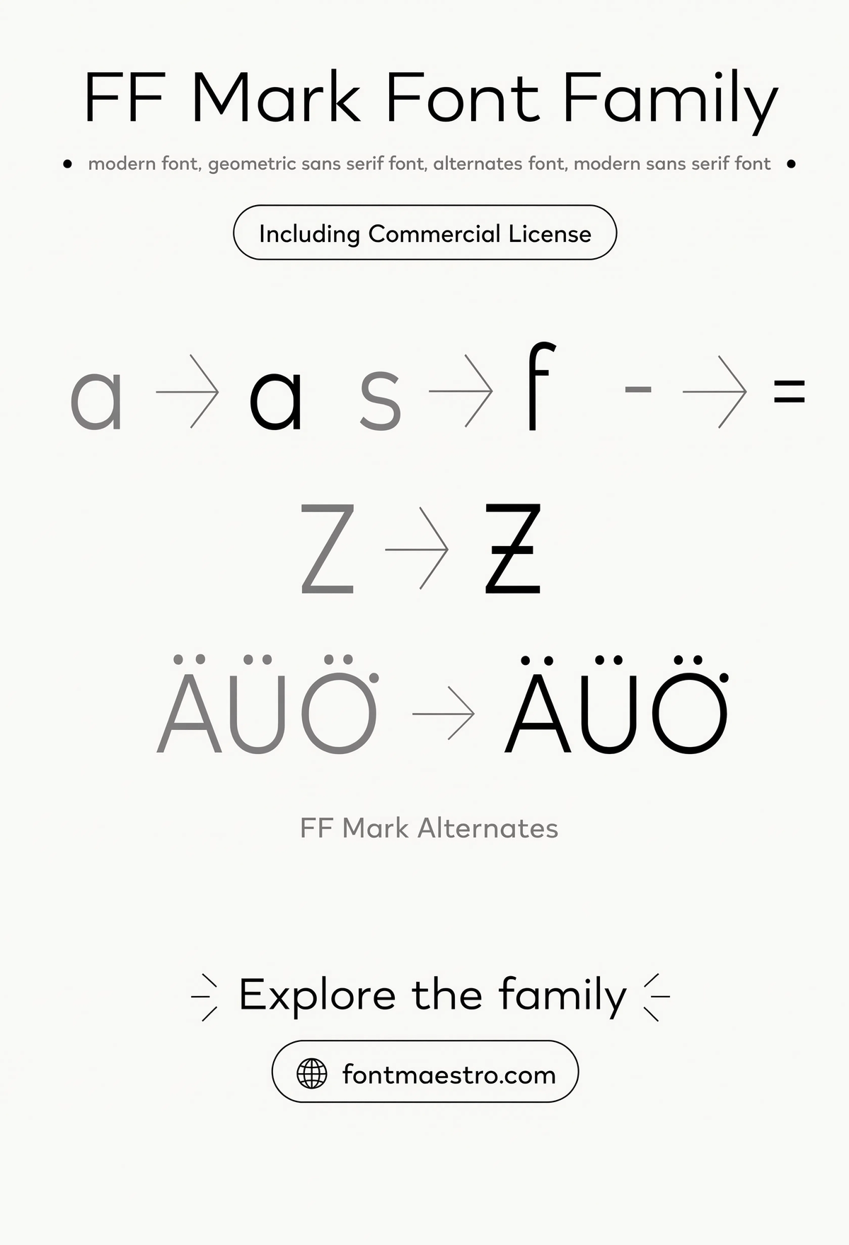
Get downloadsStylistic Alternates
Alternate letterforms available within the family — useful for distinguishing a wayfinding system’s headline text from its directional labels without switching typefaces.
Commercial License
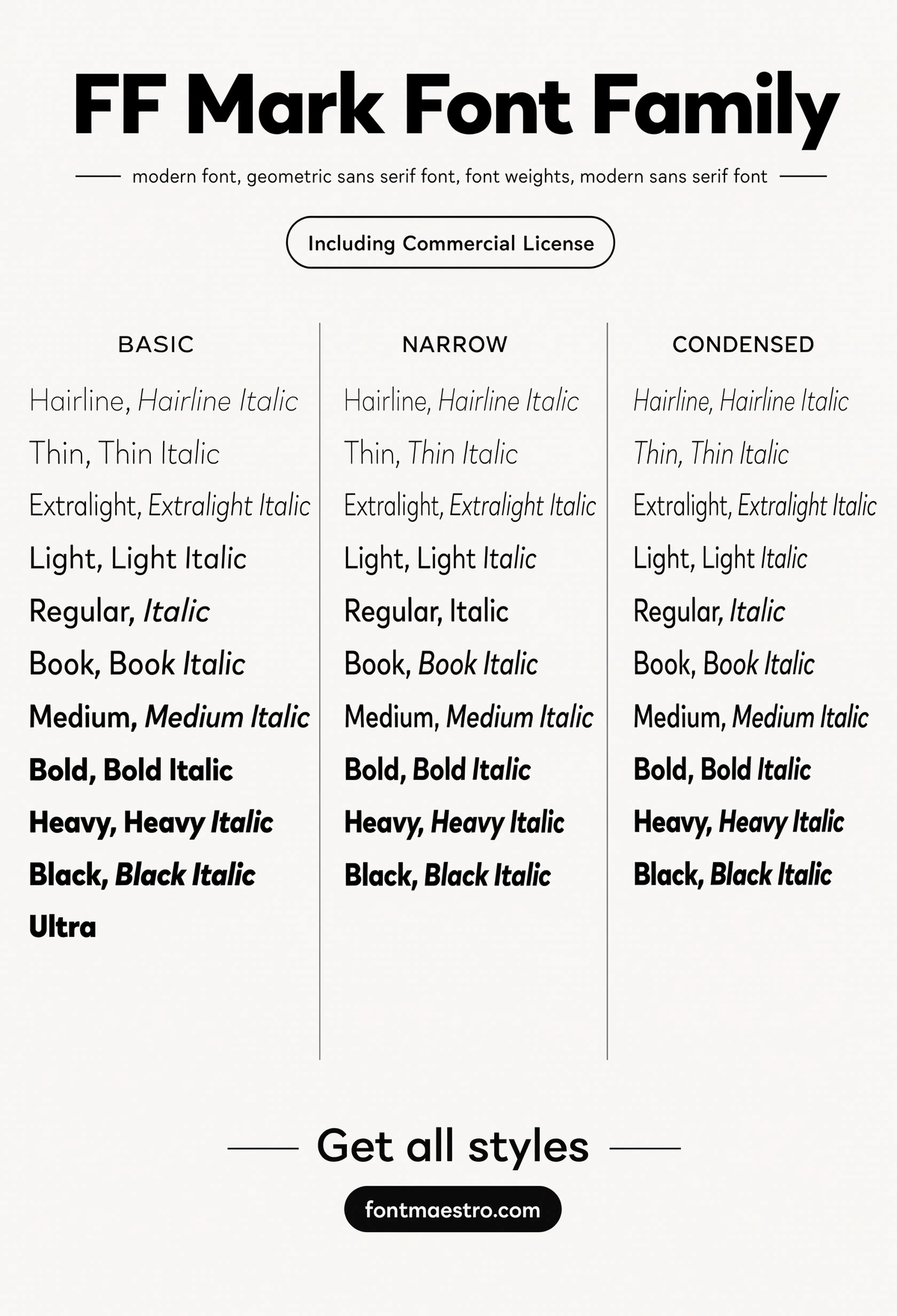
Width & Weight Specimen
The full family’s width and weight variations laid out together — the reference sheet worth checking before locking in a hierarchy for a multi-sign system.
Commercial License
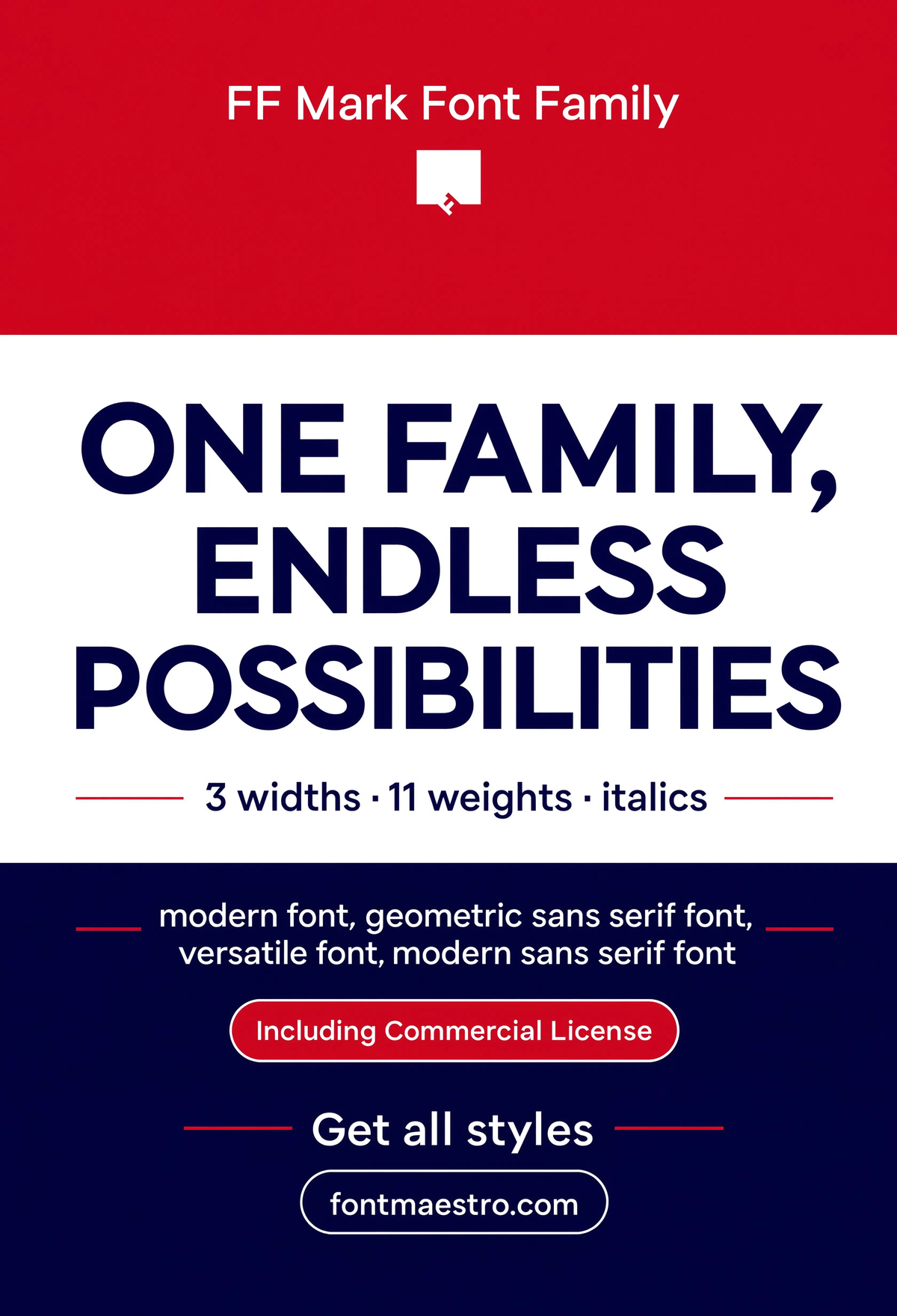
Statement Poster
A bold single-line statement filling the frame — the same clarity that works for a directional sign translates directly into high-impact poster and display work.
Commercial License
Does this typeface work outside of literal signage too?
A font good enough for public signage tends to be versatile enough for branding, editorial, and UI work — the same clarity standards carry over cleanly.
Unlimited creative assets. Access to AI tools.
Commercial licence included.
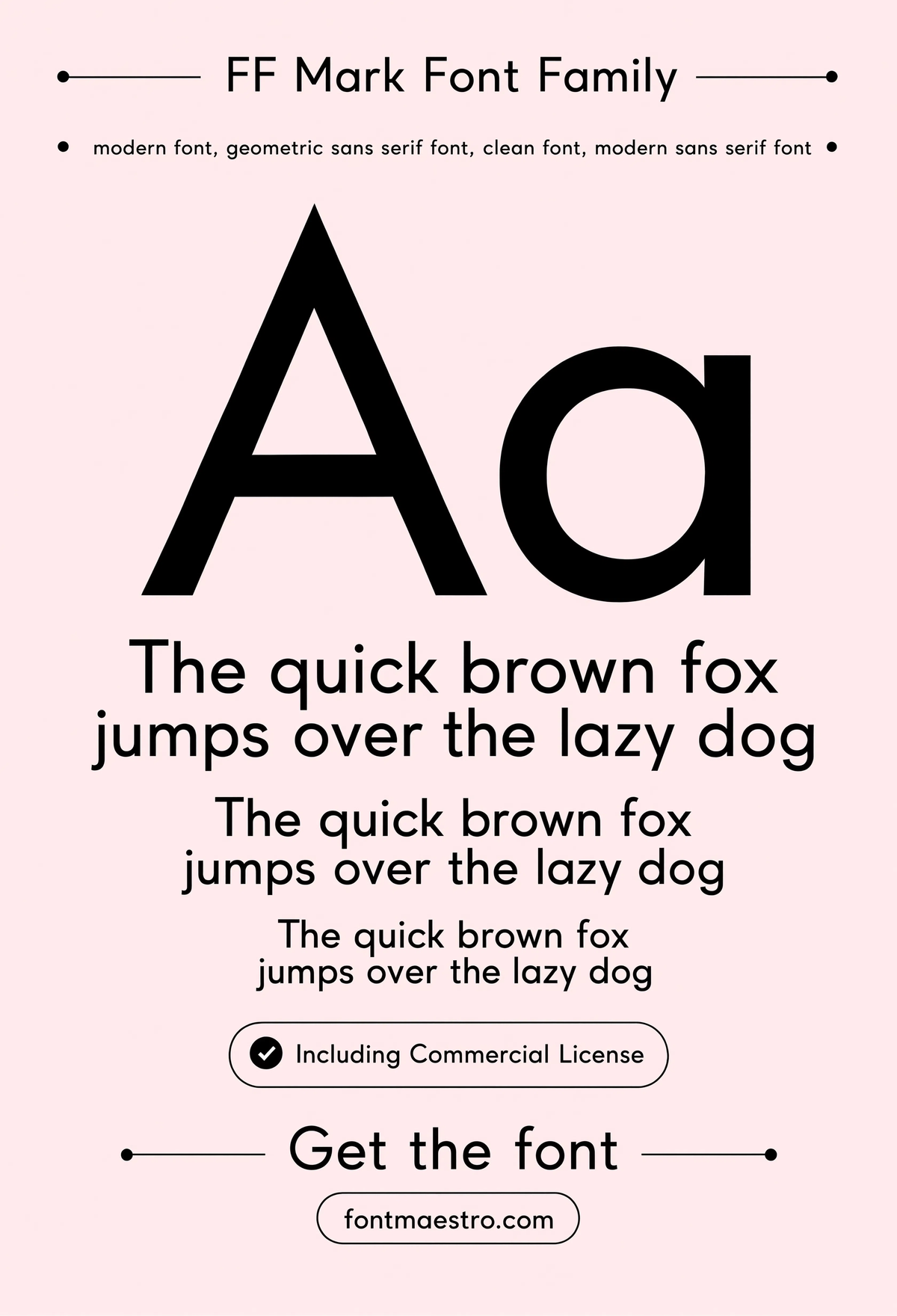
Get downloadsPangram Specimen
A full pangram set at readable size — the fastest way to test how every letter in the alphabet behaves together before committing to a full sign layout.
Commercial License
Unlimited creative assets. Access to AI tools.
Commercial licence included.
Get downloadsBranding & Stationery
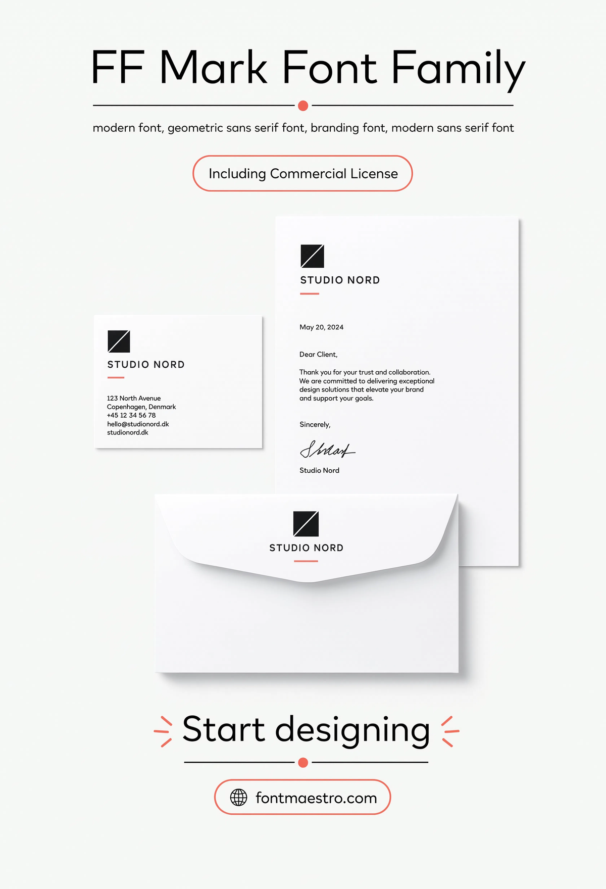
A full stationery set built on the same geometric family — from business cards to letterhead, showing the range beyond wayfinding and signage work.
Commercial License
For related type-selection guidance, see our guide to fonts for branding and identity systems, and our guide to choosing a font for poster design covers similar large-scale legibility considerations from a different angle.
Frequently Asked Questions
What’s the single most important trait in a font for signs?
Open counters — the enclosed spaces inside letters like “o,” “e,” and “a.” Tight, narrow counters fill in with shadow at distance and become illegible far sooner than the rest of the letterform.
Do I need a special font for outdoor vs. indoor signage?
Not necessarily a different typeface, but check the same legibility traits (open counters, consistent stroke width) hold up under the specific lighting and viewing distance of each environment before finalizing.
Why does language and character support matter for a sign font?
Any sign system serving more than one language, or displaying names and locations with accented characters, needs those glyphs to match the primary alphabet’s weight and proportions — mismatched character sets look unfinished.
Can the same font work for both signage and everyday branding?
Yes — a typeface built for signage-level clarity typically performs well in logos, UI, and editorial work too, since the same open, consistent letterforms that read well at distance also read well at small sizes.
How many weights should a sign system typeface include?
At minimum, a Regular and a Bold, to separate primary directional information from secondary labels. Larger wayfinding systems benefit from a wider range to build a clearer visual hierarchy.
Key Takeaways
- Want the exact family from this breakdown? Get it via this geometric sans collection with the full commercial license.
- Open counters and consistent stroke width matter more than style for fonts for signs.
- Check pan-European and numeral glyph support before finalizing a typeface for public or multilingual signage.
- A typeface built for sign-level legibility usually performs well in branding and UI work too.
Related Reads
Unlimited creative assets. Access to AI tools.
Commercial licence included.
Get downloads