Font branding decisions rarely fail because the typeface looks bad in isolation — they fail because nobody checked whether it holds up across every touchpoint a brand actually needs: a logo lockup, a signage system, a business card, and a website header, all at once.
Searches for “branding fonts,” “font branding guidelines,” and “good branding fonts” usually come from the same moment — a founder or designer staring at a logo file, unsure if the typeface underneath it can carry the rest of the identity system or if it’s about to become the weak link.
Quick answer: Helvetica remains one of the most-used branding typefaces because its neutral, letterform-consistent design carries a brand identity across every surface — signage, packaging, editorial, digital — without fighting for attention. Before locking in any font for branding, check its weight range and how it behaves in a wordmark at small sizes; that’s where most branding fonts quietly fall apart.
Why does font branding fail even when the logo looks fine on its own?
A logo file is a single frozen moment. Brand identity is not. The same typeface has to work in a sixteen-point footer link, a three-story building sign, and a black-and-white fax cover sheet — and most typefaces were never designed with all three in mind.
What separates a working branding typeface from a logo-only font:
- Neutral letterforms — a brand typeface shouldn’t have a strong “personality” of its own; the brand’s voice should come from color, imagery, and copy, not from quirky letter shapes competing for attention.
- A genuine weight system — Light for body copy, Regular for UI text, Bold for headlines, all sharing the same skeleton so nothing looks like a mismatched substitute.
- Legibility at extremes — tiny footer text and oversized signage both need to read clearly from the same source file.
Helvetica’s neo-grotesque structure was built around exactly this kind of neutrality — the letterforms recede so the message in front of them can lead.
What does a font branding system actually look like in practice?
“Font branding guidelines” searches usually want to see a real system, not a single word set in one weight. Here’s how the same neutral sans carries across a full identity build.
Unlimited creative assets. Access to AI tools.
Commercial licence included.
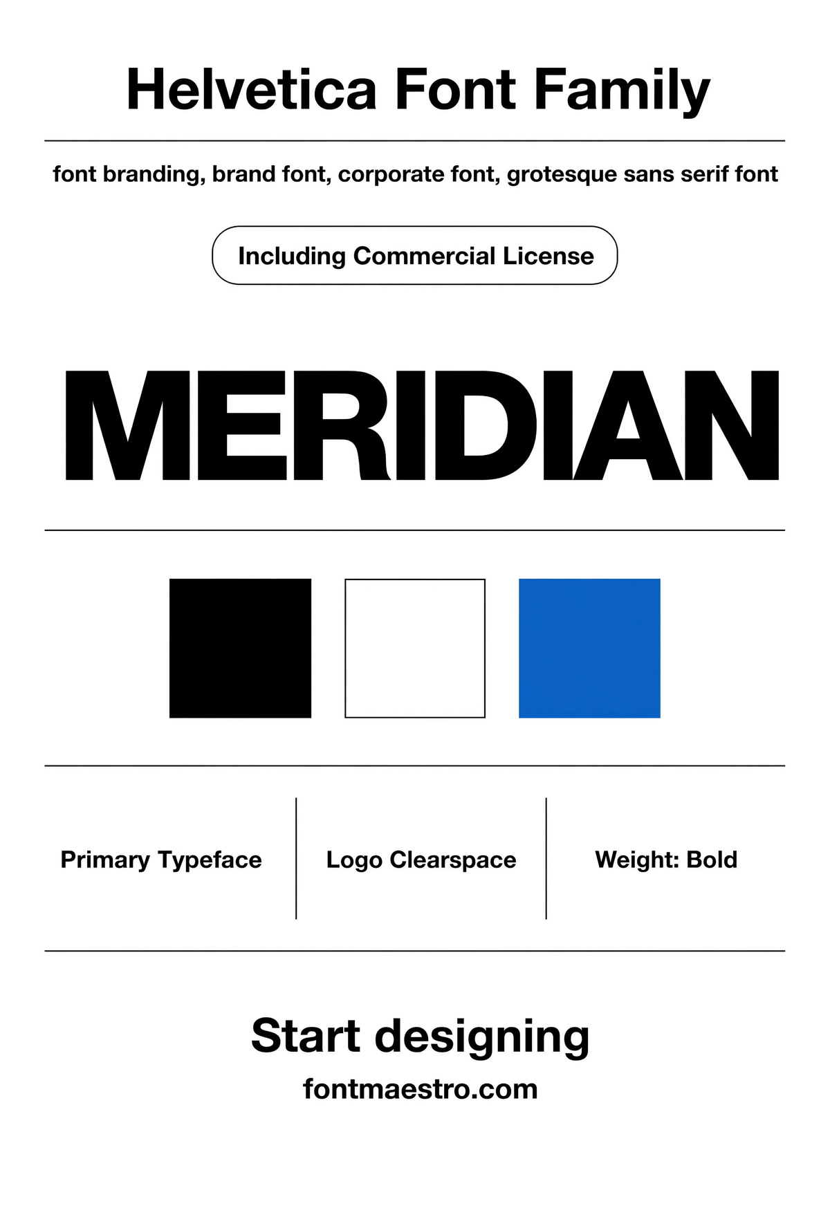
Get downloadsHelvetica — Brand Guidelines Board
A full guidelines board — logo clearspace, type scale, and usage rules laid out together. This is the reference sheet a font branding project is actually built from.
Commercial License
Helvetica — Brand Identity Grid
The full family mapped onto a grid — proof that a neutral sans still needs structure behind it. This is what a real identity system looks like before the logo gets applied to anything.
Commercial License
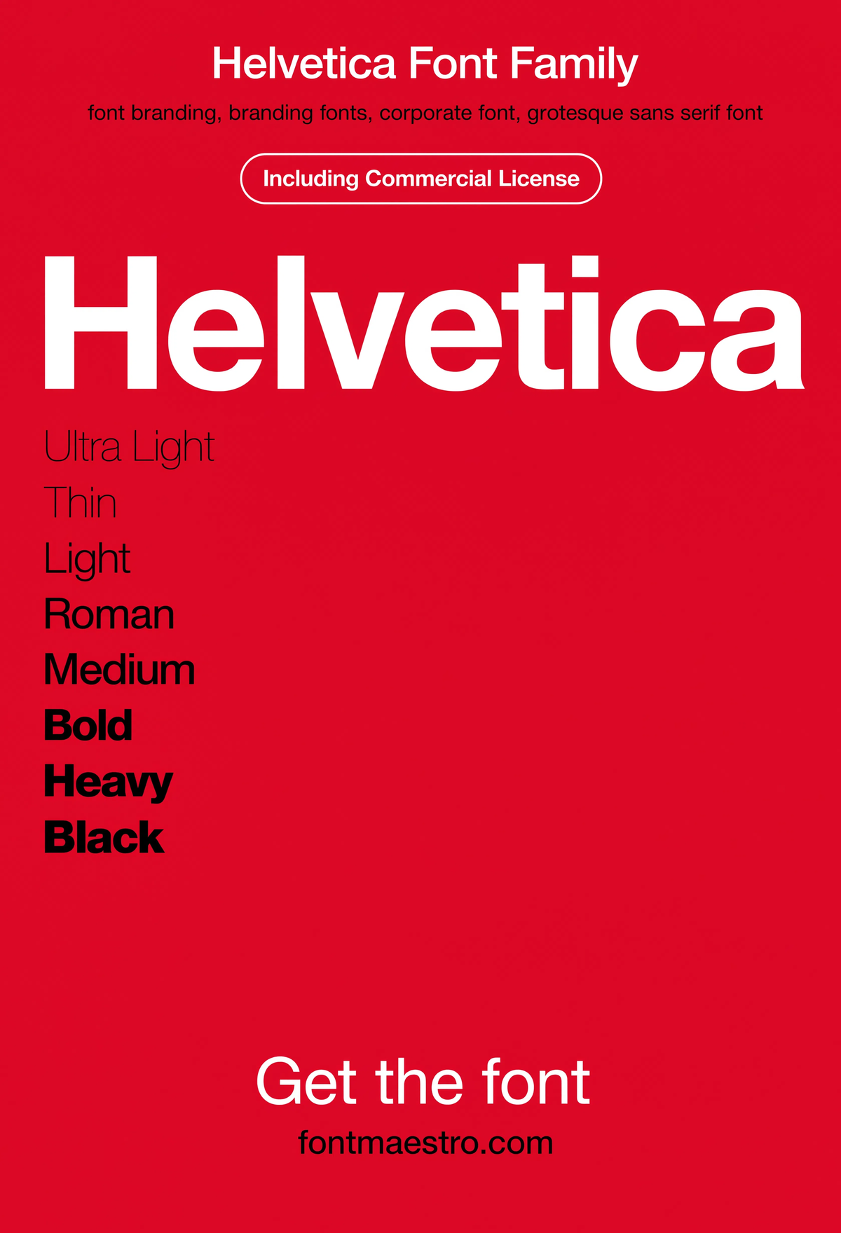
Helvetica — Branding Wordmark
A wordmark lockup, set clean and tight — the exact use case most “branding fonts” searches are actually solving for. Neutral letterforms let the name itself do the branding work.
Commercial License
The full family ships as OTF and TTF across the weight range under one commercial license, ready for logo files, brand guideline documents, and everyday production work in Illustrator, Figma, or InDesign.
Browse the Helvetica Collection →
What makes a branding font family’s weight range actually usable?
“Branding font family” and “branding font combinations” searches are really asking one question: does this typeface give me enough range to build a hierarchy without switching fonts halfway through the system?
Unlimited creative assets. Access to AI tools.
Commercial licence included.
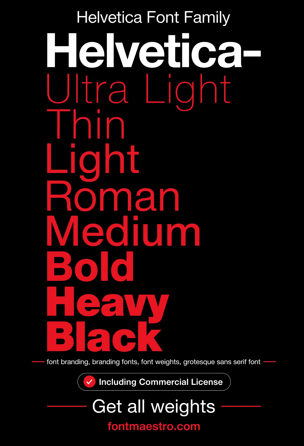
Get downloadsHelvetica — Weight Ladder
Every weight stacked in order — the fastest way to see whether a family’s Light-to-Bold range is genuinely usable or just two extremes with nothing in between.
Commercial License
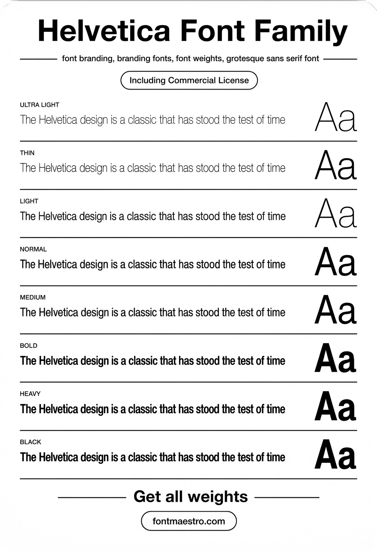
Helvetica — Weight Rows Specimen
Rows of specimen text across weights side by side — useful for checking that Regular and Bold don’t clash in tone when placed in the same document.
Commercial License
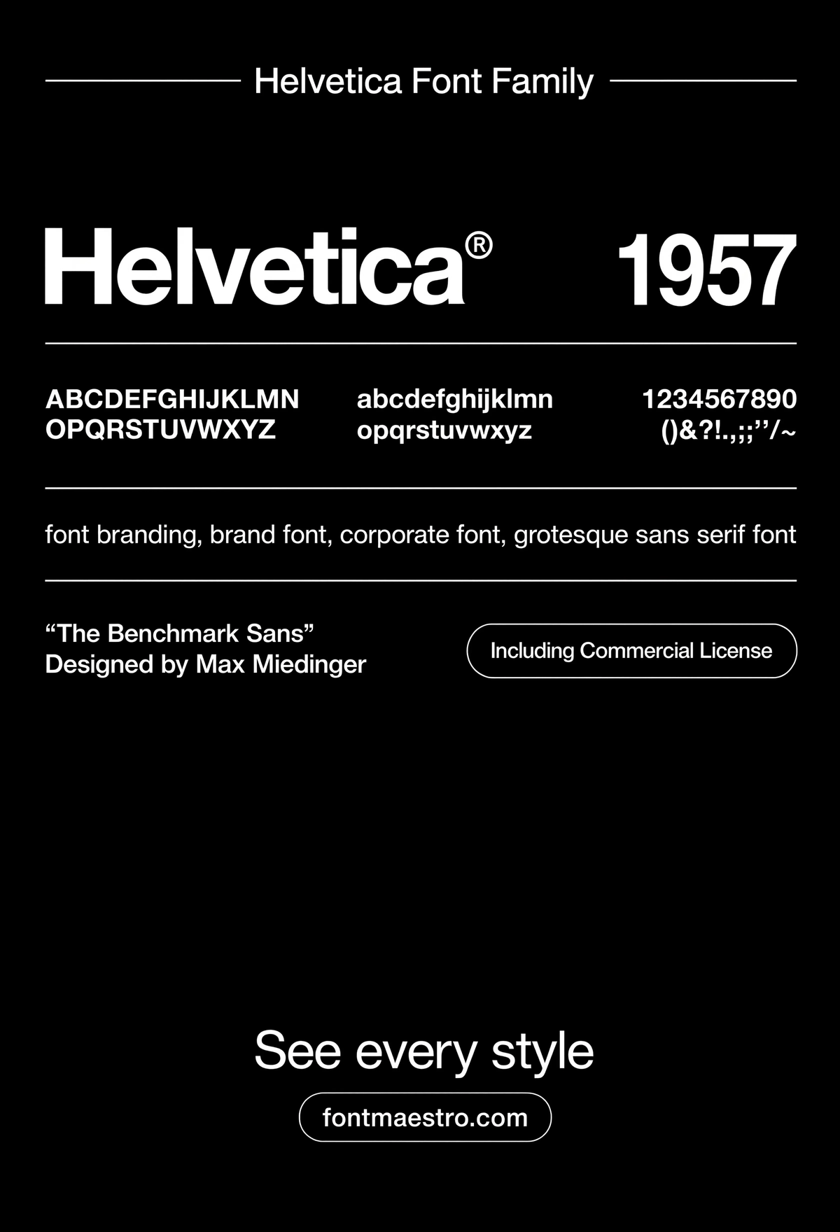
Helvetica — Specimen Sheet
A full type specimen — figures, punctuation, and alternate characters together. This is the detail sheet worth checking before committing a family to a long-term brand system.
Commercial License
Where does this typeface prove itself outside the logo file?
A branding font’s real test isn’t the business card — it’s large-scale public application, where a single design decision has to be legible from a moving vehicle or hold up printed at building scale.
Unlimited creative assets. Access to AI tools.
Commercial licence included.
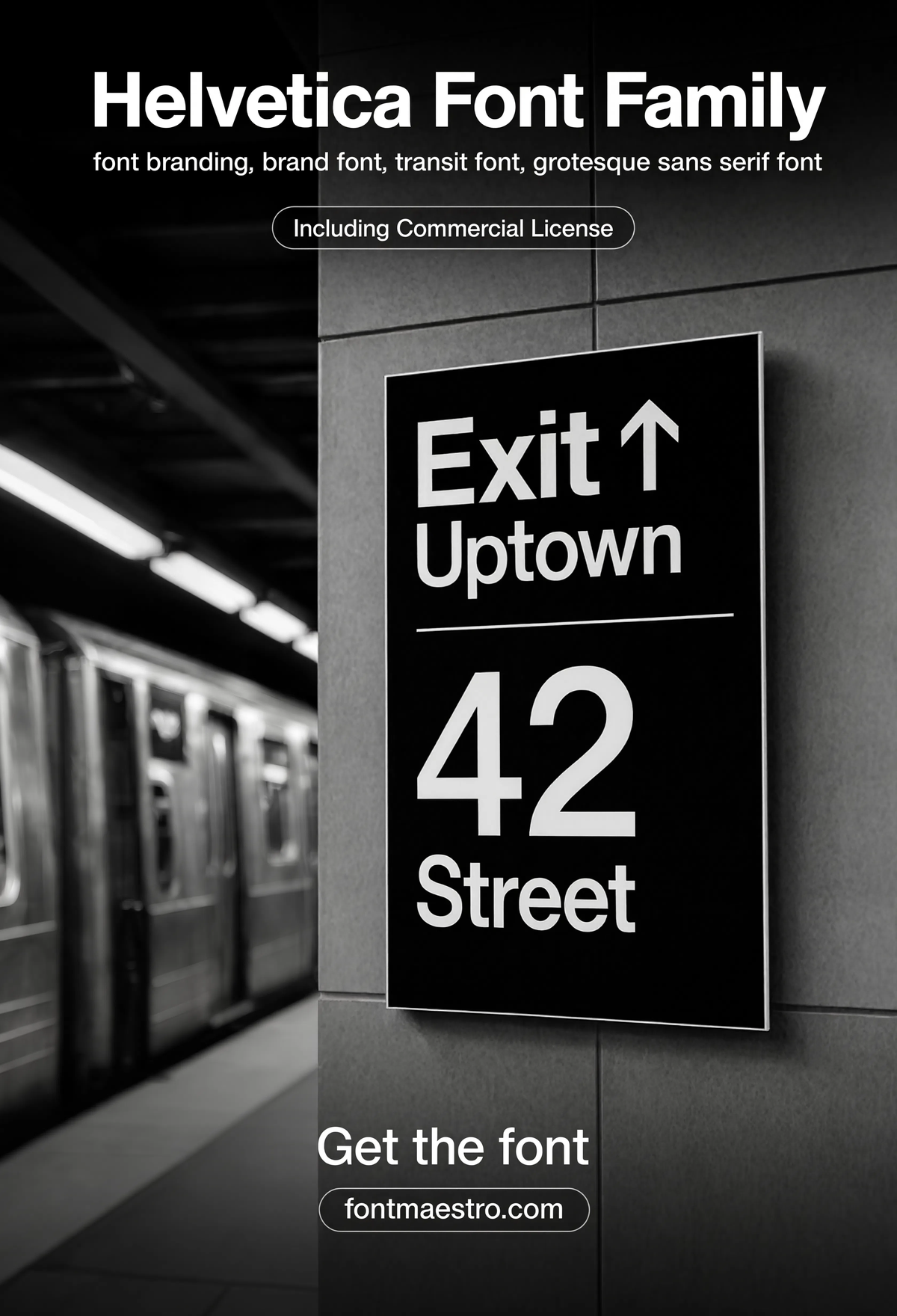
Get downloadsHelvetica — Transit Wayfinding
Transit and wayfinding signage — one of the most demanding tests for any typeface, where legibility at distance and in motion matters more than personality.
Commercial License
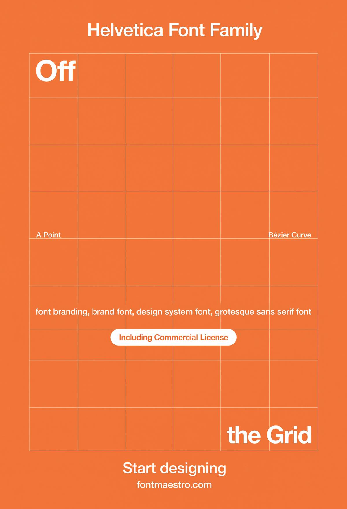
Helvetica — Grid System Poster
A poster built entirely on grid discipline — showing how a neutral sans becomes the connective tissue holding a layout together rather than the decoration on top of it.
If you want to explore more options in this direction, our guide to Best Geometric Letters Font is worth a look, and you may also enjoy Font Style For Architecture or Best Font for Poster for a different take on the same style.
Commercial License
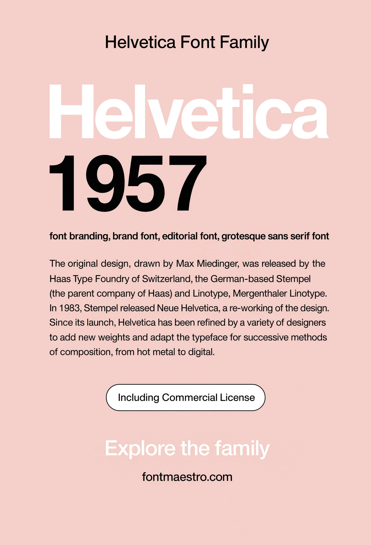
Helvetica — 1957 Editorial Spread
An editorial-style layout referencing the typeface’s original release era — proof this neutral sans has carried brand and publication work for decades without needing a redesign.
Commercial License
Is a decades-old typeface still a smart font branding choice today?
A common hesitation before choosing this typeface for a new brand: won’t it look dated, or worse, generic? The answer sits in the design’s own history and its most identifiable detail.
Unlimited creative assets. Access to AI tools.
Commercial licence included.
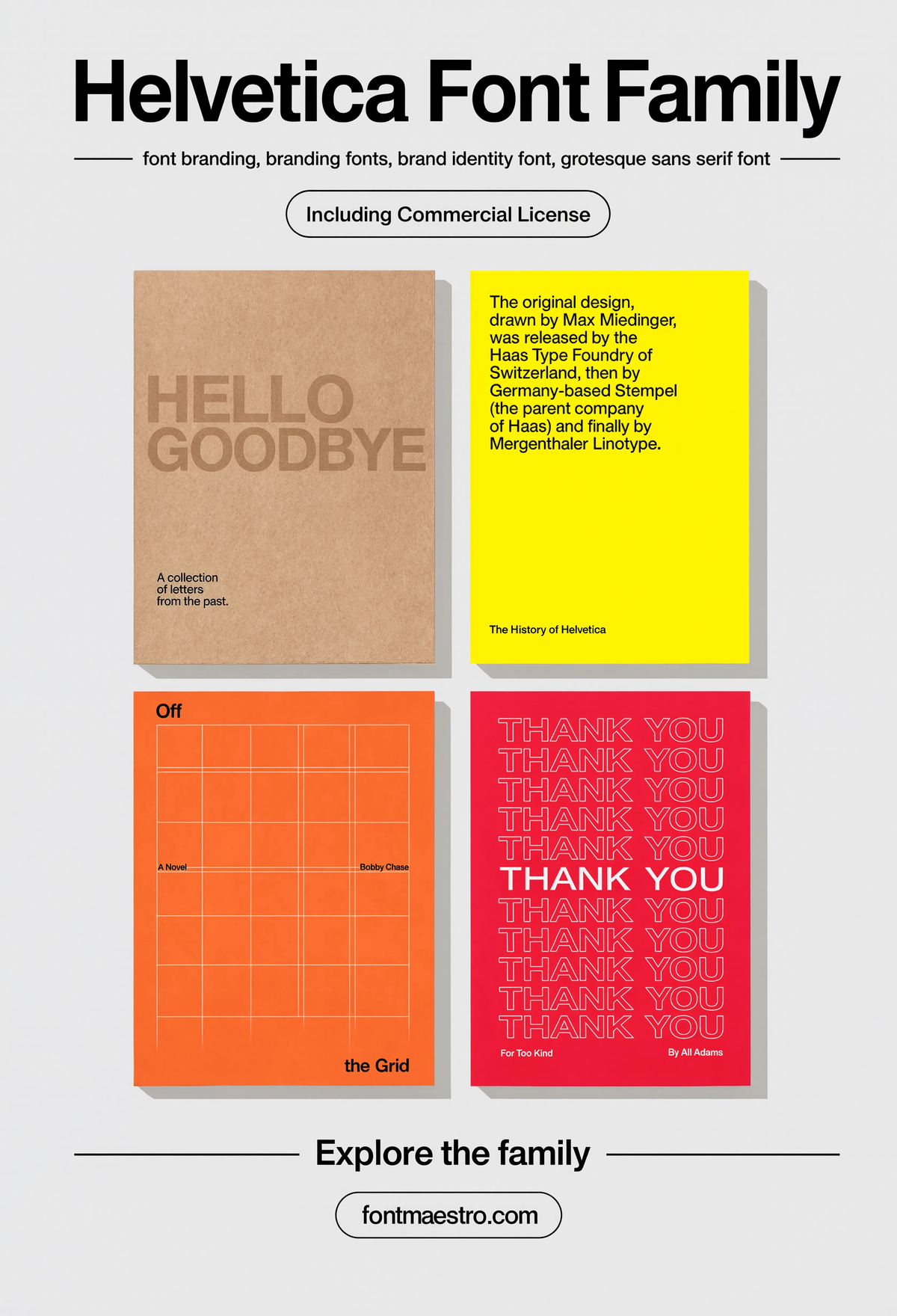
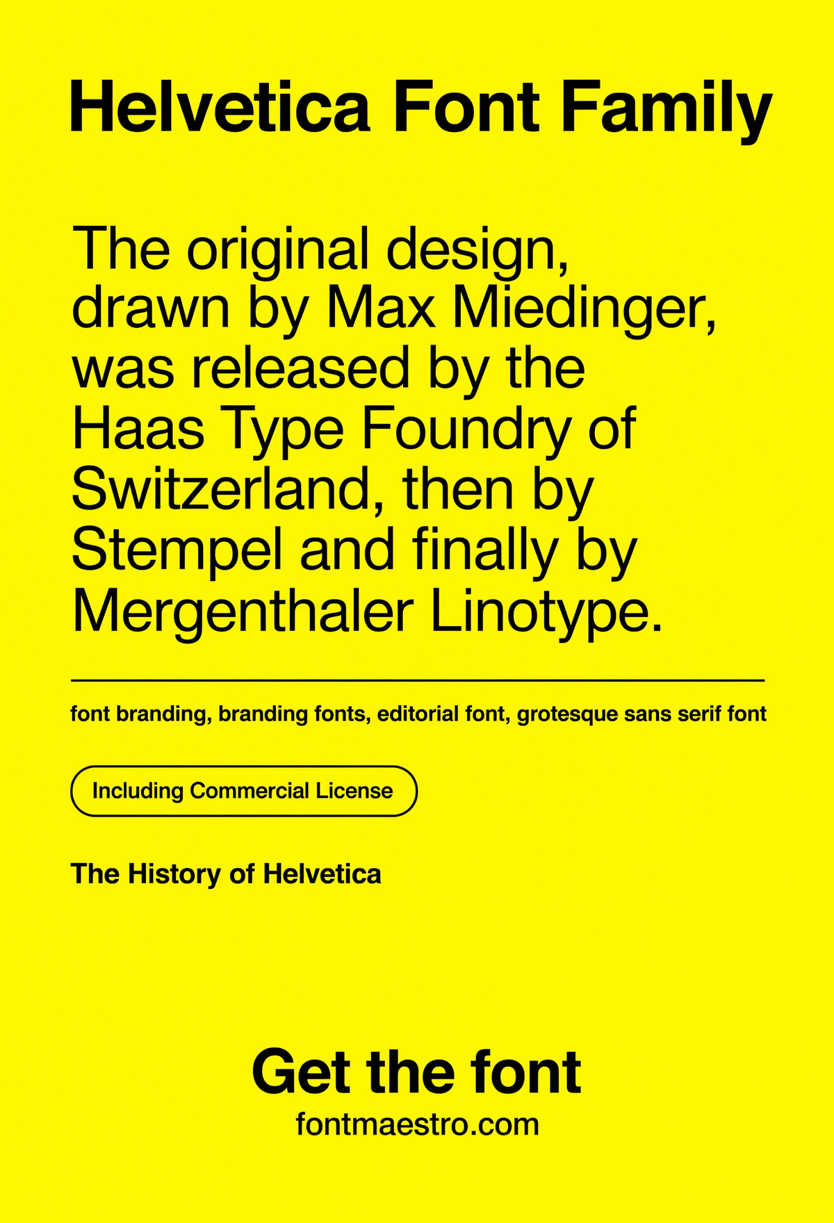
Get downloadsHelvetica — History Reference Card
A reference card covering the typeface’s release history — useful context for anyone deciding whether a long-standing design is a safe long-term brand investment.
Commercial License
Helvetica — Grid System Poster
A poster built entirely on grid discipline — showing how a neutral sans becomes the connective tissue holding a layout together rather than the decoration on top of it.
If you want to explore more options in this direction, our guide to Best Geometric Letters Font is worth a look, and you may also enjoy Font Style For Architecture or Best Font for Poster for a different take on the same style.
Commercial License
Unlimited creative assets. Access to AI tools.
Commercial licence included.
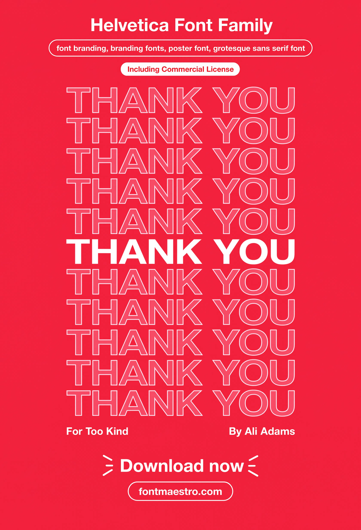
Get downloadsHelvetica — Thank You Poster
A simple thank-you poster layout — proof the same neutral system that carries corporate signage also works for warm, customer-facing messaging without feeling cold.
Commercial License
Helvetica — Grid System Poster
A poster built entirely on grid discipline — showing how a neutral sans becomes the connective tissue holding a layout together rather than the decoration on top of it.
If you want to explore more options in this direction, our guide to Best Geometric Letters Font is worth a look, and you may also enjoy Font Style For Architecture or Best Font for Poster for a different take on the same style.
Commercial License
Unlimited creative assets. Access to AI tools.
Commercial licence included.
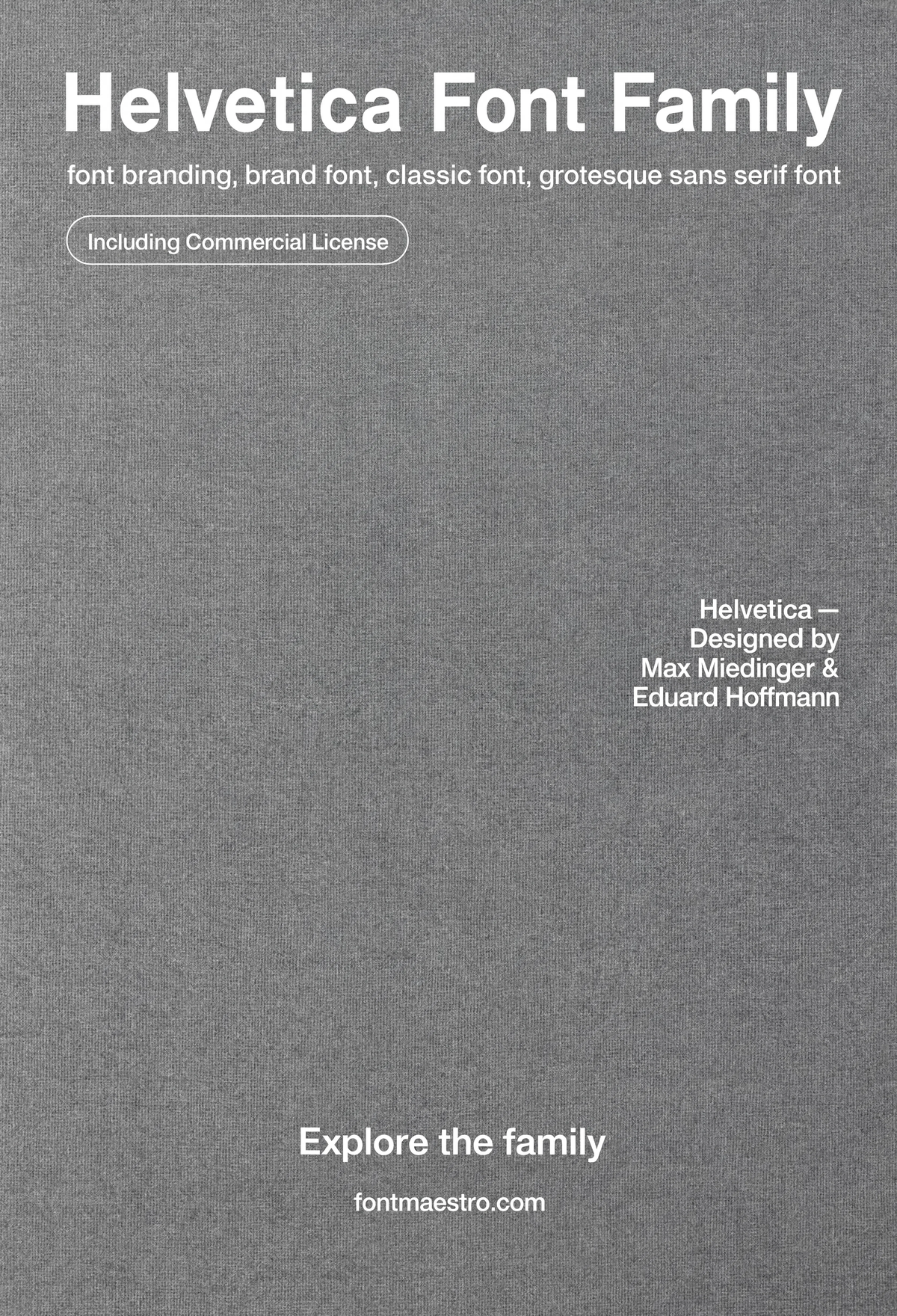
Get downloadsHelvetica — Book Cover
A book cover layout using the family’s Bold weight as the sole design element — a clean demonstration of how far restraint can carry a brand’s visual identity.
Commercial License
Helvetica — Grid System Poster
A poster built entirely on grid discipline — showing how a neutral sans becomes the connective tissue holding a layout together rather than the decoration on top of it.
If you want to explore more options in this direction, our guide to Best Geometric Letters Font is worth a look, and you may also enjoy Font Style For Architecture or Best Font for Poster for a different take on the same style.
Commercial License
For more on how a single typeface family carries across different formats, see our guide to choosing a font for poster design, and for a different take on distinctive branding-adjacent lettering, our guide to vintage font style covers the opposite end of the personality spectrum.
Frequently Asked Questions
What makes a font good for branding specifically, not just for a logo?
A branding typeface needs to work well beyond the logo file itself — in body copy, signage, packaging, and digital interfaces. Neutral letterforms and a genuine weight range are what let it carry a full identity system, not just one wordmark.
Is a neutral typeface like Helvetica too generic for a distinctive brand?
Not on its own — distinctiveness in a brand identity usually comes from color, imagery, spacing, and voice rather than unusual letterforms. A neutral typeface gives those other elements room to lead.
How many weights does a brand actually need for its font system?
Most systems work with three: a Light or Regular for body copy, a Medium for UI and subheads, and a Bold for headlines. More weights add flexibility but aren’t required for a functional system.
Can the same font branding system work for both print and digital?
Yes, if the family includes enough weights and the letterforms hold up at small screen sizes as well as large print. Check both contexts before finalizing a brand typeface.
Should a rebrand always pick a new typeface, or can it keep an existing one?
Keeping an existing, well-performing typeface across a rebrand is common — especially when the letterforms themselves aren’t the problem. Rebrands more often need new color, imagery, or positioning than a new font.
Key Takeaways
- Want the exact family from this breakdown? Get Helvetica with the full commercial license.
- A working font branding system needs neutral letterforms and a full weight range, not just one strong logo weight.
- Test any branding typeface at both signage scale and small footer-text scale before committing.
- Distinctiveness in a brand usually comes from color and voice — not from unusual letterforms fighting for attention.
Related Reads
Unlimited creative assets. Access to AI tools.
Commercial licence included.
Get downloads