You typed “chunky font” and got a wall of thick letters that all look alike. Then the shirt came back from the printer and the soft, puffy word you loved on screen had turned into a blob. The weight was never the problem. The shape was.
Below you get the three chunky shapes, round, block and slab, and what each one does when the word gets small, goes onto fabric or gets cut from vinyl. I also give one test you can run in a minute before you commit to a font.
Quick answer: For a shirt, a sticker or a poster, a block chunky font with slightly softened corners and open counters is the safest choice. Pick a round chunky font when friendliness matters more than distance, and a slab or soft serif when you want a retro look. Whatever shape you pick, test the word at the smallest size you will print.
When the free options run out, browse chunky fonts with a commercial license on Creative Fabrica.
Chunky Is Not One Shape: Round, Block and Slab
“Chunky” tells you how heavy the strokes are. It tells you nothing about how the letters are built. When you search the word on any font site, you get three different families mixed into one list. You will see them behave very differently once they leave the screen.
- Round. Every end and corner is soft, like a bar of soap. The look is friendly, playful and a little childish. Think bubble letters and balloon type.
- Block. Strokes are even and corners are square or only slightly softened. The look is sturdy, direct and a bit sporty, like a college sweater or a warning sign.
- Slab and soft serif. Heavy strokes with thick, rounded or squared feet. The look is retro, warm and a little vintage, the kind of lettering you remember from old packaging.
Here is why this matters to you. A heavy stroke fills space, and the shape decides where that filled space goes. Round fonts push weight into the corners and swell the ends. Block fonts keep weight along the stroke. Slabs add weight at the feet. You get a different failure from each choice when the letter shrinks, spreads ink or sits far away.
Chunky describes weight. Round, block and slab describe shape, and shape decides whether the word still reads after printing.
The labels on marketplaces are loose, which makes your search harder. Among thirteen Creative Fabrica fonts that passed a demand check for chunky font, round font and block font queries, five of the results under “round font” are handwritten or cursive designs, not thick round lettering. Only three of the thirteen call themselves block, and four call themselves chunky.
So do not trust the search term. I look at the sample, name the shape myself, and only then decide. You can see how a heavy face behaves at the opposite end of the scale in bold fonts for posters and packaging which covers reading distance in detail.
You can compare bold chunky fonts on Creative Fabrica and see which shape each listing really shows.
Block Fonts: Hard Corners That Read From Far
A block font has strokes of nearly the same thickness everywhere and corners that stay close to square. Because the outline is simple, your eye finds the letter fast. That is why block lettering is the default for team shirts, signs and labels that you read from a few steps away.
What a block font does well:
- Holds the outline. Even strokes shrink evenly. Nothing is thin enough to vanish first.
- Stacks cleanly. Two or three lines of block capitals sit neatly in a square, which suits a shirt front or a sticker.
- Cuts well. Square corners and straight edges are easy to weed on vinyl, and Cricut fonts for wedding signs that cut clean shows what weeding needs.
What it does badly: it can feel cold. A pure block face has no warmth, and on a children’s product or a bakery label you get a warning sign. I do not switch to a round font to fix that. I look for a block face with slightly eased corners, and you keep the strong silhouette without the harshness.
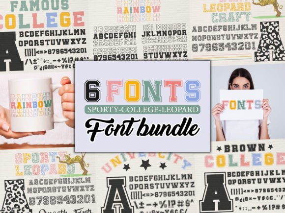
Among the thirteen fonts mentioned above, Marvel Brothers is the block example: blocky, primary-coloured lettering with black shadows. It is a colour font, so it works for a playful poster or a game-themed item, not for a single-colour vinyl cut. If your project needs a block shape in one colour, look at block fonts with a commercial license and check the sample in one colour first.
Round Chunky Fonts: Soft Corners and Friendly Weight

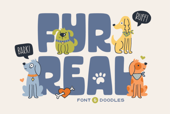
A round chunky font replaces every sharp end with a curve. Your letters look inflated, and the whole word feels approachable. For a kids’ brand, a candy label, a sticker pack or a cheerful social post, you will not find anything with the same pull.
The trade-off is how the shape handles stress:
- Ends swell. Where a block letter ends in a flat edge, a round one ends in a bulb. At small sizes the bulbs touch and the word clumps.
- Inside spaces shrink. The same swelling eats the holes in a, e, g and 8. Round fonts need more generous counters than any other chunky shape, and not all of them have them.
- Distance hurts. From far away, a soft outline is less crisp than a square one. The word reads as a cloud, not as letters.
That does not make round fonts weak. You should use them at medium and large sizes, in short words, with plenty of room between letters. I keep them there. A single word on a sticker, a name on a mug, a header on a kids’ worksheet: these are round-font jobs.
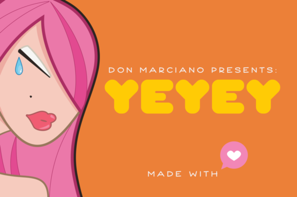
Ask Why is a good example, and I use it as my round case. Its listing describes a bold yet whimsical display font with chunky lettering, and it sits on the round-and-friendly end.
Anastasia is a gentler case: a well-rounded handwritten font, closer to a thick marker than to bubble type, which makes it better for a name than for a headline. To compare more bubble-style options, see rounded fonts with a commercial license and test your own word in the preview.
Slab and Soft-Serif Chunky Fonts for Retro Looks
A slab or soft-serif chunky font keeps heavy strokes but adds feet, or finishes the ends with a gentle curve. You know this shape from vintage packaging, cafe signs and seventies-style posters. It reads as warm and familiar instead of loud.
Its strengths come from the serifs. The feet give each letter a base, so your line sits on a clear baseline, and you can read the words even when the stroke gets very heavy. A soft-serif face also carries a mood the other two cannot: nostalgia, craft, a little humour.
Its weakness is detail. Serifs and curved joins are small features, and you will see small features fill in first on fabric. A slab at 8 mm capital height can lose its feet entirely. I use it large, and you should keep it for the main line.
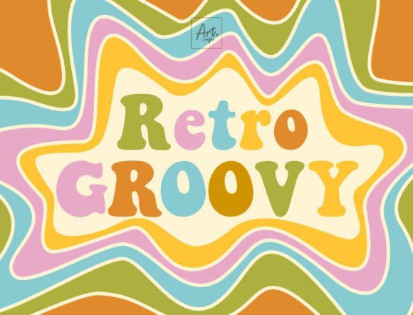
Picky Retro is a clear fit here, because its listing calls it a bold display serif with vintage flair. Stay Chunky leans retro in a different way, with tags pointing to seventies, boho and bubble-letter styles. Both suit a groovy poster, a boho shirt or a cafe menu header. Browse retro chunky fonts when you want the same warmth with a license for selling the product.
Open Counters: What Holds Weight at Small Sizes
Counters are the enclosed or half-enclosed spaces inside letters: the eye of an e, the bowl of a, the holes in B and 8. You lose them first in a heavy font, and the rule is the same for every shape.
A chunky font holds its weight when:
- The counters stay open. You can see clear space inside e, a, g and 8 at the size you will print, not at the size of the preview.
- The gaps between letters are wide enough. A good heavy font is spaced looser than its regular cousin. When the letters almost touch in the preview, they will fuse in print.
- Strokes keep an even thickness. Sudden thin hairlines next to heavy bars vanish on fabric.
Round fonts fail this most often, because the swelling that makes them cute is the swelling that closes the counters. You will find that block fonts usually pass. Slabs sit in the middle, with feet that either help you or crowd the letter.
I check the letter e first. It has a small enclosed space and an open end, so it fails early. If your e is still clear at your smallest size, you can trust the other letters. For the same idea applied to capitals, bold letters fonts: capitals that hold their shape big goes through the places a bold letter breaks.
You can test thick fonts on Creative Fabrica on the letter e before you pick one.
One Word, Three Shapes, Three Sizes: The Test
You do not need software beyond what you already have. This is the check I run before I commit to any chunky font, and you can finish it in about a minute.
- Pick one real word. Use the actual word from your project, not “Hello”. A word with e, a, s and a number is ideal.
- Set it in three fonts. One round, one block, one slab, all at the same cap height.
- Make three sizes. Full size, half size and the smallest size you will print, for example the text on a sticker corner or a sleeve print.
- Squint at the smallest one. Or shrink the preview to a thumbnail. The word that still reads is the shape that holds.
- Add the surface. For a shirt, imagine the ink spreading a little. For vinyl, imagine the weeding of the tiniest gap. Drop any font whose counters close.
Most of the time you will see the block font win on the smallest size and the round font win on charm at the largest. The slab wins when your line is short and the mood is the point. The test shows you which trade you are making, so your choice is deliberate. I read modern bold fonts without the cheap look next, for what separates a strong heavy face from a cheap one.
You can add a display font from the marketplace on Creative Fabrica as a fourth candidate in the test.
Which Shape for Which Job: Shirts, Stickers, Posters, Vinyl
The same font can be perfect on one product and wrong on another. This is how I match shape to job, and you can copy it.
- T-shirts. Block, or a soft-cornered block. Ink spreads on fabric, so even strokes and open counters matter most. A round font works for a short word in the middle of the chest, but keep it large.
- Stickers. Round or block, both fine. Stickers are read up close, and a round font adds charm. Keep the outline simple so the cut line stays clean.
- Posters. Block first, slab second. Distance blurs soft edges, so a square outline carries further. Round fonts work only for short, friendly headlines on a poster read from close by.
- Cut vinyl. Block, as cheer fonts for Cricut spirit wear shows. Straight edges and wide gaps are the easiest to weed and the least likely to tear. Avoid fonts with tiny serifs and tight joins.
- Logos and wordmarks. Any of the three, but test at favicon size. A logo that fails at 32 pixels needs a heavier, simpler shape.
When you wonder where heavy type belongs in a layout, bold heading fonts vs bold text fonts answers it, and font pairing: two fonts, one job each shows you how to give a chunky headline a quiet partner.
For a shirt you sell, pick a t-shirt font on Creative Fabrica with the license included.
Free Chunky Fonts Worth Trying First
If you plan to sell what you make, read free Cricut fonts you can legally sell with before you download anything.
Google Fonts has a good set of heavy faces, and they are open fonts that you can use commercially. You should try these first, grouped by shape, before you spend anything.
- Round: Fredoka, Varela Round, Nunito and Quicksand for a softer, friendlier line; Titan One, Chango and Modak when you want the full bubble look.
- Block: Rubik Mono One and Erica One for a heavy, square-edged headline; Bowlby One for something with a little more character.
- Slab and soft serif: Rammetto One and Gravitas One for a retro feel at large sizes.
Run the one-word test on two or three of these. Often one of them is all you need, and if it is, you can stop there. I treat the free route as a real answer, because it covers many shirts, posters and stickers.
Read the license file in each download anyway, because fonts from other free sites often do not allow commercial use. The next section shows you when the free route stops being enough.
If these do not fit, you can see fat fonts on Creative Fabrica on Creative Fabrica and run the same test.
Where a Free Chunky Font Stops Being Enough
Free chunky fonts are generous, but they share a few limits. You usually find them late, after the design is approved, so it helps to know them now.
- One weight, no family. Most free chunky faces ship as a single heavy style. You cannot set a subtitle in a lighter weight of the same design, so you need a second font for every other line.
- Missing numbers and symbols. Display fonts often skip digits, punctuation or accented letters. You find out when a price tag, a date or a name with an accent breaks.
- Personal-use licenses. A “free” font on a download site can allow personal use only. A shirt you sell, a sticker pack or a client logo is commercial use.
- Hidden glyphs. Some fonts store alternate letters in the private use area (PUA), so they appear only through the glyph panel. If you do not know that, you never see half the alphabet.
None of this means a free font is bad. The limits sit in license and completeness, not in looks. If your project is a personal poster, a school sign or a one-off, you will never hit them. If you sell something with the letters on it, you hit them on day one.
That is the moment to look at chunky fonts that include a commercial license. The license comes with the file, so you have nothing to track down later.
Chunky, Round and Block Fonts With a Commercial License
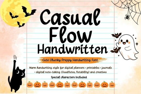
These six come with a commercial license through Creative Fabrica, and each passed a check for buyer ratings and reviews. They cover the three shapes, and I suggest you run the one-word test on the preview before you click.
Unlimited creative assets. Access to AI tools.
Commercial licence included.
Browse allCommercial license included

Ask Why
A bold yet whimsical display font with chunky, rounded lettering. Best for a short headline, a sticker word or a playful label, set large with room between the letters.
Commercial license included
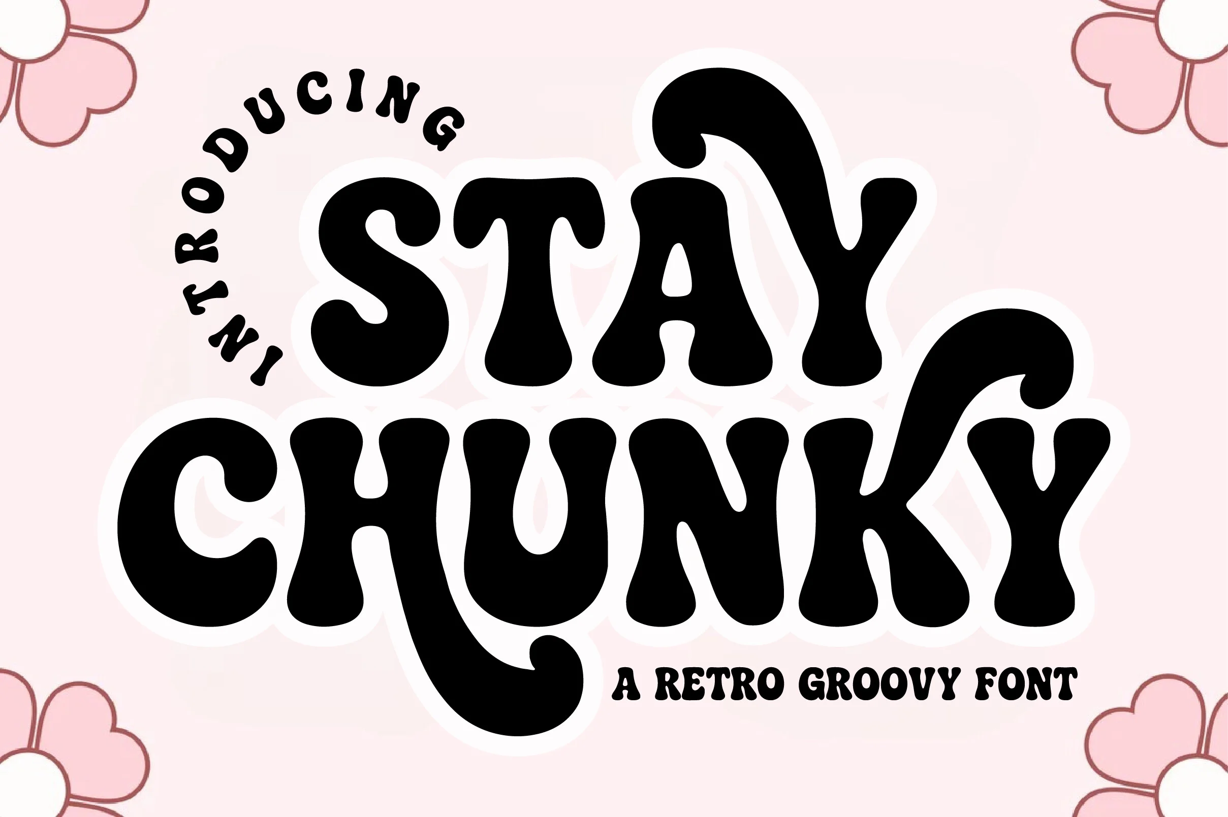
Stay Chunky
A fat, bubble-letter display font with a seventies and boho feel. Best for a groovy poster, a retro shirt or a cheerful quote, kept at a large size.
Commercial license included

Picky Retro
A bold display serif with vintage flair, the soft-serif shape from the slab section. Best for a cafe sign, a vintage label or a menu header where warmth matters more than distance.
Three more cover a marker style, a block colour font and a fat retro face.
Unlimited creative assets. Access to AI tools.
Commercial licence included.
Browse allCommercial license included
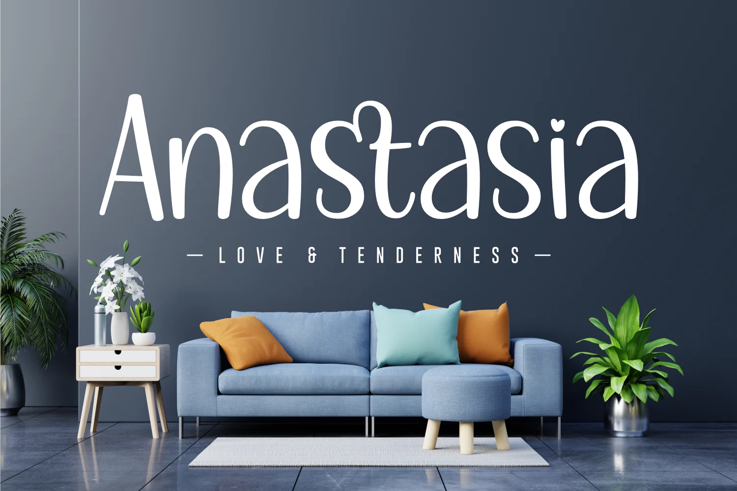
Anastasia
A playful, well-rounded handwritten font. Best for a name, a gift tag or a friendly sign. It is a thick marker style, not a bubble font, so keep it off long lines.
Commercial license included

Marvel Brothers
A full-colour block font with primary-coloured letters and black shadows, plus an alternate upper and lower case through the character map. Best for a game-themed poster or a kids’ party item, not for single-colour vinyl.
Commercial license included
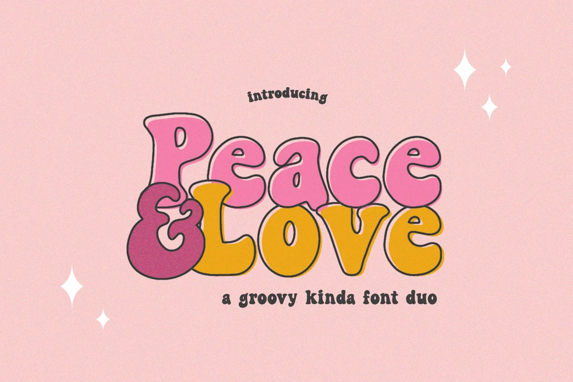
Peace and Love
A fun, retro-styled display font with fat, chunky letters. Best for a children’s design in bright colours, a sticker or a party sign.
Handwritten script fonts that the “round font” search returns fail the counters test at small sizes, so none sit in this list. A wider range is here on Creative Fabrica, but use the same filter: shape first, license second.
Mistakes With Chunky Fonts
- Trusting the search word. “Round font” often returns script. Look at the sample and name the shape yourself.
- Judging at preview size. A font that looks fine in a big preview can close its counters at the size you print.
- Tight spacing on a heavy face. Open the tracking before you decide the font is too heavy.
- Faux bold on a chunky font. Pressing the bold button on an already heavy face smears the outline. Choose a font with a real heavy style.
- A round font for distance. Soft outlines blur first when the viewer steps back. Use block for anything read across a room.
- Long text in a chunky face. Chunky is for one to four words. A paragraph in a chunky font tires the eye and looks cheap.
- Selling the product before reading the license. A font that installs is not a font you may print and sell on.
You can pick a chunky display font cleared for commercial use on Creative Fabrica and run the test on it.
Key Takeaways
- Chunky describes weight. Round, block and slab describe shape, and the shape decides what survives printing.
- Block is the safest for shirts, posters and cut vinyl. Round is for friendly short words at medium and large sizes. Slab is for retro lines set large.
- Check the counters first, with the letter e at your smallest size.
- Run the one-word, three-shape, three-size test before you commit.
- A free chunky font is a real answer. It stops being enough when you sell the product, need numbers and symbols or need a family of weights.
FAQ
What is a chunky font?
Bold chunky fonts are typefaces with very thick strokes. The term covers round, block and slab shapes, which behave differently in print.
What is the difference between a round and a block chunky font?
A round font has soft, swollen ends and corners, so it feels friendly but closes its counters sooner. A block font has even strokes and square or slightly eased corners, so it reads better from far and at small sizes.
What chunky font is best for t-shirts?
I would pick a block chunky font with open counters, because ink spreads on fabric. You can use a round font for a short word set large.
What font weight is bold?
Bold is a heavy style of a font family. Chunky and black styles are heavier still.
What are some thick bold fonts that are free?
Among bold thick fonts, Google Fonts offers Titan One, Rubik Mono One, Rammetto One, Chango and Bowlby One, among others. Read the license file in each download.
Can I use a chunky font on shirts I sell?
You can, only if the license allows commercial use. Open fonts usually do, while many free fonts from download sites are personal use only.
Why does my chunky font look blobby when printed?
Your counters are closing. Open the letter spacing, choose a font with larger inner spaces or pick a block shape, then test the word at the smallest size you will print.
Ready to test a shape? Pick a chunky font with the license already cleared and run the one-word test before you print.