Architectural signage fails in a way most fonts never get tested against — wind, distance, and low light all at once, on a building sign or wayfinding panel that has to read correctly from thirty feet away. Verlag was built for exactly this: it’s the typeface family developed for gallery and museum signage, and it’s still the reference point for what “architecture font” actually means.
Geometric construction is why it works. Verlag’s letterforms are built on consistent circular and straight elements — no stylistic flourish to misread at a glance, no thin strokes that vanish in low light.
Quick answer: Font style for architecture means a clean geometric sans with even stroke weight and strong legibility at a distance — designed for signage, blueprints, and instrument panels, not decorative branding. Verlag fits this because its circular and straight construction holds up consistently from a small technical label to a full building sign.
What Makes a Font “Architectural” Instead of Just Sans-Serif?
Not every sans-serif reads well on a building sign. Architecture-grade type needs even stroke weight across every letter — no thin serifs to fade at distance, no decorative details to blur in peripheral vision. It also needs a wide range of weights, because the same family often has to cover a blueprint title block, a directory sign, and a full building wayfinding system.
Verlag’s instrument panel application shows this range in action — the same geometric skeleton holds up whether it’s labeling a dial at 8pt or a building name at 200pt. That consistency across scale is the actual technical requirement, not just a visual preference.
Blueprint, Signage, or Branding — Where This Style Fits
- Check the specimen sheet first — a full character set reveals whether the counters stay open and legible at the weight you plan to use.
- Test against a blueprint or technical layout — numerals and small labels need to hold up at sizes far smaller than a headline.
- Confirm the weight ladder — light through bold in the same geometric skeleton lets one family cover signage, print, and branding.
- Push it to poster or display scale — a genuinely architectural sans should hold its precision at both tiny and huge sizes.
Each file below is a desktop and web-font license bundle available directly through MyFonts — install it locally for signage and layout work, or license the web-font cut for a website. It’s part of the Verlag collection, so commercial branding rights are included in the standard license.
Unlimited creative assets. Access to AI tools.
Commercial licence included.
Get downloads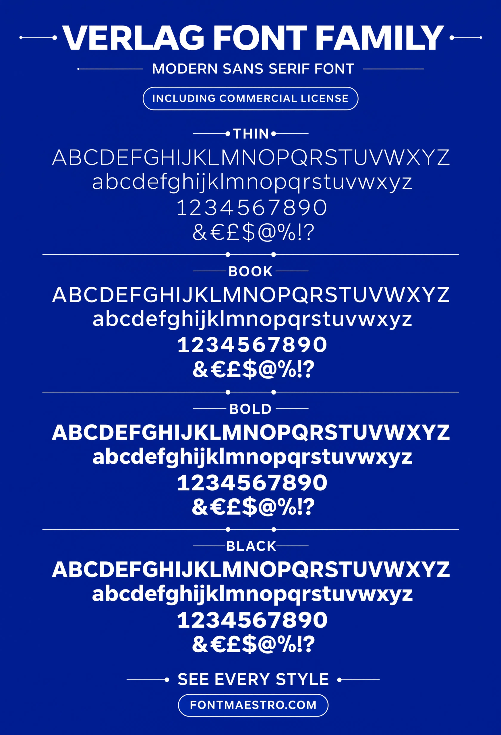
Alphabet Specimen
Full character set with consistent stroke width throughout. No thick-thin contrast to lose at a distance — every letter reads at the same visual weight.
Unlimited creative assets. Access to AI tools.
Commercial licence included.
Get downloads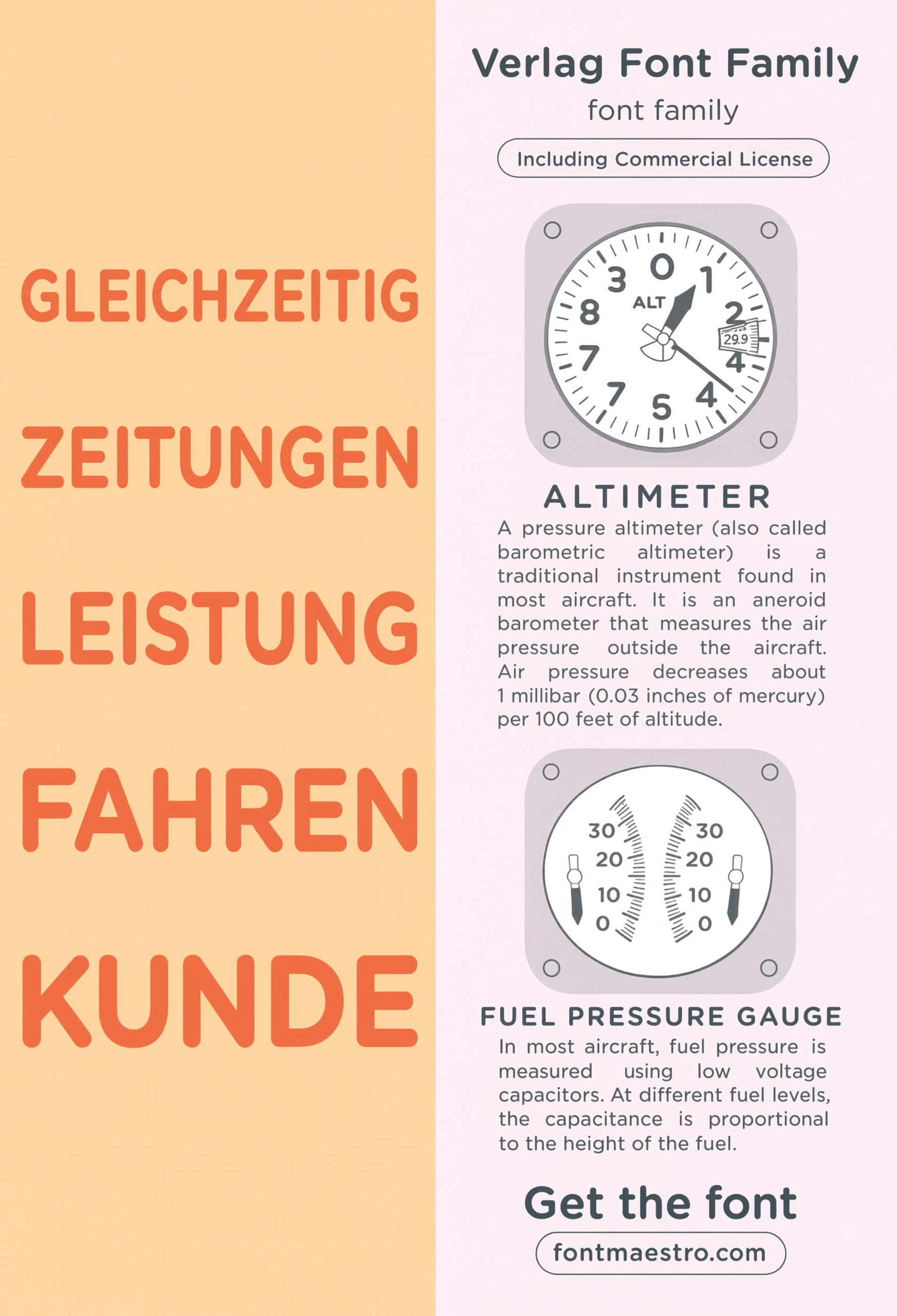
Commercial License
Instrument Panel Labeling
Small-scale technical labeling test. Holds up at 8-10pt without the counters closing up — the failure point for most geometric sans fonts at this size.
Unlimited creative assets. Access to AI tools.
Commercial licence included.
Get downloads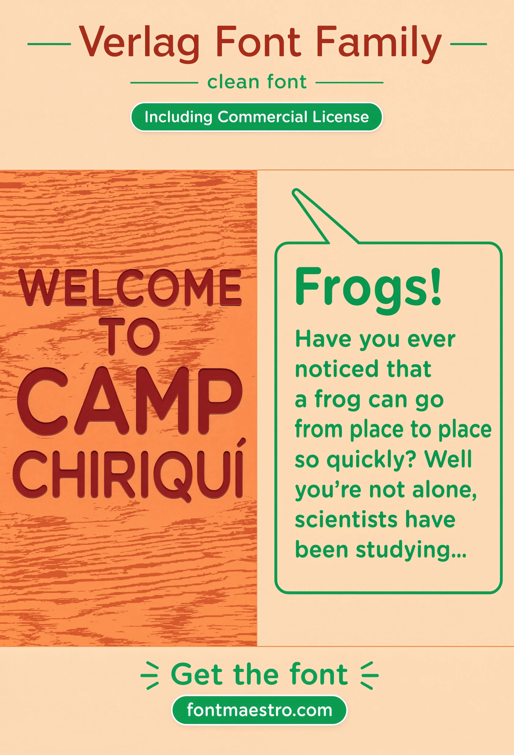
Camp Poster Layout
A large-format poster application shows the family pushed to display scale, testing whether the geometric precision holds up at a much bigger size.
Unlimited creative assets. Access to AI tools.
Commercial licence included.
Get downloads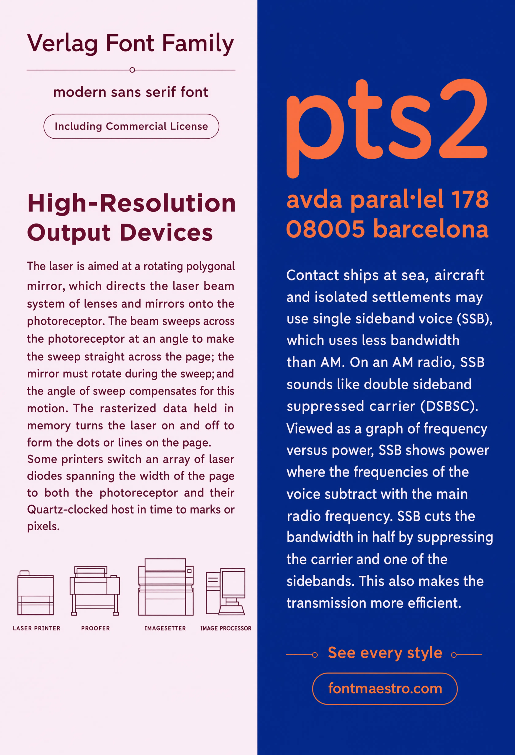
Commercial License
Editorial Layout
A magazine-style spread pairs the geometric sans against running body copy, testing readability beyond just headline and signage use.
What Happens If You Use the Wrong Font for Signage?
A decorative or thin-stroke font on exterior signage disappears in low light or from a distance — the same detail that reads as elegant on a printed invitation becomes illegible on a wayfinding sign thirty feet away. Test any candidate font at the actual viewing distance and lighting condition before committing to fabrication, since a screen preview at 100% zoom tells you almost nothing about how it performs in the field.
Explore the Verlag Collection →
Can the Same Font Cover Both a Blueprint and a Building Sign?
Yes, if the family has a full weight range — light and regular weights suit technical labeling and title blocks, while medium and bold weights carry signage and wayfinding applications. The editorial and poster examples above show how far that same geometric skeleton stretches once it leaves the blueprint and enters branding and display work.
Looking for more type inspiration? Our capital letters font styles guide covers all-caps spacing rules relevant to signage type, and our beautiful modern font guide breaks down geometric sans construction in more depth.
Frequently Asked Questions
What font style works best for building signage?
A clean geometric sans-serif with even stroke weight and no decorative detail — legibility at distance and in low light matters more than visual flair.
Why do architects favor geometric sans fonts over serif fonts?
Geometric sans fonts hold their shape consistently across scale, from a blueprint label to a full-size building sign, without thin serifs that can fade or blur.
Can the same font work for both blueprints and branding?
Yes, if the family has a full weight range — light and regular weights suit technical labeling, while medium and bold weights carry branding applications.
What should I check before using a font for exterior signage?
Test it at the actual viewing distance and lighting condition, not just at 100% zoom on a screen — decorative details that look fine up close often disappear from a distance.
Are these fonts cleared for commercial architectural projects?
Yes, with the commercial license included on MyFonts downloads — confirm the specific license terms on the product page before client delivery.
Key Takeaways
- Want a proven starting point? Explore the Verlag collection on MyFonts for a full weight range built for signage and technical clarity.
- Architecture-grade fonts need even stroke weight and strong legibility at a distance, not decorative flourish.
- A full weight range lets one family cover blueprints, signage, and branding consistently.
- Commercial license is included on MyFonts downloads, so client work is covered.
Related Reads
Unlimited creative assets. Access to AI tools.
Commercial licence included.
Get downloads