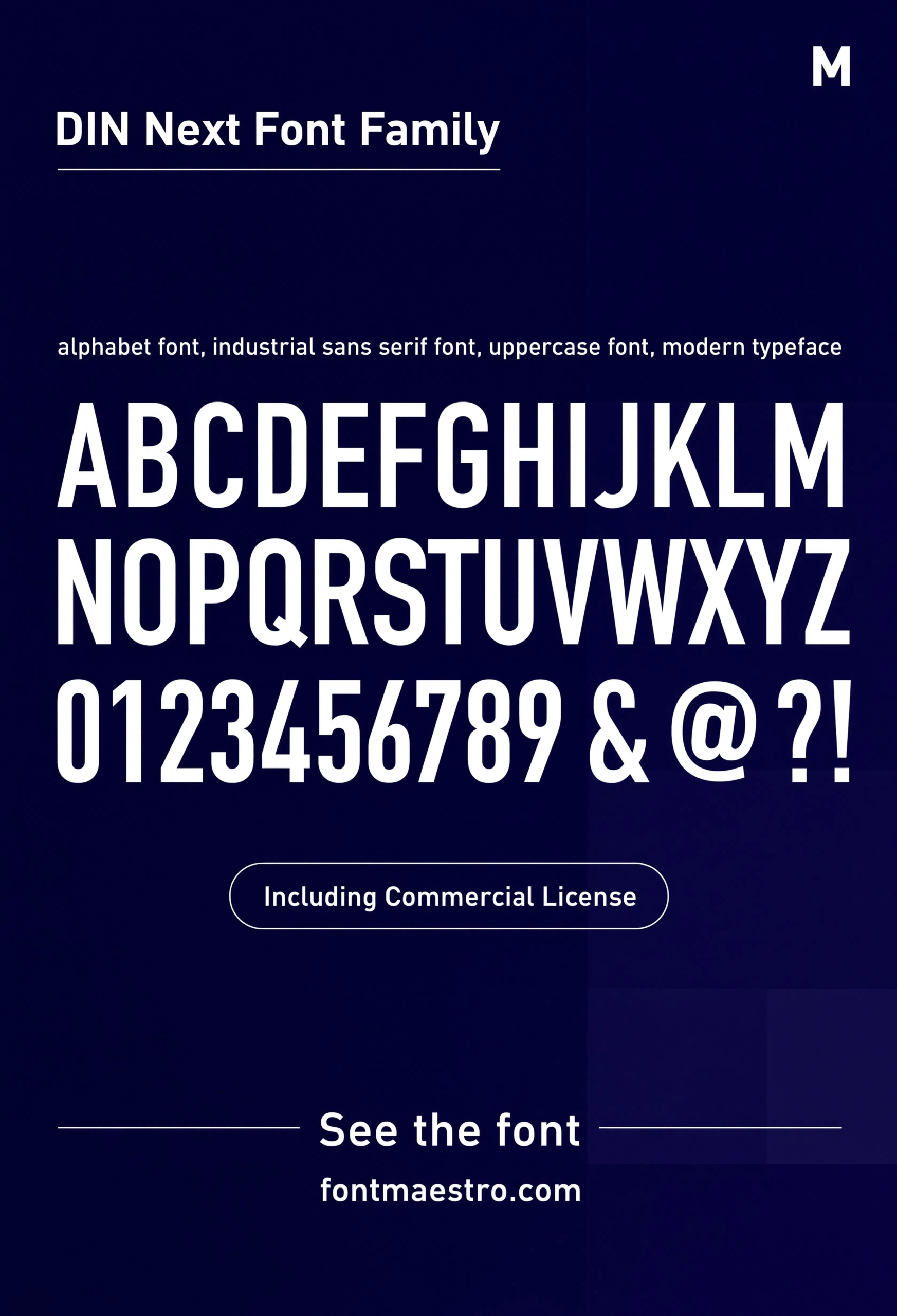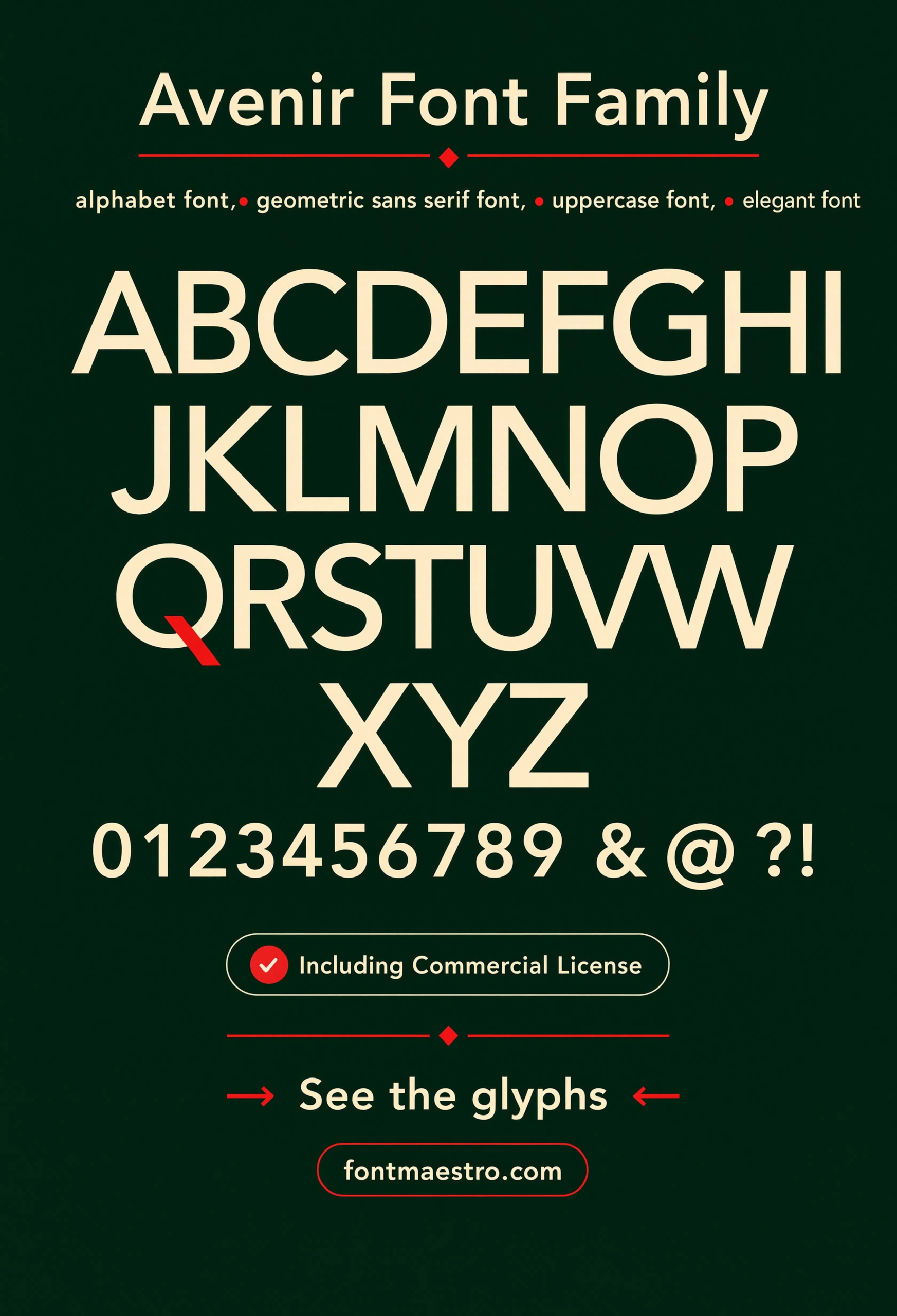
The most overused idea in branding right now is that “creative” means loud. It doesn’t. Avenir was designed on the principle that a geometric sans-serif could carry personality through proportion alone — no decoration, no gimmicks, just precise curves and consistent stroke weight. Decades after its 1988 release it’s still one of the most licensed families for brands that want to look considered rather than trendy.
That’s the shift worth making before picking a creative font logo: creativity in a wordmark comes from restraint and system thinking, not from how unusual the letterforms look on their own.
Quick answer: A creative font logo doesn’t need decorative or unusual letterforms — it needs a typeface with enough range (weights, italics, numerals, symbols) to build a distinctive brand system around. Avenir is a strong option because its geometric structure stays quietly confident across headline, body, and detail work like numerals and symbols.
What Actually Makes a Creative Font Logo Stand Out?
Range, not novelty. A typeface family with six weights, true oblique styles, full numeral sets, and a dedicated symbol set gives a designer far more creative room than a single “unique-looking” display font ever could. The specimen sheet below shows that range in one view.
How Do You Build a Creative Fonts for Logo System, Not Just a Mark?
- Start with the weight range — a creative font logo often pairs a Black or Heavy weight for the mark with a Light or Book weight for supporting taglines.
- Check oblique styles, not fake italics — true obliques keep the geometric structure intact instead of just slanting the letterforms artificially.
- Test the numerals — any brand that touches pricing, dates, or data needs numerals that match the wordmark’s personality, not a mismatched fallback font.
- Look at the symbol set — icons and symbols designed within the same family keep a brand’s visual language consistent beyond just the logo type.
Each file below is a desktop and web-font license bundle available directly through MyFonts — install it locally for logo development, or license the web-font cut for your site. It’s part of the Avenir collection, so commercial branding rights are included in the standard license.
Unlimited creative assets. Access to AI tools.
Commercial licence included.
Get downloads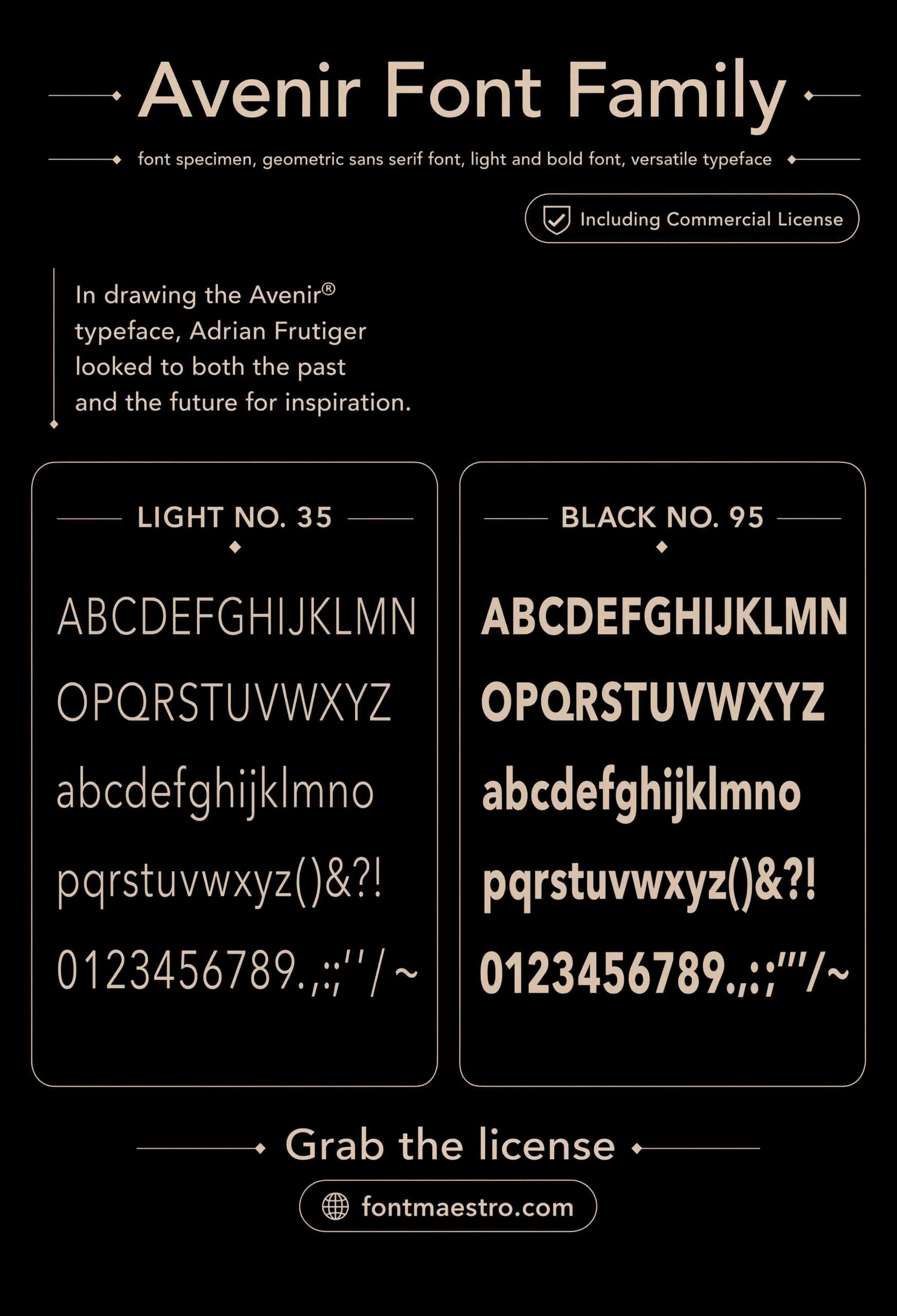
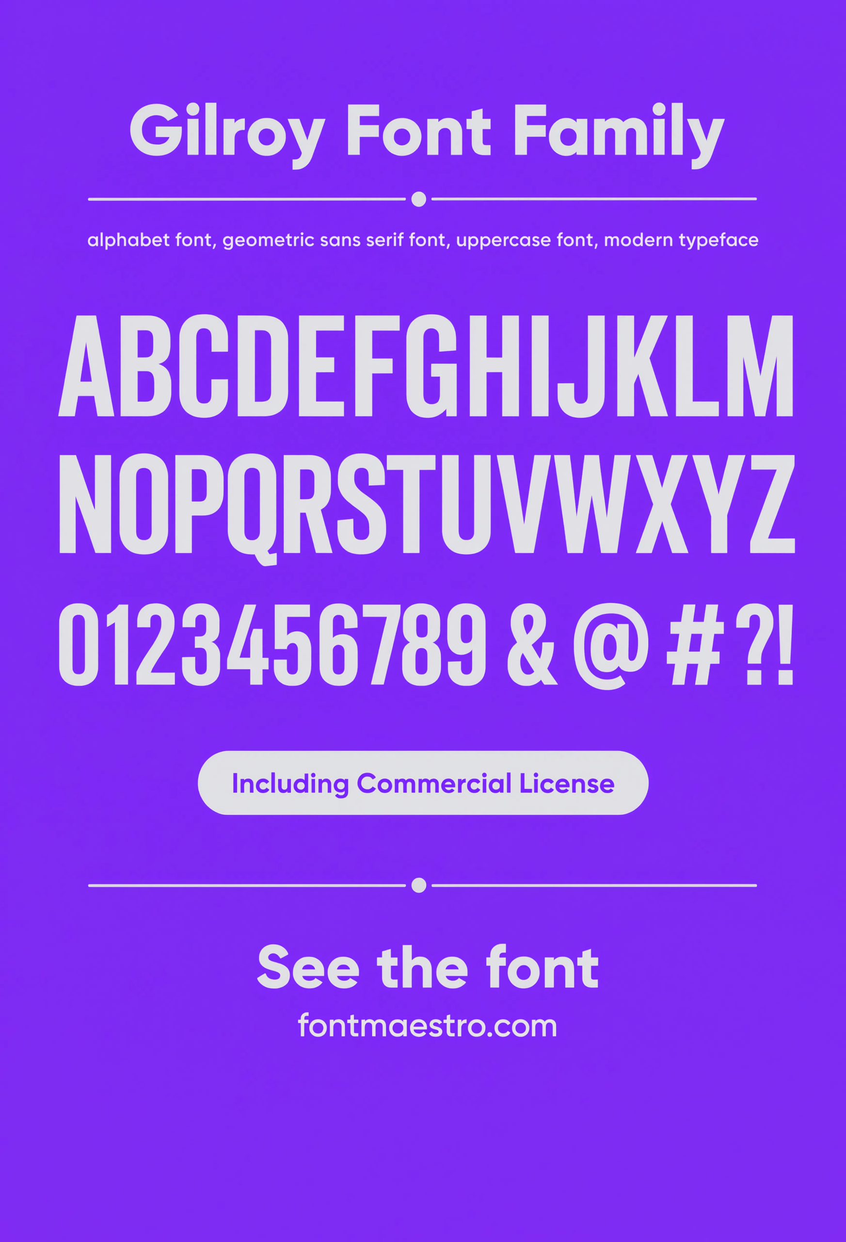
Light vs. Black Weight Study
A side-by-side of the family’s lightest and heaviest weights — the fastest way to judge how much contrast you can build into a single-family brand system.
Unlimited creative assets. Access to AI tools.
Commercial licence included.
Get downloads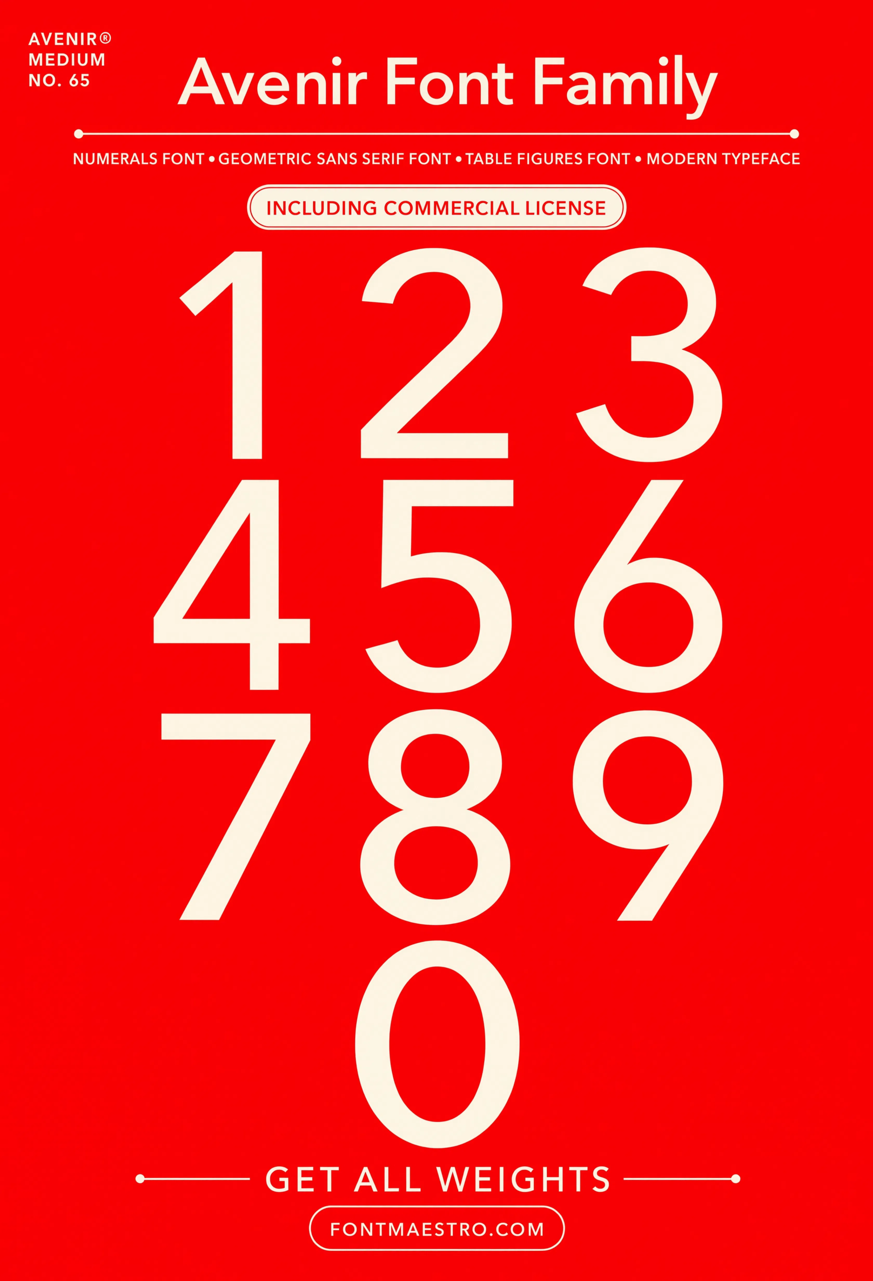
Numerals Set
A dedicated numerals sheet — check this before committing if your brand will ever need to typeset data, dates, or measurements in the same voice as the logo.
Unlimited creative assets. Access to AI tools.
Commercial licence included.
Get downloads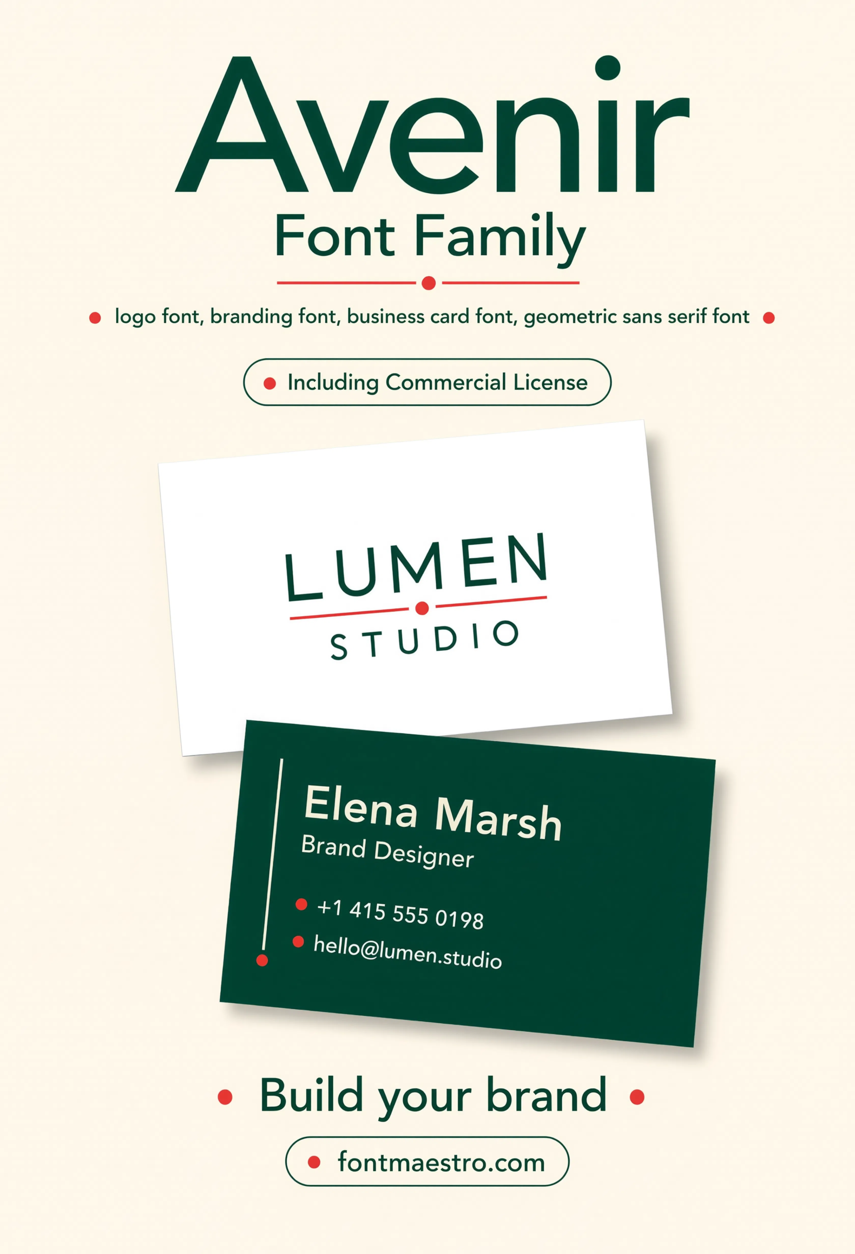
Branding Mockup
The wordmark applied to a real branding mockup — a useful gut-check for how a creative font logo actually reads once it’s off the specimen sheet and onto a physical brand touchpoint.
Unlimited creative assets. Access to AI tools.
Commercial licence included.
Get downloads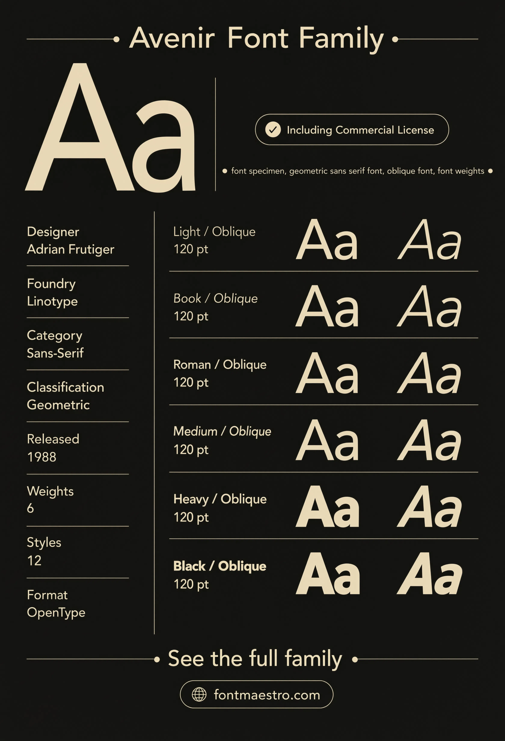
Commercial License
Specimen Sheet
A full specimen sheet lays out every weight and style side by side, making it easy to compare how Avenir behaves across a creative font logo system.
Unlimited creative assets. Access to AI tools.
Commercial licence included.
Get downloads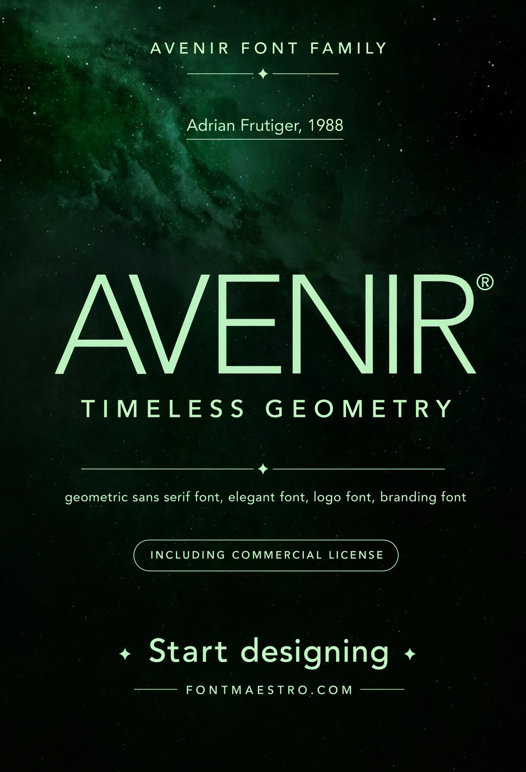
Commercial License
Cosmic Hero Display
A large-scale hero treatment pushes the typeface to display sizes, showing how the letterforms hold up when a creative fonts for logo project needs maximum visual impact.
If you want to explore more options in this direction, our guide to 11 Best Fonts for is worth a look, and you may also enjoy Font Logo Ideas That or Elegant Font Logo Ideas for a different take on the same style.
Unlimited creative assets. Access to AI tools.
Commercial licence included.
Get downloads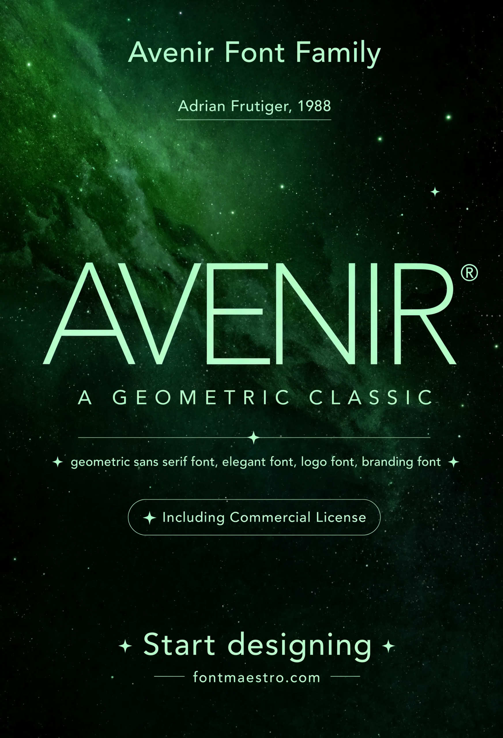
Commercial License
Cosmic Hero — Alternate Crop
A second crop of the cosmic hero display gives another angle on how Avenir scales at large display sizes.
Where Does a Creative Font Logo Get Tested Beyond the Wordmark?
An app interface and an editorial layout are two of the harder day-to-day tests for a brand typeface — one demands clarity at small UI sizes, the other demands rhythm across paragraphs of text. Both are shown below.
Explore the Avenir Collection →
Do Numerals and Symbols Matter for a Creative Font Logo?
More than most designers plan for. A logo font that only looks considered in the wordmark but ships with generic numerals or no matching symbol set creates a visible seam the moment the brand needs a price list, a data chart, or a set of custom icons.
The numerals and symbols sheets below show Avenir carrying its geometric logic into both.
How Far Can a Creative Font Logo Push at Display Scale?
The cosmic hero and poster series settings below show Avenir pushed to large display scale — proof that a considered, restrained typeface can still carry real visual weight when a brand needs a bold moment.
Looking for more direction? Our font logo ideas guide breaks down how to test a wordmark across real-world contexts, and our elegant font logo picks cover a more restrained alternative if bold isn’t the right fit.
Frequently Asked Questions
What makes a font logo idea “creative” without being hard to read?
Range and system thinking, not decoration. A creative font logo usually comes from a typeface family with enough weights, oblique styles, and supporting glyphs to build a full brand system, rather than an unusual-looking display font used in isolation.
Are creative fonts for logo design supposed to look unusual?
Not necessarily. Many of the most recognizable creative logo fonts, including geometric sans-serifs like Avenir, rely on precise proportion and consistent weight rather than novel letterforms.
Do I need matching numerals for a font logo?
Yes, if your brand will ever display pricing, dates, or data — mismatched numerals create a visible inconsistency between the logo and the rest of the brand’s typography.
How many weights should a creative brand typeface have?
At least three to six is common — enough to cover a bold logo mark, regular headlines, and lighter body copy without switching typeface families.
Does a creative font logo need a symbol or icon set?
It helps. A dedicated symbol set built within the same family keeps icons and the logo type feeling like one visual language instead of two mismatched systems.
Key Takeaways
- Want a proven starting point? Explore the Avenir collection on MyFonts for a full weight range with true obliques, numerals, and a matching symbol set.
- A creative font logo comes from range and restraint, not decorative or unusual letterforms.
- Check weights, oblique styles, numerals, and symbols before committing — not just the wordmark itself.
- Test any creative font logo at both small UI scale and large display scale before finalizing a brand system.
Related Reads
Unlimited creative assets. Access to AI tools.
Commercial licence included.
Get downloads