Where do good font logo ideas actually come from? Not a mood board of fifty fonts — from constraint. Gotham became the reference point for modern American branding because it started as a single sign painting job: hand-lettered NYC storefronts, digitized into a typeface built to work at every size a sign needs to work at.
That’s the real question behind “font logo ideas”: not which font looks good, but which one survives the widest range of contexts your brand will actually appear in.
Quick answer: Strong font logo ideas start from context, not style. Pick a typeface family with enough weights to cover your full brand system (headline, body, signage), verified glyph coverage for every market you’ll launch in, and a geometric or grotesque structure that reads clearly at both favicon and billboard scale — Gotham is a proven reference point for exactly this brief.
What Makes a Font Logo Idea Actually Work in Practice?
A font logo idea that only works in a mockup isn’t a finished idea — it’s a draft. The real test is whether the wordmark holds up across every surface a brand touches: a magazine spread, a transit sign, an app icon, a record sleeve.
Gotham’s alphabet specimen below shows the structural logic that makes this possible — every letter shares the same geometric bones, so the wordmark doesn’t wobble in quality as it moves from headline to caption size.
Which Font Logo Idea Fits Your Brand Context?
- Editorial or publishing brand → look for a font family with a proven book or magazine layout use — check how it sets long-form text, not just a headline.
- Music, entertainment, or culture brand → an album cover or poster setting tells you more than a plain specimen sheet — see how the font holds personality at large display size.
- Retail or signage-heavy brand → prioritize a font tested in real wayfinding or transit signage, where legibility at distance and in motion is non-negotiable.
- Fashion or lifestyle brand → a layered or fashion-editorial setting shows how the font handles being paired with imagery, not just sitting alone on white.
Each file below is a desktop and web-font license bundle available directly through MyFonts — install it locally for logo mockups, or license the web-font cut for your site. It’s part of the Gotham collection, so commercial branding rights are included in the standard license.
How Do You Avoid a Generic Brand Font Idea?
Genericness usually comes from stopping at the wordmark and never testing the font anywhere else. A logo font idea becomes a real brand system once you’ve seen it in a book layout, a poster, and a piece of signage — three very different jobs for the same letterforms.
The book layout and branding mockup below show two of those contexts side by side.
Explore the Gotham Collection →
What If Your Brand Needs Multilingual Font Logo Ideas?
Skip this check and you’re planning a rebrand before you’ve even launched in a second market. Confirm glyph coverage for every alphabet your brand might need — Cyrillic included — before the wordmark ships anywhere.
The Cyrillic poster and theatre settings below show Gotham holding its structure outside the Latin alphabet, which is the actual test.
Unlimited creative assets. Access to AI tools.
Commercial licence included.
Get downloads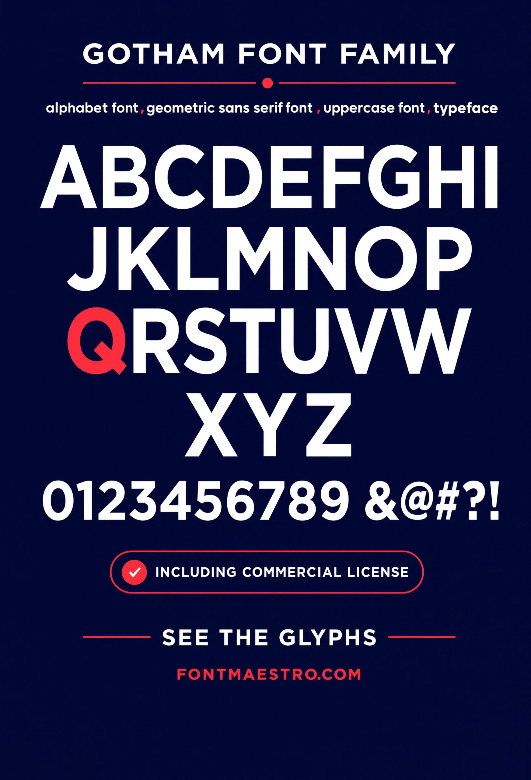
Commercial License
Alphabet Specimen
Every letter shares the same geometric bones, so the wordmark doesn’t wobble in quality as it moves from headline to caption size.
Unlimited creative assets. Access to AI tools.
Commercial licence included.
Get downloads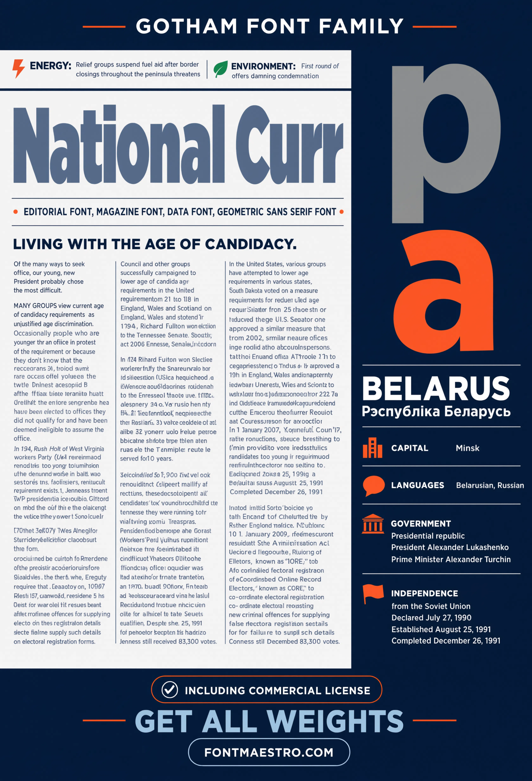
Commercial License
Editorial Almanac Spread
A full editorial spread showing headline, subhead, and body copy together — the fastest way to judge a brand font idea as a complete system, not just a logo mark.
Unlimited creative assets. Access to AI tools.
Commercial licence included.
Get downloads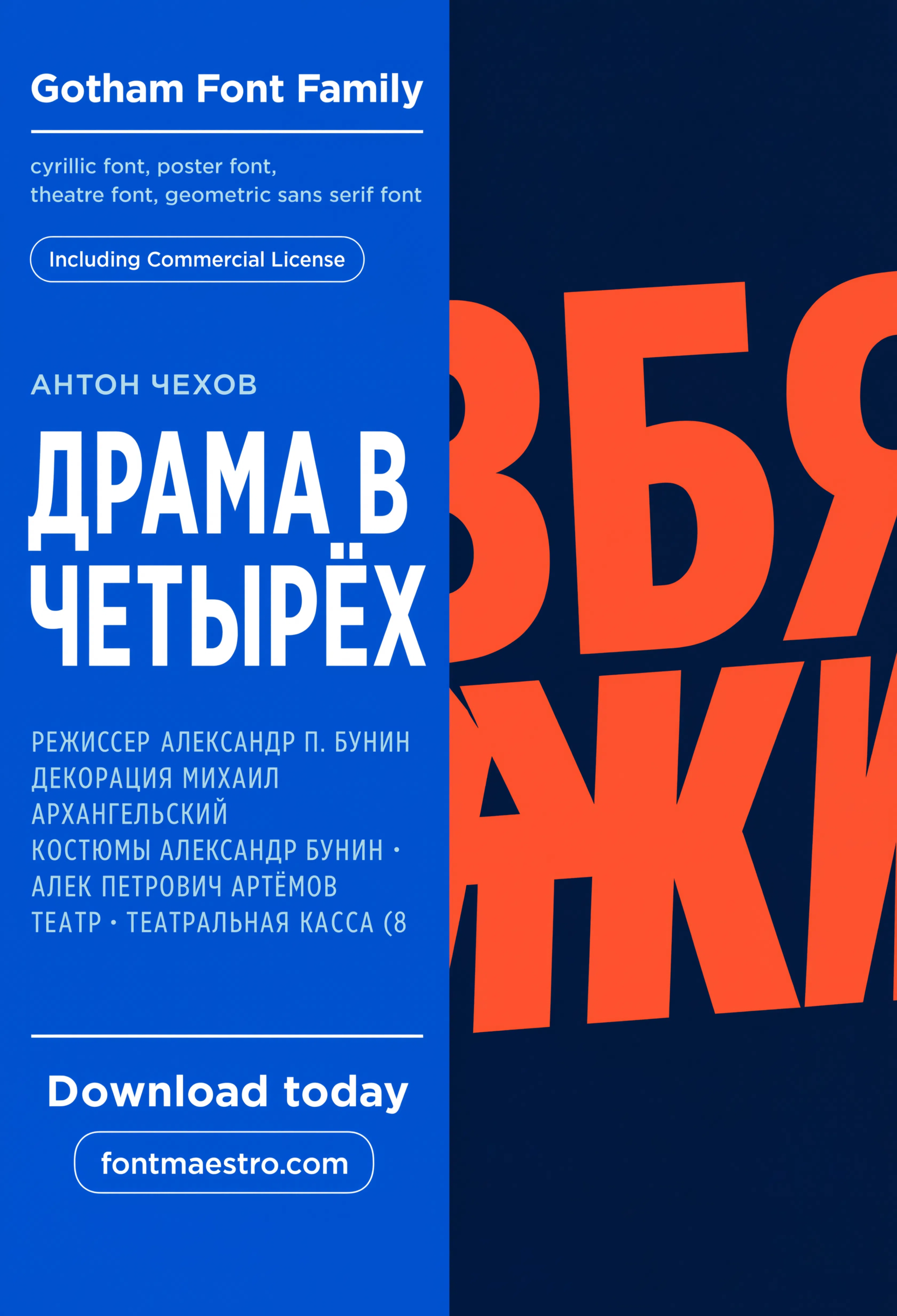
Commercial License
Cyrillic Poster Setting
A large display setting in Cyrillic — confirms the geometric structure holds outside the Latin alphabet before you commit to a global rollout.
Unlimited creative assets. Access to AI tools.
Commercial licence included.
Get downloads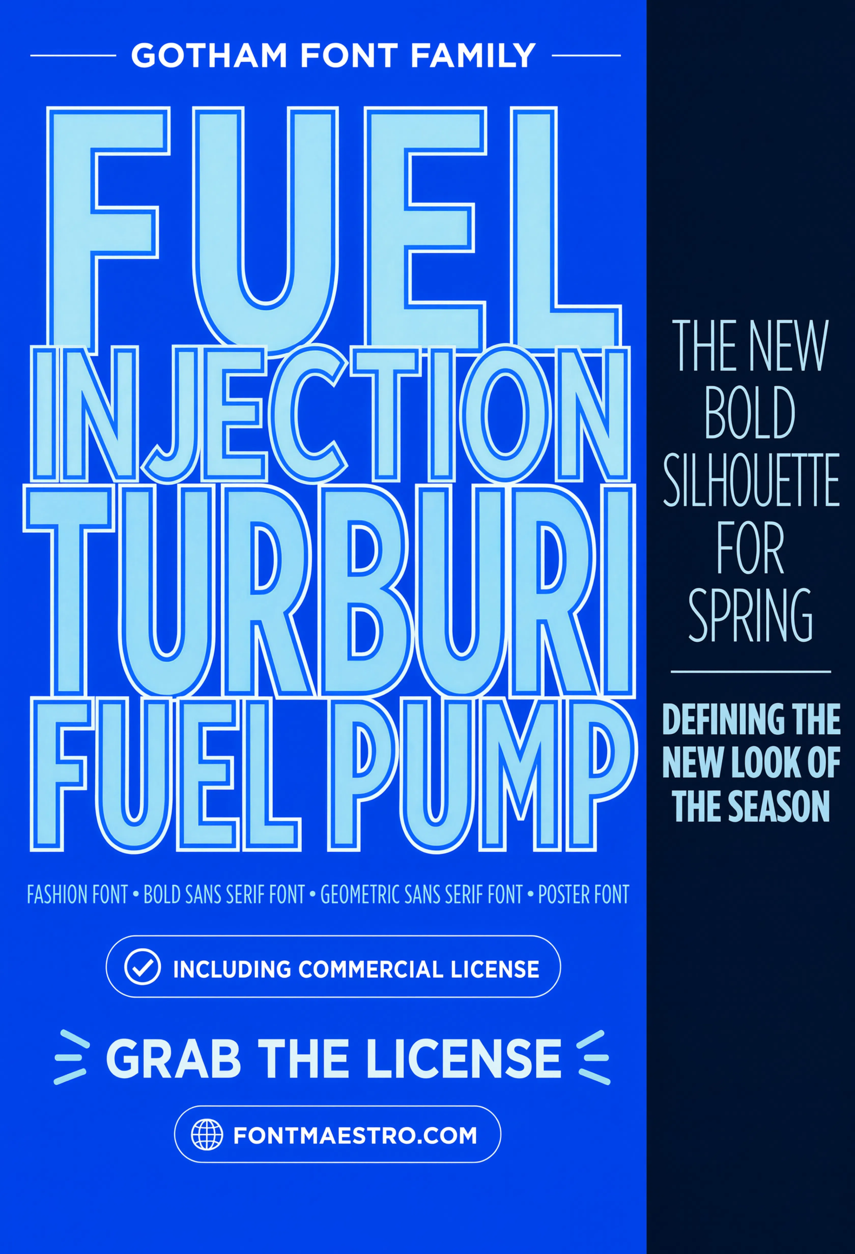
Commercial License
Fashion Layered Typography
A layered fashion-editorial setting — shows how the font holds up paired with imagery instead of sitting alone on white, the real test for a fashion or lifestyle brand font idea.
Unlimited creative assets. Access to AI tools.
Commercial licence included.
Get downloads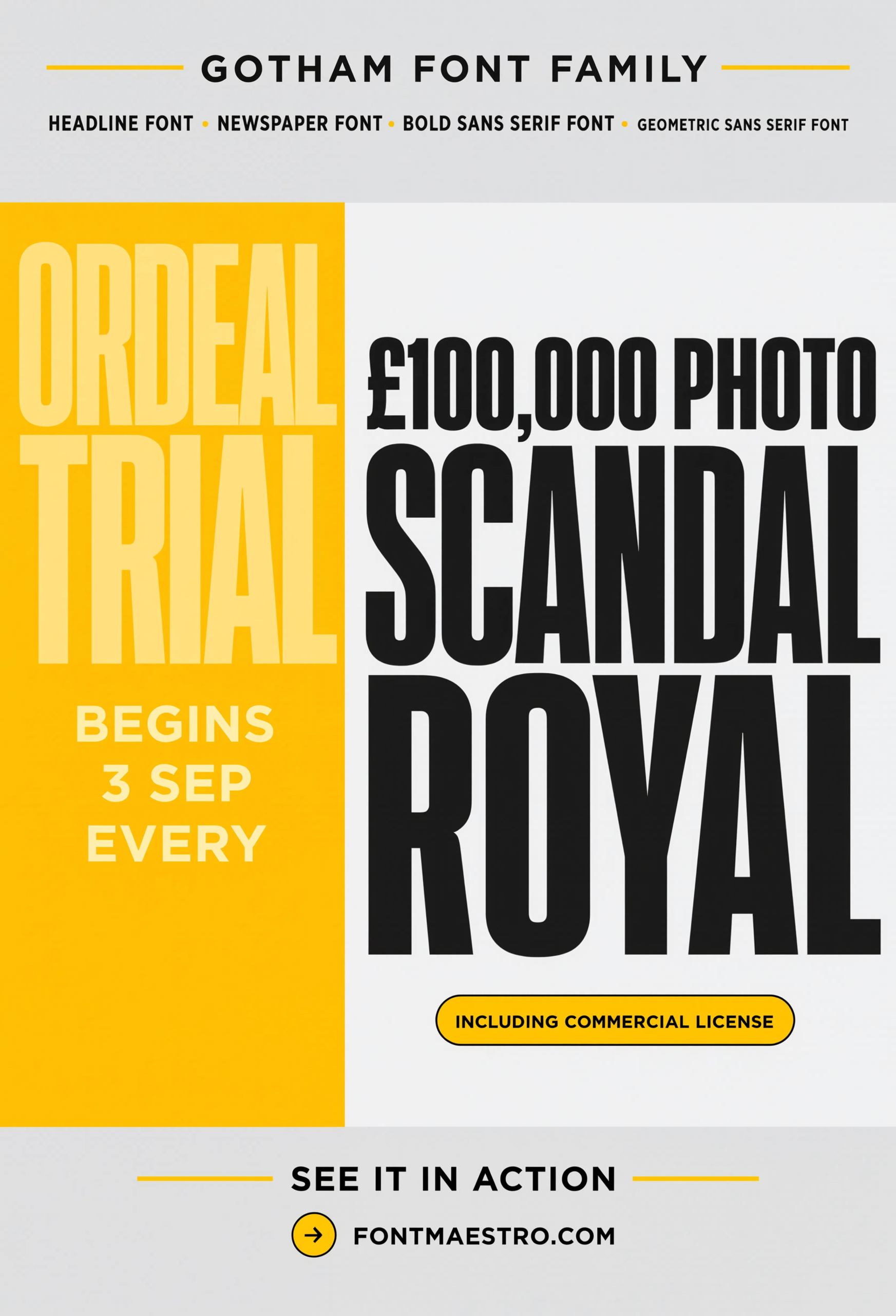
Commercial License
Tabloid Headline
Newsstand-scale headline treatment — tests impact and legibility at a glance, one of the harshest real-world tests a display font faces.
Where Do Font Logo Ideas Get Tested Hardest?
Transit signage and tabloid headlines are two of the harshest tests a font ever faces — one demands legibility in motion, the other demands impact at newsstand size. If a font logo idea survives both, it’ll survive almost anything a brand throws at it.
Looking for more direction? Our elegant font logo picks cover a quieter, more restrained approach to logo type, and our best fonts for business logos guide dives into signage-tested options in more detail.
Frequently Asked Questions
Where do good font logo ideas come from?
From context, not trend-watching — the strongest font logo ideas start with the full range of places a brand needs to appear, then work backward to a typeface family that covers all of them.
How many weights does a brand font system need?
Most brand systems need at least three: a bold weight for the logo mark, a regular weight for headlines, and a lighter weight for body copy. Gotham’s full weight ladder covers this range in one family.
Should a font logo idea be tested outside a mockup?
Yes — a font that only looks good in a clean logo mockup can still fail on signage, in a data table, or set in a second alphabet. Testing across real contexts catches this before launch.
Is Gotham a good choice for multilingual brand font ideas?
Yes — it includes Cyrillic glyph support tested at both poster and signage scale, which matters for any brand planning a multi-market rollout.
What’s the difference between a font logo idea and a finished brand font system?
A font logo idea is a single wordmark concept. A finished brand font system extends that same family across headlines, body copy, and signage with a consistent weight structure.
Key Takeaways
- Want a proven starting point? Explore the Gotham collection on MyFonts for a full weight range tested across editorial, signage, and multilingual use.
- Strong font logo ideas start from context — where the brand will actually appear — not just how the wordmark looks in a mockup.
- Test any font logo idea in at least three contexts: display size, body copy, and signage or small scale.
- Confirm multilingual glyph coverage before launch if there’s any chance of expanding into a market with a different alphabet.
Related Reads
Unlimited creative assets. Access to AI tools.
Commercial licence included.
Get downloads