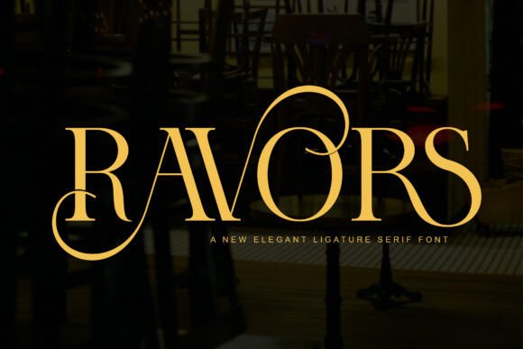
Ravors
Rounded serifs and a wide stance give this one a warm, crafty feel rather than a formal one. Seven reviews at five stars put it among…
See itSerif families for long text, book covers and anything that should read as considered rather than new. Check the italic before you commit: it is where cheap serifs fall apart.
Rounded serifs and a wide stance give this one a warm, crafty feel rather than a formal one. Seven reviews at five stars put it among…
See it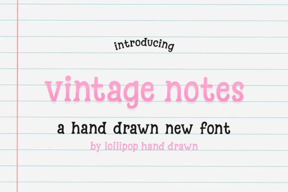
Blocky mid-century serif, closer to a 1950s shopfront than to a wedding suite, which is exactly why it works as a contrast face next to a…
See it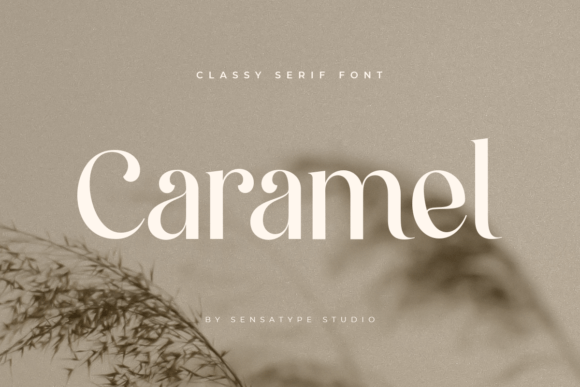
High-contrast serif with a bohemian streak: the thick-to-thin shift is wide enough to feel hand-cut, and the alternates give you a second version of most lowercase…
See it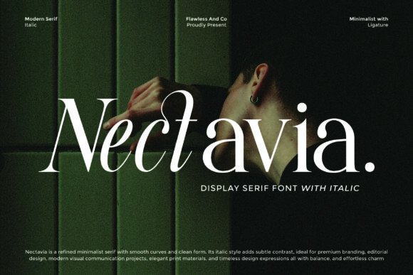
5.0★ · 1 reviews
See it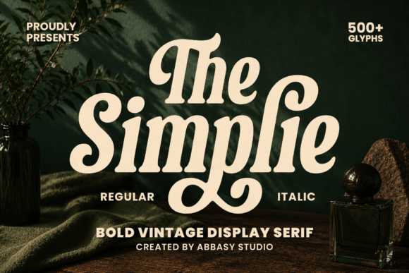
Chunky vintage serif with flat, bracketless serifs, bold enough to read across a room on a welcome sign. Comes with SVG files, so the same word…
See it
5.0★ · 1 reviews
See it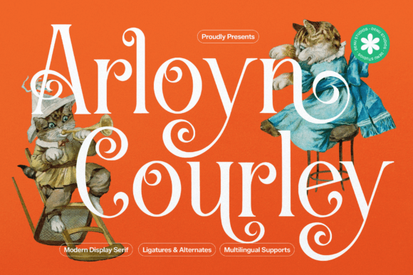
5.0★ · 1 reviews
See it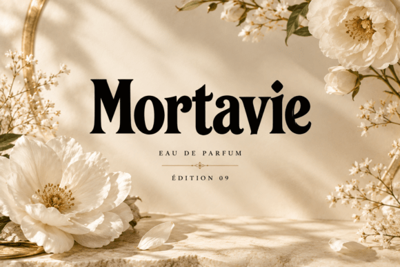
5.0★ · 1 reviews
See it
5.0★ · 1 reviews
See it
5.0★ · 1 reviews
See it
5.0★ · 1 reviews
See it
5.0★ · 1 reviews
See it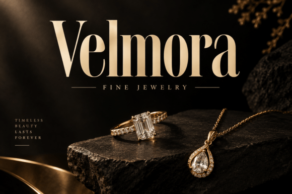
5.0★ · 1 reviews
See it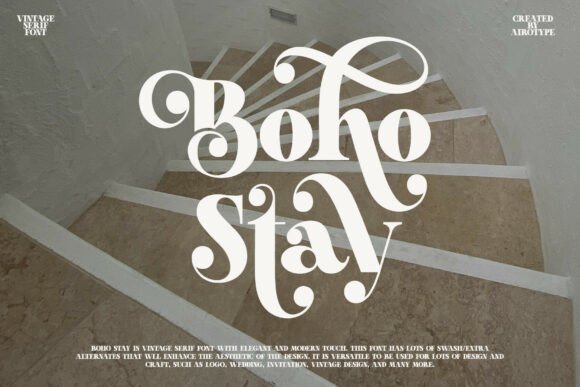
5.0★ · 1 reviews
See it
5.0★ · 1 reviews
See it
5.0★ · 1 reviews
See it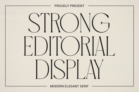
Fashion-magazine serif: very high contrast, flat serifs, built to be set large and tracked tight. At small sizes the hairlines drop out, so keep it for…
See it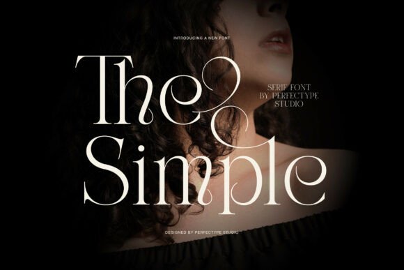
5.0★ · 1 reviews
See it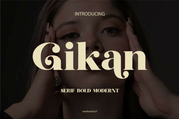
5.0★ · 1 reviews
See it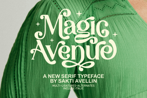
An editorial serif with unusually long entry strokes, so lowercase words read almost like calligraphy at large sizes. The alternate characters are worth opening in a…
See it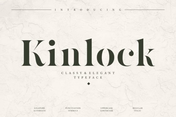
Sophisticated serif in the luxury-branding mould: narrow, high contrast, very little in the way of flourish. It is a logo face first, which means the lowercase…
See it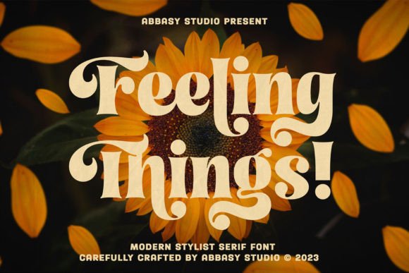
Serif with calligraphic roots, so the strokes thicken the way a broad nib would rather than the way a display face does. That gives a formal…
See it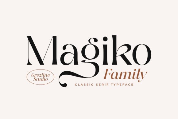
5.0★ · 1 reviews
See it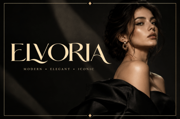
5.0★ · 1 reviews
See it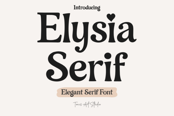
Balanced serif that was drawn as a book face, so the spacing holds up in paragraphs where display serifs fall apart. That makes it the practical…
See it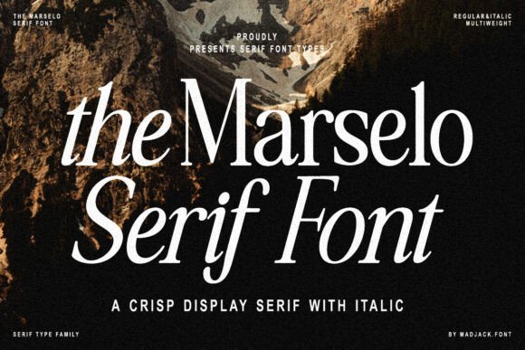
Display serif with brush-drawn edges, so the strokes have a slight roughness up close. At invitation size that texture reads as warmth; on a screen at…
See it
5.0★ · 1 reviews
See it
Classic serif with a very slight flare on the stems, which is the only decorative thing about it. That restraint makes it a good text companion…
See it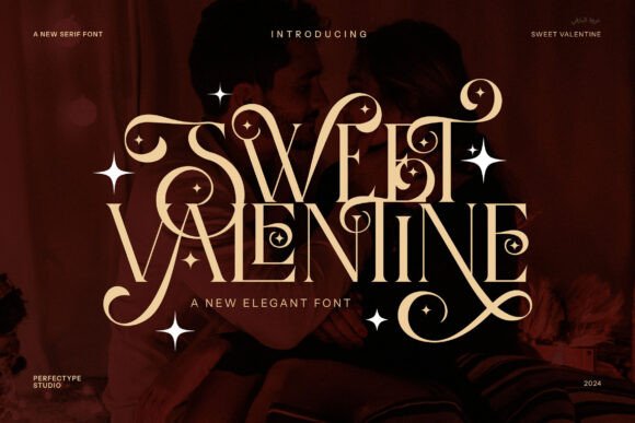
Soft serif with rounded, slightly swollen strokes, more 1990s greeting card than formal stationery. It reads as friendly at large sizes and loses its character below…
See it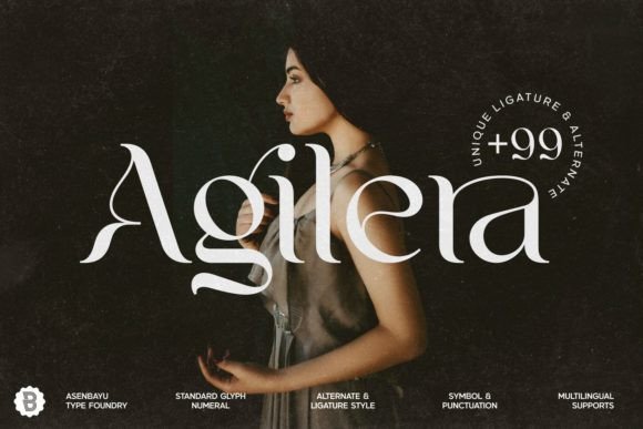
Curvy serif with decorative swashes on the capitals, the kind of face you set a single initial in. The alternates matter here, because the plain forms…
See it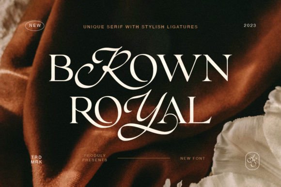
Fancy serif with long, fine serifs and a tall ascender line, built for magazine covers and reused here for invitations. Needs generous leading or the ascenders…
See it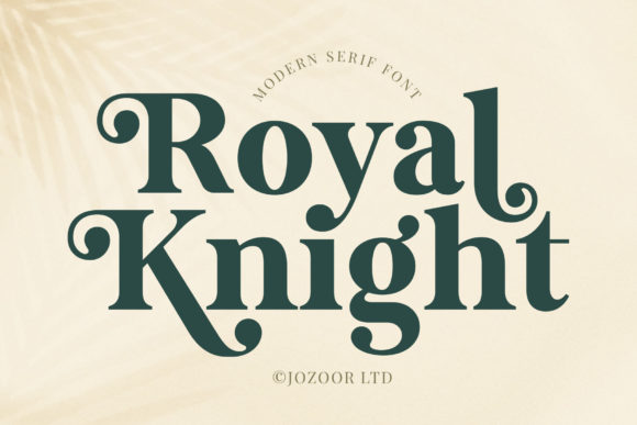
A broad, heavy serif built for words that sit alone: a surname on a welcome board, a single word on a banner. The SVG set means…
See it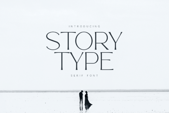
5.0★ · 1 reviews
See it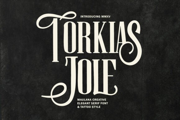
Bold serif with blackletter influence in the capitals, which gives a formal suite a slightly gothic edge. OTF and TTF only, so plan on desktop software…
See it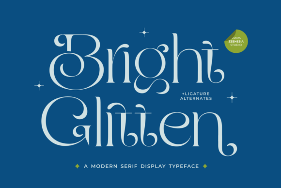
5.0★ · 1 reviews
See it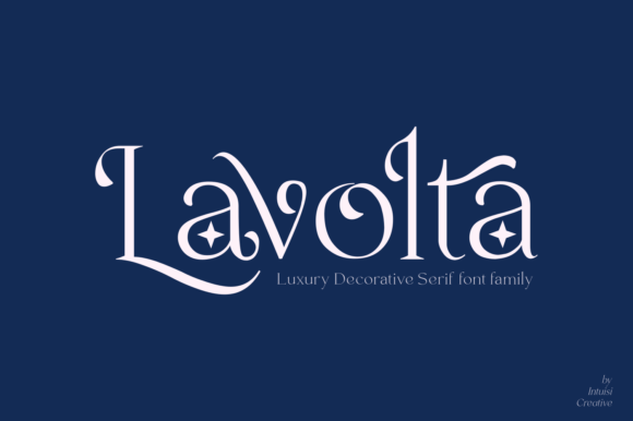
5.0★ · 1 reviews
See itWe use cookies to run this site, understand how it’s used, and support the affiliate links we share. See our Privacy Policy and Cookie Policy.
Font Maestro is a participant in affiliate programmes. Some links on this site earn us a commission at no extra cost to you. Full disclosure