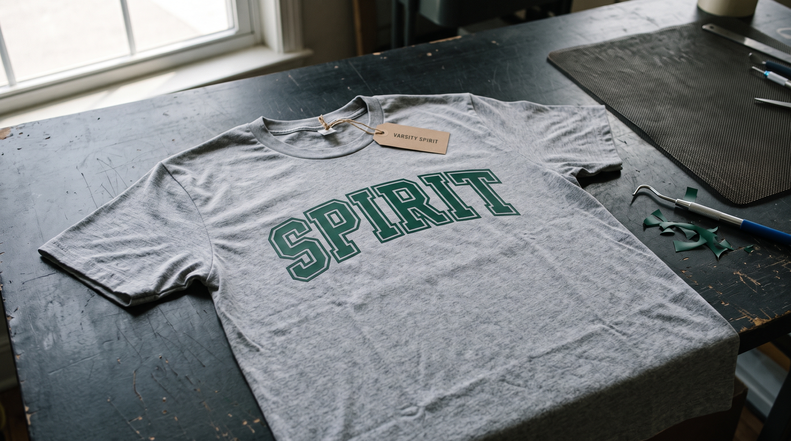
Cheer season runs on last-minute cuts. A bow order at nine at night, twelve team names on shirts before Friday, a senior banner that has to be readable from the top row of bleachers. The font decides how much of that night you spend weeding, and the fonts marketed as “cheer” are not all built the same way. Some are drawn for screen graphics, where a hairline stroke just looks delicate instead of lifting off the mat.
Quick answer: a cheer font weeds easily when its thinnest stroke still measures wider than about an eighth of an inch at the size you actually cut, and when the file you bought includes a vector, not only an installable font. The reference pins driving this search right now bear that out: the fastest-saving one in the cluster is a spirit-wear font list gaining roughly 35 saves a day, followed by an alphabet-and-numbers sheet at about 12 a day. Both are “show me the whole character set” pins, because a cheer maker needs every letter and every jersey number, not a pretty sample word. Six fonts below are picked on that basis, with the two thin scripts flagged for where they stop working.
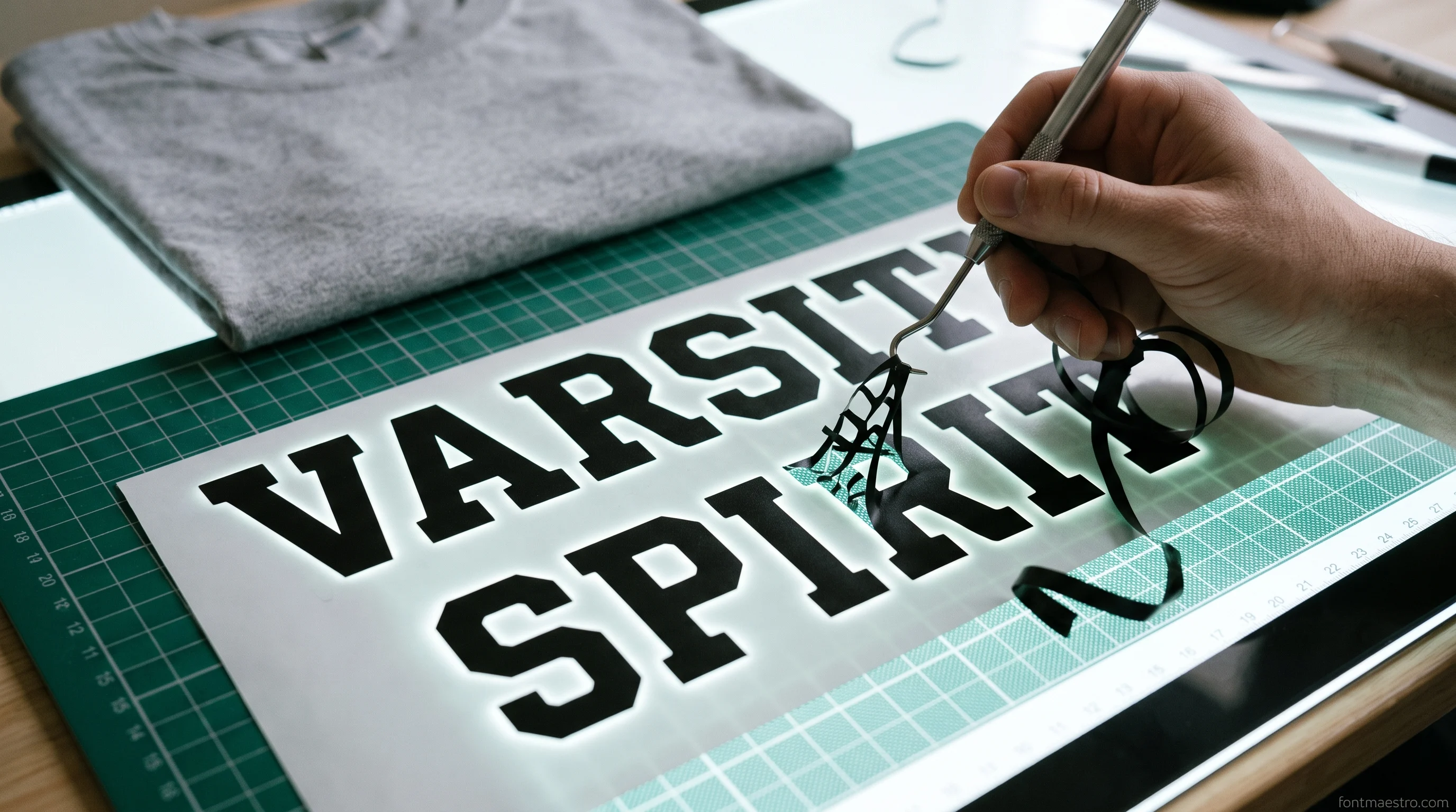
If the deadline is tonight and you only want the one that never argues on HTV, it is Varsity Spirit, a block face with the full alphabet and the jersey numbers in the same download, so nothing sends you back to the product page halfway through a team order.
What Actually Makes a Cheer Font Weed Easily
Weeding trouble is almost always a stroke-width problem, not a machine problem. Heat transfer vinyl holds a shape well down to about an eighth of an inch; below that, the piece stops being a shape and starts being a thread that comes up with the excess. Script fonts fail there first, because the thin connector between two letters is always narrower than the letters themselves.
Three checks catch it before you press Go. Type the longest real word you need, a full last name rather than the word “cheer”, at the exact size it will sit on the garment. Look at the connectors, not the capitals. And check whether the product ships a vector file, because an SVG can be thickened in Design Space with an offset, while a font file locks you into the weight the designer drew.
Measuring the connector takes about a minute and it is the only check that actually predicts the weeding session. Type the name, set the height to what the garment needs, then zoom in on the joint between two lowercase letters and drag a small square shape next to it with the size fields set to an eighth of an inch square. If the connector is visibly thinner than that square, the cut will hold on the mat but the piece will lift when the excess comes off, and you will spend the evening putting threads back with a weeding hook. This is a size test, not a font test: the same script that fails at one inch of letter height passes comfortably at three, which is why a bow center and a shirt back need different answers even in the same order.
Material changes the floor as much as size does. Smooth heat transfer vinyl is the friendly case and holds close to that eighth of an inch. Glitter carries a thicker, grittier layer that grips the excess and tears fine detail at sizes where smooth vinyl behaves, so a name that weeded fine last week in matte black can fight back in team gold. Flock sits between the two and hides small ragged edges under its pile, which forgives a slightly thin connector but blurs anything with fine detail in it. Set the floor by the least forgiving material in the order, not by the one you tested on.
Unlimited creative assets. Access to AI tools.
Commercial licence included.
Get downloads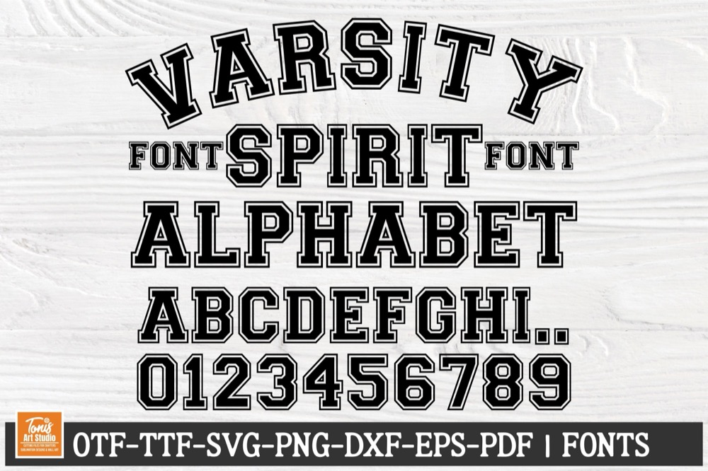
Full alphabet and numbers in one file → Varsity Spirit
Collegiate block with an inline stripe that ships as SVG, DXF, EPS, and PDF next to the OTF and TTF, with every digit drawn for jersey numbers.
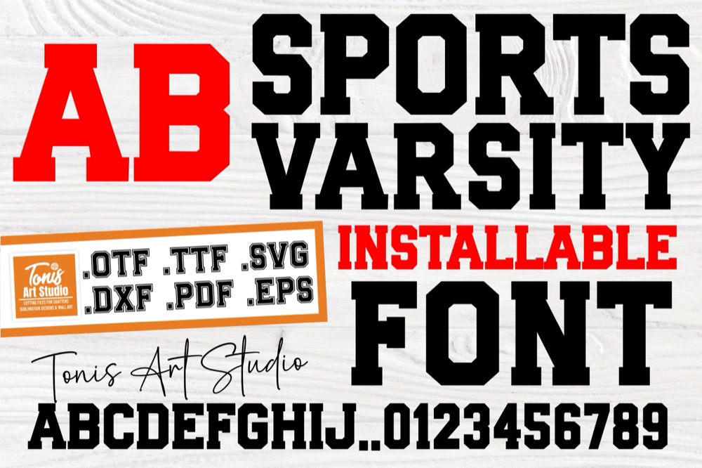
Thickest stroke in the list → Sports Varsity
No inline, no shadow, and no swash, so every letter is one closed shape and the excess comes off in a single pull instead of in pieces.
Cheer Fonts for Cricut That Hold Up on HTV
Spirit wear is the least forgiving surface in the whole order. The shirt stretches, the press flattens the edges, and anything narrow that survived weeding can still lift after the first wash. Block and athletic faces earn their place here for one plain reason: their thinnest part is still thick.
Unlimited creative assets. Access to AI tools.
Commercial licence included.
Get downloads
Heaviest block for jersey names → Sports Varsity
Solid athletic caps with no inline, fewer pieces to weed per letter than a striped varsity face, shipped as a font plus cut-ready vector formats.
Varsity Spirit
Collegiate block with an inline stripe that ships as SVG, DXF, EPS, and PDF next to the OTF and TTF, with every digit drawn for jersey numbers.
Script Cheer Fonts for Bows, Bottles, and Name Decals
Every font, one commercial licence
The bundles I test at logo size live in one subscription — commercial use included, no per-font checkout.
Bow centers and water-bottle decals are where the thin scripts still belong. Neither one gets stretched, neither goes through a dryer at high heat, and the whole point of a bow center is that it looks handwritten rather than printed. The size rule flips here too, because a bow center is small, so you are cutting a short first name, not a full roster.
Unlimited creative assets. Access to AI tools.
Commercial licence included.
Get downloads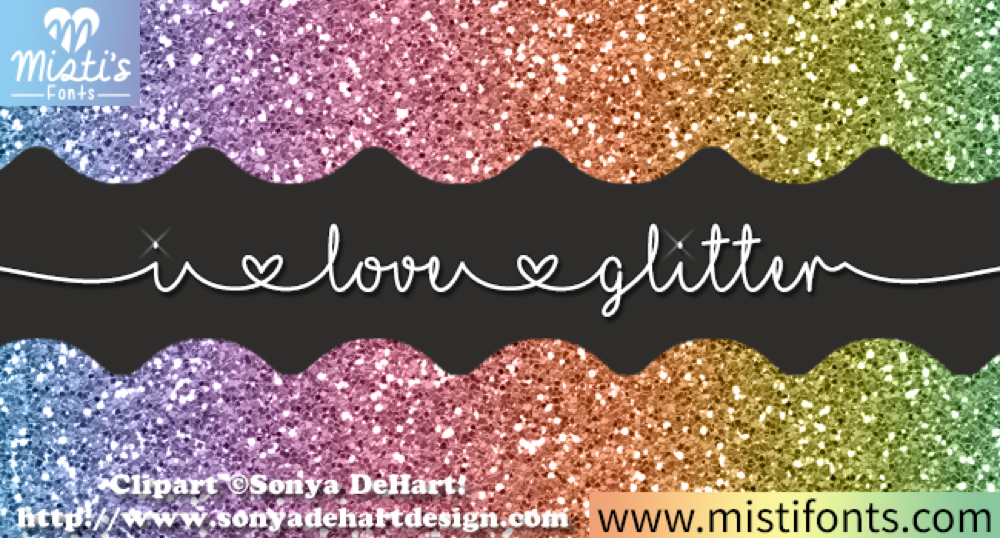
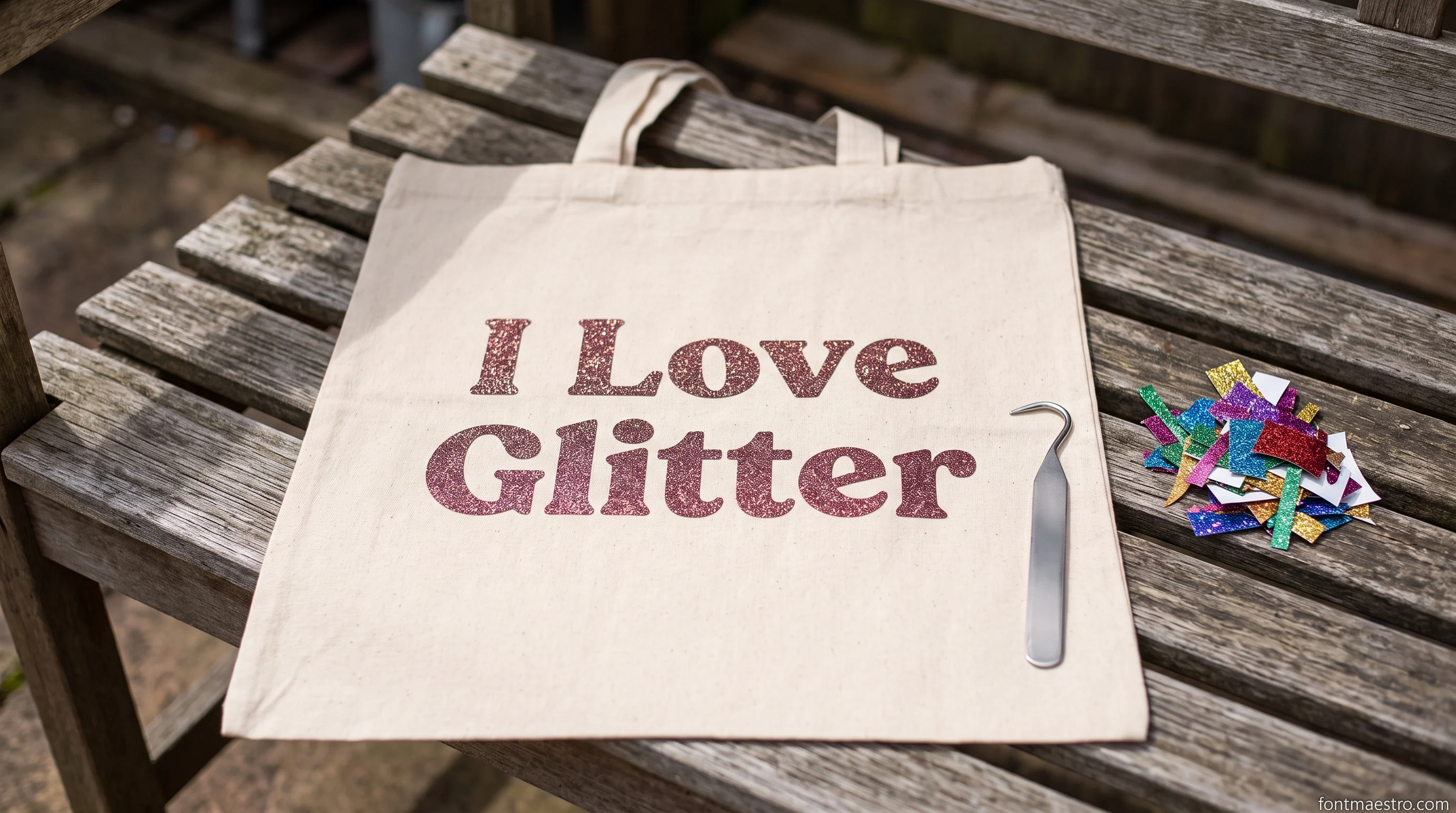
Girly monoline for bow centers → I Love Glitter
Thin, even-width script with small heart shapes in the connectors. Keep it above roughly two inches of letter height or the connectors drop under the eighth-inch line.

Varsity Spirit
Collegiate block with an inline stripe that ships as SVG, DXF, EPS, and PDF next to the OTF and TTF, with every digit drawn for jersey numbers.
Layered Fonts for Two-Color Spirit Wear
Team colors usually mean two layers, and there are two ways to get them. You can offset a single font in Design Space and cut the offset in the second color, or you can buy a font that already ships its shadow as a separate layer. The second way registers better, because the designer aligned the layers instead of the software guessing an offset distance.
Unlimited creative assets. Access to AI tools.
Commercial licence included.
Get downloads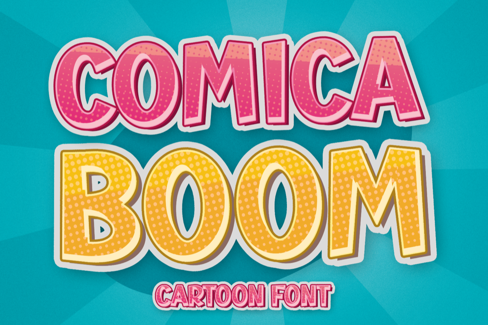
Built-in second layer → Comica Boom
Fat cartoon caps with a matching shadow layer, heavy enough to be the safest bet on glitter HTV, which weeds worse than smooth vinyl at every size.
Two colors without an offset → Varsity Spirit
The stripe inside each letter is already a separate piece, so cutting it in team color two gives a two-tone name with no offset step to guess.
Sports Varsity
No inline, no shadow, and no swash, so every letter is one closed shape and the excess comes off in a single pull instead of in pieces.
The same two-layer thinking covers cut shapes that are not letters at all. A megaphone silhouette or a pom-pom outline sits behind the name on most spirit-wear layouts, and those are vectors rather than glyphs, so they come from the SVG side of a bundle rather than the font side.
Pairing One Script With One Block Face
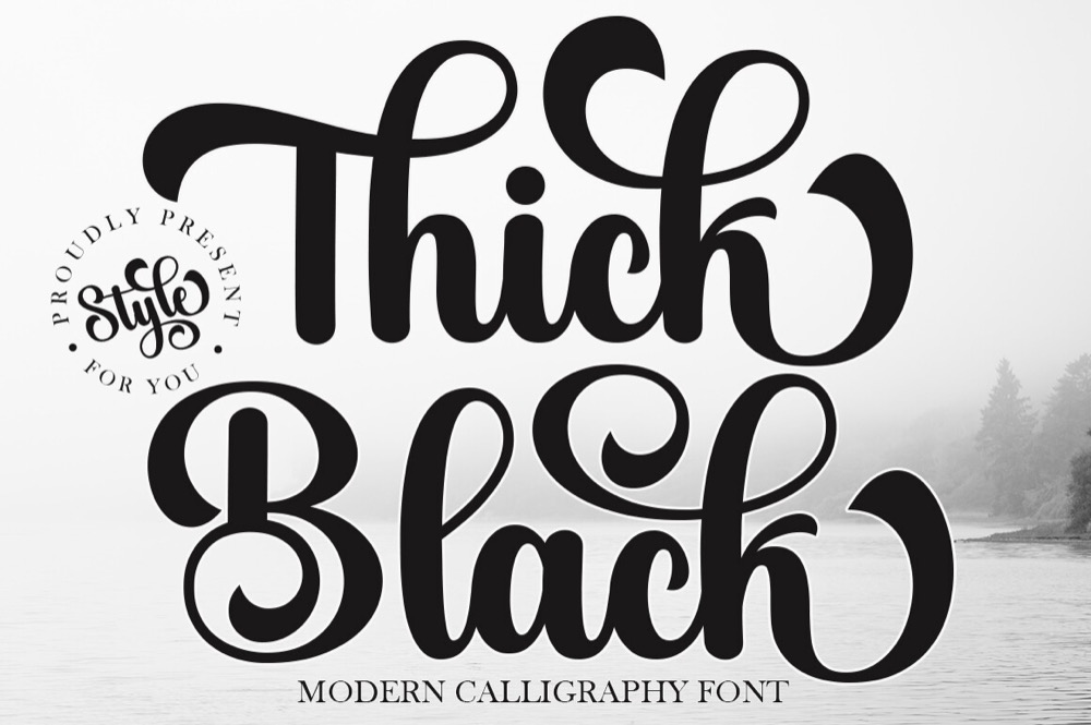
Most team layouts that read cleanly use exactly two fonts: a script for the school or squad name and a block face for everything factual underneath, which is the year, the position, or the number. The script carries the personality, the block carries the information, and a face like Thick Black sits in the first role without dropping under the weeding floor. Three fonts on one shirt is where layouts start looking homemade.
For a logo-style lockup, the script usually sits across a shape rather than beside it, arched over a star or a chevron with the block name underneath. Design Space handles that with Curve on the text and Align on the group, but only if the script welds into one continuous piece first. Otherwise the arch pulls the letters apart at the connectors.
Sizing the pair is the part most layouts get wrong. The script wants to be the largest element by a clear margin, roughly twice the cap height of the block line, because a script set at the same size as the block reads as two competing headlines rather than a name with a subtitle. Keep the block line short enough that it fits inside the width of the script above it, and centre the two on the same axis instead of aligning them left, which is what makes a lockup look designed rather than typed.
Colour follows the same hierarchy. The script takes the team color, the block line takes white or the darker of the two team colors, and any third element on the shirt takes one of those two rather than introducing another. A cheer order that has to work on three different garment colors is easier to keep consistent when the block line is the piece that changes, since a solid block face reads on almost any background while a thin script disappears on a busy one.
Numbers belong with the block face, always. A jersey number typed in the script has connectors nowhere and counters everywhere, which means it weeds badly and reads worse from the bleachers. Where the layout calls for a year under the name, set it in the block face at the same size as the block line rather than smaller, so the two factual pieces look like one row of information.
| Piece of the layout | Which face it belongs to | Why it fails in the other one |
|---|---|---|
| Squad or school name | Script | A block name at display size reads as a sign, not a team |
| Jersey number | Block | Script digits have counters that close up and weed badly |
| Year or position line | Block | A second script turns the shirt into two competing headlines |
| Arched top line over a shape | Script, welded first | Unwelded connectors pull apart as soon as the arch is applied |
| Small text on a bow center | Block | At bow scale the script connector drops under the weeding floor |
The pair that covers the whole table is one heavy block and one script with a stroke you can still see at bow size, which is why Varsity Spirit handles the factual lines on a jersey while School carries the name across the top. Buying the two together also keeps the licence question to one product page instead of two.
When the Font Won’t Load in Design Space
Every font, one commercial licence
The bundles I test at logo size live in one subscription — commercial use included, no per-font checkout.
The most common cheer-font complaint has nothing to do with cutting. You buy a font, unzip it, and it never shows up in the Design Space font list. Almost always the download contained no installable font at all, only SVG cut files, which do not install and instead have to be brought in through Upload.
The order that works: install the OTF or TTF at the operating system level first, quit Design Space fully, then reopen it, because the app reads the system font list at launch and will not pick up a font added while it was running. If the font still is not listed, open the download folder and check the file extensions. An SVG belongs in Upload, a font belongs in Manage Fonts, and mixing those two up accounts for most of the frustration.
Fonts that ship both the OTF and the SVG side-step the whole problem, because whichever route Design Space gives you that night, one of the two files works. Both Comica Boom and Sports Varsity are packaged that way.
Tablets and phones follow different rules, which catches people out when the design was started on a laptop and finished on an iPad. Fonts installed at the operating system level on a computer do not travel to the mobile app, so a name typed on the desktop and opened on the tablet either falls back to a default face or arrives as an image. The workaround is to finish the text on the machine where the font is installed and let the tablet handle only the mat layout, or to work from the SVG version of the design, which carries its shapes with it and does not care what is installed anywhere.
One more thing worth checking before blaming the file: the font list in Design Space separates system fonts from Cricut fonts, and a newly installed face lands in the system group. If the list is filtered to Cricut fonts, a perfectly working install looks like a failed one. Switch the filter to system, then search the name exactly as it appears in the font folder rather than as it appears on the product page, because designers routinely sell a face under a marketing name and ship it with a different internal one.
Once it loads, the last step for any script is Weld. A cheer name typed in a connected script is still separate letter shapes until you weld it, and cutting it unwelded gives you overlapping cut lines through the middle of every joint.
| What you see | What it actually is | What fixes it |
|---|---|---|
| Font missing from the Design Space list | The download held cut files, not a typeface | Bring the SVG in through Upload, or buy a version that lists OTF/TTF |
| Installed, still missing | Design Space read the font list at launch | Quit the app fully, then reopen it |
| Present on the laptop, absent on the tablet | Mobile apps do not read system fonts the same way | Cut from the machine that has the font installed |
| Name on the product page is nowhere in the list | Marketing name and internal font name differ | Search the list by the first two or three letters instead |
Where the Free Cheer Font Download Stops
The paid versions of the same shapes, Varsity Spirit among them, list File Formats on the product page, which is the line that tells you whether you are getting a typeface or someone else’s letters.
Free cheer fonts are easy to find and mostly fine for a shirt you are making for your own kid. The limits show up the moment the order stops being personal. We pulled twelve free and free-tier Cricut fonts and checked what was actually inside each download: only two of the twelve contained an OTF or TTF you could install and type with. The other ten were cut files with a fixed set of letters the designer had already drawn.
| What a cheer order needs | Typical free download | Paid product page |
|---|---|---|
| Type any name in Design Space | Often SVG only, so you get the designer’s letters, not a font | OTF/TTF listed under File Formats |
| Jersey numbers 0–9 | Frequently letters only | Numerals shown in the character map |
| Selling the shirts to the squad | Personal use, or no license stated at all | License tab states the commercial terms |
| Vector to thicken a thin script | Font file only, weight is fixed | SVG/DXF alongside the font |
We opened twelve free and free-tier Cricut cheer fonts and checked what was actually inside each download: only two contained an installable OTF or TTF. The other ten were fixed cut files, the designer’s letters, not a font you can type a last name in.
That is the whole difference, and it is worth reading in that order: File Formats first, then the character map for digits, then the License tab. If you are selling team orders rather than making one shirt, the license habit matters more than the font choice, and it applies the same way to Cricut fonts you can legally sell with and to the free Cricut fonts worth starting from.
For more options in the same style, browse the cheer and varsity font selection on Creative Fabrica and check the File Formats list on each product before you commit a sheet of HTV.
Reading a license tab takes less time than reweeding a bad cut, and there are only three things to look for. First, whether the terms cover finished physical products at all, since some free licenses cover personal projects and digital use but stop at anything sold. Second, whether there is a unit ceiling, because a squad of twenty shirts sits comfortably under most limits while a booster-club fundraiser might not. Third, whether the terms allow the design to be handed to someone else, which is what a team order actually is when the coach pays and the parents collect the shirts.
The safest habit for anyone taking money for cheer orders is to keep the license text with the file. Save a copy of the terms in the same folder as the font on the day you download it, named after the product, because product pages change and a term you remember reading is not evidence a year later when someone asks. It costs one extra file per font and it is the difference between a business and a hobby that occasionally invoices.
Key Takeaways
- An eighth of an inch is the practical floor for HTV. Measure the connector in a script, not the capital letter, because the connector is always the thinnest part.
- Block and varsity faces are the safe default for jerseys and banners; thin monoline scripts belong on bow centers and bottles, where nothing stretches.
- A font that ships an SVG or DXF alongside the OTF gives you a way out, because you can offset a vector to thicken it, but you cannot thicken a font file.
- Jersey numbers are not automatic. Check the character map for digits before assuming a cheer font includes them.
- One heavy block and one weeded-tested script cover a whole team order; Sports Varsity and I Love Glitter are the pair we keep coming back to.
- Of twelve free Cricut fonts we opened, only two included an installable OTF or TTF. The rest were fixed cut files, which is why the font never appears in Design Space.
FAQ
Why does my cheer script tear when I weed it?
The connectors between letters are narrower than the letters, and below roughly an eighth of an inch they lift with the excess vinyl. Scale the word up, or pick a heavier script where the connector matches the stroke weight of the letter.
Do cheer fonts include numbers for jerseys?
Not all of them. Display and script faces often ship letters and basic punctuation only. The character map on the product page shows what is drawn, and it is worth checking before you plan a numbered order.
Why won’t my downloaded cheer font show up in Cricut Design Space?
Either the download had no font file in it, only SVG cut files, or Design Space was open while you installed it. Install the OTF or TTF, quit the app completely, and reopen it.
Can I sell shirts and bows cut with these fonts?
Only where the product’s own License tab says so. Commercial terms are set per product, not per site, so read that tab for each font rather than assuming a paid font covers team orders.
Can I add fonts to Cricut myself, or does it have to be a Cricut font?
You can add any font your computer has installed, and Design Space will list it beside the Cricut ones. The switch between them sits in the font filter, where System shows what you installed yourself. Nothing has to be bought inside Cricut Access to be cuttable.
What weeds better on glitter HTV?
Heavier faces, by a clear margin. Glitter vinyl has a thicker carrier and holds the excess more stubbornly, so a font that weeds acceptably in smooth HTV can still fight you in glitter at the same size. The two heaviest faces here, Sports Varsity and Thick Black, are the ones that survive glitter at team-order sizes.


