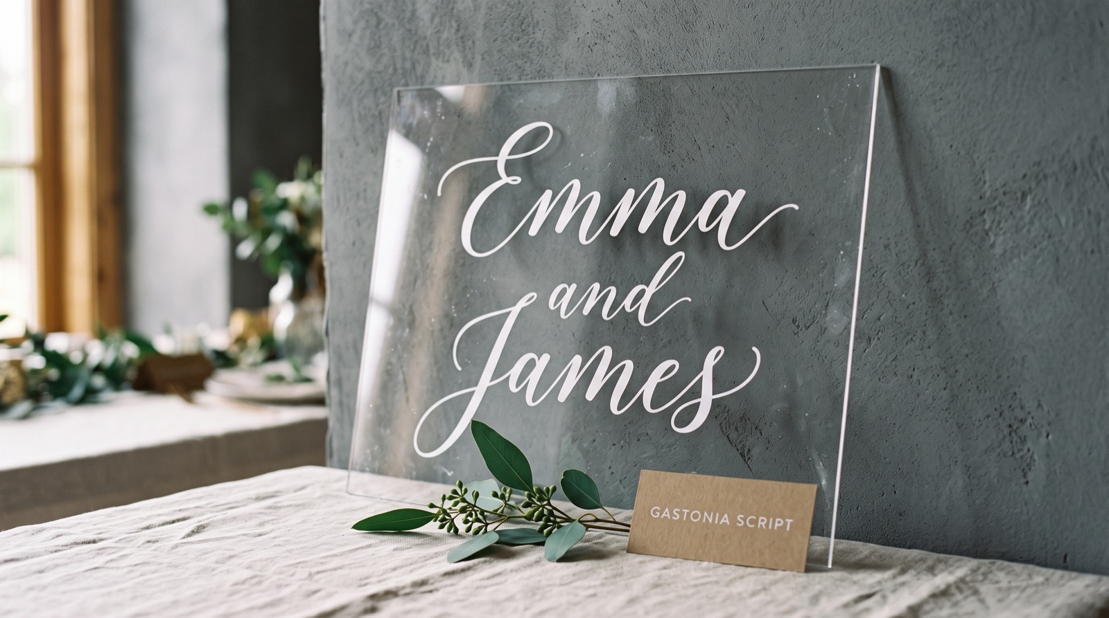
A wedding welcome sign gets one cut. If the font’s strokes are thinner than the blade can hold at the size you need, the vinyl tears at the joins and you’re weeding a second sheet the night before the ceremony. Not every font sold as “wedding style” was built with that in mind. Some were drawn for print, where a hairline stroke just prints darker instead of falling apart.
Quick answer: for Cricut wedding projects, pick a script or serif built with a stroke weight that survives vinyl at your actual sign size, not just the preview size, and most product pages show this in a photo of the cut itself, not just the type specimen. Across the reference pins driving demand for this exact search, the fastest-saving one right now is a wood-sign sealing tutorial gaining roughly 61 saves a day and a deckle-edge place-card tutorial gaining about 60 a day. Both are signage and stationery use cases, which is where a font’s stroke width matters most. Six fonts below are checked for that: a true cut-test photo, a commercial license, and file formats that include a vector, not just an installable font you have to trace yourself.
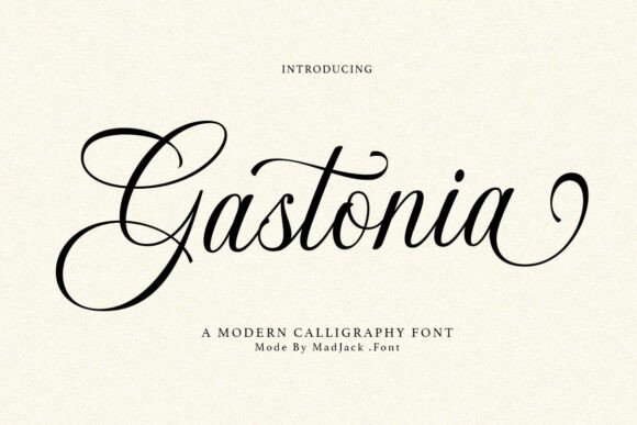
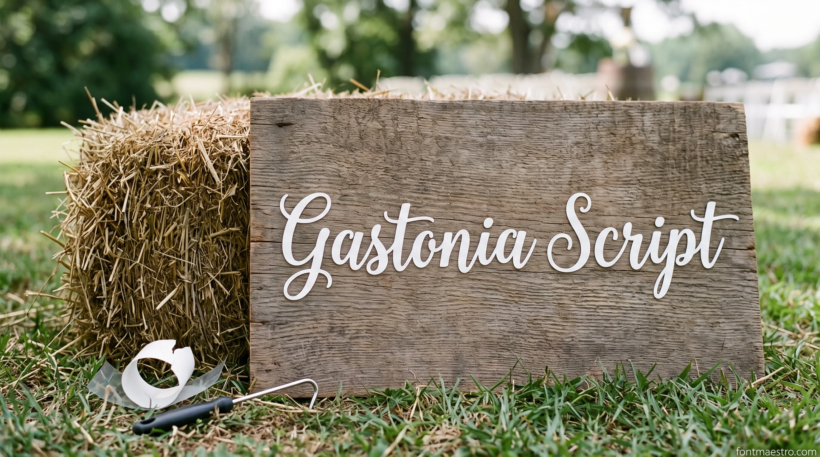
Start here if the sign is the big one → Gastonia Script
The even stroke weight is what keeps a welcome sign from tearing at the joins, and it is the one font here that holds that weight from 4 inches to 24.
Cricut Fonts for Wedding Signs That Cut Clean
A welcome sign or seating chart is usually the largest single cut in a wedding order, and it’s also the one guests photograph closest. Bold, even stroke weight matters more here than fine calligraphy detail. A thin flourish that looks romantic on screen can lift or tear the moment the vinyl comes off the mat.
Unlimited creative assets. Access to AI tools.
Commercial licence included.
Get downloads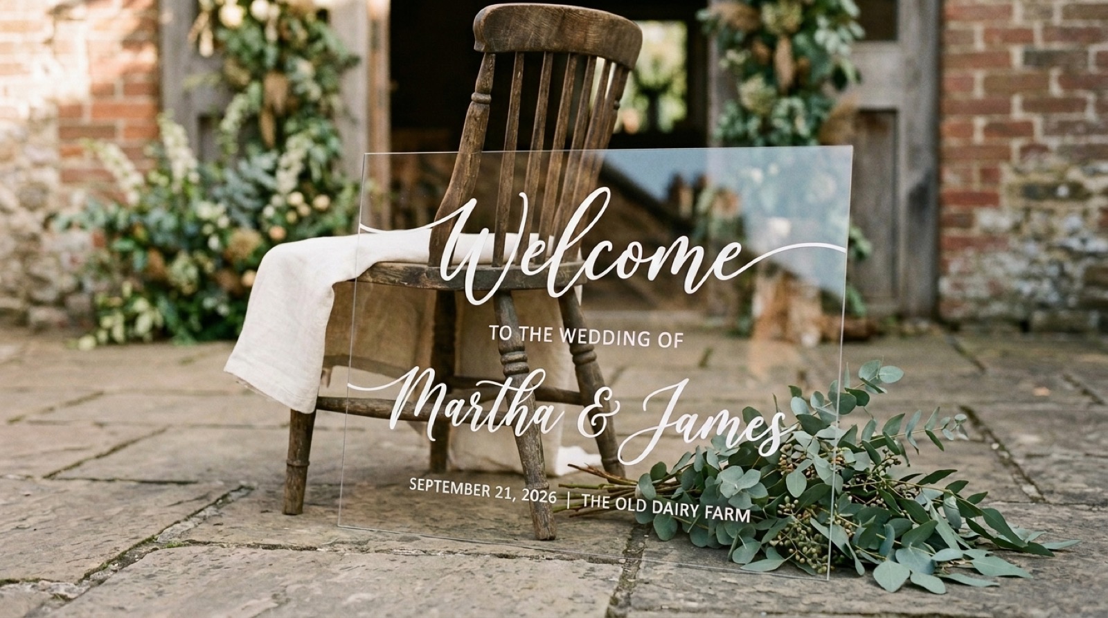
Bold enough for a welcome sign → Gastonia Script
Even stroke weight holds a 24-inch sign as well as a 4-inch card — check the product’s cut photos before sizing your mat.
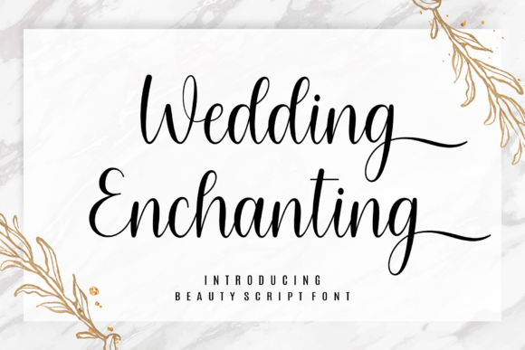
Wedding Enchanting
Installable OTF/TTF, so it goes through Manage Fonts → System Fonts and shows up in the Text tool, so you type every guest’s name individually instead of resizing a fixed cut file.
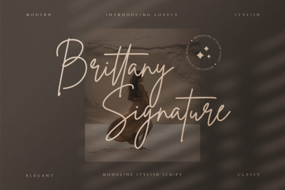
Brittany Signature Script
Drawn as one connected signature, not joined separate letters — test the couple’s actual names welded together before cutting a full run.
Six wedding fonts cleared the check for this guide, and the four lines that decided it were never in the preview image: the license tab, the file list, a photo of the actual cut, and a second style under the same license for when the first one tears.
A Wedding Font Bundle If You Need More Than One Style
A single order rarely uses one font: the welcome sign, the table numbers, and the favor tags usually call for at least two weights or styles that still read as a matched set. A bundle solves that without hunting for a second license.
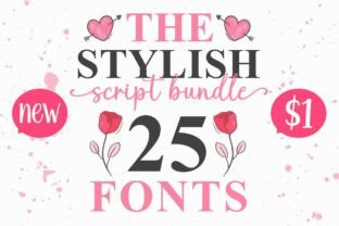
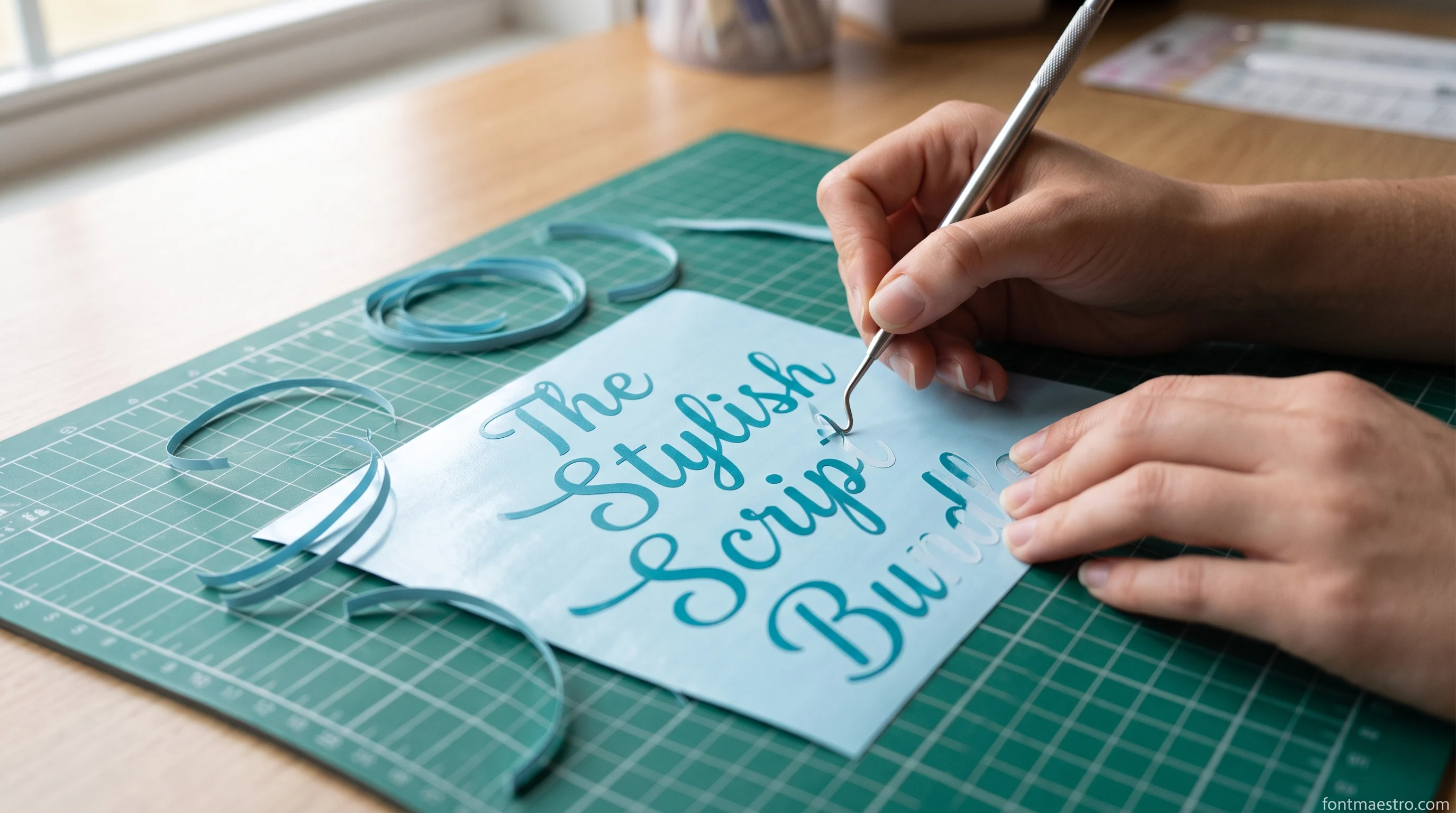
One license, several matching weights → The Stylish Script Bundle
One matched set: display weight for the sign, lighter weight for cards, so table numbers and favor tags read as one font.
Script Fonts for Invitations, Place Cards, and Monograms
Every font, one commercial licence
The bundles I test at logo size live in one subscription — commercial use included, no per-font checkout.
Smaller-format pieces (place cards, invitation inserts, a couple’s monogram) can carry more flourish than a sign, since the cut is smaller and the detail reads as intentional instead of fragile. This is also where a genuine installable font earns its keep: you can still type a new name for every place card without redrawing anything.
Unlimited creative assets. Access to AI tools.
Commercial licence included.
Get downloads
Built for names and monograms → Wedding Enchanting
Installable OTF/TTF, so it goes through Manage Fonts → System Fonts and shows up in the Text tool, so you type every guest’s name individually instead of resizing a fixed cut file.
A true signature look → Brittany Signature Script
Drawn as one connected signature, not joined separate letters — test the couple’s actual names welded together before cutting a full run.
Gastonia Script
Even stroke weight through the whole alphabet, so a 24-inch welcome sign holds its shape as well as a 4-inch place card, so check the product’s own cut photos before sizing your mat.
Elegant, Lower-Contrast Options for Small Text
Not every piece needs high-drama script. Programs, thank-you notes, and anything printed rather than cut in vinyl usually read cleaner in a lower-contrast calligraphy style, one where thick and thin strokes are closer in weight, so the letters stay legible at 10-point size on paper.
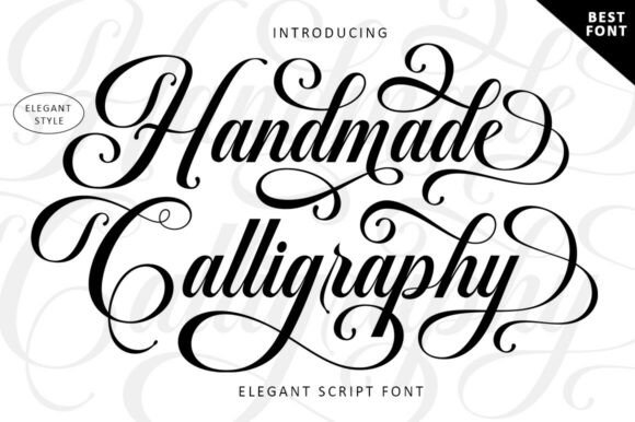
Reads clean at small sizes → Handmade Calligraphy
Even stroke contrast keeps this legible on printed programs and thank-you cards, where a heavier display script tends to fill in at small point sizes.
Luxury and Vintage Script for Branding, Not Just Signs
Save-the-dates, a wedding logo for a website, or a monogram used across the whole event benefit from a script with more dramatic flourish, the kind meant to be seen at a distance on a screen or a printed card, not necessarily cut small and repeated.
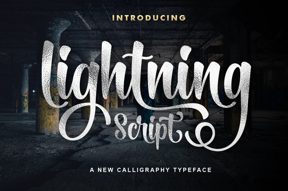
Dramatic flourish for branding and save-the-dates → Lightning Script
Nearly 600 reviews, mostly from monogram-logo and save-the-date use — it holds up on screen even where it wouldn’t survive a small cut.
Why the Free Download Usually Isn’t the Whole Font
A search for “free wedding fonts” turns up plenty of results, but three limits show up on almost all of them: no commercial license for a paid product like invitations or signage-for-hire, no vector file included (only a font you’d have to trace by hand for a cut), and no cut-tested version at wedding-sign scale. None of that shows up in the thumbnail.
| What you need | Typical free download | Creative Fabrica product page |
|---|---|---|
| Commercial / client use | Personal use only, no license terms stated | License tab states commercial terms per product |
| Cut-ready vector | Font file only, traced by hand for a cut | SVG/AI included alongside the font file |
| Confirmed at sign size | Preview image only, usually small | Product photos often show the actual cut |
| Backup if the first font tears | One file, no alternative included | All Access unlocks the rest of the catalog to test another |
The backup style, already licensed → The Stylish Script Bundle
One license covering several matching weights is the cheapest insurance against a font that tears the night before: you swap style, not licence.
None of this means every free font is unusable. It means the license and the file list are the two lines worth reading before you commit a sheet of vinyl, not the preview image. If you’re planning to sell what you cut, the same license-reading habit applies to Cricut fonts you can legally sell with in general, and the same File Formats check applies if you’re starting from a free Cricut font instead of a paid one.
For more options in the same style, browse the full wedding Cricut fonts selection on Creative Fabrica and check each product’s own cut photos before you buy.
Sign, Place Card, or Table Number: Three Sizes, Three Stroke Widths
Every font, one commercial licence
The bundles I test at logo size live in one subscription — commercial use included, no per-font checkout.
The single most useful thing to work out before choosing a wedding font is which pieces you are actually cutting, because one order usually spans a range of sizes wide enough that no single stroke weight covers all of it. A welcome sign is typically cut somewhere between 18 and 24 inches wide, a seating chart around 16 to 20, table numbers at 4 to 6, and place cards at 3 to 4. The letters scale with the piece; the blade does not. A hairline that measures comfortably wide on a 24-inch sign becomes narrower than the blade path once the same word is set on a 4-inch card, which is where the weeding tears start.
| Piece | Typical cut width | What the font has to do |
|---|---|---|
| Welcome sign | 18 to 24 in | Even stroke through the whole alphabet, flourishes welded into the letter, not floating beside it |
| Seating chart | 16 to 20 in | Legible at reading distance with a lot of short lines of text stacked close together |
| Table numbers | 4 to 6 in | Numerals as carefully drawn as the letters, since many scripts treat digits as an afterthought |
| Place cards | 3 to 4 in | Joins that survive at small size, and a real installable font so every guest name can be typed |
| Envelopes | 4 to 7 in wide | Pen-tool behaviour, since addressing is usually drawn rather than cut |
The practical test costs one scrap of vinyl. Set the longest word on the smallest piece in the order, at the exact size it will be cut, and run that single word before committing a full sheet. If the joins survive on the place card, the same font is safe everywhere larger in the same order. Working the other way round, starting from the sign, tells you nothing about the card.
If one font has to cover both ends of that range, Gastonia Script is the one in this set built to hold its stroke weight from a 4-inch card up to a 24-inch sign, so you’re not licensing a second font just for the small pieces.
Can You Add Fonts to Cricut Design Space, and How
Yes, and the route depends on what you downloaded. An installable OTF or TTF is installed on the device first, using Font Book on a Mac or the right click Install option on Windows, and Design Space picks it up under Manage Fonts and System Fonts after a restart. On an iPad or phone the font is added through a font installer app before Design Space can see it. A downloaded SVG or AI file is not a font at all: it goes through Upload and Upload Image, and it arrives holding whatever word the designer already drew.
That difference decides whether you can address a hundred envelopes or only reproduce one sample name, so it is worth checking the File Formats line on the product page before the download rather than after. For wedding work specifically, the installable font is almost always the right buy, because every place card carries a different name.
Wedding Enchanting installs this way — OTF/TTF through Manage Fonts, ready in the Text tool for every guest name — rather than arriving as a single fixed cut file.
Key Takeaways
- Stroke weight at your actual sign size matters more than the preview image, since a font that looks fine at thumbnail size can still tear on a large cut.
- A bundle keeps a welcome sign, table numbers, and favor tags visually matched under one license instead of mixing unrelated fonts.
- Installable OTF/TTF fonts let you type a new name per place card; a fixed cut file only gives you the word the designer already drew.
- Signature-style scripts depend on the weld holding, so test the actual couple’s names together in Design Space before cutting a full run.
- Free wedding-font downloads usually skip three things: a commercial license, an included vector file, and a cut test at real sign size.
- A licensed bundle like The Stylish Script Bundle covers the whole order under one license instead of hunting a second one mid-project.
FAQ
Can I sell wedding signs cut with these fonts?
Only if the specific product’s License tab says so. Check it per product, not per site, since a commercial license is set individually and isn’t implied by a font simply being for sale.
Why did my script font tear when I cut a large wedding sign?
Most likely the stroke width that looked fine in the preview was too thin at the size you scaled it to. Check the product’s own cut photos for a large-format example before scaling, and test one word at your real sign size first.
Do I need a different font for vinyl signs versus paper invitations?
Not always a different font, but often a different weight. A bolder cut of the same style usually survives vinyl better, while the lighter weight can stay on paper where it doesn’t need to hold its own shape after weeding.
What’s the difference between a font file and a cut file for Cricut?
A font file (OTF/TTF) installs through Manage Fonts and lets you type any word in Design Space’s Text tool. A cut file (SVG/AI) is a fixed shape the designer already drew: you can resize or recolor it, but you can’t type new text with it.
What is the best Cricut font for a wedding seating chart or table numbers?
Whichever one in your set has properly drawn numerals and holds a short line of text at 16 to 20 inches for the chart and 4 to 6 inches for the numbers. Many scripts draw beautiful letters and lazy digits, so set the actual numbers before you decide, not just the couple’s names.
What is a good cursive font for Cricut wedding envelopes?
For envelopes the question is the pen, not the blade: addressing is drawn, so a single-line file behaves differently from an outline font. Test one address with the Pen tool selected and watch whether Design Space draws one stroke or a hollow double outline before you run a box of envelopes. Handmade Calligraphy is drawn with that even, single-line contrast, so it holds up whether the piece is cut or drawn with the pen.
Are the free wedding fonts in Cricut Access enough on their own?
They cover the plain sans and serif needs well, and they fall short exactly where wedding work lives: connected script with swash alternates. Access fonts also come with their own terms for finished items you sell, so read those the same way you would read any other license tab.
Related reading: cheer fonts for cricut that weed clean, cursive fonts for cricut that weld without.


