Elegant is one of those words that gets attached to almost any serif typeface by default, as if the category alone guarantees the result. It doesn’t. Sabon Next is what elegant font design actually looks like when it’s earned — an old-style serif redrawn from Jan Tschichold’s original Sabon with the proportion and calm rhythm that make long passages of text a pleasure to read, not just a headline that photographs well.
That distinction matters for design work: a genuinely elegant font holds its composure at both small text sizes and large display sizes, not just in a single hero shot.
Quick answer: Elegant font design means a serif typeface with calm, consistent proportions and a full weight and style range — not just fine hairlines on a headline. Sabon Next fits this because its old-style serif construction was refined for both body-text readability and display-scale branding, so the same family covers a wedding invitation, an editorial spread, and a storefront sign.
What Actually Makes a Serif Font Read as “Elegant”?
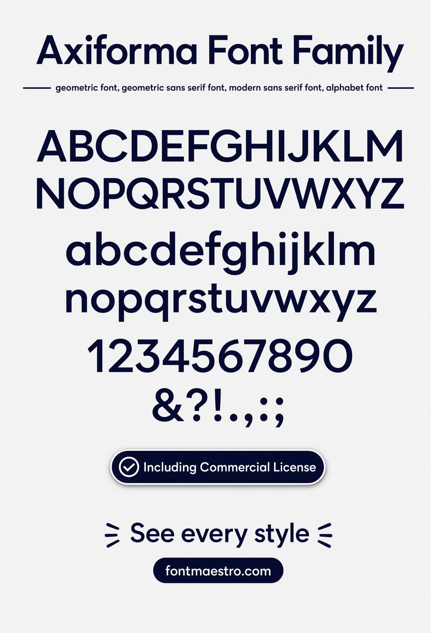
Consistent stroke contrast and generous, even spacing — not just thin hairlines. A serif drawn with balanced proportions holds its calm character whether it’s set as a single word on an invitation or a full paragraph in a magazine. The specimen sheet below shows Sabon Next’s full character set, the clearest way to judge this before committing to a project.
Where Does an Elegant Serif Actually Get Used?
- Wedding and invitation work — an old-style serif with true italics suits the formal, personal tone these projects need.
- Editorial and long-form text — the same qualities that make a serif elegant also make it comfortable to read across paragraphs.
- Branding and signage — a full weight range lets one elegant serif carry a logo, a sign, and supporting copy without switching families.
- Multilingual projects — check the character set covers the diacritics and extended glyphs a project actually needs before committing.
Each file below is a desktop and web-font license bundle available directly through MyFonts — install it locally for print and branding work, or license the web-font cut for a website. It’s part of the Sabon Next collection, so commercial branding rights are included in the standard license.
Unlimited creative assets. Access to AI tools.
Commercial licence included.
Get downloads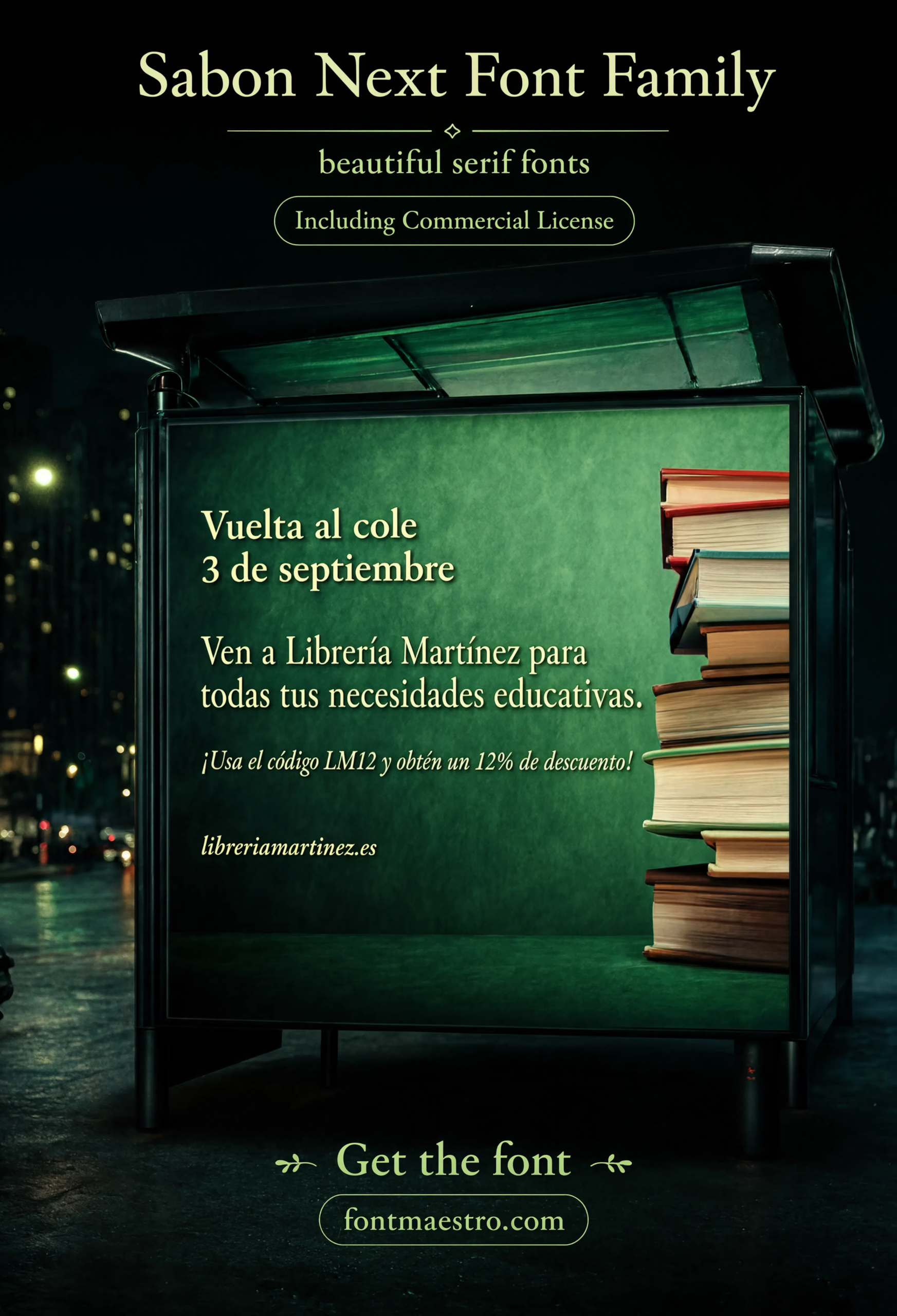
Billboard Application
A large-format billboard mockup shows the serif pushed to outdoor display scale — proof that elegant construction can still carry visual weight at a distance.
Unlimited creative assets. Access to AI tools.
Commercial licence included.
Get downloads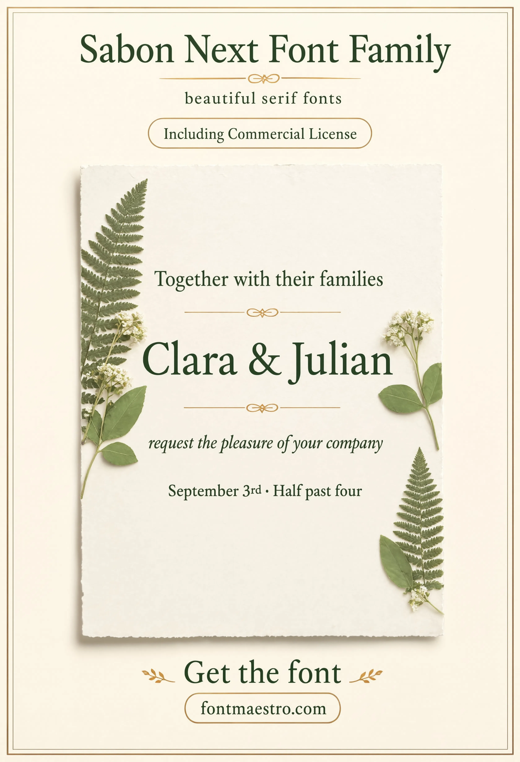
Commercial License
Wedding Invitation
A wedding invitation layout — the classic proving ground for elegant type, where formal tone and true italics matter as much as legibility.
Unlimited creative assets. Access to AI tools.
Commercial licence included.
Get downloads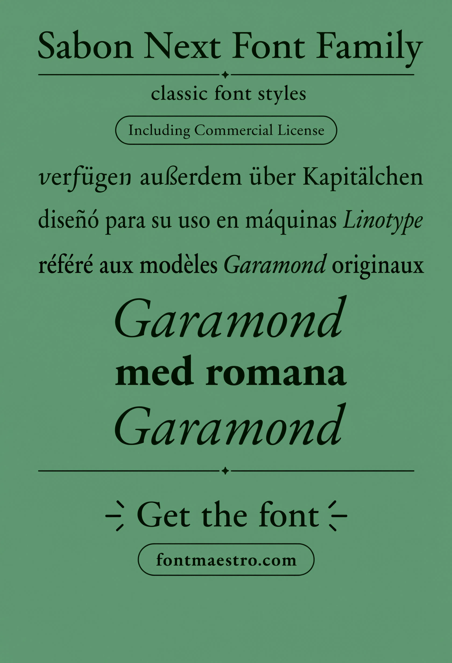
Commercial License
Multilingual Character Set
Extended diacritics and multilingual glyphs shown together — worth checking before committing to a project that needs more than a basic Latin set.
Unlimited creative assets. Access to AI tools.
Commercial licence included.
Get downloads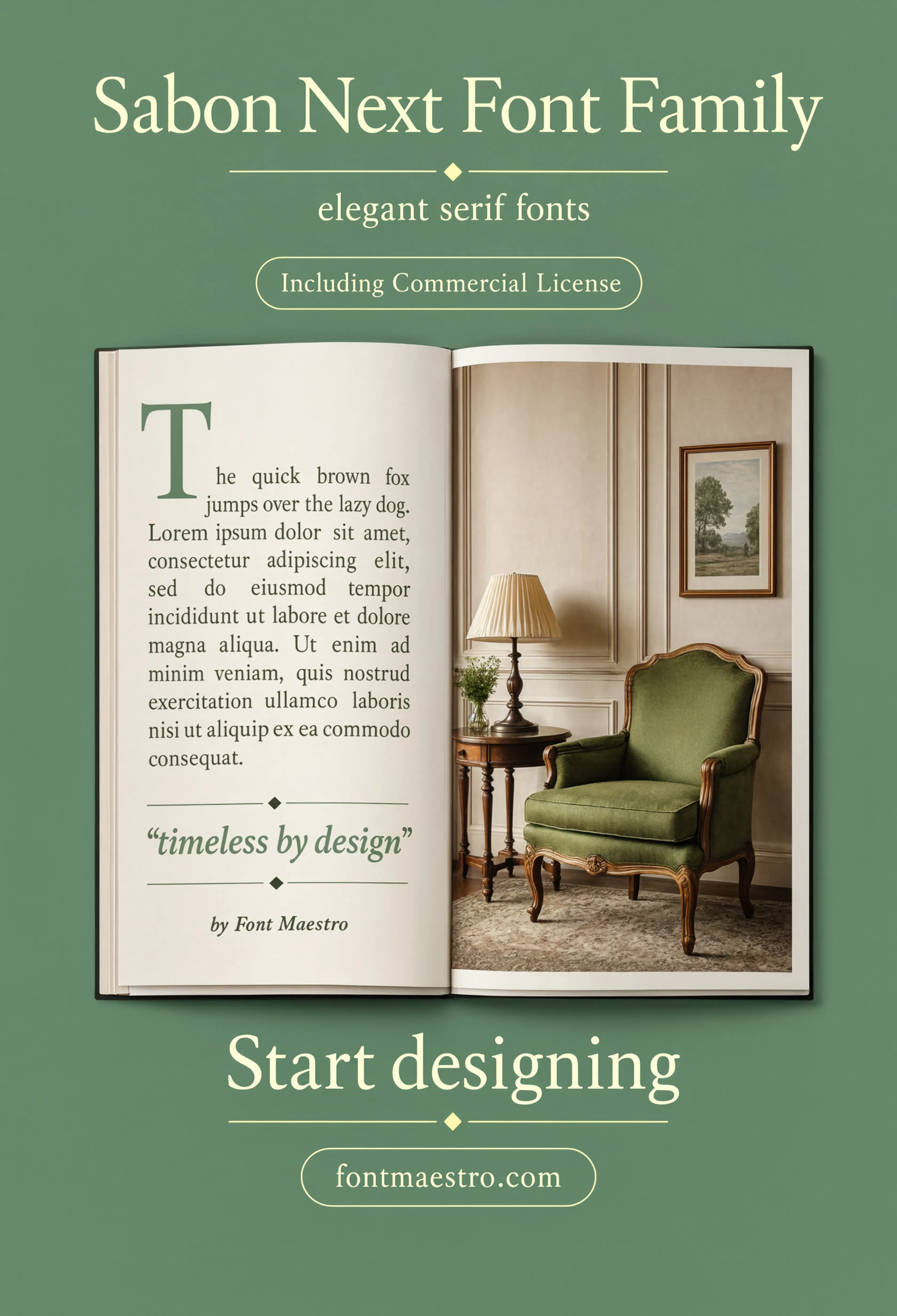
Editorial Layout
A full editorial spread with running body text — this is where an old-style serif’s calm rhythm actually earns its “elegant” label, paragraph after paragraph.
Unlimited creative assets. Access to AI tools.
Commercial licence included.
Get downloads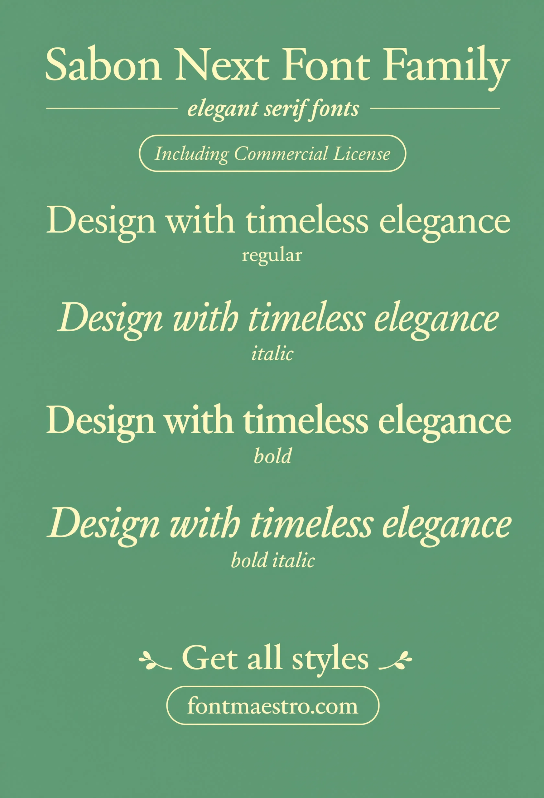
Weight Ladder
Light through bold in one sheet, all sharing the same old-style proportions — the full ladder view for planning a multi-weight brand system.
Unlimited creative assets. Access to AI tools.
Commercial licence included.
Get downloads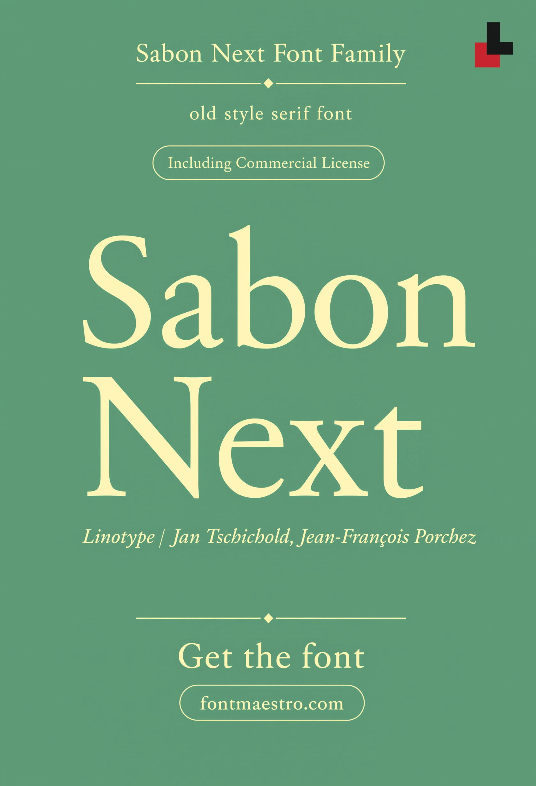
Commercial License
Old-Style Hero Display
A large hero-scale treatment of the old-style serif — proof that a typeface built for body text can still anchor a bold display moment.
How Does an Elegant Serif Hold Up Across Print and Digital?
A billboard and a website hero are two of the more demanding real-world tests for an elegant serif — one has to read from a distance outdoors, the other has to render cleanly on screens at typical body-text sizes. Both are shown above.
Explore the Sabon Next Collection →
Why Do Old-Style Serifs Still Feel Modern in Branding?
Because their calm proportions and consistent rhythm never depended on trend cycles the way heavily stylized display fonts do. A well-drawn old-style serif like Sabon Next reads as considered and timeless in a billboard, a wedding suite, or a cafe menu alike, precisely because it isn’t chasing a specific design moment.
Looking for more type direction? Our beautiful modern font guide covers a geometric sans alternative, and our bold font style name guide looks at a heavier display option for a different brand voice.
Frequently Asked Questions
What makes a serif font read as elegant rather than just decorative?
Consistent stroke contrast and generous, even spacing — an elegant serif holds its calm character at both small text sizes and large display sizes, not just in a single close-up shot.
Is an old-style serif suitable for both print and web design?
Yes, if the family includes a proper web-font license and the weight range needed — Sabon Next covers both use cases in the same commercial bundle.
Do I need a true italic for wedding or invitation design?
It helps significantly. A true italic cut, redrawn rather than slanted, gives invitation and formal design work the personal, handwritten-adjacent feel these projects usually call for.
Why check the multilingual character set before choosing an elegant font?
Any project reaching an international audience needs diacritics and extended glyphs that match the main typeface’s character — a mismatched fallback breaks the design’s consistency.
Are these fonts cleared for commercial branding and print use?
Yes, with the commercial license included on MyFonts downloads — confirm the specific license terms on the product page before client delivery.
Key Takeaways
- Want a proven starting point? Explore the Sabon Next collection on MyFonts for old-style serif proportions built for both text and display use.
- Elegant font design comes from consistent stroke contrast and even spacing, not just fine hairlines on a headline.
- A full weight and style range lets one elegant serif cover branding, editorial, and signage without switching families.
- Check the multilingual character set before committing if a project needs more than a basic Latin alphabet.
Related Reads
Unlimited creative assets. Access to AI tools.
Commercial licence included.
Get downloads