Most people who search for cool fonts for letters end up somewhere unexpected: Helvetica. Not because it’s trendy, it’s the opposite of trendy, but because once you start looking closely at individual letterforms, it’s hard to find another typeface where every single character was refined this carefully.
This isn’t a roundup of decorative alphabets. It’s a close look at what actually happens when you zoom into Neue Helvetica’s letterforms, weight range, and construction, the details that make it a reference typeface instead of just another sans-serif.
Quick answer: If you want to understand why designers keep calling Helvetica “cool” despite having zero decorative flair, it comes down to letterform precision, consistent stroke geometry, a huge weight range, and construction that holds up under close inspection. The six details below show what that looks like up close.
Why a “boring” font keeps getting called a design classic
Cool doesn’t have to mean loud. Neue Helvetica’s reputation comes from how well it performs under scrutiny, at any size, in any weight, next to any other letter in the alphabet, the geometry holds together with almost no variation in visual weight or spacing.
Three things to look at if you want to actually evaluate letterform quality, in this font or any other:
Terminal angles. Where a stroke ends, on letters like “c,” “e,” “s”, reveals a lot about how deliberately a font was drawn. Neue Helvetica’s terminals are cut at consistent angles across the whole family, not eyeballed letter by letter.
Optical correction. Circular letterforms (“o,” “e,” “c”) are drawn very slightly larger than square ones to look the same size to the eye, a correction most casual fonts skip, which is why they can look uneven up close.
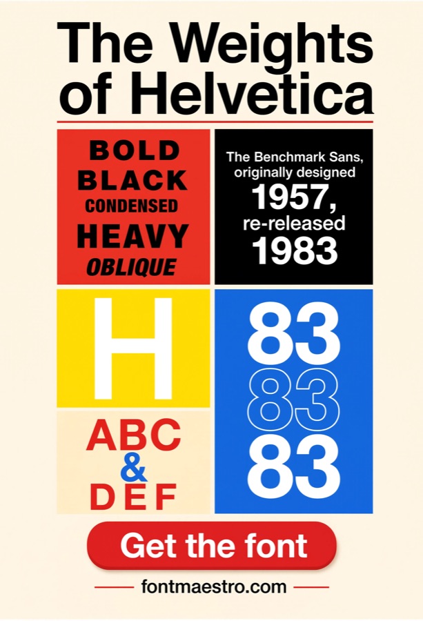
Weight range breadth. A font with only two or three weights limits what you can do with hierarchy. Neue Helvetica’s range, light through black, condensed through extended, is unusually wide for a single family.
The six details below get closer to the letterforms themselves than a typical “best fonts” roundup usually does.
Unlimited creative assets. Access to AI tools.
Commercial licence included.
Get downloads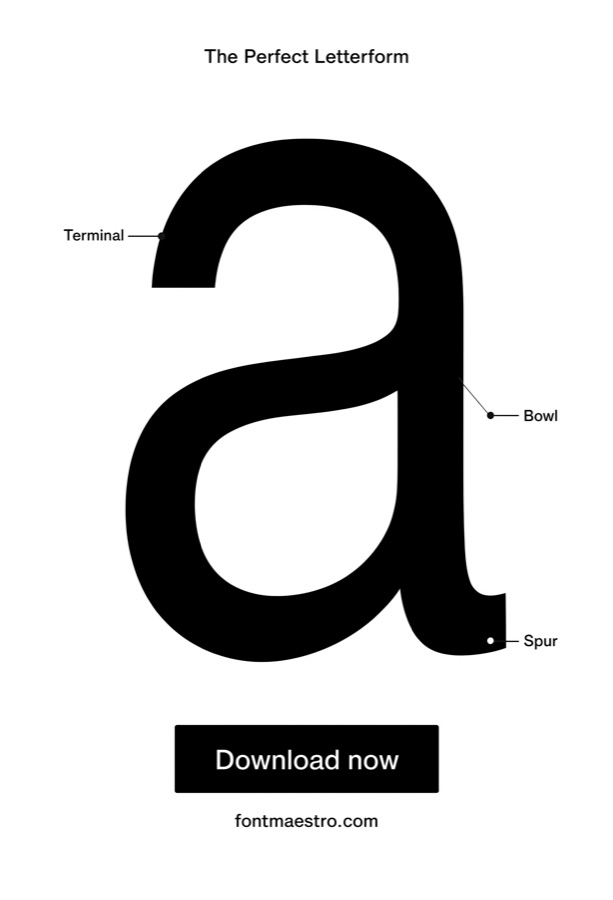 Commercial License
Single Letterform Close-Up
Best for evaluating construction quality up close. A single letter blown up large exposes exactly how a typeface was drawn, the terminal angles, the stroke geometry, the optical corrections. This is the level of detail most people never look at, and it’s where Neue Helvetica’s careful construction actually shows.
 Commercial License
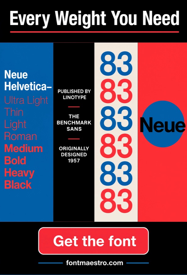
Weight Range Comparison
Best for understanding what a full family actually offers. Seeing Light through Black side by side shows how much design flexibility comes from one typeface family, different moods and hierarchy levels without switching fonts and risking a mismatched pairing.
 Commercial License
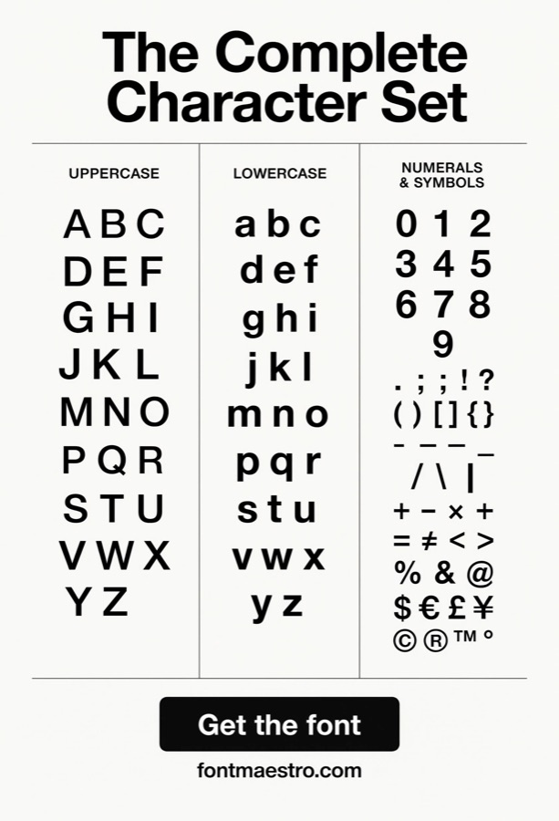
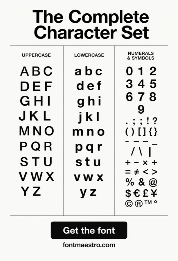
Full Alphabet Character Set
Best for spotting consistency across every character. This is the real test of a typeface, not the hero letters everyone shows off, but whether the “z,” the “&,” the numerals, and the punctuation all feel like they belong to the same family. Neue Helvetica holds that consistency across the entire set.
Unlimited creative assets. Access to AI tools.
Commercial licence included.
Get downloads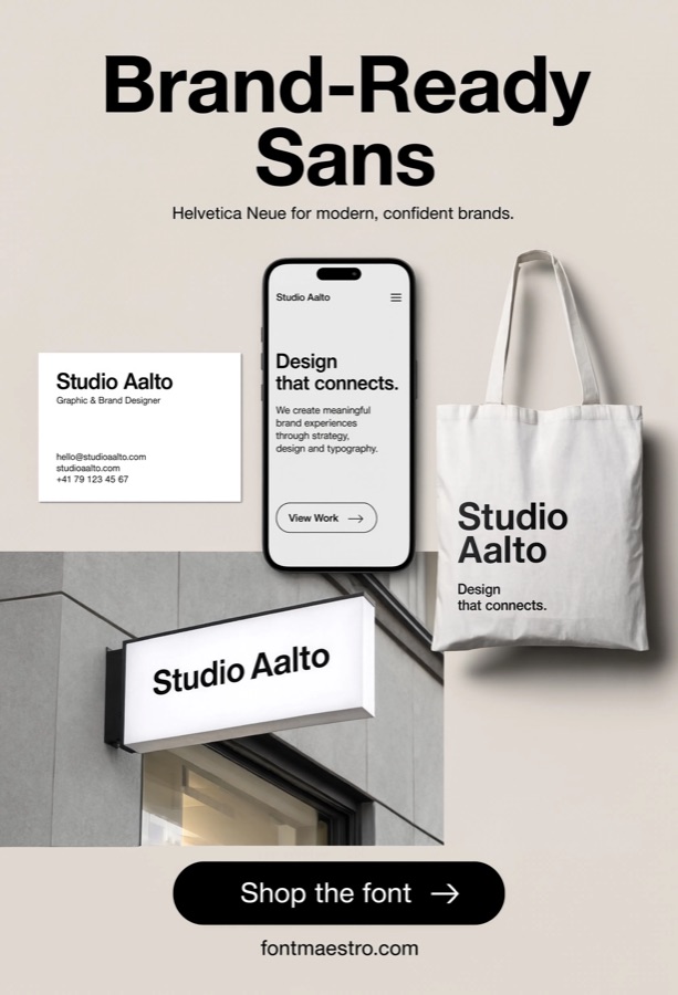 Commercial License
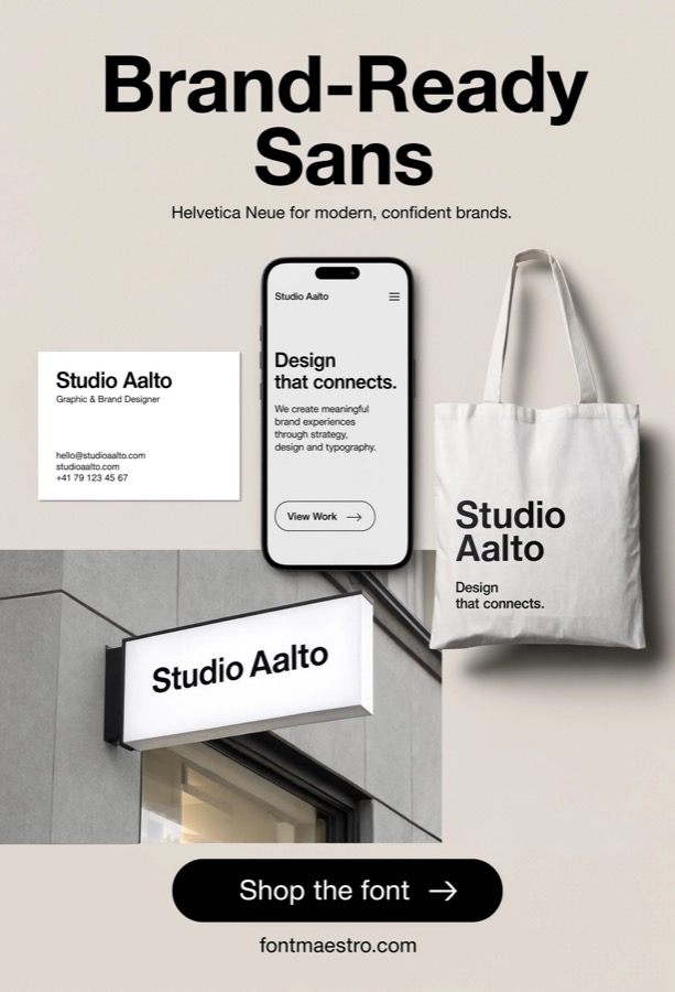
Real Branding Application
Best for seeing letterforms in actual use, not just a specimen. A typeface’s quality is easiest to judge in context, set into a logo, a business card, a real layout. This is where Neue Helvetica’s neutrality becomes an asset instead of a limitation: it supports the brand instead of competing with it.
 Commercial License
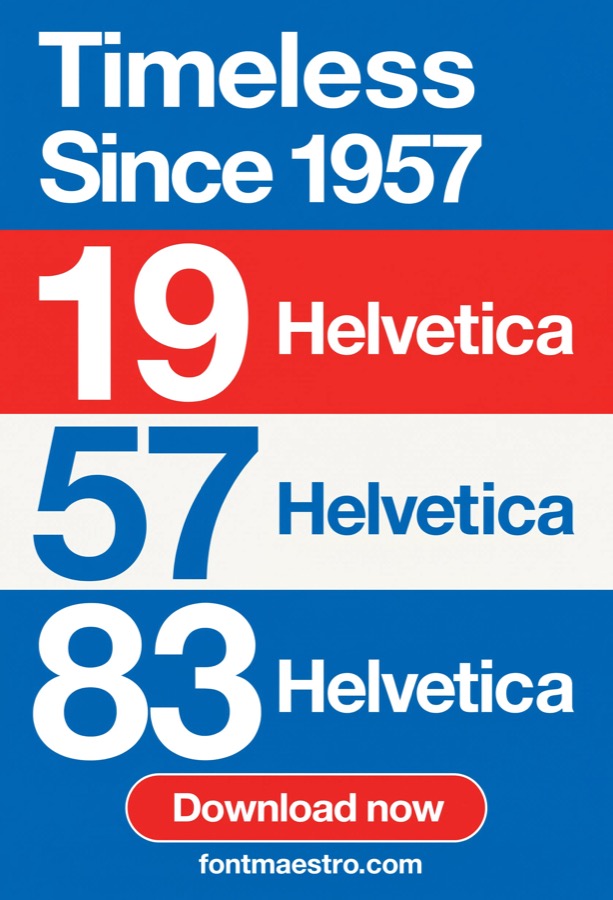
Color & Contrast Testing
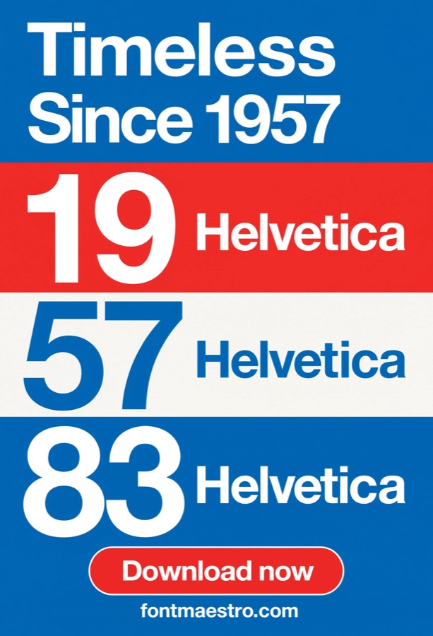
Best for checking legibility across different backgrounds. A well-constructed letterform should read cleanly against light, dark, and saturated color backgrounds alike. Testing type against color bands before finalizing a design catches legibility problems early, rather than after print or launch.
 Commercial License
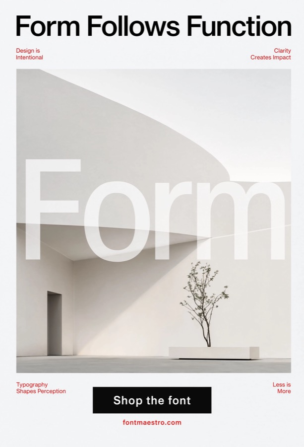
Large-Scale Poster Display
Best for confirming a typeface holds up at true full scale. Specimen sheets and screen previews don’t always predict how a font performs printed several feet wide. A poster-scale test is the final check, and it’s where the earlier claims about consistent stroke weight and optical correction actually get proven out.
Unlimited creative assets. Access to AI tools.
Commercial licence included.
Get downloads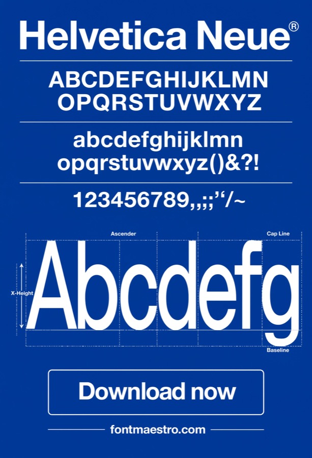 Commercial License
Cool-Tone Specimen Rendering
Best for evaluating letterform edges against a cool blue background instead of the usual black-on-white specimen. Most specimen sheets default to black text on white, which can hide subtle edge softness that shows up against color. Viewing the same letterforms rendered in blue tones exposes how clean the stroke edges actually are once high-contrast black-and-white isn’t doing the work.
 Commercial License
Close-Up Logo Construction Detail
Best for scrutinizing exact letter spacing and stroke junctions in a finished logo. This zooms further in than viewing a logo in general branding context, it’s about examining the precise kerning and stroke junctions at the letter level, the details a designer checks before finalizing a wordmark, not how the logo reads on a business card from arm’s length.
 Commercial License
Glyph-Level Terminal Inspection
Best for inspecting exactly where and how individual strokes terminate on specific letters. Rather than scanning the whole alphabet for general consistency, this is a magnified look at terminal cuts on individual glyphs like “c,” “e,” and “s”, the detail level where you can actually see whether those angles were drawn deliberately or left inconsistent.
Unlimited creative assets. Access to AI tools.
Commercial licence included.
Get downloads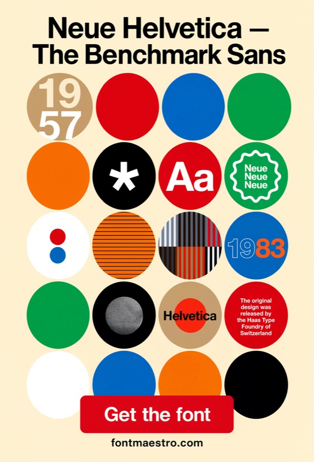 Commercial License
Optical Correction Comparison
Best for seeing the optical correction on round letters directly, side by side with square ones. This isolates one specific construction technique, showing a round letterform like “O” drawn very slightly larger next to a square one like “H” so the size difference that corrects for optical illusion becomes visible, rather than just describing the concept in text.
 Commercial License
Sequential Color Band Testing
Best for testing legibility across a full spectrum of color bands in sequence, not just light versus dark. Going further than a simple light/dark/saturated check, this tests the same letterform against a full sequential run of color bands, useful for confirming a typeface holds up across an entire brand palette rather than just the two or three most obvious background colors.
If you want to explore more options in this direction, our guide to Font For Letters is worth a look, and you may also enjoy Alphabet Font For Letters or Fonts For Letters for a different take on the same style.
 Commercial License
Stroke Geometry Poster Diagram
Best for an educational or diagram-style poster that illustrates how the letterform strokes are built. Unlike a display poster meant purely for visual impact, this format is explanatory, annotated or diagrammed to show stroke geometry and construction logic, the kind of reference material used in type design education or a detailed brand style guide.
Unlimited creative assets. Access to AI tools.
Commercial licence included.
Get downloads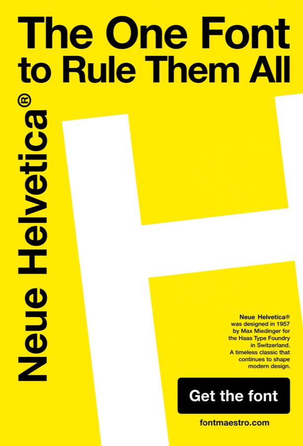 Commercial License
Extreme Scale Stress Test
Best for confirming letterform integrity at scales well beyond a normal poster, building-scale or billboard-scale references. This pushes past standard poster testing into genuinely extreme scale, the range where even small construction flaws become impossible to miss. It’s the final stress test before committing a letterform to something as permanent and large as building signage or a billboard.
 Commercial License
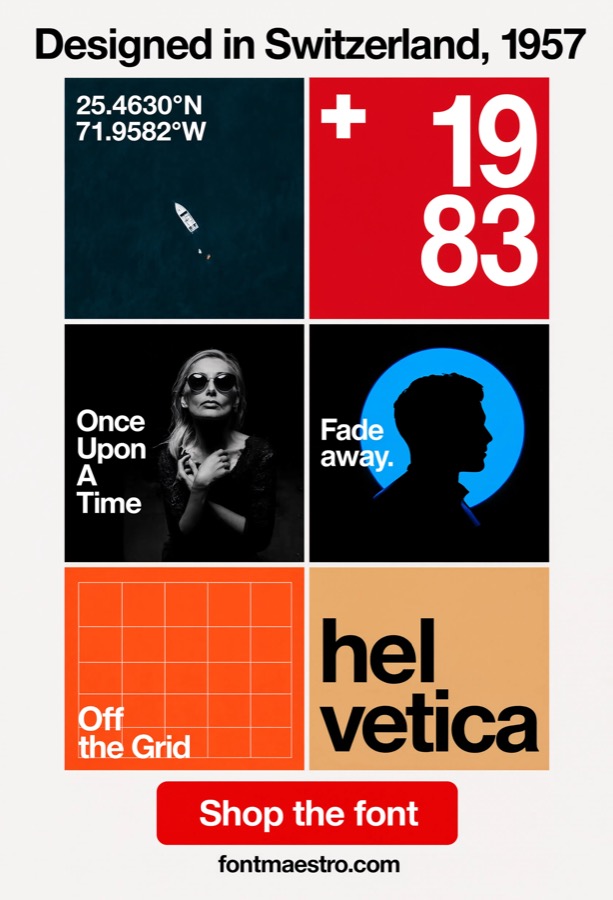
Grid-Constrained Poster Layout
Best for a poster where the composition is dictated by a visible or implied grid, not free placement. This differs from a straightforward large-scale display poster by adding a structural constraint, every element locked to grid lines rather than placed freely. It’s a good reference for how disciplined grid alignment interacts with a close-up, detail-focused typeface study.
 Commercial License
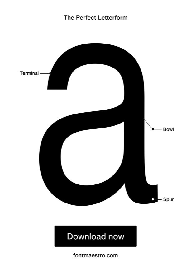
Apex & Crossbar Detail Study
Best for examining one of the hardest letters to draw well, the apex point and crossbar height of a capital A. The capital A is a known trouble spot in type design, get the apex too sharp or the crossbar height wrong and the letter looks off-balance next to the rest of the alphabet. A close study of this specific letter shows why Helvetica’s version reads as stable rather than awkward.
Unlimited creative assets. Access to AI tools.
Commercial licence included.
Get downloads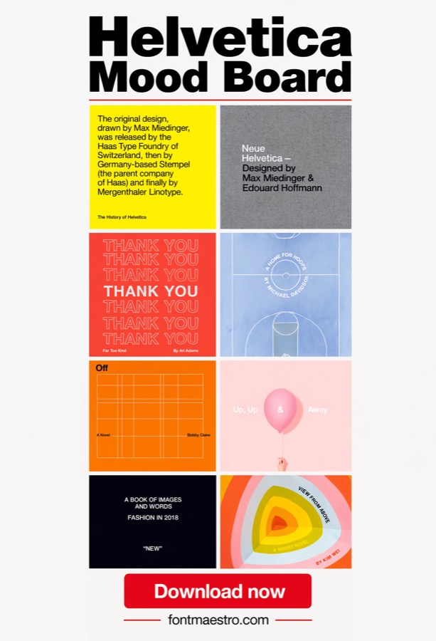 Commercial License
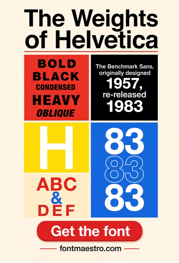
Detail-Focused Material Board
Best for presentation boards that use cropped, zoomed letterform fragments as the visual content itself. Rather than showing full words or sentences, this style of board uses tight crops of individual strokes and curves as design elements, turning the letterform’s construction quality into the visual subject of the board rather than just the message carrier.
 Commercial License
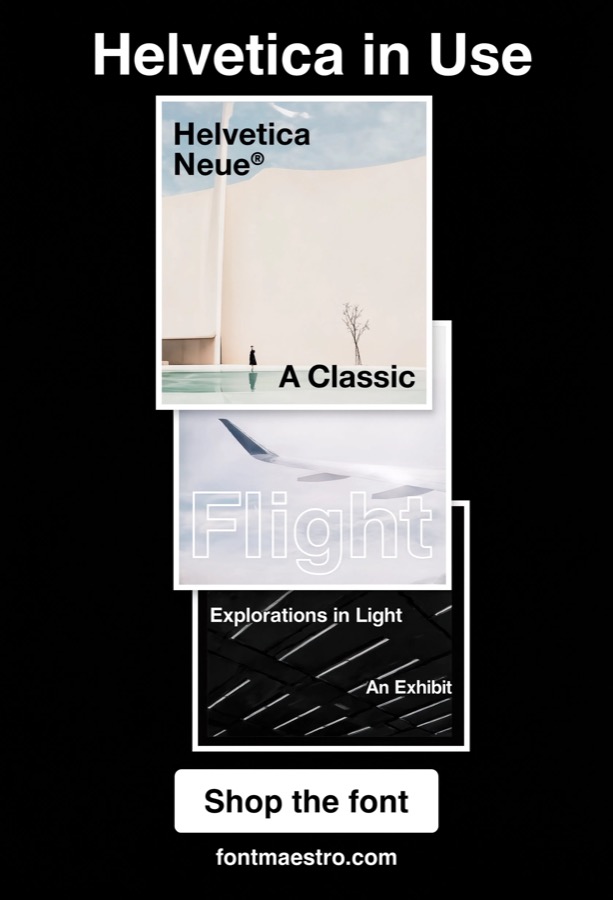
Gallery Wall Poster Arrangement
Best for planning how multiple posters look arranged together as a gallery wall, not evaluated individually. Posters that look fine individually can clash once grouped, inconsistent letterform weight between pieces becomes obvious in a gallery arrangement in a way it never would displayed alone. Pulling every piece from one family avoids that mismatch.
 Commercial License
Detail Crop Poster Series
Best for a poster series where the imagery itself is a zoomed letterform crop rather than a full word or headline. This treats the letterform’s construction detail as the poster’s subject matter, not just its typography, a stylistic choice that only works if the underlying letterform is precise enough to hold up as the primary visual when blown up and cropped tight.
Unlimited creative assets. Access to AI tools.
Commercial licence included.
Get downloads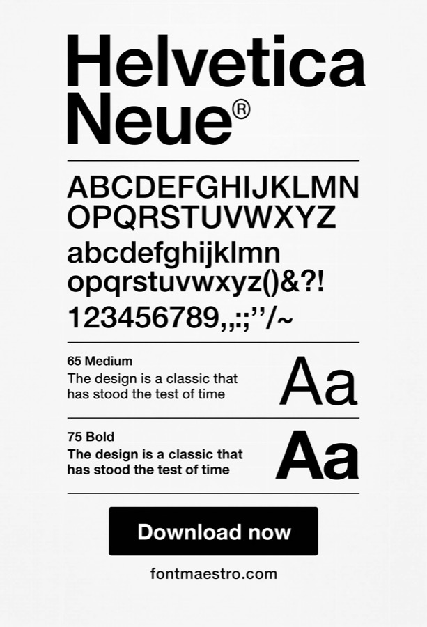 Commercial License
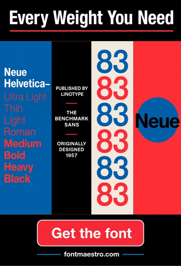
Full-Family Detail Specimen
Best for a single reference document combining zoomed construction detail with the complete weight lineup. This combines two things usually shown separately, magnified construction detail and the full weight range, into one full specimen document, useful as a complete reference when evaluating whether to commit to the full family for a project.
 Commercial License
Adjacent-Weight Stroke Comparison
Best for comparing two adjacent weights closely to judge whether the visual jump between them is enough for hierarchy. Rather than viewing the entire weight range at once, this narrows in on two neighboring weights side by side, useful for confirming whether, say, Regular and Medium are different enough to use together for hierarchy, or too close to read as distinct.
 Commercial License
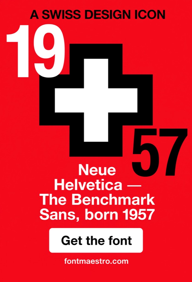
Cross-Motif Construction Detail
Best for examining how a cross or plus-shaped graphic element relates structurally to the typeface’s own stroke geometry. Some Swiss-influenced identity systems build a cross or plus motif directly from the typeface’s stroke proportions rather than as a separate graphic element. A close-up study of that relationship shows whether the motif and the letterforms actually share consistent proportions or just happen to sit near each other.
See Neue Helvetica on MyFonts →
Which detail should you look at first?
- Evaluating any font’s construction quality → Single Letterform Close-Up. Zoom in before you commit to a whole project.
- Planning a hierarchy across a layout → Weight Range Comparison. See the full range before picking which weights to use.
- Confirming consistency before purchase → Full Alphabet Character Set. Check the letters nobody shows off in a preview.
- Seeing how it performs in real work → Real Branding Application. Context reveals more than a specimen sheet.
- Testing legibility across backgrounds → Color & Contrast Testing. Catch problems before print or launch.
- Confirming scale performance → Large-Scale Poster Display. The final test before a big print run.
- A specimen rendered specifically in blue tones, distinct from general weight specimens → Cool-Tone Specimen Rendering. Color exposes edge softness that black-on-white can hide.
- A macro view of how a logo’s letterforms are constructed, distinct from the full branding-in-context card → Close-Up Logo Construction Detail. Zooms into kerning and stroke junctions, not the logo in context.
- Zooming into terminal angles on specific glyphs, distinct from full alphabet consistency review → Glyph-Level Terminal Inspection. Magnified terminal cuts on specific glyphs like c, e, and s.
- Specifically illustrating the optical size correction on round letters, distinct from general close-up study → Optical Correction Comparison. Round letters sit slightly larger than square ones, visibly here.
- Testing across a full gradient sequence of color bands, distinct from general contrast testing → Sequential Color Band Testing. Tests a full sequential color range, not just light versus dark.
- A diagram-style poster illustrating stroke construction, distinct from a display poster → Stroke Geometry Poster Diagram. Annotated construction logic, not a display-only poster.
- Testing a single letter at an extreme, poster-exceeding scale, distinct from standard poster display → Extreme Scale Stress Test. Scale well beyond a normal poster, where flaws can’t hide.
- A poster locked to a strict underlying grid, distinct from the large-scale display poster card → Grid-Constrained Poster Layout. Every element locked to grid lines, not placed freely.
- A specific study of the letter A’s apex and crossbar construction, distinct from the general single-letterform close-up → Apex & Crossbar Detail Study. The apex and crossbar of capital A, a known trouble spot.
- A mood board built around close-up letterform crops rather than full-word specimens → Detail-Focused Material Board. Cropped strokes and curves become the visual content itself.
- Multiple posters arranged together on a wall, distinct from a single large-scale poster → Gallery Wall Poster Arrangement. Multiple posters grouped together expose weight mismatches.
- A poster series built specifically around close-up letterform crops as the imagery, distinct from full-word posters → Detail Crop Poster Series. The imagery itself is a zoomed letterform crop, not a full word.
- A full specimen combining close-up crops with full weight range, distinct from the standalone weight comparison → Full-Family Detail Specimen. Combines construction detail with the complete weight lineup.
- Comparing two neighboring weights side by side at the stroke level, distinct from the full light-to-black range card → Adjacent-Weight Stroke Comparison. Two neighboring weights compared to judge hierarchy contrast.
- A close-up study of a cross or plus-shaped motif built from the letterform, distinct from general geometric icon pairing → Cross-Motif Construction Detail. A cross motif built from the letterform’s own stroke proportions.
Looking for more type direction? Our Swiss modernist grid guide covers the design history behind this typeface, and our block letters guide covers legibility at signage scale.
Frequently Asked Questions
What makes Helvetica’s letterforms different from a generic sans-serif?
The precision of its construction, consistent terminal angles, optical size corrections on curved letters, and even stroke geometry across the entire character set, details that are easy to overlook until you compare it side by side with a less carefully drawn font.
How many weights does Neue Helvetica actually include?
The family spans a wide range from ultra light through black, plus condensed and extended widths, check the MyFonts product page for the exact weight and width lineup included in the specific package you’re purchasing.
Is Neue Helvetica considered a “cool” or trendy font, or is it too plain?
Its reputation isn’t built on trend, it’s built on construction quality and versatility, which is why it’s stayed relevant across seven decades while trend-driven fonts from the same eras have dated. “Cool” in this context means it never looks wrong, not that it makes a loud visual statement.
Can I preview individual letterforms before buying the full family?
MyFonts product pages typically include a character preview and a custom text preview tool, so you can test specific letters or words before purchasing.
Does the license allow using the font in a mockup or presentation for a client?
Generally yes for the mockup stage itself, a standard desktop license typically covers building and presenting design mockups internally or to a client for approval. Where it gets more specific is the final deliverable: if the client-facing presentation or the finished asset gets distributed beyond an approval meeting (posted publicly, printed at scale, embedded in a shipped product), that can cross into a different license tier. Check the desktop license’s presentation and mockup terms on the MyFonts product page before the deliverable moves past internal review.
What file formats come with a Neue Helvetica purchase?
Format availability (OTF, TTF, web font formats) depends on which license tier you purchase, desktop, web, and app licenses often include different file types, so check the product page for the exact formats bundled with your purchase.
Key Takeaways
- Letterform quality shows up in details most people never examine closely, terminal angles, optical corrections, stroke consistency.
- A wide weight range (light through black) gives more design flexibility than picking multiple unrelated fonts for hierarchy.
- Always check the full character set, not just the hero letters shown in a specimen preview.
- File formats and use-case coverage (desktop, web, app, client presentation) vary by license tier, confirm before purchase.
About the Author: Font Maestro tests and reviews fonts for real-world use, Canva projects, Cricut cuts, and everyday branding, calling out what looks good on paper but breaks down in practice.




