Search “font for letters” and you get thousands of results promising the perfect alphabet typeface. Most of them are decorative — great for a headline, useless the moment you need consistent letterforms across a whole brand, a poster series, or a grid layout.
There’s a reason type foundries keep coming back to one family whenever letterforms actually need to hold up under pressure: Neue Helvetica. It’s not flashy. That’s the point — every letter is drawn to work at any size, in any weight, next to any other letter, without calling attention to itself.
Quick answer: If you need a font built specifically around clean, consistent letterforms — not a novelty alphabet — Neue Helvetica is the reference standard. Below are six ways its letterforms actually get used, from single-letter monograms to full grid systems, so you can see where it fits before you commit.
Why “letters” is the wrong word for most alphabet fonts
A lot of fonts marketed for “letters” are really display fonts with 26 characters — designed to look good as a standalone word, not as a system. They break down the moment you need a lowercase “a” and a lowercase “e” to feel like they belong to the same family, or a heavy weight and a light weight to line up on the same grid.
Neue Helvetica solves that differently. It was built as a full family — dozens of weights and widths, all drawn from the same underlying skeleton — specifically so letterforms stay consistent no matter which weight or size you pull from.
Three things to check before picking any “font for letters,” Helvetica included:
Weight range. One weight is rarely enough for a real project — you need at least a regular and a bold that actually match, not two unrelated fonts pretending to be a family.
x-height consistency. If the lowercase letters look cramped or oversized next to the capitals, the font wasn’t drawn as a cohesive system — it’ll show in body text.
Licensing for your use case. Web embedding, print, and app UI licenses aren’t always bundled together. Check what MyFonts includes before you build a whole project around it.
Each example below shows a different practical use for letterform-driven design work — not just what the font looks like in a specimen sheet, but where it actually earns its place.
Unlimited creative assets. Access to AI tools.
Commercial licence included.
Get downloads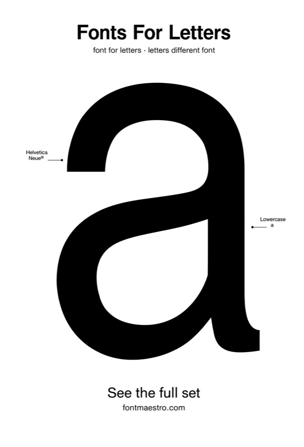 Commercial License
Bold Single-Letter Display
Best for monograms and oversized initials. A single bold letter, blown up large, is where letterform quality is hardest to hide — every curve and terminal is on display at full size. Helvetica’s bold weight holds its shape even when scaled to poster size, which thinner alphabet fonts can’t do without looking hollow.
 Commercial License
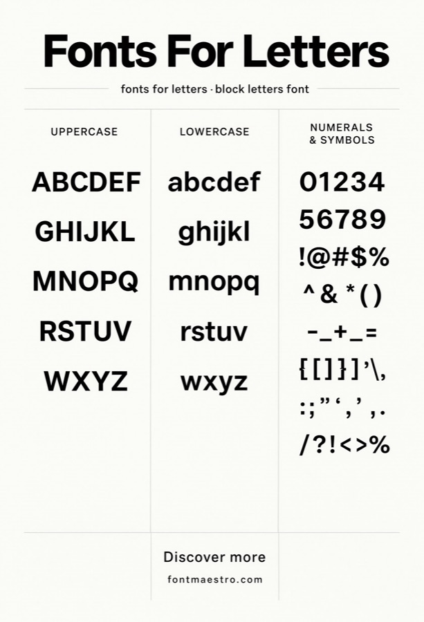
Full Character Set / Glyph Panel
Best for checking consistency before you commit. Before using any letters font across a real project, look at the full character set laid out together — not just a handful of hero letters. This is where mismatched x-heights and inconsistent stroke weights get exposed. Neue Helvetica’s full set stays even across every character.
 Commercial License
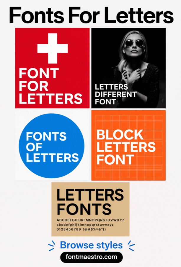
Grid & Poster Systems
Best for editorial layouts and modular grids. Letterform fonts get tested hardest in grid-based design — headlines, captions, and body copy all sharing one typeface across a strict column structure. This is Neue Helvetica’s original use case, and it’s still where it performs best: neutral enough to not compete with the grid itself.
Unlimited creative assets. Access to AI tools.
Commercial licence included.
Get downloads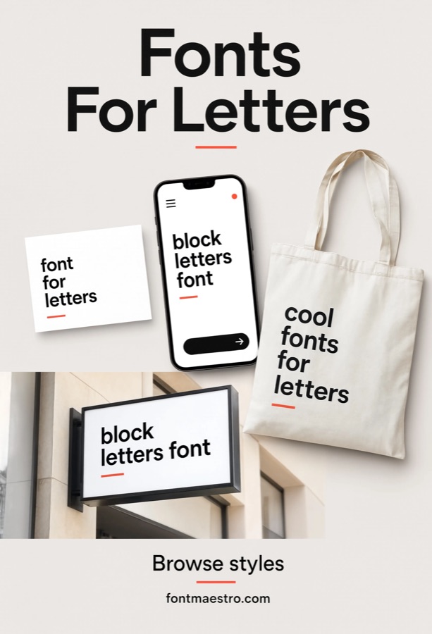 Commercial License
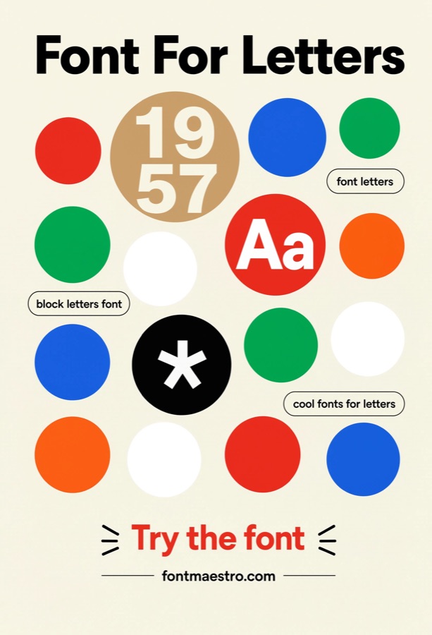
Branding & Logo Mockups
Best for wordmarks that need to read as timeless, not trendy. A logo built on solid letterforms ages better than one built on a display trend. Helvetica shows up in more corporate identity systems than almost any other typeface for exactly this reason — it doesn’t date the brand around it.
 Commercial License
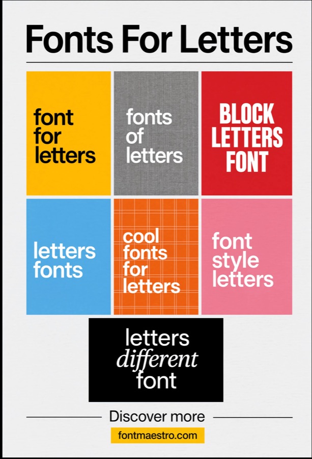
Circular & Badge Layouts
Best for stamps, seals, and badge-style marks. Letters set inside a circle or badge shape need even stroke weight in every direction — a font with inconsistent thick-and-thin strokes will look lopsided the moment it’s curved or centered inside a shape. Helvetica’s uniform stroke width holds up here.
 Commercial License
Mood Boards & Style Presentations
Best for pitching a typeface before final layout. When you’re presenting type direction to a client or team, a mood board built around consistent letterforms communicates the tone faster than a single specimen line. Neutral letterforms like Helvetica’s photograph well against texture and color, which is why they show up so often in these boards.
Unlimited creative assets. Access to AI tools.
Commercial licence included.
Get downloads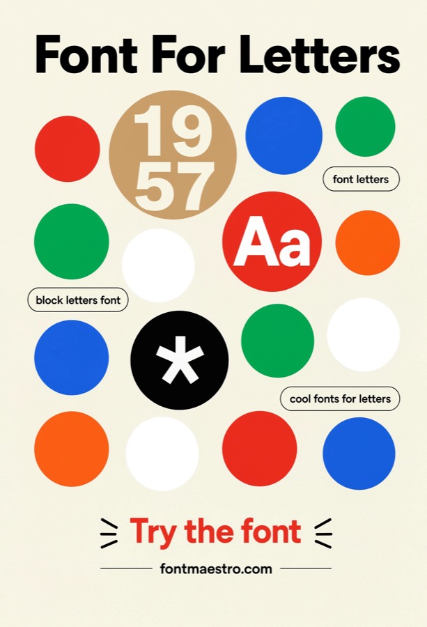 Commercial License
Concentric Circle Compositions
Best for layout experiments built around concentric rings rather than a single stamp shape. A composition using several nested circles asks more of a letterform than one badge does — the letters have to hold their shape while repeated at different scales within the same piece. Neue Helvetica’s consistent stroke weight keeps every ring legible instead of the smallest one blurring into a smudge.
 Commercial License
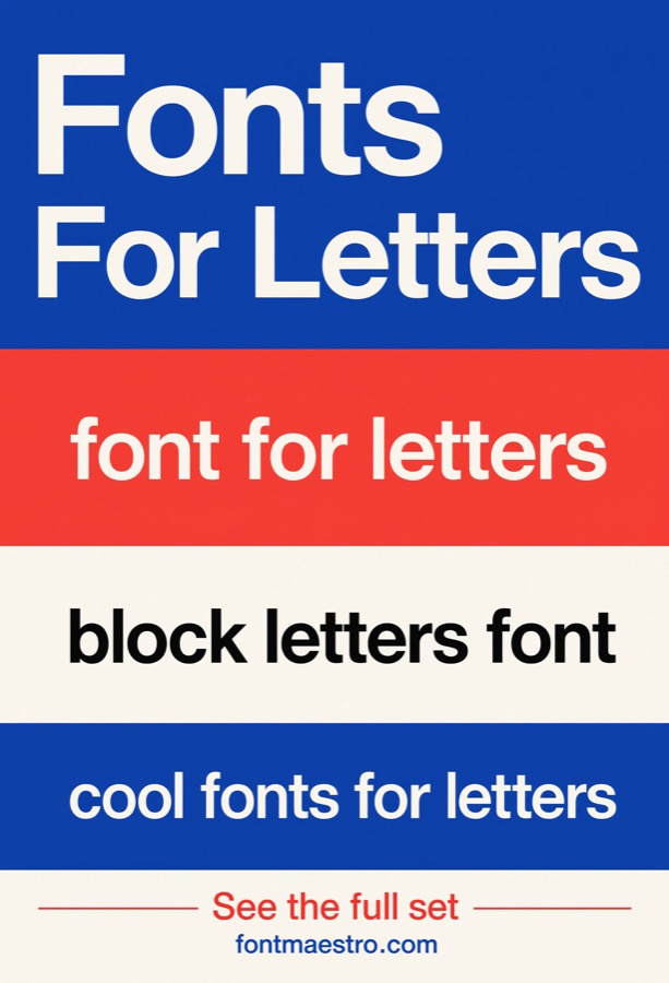
Striped Band Typography
Best for layouts where letterforms sit across repeating horizontal stripes. Running text or a headline across alternating color bands tests whether a letterform keeps its shape when parts of it sit on different-colored backgrounds. Helvetica’s even stroke geometry means the letter reads as one continuous shape rather than fragmenting where the bands change color.
 Commercial License
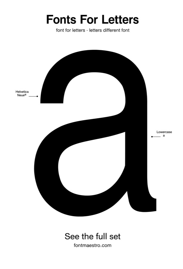
Poster-Scale Capital Study
Best for minimalist posters built around one dominant capital letter filling the frame. Unlike a monogram paired with other design elements, a poster built around one capital letter has nothing else to carry the composition — proportion and stroke consistency are the entire visual. Helvetica’s capitals were drawn to hold that kind of scrutiny without looking hollow or lopsided.
If you want to explore more options in this direction, our guide to Fonts For Letters is worth a look, and you may also enjoy Alphabet Font For Letters or Cool Fonts For Letters for a different take on the same style.
Unlimited creative assets. Access to AI tools.
Commercial licence included.
Get downloads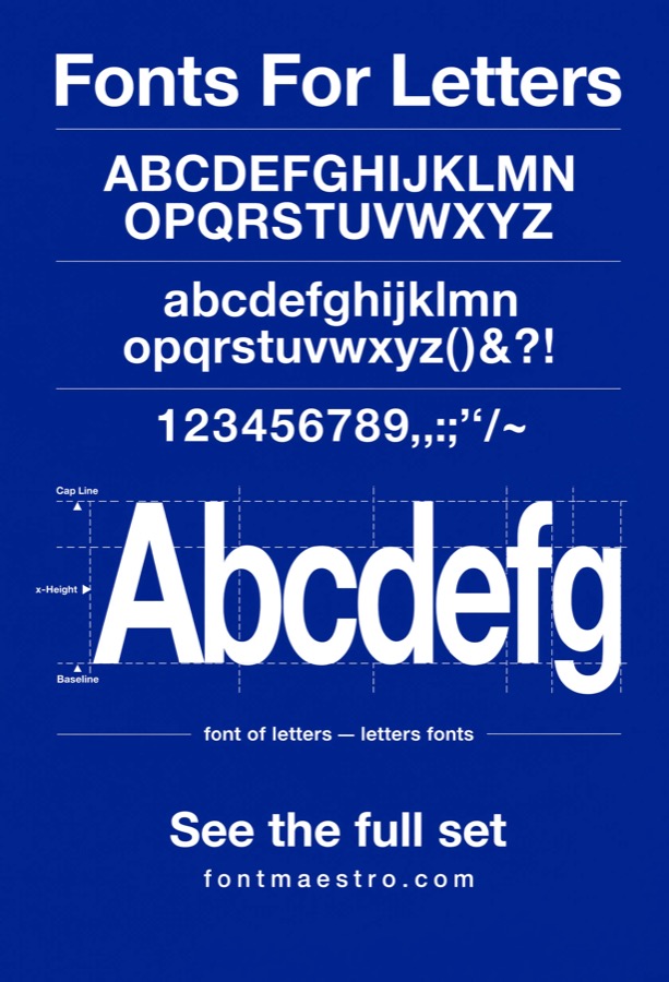 Commercial License
Cool-Tone Palette Testing
Best for brand or web palettes built around blue and cool tones. Cool color palettes can wash out thin or low-contrast letterforms, especially on screen. Testing a typeface against a blue-dominant palette before finalizing a design catches legibility issues that don’t show up against a neutral white background.
 Commercial License
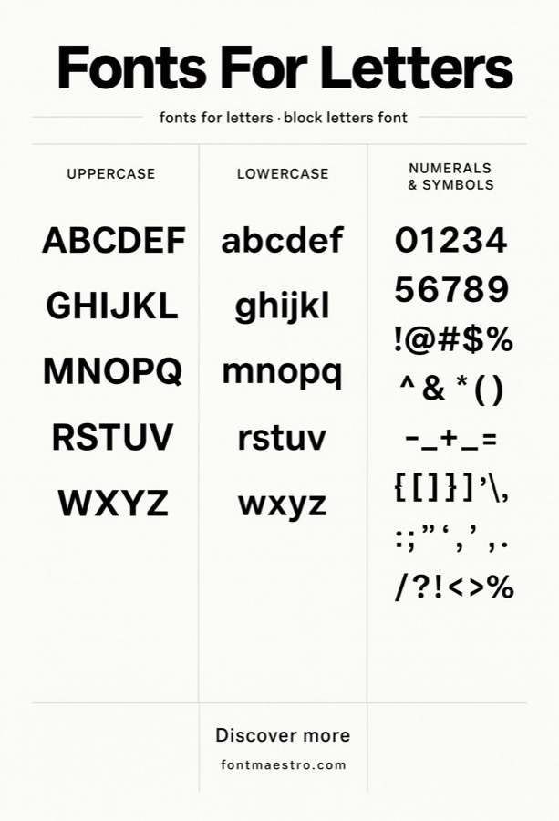
Numeral & Punctuation Check
Best for projects that lean heavily on numerals — pricing, dates, data displays. Most people judge a font by its letters and forget to check numerals and punctuation, which often get less design attention in cheaper fonts. Neue Helvetica’s figures are drawn with the same care as its letters, so a phone number or price doesn’t look like an afterthought next to the headline.
 Commercial License
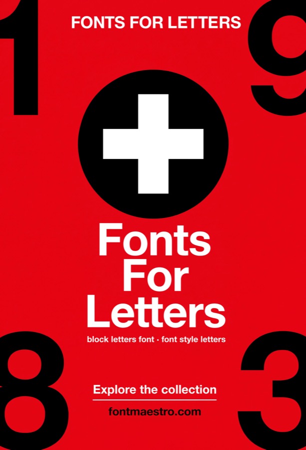
Cross-Axis Grid Composition
Best for compositions built around a crossing or plus-shaped structural axis rather than parallel columns. A cross-axis layout — type radiating from a central intersection rather than stacked in columns — puts extra strain on how letterforms read at odd angles and junctions. Helvetica’s uniform stroke weight keeps the composition legible from whichever direction the eye enters it.
Unlimited creative assets. Access to AI tools.
Commercial licence included.
Get downloads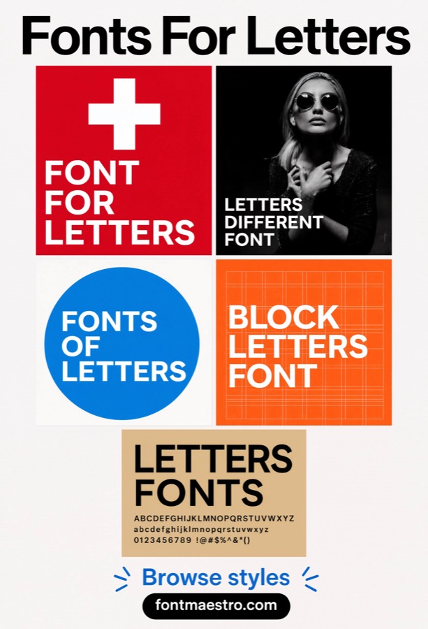 Commercial License
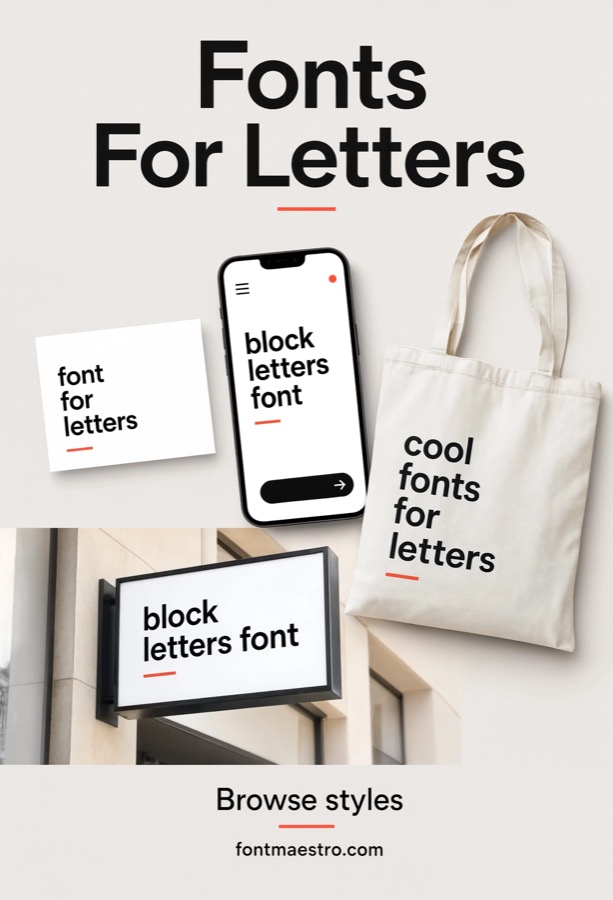
Multi-Poster Grid Series
Best for a poster set where every piece shares the exact same underlying grid, not just the same font. This goes a step further than a single grid layout — it’s about keeping type placement, margins, and column widths identical across an entire series so the pieces read as one system when displayed together. Consistent letterforms across every weight make that repetition feel intentional rather than repetitive.
 Commercial License
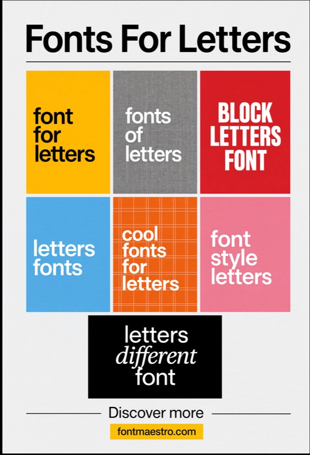
Product Packaging Mockup
Best for previewing letterforms on curved or dimensional packaging surfaces. Packaging mockups distort type across folds, curves, and different material textures in ways a flat print mockup doesn’t. Testing letterforms in this context shows whether the font still reads cleanly once it’s wrapped around a box or bottle, not just printed flat.
 Commercial License
Texture & Material Pairing
Best for design directions that pair typography with tactile, physical materials. Placing type against real material textures — raw wood, fabric weave, poured concrete — is a different test than a color-based mood board. It shows whether a letterform’s clean geometry contrasts well against organic texture, which matters for packaging and interior branding work.
Unlimited creative assets. Access to AI tools.
Commercial licence included.
Get downloads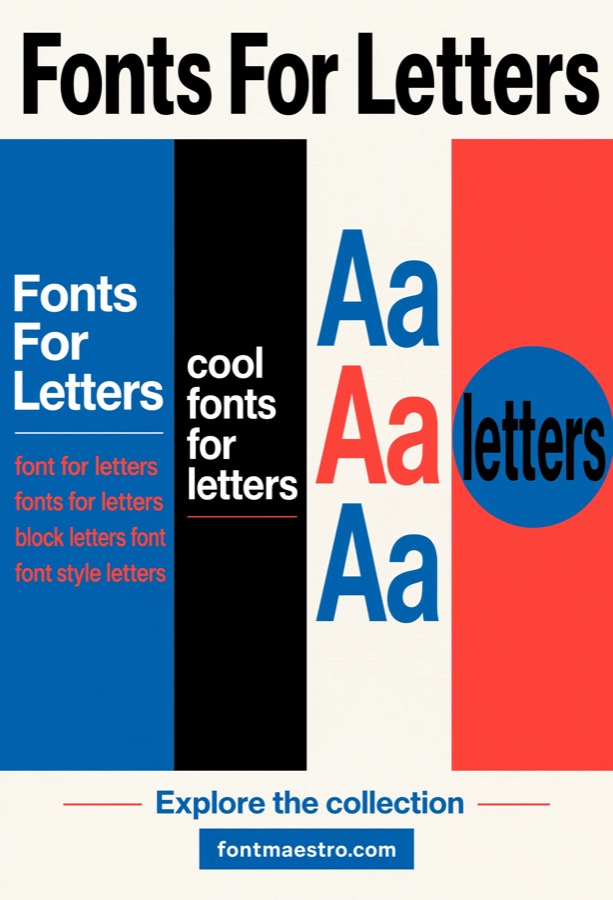 Commercial License
Sequential Panel Layout
Best for instructional content or sequential storytelling laid out in panels. A panel-based sequence needs letterforms that stay instantly recognizable in small repeated doses across many frames, without becoming visually tiring. Helvetica’s neutral shapes hold up across dozens of repetitions in a way more characterful display fonts don’t.
 Commercial License
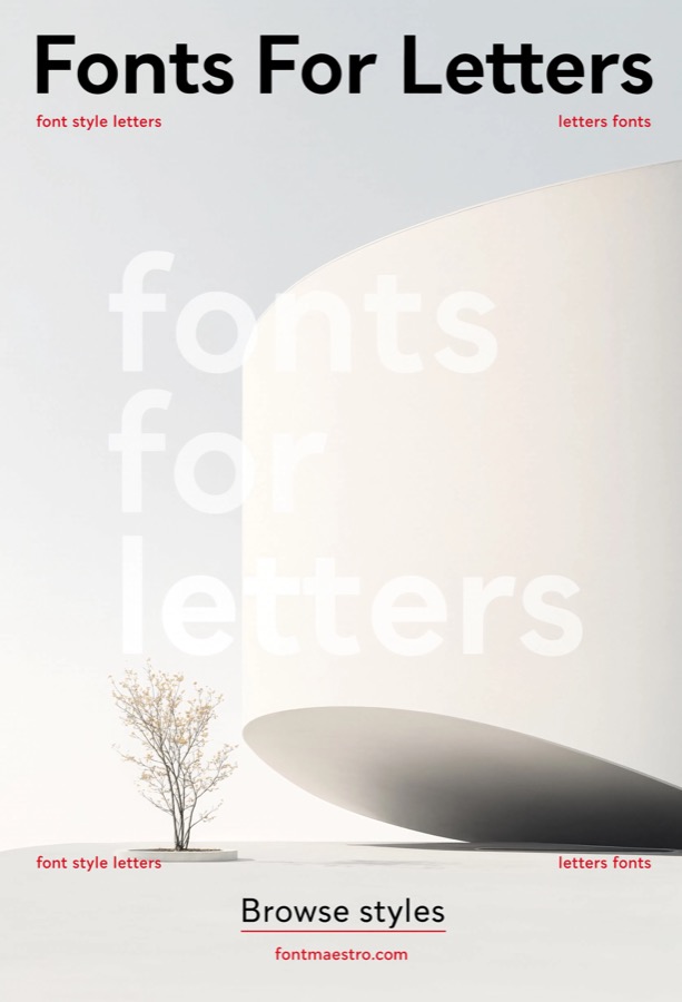
Photo Overlay Typography
Best for headlines or captions set directly over photographic imagery. Type over a photo has to compete with real-world detail, shadow, and color variation instead of a flat, controlled background. A letterform with even stroke weight and clean edges stays readable across the uneven contrast of a photograph in a way thinner or more decorative fonts struggle with.
 Commercial License
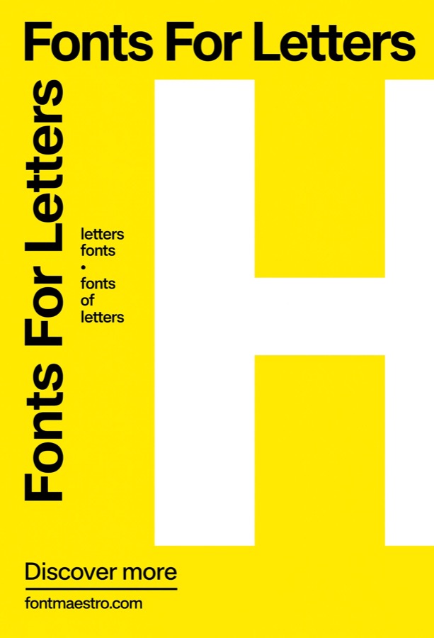
Two-Tone Accent Typography
Best for designs that isolate one letter or word in an accent color against a neutral palette. Splitting a headline into a neutral color plus one accent color — often yellow for maximum contrast — is a common way to draw the eye without adding decoration. It only works if the base letterform is clean enough that the accent color reads as emphasis, not a mismatch.
See Neue Helvetica on MyFonts →
Which use case matches your project?
- A monogram or single oversized initial → Bold Single-Letter Display. Test at the largest size you’ll actually use.
- Deciding if a font is consistent enough to commit to → Full Character Set. Always check the whole alphabet, not a few hero letters.
- An editorial layout or strict grid system → Grid & Poster Systems. This is the use case the letterforms were originally built for.
- A logo or wordmark meant to last → Branding & Logo Mockups. Neutral letterforms don’t date as fast as trend-driven ones.
- A badge, seal, or circular mark → Circular & Badge Layouts. Even stroke weight matters more here than anywhere else.
- Presenting type direction to a client → Mood Boards. Consistent letterforms photograph better against texture.
- A layered ring composition, not a badge → Concentric Circle Compositions. A layered look built on repetition, not a single badge shape.
- Type running across horizontal color bands → Striped Band Typography. Confirms the letterform survives being crossed by color stripes.
- A single capital used as the entire poster composition → Poster-Scale Capital Study. Proportion is the entire composition when nothing else is on the page.
- Checking legibility against blue and cool color schemes → Cool-Tone Palette Testing. Cool palettes can wash out weak strokes — check before finalizing.
- Verifying numbers and symbols match the letterform quality → Numeral & Punctuation Check. Numerals matter as much as letters when pricing or data is involved.
- A plus-shaped or crossing grid layout, distinct from a straight column grid → Cross-Axis Grid Composition. Legibility from odd angles matters more than in a straight-column grid.
- A set of posters unified by one repeating grid template → Multi-Poster Grid Series. One grid template repeated across an entire series, not just one poster.
- Type applied to a packaging or product surface, not a wall or print mockup → Product Packaging Mockup. Curved, dimensional surfaces distort type differently than flat prints.
- Letterforms placed against physical material textures — wood, fabric, concrete → Texture & Material Pairing. Shows how clean geometry reads against raw, organic texture.
- A multi-panel sequence — comic-style or step-by-step instructional layout → Sequential Panel Layout. Small repeated doses across many frames need to stay recognizable.
- Type layered directly on top of a photograph, not a flat color mockup → Photo Overlay Typography. Real photographic detail is a harder background than flat color.
- A single accent color (like yellow) used to highlight part of a letterform or word → Two-Tone Accent Typography. One accent color should read as emphasis, not a mismatch.
Looking for more type direction? Our free fonts roundup covers budget-friendly picks, and our Canva font pairing guide has more on combining typefaces.
Frequently Asked Questions
What’s the actual difference between Helvetica and Neue Helvetica?
Neue Helvetica is a 1983 redrawing of the original 1957 Helvetica, with corrected proportions and a more systematic weight and width structure across the whole family. Visually they’re close, but Neue Helvetica’s letterforms are more consistent from weight to weight — which matters if you’re using multiple weights in one project.
Is Neue Helvetica the same as the free system font that comes with my computer?
No. Most operating systems ship a substitute (like Arial or Helvetica Neue’s system-installed subset) rather than the licensed Linotype family sold on MyFonts. The licensed version includes the full weight range and proper hinting for print and professional design work — the system substitute doesn’t.
Can I use Neue Helvetica for a client logo or commercial branding project?
For a logo or wordmark, licensing typically separates desktop use (designing the mark) from broader trademark or brand-system rights — a standard desktop license usually covers design work, but a logo intended for wide commercial reproduction (packaging, signage, merchandise) may need a higher tier. Linotype/Monotype list these tiers separately on the MyFonts product page, so confirm which one matches how far the logo will travel before you finalize a brand identity around it.
Does Neue Helvetica include enough weights for a full brand system?
Yes — the family spans multiple weights from ultra light through black, plus condensed and extended widths, which is unusually broad for a single typeface family and is a large part of why it’s used as a system font in corporate identity work.
Will Neue Helvetica work for both print and web/app use?
The family is available in formats suited to both, but print, web-embedding, and app licenses are typically separate products on MyFonts — confirm the license covers your specific output before publishing.
Why do designers keep recommending Helvetica when there are newer geometric sans fonts?
Newer geometric sans fonts often prioritize a distinct visual personality, which can date a project. Helvetica’s letterforms were deliberately drawn to be neutral, so it doesn’t compete with content or trend out — which is why it’s still a default choice for grid-heavy and editorial work decades later.
Key Takeaways
- A “font for letters” needs consistent letterforms across every weight and character, not just a good-looking hero word.
- Always check the full character set before committing — mismatched x-heights show up fastest in body text, not headlines.
- Neue Helvetica’s neutral letterforms are why it keeps showing up in grid systems, branding, and badge work decades after release.
- Licensing for web, print, and app use is often sold separately — confirm coverage on the MyFonts product page before publishing.
About the Author: Font Maestro tests and reviews fonts for real-world use — Canva projects, Cricut cuts, and everyday branding — calling out what looks good on paper but breaks down in practice.




