Font Maestro
- Fonts
- By Theme
- All fonts
- Wedding and invitations 1225
- Christmas and winter 752
- Kids, cartoon and bubble 621
- Halloween and horror 337
- Retro, groovy and western 282
- Logo and branding 238
- Tech, gaming and futuristic 187
- Sports and varsity 163
- Gothic, blackletter and tattoo 86
- Boho, botanical and doodle 68
- Book covers, posters and editorial 22
- Crafts, shirts and signs 11
- Works With
- Font Pairings
- Blog
Skip to content

Fonts We Like
Hand-picked fonts worth installing — script and calligraphy faces for signatures and invitations, display faces that carry a poster on their own, clean sans and serif families for body text, and decorative sets for the one word that has to stand out. Search by name, or sort the way you would sort a type shop: by popularity, newest, rating, saves or A-Z.
Barlon
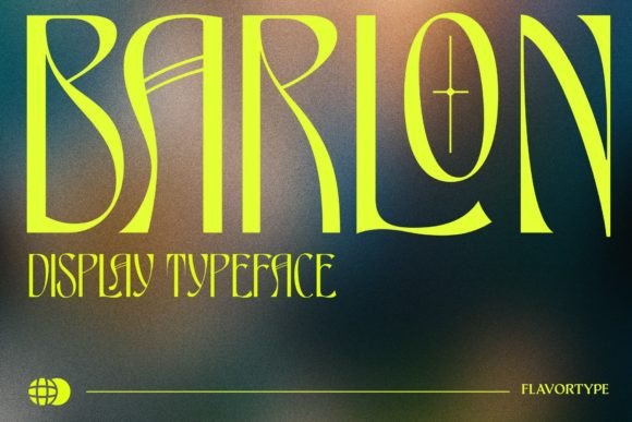
Art-nouveau revival by way of the seventies: tall, curving, decorative capitals. Striking in a headline, unreadable in a sentence. One review, five stars.
See itHalftone Printer
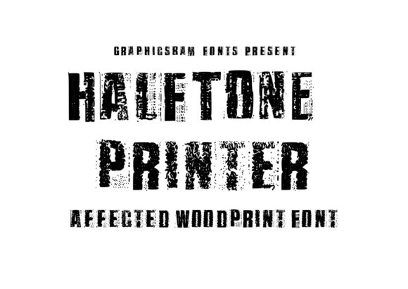
Halftone dots are part of the letterforms, so it prints like a comic panel. One five-star review. Vector-wise it is heavy, keep that in mind before…
See itComic Heroes
See itBold Graffiti
See itSurprisee
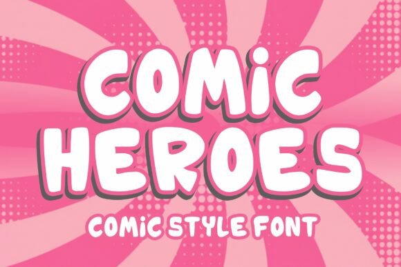
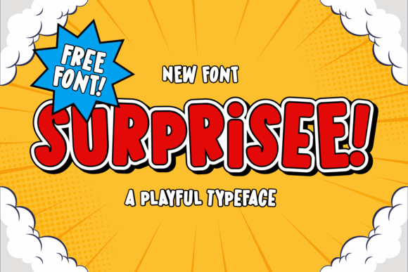
Comic display, bold and groovy, with a free tier from the author. Good for a punchline word rather than a whole headline: at length the exaggerated…
See itSwanky Turnip
See itFur Real
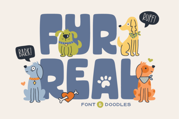
All-caps animal-themed block lettering, chunky and friendly. SVG files included, and the solid strokes make it one of the safer cut options on this shelf.
See itYeyey
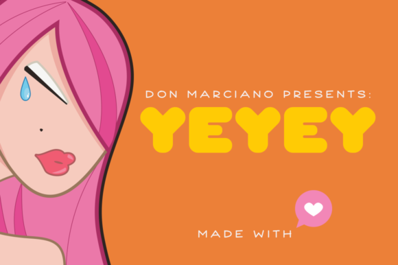
Bold display that sells itself for apparel and book covers. Solid single weight, no thin parts, which is what makes it survive a screen print.
See itVintage Essence
See itScholar Varsity
See itVictory
Athletic lettering with eight reviews at five stars, which is a strong record for a sports face here. SVG files included, and the block forms weed…
See itAkroma
See itCollege
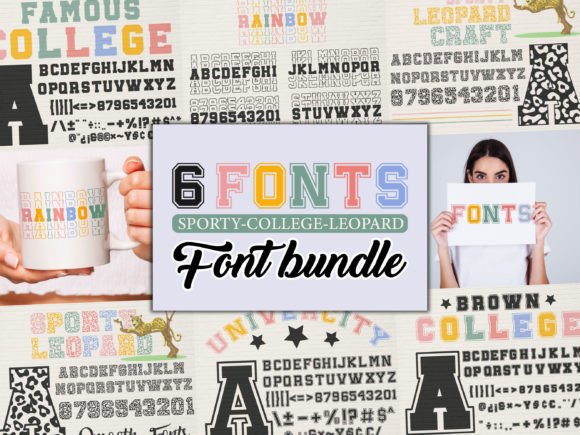
Varsity lettering with a cursive companion in the same bundle, which is why it gets used on team shirts and school projects more than anything else…
See itSports
See itSports Ball
See itTattoo Nobaga
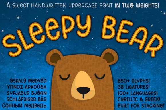
See itSleepy Bear
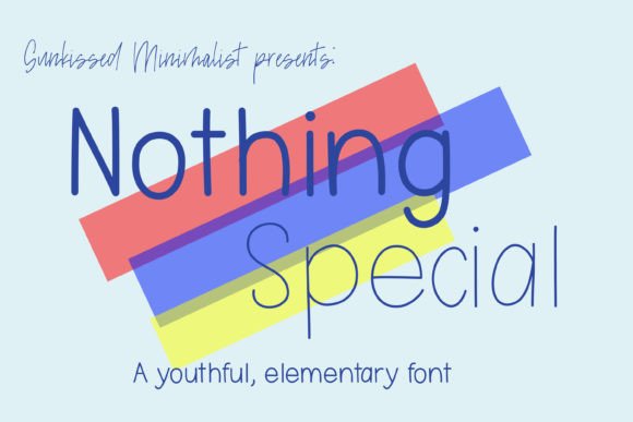
See itNothing Special
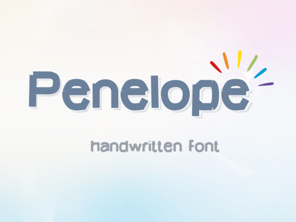
See itPenelope
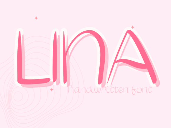
See itLina
See itKhedelic
See itHello Rodeo
See itShengxio Kids
See itPixelvanta
See itRetro Game
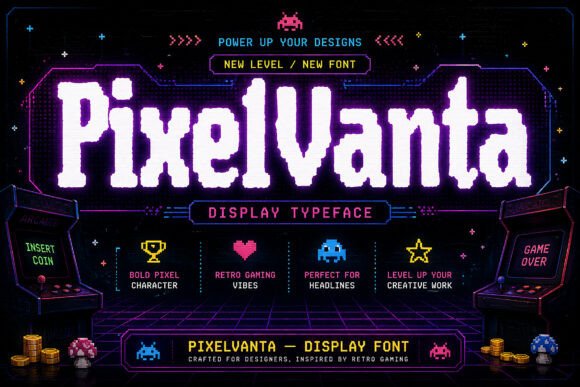
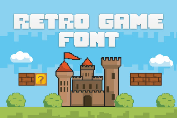
Arcade lettering drawn from the cabinet era: square corners, even strokes, no curves to speak of. Works for gaming invites and anything that wants an eight-bit…
See itSuper Jersey
See itCampus Stamp
See itRetro Groovy
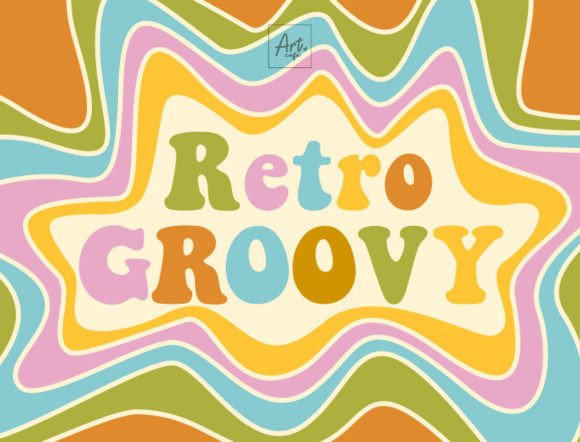
Seventies display with fat rounded strokes and tight spacing. Twenty-four reviews, all but a couple at five stars, which is the deepest feedback in this corner…
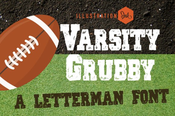
See itVarsity Grubby
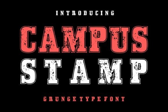
Varsity letters with grunge texture already applied, aimed at coaches, soccer and back-to-school prints. The distress is part of the glyph, so it survives being scaled…
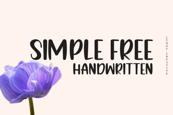
See itSimple Free
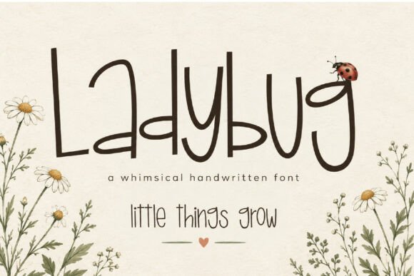
See itLadybug
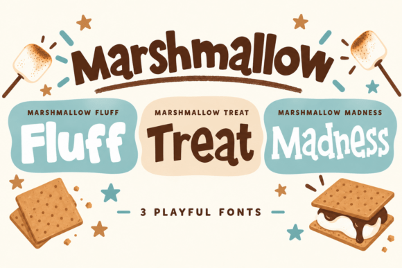
See itMarshmallow Trio
See itJack Sprat
See itMarigold
See it