Search “fonts for letters” long enough and the same reference keeps coming up: Swiss modernism. The International Typographic Style, built in Switzerland in the 1950s, set the rules that most grid-based, legibility-first design still follows today, and Neue Helvetica is the typeface that style was built around.
You don’t need to care about design history to use it well. But understanding what the Swiss grid tradition was actually solving for explains why this particular alphabet still outperforms newer, flashier fonts in layout-heavy work.
Quick answer: Swiss-style modernist design depends on a typeface with zero visual noise, no personality competing with the grid or the content. Neue Helvetica was engineered for exactly that role, and the six examples below show how that principle plays out in real layouts.
What the Swiss grid tradition actually demands from a typeface
Swiss modernist design (also called the International Typographic Style) is built on strict grid systems, generous white space, and sans-serif type set with mathematical consistency. The typeface itself isn’t supposed to have a “voice”, it’s infrastructure, not decoration.
That’s a harder brief than it sounds. A font needs to:
Disappear into the grid. No stylistic flourishes that pull attention away from the layout’s structure, the grid does the visual work, not the letterforms.
Stay legible at every scale the grid requires. Headlines, captions, and body copy in the same family, all reading cleanly at their respective sizes.
Hold up across decades of use without looking dated. Trend-driven fonts age visibly. Neutral, well-constructed letterforms don’t, which is a large part of why Neue Helvetica still anchors editorial and wayfinding design today.
The six examples below trace that principle from typeface specimen through to finished modernist layouts.
Unlimited creative assets. Access to AI tools.
Commercial licence included.
Get downloads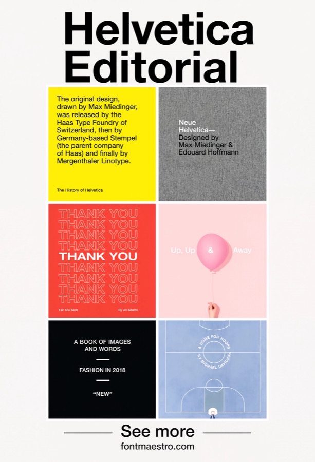 Commercial License
Editorial Grid Layouts
Best for magazine-style and long-form layouts. Editorial design lives or dies on grid discipline, columns, margins, and type all locking into a consistent system. Neue Helvetica’s neutral letterforms let the grid carry the visual weight instead of competing with it.
 Commercial License
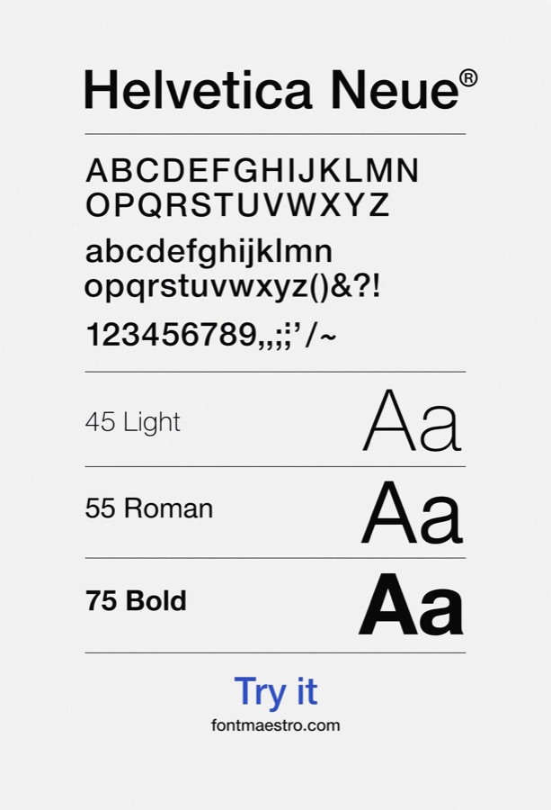
Full Weight Specimen
Best for planning a hierarchy before you design. Seeing every weight of a family lined up together, light through black, makes it obvious which combinations will create clear visual hierarchy in a layout, and which weights are too close together to read as distinct.
 Commercial License
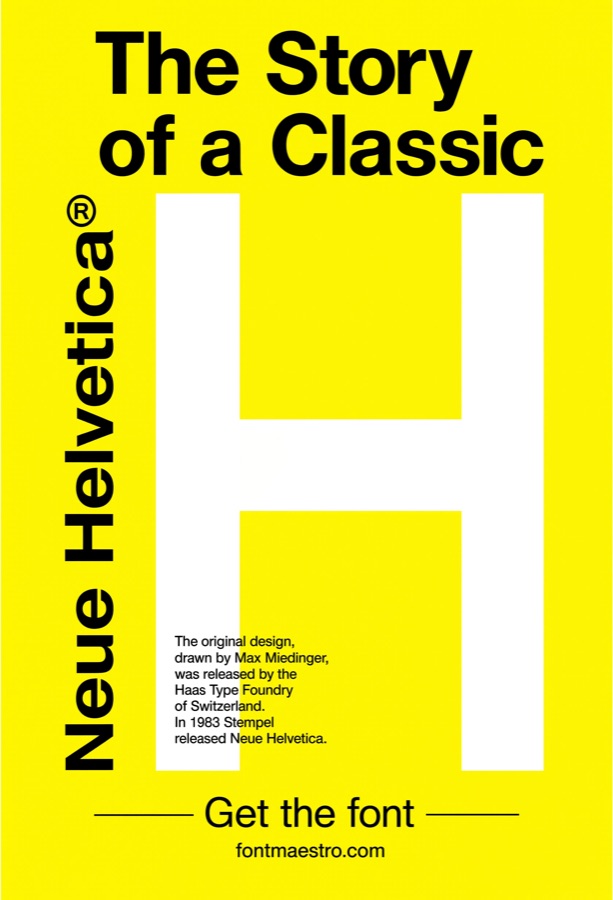
High-Contrast Color Blocking
Best for bold, poster-style modernist compositions. Swiss design isn’t always minimal, high-contrast color blocking with a single bold letterform is a recognizable branch of the same tradition. It works because the letterform itself stays structurally clean even against saturated color.
 Commercial License
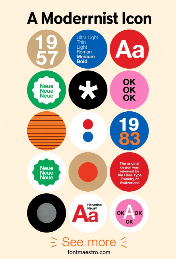
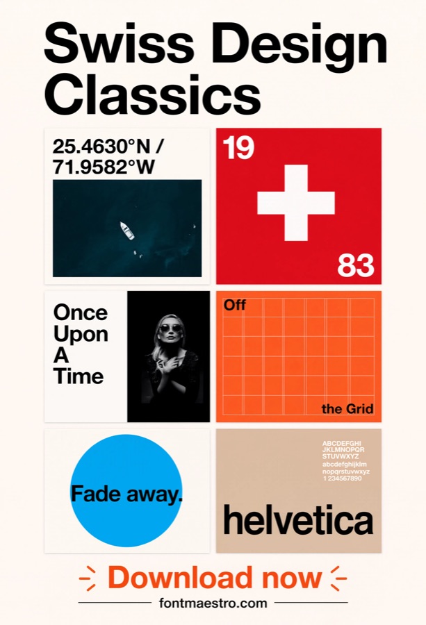
Geometric Icon Pairings
Best for combining type with geometric graphic elements. Modernist layouts often pair type with simple geometric shapes, circles, grids, bars. A neutral typeface keeps the composition feeling unified rather than like two competing design languages stitched together.
 Commercial License
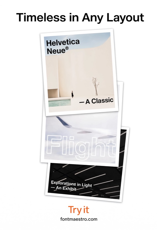
Strict Swiss Grid Systems
Best for wayfinding, transit, and information design. This is the use case the style was originally built for, signage systems where clarity has to survive distance, motion, and glancing attention. Neue Helvetica remains a default choice for transit and wayfinding design worldwide for this reason.
 Commercial License
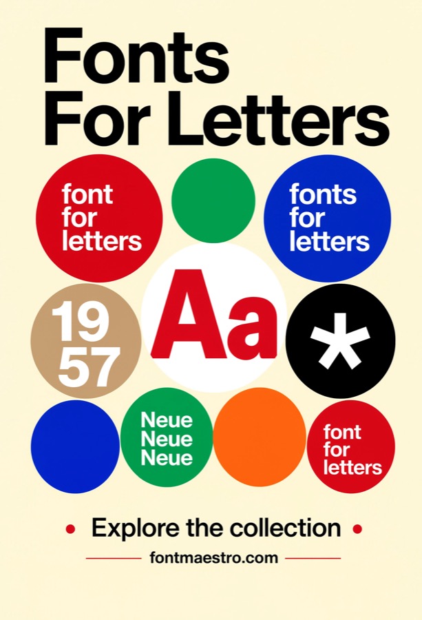
Timeless Poster Composition
Best for a design that needs to still look right in ten years. Trend-driven display fonts date a poster fast. A composition built on neutral, well-proportioned letterforms ages the way the original Swiss modernist posters have, still referenced and reproduced decades later.
 Commercial License
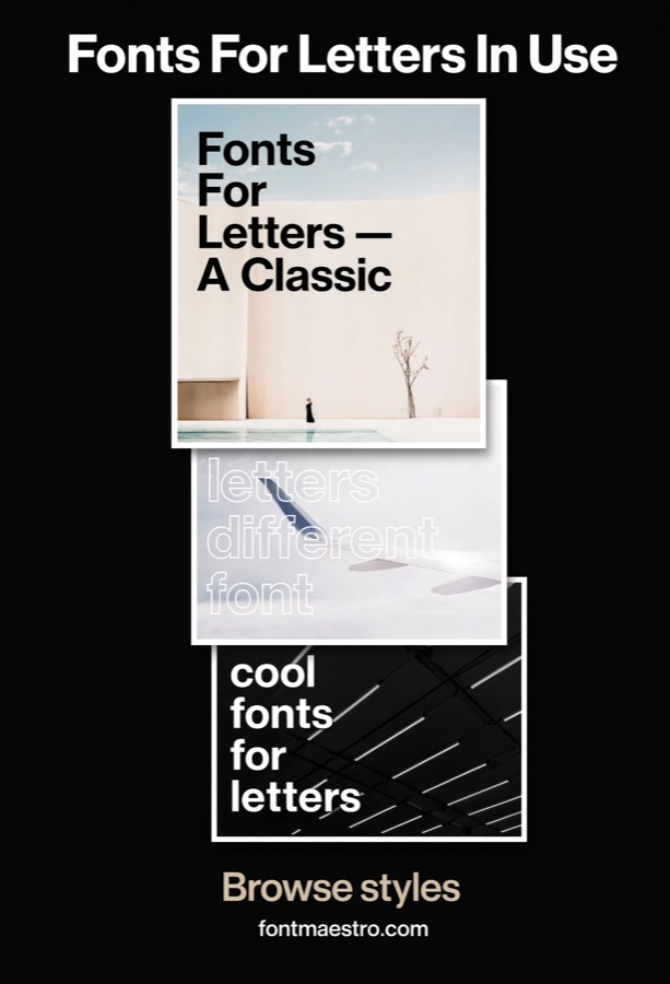
Concentric Ring Diagrams
Best for information diagrams built around concentric circles, schedules, cycles, comparison charts. Swiss information design leans heavily on circular diagrams for showing cycles, proportions, and time-based data. A neutral letterform keeps labels legible inside and around the rings without the type competing with the diagram’s own geometry for attention.
 Commercial License
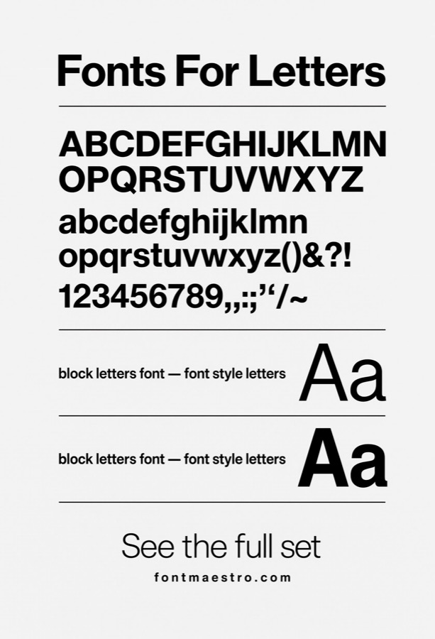
Single-Sheet Broadside Posters
Best for a single standalone announcement poster rather than a coordinated series. A one-off broadside, an event announcement, a lecture poster, a single-sheet notice, carries its entire message in one composition with no companion pieces to lean on. Clean, well-proportioned letterforms hold that weight without needing decorative support.
 Commercial License
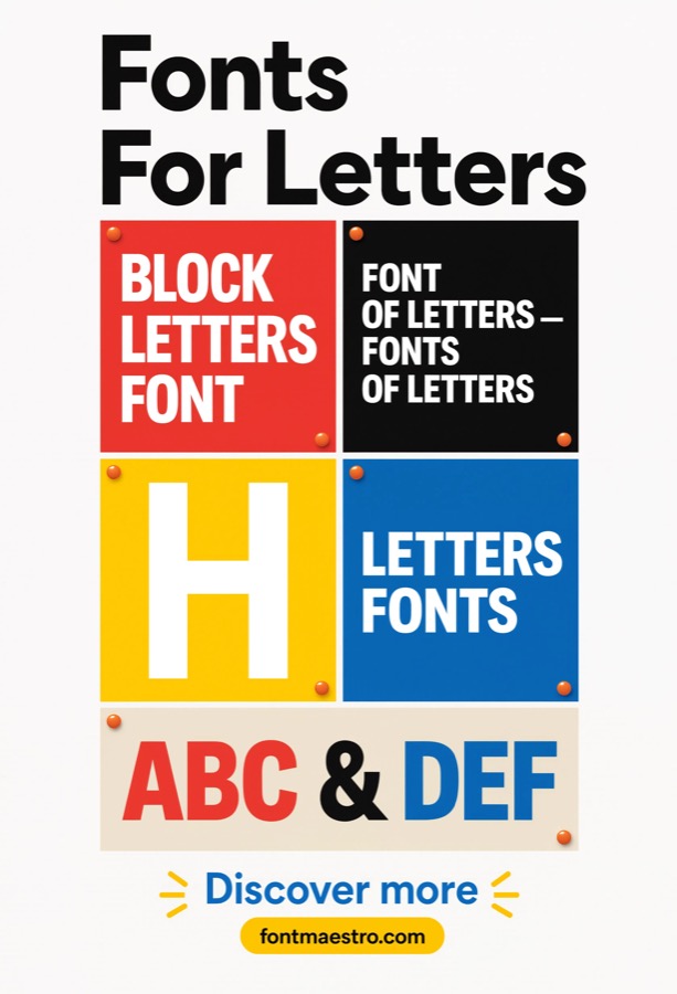
Type Specimen Publication Layout
Best for a formal type specimen publication, the kind foundries produce to show a family in print. A specimen publication does more than line up weights side by side, it demonstrates the typeface in running text, at multiple point sizes, and across different layout contexts within one document. This is the format Swiss foundries used historically to prove a typeface’s range, and it still works the same way today.
 Commercial License
Architectural Wall Typography
Best for large-scale typographic installations built into architecture or interior walls. This differs from signage in intent, it’s decorative and spatial rather than purely directional, often spanning an entire wall as part of an interior design scheme. Neutral letterforms integrate into architectural space without dating the interior the way a trend-driven display font would.
If you want to explore more options in this direction, our guide to Font For Letters is worth a look, and you may also enjoy Alphabet Font For Letters or Cool Fonts For Letters for a different take on the same style.
 Commercial License
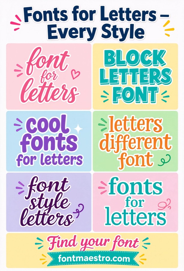
Modular Grid Component Testing
Best for checking how letterforms behave inside a single grid module before committing to a full-page layout. Testing type at the module level, one column, one cell of the grid, catches spacing and proportion problems early, before they get repeated across an entire multi-page layout. It’s a smaller, earlier-stage check than reviewing a finished grid system.
 Commercial License
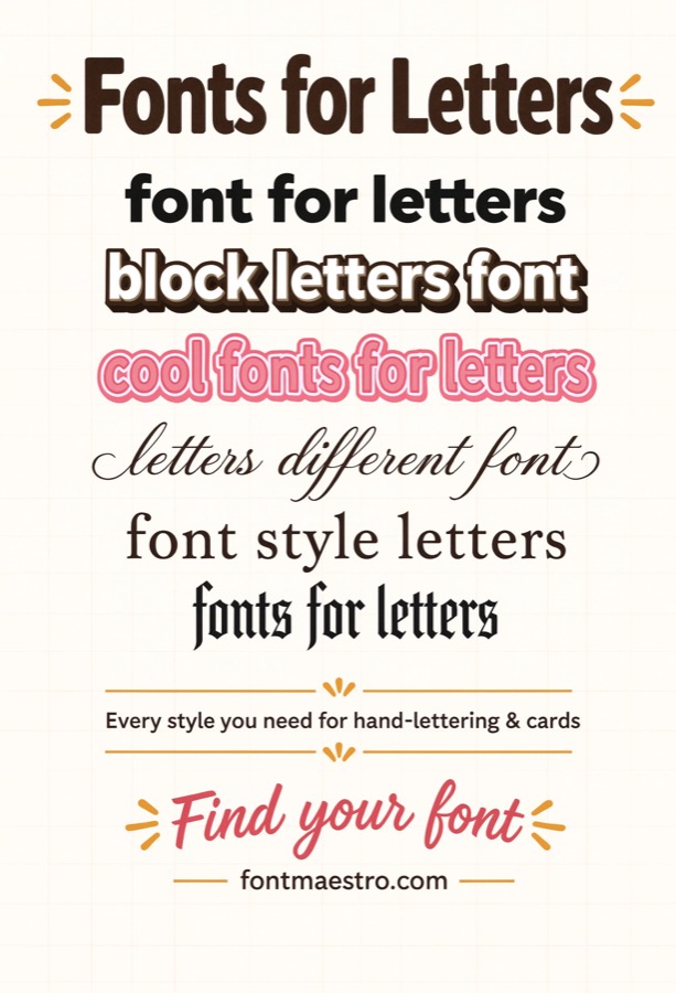
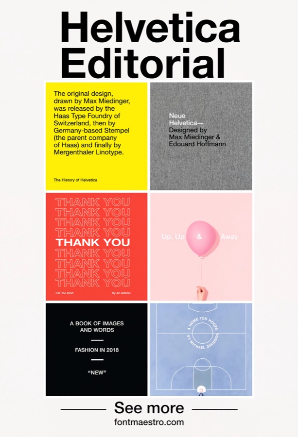
Minimalist Letterform Study
Best for evaluating letterforms with nothing else in the composition to lean on. Stripped of grid lines, color blocking, or supporting graphics, a pure letterform study shows exactly what the typeface itself contributes to a design, proportion, rhythm, and character, without any other element propping it up.
 Commercial License
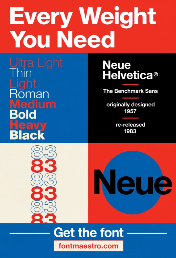
Multi-Page Magazine Spread
Best for spreads that span facing pages and need type to align across the gutter. A multi-page spread adds a constraint a single-column layout doesn’t have, headlines and columns need to align visually across the binding gutter. Neue Helvetica’s consistent x-height and baseline make that cross-page alignment easier to hold than with fonts that have more irregular proportions.
 Commercial License
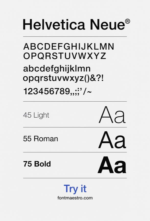
Three-Tier Hierarchy Pairing
Best for locking in one specific three-weight combination for headline, subhead, and body copy. This goes beyond viewing the full weight range, it’s about testing one committed pairing (for example Bold headline, Regular subhead, Light body) in an actual layout to confirm the contrast between tiers reads clearly at real point sizes, not just in a specimen chart.
 Commercial License
Condensed & Extended Width Testing
Best for layouts with tight column widths that need a condensed cut, or wide headline treatments that need extended. Width variants solve a different problem than weight variants, they let a design fit more or less text into the same horizontal space without changing the visual weight. Testing condensed and extended cuts separately from the light-to-black range confirms both axes hold up before finalizing a layout.
 Commercial License
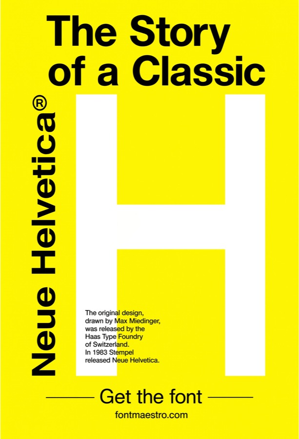
Single-Color Brand Accent System
Best for a brand or campaign system that commits to one signature accent color used consistently. This is a system-level decision rather than a one-off poster choice, picking a single accent color like yellow and applying it consistently across every piece in a campaign so the color itself becomes part of the brand’s identifiable structure, alongside the grid.
 Commercial License
Pictogram & Symbol Systems
Best for wayfinding or information systems that need a complete matched set of pictograms alongside type. Building a full pictogram system, dozens of consistent symbols, not just one icon, is a bigger undertaking than pairing type with a single geometric shape. A neutral typeface holds its own alongside an entire icon library without either the type or the symbols reading as mismatched in style.
 Commercial License
Underlying Grid Structure Diagram
Best for teaching or documenting how a Swiss grid is actually constructed, column by column. This shows the grid’s bones, the column and baseline structure itself, often with guide lines visible, rather than a finished wayfinding sign built on top of it. It’s the reference material designers use to understand why the grid works before applying it to real content.
 Commercial License
Archival Reprint Composition
Best for projects that deliberately reference the original 1950s-60s Swiss poster era. Rather than simply aiming for a design that ages well going forward, this use case looks backward, recreating the specific look of period Swiss posters for archival, educational, or nostalgic branding purposes. Neue Helvetica is the accurate typeface choice for that reference, since it’s the direct lineage of the type used in the originals.
See Neue Helvetica on MyFonts →
Which modernist approach fits your project?
- A magazine or long-form editorial layout → Editorial Grid Layouts. Let the grid carry the visual structure.
- Planning type hierarchy before you design → Full Weight Specimen. Line up every weight before choosing which ones to combine.
- A bold, high-impact poster → High-Contrast Color Blocking. Clean letterforms hold up even against saturated color.
- Pairing type with geometric graphics → Geometric Icon Pairings. Neutral type keeps the composition unified.
- Wayfinding or information design → Strict Swiss Grid Systems. The original use case, clarity has to survive distance and motion.
- A design meant to age well → Timeless Poster Composition. Neutral letterforms outlast trend-driven ones.
- Circular data or diagram compositions, distinct from icon pairings → Concentric Ring Diagrams. Labels need to stay legible inside and around the ring geometry.
- A one-page broadside poster, distinct from a multi-poster series → Single-Sheet Broadside Posters. One announcement carries its whole message with no companion pieces.
- A dedicated specimen booklet or publication page, distinct from the weight comparison card → Type Specimen Publication Layout. Shows range across running text and multiple sizes, not just a chart.
- Type integrated into architectural or interior wall surfaces, not signage → Architectural Wall Typography. Spans architecture and interior space, not a directional sign.
- Testing type within individual grid modules before full-page layout → Modular Grid Component Testing. Catches spacing problems early, before they repeat across a full layout.
- A pure typography study with no grid or color elements, isolating the letterforms themselves → Minimalist Letterform Study. Nothing else in the frame, the letterform is the entire study.
- A two-page or multi-page editorial spread, distinct from single-column editorial layouts → Multi-Page Magazine Spread. Headlines and columns need to align across the binding gutter.
- A specific headline/subhead/body three-weight pairing, distinct from the full weight specimen → Three-Tier Hierarchy Pairing. One committed weight pairing tested at real point sizes.
- Testing the condensed/extended width variants specifically, distinct from weight (light-to-black) testing → Condensed & Extended Width Testing. Condensed and extended solve space, not visual weight, differently.
- A defined single-accent-color system (yellow), distinct from general high-contrast color blocking → Single-Color Brand Accent System. One accent color applied consistently becomes part of brand structure.
- A full pictogram/icon system paired with type, distinct from single icon pairings → Pictogram & Symbol Systems. A full matched set of symbols, not a single paired icon.
- Showing the grid’s construction lines themselves, distinct from finished wayfinding application → Underlying Grid Structure Diagram. The column and baseline structure itself, before content is applied.
- A composition styled after historical Swiss poster reprints, distinct from a forward-looking timeless design → Archival Reprint Composition. Deliberately references the original 1950s-60s Swiss poster era.
Looking for more type direction? Our font for letters guide covers everyday letterform use cases, and our block letters guide has more on legibility at scale.
Frequently Asked Questions
What exactly is “Swiss style” or “International Typographic Style”?
It’s a design movement that emerged in Switzerland in the 1950s, defined by grid-based layouts, sans-serif typography, and objective, uncluttered presentation of information. Neue Helvetica is one of the typefaces most closely associated with it.
Why is Helvetica specifically tied to this design movement rather than other sans-serif fonts?
Helvetica (and its later revision, Neue Helvetica) was developed in the same era and region as the movement and was widely adopted by the designers who defined the style, largely because its neutral letterforms matched the movement’s goal of objective, non-decorative typography.
Do I need special software to use Neue Helvetica in a grid-based layout?
No, once licensed and installed through MyFonts, it works in standard design software like Adobe InDesign, Illustrator, Photoshop, Figma, and Canva (with a Pro/manual upload), the same as any other licensed font.
Is Swiss-style design still relevant, or is it considered outdated?
Grid-based, legibility-first design principles from this movement remain foundational in modern editorial, wayfinding, and UI design, the aesthetic is often described as timeless rather than dated because it was built around clarity, not trend.
What license do I need if I’m designing a poster series for commercial sale?
For a multi-page publication or poster set intended for wide distribution, licensing usually needs to account for run size and redistribution rights, not just design use, a standard desktop license may not cover a print run being sold or distributed publicly, and reprints or additional distribution can require renewing coverage. Check the specific commercial and redistribution terms on the MyFonts product page before printing a full poster series or editorial publication run.
Can Neue Helvetica be used for both digital (web/app) and print poster design?
The family is available in formats for both, but web, app, and print licenses are usually sold as separate products, confirm which license covers your specific output before publishing or printing.
Key Takeaways
- Swiss modernist design depends on a typeface with no visual “voice” of its own, the grid does the work, not the letterforms.
- Neue Helvetica was developed in the same era as the movement and remains its most closely associated typeface.
- Neutral letterforms age better than trend-driven display fonts, which is why this style still gets referenced decades later.
- Web, print, and commercial-resale licenses are typically separate, confirm coverage before publishing a poster series.
About the Author: Font Maestro tests and reviews fonts for real-world use, Canva projects, Cricut cuts, and everyday branding, calling out what looks good on paper but breaks down in practice.




