Block letters get requested for a specific reason: someone needs an alphabet that reads instantly at a distance, holds its shape when it’s cut, printed, or projected huge, and doesn’t lose legibility when it’s squeezed onto a narrow sign. That’s a different job than a pretty script font, and most “alphabet fonts” aren’t built for it.
Neue Helvetica’s bold and black weights are the industry reference for exactly this use case — heavy enough to read as true block letters, but without the exaggerated proportions that make some display alphabets illegible past a certain distance.
Quick answer: For genuine block-letter legibility — signage, wall art, poster series — you want a bold grotesque with even stroke weight, not a novelty display font. Neue Helvetica’s heavier weights are built for exactly this, and the six examples below show where that actually matters.
What makes an alphabet font actually work as “block letters”?
Plenty of fonts get labeled block letters because they’re bold and sans-serif. That’s not the same as being built for legibility at scale. Real block-letter performance comes down to three things:
Stroke consistency. If the vertical and horizontal strokes vary noticeably in weight, the letterform looks uneven once it’s blown up to poster or wall size — a flaw that’s invisible at small sizes and obvious at large ones.
Counter space. The enclosed space inside letters like “o,” “a,” and “e” needs to stay open enough that the letter doesn’t fill in when printed dark, cut from vinyl, or viewed from a distance.
Consistent tracking at scale. Letters that are perfectly spaced at 12pt can look cramped or gappy blown up to 12 feet — a font drawn with scale in mind accounts for this; a lot of display fonts don’t.
The examples below walk through where block-letter alphabets actually get used — not just what they look like as a specimen, but where the legibility requirements are highest.
Unlimited creative assets. Access to AI tools.
Commercial licence included.
Get downloads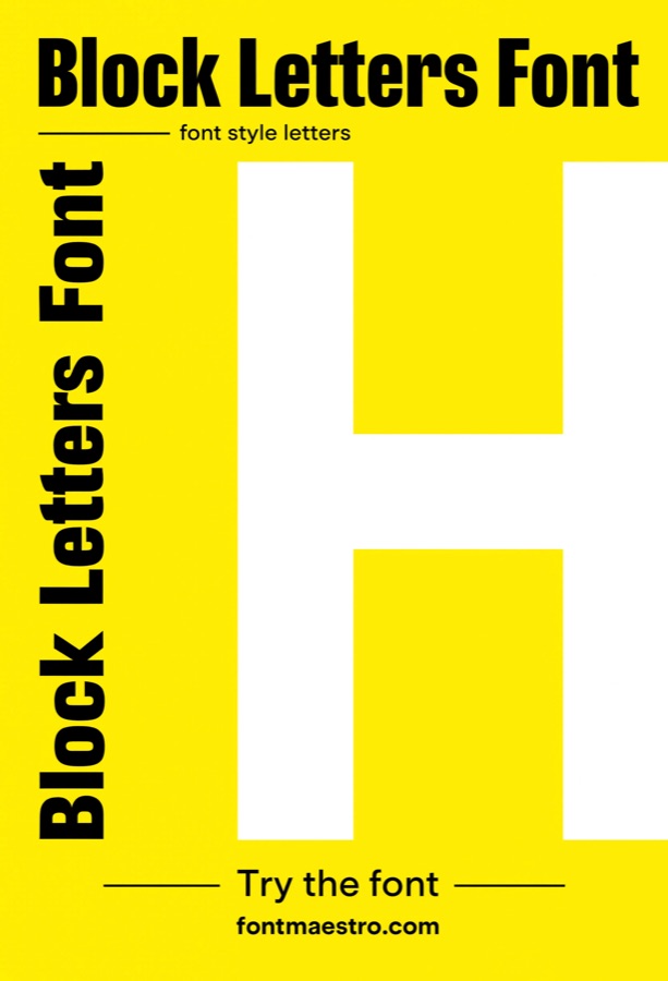 Commercial License
Giant Single-Initial Signage
Best for oversized wall letters and entryway signage. A single letter blown up to several feet tall is the ultimate legibility test — every inconsistency in stroke weight becomes visible. Helvetica Black holds an even weight at this scale, which is why it’s a common pick for architectural signage.
 Commercial License
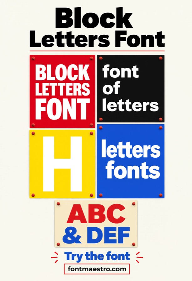
Wall Art & Statement Posters
Best for decor pieces meant to read from across a room. Block-letter wall art needs to work as a graphic shape as much as text — readable from a distance, but also visually balanced as a composition. A grotesque with consistent counters holds up better here than a condensed or novelty alphabet.
 Commercial License
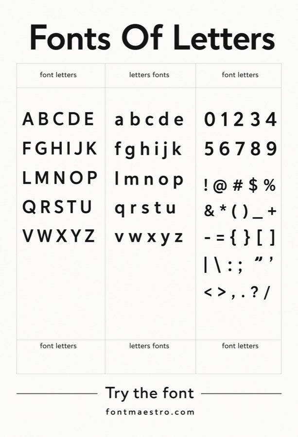
Alphabet Character Set Review
Best for confirming every letter holds up, not just the ones in your test word. Block-letter alphabets often look strong in a hero word like “BOLD” but fall apart on letters like “M,” “W,” or “&” that need more horizontal space. Checking the full set before committing avoids a mid-project surprise.
 Commercial License
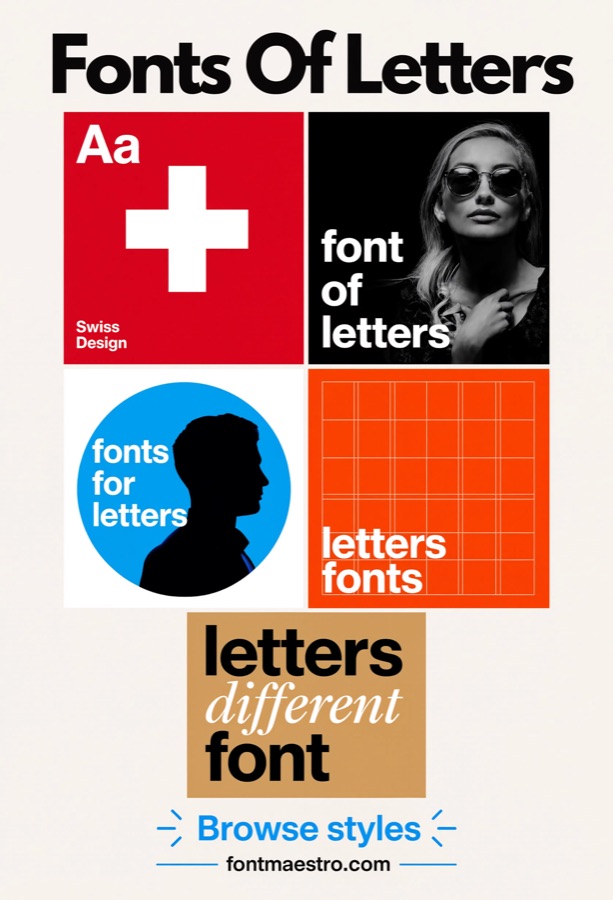
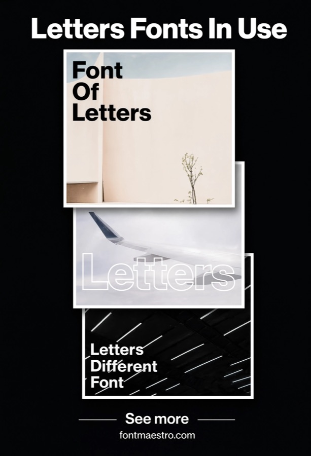
Grid-Based Letter Layouts
Best for modular signage systems and wayfinding. When block letters need to sit inside a strict grid — building directories, wayfinding signs, modular displays — even stroke weight and consistent proportions matter more than personality. This is where Helvetica’s grid-first design history pays off directly.
 Commercial License
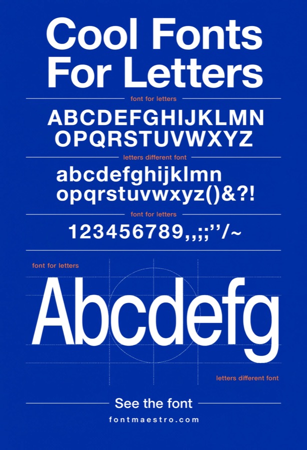
Poster Series & Editorial Sets
Best for a cohesive multi-poster campaign. A poster series only reads as a set if the letterforms stay consistent across every piece — different headline weights, same underlying skeleton. Pulling every poster from one type family avoids the mismatched look of hand-picking a new bold font for each one.
 Commercial License
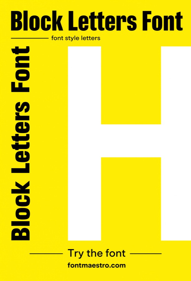
Bold Color-Block Display
Best for high-contrast color layouts. Bold block letters set against strong color blocks need to read clean at a glance — no fine detail to get lost against a saturated background. A heavier grotesque weight keeps the letterform readable even when color contrast is doing a lot of the visual work.
 Commercial License
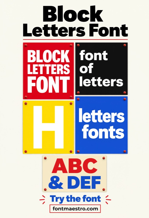
Single-Character Building Numeral
Best for building numbers, unit markers, and address signage that need to read from the street. An address numeral gets glanced at, not read closely — it has maybe a second to register from a car or sidewalk. Helvetica Black’s even stroke weight keeps a single digit or letter legible at a glance in a way thinner display faces, which can vanish at distance, don’t.
 Commercial License
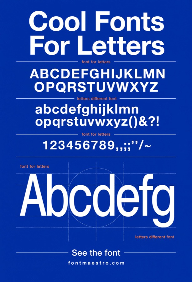
Dimensional Wall-Mounted Letters
Best for fabricated dimensional letters — the kind mounted with standoffs on a lobby or storefront wall. Dimensional letters cast a shadow that shifts with lighting throughout the day, which can distort how thin strokes and counters read compared to a flat print. Helvetica’s open counters and consistent stroke width hold up under that shifting shadow better than fonts with fine serif detail that gets lost in the depth.
 Commercial License
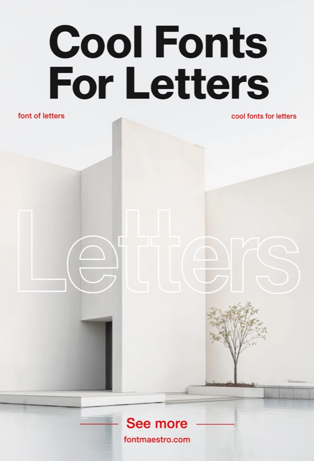
Blue-Channel Backlit Signage
Best for illuminated channel letters or backlit signs using blue-toned LED lighting. Backlighting bleeds light around thin strokes and can make a letterform look thicker or blurrier at night than it does in daylight mockups. Testing block letters against a blue-lit backdrop before fabrication catches whether the counters stay open once the sign is actually lit.
 Commercial License
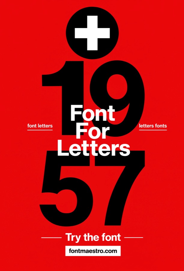
On-Site Signage Photography
Best for confirming legibility in real installed conditions, not a rendered mockup. A signage mockup rendered in design software doesn’t account for weather glare, uneven daylight, or the angle most people will actually view the sign from. Reviewing how block letters photograph on an actual installed sign is the only way to confirm the legibility claims made at the design stage.
 Commercial License
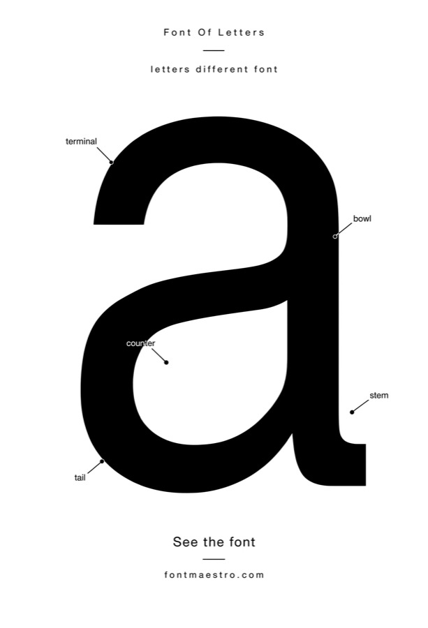
Cross-Axis Wayfinding Marker
Best for directional markers built around a crossing or plus-shaped icon paired with block letters. Wayfinding markers at intersections often pair a directional symbol with a single letter or short code — a different job than a full grid directory. Helvetica’s uniform stroke weight keeps the letter legible next to a bold graphic symbol without either element overpowering the other.
If you want to explore more options in this direction, our guide to Font For Letters is worth a look, and you may also enjoy Fonts For Letters or Cool Fonts For Letters for a different take on the same style.
 Commercial License
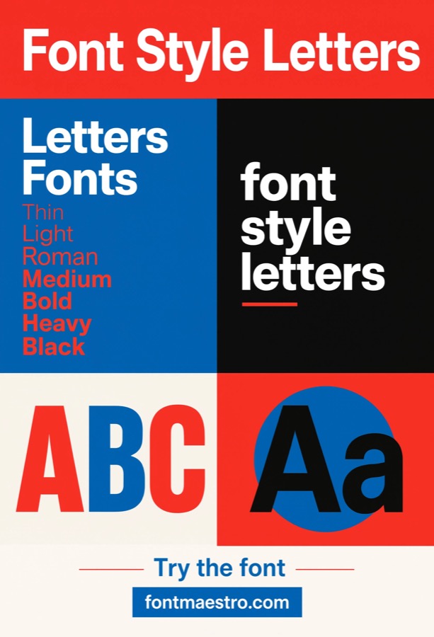
Fabrication-Ready Letterform Proofing
Best for the final proofing step before a sign gets cut, routed, or fabricated. This is a narrower check than a general character-set review — it’s specifically about confirming stroke width and counter shape hold up at the exact production size before committing to vinyl, acrylic, or metal fabrication, where mistakes are expensive to redo.
 Commercial License
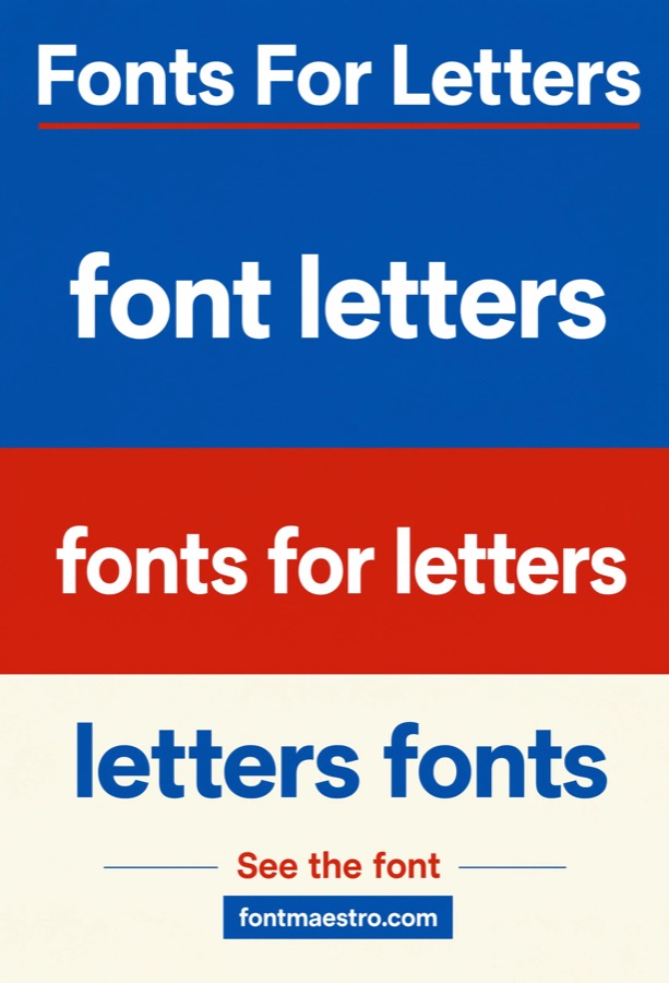
Modular Panel Signage Sets
Best for directory systems using individual swappable letter or number panels. Modular panel signage — the kind where individual letters slot into a track for building directories or changeable message boards — needs every character to match in weight and baseline regardless of which panel it’s mounted on. Helvetica’s consistency across the full character set prevents a mismatched look when panels get swapped or reordered.
 Commercial License
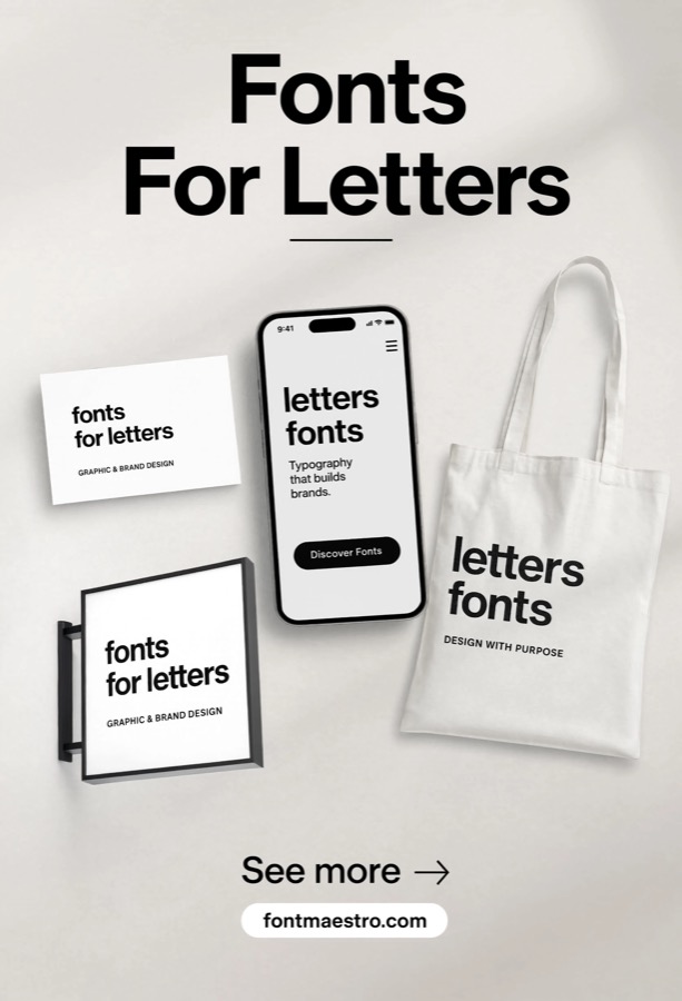
Striped Accent Signage
Best for signage that pairs bold letterforms with striped or banded backing panels for visual rhythm. Adding horizontal stripes behind or around block letters creates visual rhythm but also more visual noise for the letterform to compete with. Even stroke weight keeps the type legible against the added pattern instead of getting visually chopped up by the stripes.
 Commercial License
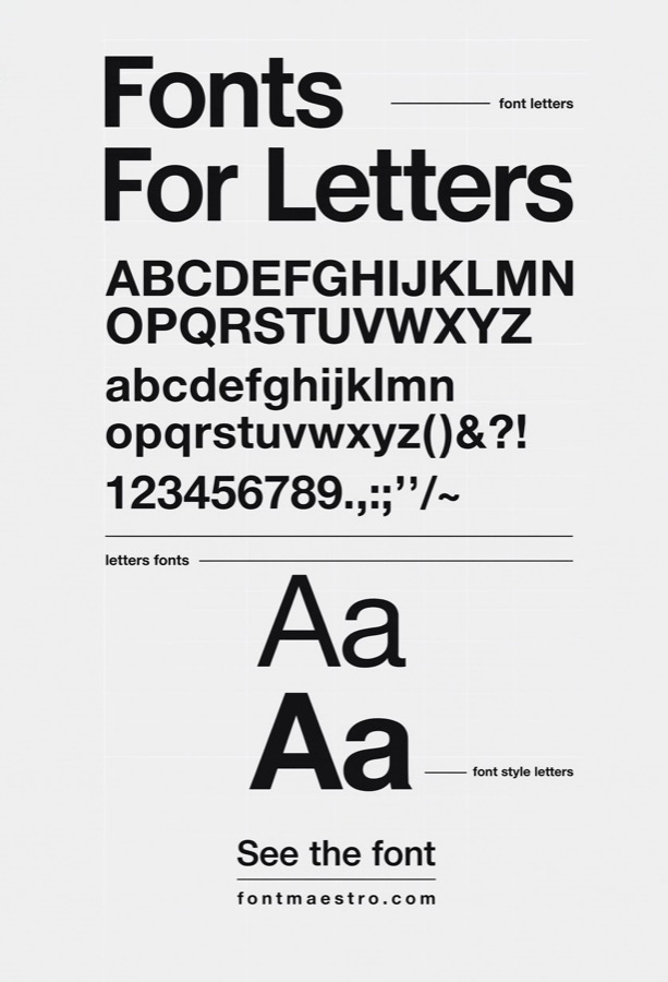
Client Signage Approval Mockup
Best for the mockup stage where a sign design gets approved before fabrication begins. A signage mockup built for client approval has to look convincingly close to the finished install — scale, materials, and lighting all matter more here than in an early concept sketch. Getting the letterform right at this stage avoids costly change orders after fabrication starts.
 Commercial License
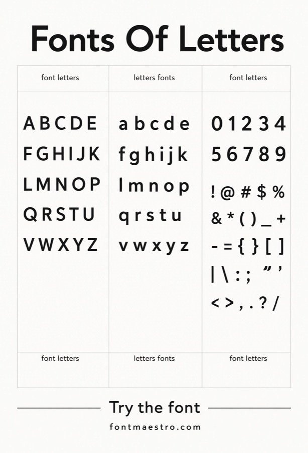
Signage Specimen Reference Sheet
Best for handoff documents that give a sign fabricator exact letterform specifications. Fabricators need more than a font name — they need stroke width, height, and spacing documented clearly before they cut anything. A specimen reference sheet built from the licensed font file gives them that exact reference instead of relying on a photo or rough sketch.
 Commercial License
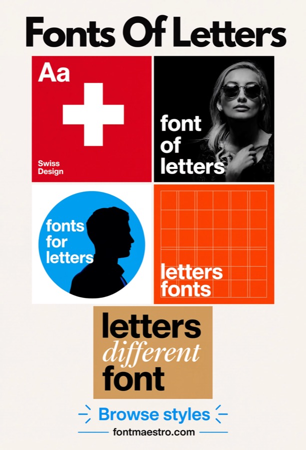
Full Signage Character Inventory
Best for confirming a specific sign’s full text — including any numerals or symbols — is covered before ordering fabrication. Unlike a general character-set review done during font evaluation, this is a project-specific check: pulling every character an actual sign needs (including ampersands, numerals, or diacritics) and confirming none of them look inconsistent before locking the design for production.
 Commercial License
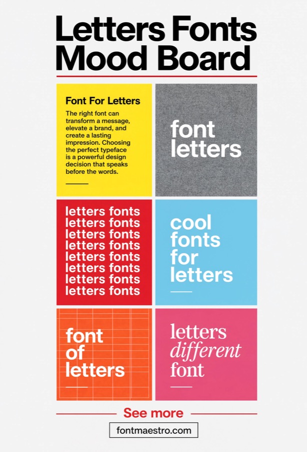
Building Directory Grid System
Best for lobby directory boards listing multiple names, suites, or floor numbers in rows. A directory board is read up close and often scanned quickly for one specific line, unlike a wayfinding sign glanced at from a distance. Consistent letter width across a long list of names keeps rows aligned and easy to scan even when some names are much longer than others.
 Commercial License
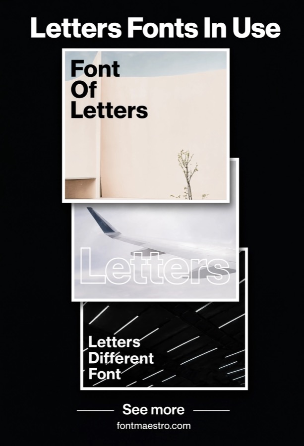
Signage Material & Finish Board
Best for presenting sign material and finish options — brushed metal, matte vinyl, illuminated acrylic — before fabrication. This is a materials-focused board rather than a general brand mood board — it’s about showing how the same letterform will look across different physical finishes so a client can choose before the sign gets built, not after.
 Commercial License
Directional Poster Signage Series
Best for a set of informational or directional posters used throughout a space — not decorative wall art. Directional posters placed throughout a building or venue need to feel like one system even when the content on each one differs — exit signs, floor guides, instructional notices. Pulling every poster from the same weight family keeps that system legible and visually consistent room to room.
See Neue Helvetica on MyFonts →
Which block-letter use case matches your project?
- An oversized single letter for a wall or entryway → Giant Single-Initial Signage. Test the heaviest weight at full scale before cutting or printing.
- Decor or statement wall art → Wall Art & Statement Posters. Balance legibility with composition, not just size.
- Confirming a font before you commit → Alphabet Character Set Review. Always check the full set, not just your hero word.
- Wayfinding or modular signage → Grid-Based Letter Layouts. Even stroke weight matters more than personality here.
- A multi-piece poster campaign → Poster Series & Editorial Sets. One type family keeps the set visually cohesive.
- High-contrast color layouts → Bold Color-Block Display. Heavier weights stay legible against saturated backgrounds.
- One oversized character mounted as an address or unit number → Single-Character Building Numeral. Address and unit numerals only get a glance from the street.
- Raised or dimensional letters fabricated for a wall install, not flat-printed art → Dimensional Wall-Mounted Letters. Shifting shadow from raised letters changes how strokes read all day.
- Illuminated or backlit signage using blue or cool-toned lighting → Blue-Channel Backlit Signage. Backlighting can bleed light around thin strokes at night.
- Reviewing how letters photograph once actually installed outdoors → On-Site Signage Photography. Weather glare and viewing angle aren’t visible in a rendered mockup.
- A plus-shaped or intersecting directional marker, distinct from the grid-based layout card above → Cross-Axis Wayfinding Marker. A directional marker pairs a symbol with a letter, not a full grid.
- Checking exact letterform geometry before cutting or fabrication, not a design review → Fabrication-Ready Letterform Proofing. The final geometry check before anything gets cut or routed.
- Interchangeable letter panels for directories or changeable signage → Modular Panel Signage Sets. Swappable panels need every character to match regardless of order.
- Block letters combined with striped or banded background panels → Striped Accent Signage. Added background pattern shouldn’t chop up the letterform.
- A presentation-ready mockup specifically for client sign-off, distinct from general design mockups → Client Signage Approval Mockup. Scale and materials matter more here than in an early sketch.
- A reference sheet documenting exact letter specs for fabricators → Signage Specimen Reference Sheet. Fabricators need documented specs, not just a font name.
- Confirming every character needed for a specific sign project is covered, distinct from general alphabet review → Full Signage Character Inventory. A project-specific character check, not a general alphabet review.
- A directory board with rows of names/numbers, distinct from wayfinding grid signage → Building Directory Grid System. Long name lists need consistent width to stay scannable.
- A mood board specifically for sign materials and finishes, not general brand mood boards → Signage Material & Finish Board. Shows the same letterform across real physical finishes.
- A series of directional or informational posters for a space, distinct from decor poster series → Directional Poster Signage Series. A system of informational posters, not decorative wall art.
Looking for more type direction? Our font for letters guide covers everyday letterform use cases, and our free fonts roundup has budget-friendly picks.
Frequently Asked Questions
What’s the difference between “block letters” and a regular bold font?
Any font can be set in a bold weight, but true block-letter design also accounts for even stroke thickness, open counters, and legibility at large scale — qualities a font needs to be specifically drawn for, not just a stylistic weight bump.
Which weight of Neue Helvetica works best for block letters?
Bold and Black are the weights typically used for block-letter and signage work — Regular and Light don’t have enough visual weight to read as true block letters at a distance.
Can I use block letters from this font for vinyl cutting or Cricut projects?
Format compatibility depends on the license tier purchased through MyFonts — check that the license includes the file formats your cutting software requires before buying.
Will block letters set in this font look good printed at poster size?
Neue Helvetica’s letterforms are vector-based and scale cleanly to any size without quality loss, which is one of the reasons it’s commonly used for large-format signage and posters.
Is there a cost difference between licensing one weight versus the full family?
MyFonts typically prices individual weights and full family bundles separately — if your project needs more than one weight (which most block-letter layouts do), check whether a family license works out more practical than buying weights individually.
Do I need a different license for commercial signage versus personal wall art?
Yes, in most cases. Signage specifically tends to fall into commercial-use terms once a print run is involved — a batch of building letters or a fabricated sign for a business is treated differently than a single personal wall-art print, and license tiers scale with the size and reach of the print run. Confirm the intended print quantity and installation type against the license terms on the MyFonts product page before ordering fabrication.
Key Takeaways
- True block-letter performance depends on even stroke weight and open counters, not just a bold font weight.
- Always review the full alphabet — some letters (M, W, &) expose weaknesses that a single hero word hides.
- Bold and Black weights are built for signage-scale legibility; Regular and Light aren’t a substitute.
- Commercial and personal-use licenses are usually separate — confirm coverage before using block letters on client or for-sale work.
About the Author: Font Maestro tests and reviews fonts for real-world use — Canva projects, Cricut cuts, and everyday branding — calling out what looks good on paper but breaks down in practice.




