Font Maestro
- Fonts
- By Theme
- All fonts
- Christmas and winter 19618
- Wedding and invitations 16437
- Halloween and horror 7499
- Kids, cartoon and bubble 5723
- Retro, groovy and western 2222
- Sports and varsity 703
- Tech, gaming and futuristic 637
- Logo and branding 583
- Gothic, blackletter and tattoo 509
- Japanese and Chinese style 448
- Boho, botanical and doodle 270
- Crafts, shirts and signs 132
- Book covers, posters and editorial 88
- Works With
- Font Pairings
- Blog
Skip to content


Serif Fonts
Serif families for long text, book covers and anything that should read as considered rather than new. Check the italic before you commit: it is where cheap serifs fall apart.
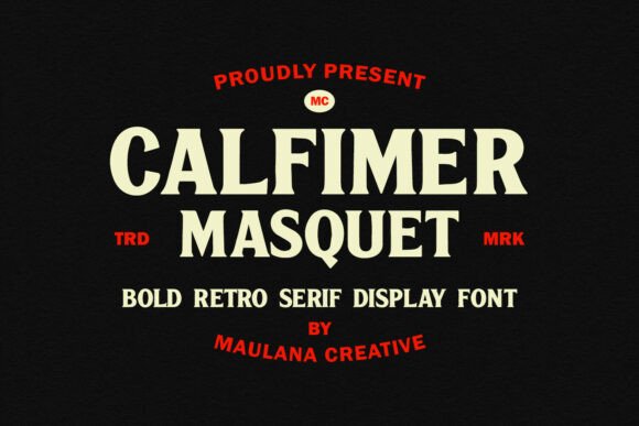
Calfimer Masquet
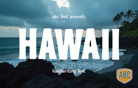
See itHawaii
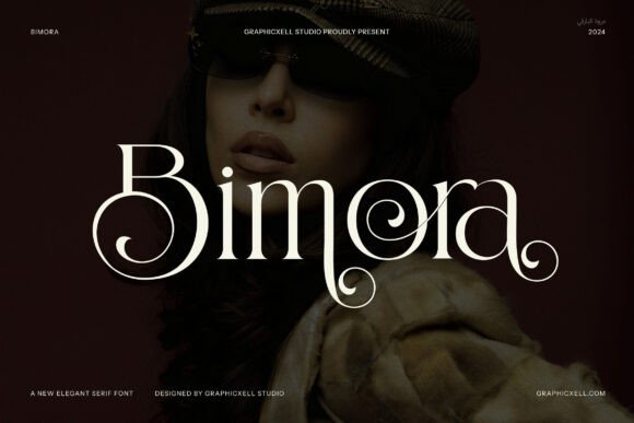
See itBimora
A 1970s revival serif with heavy slabs and tight spacing, warm rather than formal. It pairs badly with calligraphy and well with a plain sans, which…
See itRodeon Western Bundle
See itRegal Crown
See itKarly
See itGently Retro
See itRondeo
See itRookvale
See itMessy Wobbly
See itCalico
See itGimick
See itKangker
See itCaribel
See itBrimula
See itHumble Flame
See itBandiera
See itIncline
See itChiper Type
See itAnymore
See itBogent
See itCekona
See itLemur
See itFagora
See itSyosta Work
See itJaguer
See itMasker
See itReese
See itReagan
See itRaya
See itRaelynn
See itPeyton
See itPalmer
See itOphelia
See it