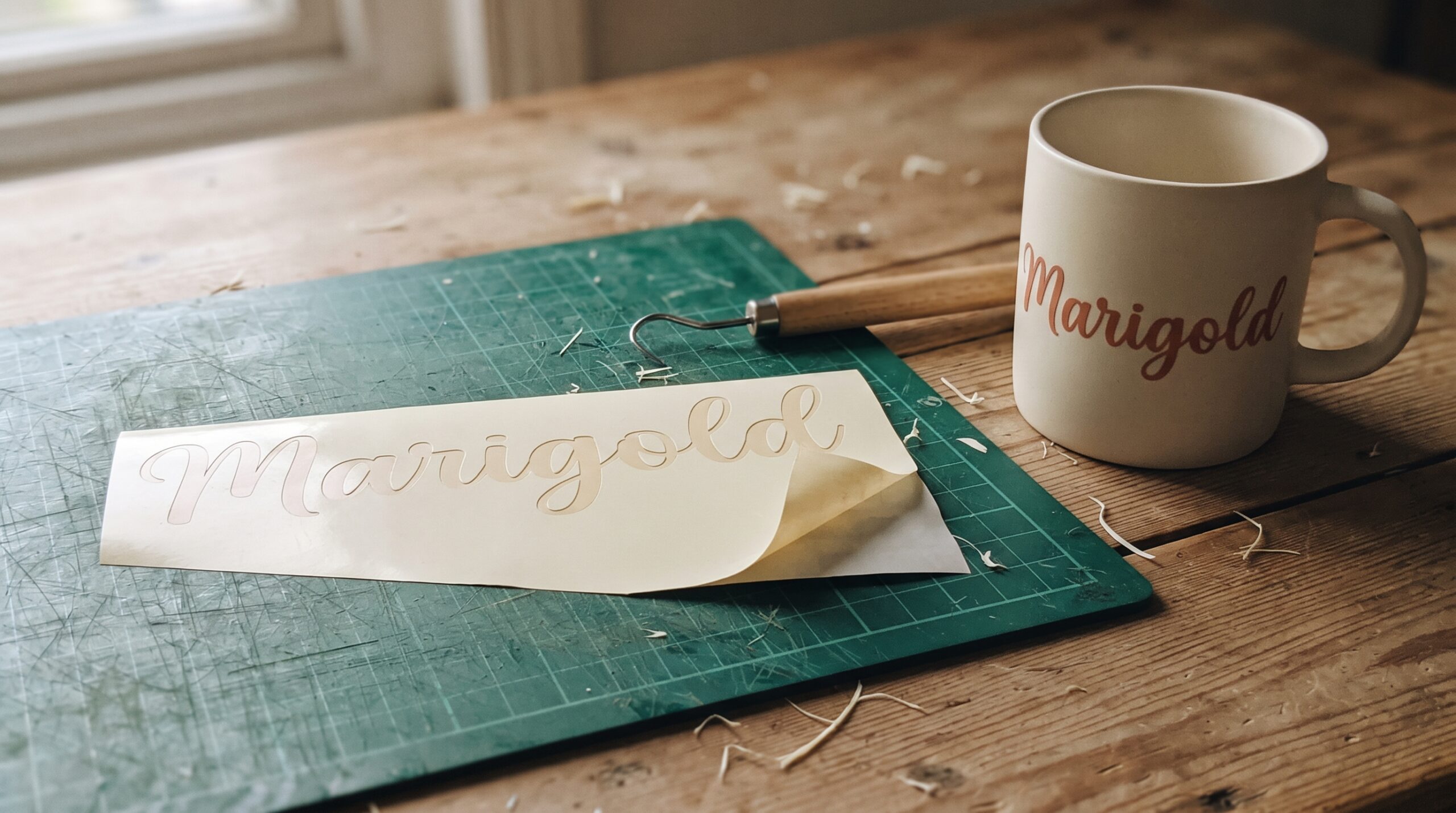
Quick answer: pick a script font by how much of the design it has to carry. Formal wedding stationery wants a modern calligraphy script with long connecting strokes. A signature-style logo wants a lighter, well-spaced script that survives being shrunk to an avatar. Retro packaging wants a bold vintage script with a solid stroke weight. Tattoo lettering wants an ornate blackletter-influenced script built for outline work. Below is a pick for each, plus the two checks (small-size legibility and commercial licensing) that decide whether the font actually works.
What the lists actually agree on: almost nothing. In August 2026 I scanned 295 script-font pins on Pinterest, pulled the 10 most-saved roundups of popular script fonts posted in the last three months, and tallied every typeface they name. Across those 10 lists there are 110 named samples, and only three fonts appear on more than one list. A “best script fonts” list is not a consensus; it is one person’s font folder. That is why the section below is organised by the job the font has to do, not by rank.
Script Fonts by Use Case
Five paths, five different jobs. Match the job first, then judge the letterforms.
Unlimited creative assets. Access to AI tools.
Commercial licence included.
Get downloads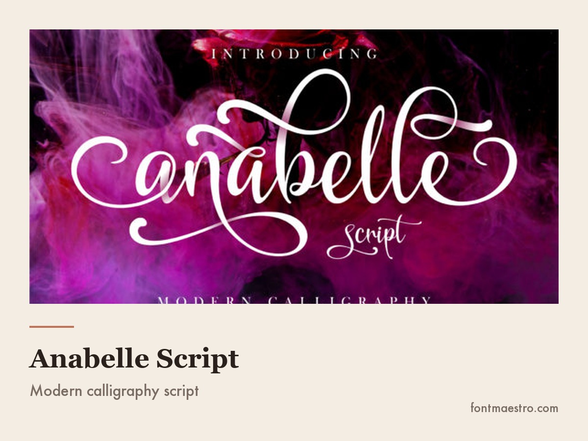
Wedding stationery and invitations → Anabelle Script
Invitations are the one place where a script can carry the entire layout, because the type is set large and printed on paper you control. Anabelle Script is a modern calligraphy face with characters that ride up and down the baseline, which is what gives handwritten stationery its rhythm. It is PUA encoded, so the swashes and alternates are reachable without a glyph-panel hunt, and that matters when you are setting dozens of different names on place cards.
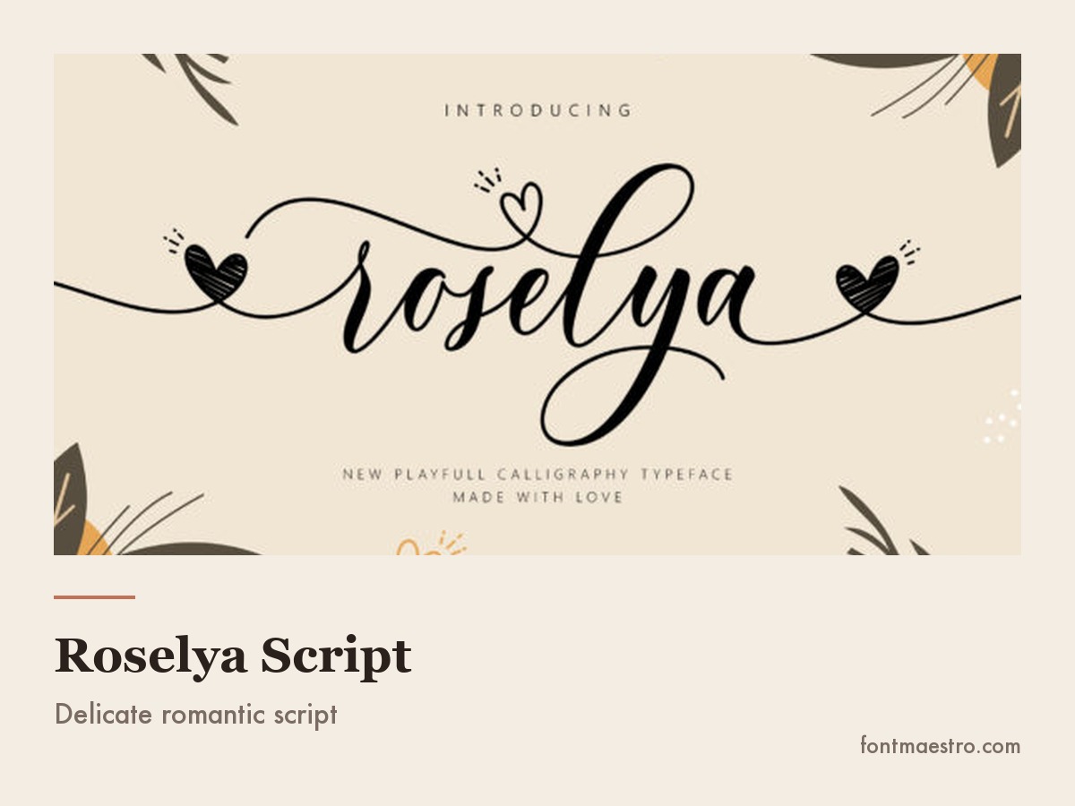
Roselya Script at small size on a party sign
The paid answer to the small-size problem the sixteen above run into.
Get Roselya Script at small size on a party sign on All Access →
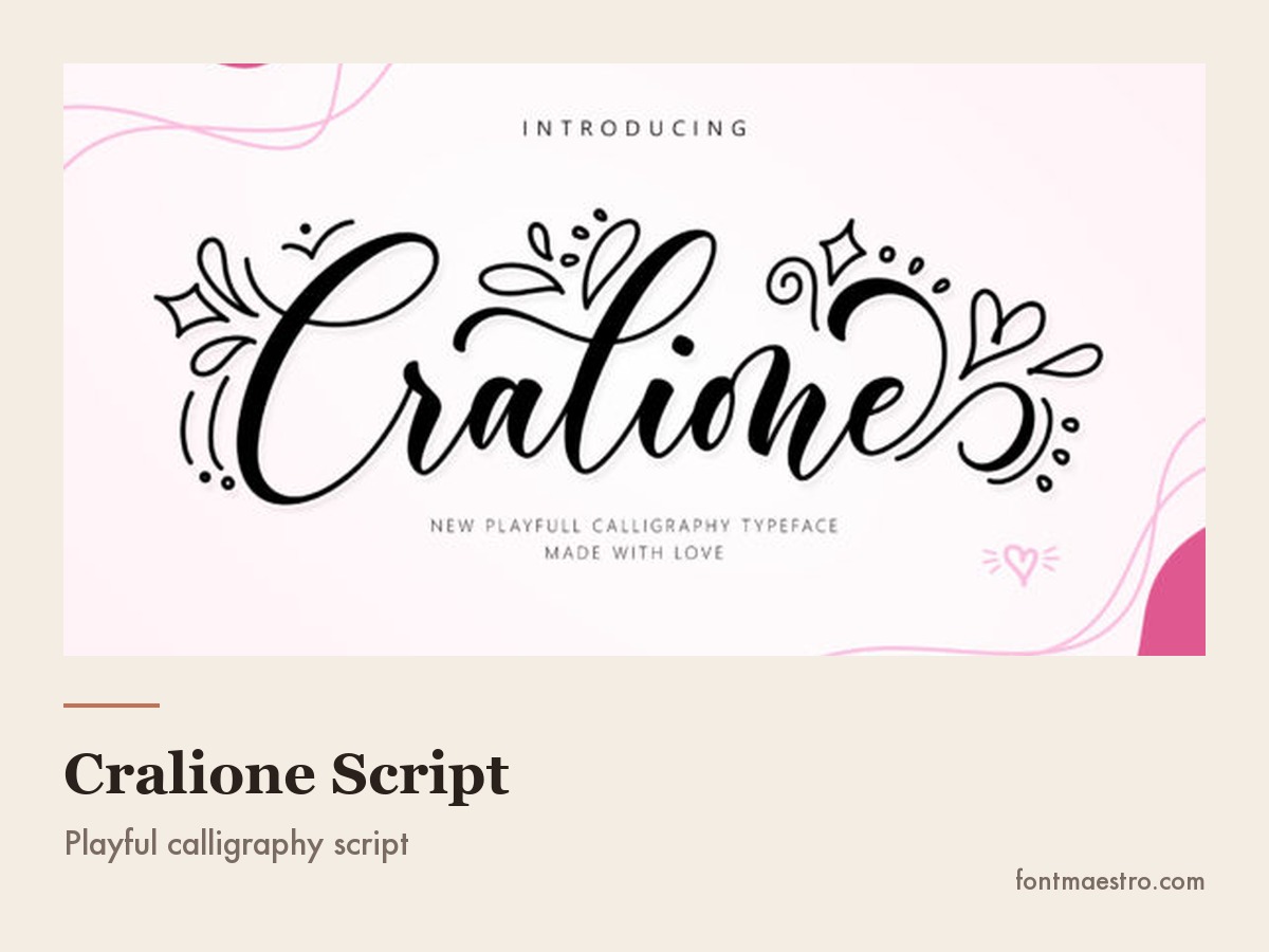
Cralione Script wordmark set in one weight
One weight, no swash tail — nothing here to break at sign size.
Get Cralione Script wordmark set in one weight on All Access →
Unlimited creative assets. Access to AI tools.
Commercial licence included.
Get downloads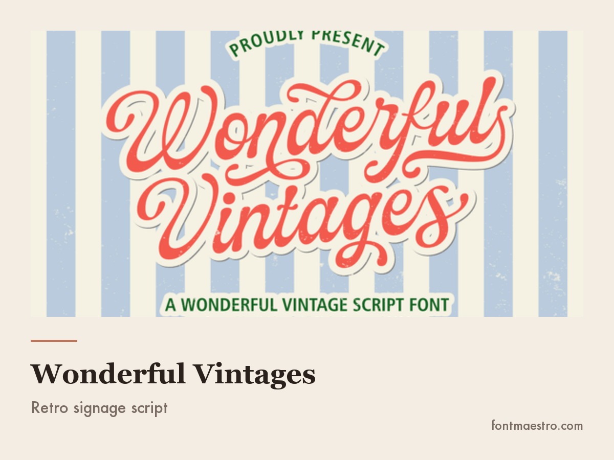
Retro packaging and signage → Wonderful Vintages
The heavy, confident scripts painted on mid-century shopfronts and soda labels are a different species from wedding calligraphy: thick, tightly connected, built to be read across a street. Wonderful Vintages sits in that tradition, with the solid stroke weight and slight backward lean that make retro lettering feel period-correct rather than merely old-fashioned. It is the safest of these five for single-color print and vinyl cutting, because there are no hairlines to lose.
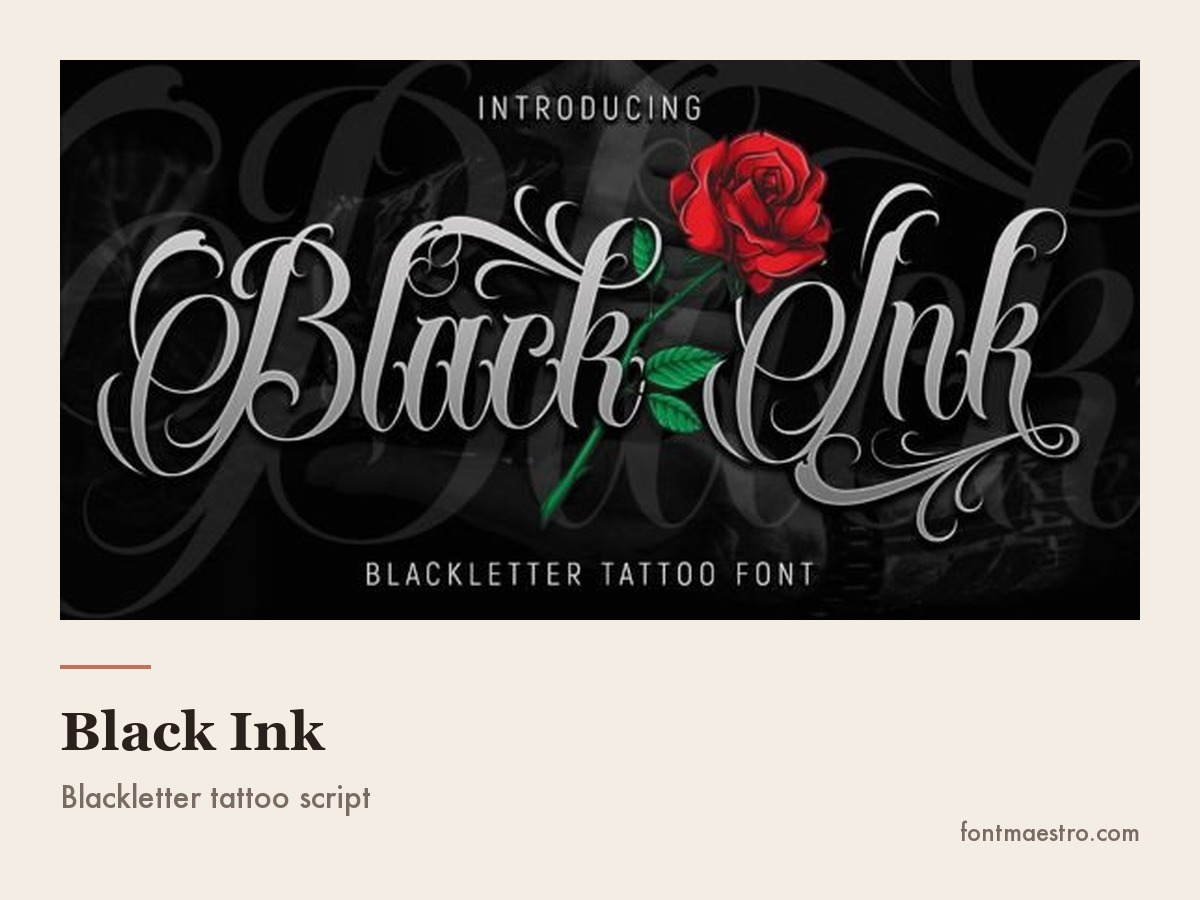
Black Ink brush script on a bold headline
The hardest-edged pick on this page, for headlines that need weight.
Get Black Ink brush script on a bold headline on All Access →
Anabelle Script
Invitations are the one place where a script can carry the entire layout, because the type is set large and printed on paper you control. Anabelle Script is a modern calligraphy face with characters that ride up and down the baseline, which is what gives handwritten stationery its rhythm. It is PUA encoded, so the swashes and alternates are reachable without a glyph-panel hunt, and that matters when you are setting dozens of different names on place cards.
Across ten of the most-saved script-font roundups posted in the last three months, 110 named samples produced only three fonts that appear on more than one list. A best-script-fonts list is not a consensus; it is one person’s font folder.
What Actually Breaks in a Script Font
Script fonts fail in ways that plain sans serifs never do, and all of them show up after you have already committed to the design.
Unlimited creative assets. Access to AI tools.
Commercial licence included.
Get downloads
Cralione Script
One weight, no swash tail — nothing here to break at sign size.
Anabelle Script
Invitations are the one place where a script can carry the entire layout, because the type is set large and printed on paper you control. Anabelle Script is a modern calligraphy face with characters that ride up and down the baseline, which is what gives handwritten stationery its rhythm. It is PUA encoded, so the swashes and alternates are reachable without a glyph-panel hunt, and that matters when you are setting dozens of different names on place cards.
Roselya Script at small size on a party sign
The paid answer to the small-size problem the sixteen above run into.
Get Roselya Script at small size on a party sign on All Access →
The connection between letters. A script is supposed to look like one continuous stroke. Whether it does depends on how the designer drew the exit and entry points of each letter, and on whether the font has the alternate characters needed to fix the pairs that don’t meet. Type your actual word, not the specimen word, and look at every joint.
This is the single test that separates a script you can ship from one you cannot, and it is also what you are paying for: Anabelle Script carries a full PUA-encoded alternates set precisely so the pairs that don’t meet can be fixed without redrawing anything. Get Anabelle Script on All Access →
Capital letters next to lowercase. Script capitals are usually drawn with big flourishes. Set a whole word in capitals and most scripts turn into an unreadable knot. Scripts are lowercase-first fonts; treat the capitals as decoration for the first letter only.
Stroke weight at final size. The thin upstrokes of a calligraphy script are the first thing to vanish when the design gets scaled down, printed on fabric, or cut in vinyl. A script that looks refined on a laptop can read as a smudge on a business card.
If the final size is small or the surface is fabric or vinyl, pick from the thicker end of the family instead of thinning a calligraphy face: Cralione Script and Wonderful Vintages both keep their stroke weight down to card size.
Commercial licensing. A script downloaded for a mockup is not automatically cleared for a client’s logo, a product listing, or a shirt you sell. Every pick above is a licensed commercial font; confirm the terms on the product page before a paid project goes out the door.
Free Script Fonts vs Paid Ones
There are excellent free script fonts; the problem has never been the drawing, it is what the licence permits and how complete the character set is. Two things separate a free file from a working one.
- Alternates and ligatures. Scripts live on alternate characters: a different l for the start of a word, a different one for the middle, an ending swash for the last letter. Many free releases ship the basic alphabet only, which is why a free script often looks stiff next to a paid one in the same style.
- Commercial permission. Free usually means free for personal use. Silence about commercial use is not permission. If a licence does not say you can use it in something you sell, assume you cannot.
Where script fonts free of charge genuinely work: personal projects, mockups you are not billing for, and social posts for your own account. Where they usually do not: a client’s logo, a product on a shop, or anything printed for resale. If you are hunting for the best free script fonts, download the licence text at the same time as the font file and keep both in the project folder, because the download page will change, your folder will not.
When the project is billed, the shortest way past both problems is a licensed face with the alternates already in the file. Roselya Script is the soft, personal-branding option; Wonderful Vintages is the retro one. Get Roselya Script on All Access →
Unlimited creative assets. Access to AI tools.
Commercial licence included.
Get downloads
Anabelle Script
Where free stops: the alternate set that makes a name look set, not typed.
Roselya Script at small size on a party sign
The paid answer to the small-size problem the sixteen above run into.
Get Roselya Script at small size on a party sign on All Access →
Cralione Script wordmark set in one weight
One weight, no swash tail — nothing here to break at sign size.
Get Cralione Script wordmark set in one weight on All Access →
16 Free Script Fonts You Can Legally Sell With
Every font, one commercial licence
The bundles I test at logo size live in one subscription — commercial use included, no per-font checkout.
The licence question is the one that actually decides whether a free script is usable, so here is a shortlist where the answer is already settled: every face below is published on Google Fonts under the SIL Open Font License, which permits commercial work, client logos and products you sell. You still cannot resell the font file itself, and you should keep a copy of the licence in the project folder, but you do not have to email anybody to use these.
Unlimited creative assets. Access to AI tools.
Commercial licence included.
Get downloads
Roselya Script
The paid answer to the small-size problem the sixteen above run into.
Anabelle Script
Invitations are the one place where a script can carry the entire layout, because the type is set large and printed on paper you control. Anabelle Script is a modern calligraphy face with characters that ride up and down the baseline, which is what gives handwritten stationery its rhythm. It is PUA encoded, so the swashes and alternates are reachable without a glyph-panel hunt, and that matters when you are setting dozens of different names on place cards.
Cralione Script wordmark set in one weight
One weight, no swash tail — nothing here to break at sign size.
Get Cralione Script wordmark set in one weight on All Access →
They are grouped by family, because that is the choice that comes first. Names are exact, so you can set your own words in each one before you commit.
| Font | Family | Best job | Watch out |
|---|---|---|---|
| Great Vibes | Calligraphy | Invitations, menus, formal wordmarks | Hairlines vanish below roughly 24 px |
| Allura | Calligraphy | Place cards, monograms, save-the-dates | Capitals overlap the letter after them |
| Pinyon Script | Calligraphy | Certificates, engraved-looking headers | Very high contrast; single-colour print only |
| Alex Brush | Calligraphy | Signature-style logos, one or two words | Looks stiff in long phrases, no alternates |
| Italianno | Calligraphy | Wedding stationery set large | The thinnest of the six; not for vinyl |
| Mrs Saint Delafield | Calligraphy | Ornate initials, letterpress-style headers | Loops collide in words with tall letters |
| Yellowtail | Brush | Retro signage, food labels | Tight default spacing; open the tracking |
| Kaushan Script | Brush | Posters, sportswear, energetic headlines | Strong slant fights centred layouts |
| Pacifico | Brush | Friendly small-business branding | Over-used; recognisable to a lot of people |
| Norican | Brush | Packaging, stickers, tags | Lowercase-only rhythm; capitals read loud |
| Caveat | Handwritten | Annotations, quotes, planner graphics | Reads casual, wrong for luxury |
| Shadows Into Light | Handwritten | Notes, captions, craft labels | Light stroke; loses ground on dark backgrounds |
| Marck Script | Handwritten | Personal notes, informal invitations | Irregular baseline unsettles tight grids |
| Grand Hotel | Vintage / signage | Shopfronts, café boards, retro packaging | Needs generous line spacing |
| Lobster Two | Vintage / signage | Headlines that must read across a room | Very familiar; pair it with a plain sans |
| Berkshire Swash | Vintage / signage | Labels, badges, market-stall lettering | Decorative capitals; never set in all caps |
Sixteen faces, four families, one licence question already answered. Set your own words in the three or four that match your job, print them at final size, and let the joins decide; that test eliminates more candidates than any style preference.
If the joins or the alternates give out on the free file and the job is paid, that is the point to stop testing and pick a licensed face with a full character set. Get Anabelle Script on All Access →
Types of Script Fonts: The Four Families
Different script fonts are not variations on one idea. Searches for fonts script and script fonts return four families that behave completely differently, and picking across them by accident is the most common reason a design feels off.
Calligraphy script fonts imitate a pointed pen: strong contrast between thick downstrokes and thin upstrokes, letters that connect on a slant, a formal rhythm. This is the wedding-invitation family. It has the most elegance and the least tolerance for small sizes. Anabelle Script sits here.
Brush script fonts imitate a loaded paintbrush: even or slightly tapered strokes, visible dry-brush texture, a faster and looser feel. This is the sportswear, food packaging and poster family. It scales down better than calligraphy because the strokes stay thick. Cralione Script and Wonderful Vintages sit here.
Handwritten script fonts imitate an ordinary pen in an ordinary hand: no formal contrast, irregular baseline, letters that often do not connect at all. This is the notes-and-labels family. It is the most casual and the easiest to over-use. Roselya Script sits here.
Gothic cursive fonts come from blackletter rather than from a pen or brush: angular joins, heavy vertical stems, ornament concentrated in the capitals. This is the tattoo, band and streetwear family. It is the least legible of the four in long words and the most distinctive in short ones, which is exactly why it lives on one-word marks. Black Ink sits here.
Pick the family from the feeling the brand needs (formal, energetic, casual or hard-edged) and only then compare individual faces inside it. Comparing a calligraphy face against a brush face is comparing two answers to different questions.
Unlimited creative assets. Access to AI tools.
Commercial licence included.
Get downloads
Roselya Script
Four families, one that holds at sign size — this is the readable end.
Anabelle Script
Invitations are the one place where a script can carry the entire layout, because the type is set large and printed on paper you control. Anabelle Script is a modern calligraphy face with characters that ride up and down the baseline, which is what gives handwritten stationery its rhythm. It is PUA encoded, so the swashes and alternates are reachable without a glyph-panel hunt, and that matters when you are setting dozens of different names on place cards.
Cralione Script wordmark set in one weight
One weight, no swash tail — nothing here to break at sign size.
Get Cralione Script wordmark set in one weight on All Access →
Cool, Cute, Masculine: What Each Style Word Asks For
Almost nobody searches for stroke contrast or entry strokes. People search for a feeling: cool script fonts, cute script fonts, trendy script fonts. Those words carry real information about the job, they just name the effect instead of the mechanism. Script fonts design work goes faster once you can translate one into the other, because you stop downloading files that look right in the specimen image and wrong in your own words.
| What you searched | What it asks for structurally | Where it holds up |
|---|---|---|
| Cool script fonts | A brush or marker base with a fast slant and one distinctive move: a dropped tail, a flat cut terminal, a crossed stroke | Merch, sportswear, music and skate branding |
| Beautiful script fonts | Pointed-pen calligraphy with high contrast and a full alternates set, since the beauty lives in the swashes rather than the base alphabet | Invitations, certificates, luxury packaging |
| Fun script fonts | Bounced baseline, thick even strokes, rounded terminals, letters that vary in size | Kids’ products, party goods, food labels |
| Cute script fonts | The same bounce at a smaller scale with tighter loops and a marker weight, no hairlines anywhere | Stickers, planner graphics, small craft labels |
| Trendy script fonts | Whatever the current cycle favours, at the moment tight tracking, low contrast and a slightly wobbly monoline | Social graphics and campaigns, not a logo meant to last a decade |
| Aesthetic script fonts | A period cue carried consistently: 70s swelled strokes, or a fine monoline with very wide letter spacing | Mood-driven branding, Pinterest-facing layouts |
| Masculine script fonts | Heavy even weight, a steep slant, angular joins and squared-off terminals rather than loops | Barbershops, garages, sports and outdoor brands, tattoo lettering |
Two of these pull against each other often enough to name. Beautiful script fonts want delicacy and contrast; masculine script fonts want weight and angle. A brief asking for both is asking for a calligraphy face set large with a heavy sans underneath it, not for a single file that somehow does both.
Translated into the five picks on this page: cool goes to Cralione Script, beautiful to Anabelle Script, fun and cute to Roselya Script, vintage to Wonderful Vintages, and the harder end of cool to Black Ink.
Unlimited creative assets. Access to AI tools.
Commercial licence included.
Get downloads
Cralione Script
“Cool” translated: one weight, low ornament, no swash tail.
Anabelle Script
Invitations are the one place where a script can carry the entire layout, because the type is set large and printed on paper you control. Anabelle Script is a modern calligraphy face with characters that ride up and down the baseline, which is what gives handwritten stationery its rhythm. It is PUA encoded, so the swashes and alternates are reachable without a glyph-panel hunt, and that matters when you are setting dozens of different names on place cards.
Roselya Script at small size on a party sign
The paid answer to the small-size problem the sixteen above run into.
Get Roselya Script at small size on a party sign on All Access →
Script Fonts for Tattoos
People search for script fonts for tattoos more than for almost any other script use, and the requirements are genuinely different from print. Ink spreads under the skin over years, so any two strokes that sit close together will eventually merge. That rules out the delicate calligraphy faces that look best on paper.
What survives: heavier strokes, generous space between letters, and ornament kept to the capital rather than woven through every character. Blackletter-influenced faces like Black Ink were drawn with exactly this in mind. Print the design at final size on paper, hold it at arm’s length, and check that every letter still separates. An artist will tell you the same thing, and it is cheaper to find out before the appointment.
Which One Should You Actually Use
Every font, one commercial licence
The bundles I test at logo size live in one subscription — commercial use included, no per-font checkout.
If you want elegant script fonts for stationery or a luxury wordmark, start with the calligraphy family and accept that you will be setting type large. If you want romantic script fonts for a personal brand, look for lighter weight and loose joins rather than more flourish: restraint reads as expensive, ornament reads as busy. For wedding script fonts specifically, the deciding factor is almost never beauty, it is whether the font has the alternates to make every guest’s name look intentional.
For vintage script fonts, weight is the whole game: if the strokes are not thick enough to survive one-colour printing, the design will not read as period-correct no matter how good the curves are. And when people ask which are the best script fonts in general, the honest answer is the ones you have tested with your real words, at your real size, in one colour. That test eliminates more candidates than any style preference.
If you would rather not run that test from scratch, the five below are the ones that already passed it here, sorted by the job:
- Invitations and stationery — Anabelle Script
- Soft, personal branding — Roselya Script
- Playful small-business branding — Cralione Script
- Retro packaging and signage — Wonderful Vintages
- Tattoo lettering and dark apparel — Black Ink
Unlimited creative assets. Access to AI tools.
Commercial licence included.
Get downloads
Wonderful Vintages
Vintage brief, and the one that survives being cut in vinyl.
Anabelle Script
Invitations are the one place where a script can carry the entire layout, because the type is set large and printed on paper you control. Anabelle Script is a modern calligraphy face with characters that ride up and down the baseline, which is what gives handwritten stationery its rhythm. It is PUA encoded, so the swashes and alternates are reachable without a glyph-panel hunt, and that matters when you are setting dozens of different names on place cards.
Roselya Script at small size on a party sign
The paid answer to the small-size problem the sixteen above run into.
Get Roselya Script at small size on a party sign on All Access →
Key Takeaways
- Type your actual words, not the specimen word, because script fonts fail at the joins between specific letter pairs, and only your own text shows them.
- Never set a script in all capitals; script capitals are drawn as decorative initials, not as a word-setting alphabet.
- Calligraphy, brush and handwritten scripts solve different problems; pick the family before you compare individual fonts.
- Thin upstrokes disappear in small print, on fabric and in vinyl; if the design will be small or single-colour, pick a heavier script.
- Confirm commercial licensing before a script goes into a client logo or a product you sell.
FAQ
What is the most readable script font for a logo?
One with wide spacing and even stroke weight. Readability in a script comes from the space between letters and the absence of hairlines, not from how simple the letterforms are. Test the candidate at avatar size before you decide.
Can I use a script font for body text?
No. Scripts are designed for a few words at a large size. Past roughly a sentence, the connected letterforms slow reading down sharply, so use a script for the name or the headline and a plain font for everything else.
Why do the letters in my script font not connect properly?
Because the pair you typed needs an alternate character. Most quality scripts ship beginning, middle and ending forms for the letters that commonly break; open the glyph panel or turn on contextual alternates and swap the offending letter.
Are script fonts safe for Cricut and vinyl cutting?
Heavier scripts are. Thin connecting strokes tear when weeding, so choose a face with a solid minimum stroke weight and weld the letters before cutting.
Unlimited creative assets. Access to AI tools.
Commercial licence included.
Get downloads
Black Ink
The hardest-edged pick on this page, for headlines that need weight.
Anabelle Script
Invitations are the one place where a script can carry the entire layout, because the type is set large and printed on paper you control. Anabelle Script is a modern calligraphy face with characters that ride up and down the baseline, which is what gives handwritten stationery its rhythm. It is PUA encoded, so the swashes and alternates are reachable without a glyph-panel hunt, and that matters when you are setting dozens of different names on place cards.
Roselya Script at small size on a party sign
The paid answer to the small-size problem the sixteen above run into.
Get Roselya Script at small size on a party sign on All Access →


