Type “free display fonts” and the search results hand you galleries: forty-one preview cards, one after another, each one a free download link. What none of those galleries tell you is whether the font behind that preview comes with a commercial license you can actually use — put it on a product you sell, hand the file to a client, print it on a run of merchandise. That question gets skipped so consistently across the niche that it starts to look deliberate: the preview is the product, and the license is somebody else’s problem to find out later.
Quick answer: most free display font roundups show you the letterforms and nothing about the license. Checking three separate vintage-font collections (72 fonts total) turned up zero that stated a commercial-use license directly in the listing text — every one pointed back to a generic “check the license” disclaimer instead of answering it. If you’re building a logo, a product mockup, or anything you plan to hand to a client or sell, that silence is the actual cost of “free.” The ten display fonts below are different: each one cleared a real rating-and-review bar on Creative Fabrica, and each one ships under a license that covers commercial use and client hand-off, not just personal projects.
Why Most “Free Display Fonts” Go Quiet on the License
Every font, one commercial licence
The bundles I test at logo size live in one subscription — commercial use included, no per-font checkout.
I checked this directly before writing a word of this guide, because it’s the question every one of my own client projects runs into eventually. Three vintage-font roundups, 72 fonts between them, and not a single listing said in plain text whether the font could go on something you sell. The phrasing repeats across sites almost word for word: download it, enjoy it, and go read the license yourself. That’s not an oversight on one site — it’s the standard shape of the whole gallery format. The winning result for this exact search is the same shape at a bigger scale: forty-one fonts, one preview card each, zero mentions of commercial rights anywhere in the copy.
Google’s own autocomplete gives away who’s actually searching and why: “free display fonts for commercial use,” “best free script fonts for commercial use,” “free display fonts commercial use” all sit right under the plain search. Nobody types that unless the free-tier answer already left them unsure. The galleries that rank for this keyword are built to answer “what does it look like,” not “can I legally use it” — the second question just never comes up in the format.
That’s where the selection for this list is different from a typical roundup. A font only makes it below if it carries a real commercial license covering client work and merchandise, and if it already has enough buyer feedback on Creative Fabrica to prove it’s not just a pretty render with nobody behind it. Not every font that looked good under a “bold display font” search cleared that bar. Horror Season Font had twenty reviews but a rating too low to trust for paid work; Simple Stacked Font had nineteen reviews and the same problem. Both got dropped for the same reason: review volume alone doesn’t prove quality, and a shaky rating doesn’t improve because a lot of people left one.
Display Fonts You Can Actually Put On a Product
Every font here passed a rating-and-review check before it earned a spot — a near-perfect average with a real review count behind it, or, for the newer listings with fewer reviews yet, a save count high enough to show demand is already there. None of them are the “download and hope” kind of free. Each one carries the commercial license needed to put it on a product, a logo, or client work, which is the exact thing the galleries above leave you to guess at.

Hey Baby — Flowing Script for Wedding and Baby Branding
A handwritten display face with the uneven, calligraphic feel of real brush lettering. Best if you’re building a wedding suite or a baby-brand logo and want something that reads as hand-lettered rather than typed. Not the pick if you need a face that stays legible at small sizes on packaging — the flourishes need room.
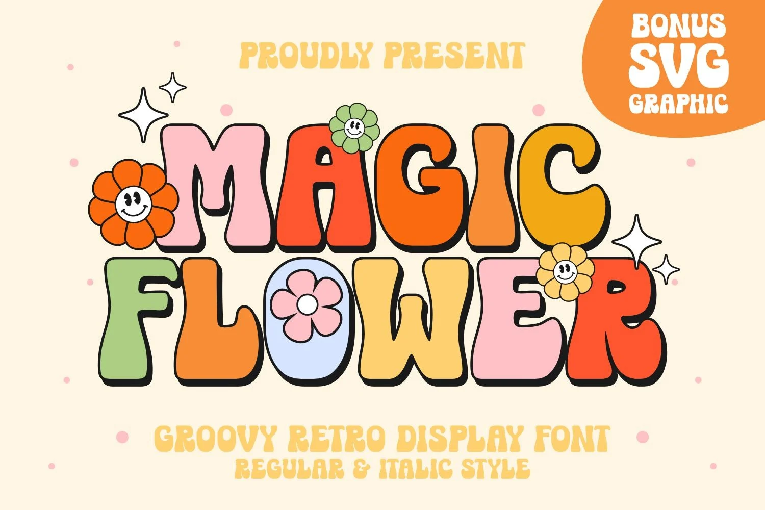
Magic Flower — Retro Groovy Display for Branding With Personality
Uneven thick-and-thin strokes built to read as hand-drawn, with a flower-power era feel. Best if the brand is leaning into a retro or boho look on purpose — packaging, merch, event graphics. Not the pick for a client who asked for “clean and modern.”
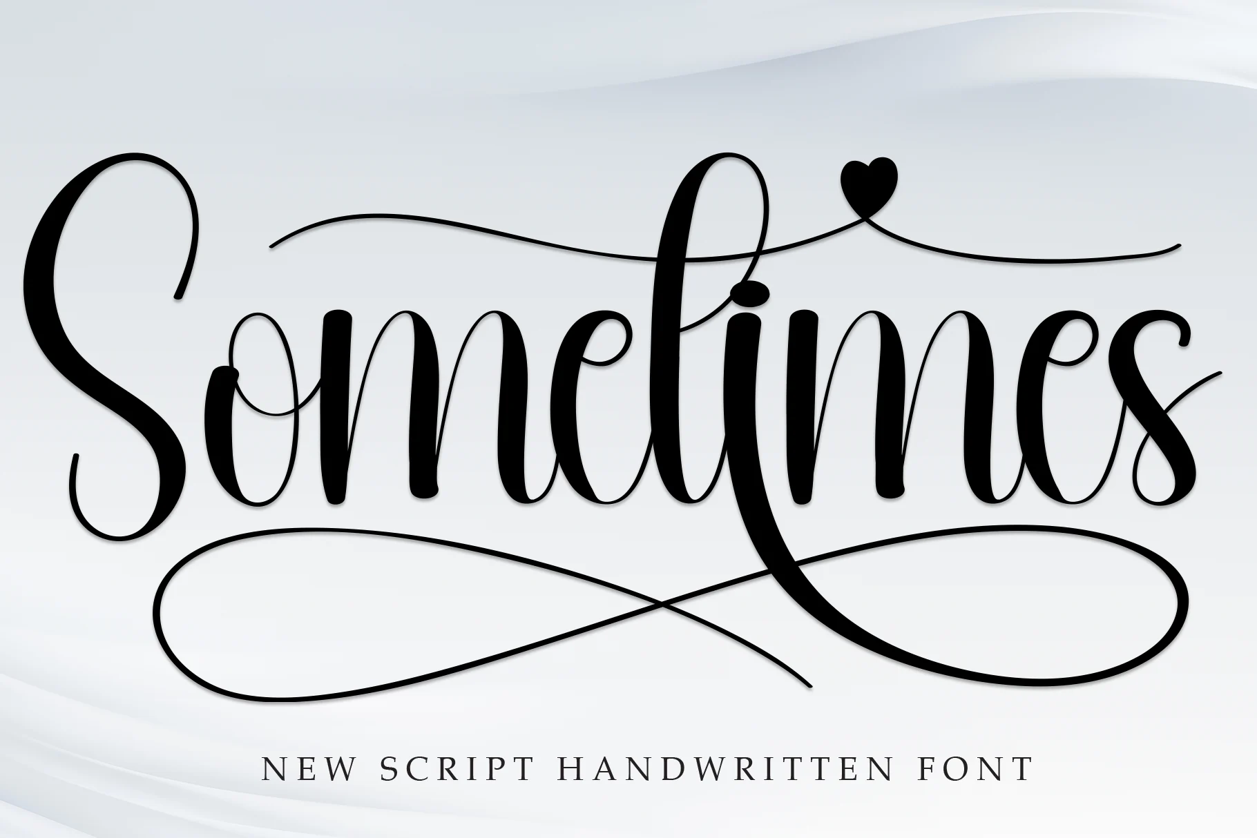
Sometimes — Sweet Handwritten Face for Cards and Invitations
A friendly, casual script with a lighter touch than Hey Baby — less flourish, more everyday warmth. Best for wedding invitations, greeting cards, or any design that wants a personal note instead of a formal one. Not the pick for a bold headline that needs to carry weight at a distance.
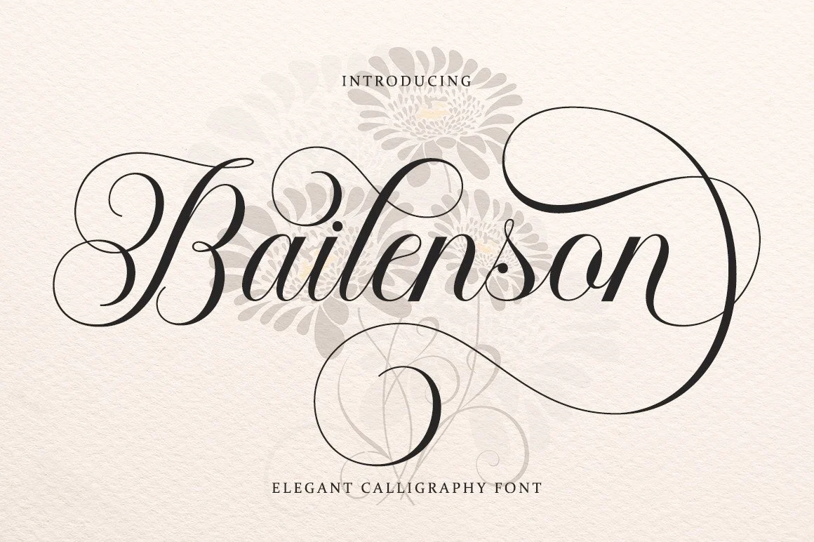
Bailenson — Classic Calligraphy for Favors and Certificates
Inspired by Italian handwriting and old manuscripts, built with a formal, classic touch. Best for wedding favors, book covers, business cards, and certificates — anywhere the brief calls for elegant rather than playful. Not the pick for a youth or streetwear brand.
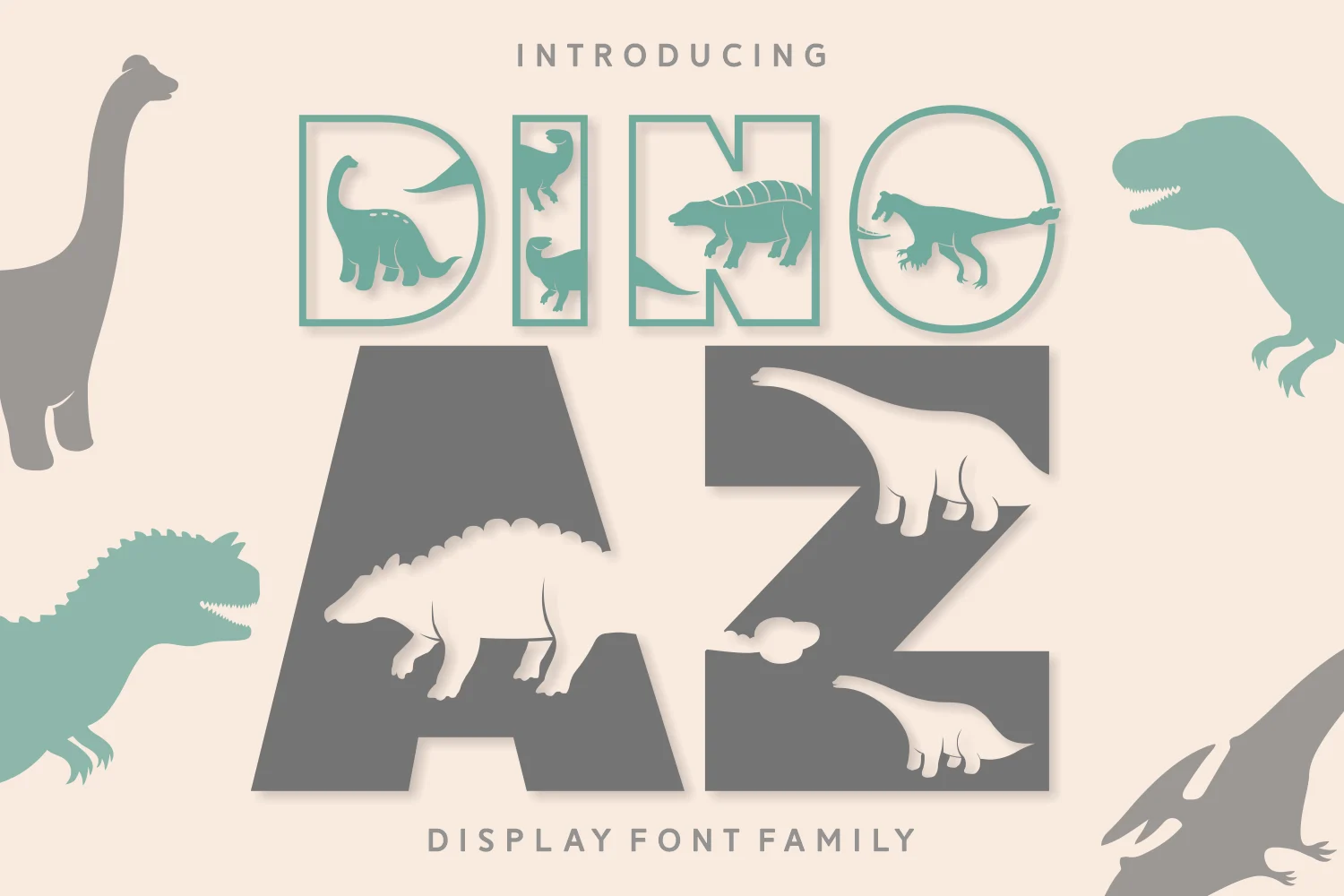
Dino Az — Playful Decorative Face for Kids and School Projects
A quirky, uniquely shaped face with a built-in sense of fun, PUA-encoded so every glyph and swash is reachable without hunting through a character map. Best for kids’ products, school projects, or anything that wants to read as playful rather than polished. Not the pick for anything that needs to look serious.
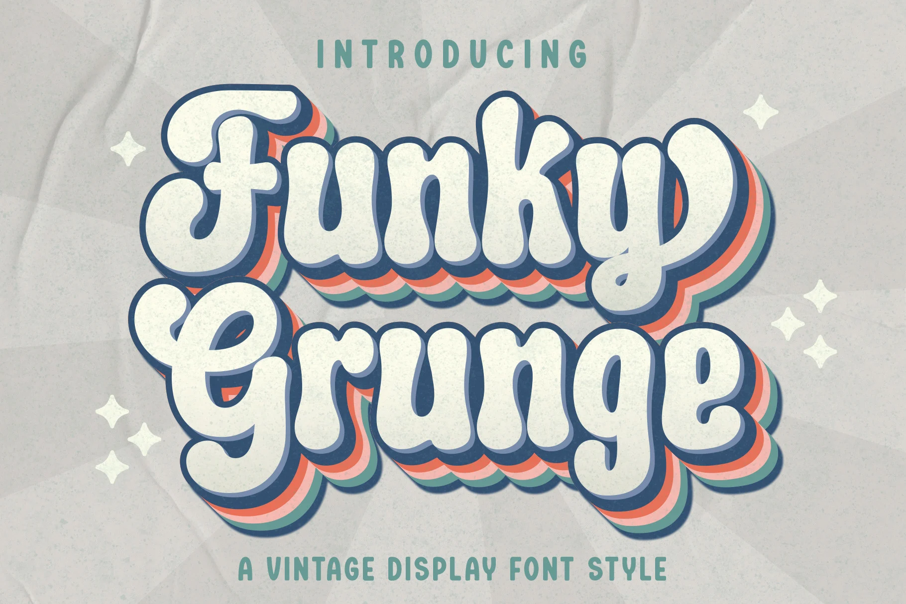
Funky Grunge — Vintage Texture for Logos and Branding
A cool, worn-in display face with a retro texture built into the letterforms. Best for logos, branding, invitations, and social posts that want a lived-in look without actual wear and tear on the file. Not the pick for anything that needs crisp, geometric lines.
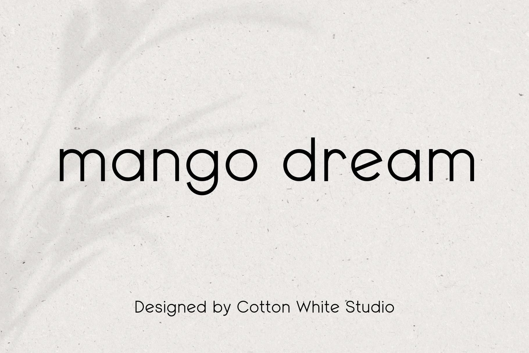
Mango Dream — Bold Display Face, Judged on the Letterforms Alone
This one’s listing page doesn’t carry a written description beyond the name, which is worth saying plainly rather than inventing a backstory for it. It’s included because the rating and review count back it up on their own, not because of any marketing copy. Best if you’ve looked at the preview and the shape is what you need; worth skipping when a client needs a written product description to approve before you buy.
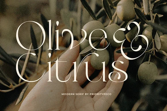
Olive & Citrus — Modern Serif for Branding and Editorial Layouts
A classic, elegant serif with a more restrained feel than the scripts above — PUA-encoded for full access to its glyph and ligature set. Best for branding, logos, and magazine-style layouts that want a modern-classic look. Not the pick if the brief calls for anything hand-drawn.
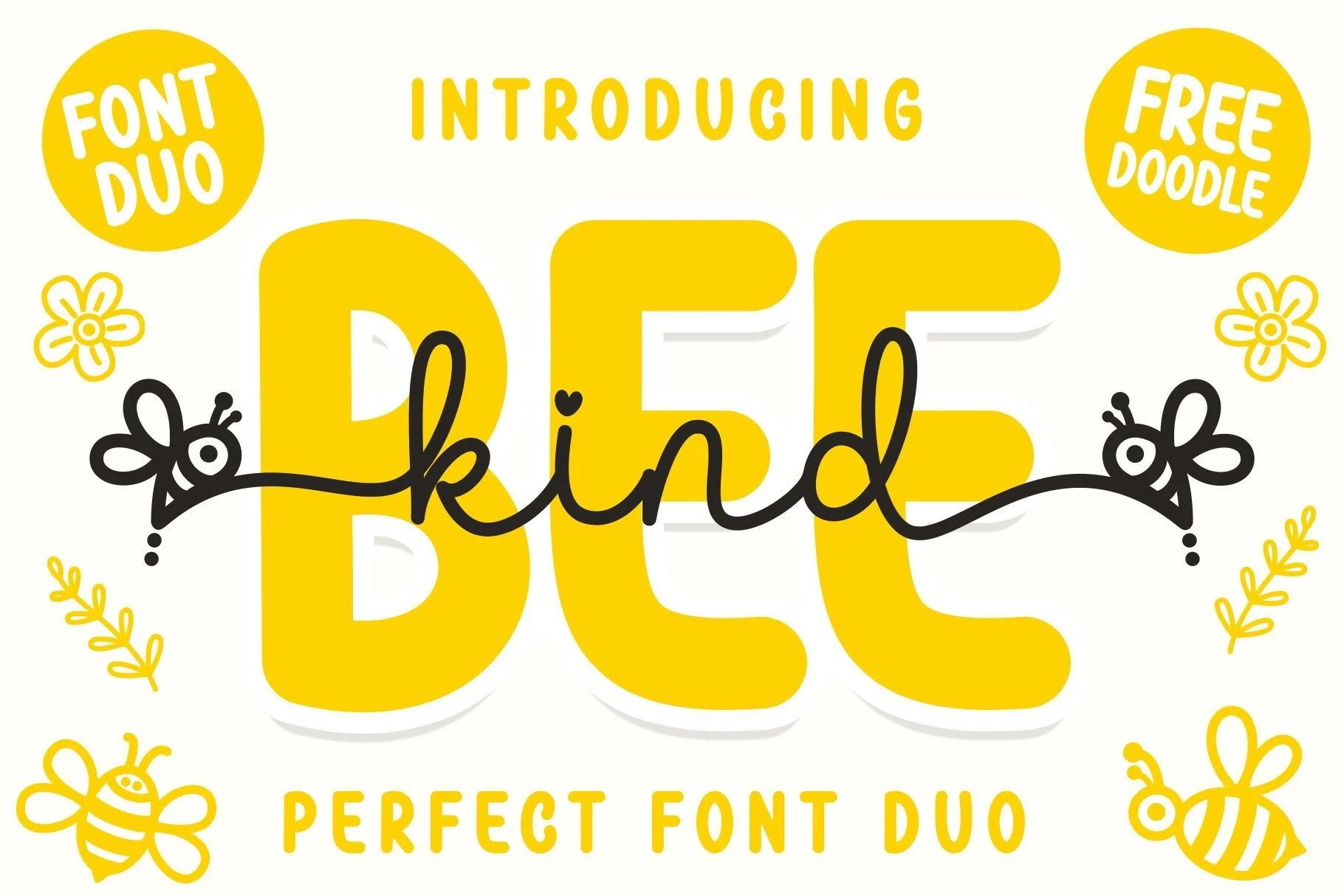
Bee Kind Duo — A Script and Display Pairing in One Download
This one skips the pairing problem below entirely: it ships as two matched styles, a script and a sans display, built around a cute bee theme. Best for kids’ products or anything that needs a script-and-headline combo without hunting for a second font that actually matches. Not the pick if the bee motif doesn’t fit the brand.
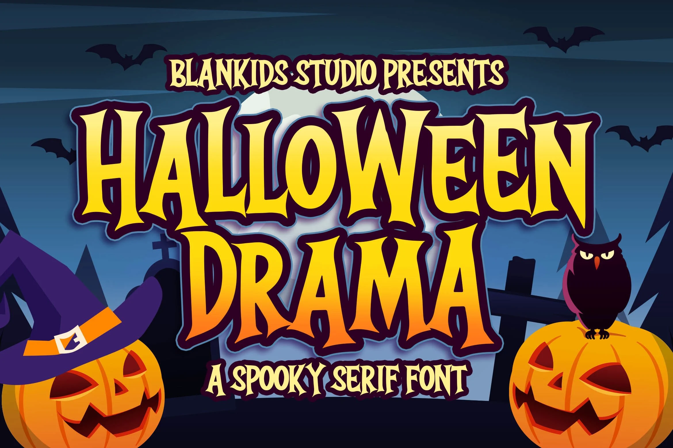
Halloween Drama — Spooky Seasonal Face for Packaging and Covers
A fun, spooky display face built for seasonal work: book covers, packaging, comics, posters, merch. It has the fewest reviews of the ten here, so treat it as newer and promising rather than as proven as the others — worth watching if you’re planning seasonal stock ahead of Halloween.
Pairing a Free Display Font With a Text Face
Every font, one commercial licence
The bundles I test at logo size live in one subscription — commercial use included, no per-font checkout.
This is the other place the free galleries fall short: every preview above is a standalone display face, and none of the roundups that rank for this keyword hand you a text font that actually sits well underneath one. A display face is built to be read in three or four words, not a paragraph — pair it with something plainer for body copy, and keep the pairing to one display face and one text face per layout. Bee Kind Duo sidesteps this entirely since it already ships as a matched script-and-sans pair. For the others, the rule that holds up across all nine: match the weight of the text face to the display face’s stroke width, not to its personality. A heavy script like Hey Baby wants a light, quiet sans underneath it, not a second decorative face competing for attention.
Key Takeaways
- Free display font galleries show you the letterforms, not the license — three separate roundups (72 fonts) left the commercial-use question unanswered in every single listing.
- “Free” and “cleared for client work and merchandise” are two different claims. Check which one you’re actually getting before it goes on a product.
- All ten fonts above carry a commercial license and passed a real rating-and-review bar — two other candidates with high review counts (Horror Season Font, Simple Stacked Font) got dropped for a rating too low to trust.
- Bee Kind Duo solves the pairing problem on its own by shipping as a matched script-and-sans set.
Can I use free display fonts for commercial use?
Only if the specific font’s license says so — “free to download” and “cleared for commercial use” are not the same claim, and most free-tier gallery listings never spell out the difference. Check the license line on the product page itself, not the gallery that linked you there.
Can I use free display fonts for merchandise like t-shirts and mugs?
Only with a license that explicitly covers merchandise and resale, which is a step beyond basic commercial use. The ten fonts in this guide carry that coverage; a font pulled from a generic free-download gallery usually needs its own license checked before it goes on a product you plan to sell.
What’s the difference between a display font and a decorative font?
In practice the two labels overlap — both describe typefaces built for short, large text like headlines and logos rather than paragraphs. “Decorative” usually leans further into texture or ornament (like Funky Grunge or Magic Flower above), while “display” is the broader category that includes cleaner faces too.
How many free display fonts should I keep in my library?
Fewer than you’d think. A handful of license-cleared display faces that cover a few real moods (handwritten, bold, elegant, playful) does more for client work than a folder of forty download-and-forget options with no license clarity behind any of them. Swap a font out of the handful once its mood stops matching the brief, rather than letting the folder grow past the point where you remember which license covers what.

