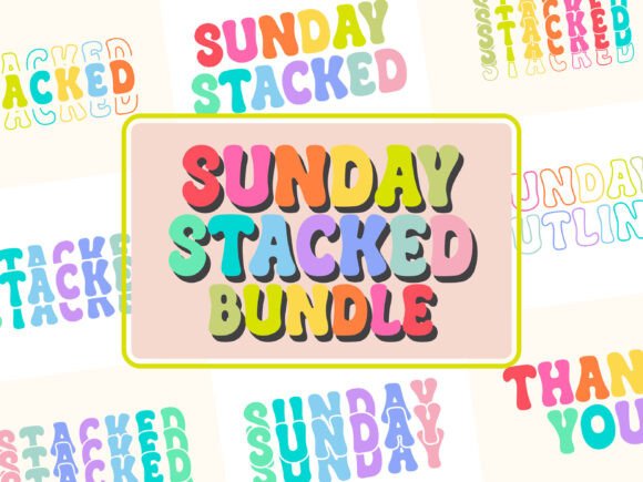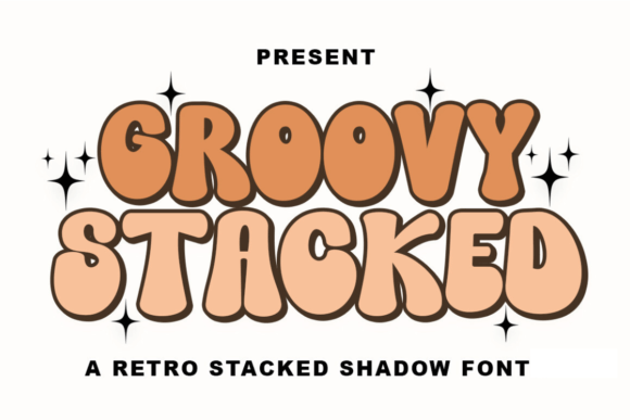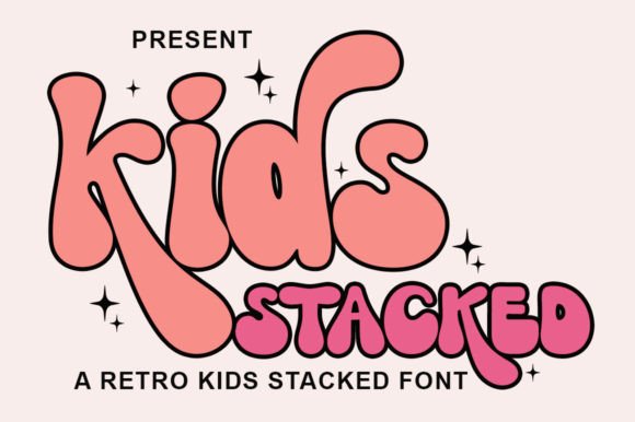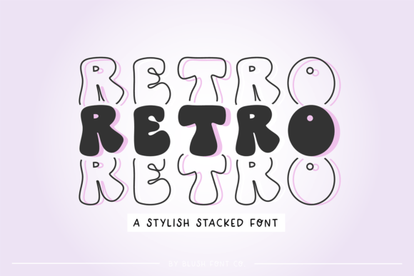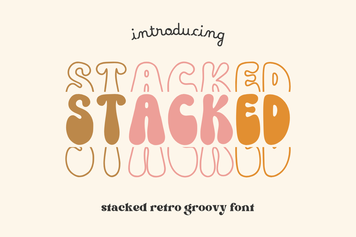
About Stacked
Most of what turns up under bold font needs work before it is usable. Stacked is the version that does not. Credit goes to Sakti Avellin. 158 saves is a quiet kind of recommendation, and it is the only one we can read off the listing. No reviews either way, so the preview is doing all the work on this one.
We would use it the way the listing hints — charm of yesteryears — and that is also where we would start if you are trying it for the first time. A display font only has to work big, so we judge it at poster size and ignore how it looks in a paragraph — that is not its job. One thing we always do and you should too: open the preview full size. A thumbnail hides exactly the detail that decides whether bold font is really what you are getting.
Stacked Specifications
| Font name | Stacked |
|---|---|
| Designer | Sakti Avellin |
| Font type | Display and Poster Fonts |
| Format | Digital download |
| Saved by | 158 makers on |
How to use this font
- Download the font from Creative Fabrica and unzip it — you normally get OTF and TTF of the same face, plus a licence file.
- Install the OTF if your software gives you the choice: it carries the alternates and ligatures that make a script face look handwritten.
- Restart the app you design in — Canva, Photoshop, Cricut Design Space and Word all read the font list once, at launch.
- Read the licence before a paid job: personal and commercial use are priced apart, and a logo often needs the extended one.
Download Details
- Format: Digital download
- Files: listed on the Creative Fabrica page for this font
- Licence: whichever licence Creative Fabrica shows for this file — check it there before you sell what you make