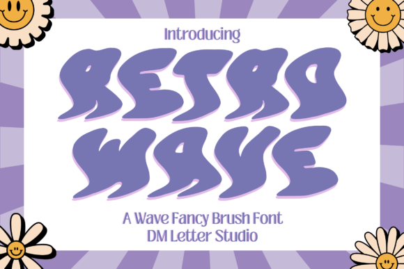
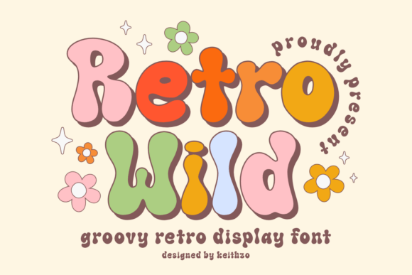
About Retro Wave
Retro Wave earned its place here for one reason: it is a straight answer to 70s fonts, and straight answers are rarer in this font catalogue than you would think. Dustfinger is the name on the listing. With 77 saves it has barely been seen, and that is neither a good nor a bad sign on a catalogue this size. There are no reviews on it yet, so judge it by the preview and not by a score that does not exist.
We keep it filed mentally under 70slooks, which is the use that needs the least adjusting afterwards. Check the capitals and the spacing between them — display type lives or dies on how a short word in caps sits together. Open it big before you commit. At thumbnail size every font on this shelf looks equally good, which is the problem with thumbnails.
Retro Wave Specifications
| Font name | Retro Wave |
|---|---|
| Designer | Dustfinger |
| Font type | Display and Poster Fonts |
| Format | Digital download |
| Saved by | 77 makers on |
How to use this font
- Download the font from Creative Fabrica and unzip it — you normally get OTF and TTF of the same face, plus a licence file.
- Install the OTF if your software gives you the choice: it carries the alternates and ligatures that make a script face look handwritten.
- Restart the app you design in — Canva, Photoshop, Cricut Design Space and Word all read the font list once, at launch.
- Read the licence before a paid job: personal and commercial use are priced apart, and a logo often needs the extended one.
Download Details
- Format: Digital download
- Files: listed on the Creative Fabrica page for this font
- Licence: whichever licence Creative Fabrica shows for this file — check it there before you sell what you make